Blue Agate-Inspired Watercolor Wedding Invitations

A bit of agate-inspired prettiness to brighten your Wednesday! Agate slices and jewel tones are having quite a moment these days, don’t you think? First these gorgeous purple-hued agate-inspired invitations a few weeks ago, and now these vibrant blue agate-inspired watercolor wedding invitations from Debbie Wong Design! The watercolor does a great job of mimicking the unique and varied nature of agate stones. And the hand painted watercolor is even more beautiful when paired with deckle edge paper and modern calligraphy in white ink!

Blue Agate-Inspired Watercolor Wedding Invitations by Debbie Wong Design

From Debbie: The aesthetic and rich jewel tones of agate were the main inspiration for this invitation suite. Blue is incredibly versatile and a beautiful color to use year-round, no matter how seasonal trends may change.

Blue Agate-Inspired Watercolor Wedding Invitations by Debbie Wong Design

Since agate stones come in so many different patterns, the background for the invitation and response card were also unique from one to another, due to the handmade nature of watercolors. Another unique element of agate slices that we wanted to highlight was the unique crystal design at the center of each stone.

Blue Agate-Inspired Watercolor Wedding Invitations by Debbie Wong Design

I decided modern calligraphy was an appropriate style to use for this fun invitation suite, and white ink was the perfect choice to stand out the most against the dark blue tones of the suite. The invitation suite was created on hand deckled cotton rag paper to get a gorgeous texture. Then, the invitation and the response card were tied together with a soft dusty blue silk ribbon from Silk and Willow, before inserting them into a light blue envelope.

Blue Agate-Inspired Watercolor Wedding Invitations by Debbie Wong Design

Vintage stamps were another fun detail we incorporated. Blue stamps fit the theme, but we added a couple of brightly colored stamps to make the envelopes stand out in a fun and vibrant. A blueberry stamp was also incorporated, and this motif tied in with the menu card.

Blue Agate-Inspired Watercolor Wedding Invitations by Debbie Wong Design

The reception was going to be a cocktail style affair, so the menu items were hors d’oeuvres instead of a full seated dinner. The menu was also made on the same hand deckled cotton paper, with a little blueberry painted on the top as the header. We used watercolor to write the appetizer names onto these cards. I knew using watercolor would give the menu cards an organic look with the colors varying slightly from word to word.

Blue Agate-Inspired Watercolor Wedding Invitations by Debbie Wong Design

We used actual agate slices as food labels for the stations at the reception. Brilliant white ink with modern calligraphy was used to match the invitation suite’s calligraphy. I purposely chose three distinctive looking agate stones for the appetizer cards, as no two agates are exact, just like a hand painting. This was such a fun project to orchestrate and I love how it came together!

Blue Agate-Inspired Watercolor Wedding Invitations by Debbie Wong Design

Thanks Debbie!

Design, calligraphy, & hand painting: Debbie Wong Design

Ribbon: Silk and Willow

Check out the Designer Rolodex for more tal­ented wed­ding invi­ta­tion design­ers and the real invi­ta­tions gallery for more wedding invitation ideas!

Photo Credits: Debbie Wong

Cactus and Calligraphy Wedding Invitations

A wedding ten years in the making! A destination wedding in Palm Springs! We’re starting the week off with some seriously stunning calligraphy and cactus wedding invitations from Taryn of Twinkle & Toast for an epic wedding in the desert. Copper foil, a blind deboss palm frond, burgundy edge painting, custom calligraphy, and watercolor cactus illustrations throughout. Take a look for yourself below!

Cactus and Calligraphy Wedding Invitations by Twinkle and Toast

From Taryn: This custom invitation suite was designed for a real wedding for our fantastic couple, Ali and David. Our outgoing and much loved bride and groom have been together since they were fifteen. They survived high school, long distance through college, and various other ups and downs. Needless to say, they were ready to plan an epic soirée of a weekend for all their friends and family!

Cactus and Calligraphy Wedding Invitations by Twinkle and Toast

Cactus and Calligraphy Wedding Invitations by Twinkle and Toast

The couple resides in Chicago and planned a Palm Springs destination wedding (with over 200 guests!). Palm Springs holds a special place in the bride’s heart, as do details and clean design (she’s a hotel interior designer), so it was really important to her to set the tone with the invitation suite.

Cactus and Calligraphy Wedding Invitations by Twinkle and Toast

Cactus and Calligraphy Wedding Invitations by Twinkle and Toast

The inspiration was clean white, desert sophistication, with a touch of fun. The color palette was desert greens and burgundy jewel tones. The star of the suite was definitely the main invitation. We did a blind deboss of a palm design, copper foil printing, extra thick cotton paper, and a burgundy painted edge. This piece has so much weight and texture and really left an impact on their guests.

Cactus and Calligraphy Wedding Invitations by Twinkle and Toast

Cactus and Calligraphy Wedding Invitations by Twinkle and Toast

As a calligrapher as well as a stationer, the whole suite had custom calligraphy on all pieces. The envelope calligraphy called for pointed pen with a diluted burgundy gouache (for a watercolor effect). We pulled vintage cactus stamps, plus some soft pinks to echo her floral palette. We created a cactus watercolor painted envelope liner, and carried the cactus elements throughout.

Cactus and Calligraphy Wedding Invitations by Twinkle and Toast

From the very beginning, Ali really wanted a fun bellyband with the phrase “a weekend ten years in the making” to tie the entire wedding invitation suite together. Telling their story was important to us, and knowing them is to love them. This day has been highly anticipated and this party was certainly worth the wait!

Cactus and Calligraphy Wedding Invitations by Twinkle and Toast

Thanks Taryn!

Calligraphy & Invitation Design: Twinkle & Toast

Floral: Catalina Neal

Ring Box: The Mrs. Box

Check out the Designer Rolodex for more tal­ented wed­ding invi­ta­tion design­ers and the real invi­ta­tions gallery for more wedding invitation ideas!

Photo Credits: Society House

Behind the Stationery: Iron Curtain Press

Welcome to another installment of Behind the Stationery! Today we’re joined by LA-based designer and owner of Iron Curtain Press, Rosanna. Iron Curtain Press has grown their letterpress business by staying true to what inspires them, beginning designs with a particular occasion or person in mind. In need for more space, Rosanna shares about their search for a larger studio and, serendipitously, a storefront for their connected retail store, Shorthand, which has been a special way to extend the Iron Curtain Press personality. Welcome, Rosanna! –Megan

Iron Curtain Press: Shop Shorthand

From Rosanna: I have been so fortunate to spend my entire professional life working in paper. When I was searching for what to do with my English Literature degree shortly after I graduated from college, I took a letterpress printing class and never looked back. I apprenticed with the fabulous Bremelo Press before striking out on my own a few months later. This February was the 9 year anniversary of working for myself as Iron Curtain Press. I think I was just young enough and idealistic enough to take the leap without thinking too hard about all the potential risks that come from owning your own business. Years of hustle, hard work, dreaming big along with a lot of sweat and tears have led to where we are now!

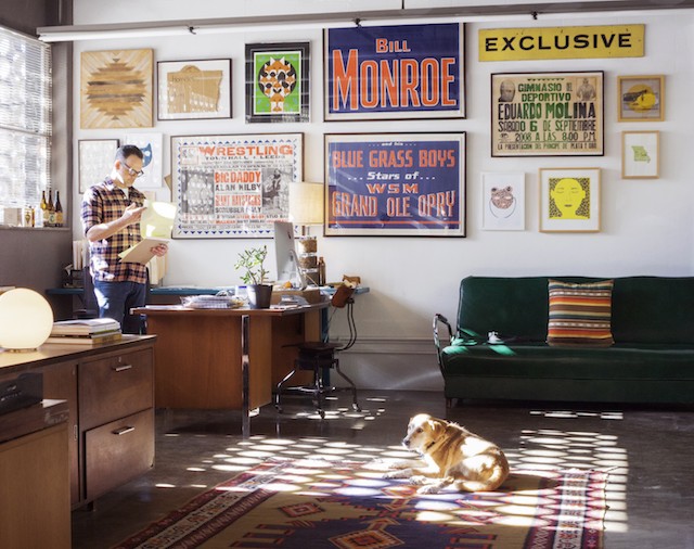
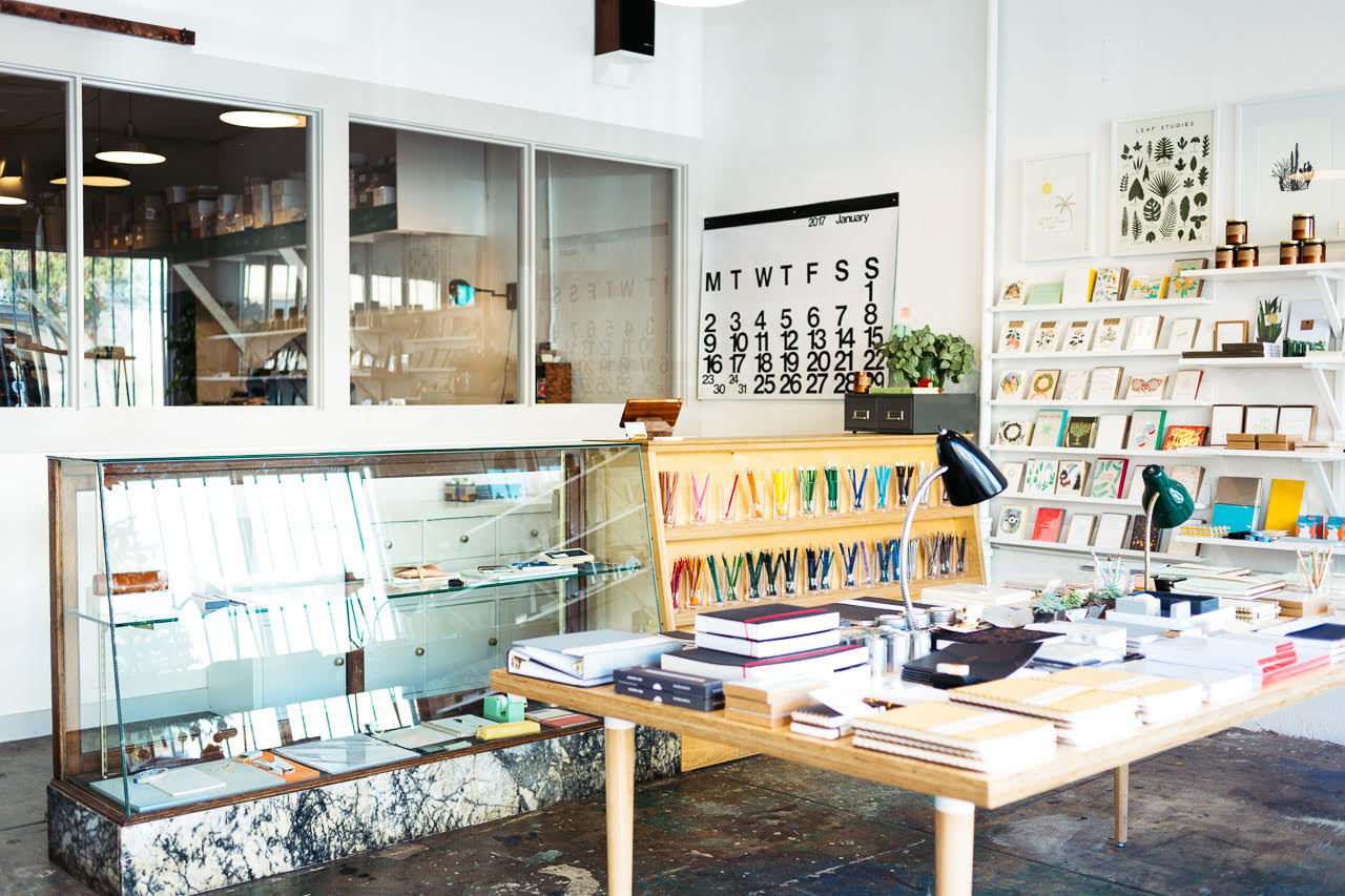
We’ve called North East Los Angeles home for the past 5 years. We’ve been in our current location since January 2016 and hopefully this will be our home for many years to come! The print shop where we create all our own products plus print all the custom projects that come through our doors each year is the bulk of the space.

Iron Curtain Press: Print Shop

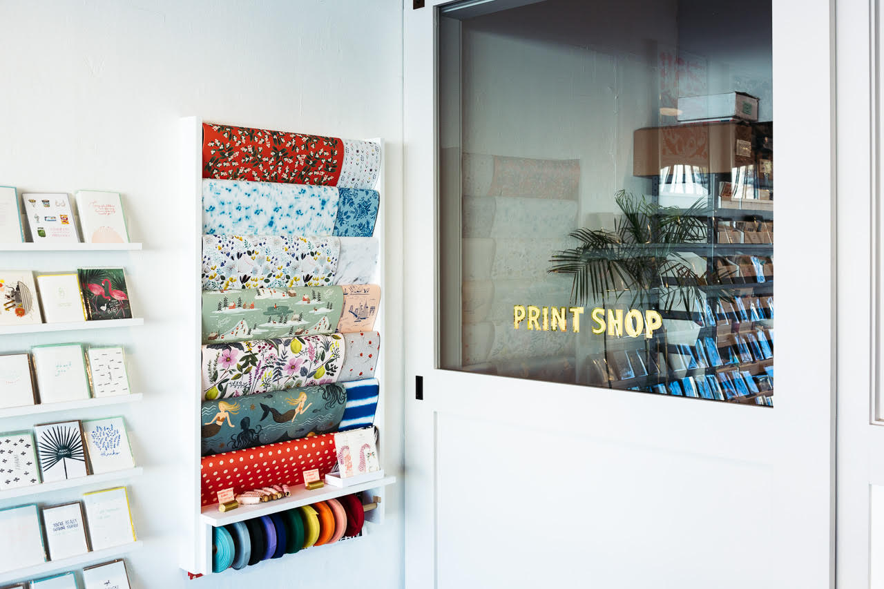
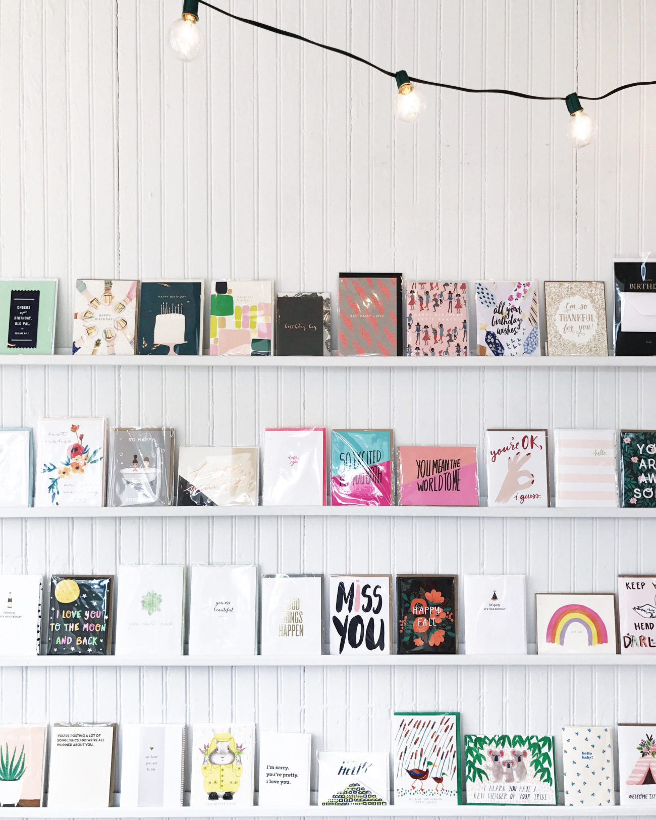
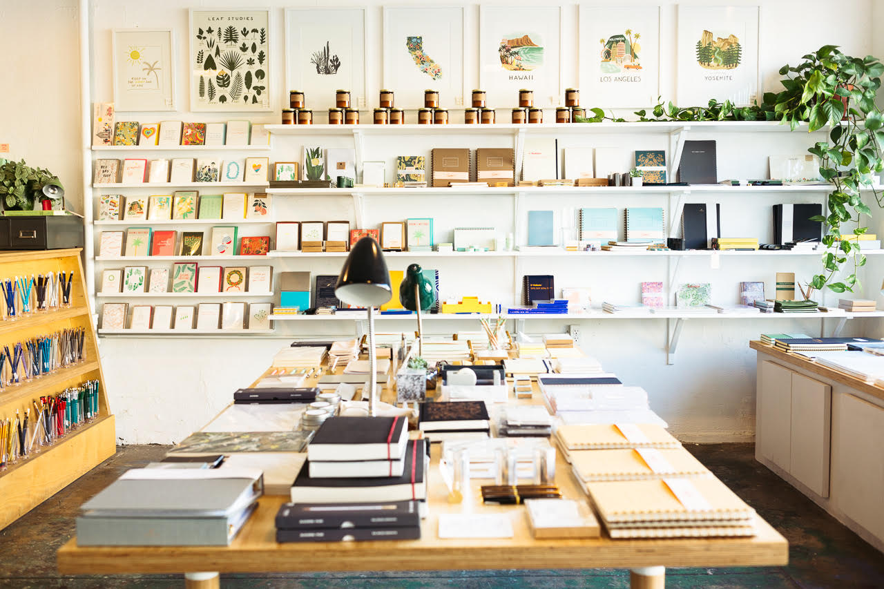
We were able to open a small store front specializing in cute supplies for your desk just about a year ago. Shorthand sprang to life almost by accident. We were looking for a new studio space, ideally near our home, and a space on one of our favorite streets in our neighborhood became available. Owning a retail store had never been a top priority goal, but as soon as we saw the space I knew what I would want if I opened a store! Of course, we would sell all our own products, and then I wanted to find cute desk supplies that would complement our offerings. I started tracking down products for the store by figuring out who made my favorite little brass pencil sharpener and then once I found them, realized they made a bunch of cool stuff.

Iron Curtain Press / Shorthand

Over and over, I’ve just had in my mind something I want to carry, figured out who made it, and then found a wealth of other amazing products made by the same company or manufacturer. Our tagline is “for the love of your desk” and that helps me stay focused on what we bring in to the store. We thought, worst case scenario, this will be a cute showroom for our own products. But it’s really taken on a life of it’s own and buying for the store has become one of the best parts of my job. I love how delighted our customers are when they come in and experience our overwhelming appreciation of desk accessories and supplies.

Iron Curtain Press / Letterpress Printing

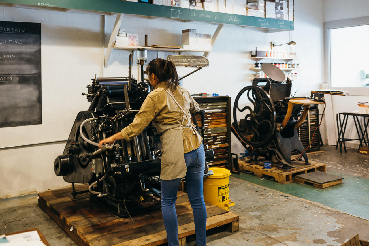
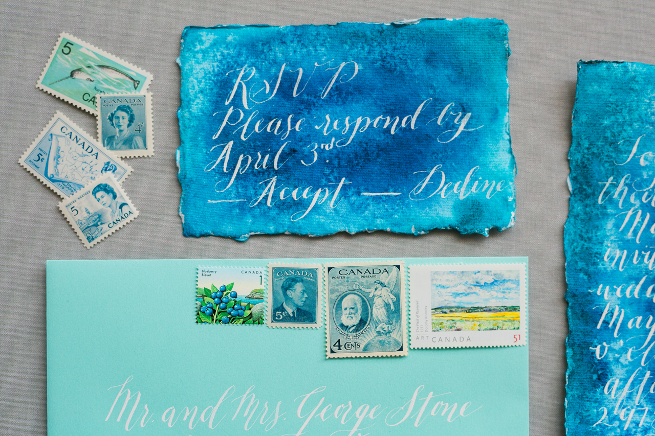
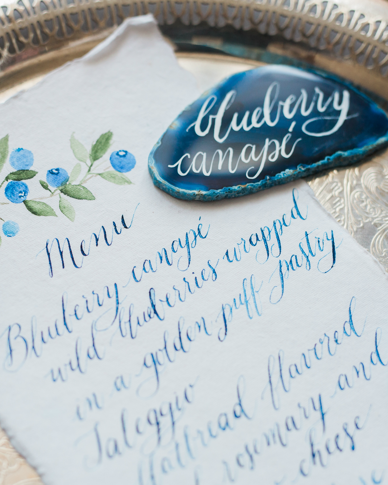
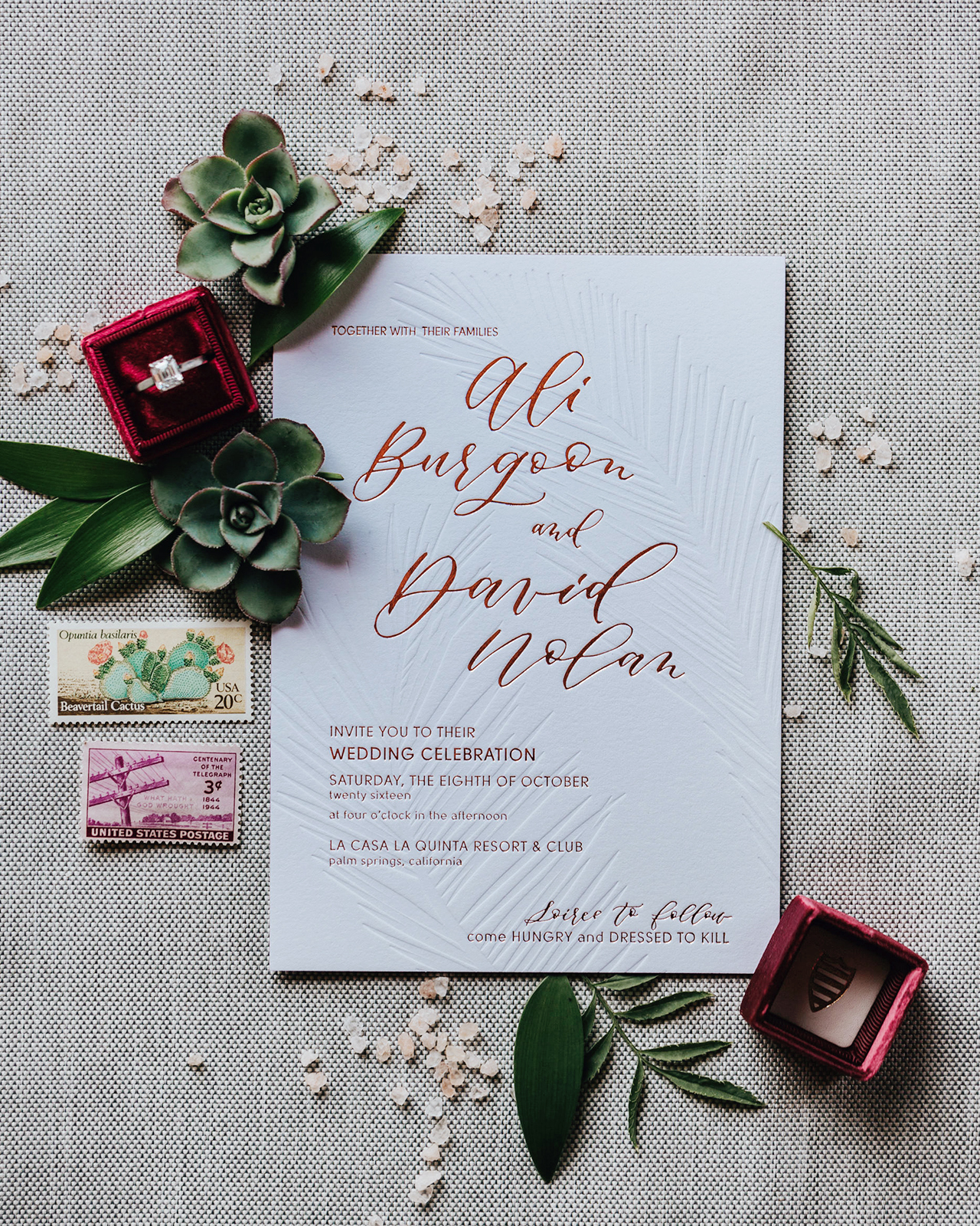
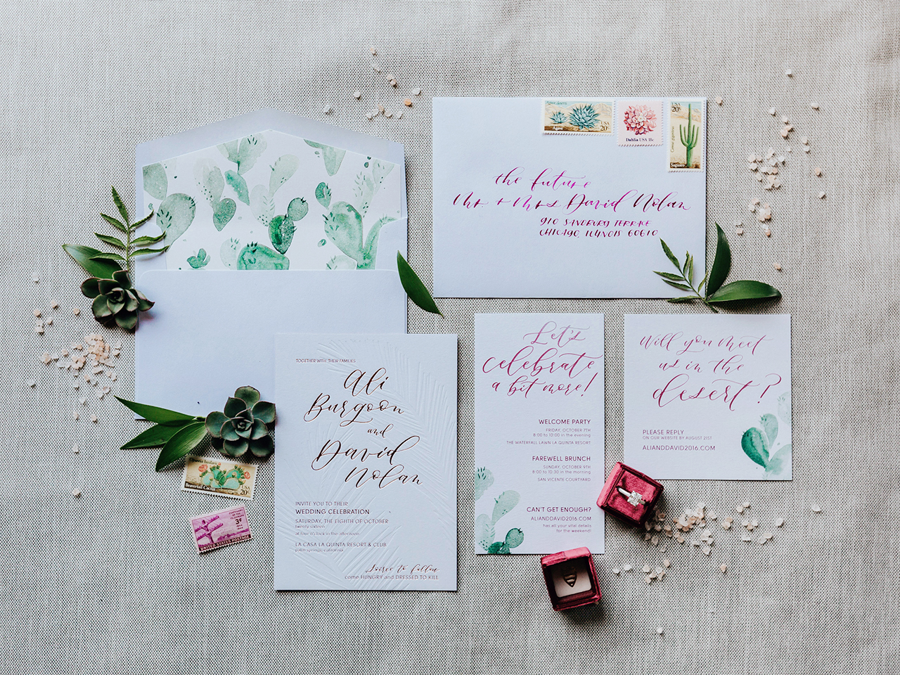
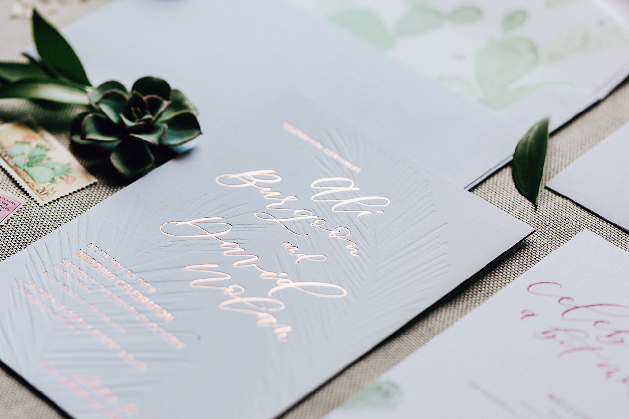
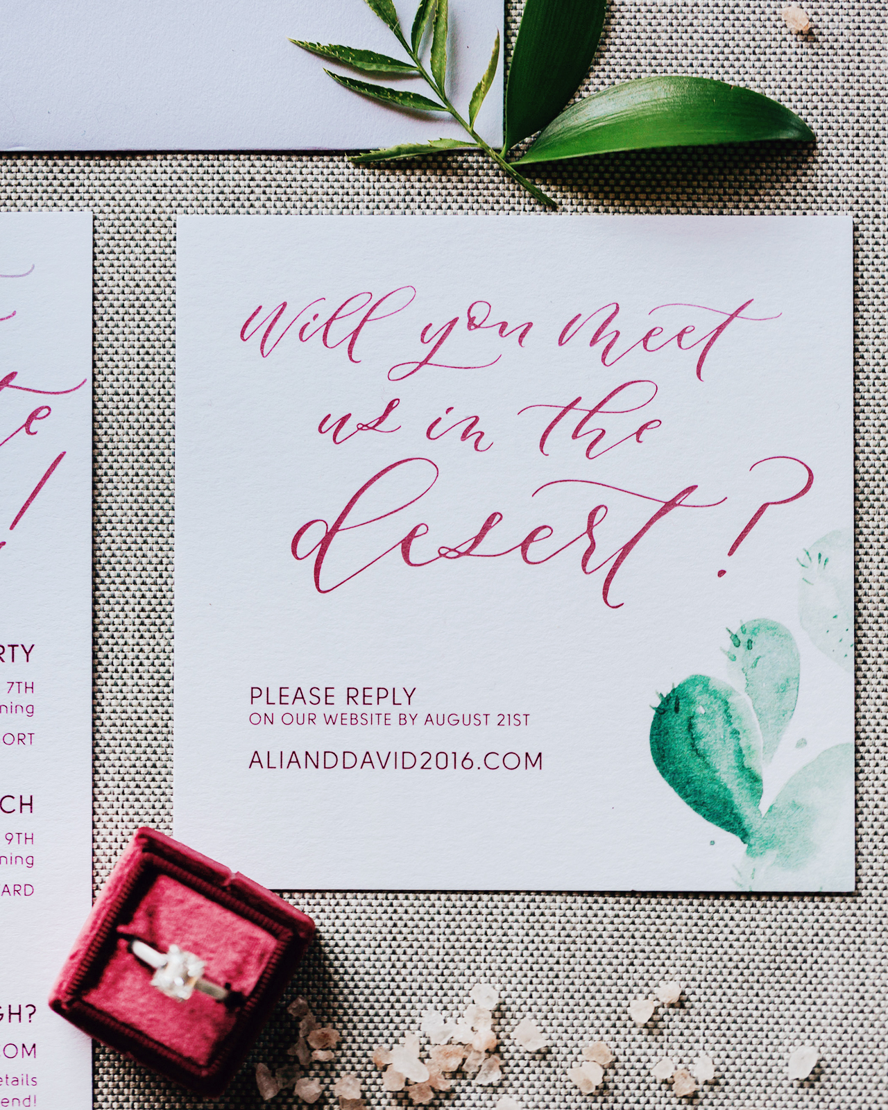
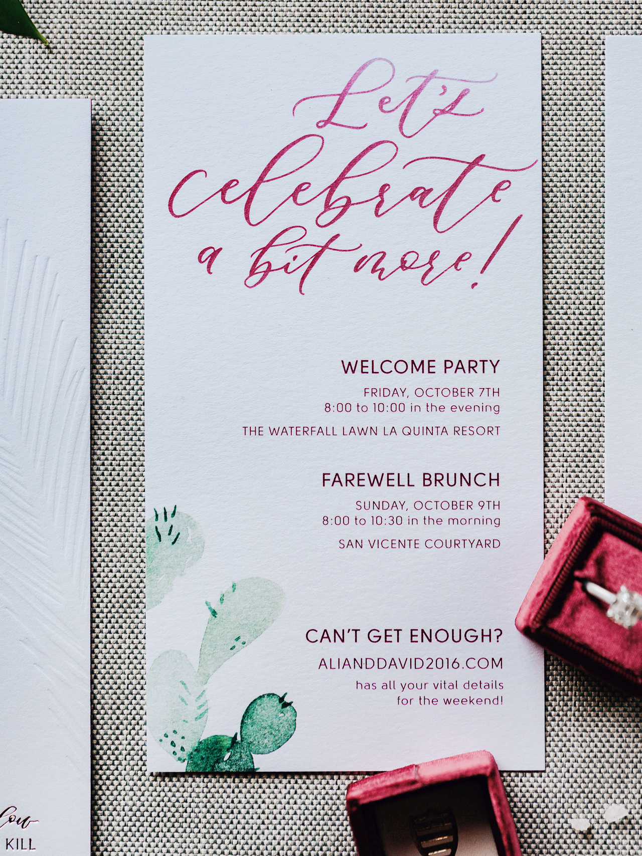
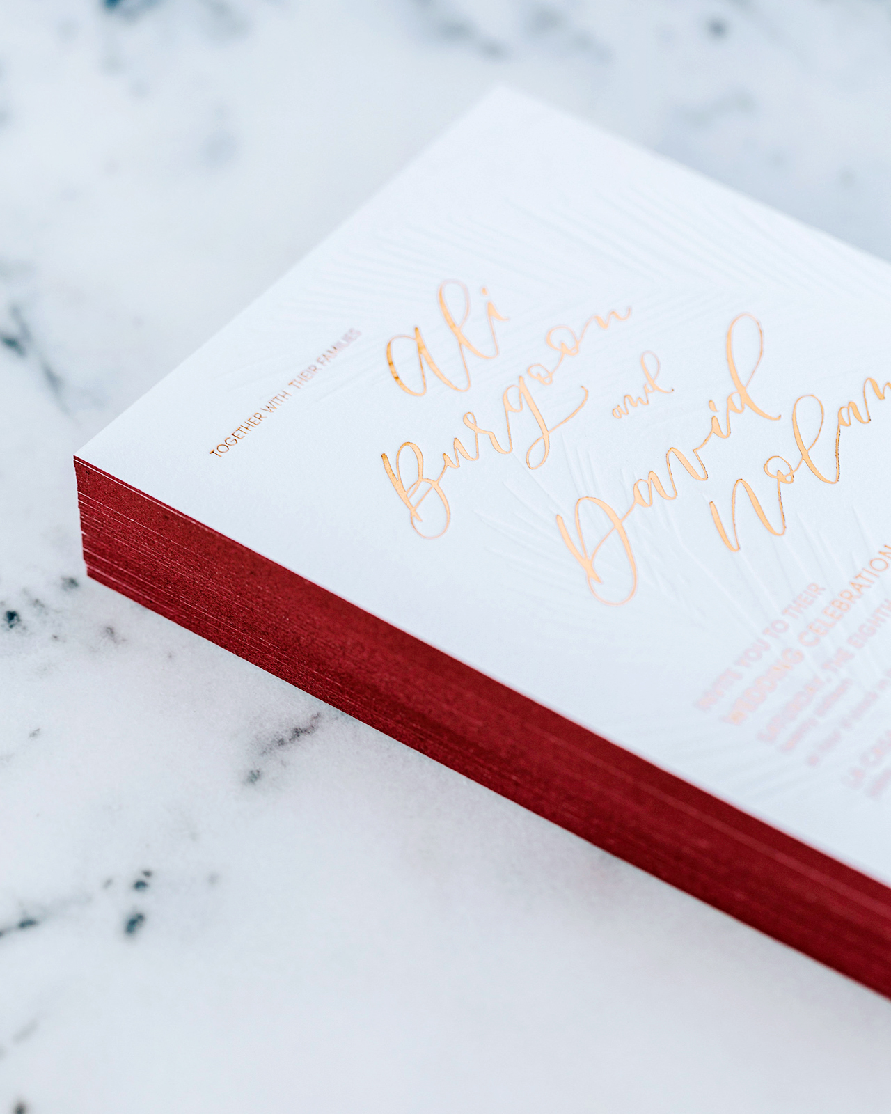
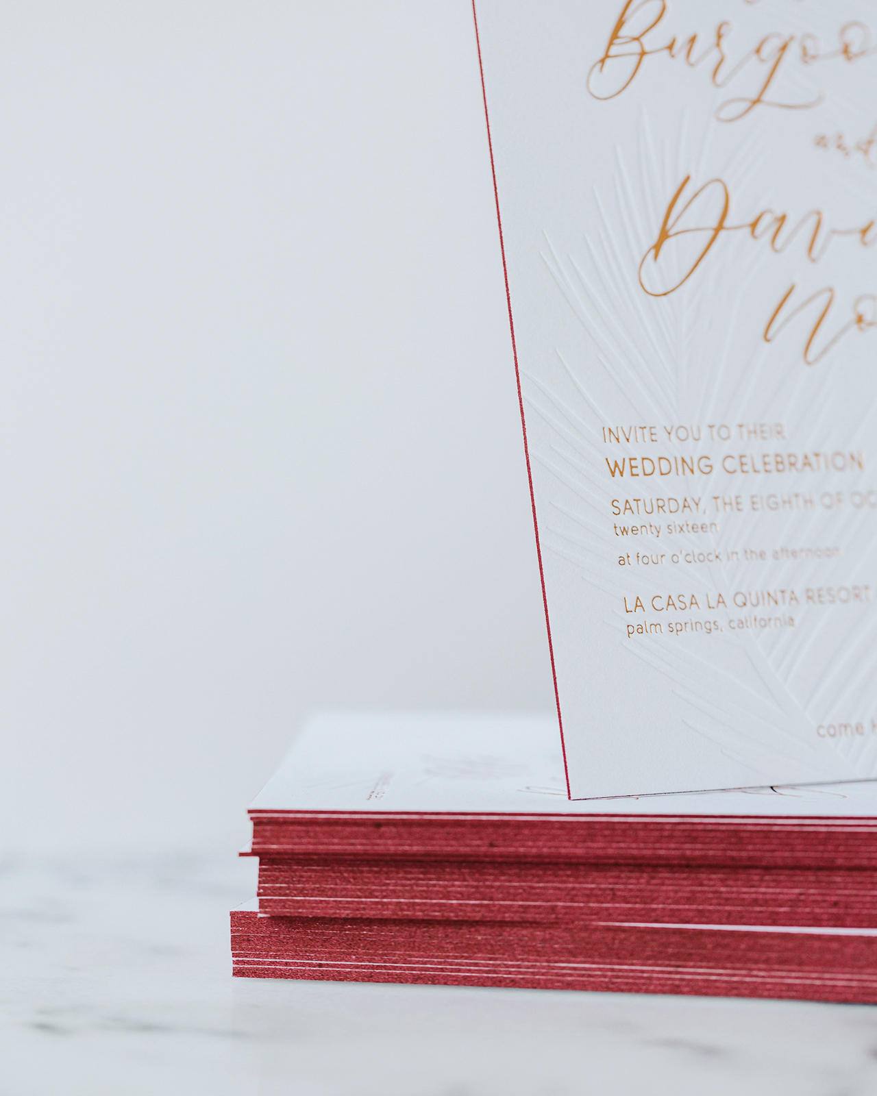
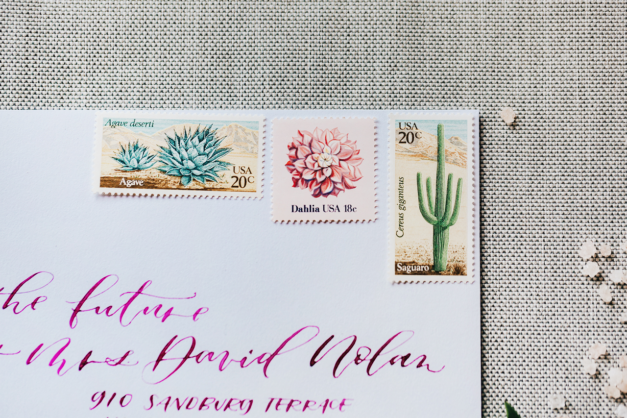
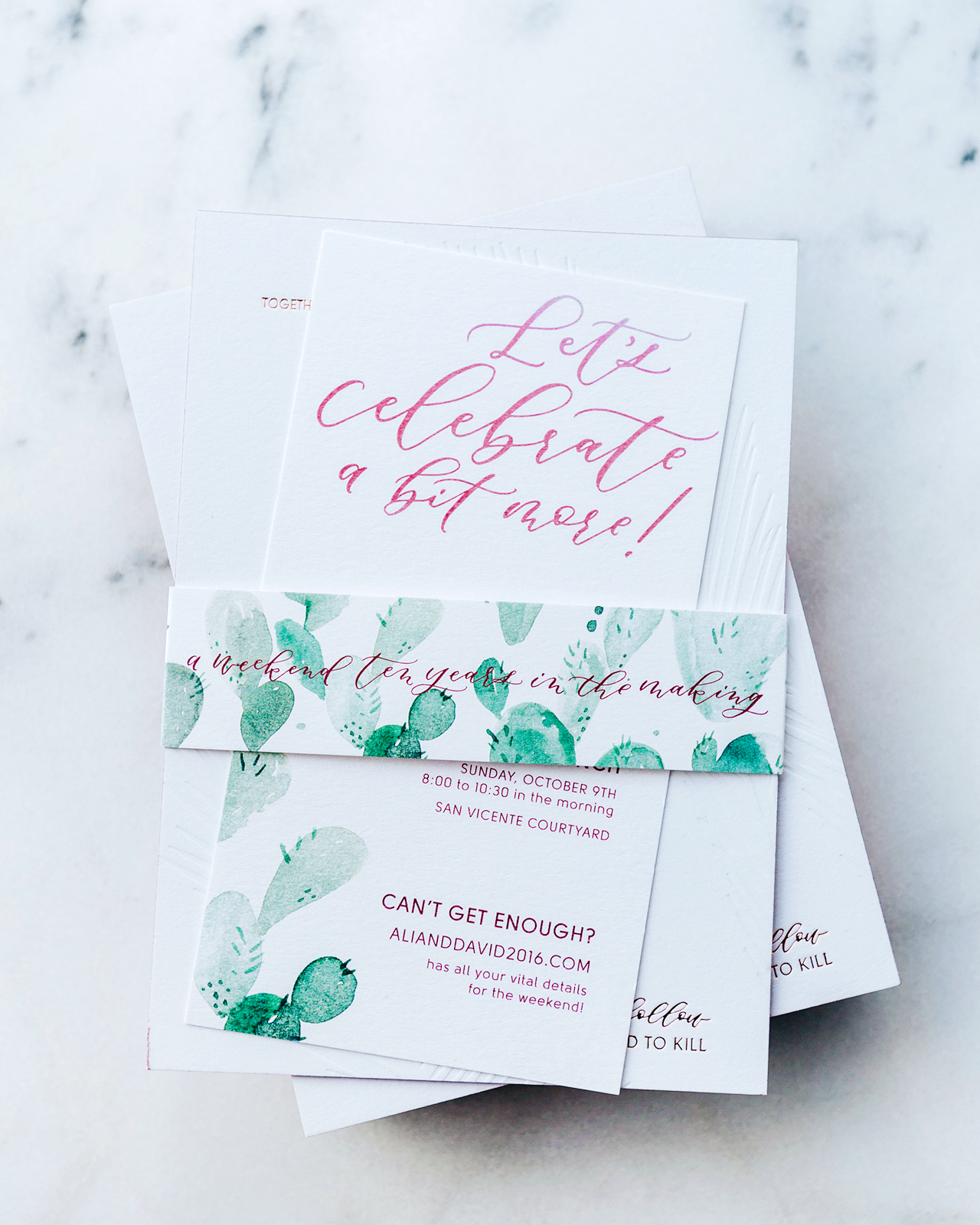
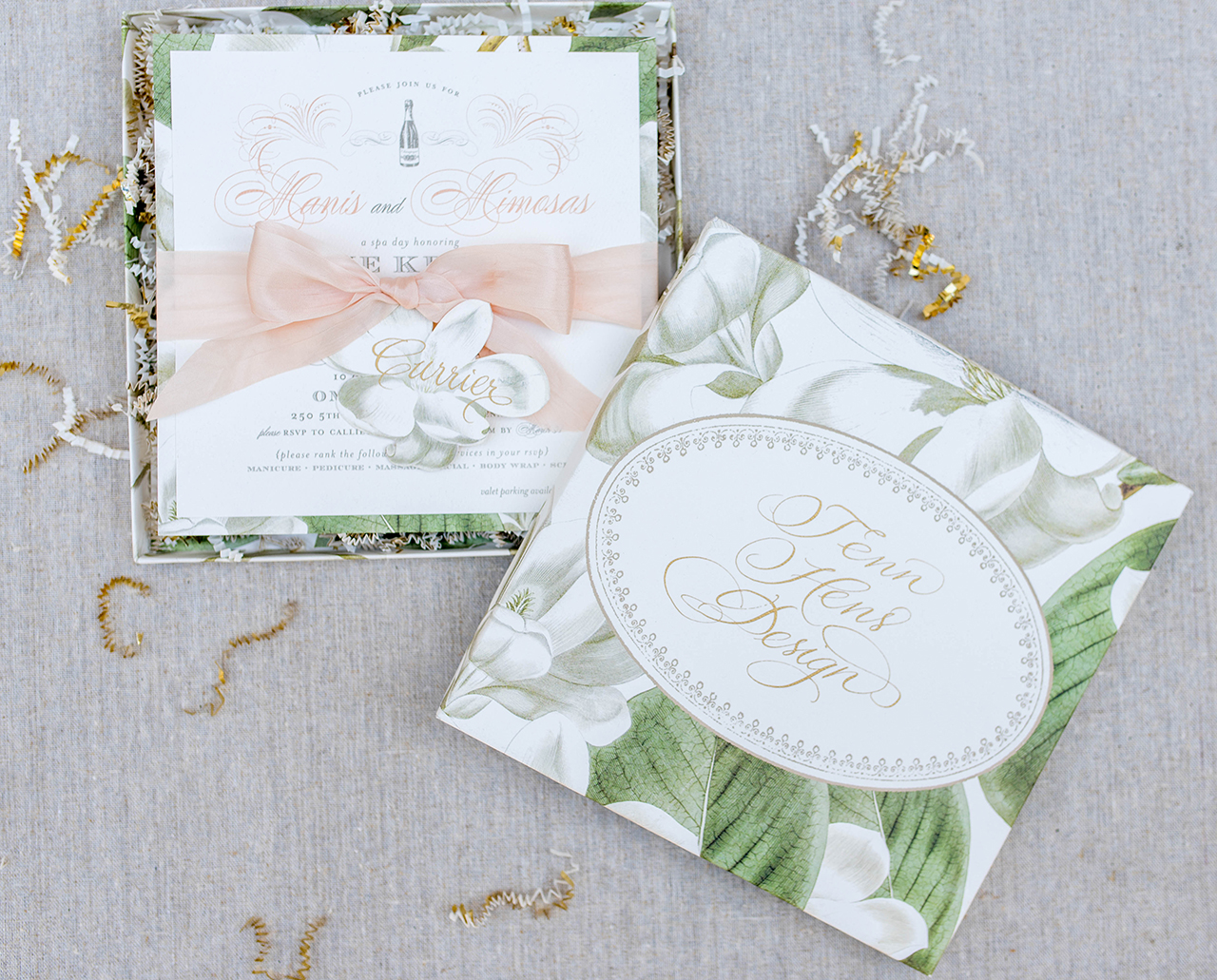
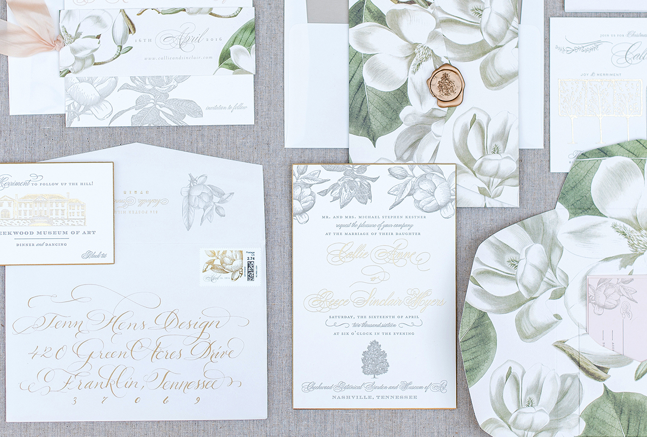
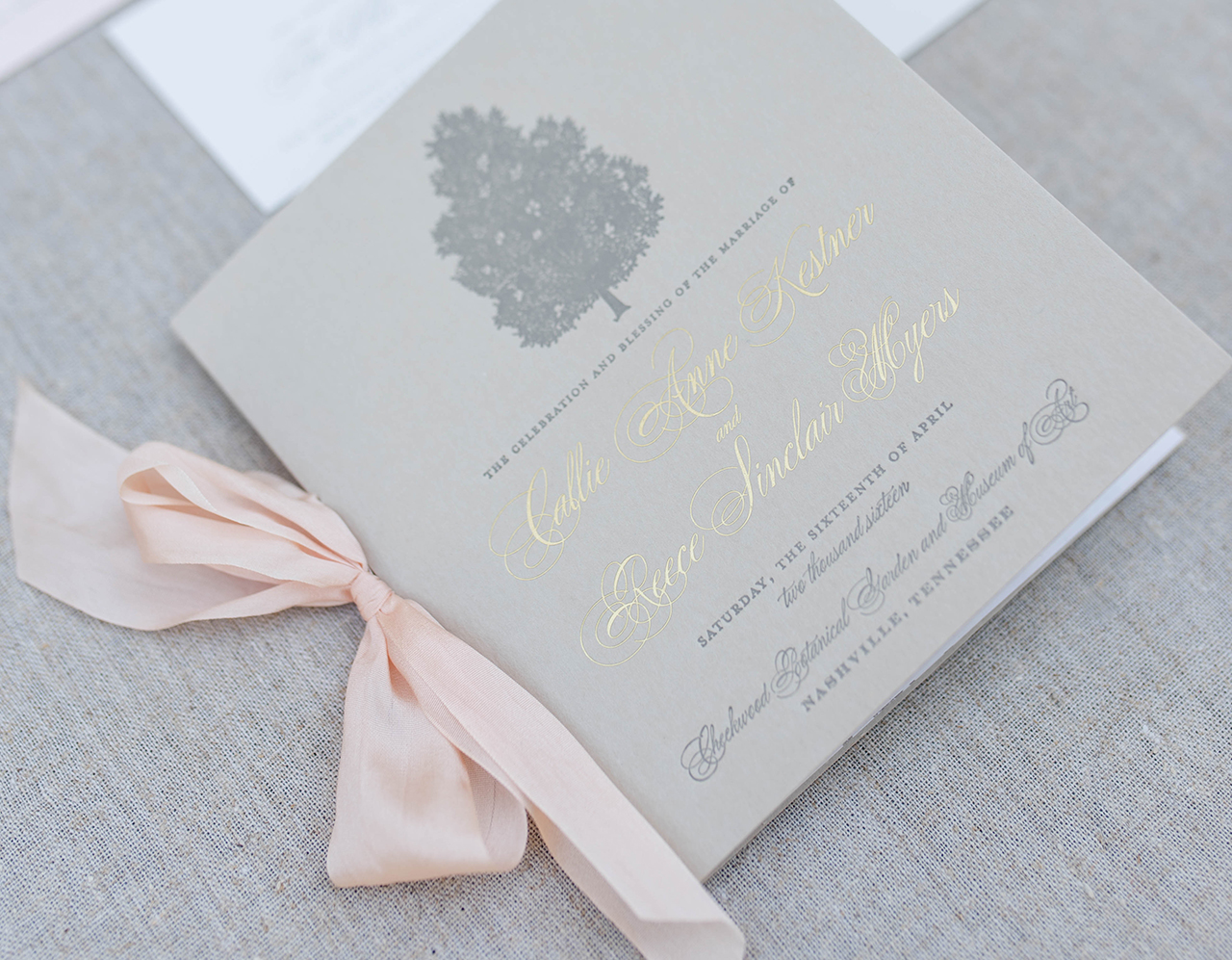
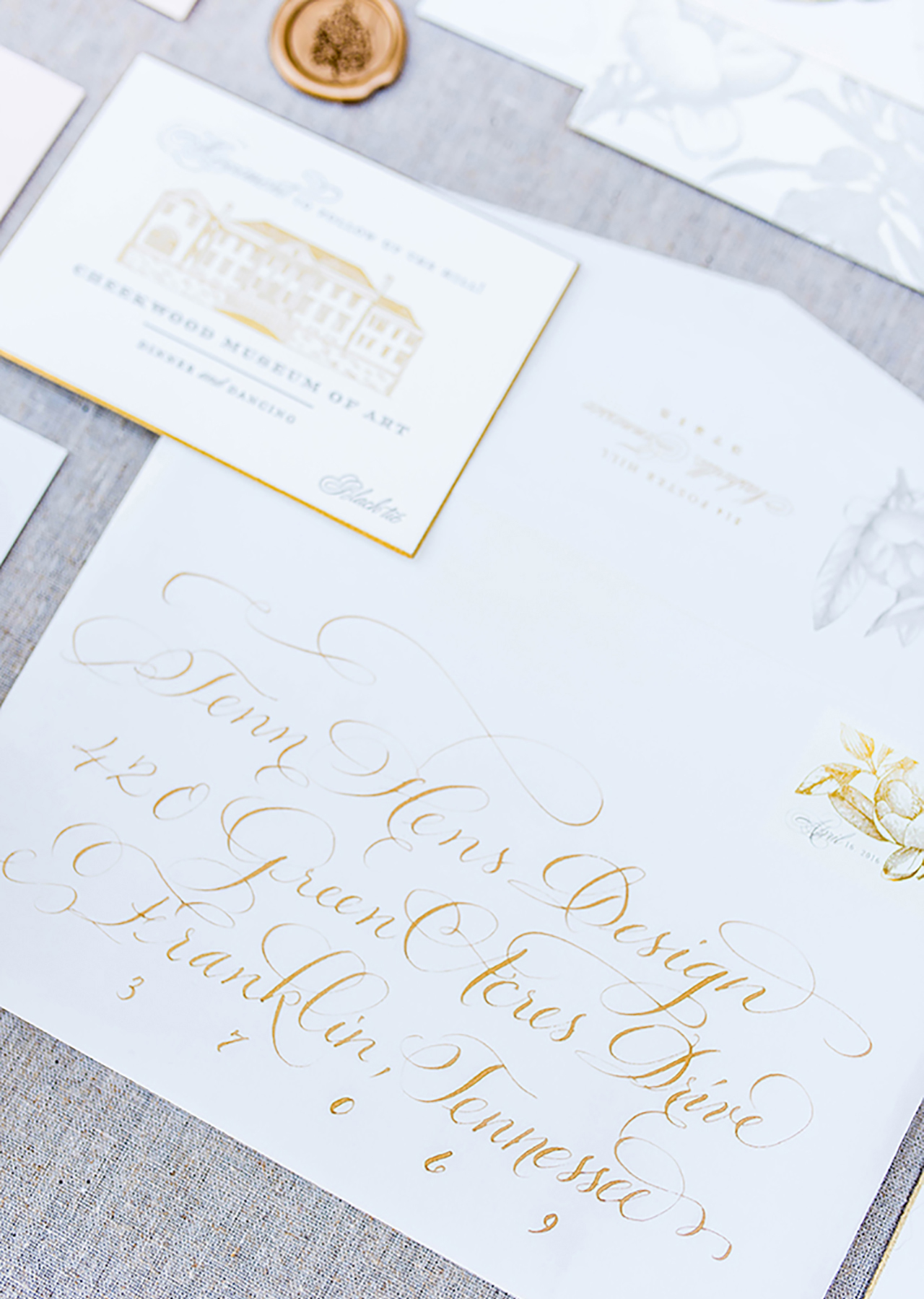
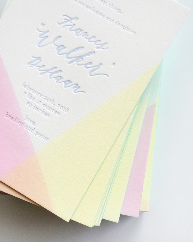
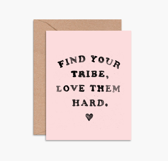
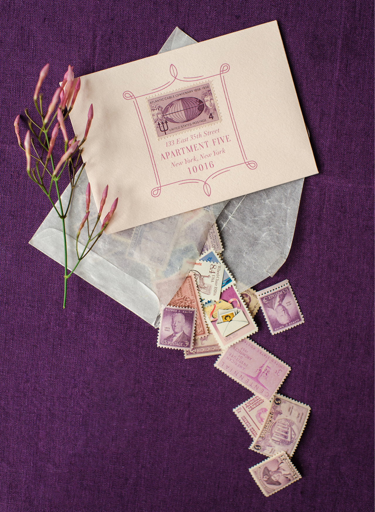
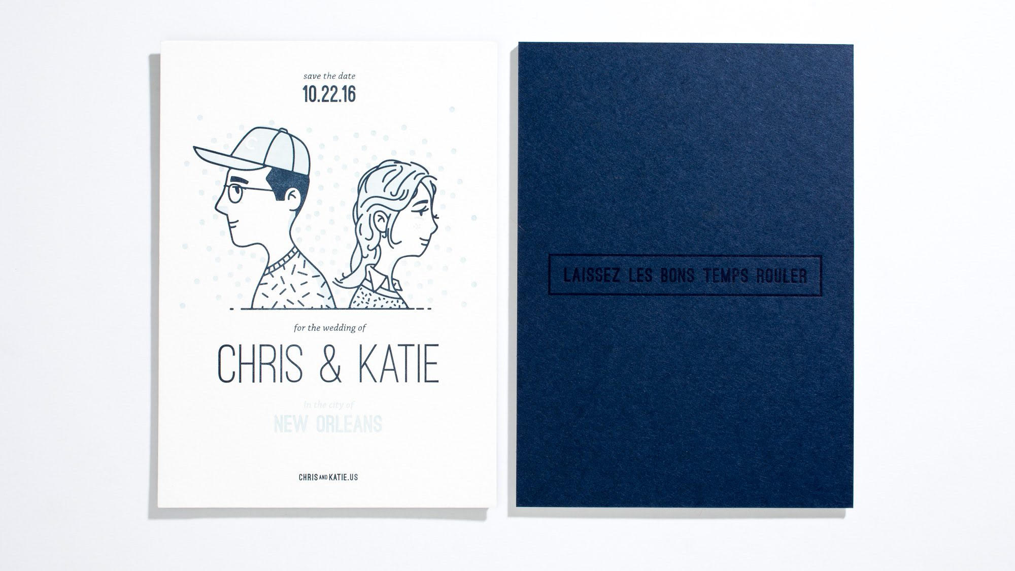
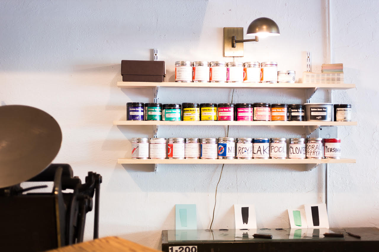
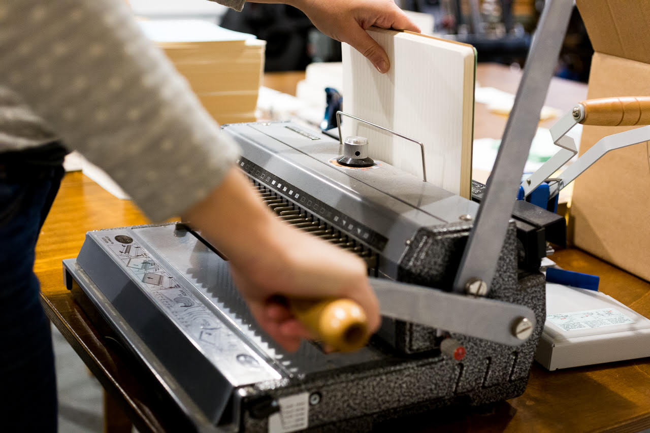
Iron Curtain Press is a letterpress print shop. Everything we print has that lovely tactile quality that modern letterpress printing is known for. We also have a variety of finishing methods that we offer: mounting, edge painting, and die cutting to name a few. There are two kinds of jobs we print every day: projects for ourselves that become products that we sell (greeting cards, notebook covers etc) and then projects for our custom clients (business cards and stationery, small product packaging, invitations, etc). The custom projects are fun because they push our skills and boundaries and make us better printers. We are not a design studio in that we will happily consult about paper and ink but do not offer design services. We limit our design work to the items we create to sell.

Iron Curtain Press / Wedding Invitation

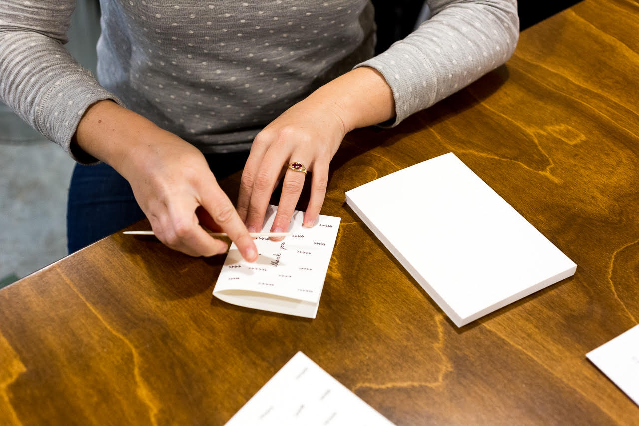
We’ve cultivated a pretty magical team working with us here every day. We check in together in the morning to decide the priorities of the day, but there are always orders to be shipped out, payments to be collected, greeting cards to be re-printed, notebooks to be made, photographs to be taken, custom projects to be printed / inspected, and emails to be answered.

Iron Curtain Press / Card Folding

Currently, I spend most of my time writing estimates for custom projects, making plans for how the business will grow in the next quarter and year and placing orders for Shorthand. We are a hard working team, but I am a firm believer in not fostering an environment of workaholics. Our work days have a definite start time and stop time and we take our weekends. I believe building a small business is a marathon not a race.

Iron Curtain Press / Inks

I am so grateful that my job allows me to express my creative vision in so many ways. I love to create greeting cards by thinking of a specific occasion and person. Greeting cards are so personal and I’m most inspired (and the card sales reflect this) when I design a card for a particular person / occasion. When I design products for our line that are not greeting cards, I start by thinking about what I want to make and then price out the potential item to determine the hard costs, the potential wholesale price, the potential retail price and then researching to see if that seems to match what the market will bear. Once I know the product will actually work, I move into the design and prototyping phase.

Behind the Stationery: Iron Curtain Press

At this point, I’ve thought about the new item so much that it seems to come together pretty quickly, but really I’ve just been thinking about it for a very long time. I am currently working on a pretty big release that will debut at the National Stationery Show in May – I’m in the prototyping stage and it’s so fun!

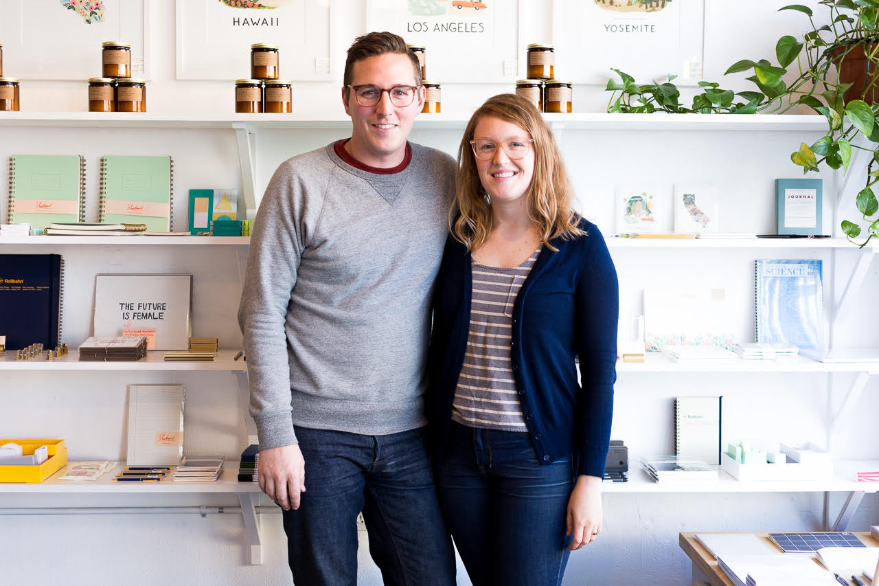
As the head of Iron Curtain Press, I am also so fortunate to be able to design every aspect of the business. As our company has grown, my husband Joel has come on board full time. His background is in photography and woodworking, so he takes all the photographs for our catalog and online, has built out both our print shop along with building all the fixtures for Shorthand. I love being able to work with him to design our spaces and see my vision executed so beautifully.

Iron Curtain Press: Rosanna and JoelWe are stoked for what 2017 holds for our cute little business. I love my job, I love the people that work with us every day and all of our clients and customers that allow us keep doing what we love.

All photos courtesy of Iron Curtain Press.

Want to be featured? Reach out to Megan at megan[at]ohsobeautifulpaper.com for details.

Timeless Southern Magnolia Wedding Invitations

Today we’re practically dripping in beautiful magnolia flowers thanks to these stunning, timeless Southern magnolia wedding invitations from Bonnie and Currier of Tenn Hens Design! And really, is there anything more perfectly suited for a garden wedding in Nashville? Bonnie and Currier incorporated magnolias throughout the save the dates, wedding invitation suite, and day-of stationery, from the envelope liner to small die cut magnolia flowers paired with escort cards for the reception. So lovely!

Timeless Southern Magnolia Wedding Invitations by Tenn Hens Design

From Tenn Hens Design: Our client had grand magnolia dreams for this wedding, so we created a design that felt Southern, botanical, and timeless. The ceremony was set in a beautiful garden at Cheekwood here in Nashville, and the reception followed inside the art museum located at the historic Cheek estate.

Timeless Southern Magnolia Wedding Invitations by Tenn Hens Design

The square save the date was letterpress printed in blush and gray and we drew an illustration of the mansion. They loved the idea of a bookmark so we wrapped the magnolia pattern around the card to become a keepsake for guests. The envelope liner matched in the same pattern.

Timeless Southern Magnolia Wedding Invitations by Tenn Hens Design

For the big day we revealed our plans of a custom magnolia wrap that held all the details together. Inside was the invitation with letterpress printed text and illustrations, gold foil, and gold edge painting. The gold foil added a real glam factor against the subtle gray impression along the edges. Such gorgeous details and textures in every piece. Behind the invitation, the wrap had a pocket that tucked all the detail cards and rsvp cards neatly inside. Even the blush from the save the date made an appearance on the rsvp card and envelope. Also we had custom wax seals made with the magnolia tree we created. We really wanted the suite to feel like you were revealing something super special as it all unveiled!

Timeless Southern Magnolia Wedding Invitations by Tenn Hens Design

Escort cards were designed with die-cut magnolia blooms tucked inside small pockets and topped with a wax seal of the magnolia tree from the invitation suite. The tree was carried over to the program as well and we used the same gray paper on the cover from the envelope liner. The bloom illustrations also made an appearance on the circular menu. Touches of gold foil adding a bit of sparkle underneath the clear plate.

Timeless Southern Magnolia Wedding Invitations by Tenn Hens Design

Timeless Southern Magnolia Wedding Invitations by Tenn Hens Design

Timeless Southern Magnolia Wedding Invitations by Tenn Hens Design

The magnolia designs really branded the entire event. We loved the impact of the big bold pattern, mixed with the soft color palette in the type and finely detailed illustrations. It was truly a dream to be a part of this incredible wedding with such a fine group of people.

Timeless Southern Magnolia Wedding Invitations by Tenn Hens Design

Thanks Bonnie and Currier!

Design: Tenn Hens Design

Wedding Planning: The Social Office

Calligraphy: Val Cole

Tenn Hens Design is a member of the Designer Rolodex – you can see more of their beautiful work right here or visit the real invitations gallery for more wedding invitation ideas!

Photo Credits: Mary Craven Dawkins

Best of 2016: My Favorites

Today I’m wrapping up my Best of 2016 recap with a few of my personal favorite posts from the year! 2016 was definitely a rollercoaster of a year, and sometimes it has been tough to find the bright and happy moments with so much turbulence around the world. But when I look back at our posts from the year, each one below fills me with happiness and gratitude. I can’t think of a better way to say goodbye to another year (and welcome a new one!). I wish each and every one of you a very merry Christmas, happy Hanukkah, and a wonderful New Year!

Best of 2016: Rainbow Watercolor Hologram Foil Party Invitations by Ashley Buzzy for Paper Party 2016

Rainbow watercolor and hologram foil party invitations for Paper Party 2016. Designed by Ashley Buzzy and printed by Bella Figura. The invitations that started my love affair with hologram foil!

Best of 2016: Paper Party 2016 Art Print

I’m still completely obsessed with the limited edition art print that we made for Paper Party 2016! Designed by Ashley Buzzy, and printed by Mama’s Sauce on Legion Paper lavender Color Plan paper. Hologram foil for life!

Best of 2016: Dip Dyed Letterpress Printed Baby Announcements by Swell Press Paper

I loved these two-color dip dye baby announcements by Swell Press Paper – with mint green edge painting!

Best of 2016: Behind the Stationery with Hammerpress

Our Behind the Stationery column continued to be one of my personal favorites – this installment with Hammerpress was a particular highlight from 2016!

Best of 2016: Brick + Mortar / Daydream Prints

Over in our Brick + Mortar column, Emily talked about why stationery matters in these challenging times. So much yes. Greeting card by Daydream Prints.

Best of 2016: How to Style Stationery for Photography by Coral Pheasant

How to Style Stationery for Photography – I learned a ton of new tips and tricks in this guest post by Nichole of Coral Pheasant

Best of 2016: Eleven Independent Etsy Wholesale Boutiques

I got to share eleven of my favorite independent stationery and gift boutiques across the country in partnership with Etsy Wholesale!

Best of 2016: Our Bathroom Renovation

On the personal side, I got to share our bathroom renovation! This was our first major home renovation, and we did our best to create a bathroom that both honors the age of our home and maximizes storage for a family of four.

If you made it this far, I just want to thank you from the bottom of my heart for supporting Oh So Beautiful Paper this year. I love my job and the fact that I get to do it every single day, I love this blog and the amazing stationery community, and I love all of you for coming here to read our posts! The last couple of years have been incredibly challenging as I’ve tried to learn how to balance motherhood with entrepreneurship and try to figure out how to grow a business in an ever-changing environment. Your comments here and on social media are always a highlight on even the most difficult days. So thank you for supporting, commenting, sharing, and coming back. I may pop in with a couple of quick posts next week, but otherwise we’ll be back in 10 days. See you in 2017, my friends. xoxo