Business Card Ideas and Inspiration #12

I had so much fun sharing some edge painted business card ideas with you last week, I thought I would pull together some more business card inspiration again this week!  This time we’re not just limited to edge painting as a key element – today’s selection includes non-traditional shapes and sizes, die cut elements, foil printing, and much more…

Cast Iron Design

Hype & Slippers


Oscar & Emma

Black and White Letterpress Business Card

Design: Racket, Letterpress Printing: The Hungry Workshop

Studio on Fire

Moontree Letterpress

Oleg Lyutov Design via FPO

Blush Publishing

Do you have an awesome business card that you’d like to share?  If so, e-mail me right here!

{images via their respective sources}

Business Card Ideas and Inspiration #11

It’s no secret that I love business cards – a great business card can be like a tiny little piece of art!  I also love it when designers and printers incorporate edge painting into business card design, from bright pops of color to elegant metallics to sophisticated black ink.  It’s been a while since I rounded up some inspiring business cards, so today I thought I’d share some of my recent favorites!

Callie Kant via Lovely Stationery

Swiss Cottage Designs

Mike McQuade for Tom Dick & Harry Creative Co. via FPO

Dingbat Press

Parrott Design Studio

Adam Mann via FPO

Studio on Fire

Bespoke Letterpress Calling Cards

Gold Foil Edge Business Cards by Deutsche & Japaner via Design Work Life

Do you have an awesome business card that you’d like to share?  If so, e-mail me right here!

{images via their respective sources}

DIY Watercolor Floral Pattern Wedding Invitations

It’s the ladies of Anti­quaria, back with another cre­ative DIY project for you!  Today they’re sharing a gorgeous floral watercolor wedding invitation tutorial!

This week, we are challenging your inner artist and showing you how to design your own floral watercolor print invitation suite.  We have so much fun putting together our artwork and painting watercolors for our online magazine, The Antiquarian Post, we thought, why not incorporate the same technique into a DIY invitation suite?  We’ve chosen a coral, toffee and lavender-grey palate to work with but the options are as endless as your supply of paint!

No need to feel intimidated about this one though…we’ll take you through the process, step-by-step.

DIY Tutorial: Floral Watercolor Wedding Invitations

DIY Tutorial: Floral Watercolor Wedding Invitations

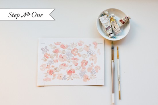
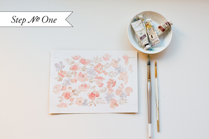
Step One: On an 8.5 x 11″ sheet of heavy watercolor paper, paint your botanical watercolor pattern.  We used a palette of coral, toffee and lavender gray for our floral pattern.  To create watercolor flowers, use 2 different size round brushes, one large and one small.  Wet the large brush, dip it in the coral color and paint petals.  The more non-uniform each petal is, the more organic and natural the flowers turn out.  Wet the small brush, dip it into the toffee paint and add the centers of the flowers.  Also with the small brush, you will want to fill in-between the large coral flowers with clusters of small lavender gray flowers.  Fill in further with toffee leaves (made with the large brush).  Fill the whole sheet of paper, making sure that the overall composition is balanced and full of pattern.  Set aside to dry completely.

DIY Tutorial: Floral Watercolor Wedding Invitations

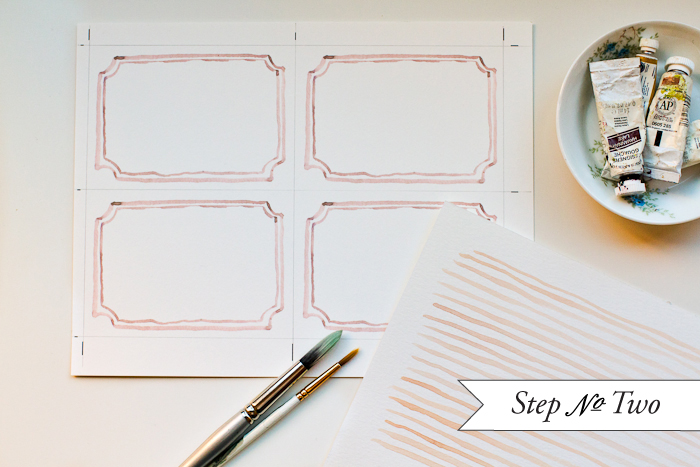
Step Two: On another 8.5 x 11″ sheet of heavy watercolor paper, measure out four 3.5 x 5″ rectangles.  Lightly draw yourself an outline in pencil.  Just outside the lines, draw yourself crop marks which will be used as guides to cut the final printed product.  Paint a coral border in each rectangle making sure not to get to close to the edges.  When the paint dries, erase your pencil guide lines leaving just your crop marks.  For the envelope liner pattern, we used an simple striped pattern.  On a clean 8.5 x 11″ sheet of watercolor paper, simply  paint horizontal coral lines, as even or uneven as you please!
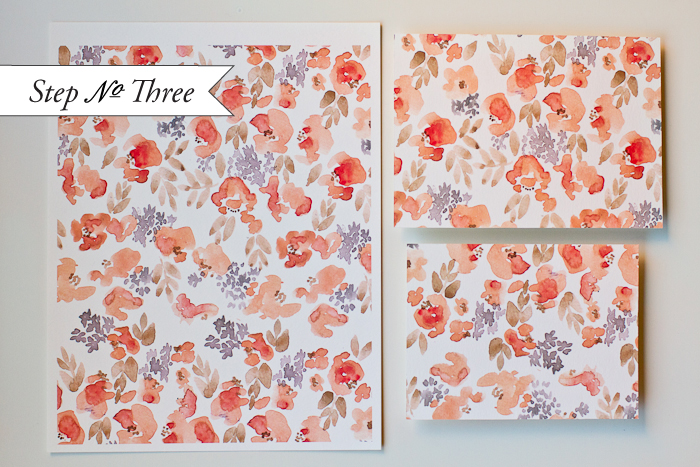
DIY Tutorial: Floral Watercolor Wedding Invitations

Step Three:  Place each sheet of artwork on a flatbed scanner and scan at 300 dpi.  Print the patterns 100% scale on high quality card stock (the thickest you can get through your printer).  Make sure to set your printer margins to the smallest they will allow to maximize your printable area.  For the striped pattern, print it on high quality text weight paper… you will be installing it later in the envelopes and thinner paper works better for this!

Out of each printed  sheet of the floral pattern paper, cut a 5 x 7″ card and a 4 x 6″ card, as shown above.  You will see that since you’ve created the whole page as a pattern, the cards will have a full bleed (meaning that the pattern will flow off the page).

Alternatively, you can take in your artwork to your local print shop (bring the scans on a zip drive or ask them to scan them for you).  Here they can print out the paintings on card stock and text weight using a high quality digital printer.  You can also have them professionally cut all the pieces down to your desired size!

DIY Tutorial: Floral Watercolor Wedding Invitations

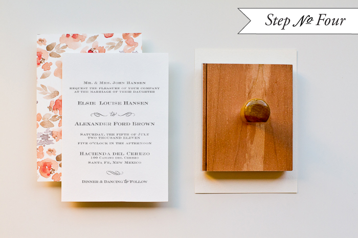
Step Four: Now you can stamp your invitation!  Ink your invitation stamp thoroughly (we used our “Sophisticate” Invitation Stamp) and line it up, centered over your card.  Of course, you will be printing on the “back” blank side of the 5 x 7″ floral card.  Press down on the stamp evenly and moderately with the handle to get a crisp image.  Let dry.

DIY Tutorial: Floral Watercolor Wedding Invitations

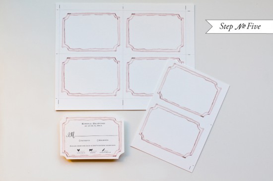
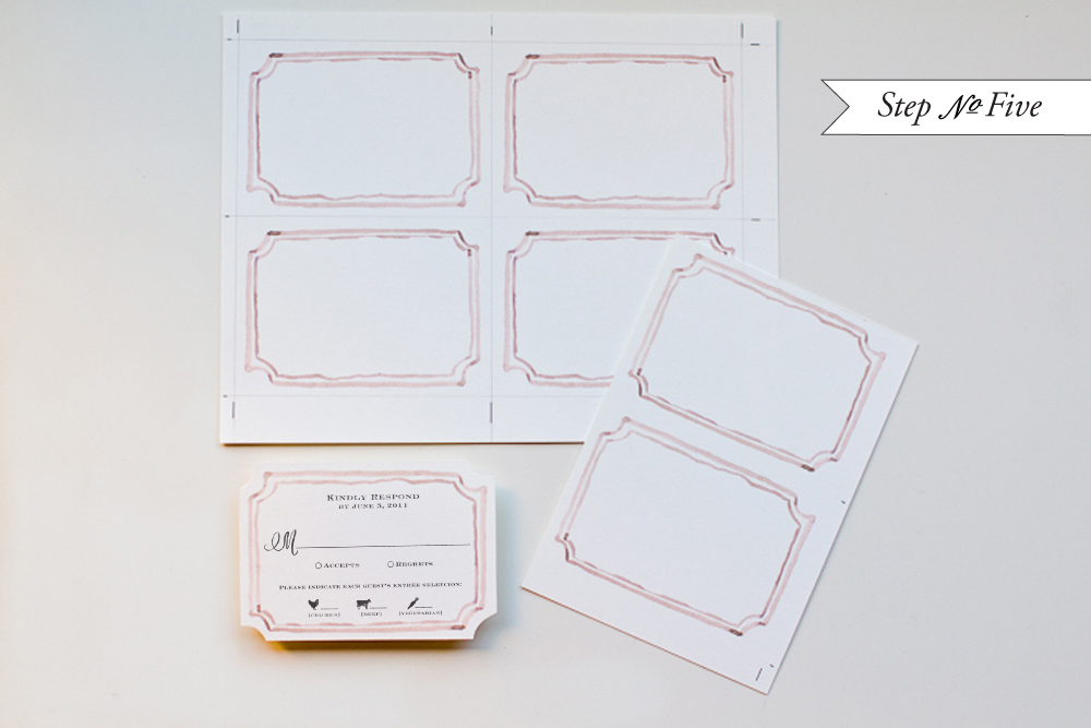
Step Five: Using the crop marks, cut your reply cards (we typically use a paper cutter or x-acto and ruler) to size.  Ink your reply stamp thoroughly (we used our “Sophisticate” Reply Stamp, option B) and line up, centered over your card.  Press down on the stamp evenly and moderately with the handle to get a crisp image.  Let dry.  Notch in the corners, if you like, to create the look of a die cut card.

DIY Tutorial: Floral Watercolor Wedding Invitations

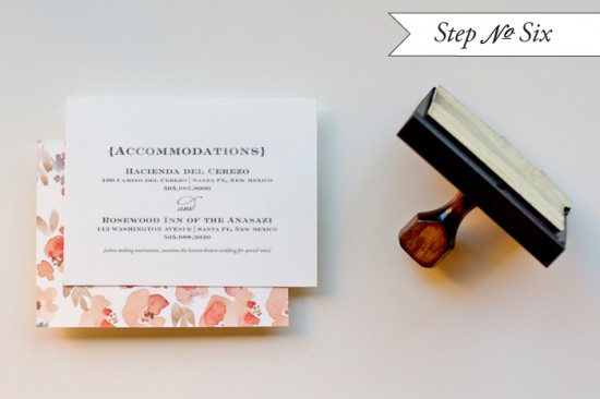
Step Six: On the back of the 4 x 6″ card, ink your accommodations stamp thoroughly (we used our Sophisticate” Accommodations Stamp) and line up, centered over your card.  Press down on the stamp evenly and moderately with the handle to get a crisp image.  Let dry.

DIY Tutorial: Floral Watercolor Wedding Invitations

Step Seven: Cut the liners using a template made for your envelopes.  These do the job well!  Trace the template with a pencil and cut on the line.  Use stick glue or double stick tape along the triangular end to adhere the liner to your envelope.

DIY Tutorial: Floral Watercolor Wedding Invitations

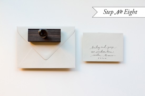
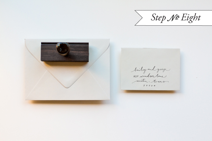
Step Eight: Once again, we are using stamps to save on our invitation budget.  We printed our “Scripted” Return Address stamp for both the return address on the outer envelope and for the reply address.  The great part is that you can also use it on your thank you notes!!

DIY Tutorial: Floral Watercolor Wedding Invitations

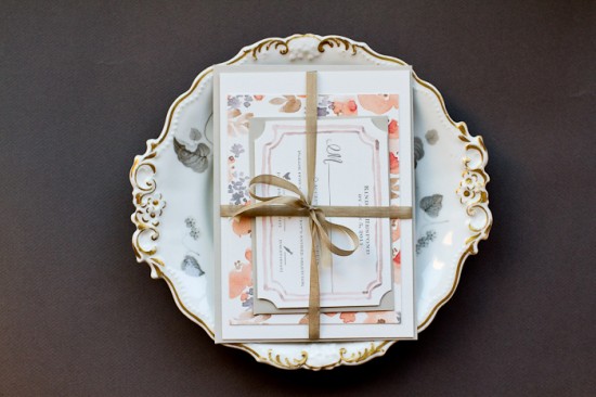
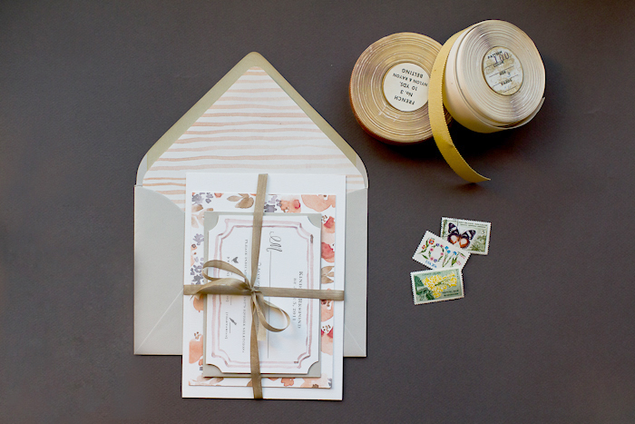
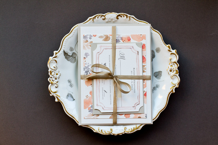
Now all that’s left is to tie them together with a beautiful ribbon, address the envelopes and get them into the post!  Your guests will be thrilled to receive your very own watercolor artwork in the mail.

Materials List:

Sophisticate Wedding Invitation Stamp (from Antiquaria)

Sophisticate Reply Card Stamp (from Antiquaria)

Sophisticate Accommodations Card Stamp (from Antiquaria)

 Scripted Return Address Stamp (from Antiquaria)

Stamp Pad, we used Antique Pewter

Heavy duty watercolor paper

Water color paints (preferably in 3 or more colors)

Paint brushes, 1 large & 1 small

Jar filled with water to wash brushes

Card stock, in soft white

Text Paper, in soft white

Scanner

Printer

Paper cutter or x-acto knife

Ruler

Pencil

A7 Envelopes

4bar Envelopes

Liner template

Scissors

Glue stick or double stick tape

Ribbon

Patterns painted by Emma James for Antiquaria.  Custom watercolor invitations are available from Antiquaria’s Custom Design Division.  Please email them for more information!

Photography by Jamie Simon of Intertwyned

{happy weekend!}

Woah, this was quite a week.  The end of the weekend saw me completely flattened by a terrible 24-hour virus, which left me unable to do anything but sleep during the early part of the week.  Ugh.  Thankfully I recovered in time for my flight out to Salt Lake City for Alt Summit – which is where I am right now!  I’m enjoying the beautiful mountains and catching up with friends before heading back home to DC at the end of the weekend.  But in the meantime…

Photo Credit: Aaron Huey

…a few links for your weekend!

This week on Oh So Beautiful Paper:

Finally, don’t forget to enter the Valentine’s Day giveaway from One Plus One – the contest ends Sunday!  And as an added bonus, One Plus One is offering free shipping from their Etsy shop from now until Friday, January 27!  Yay!  Just use the code LOVEISINTHEAIR at checkout!

Check back soon for today’s cocktail recipe!  I’ll see you back here on Monday! xoxo

The Printing Process: Edge Painting

Every morning this week, I’m running a series of guests posts about different printing methods â€“ so if you’ve ever wondered why certain printing methods are best for certain kinds of designs (or cost more than others), this is for you!  You can read the previous installments covering digital printingengravingscreen printingletterpress printing with antique type, and foil stamping all right here.  Today Michael from Czar Press is here to walk us through edge painting!

What is Edge Painting?

Edge painting at its surface sounds pretty simple – it’s a process by which color is applied to the edges of cards, invitations, even books or journals.  Edge painting can be done in any color, including metallics and foils (!), and is usually mixed by hand to be matched to a specific Pantone color.

I’m a huge fan of edge painting for a bold pop of color on business cards and wedding invitations, like the new invitation collections from Bella Figura, Dauphine Press, and many others.  While edge painting is a commonly used technique, there is a whole lot of mystery surrounding the process – and printers seem to have different methods or processes for applying edge paint.  Today we have Michael from Czar Press walking us through his edge painting process and removing some of the mystery from this popular technique!

The Process

The edge painting process takes place after all graphics and text have been printed and all paper materials cut down to size.  For this example, we’re focusing in on a recent business card project.  I like to make sure my blade is especially nice and sharp when trimming out cards that are going to be edge painted.

Edge painting involves a padding press (pictured above), ink, and a brayer.  The cards should be stacked on the padding press, making sure that the cards are pressed against one wall of the padding press as evenly as possible.  Crank down the vice(s) on the press, applying pressure to the cards, making them nice and snug.  Remove the outer wall off the padding press, leaving one side exposed.  This the side that will receive the ink.


Then using just a little bit of ink, ink up your brayer.  Roll the brayer around and around on a piece of glass if possible in attempt to make the ink spread even across the brayer roller.  Then I apply the ink to the exposed side of the card, applying as little pressure as possible with the brayer to get good ink coverage on the cards.  Once the ink has been applied, I like to gently wipe down the inked side of the cards with a cotton cloth to remove any excess ink.


Let them dry for a while – maybe an hour, depending on conditions – until they are dry to the touch.  Put the outer wall back on the padding press, spin the cards around to the next side and repeat until all sides are complete.

Tips and Advice

Most printers recommend thicker papers – usually 160 lb and up – for maximum results with edge painting.  Edge painting can be done on thinner paper, but heavier (thicker) paper weights will better show the color and saturation of the ink color.

Similarly, most letterpress printers recommend darker or more saturated colors for edge painting.  Think bright red, cobalt blue, or even bright neon or metallic foils!  As with any custom process, most printers hand mix inks to match a specific Pantone color, so keep in mind that there may be slight variations in tone and saturation depending on the number of cards being painted.

Thanks Michael!  Check out more of Michael’s letterpress work right here!

Photo Credits: Example images via Bella Figura, process photos by Czar Press