Paige + Michael’s Elegant Calligraphy Wedding Invitations

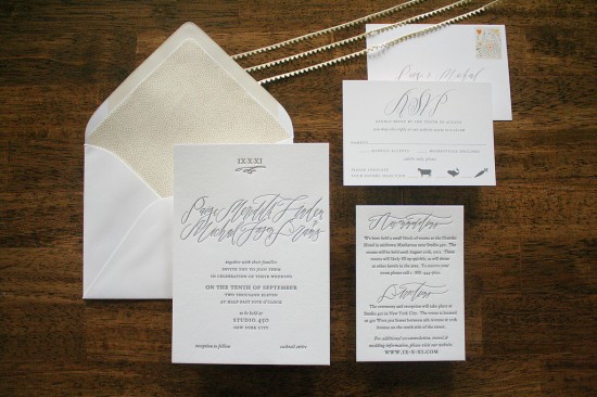
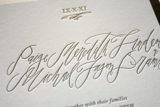
It’s no secret that I love the combination of beautiful calligraphy script and letterpress printing, particularly when it comes to wedding invitations, so naturally I’m completely smitten with the most recent collaboration between Sarah of Parrott Design Studio and calligrapher Betsy Dunlap!

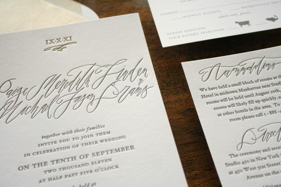
Sarah incorporated Betsy’s calligraphy into a sophisticated and elegant letterpress wedding invitation that features the roman numeral of the wedding date.  I love the subtle mix of soft gray tones in the text with the delicate matte gold tones of the envelope liner and roman numerals.  So pretty!

Check out a bit more over on the Parrott Design Studio blog right here!

Design and Letterpress Printing: Parrott Design Studio

Calligraphy: Betsy Dunlap

Parrott Design Studio is a member of the Designer Rolodex – you can see more of Sarah’s beautiful work right here or visit the real invi­ta­tions gallery for more wedding invitation ideas!

Photo Credits: Parrott Design Studio

*Parrott Design Studio is one of my fab­u­lous spon­sors; for more on my edi­to­r­ial poli­cies please click here.
{happy weekend!}

Happy Friday everyone!  Spring is most definitely in the air here in DC – the sun is shining, the daffodils are blooming, trees and plants are starting to come back to life, and before I know it the cherry blossoms and magnolias will be here!  I can’t wait.  But in the meantime…

Photo Credit: Cinnamon

…a few links for your weekend!

This week on Oh So Beautiful Paper:

As usual, we have a fun cocktail coming up for you this afternoon, so check back a bit later for the recipe!  I hope you all have a wonderful weekend, and I’ll see you back here on Monday!  xoxo

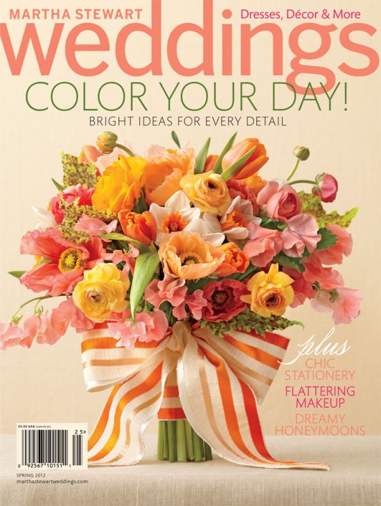
Sneak Peek – Martha Stewart Weddings Spring 2012 Issue!

We’re heading into the final week of February (already?!), which means that the Spring 2012 issue of Martha Stewart Weddings is just around the corner!  Today we have a special sneak peek at the new issue, which is all about fabulous color for your wedding day!

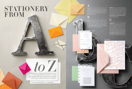
For this issue, the editors have pulled together the ultimate A – Z guide to stationery – from printing methods to typography to all the details that go into your wedding invitation suite.  This is definitely a story that is best appreciated in print, so you’ll definitely want to track down a copy in your area for the full details.

Keep an eye out for the new issue on newsstands soon!

Photo Credits: Cover by Christopher Baker, story photographs by Johnny Miller, both for Martha Stewart Weddings Spring 2012

Kristina + Jon’s Sydney Harbor Fabric Wedding Invitations

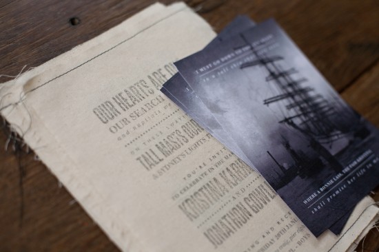
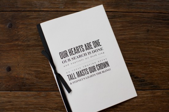
I am completely smitten with these wedding invitations from Australian designer and photographer Kerrie-Anne Bennett.   Kerrie-Anne created these invitations for a wedding taking place on an antique ship in the Sydney Harbor.  I love the way Kerrie-Anne incorporated canvas as a subtle nod to the nautical wedding venue while also maintaining an organic and modern texture for the invitation suite.

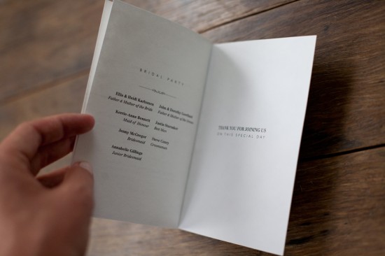
From Kerrie-Anne: I custom designed this wedding invitation suite for a couple who were getting married on Sydney Harbour.  Their ceremony and reception would take place on an old ship called the James Craig, which is over 100 years old.  Using canvas as the main invitation, which is similar to the ship’s sails, I created a stamp and stamped the information and a poem the groom wrote, which I thought was such a nice touch.  I sewed the tops and bottom of these to add a little texture.  For the RSVP card I found an old image of an almost replica of the James Craig.

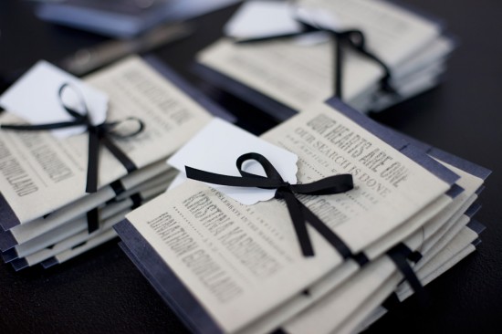
I continued using the same poem from the invite on the ceremony programs, which tied everything together nicely.

Thanks Kerrie-Anne!

Check out the Designer Rolodex for more tal­ented wed­ding invi­ta­tion design­ers and the real invi­ta­tions gallery for more wedding invitation ideas!

Photo Credits: Kerrie-Anne Photography + Design

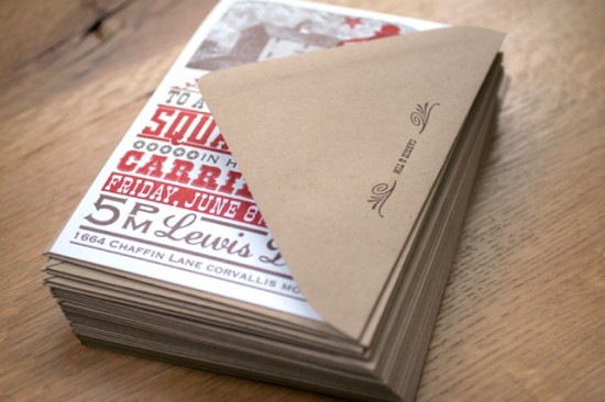
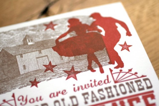
Carrie + Tim’s BBQ Squaredance Wedding Invitation

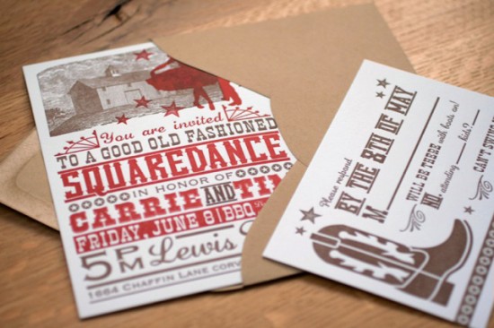
Now these look like invitations for a fun wedding!  Designed and printed by Noteworthy Paper & Press in Missoula, Montana, these invitations were inspired by the bride and groom’s passion for folk music and the Montana dairy farm wedding location – all with a wonderful old-timey and lighthearted vibe.

From Taylor of Noteworthy Paper & Press: The inspiration for these invitations came from the bride, Carrie, who is a nurse by day and a talented old timey folk fiddle player by night.  Since they were planning a down home square dance and BBQ complete with personalized handkerchiefs, I thought it would be fun to emulate a ’50s show poster à la Hatch Show Print.

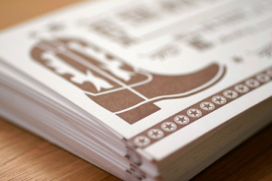
Both native Montanans, the wedding celebration will be held in a barn on a dairy farm in the beautiful Bitterroot Valley.  The design reflects their love of good music and good country.  These invitations were letterpress printed on 300 gsm Somerset White 100% cotton paper with Waste Not Paper envelopes using our Vandercook #4 Proof Press.

Thanks Taylor!

Check out the Designer Rolodex for more tal­ented wed­ding invi­ta­tion design­ers and the real invi­ta­tions gallery for more wedding invitation ideas!

Photo Credits: Noteworthy Paper & Press