Erin + Andrew’s Ombre Watercolor and Letterpress Wedding Invitations

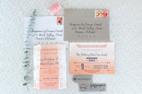
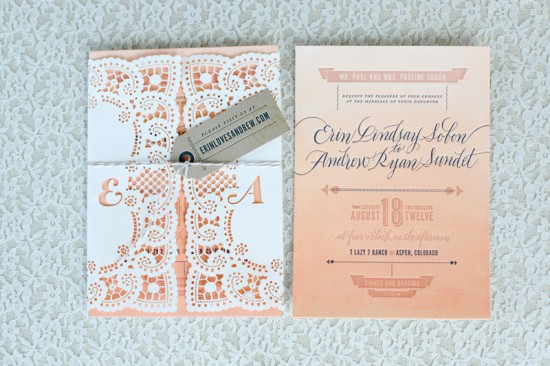
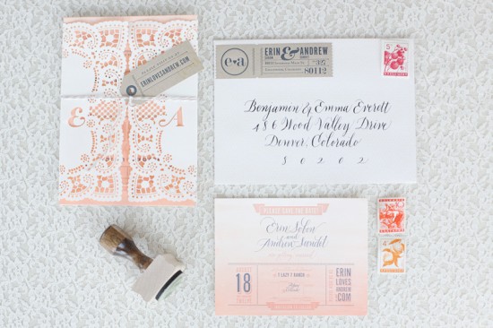
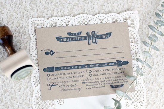
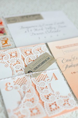
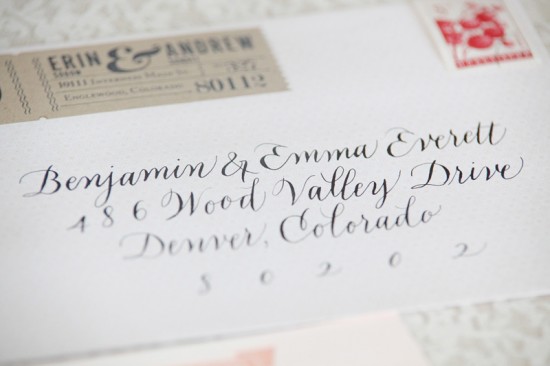
I’m constantly amazed at what happens when talented individuals pool their efforts on a single project – and these incredible wedding invitations are no exception.  Photographer Laura Murray sent over the gorgeous invitations for her sister Erin’s wedding.  Erin worked with Roger from Flourish Letterpress and Victoria of Calligraphos to create a custom invitation suite that combines hand painted watercolor (DIY’d by the bride and groom!), letterpress, calligraphy, and even laser cutting!

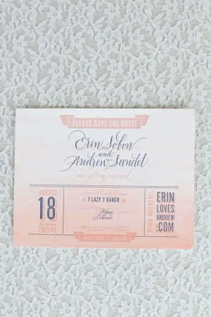
From Erin, the bride: Ombre, calligraphy, and letterpress printing.  These are three things I adore and all elements that I wanted in my wedding invitation suite.  After we finalized the design, Roger from Flourish Letterpress cut the paper for the save the dates, wedding invitations, and reception cards and passed them off to me to be watercolored in an ombre effect.

My fiancé and I did an ombre wash on all the paper using a mixture of Holbein Artist’ Water Color inks in Jaune Brilliant No. 2, Shell Pink, and Brilliant Pink.  Once everything had dried, we handed the paper back off to Roger for letterpress printing.


Roger used Crane Lettra 220# pearl white paper for the invitations and matching 110# Lettra paper for the save the dates and reception card.  Lettra paper is made from 100% cotton, giving it a unique, smooth texture and the ability to absorb the letterpress impression.  We found that this paper took the watercolor well and maintained its ability to really hold the letterpress texture.

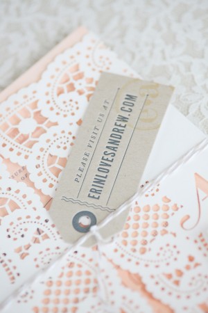
From Roger of Flourish Letterpress: I wanted to combine elegance with a slightly rustic feel for the invitation design.  I incorporated the kraft paper for a nice contrast while tying in the feeling of their wedding venue.  I wanted to try something new, so I used my laser engraving abilities to make a paper wrap with the look of lace and also incorporates Erin and Andrew’s initials.  Erin’s ombre watercolor painting really made the lace wrap pop.


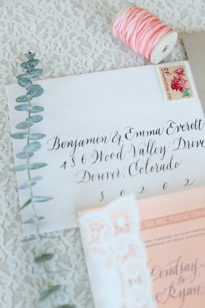
Lastly, we created a rubber stamp with their wedding logo so they could stamp their logo on the hang tag and envelopes.  It’s a fun, extra element that they could play with and use to customize each piece.

Gah – so amazing!  Thank you so much ladies!

Design and Letterpress Printing: Flourish Letterpress

Calligraphy: Victoria Lane, Calligraphos

Watercolor: DIY by the bride and groom

Check out the Designer Rolodex for more tal­ented wed­ding invi­ta­tion design­ers and the real invi­ta­tions gallery for more wedding invitation ideas!

Photo Credits: Laura Murray Photography

{happy weekend!}

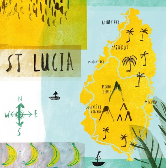
So now that our big news is out, it’s time to wish you all a wonderful weekend!  Next week, the husband and I are jetting off to St. Lucia for a few days of rest and relaxation – I can’t wait!  While we’re away I’ll be sharing a little mini guide to DC, from restaurants to shops to museums.  I hope you enjoy the guide!  But in the meantime…

St. Lucia Map Illustration by Laura Bird

…a few links for your weekend!

This week on Oh So Beautiful Paper:

That’s it for me this week!  We’re taking a quick break from Cocktail Fridays until after we get back from our trip, but if you’re looking or a fun recipe to try this weekend – try two of my favorite recipes so far: the Aviation or Vieux Mot.  Have a wonderful weekend!  xoxo

Tara + Rich’s Colorful Palm Springs Wedding Invitations

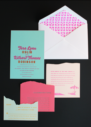
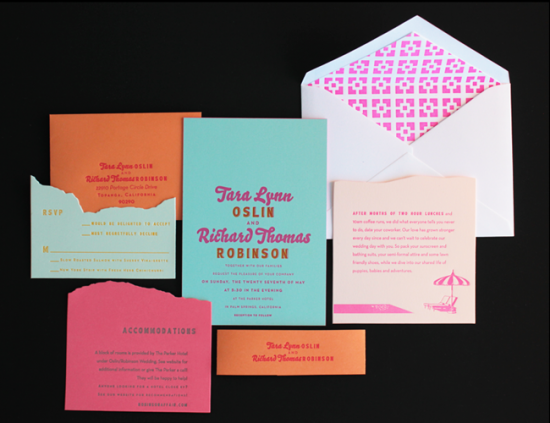
If you thought last week’s oversize map wedding invitations from Ladyfingers Letterpress were cool, wait until you see these Palm Springs invitations!  Inspired (naturally) by the wedding venue, the entire invitation suite is just bursting with color – from cool aqua to bright neon pink – and Arley-Rose and Morgan used color and die-cutting to create an awesome layered landscape effect.  Love!


From Arley-Rose and Morgan: We worked with Tara and Rich all winter on these super sunny and poolside-inspired invitations.  The couple sent over vintage postcards and designs from the ’50s that featured Palm Springs as inspiration.  Arley hand drew the pool lounge chairs and umbrellas from the wedding location.  The envelope liners feature the iconic brick work of the walls lining the hotel grounds.

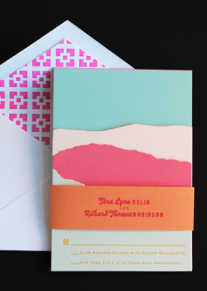
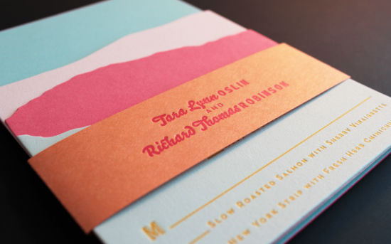
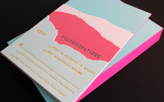
For the main invitation, we letterpress printed a two color design in neon pink and bright orange on Crane’s aqua 100% cotton 134 lb paper.  We then duplexed it (yes, we are a bit fanatical about details) to a second sheet of aqua paper, cut them down, and edge painted them in neon pink.

For the enclosures, we looked to the landscape of Palm Springs.  We were able to create a layered look using colorful 100% cotton paper and die cutting – incorporating all the information in a way that reflected the layers of foliage and mountains that are characteristic of the arid Palm Springs environment.

All of the pieces were stacked together and wrapped with a orange belly band, and we tucked the rsvp envelope in the back behind the invitation.  Palm Springs has been at the top of our vacation list since working on this project!

Thanks Arley-Rose and Morgan!

Ladyfingers Letterpress is a member of the Designer Rolodex – check out more of their beautiful work right here or visit the real invi­ta­tions gallery for more wedding invitation ideas!

Photo Credits: Ladyfingers Letterpress

Edge Painted Business Cards from Antiquaria

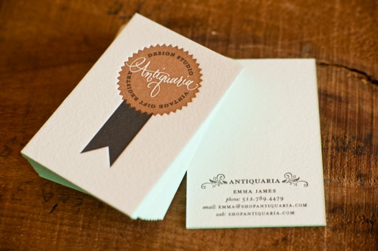
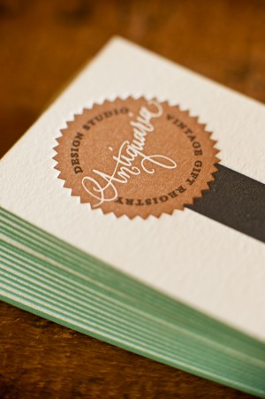
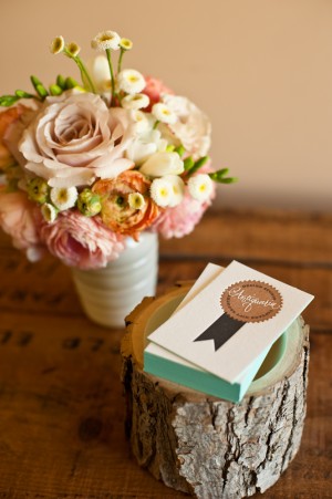
You already know Bailey and Emma, the lovely and talented ladies behind Antiquaria, from their regular DIY tutorials here on Oh So Beautiful Paper – not to mention their custom wedding invitations and vintage shop.  Bailey and Emma recently redesigned their business cards, and I’m loving the beautiful knockout calligraphy logo and soft aqua edge painting!

From Bailey and Emma: We wanted to make something unique while keeping in line with our brand image.  The cards were letterpress printed in black and copper on super thick cotton paper.  We then added the edge painting ourselves because, after all, who doesn’t love a pop of color?


Thanks ladies!

Antiquaria is a member of the Designer Rolodex – check out more of their beautiful work right here!  For DIY inspiration, you can also see their DIY tutorials here.

Photo Credits: Kelly James of Studio Austin Weddings

Modern Wedding Invitations from Alee + Press

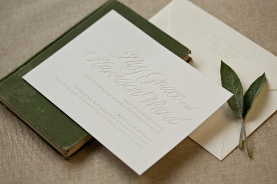
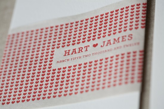
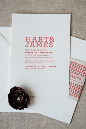
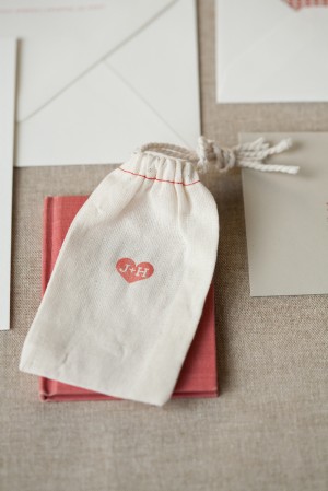
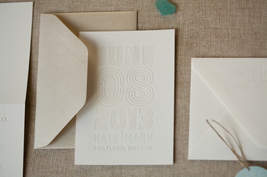
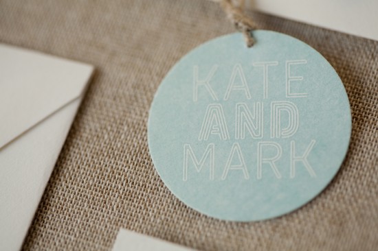
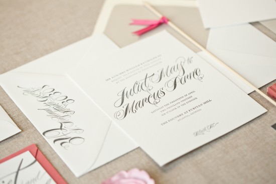
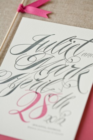
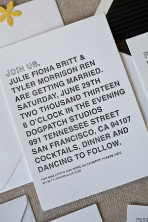
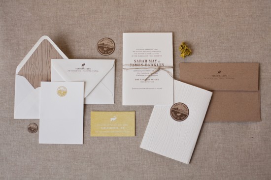
I’m a longtime fan of Alee & Press, so I was thrilled when Amanda from Alee & Press sent over some of her latest wedding invitation designs.  Amanda creates seriously beautiful and sophisticated (and eco-friendly!) typography-driven letterpress invitations and announcements.  Here are a few of my favorites…

Alee & Press will be exhibiting at this year’s National Stationery Show (Booth 2071!) – and these invitations are part of a new 2012 wedding collection making their debut at the show.  So exciting!


You can check out more beautiful invitations from Alee & Press right here!  Amanda also tells me that her Atlanta studio is located close to a key lime pie factory, which just sounds like the perfect way to keep creative energy flowing.  Thanks Amanda!

Photo Credits: Alee & Press