Amritha + Josh’s Red and Gold Letterpress Wedding Invitations

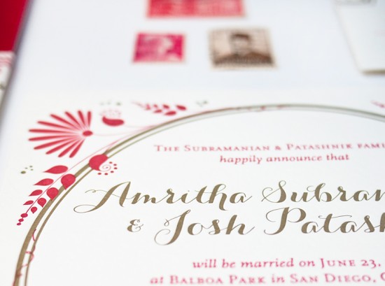
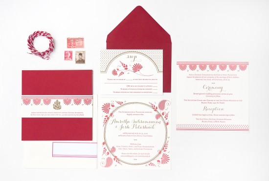
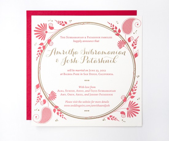
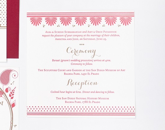
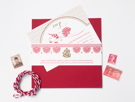
You might remember these purple and gold foil wedding invitations from a couple weeks ago, and today designer Rashi Birla is back with another stunning wedding invitation suite!  The combination of a red and gold color palette and graphic elements inspired by the wedding’s floral designs help create an invitation design that is both elegant and modern.  Love!

Red and Gold Letterpress Wedding Invitations by Rashi Birla via Oh So Beautiful Paper (2)

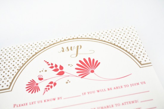
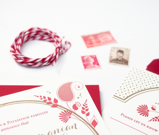
From Rashi: Amritha and Josh wanted their wedding invitations to be elegant and fun.  Their wedding was full of bold and bright flowers, so I wanted to play off of that motif and make the invitations very graphic with floral illustrations.  Amritha loves the color red, so we chose to letterpress print the invitation design in gold and red ink.

Red and Gold Letterpress Wedding Invitations by Rashi Birla via Oh So Beautiful Paper (7)

Red and Gold Letterpress Wedding Invitations by Rashi Birla via Oh So Beautiful Paper (3)

Red and Gold Letterpress Wedding Invitations by Rashi Birla via Oh So Beautiful Paper (6)

We were able to keep the invitation sophisticated by keeping most of the graphic elements and type in red, and adding hits of gold in the right places. The invitation was held in place with a letterpress printed bellyband that had a Sanskrit proverb on the front.

Red and Gold Letterpress Wedding Invitations by Rashi Birla via Oh So Beautiful Paper (1)

Red and Gold Letterpress Wedding Invitations by Rashi Birla via Oh So Beautiful Paper (5)

Red and Gold Letterpress Wedding Invitations by Rashi Birla via Oh So Beautiful Paper (4)

Thanks so much Rashi!

Design: Rashi Birla

Letterpress Printing: Studio on Fire

Check out the Designer Rolodex for more tal­ented wed­ding invi­ta­tion design­ers and the real invi­ta­tions gallery for more wedding invitation ideas!

Photo Credits: Rashi Birla

Leah + Adam’s Calligraphy and Kraft Paper Wedding Invitations

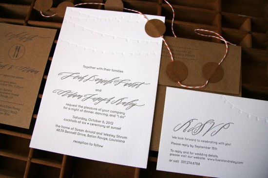
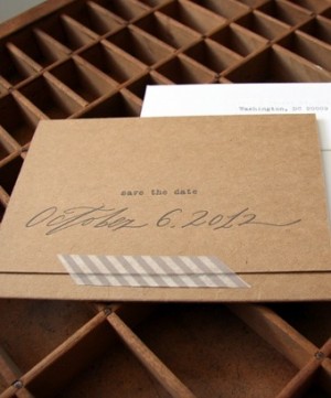
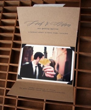
Good morning everyone!  The past few days have been cold and rather dreary, so I’m happily brightening my morning with these gorgeous save the dates and wedding invitations from Kathryn at Black­bird Letterpress.  For this invitation suite, Kathryn combined two of my favorite things – romantic calligraphy and rustic kraft paper.  So perfect for a backyard fall wedding!

Blackbird Letterpress via Oh So Beautiful Paper (3)

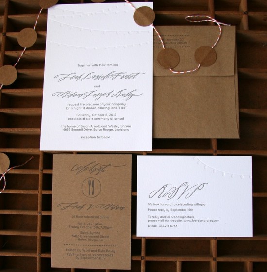
From Kathryn: Leah and Adam’s wedding was held outside in a beautiful backyard, with lots of lights strung about in the tall trees.  We used strings of lights as the main illustration for the invitation suite, which was accented with the elegance of Betsy Dunlap‘s calligraphy.

Blackbird Letterpress via Oh So Beautiful Paper (6) Blackbird Letterpress via Oh So Beautiful Paper (5)

Leah was first inspired by Laura’s kraft paper save the dates.  We took that as inspiration to start and used the tri-fold with photo idea and made it fit her style.  The entire suite was printed on a combination of fluorescent white cotton paper, kraft chipboard and envelopes, steel gray ink.

Blackbird Letterpress via Oh So Beautiful Paper (1)

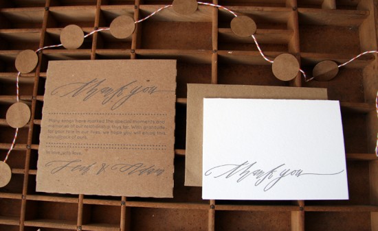
We also printed CD sleeves for the mix CDs that Leah and Adam made for guests as wedding favors.  And thank you notes were important for the post-wedding etiquette.

Blackbird Letterpress via Oh So Beautiful Paper (2)

Thanks so much Kathryn!

Design and Print­ing: Black­bird Letterpress

Cal­lig­ra­phy: Betsy Dun­lap

Black­bird Let­ter­press is a mem­ber of the Designer Rolodex – you can see more of Kathryn’s beau­ti­ful work right here (including a version of this suite that is now part of Kathryn’s permanent collection!) or visit the real invi­ta­tions gallery for more wedding invitation ideas!

Photo Credits: Invitation and save the date photos by Black­bird Letterpress; Leah + Adam’s engagement photo by Bonnie Sen

{happy weekend!}

What. A. Week. While we weathered the storm pretty well here in DC, my thoughts have been with those in New York and New Jersey affected by Hurricane Sandy.  The images and stories of the destruction are completely overwhelming and I know the road to recovery, much less the restoration of power, will be a long one.  When I haven’t been completely glued to the news, somewhere between last weekend and today, my little Sophie suddenly stopped looking like a newborn and started looking like a real baby.  She’s getting bigger each and every day, even though she’s still smaller at 7 weeks than some newborns, she’s paying closer attention to objects, and she’s smiling at us!  The smiles just make my heart melt.  This weekend we’re planning to visit our favorite flea market and relax at home, but in the meantime…

…a few links for your weekend!

This week on Oh So Beautiful Paper:

That’s it for me this week!  I hope you all have a wonderful weekend, and I’ll see you back here on Monday – when I’ll start sharing some of my favorite holiday cards! xoxo

Quinn’s Modern Birth Announcements

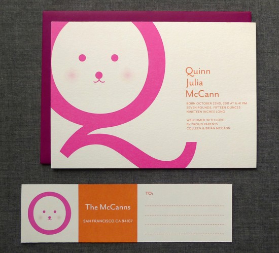
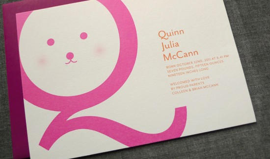
With a name as adorable as Quinn’s, why not make her first initial the focus of her birth announcement design?  Ashley from Fine Day Press incorporated an oversize Qand bright colors to create these modern birth announcements for this sweet girl.  So cute!

Modern Birth Announcements by Fine Day Press via Oh So Beautiful Paper (3)

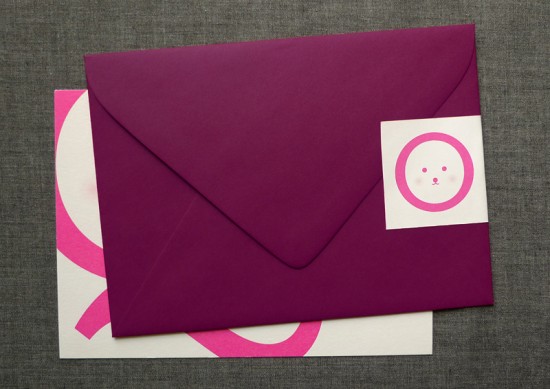
From Ashley: A big bright pink “Q” with a sweet smiley face inside is a super-cute way to introduce little miss Quinn to the world! The design combines sweet elements with a clean sans-serif type, dark plum envelope and wraparound address label. The announcements were printed digitally on thick cotton stock.

Modern Birth Announcements by Fine Day Press via Oh So Beautiful Paper (1)

Modern Birth Announcements by Fine Day Press via Oh So Beautiful Paper (2)

Thanks Ashley!

Fine Day Press is a member of the Designer Rolodex – you can see more of Ashley’s beautiful work right here!

Photo Credits: Fine Day Press

*Fine Day Press is a sponsor of Oh So Beautiful Paper