Bouquet by Lauryl Lane via Grey Likes Weddings (left); Amanda + Sudhir’s wedding invitations by Mr. Boddington’s Studio (right)
Photo Credits: Bouquet photo by Jen Huang, invitation photo by Mr. Boddington’s Studio

Bouquet by Lauryl Lane via Grey Likes Weddings (left); Amanda + Sudhir’s wedding invitations by Mr. Boddington’s Studio (right)
Photo Credits: Bouquet photo by Jen Huang, invitation photo by Mr. Boddington’s Studio
After Mother Nature dumped a few buckets of rain and snow down on us yesterday, I’m definitely craving signs of spring – and that means anything floral! These wedding invitations by Kate of Blue & Theory were inspired by one of spring’s most delicate flowers: Lily of the Valley. Kate created a floral border for the invitations and the rsvp card, with a muted Earth tone color palette for the entire invitation suite.
From Kate: These invitations were inspired by a feeling of vintage romance combined with delicate Lily of the Valley. During the creation of this set, I found it very important to strike a strong balance between whimsical and traditional. I wanted to create floral illustrations that that represented the romantic and intimate feel of the upcoming wedding, while anchoring the invite with traditional and structured type.
For the color palette, Lucy and John wanted to stay on theme with Lily of the Valley with muted earth tones. It was important for the illustrations to be very pronounced without the use of bright, bold colors. For the envelopes, rather than have the addresses printed, I had a custom stamp made of the floral illustrations, as well as the return address, to enhance the personal feel and look of the invitations. Inspired by old love letters and packages sent in a time before email, I chose kraft colored envelopes as well as baker string to enhance that old-fashioned-love-letter feel.
Thanks Kate!
Check out the Designer Rolodex for more talÂented wedÂding inviÂtaÂtion designÂers and the real inviÂtaÂtions gallery for more wedding invitation ideas!
Photo Credits: Blue & Theory
Longtime readers will remember these beautiful invitations inspired by Mexican tile from Lizelly of Lizzy B Loves – and today Lizelly is back with a fresh spin on her design! Working with the bride’s vision, Lizelly adapted her design to achieve a more rustic feel that was further complemented by leather envelopes and a lovebird wax seal. So creative!
From Lizelly: Ashley had a particular style in mind, so we took elements from the popular Mexican tile-inspired invitation and incorporated it into her vision. I designed the main components of the suite, such as the invitation itself, an rsvp card, and the accommodations card. Ashley then sourced the leather envelopes, wax seal, and love-bird milagros.
Thanks Lizelly!
Design: Lizzy B Loves
Letterpress Printing: Crane & Co. via Pennysmith’s Paper
Calligraphy: Bill Kemp Calligraphy
Wax Seal: Nostalgic Impressions
Leather Envelope: Custom Designed by the Bride
Check out the Designer Rolodex for more talÂented wedÂding inviÂtaÂtion designÂers and the real inviÂtaÂtions gallery for more wedding invitation ideas!
Photo Credits: Lizzy B Loves
I’ve heard of scented paper, but this is the first time I’ve seen baby powder scented paper! Lesley from Inclosed Studio used this subtly scented paper for her son Fletcher’s birth announcements, keeping the rest of the design classic and simple with clean blue stripes and gray text. Such a wonderful announcement for a sweet little man!
From Lauren of Inclosed Studio: When Lesley created these announcements for her newborn son, Fletcher, she knew she wanted to use baby powder scented paper. She kept the design clean and simple to match the subtle scent. The design was then letterpress printed in gray and light blue inks on the custom handmade paper. The photo was digitally printed on a felt weave paper to match the texture of the paper.
Thanks Lauren and Lesley!
Design: Inclosed Studio
Paper: Porridge Papers
Inclosed Studio is a member of the Designer Rolodex – you can see more of their fabulous work right here!
Photo Credits: Linda Gentry Photography
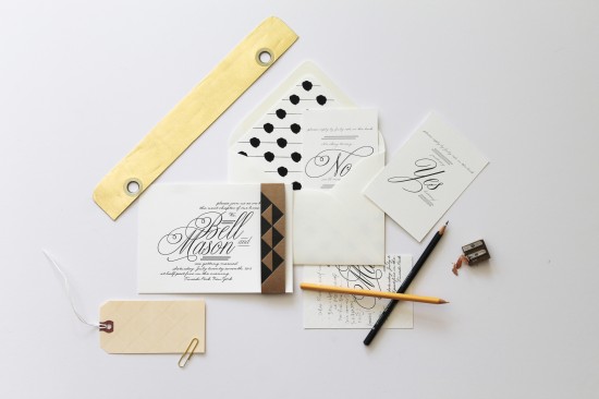
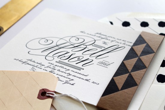
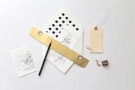
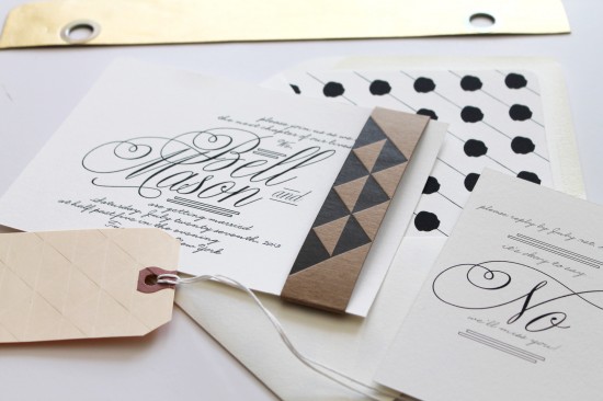
These wedding invitations from Jackie at 42 Pressed mix two of my favorite things – classic black and white design with modern geometric patterns! I’m loving the contrast between the script of the wedding invitation and the graphic elements, not to mention the double RSVP cards with space for guests to write a quick note back to the couple. Such a great idea!

From Jackie: This couple was such a blast to work with! They wanted a classy look, but still wanted to play with patterns and textures and have their wedding suite really represent them. The suite was digitally printed on our house stock paper for letterpress, with the exception of the letterpress printed belly band.

The couple wanted to keep the invitations simple and beautiful with certain elements of surprise. We paired a fun kraft belly band of geometric shapes, and used the fun polka dot liners that helped offset the more sophisticated look of the invitations and rsvp cards. They really wanted to pair elegance and whimsy with a strong modern sense.

Two rsvp cards were printed, one for yes and one for no… and then the guests were told to write their names on the appropriate rsvp along with a little note on the back. So fun, right?

Thanks Jackie!
42 Pressed is a member of the Designer Rolodex – you can see more of Jackie’s beautiful work right here or visit the real inviÂtaÂtions gallery for more wedding invitation ideas!
p.s. Congrats to Jackie on the new 42 Pressed Etsy shop!
Photo Credits:Â 42 Pressed