Happy Friday everyone! My sweet Sophie had a big week: she started daycare on Tuesday! She did great this week, but I was a complete wreck on her first day. We’re all still figuring out our new routine, but it turns out that I’m approximately 800% more productive when I don’t have a whirlwind baby to chase after during the day. I miss my girl while she’s at daycare, but getting things done? So. Good. Today she’s home with me, so I’m heading out to enjoy this beautiful fall weather with her. But in the meantime…

Photo from our Bon Voyage Cocktail Party with St-Germain
…a few links for your weekend!
- The cutest window display ever at Urbanic
- Congrats to Ez on her new illustration print shop!
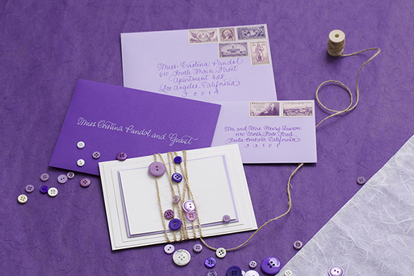
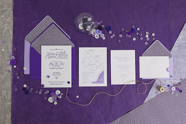
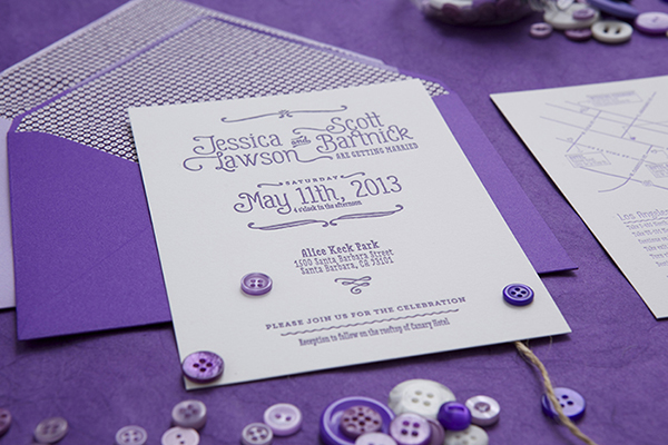
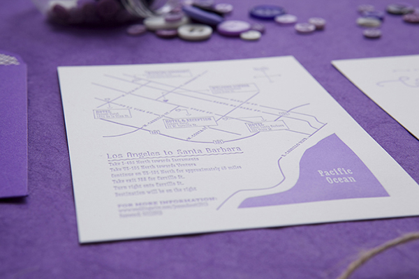
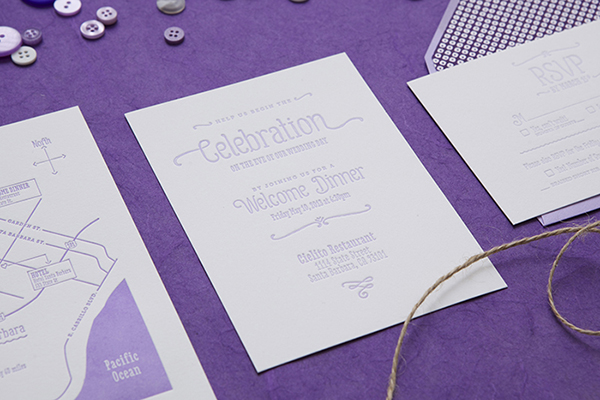
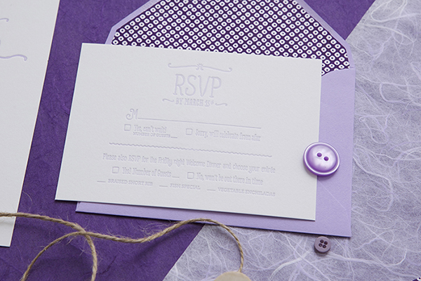
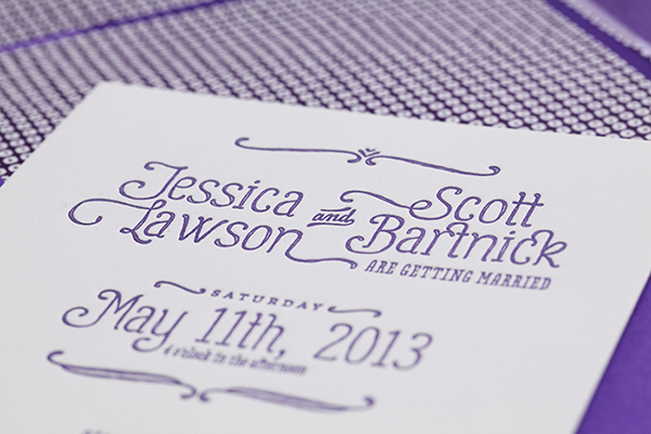
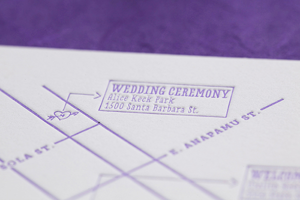
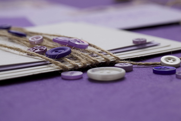
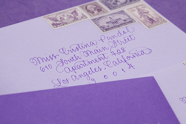
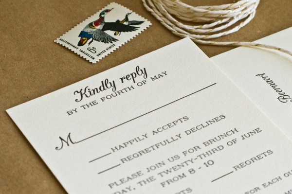
- Beautiful bohemian wedding invitations
- Must get for Sophie: The Umbrella
- Amazing. Totally made me smile.
This week on Oh So Beautiful Paper:
- An end of summer bon voyage cocktail party with St-Germain! And the delicious cocktail recipes, of course
- A few more favorite 2014 calendars (with lots more to come)
- Well Said Type: Thirsty Script
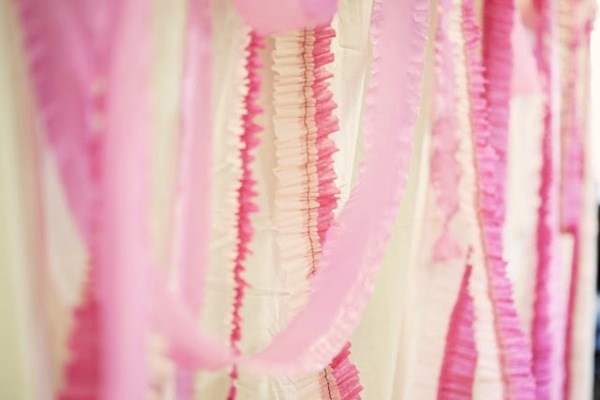
- We’re feeling pink for fall, especially when it comes to your wedding stationery
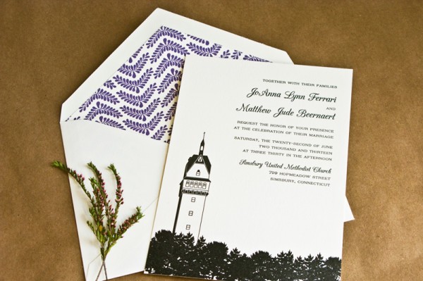
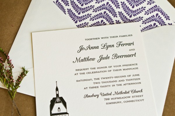
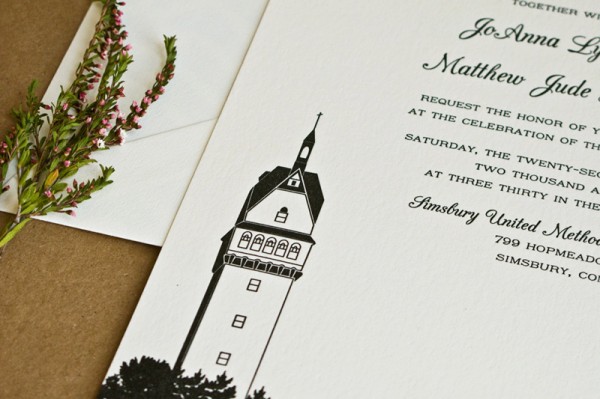
- Illustrated wedding invitations inspired by the bride and groom’s favorite place
- Beautiful prints and illustrations from artist Vikki Chu
Check back soon for this week’s cocktail! I hope you all have a wonderful weekend, and I’ll see you back here next week! xoxo


")
")
")
")
")
")
")