Watercolor + Gold Foil Edged Letterpress Business Cards

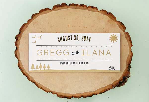
I’m so unbelievably excited to share a very special project with all of you today – my brand new business cards! After launching the new design back in March, it was definitely time to update my business cards. I’ve always been impressed by the amazing custom work from Samantha and Whitney of Gus & Ruby Letterpress, so I immediately turned to them for help translating the beautiful new logo (by Liz from Linda & Harriett) into an equally beautiful business card. When it comes to my own personal projects, my approach is always to pick a designer whose work I absolutely love and then just let them run with it –and Samantha and Whitney completely knocked it out of the park! I couldn’t be more thrilled with the way they turned out!

Watercolor-Gold-Foil-Edged-Letterpress-Business-Cards-Gus-and-Ruby-Letterpress-OSBP-17

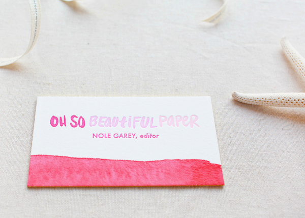
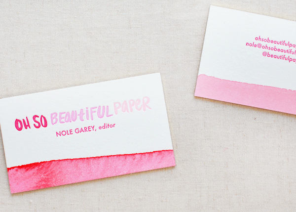
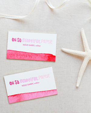
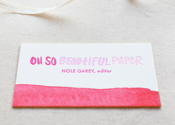
From Samantha and Whitney: We took strong inspiration from the watercolor logo designed for Oh So Beautiful Paper by Linda & Harriett. We wanted the card to complement the logo without feeling visually overwhelming or too busy.

Watercolor-Gold-Foil-Edged-Letterpress-Business-Cards-Gus-and-Ruby-Letterpress-OSBP-30Watercolor-Gold-Foil-Edged-Letterpress-Business-Cards-Gus-and-Ruby-Letterpress-OSBP-49

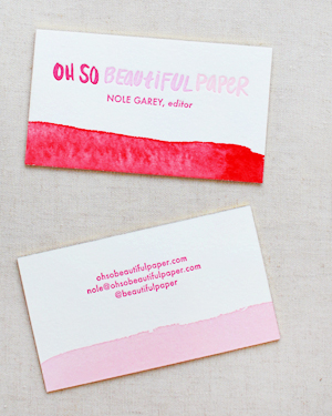
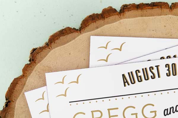
Because we can’t achieve the exact same look as watercolor with letterpress printing, we had to be creative as to how we showcased that tonal variation. We opted to print using three different shades of pink to give an ombre/gradient effect and then added a wash of color along the bottom for a pop of interest.

Watercolor-Gold-Foil-Edged-Letterpress-Business-Cards-Gus-and-Ruby-Letterpress-OSBP-9

Watercolor-Gold-Foil-Edged-Letterpress-Business-Cards-Gus-and-Ruby-Letterpress-OSBP-27Watercolor-Gold-Foil-Edged-Letterpress-Business-Cards-Gus-and-Ruby-Letterpress-OSBP-37

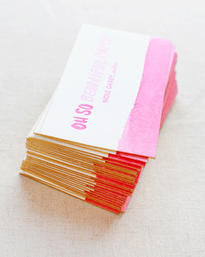
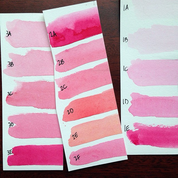
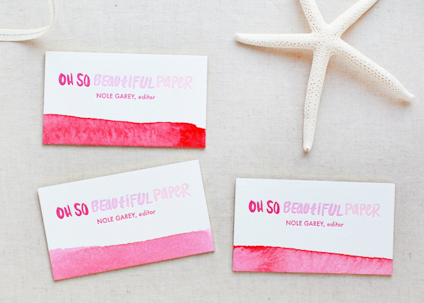
We brainstormed various ways to add the pop of color (from dip dying using vegetable and fruit dyes to pigment dyes), but ultimately decided that actually watercoloring each card by hand was the way to go. We spent hours testing different watercolor mixes and saturations to come up with the perfect palette of paints.

OSBP-Gus-and-Ruby-Letterpress-Business-Card-Watercolor-Swatches

Watercolor-Gold-Foil-Edged-Letterpress-Business-Cards-Gus-and-Ruby-Letterpress-OSBP-21

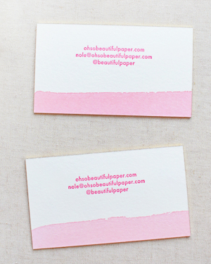
Every card was individually painted with a wash of watercolor on each side prior to being trimmed down, so each card is unique and has a slightly different look/color scheme due to the variation in concentration of the wash.

Watercolor-Gold-Foil-Edged-Letterpress-Business-Cards-Gus-and-Ruby-Letterpress-OSBP-15

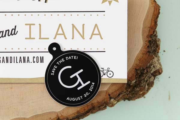
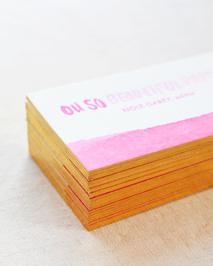
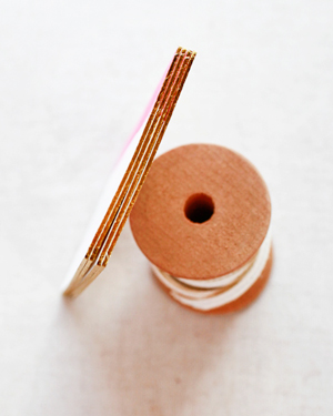
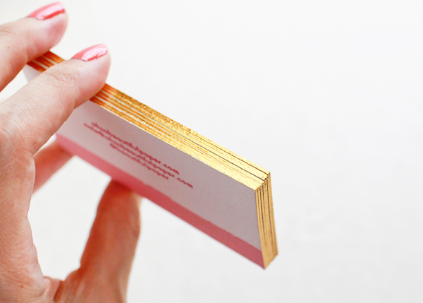
All pieces were lovingly printed by hand in our Dover, New Hampshire studio and are printed on thick, 220# 100% cotton. As the final finishing touch, Smock foil edged the cards in metallic gold shine foil!

Watercolor-Gold-Foil-Edged-Letterpress-Business-Cards-Gus-and-Ruby-Letterpress-OSBP-53Watercolor-Gold-Foil-Edged-Letterpress-Business-Cards-Gus-and-Ruby-Letterpress-OSBP-55

Watercolor-Gold-Foil-Edged-Letterpress-Business-Cards-Gus-and-Ruby-Letterpress-OSBP-60

I hope you love these business cards as much as I do!

Design / Letterpress Printing and Watercolor: Gus & Ruby Letterpress

Foil Edging: Smock

Logo Design: Linda & Harriett

Smock and Gus & Ruby Letterpress are members of the Designer Rolodex – you can see more beautiful work from Smock right here and more wonderful custom work from Gus & Ruby Letterpress here!

Photo Credits: Nole Garey for Oh So Beautiful Paper

Happy Weekend!

Happy Friday everyone! I can’t believe how fast this summer is flying by – I mean, July is just around the corner! We have some fun Fourth of July-inspired posts coming for you early next week… I can’t wait to share them with you! But in the meantime…

Floret-Flower-Farm-Ombre-Sweet-Peas

Photo via Floret Flower Farm

…a few links for your weekend!

This week on Oh So Beautiful Paper:

Check back soon for this week’s cocktail! I hope you all have a wonderful weekend, and I’ll see you back here next week! xoxo

Gregg + Ilana’s Outdoors-Inspired Save the Dates

When it comes time to design their own wedding invitations and personal stationery, designers can often be their own toughest clients – but I always love to see the results! For her own wedding save the dates, Ilana from Sugar and Type wanted to capture her fiancé’s love of cycling and their shared love of the outdoors. Ilana incorporated lots of outdoors-inspired imagery with a horizontal layout, hand addressed kraft paper envelopes, and purple edge painting!

Outdoors-Inspired-Letterperss-Save-the-Dates-Sugar-and-Type5

From Ilana: My fiancé was a professional BMX Racer, and now rides Cyclocross all over the United States. Cycling is a huge part of our lives, and I really wanted to incorporate our love for the outdoors, hiking, biking, and soaking up the sun. After showing Gregg tons of options, he loved this approach! It was so rewarding to find something we felt represented our relationship.

Outdoors-Inspired-Letterperss-Save-the-Dates-Sugar-and-Type6

Outdoors-Inspired-Letterperss-Save-the-Dates-Sugar-and-Type7

I was happy to call our dear friend Amy of Greengirl Press and be able to help her pull our prints off her Vandercook Press. We used 220 lb paper, giving us the opportunity to do a pop of color with purple edge painting.

Outdoors-Inspired-Letterperss-Save-the-Dates-Sugar-and-Type8

Outdoors-Inspired-Letterperss-Save-the-Dates-Sugar-and-Type2

Outdoors-Inspired-Letterperss-Save-the-Dates-Sugar-and-Type4

Thanks Ilana!

Design and Envelope Addressing: Sugar and Type

Letterpress Printing and Edge Painting: Greengirl Press

Check out the Designer Rolodex for more tal­ented wed­ding invi­ta­tion design­ers and the save the date gallery for more beau­ti­ful cus­tom save the dates!

Photo Credits: Audra Zaba Photo

Jennifer + Brian’s Gold Foil and Black Wedding Invitations

These gold foil and black wedding invitations from designer Sandra Picco are just so glamorous – and perfect for a black tie wedding reception! Sandra paired the gold foil invitations with complementing black and white accents and gold envelope liners. Totally classic, and absolutely stunning!

Gold-Foil-Black-Wedding-Invitations-Sandra-Picco-Design-OSBP10

From Sandra: Jennifer had been doing lots of pinning and inspiration-gathering her wedding: a traditional church ceremony followed by a black tie-optional ballroom reception. Their colors were pink and black with touches of gold, so of course, I immediately thought that we should incorporate gold foil somehow. Her preference was to not use pink for the stationery, so together we decided to go with gold foil on black paper.

Gold-Foil-Black-Wedding-Invitations-Sandra-Picco-Design-OSBP5

Jennifer and Brian were working within a budget for their paper goods and foil stamping the entire suite was a bit too expensive. Instead we used foil for the invitation and belly band and a coordinating gold stock for the reception card and envelope liners. White reply cards paired with black envelopes and white outer envelopes tied everything together nicely and kept us within budget. Happy budget, happy bride!

Gold-Foil-Black-Wedding-Invitations-Sandra-Picco-Design-OSBP

Gold-Foil-Black-Wedding-Invitations-Sandra-Picco-Design-OSBP3

Gold-Foil-Black-Wedding-Invitations-Sandra-Picco-Design-OSBP8

Gold-Foil-Black-Wedding-Invitations-Sandra-Picco-Design-OSBP7

Thanks Sandra!

Design: Sandra Picco Design

Foil Stamping: Norman’s Printery

Check out the Designer Rolodex for more tal­ented wed­ding invi­ta­tion design­ers and the real invi­ta­tions gallery for more wedding invitation ideas!

Photo Credits: Sandra Picco Design

Jennifer + Barron’s Gold Foil Watercolor Crest Wedding Invitations

Our next set of wedding invitations mixes classic sophistication with modern glamour and watercolor illustration! With a custom watercolor crest created by Happy Menocal, these invitations from Sandy of Roseville Designs feature gold foil text and a metallic emerald envelope liner. So pretty!

Watercolor-Gold-Foil-Crest-Wedding-Invitations-Roseville-Designs-OSBP

From Sandy: The bride wanted to have a classic wedding invitation with a little bit of fun and glam! The starting inspiration was the gorgeous custom watercolor crest created by Happy Menocal. It featured the couple’s initials and their beloved dog, Pedro! We balanced the softness of the crest with gold foil stamping of their names in a modern script. We also included elements of the crest on the RSVP card to tie it all together. The entire suite was printed on double-thick ecru felt stock, and finished with a metallic colored envelope liner.

Watercolor-Gold-Foil-Crest-Wedding-Invitations-Roseville-Designs-OSBP2

Watercolor-Gold-Foil-Crest-Wedding-Invitations-Roseville-Designs-OSBP6Watercolor-Gold-Foil-Crest-Wedding-Invitations-Roseville-Designs-OSBP15

Watercolor-Gold-Foil-Crest-Wedding-Invitations-Roseville-Designs-OSBP5

Watercolor-Gold-Foil-Crest-Wedding-Invitations-Roseville-Designs-OSBP7Watercolor-Gold-Foil-Crest-Wedding-Invitations-Roseville-Designs-OSBP8

Happy Menocal also created a married version of the crest, which we used in their day-of wedding stationery. We designed programs, menus, table numbers, and other signage that lived throughout the reception tent.

Watercolor-Gold-Foil-Crest-Wedding-Invitations-Roseville-Designs-OSBP10

Watercolor-Gold-Foil-Crest-Wedding-Invitations-Roseville-Designs-OSBP13

Thanks Sandy!

Design: Roseville Designs

Watercolor Crest: Happy Menocal

Printing: StationeryHQ

Check out the Designer Rolodex for more tal­ented wed­ding invi­ta­tion design­ers and the real invi­ta­tions gallery for more wedding invitation ideas!

Photo Credits: Roseville Designs, Wedding Photography by Hudson River Photographer