Autumn Floral Copper Foil Wedding Invitations

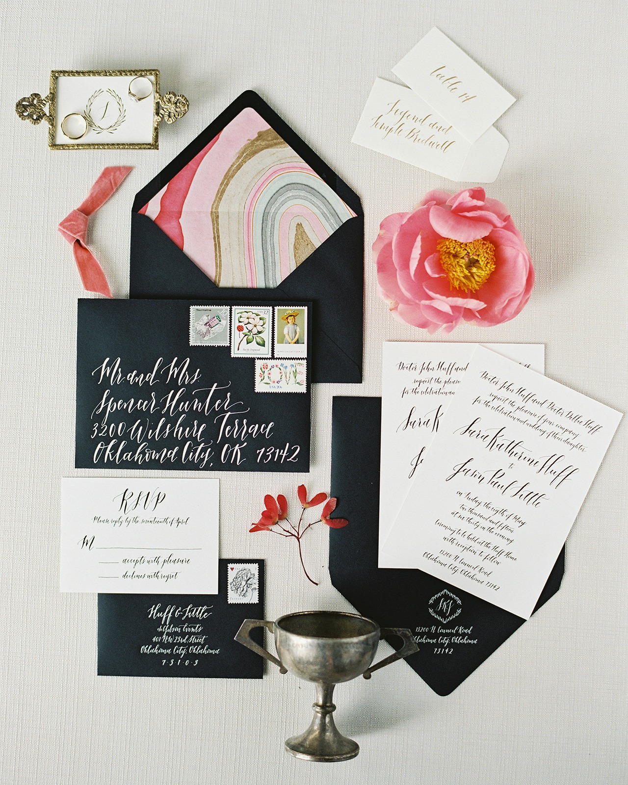
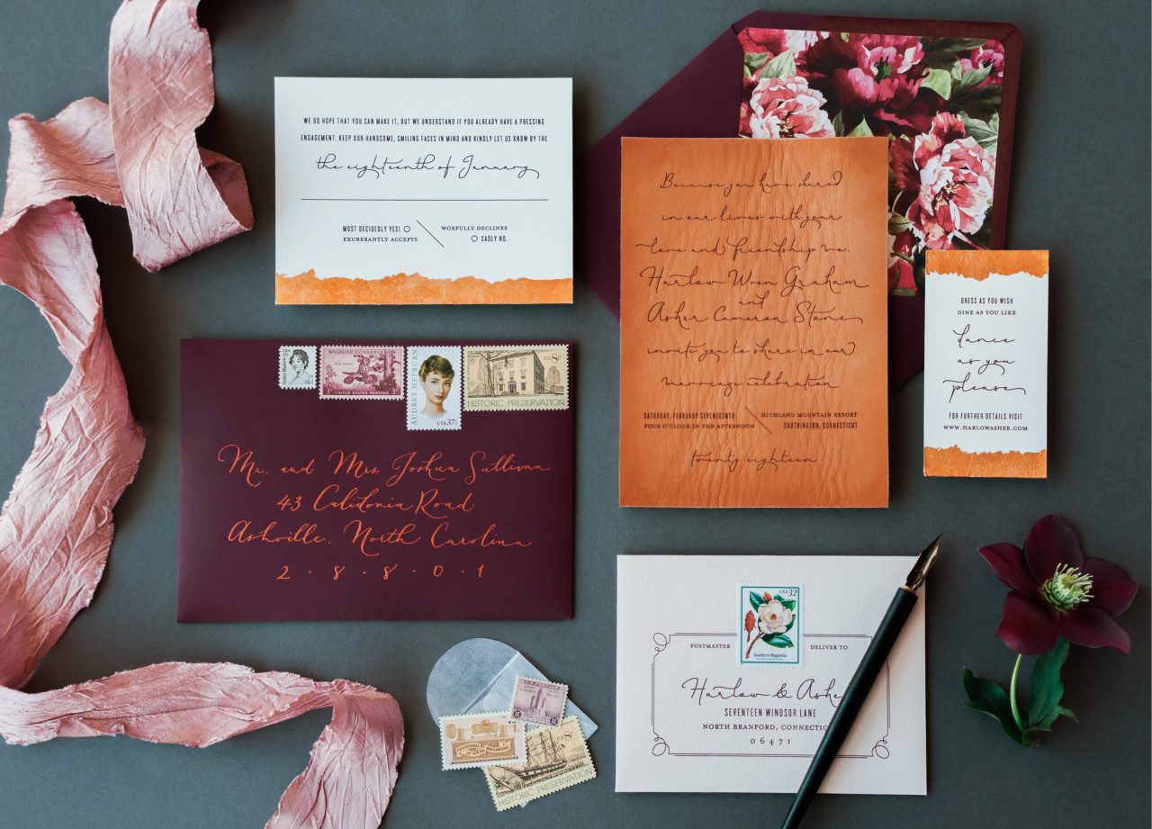
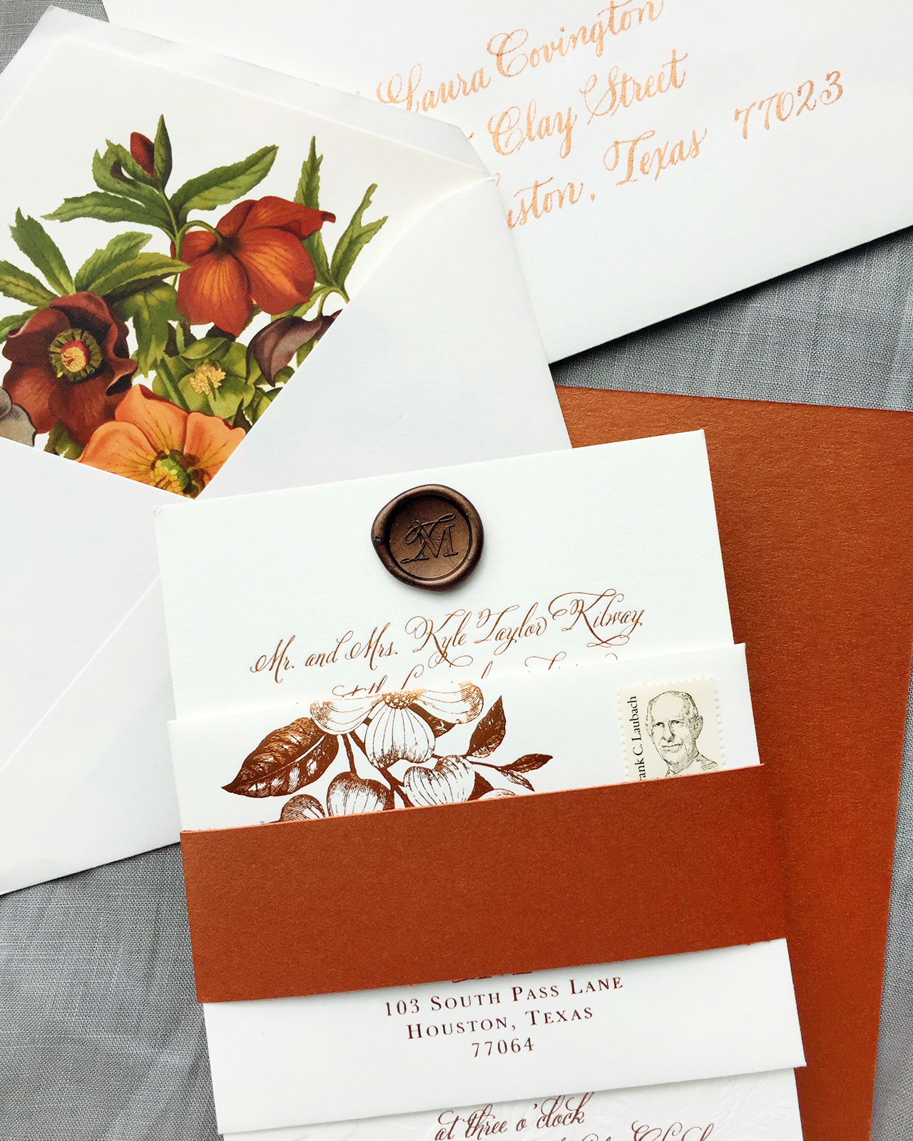
We are just in love with these autumn floral copper foil wedding invitations by Lauren of Charm & Fig, featuring luxurious blind impression letterpress printed floral details. Lauren drew her inspiration from the bride’s unabashed love of the color orange, incorporating metallic copper foil and rounding out the color palette with deep red, plum, and forest green. We’re absolutely loving the copper foil details on the RSVP envelope and that gorgeous floral envelope liner!

Autumn Copper Foil Wedding Invitations by Charm & Fig

From Lauren: This wedding suite made me want to pull out cozy wool blankets and the spiked-apple cider! Taylor unabashedly loves orange, which was a no-brainer for her fall wedding and a not-so-secret tribute to her beloved Texas Longhorns. We ran with the idea of using lots of metallic copper, fall florals, and romantic details for this black tie wedding.

Autumn Copper Foil Wedding Invitations by Charm & Fig

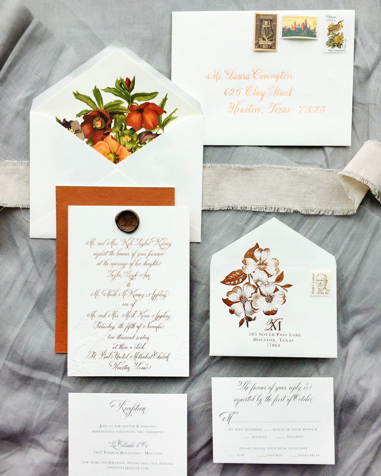
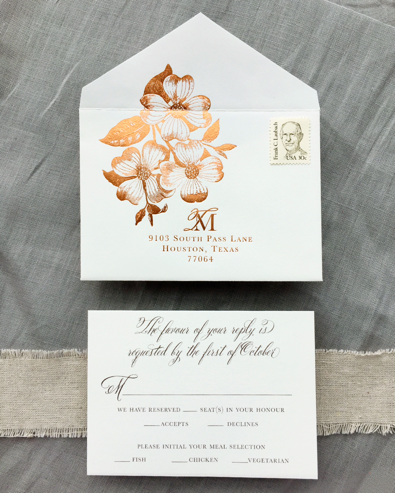
First impressions are important! The first thing guests would see when they opened the interior envelope was a floral envelope liner displaying sophisticated fall hues of orange, wine, plum, and forest green. True story: another client saw a sample of this envelope liner, grabbed it, and vowed to use the palette for her dining room renovation!

Autumn Copper Foil Wedding Invitations by Charm & Fig

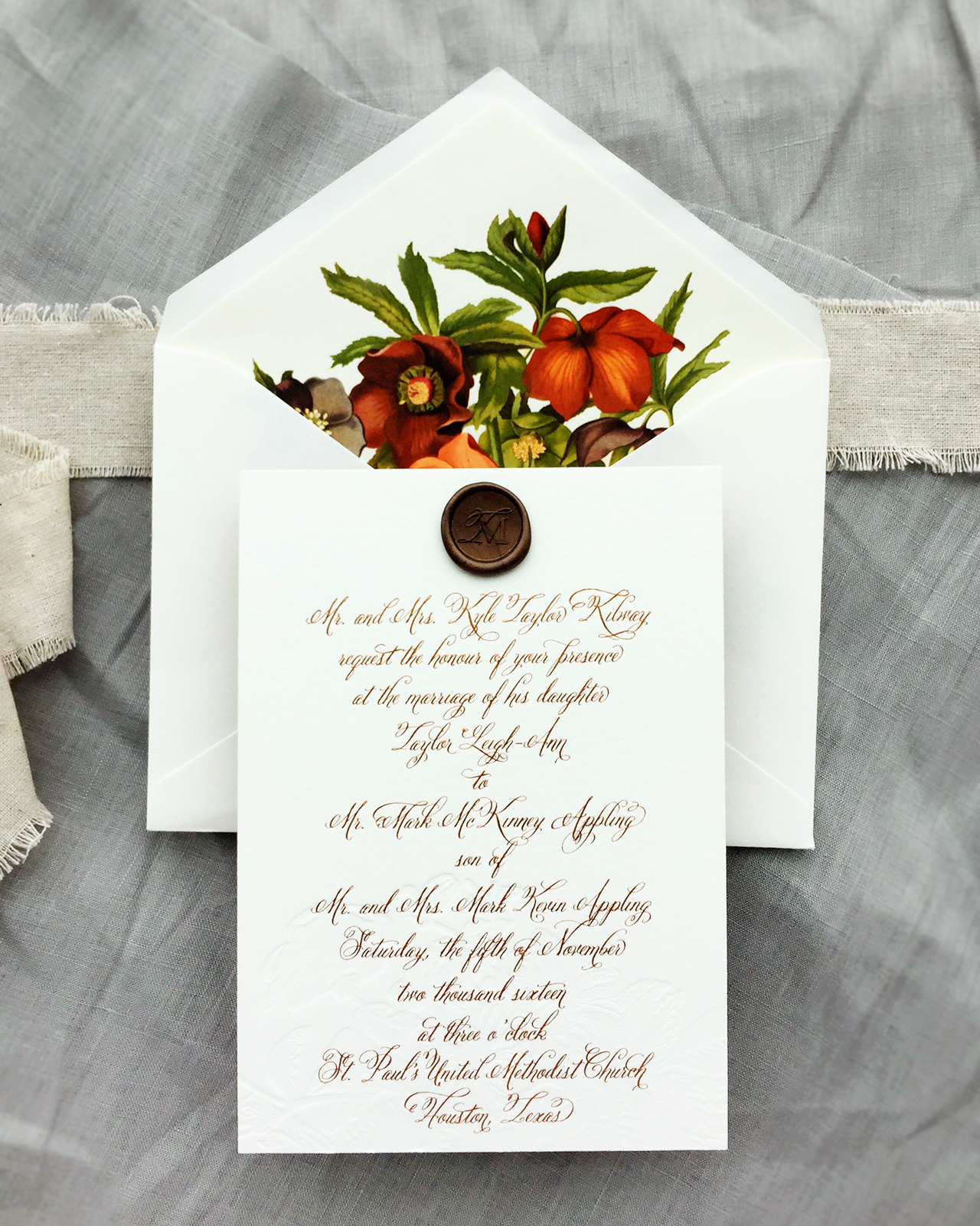
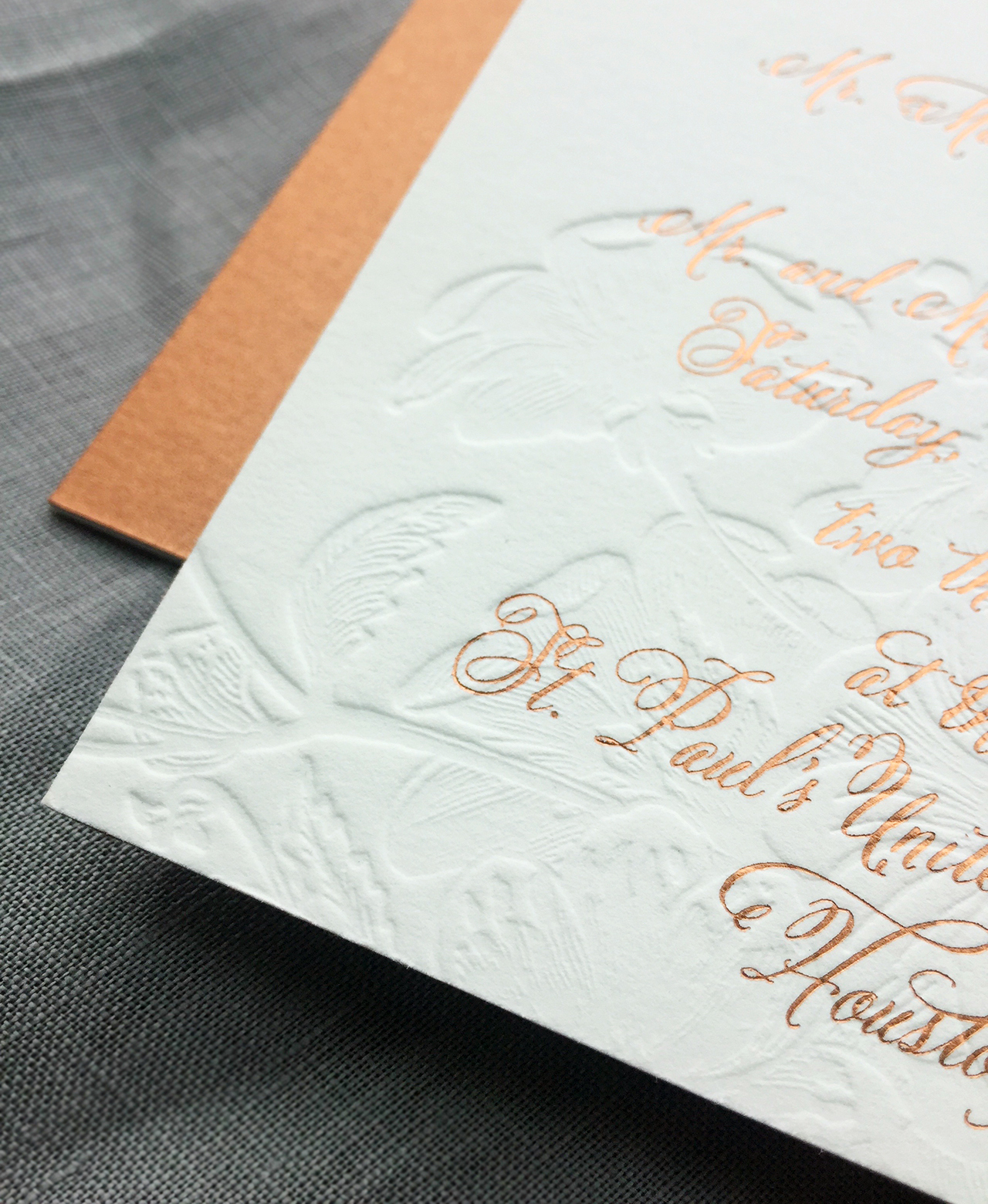
On the invitation, we started with double-ply cotton paper and had it blind letterpress printed with a bundle of botanical florals. Debi Sementelli’s Bellucia calligraphy font was printed in copper foil over the blind image and brought just the right amount of elegance and femininity to the suite. A chocolate wax seal with a custom monogram was affixed to the top and added another layer texture to the main piece. For extra thickness, the invitation was backed with Stardream’s metallic copper paper.

Autumn Copper Foil Wedding Invitations by Charm & Fig

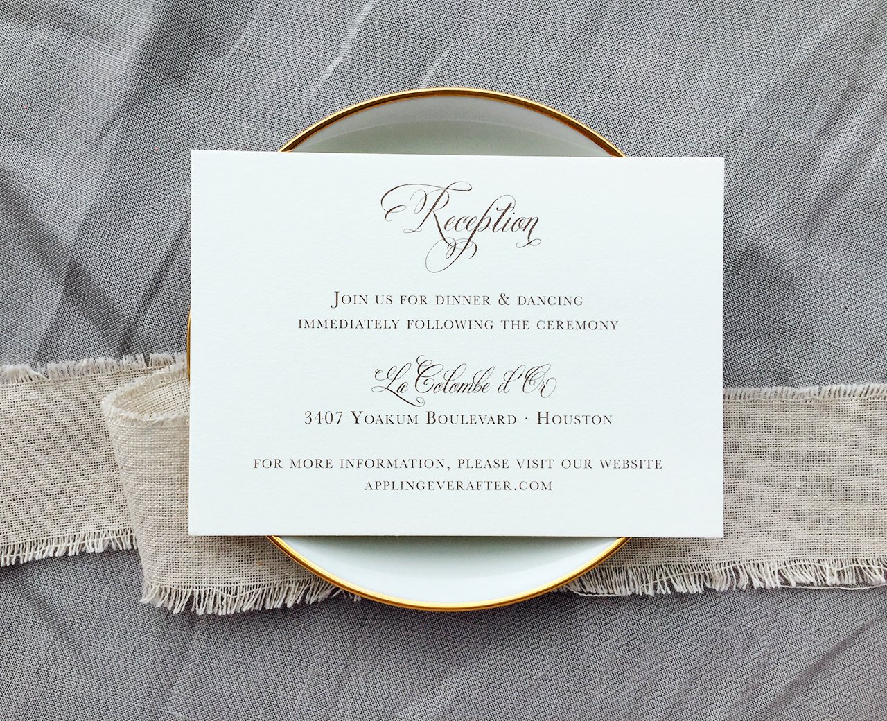
In order to create some balance within the suite, we opted for more simple reception and response cards, flat printed in chocolate on single-ply cotton paper to coordinate with the chocolate wax seal. The outer envelopes were addressed by Maureen Vickery of Pendance Studio. She sourced the perfect copper ink and calligraphy style to match our invitations. For the final packaging, we created a single copper bellyband with the same paper used on the back of the invitation.

Autumn Copper Foil Wedding Invitations by Charm & Fig

Autumn Copper Foil Wedding Invitations by Charm & Fig

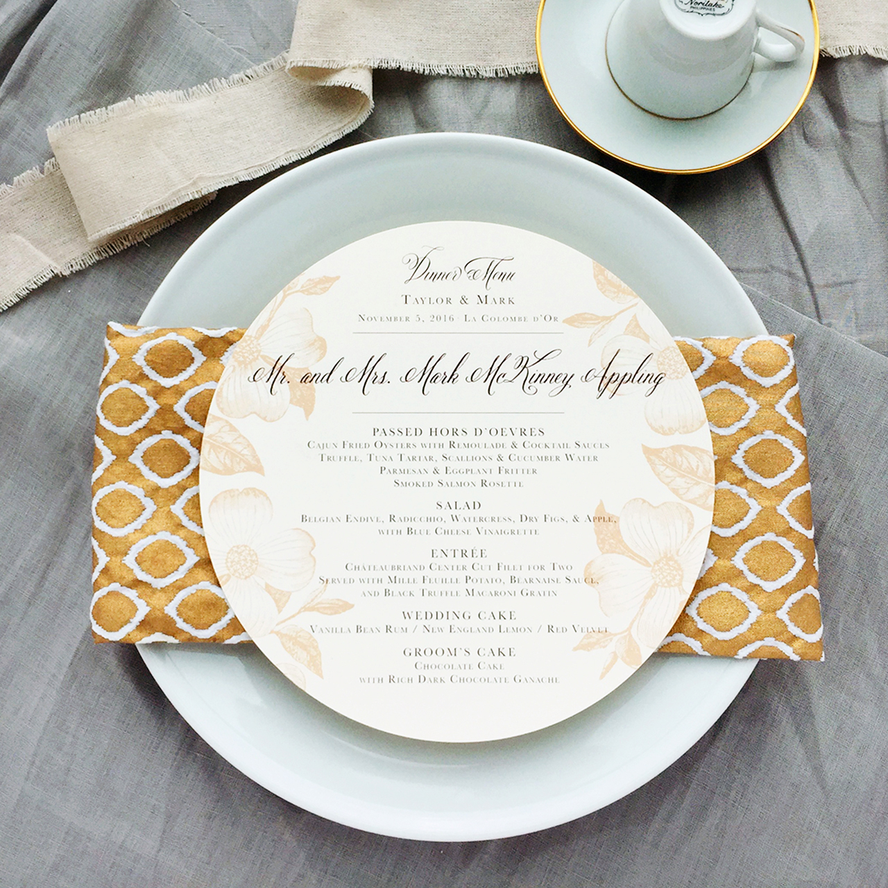
The dinner plate menus were flat printed in chocolate brown with the same dogwood florals from the response envelopes, and served double duty as a place card with the name of each guest printed at the top.

Autumn Copper Foil Wedding Invitations by Charm & Fig

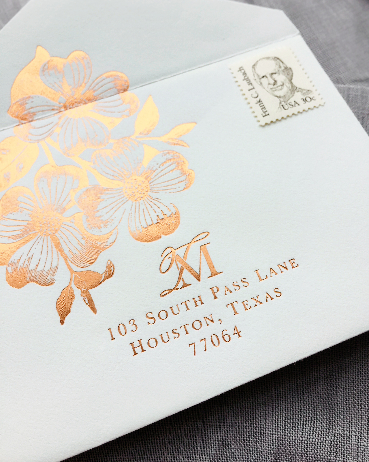
By far, the response envelope was our favorite piece. It was printed in copper foil with a detailed dogwood botanical illustration and the couple’s monogram. Although it was a little tricky to foil print over the crease of the envelope, our amazing printers pulled it off and it was totally worth it. It’s kind of a secret gift to yourself to have a pretty RSVP envelopes since you’ll get gorgeous mail for weeks as the RSVPs roll in.

Autumn Copper Foil Wedding Invitations by Charm & Fig

Thanks Lauren!

Design and Styling: Charm & Fig

Printer: Quality Printing Company

Envelope Calligraphy: Maureen Vickery of Pendance Studio

Charm & Fig is a member of the Designer Rolodex – check out more of their beautiful work right here or visit the real invi­ta­tions gallery for more wedding invitation ideas!

Photo Credits: Charm & Fig

Happy Weekend!

Happy Friday everyone! How was your first week of 2017? I spent most of the week cleaning out my office and trying to mentally prepare myself to dive into 2017. The last couple of years have felt VERY chaotic, both personally and professionally, so this year I’m trying to take a step back and focus on building a foundation that will help me grow and move forward in an intentional way. I know we all project a positive, happy, and successful vibe on blogs and social media, but behind the scenes life often feels like the exact opposite! So, last summer, I signed up for Shanna Skidmore’s Blueprint Model program to help me build that foundation. I’m only about two thirds of the way through the 12-week program, but it has been absolutely invaluable in helping me figure out the direction I want to take, both with my business and my life (more on that sometime soon!), and some of the key ingredients missing from my business model. Anyway, I’m looking forward to finishing the final third of the program while things are still fairly quiet in January, and if any of you are interested in doing something similar for your business, I’d definitely encourage you to sign up for the next 12 week round – registration opens today and runs through January 12! And you can even get $100 off your registration with code “THEYTOLDMETOO” at checkout. And if that wasn’t enough, Shanna is offering one-on-one sessions for the first 25 people that sign up. Go NOW! But in the meantime…

Little Arrow Shop / Don't Quit Your Daydream

Don’t Quit Your Daydream Unicorn pin by Little Arrow / Photo by @tokyokittengalaxy

…a few links for your weekend:

  • How stamps get designed. I think this is just the coolest thing ever.
  • Just totally obsessed with this vase – and this matching terrarium
  • The holidays may be over, but I totally want to try Ashley’s recipe for dairy-free Milk Punch (made with almond milk!)
  • Have any of you tried a facial cleansing oil? I tend to get really dry skin in the winter months, so I’m very curious!
  • Can I please get this sweater in my size?? (I’m totally getting one for Sophie – and it’s 40% off with code MUSTSHOP!)
  • The invisible workload. I found this article super interesting. I’m sure in some homes it’s the husband who does most of the invisible thinking work, not to mention households with couples of the same gender, but I’m guessing in most homes the invisible work generally falls to one person. In my home, my husband helps keep track of our grocery list, but I keep track of pretty much everything else. What do you think? Is it the same for you?

This week on Oh So Beautiful Paper:

That’s it for us this week! Have a fabulous weekend, and I’ll see you back here next week! xoxo

Elegant Blush and Gold Letterpress Wedding Invitations

I pretty much always fall in love with anything in the color pink. Pale blush pink, bright pink, magenta, neon… the list goes on and on. Lisa from Missive created these elegant blush and gold letterpress wedding invitations for a wedding in the mountains. I’m loving the combination of rustic and romantic, with hand drawn botanical details and vintage-inspired floral postage stamps. And those pale pink wedding details cards? So good!

Elegant Blush and Gold Letterpress Wedding Invitations by Missive

From Lisa: The inspiration for this suite came from both the event venue and the bride’s description of her vision for their perfect wedding day. The wedding venue was the Black Bear Inn, a rustic, elegant lodge in the heart of the Sierra (think towering sequoia trees and the scent of pine year round). The wedding was held outdoors in the venue’s garden, surrounded by the resplendent woodland foliage of the Stanislaus National Forest.

Elegant Blush and Gold Letterpress Wedding Invitations by Missive

An elegant blush and gold color palette with charcoal gray accents was a theme throughout the wedding and reception, from gold rimmed flutes, to sparkly pink sequin (yes, sequin!) table runners and blush pink floral arrangements in rustic wood boxes, which were handcrafted by the bride and groom.

Elegant Blush and Gold Letterpress Wedding Invitations by Missive

Since their wedding was all about their love of the outdoors, coupled with bride’s idea of a perfectly elegant wedding, I designed a nature-inspired invitation suite featuring hand drawn foliage surrounding a combination of modern, calligraphic scripts and typefaces with rustic charm. The invitation design was kept symmetrical and orderly while incorporating lots of flowing, hand drawn botanicals to frame the wording.

Elegant Blush and Gold Letterpress Wedding Invitations by Missive

Their entire wedding suite was letterpress printed on our vintage presses in blush and matte gold inks on soft white cotton and blush pink papers, with deep, tactile impressions. The couple’s wedding website had plenty of information for out of town guests, so we created a wedding details card printed in gold on blush pink stock for an accent of color.

Elegant Blush and Gold Letterpress Wedding Invitations by Missive

Reply card envelopes were the same blush pink color and featured their address surrounded by more hand drawn botanicals. The bride chose the gorgeous Botanical Art stamps for the postage, which I’ve personally been hoarding for future use!

Elegant Blush and Gold Letterpress Wedding Invitations by Missive

Thanks Lisa!

Design and Printing: Missive

Check out the Designer Rolodex for more tal­ented wed­ding invi­ta­tion design­ers and the real invi­ta­tions gallery for more wedding invitation ideas!

Photo Credits: Missive

Illustrated Lake Tahoe Inspired Wedding Invitations

We love the juxtaposition of soft watercolor illustrations with rugged, rustic wedding details! Amanda Franz of Wide Eyes Paper Co. created these illustrated Lake Tahoe inspired wedding invitations, featuring the stunning illustrated scenery of the Lake Tahoe area throughout the invitation suite. We’re also loving those adorable engraved wooden tags featuring the couple’s custom monogram. So fun!

Illustrated Lake Tahoe Inspired Wedding Invitations by Wide Eyes Paper Co.

From Amanda: Named after the Lake Tahoe Basin’s most plentiful tree, The Jeffrey Pine suite was created for two lovers getting married in majestic Lake Tahoe. Heather and Jon hired us to create an invitation suite that was both classic and sophisticated with a woodland flare. For a touch of rustic elegance, this set also features a wooded watercolor scene alongside the beautiful shores of Lake Tahoe.

Illustrated Lake Tahoe Inspired Wedding Invitations by Wide Eyes Paper Co.

Illustrated Lake Tahoe Inspired Wedding Invitations by Wide Eyes Paper Co.

The watercolor scenery was incorporated into various elements of the invitation to create a stunning visual experience. One of our favorite places where we incorporated the watercolor artwork was on the custom envelope liners.

Illustrated Lake Tahoe Inspired Wedding Invitations by Wide Eyes Paper Co.

Heather and Jon wanted to go a more informal route, so we designed a postcard style RSVP enclosure. These were great because they did not require an envelope and we printed their return address directly onto the back of the card. The watercolor scenery is also seen on the front of the RSVP card, which was another fun element of surprise.

Illustrated Lake Tahoe Inspired Wedding Invitations by Wide Eyes Paper Co.

In addition to the watercolor artwork, we created a custom monogram for the pair that is showcased on our signature wood engraved tags. We also included the custom monogram on the envelope liners to push their aesthetic even further.

Illustrated Lake Tahoe Inspired Wedding Invitations by Wide Eyes Paper Co.

Illustrated Lake Tahoe Inspired Wedding Invitations by Wide Eyes Paper Co.

Another amazing detail seen in this suite is the colorful watercolor map we illustrated. Maps are such a fun, quirky way to point out special landmarks that hold significance to the couple.

Illustrated Lake Tahoe Inspired Wedding Invitations by Wide Eyes Paper Co.

We love how the olive green envelopes play with the lake themed accents in the design. For the final touches, we printed each guest’s name and address onto the envelopes. Their custom monogram is printed on the back flap of the envelope to create a cohesive look and feel.

Illustrated Lake Tahoe Inspired Wedding Invitations by Wide Eyes Paper Co.

Thanks Amanda!

Design: Wide Eyes Paper Co.

Printer: Advanced Reprographics

Wide Eyes Paper Co. is a member of the Designer Rolodex – you can see more of Amanda’s work right here or visit the real invitations gallery for more wedding invitation ideas!

Photo Credits: Nicole Mason

Best of 2016: Wedding Invitations

We still have some fun posts planned for this week, but since my goal for next week is to truly relax and rest my brain (if such a thing is even possible with two small children), I’m sharing my annual “Best Of” recaps with you this week! First up, the best wedding invitations of 2016! After eight years of blogging, my mental timeline can get kind of fuzzy, so I love doing these round ups and looking back to see all of the amazing things that I had the opportunity to share with you over the past year. And truly, there was so much gorgeousness in 2016. Tropical motifs, watercolor, metallics (especially copper), elegant calligraphy, playful hand lettering, and a return to handmade paper and deckled edges in a MAJOR way in the second half of the year. What design trends do you think 2017 will bring to us? I can’t wait to see!

Best Wedding Invitations of 2016: Black and White Foil Printed Calligraphy Wedding Invitations by Blue Eye Brown Eye

Black and white calligraphy invitations with white foil on black paper, black foil on white paper, and a marbled envelope liner by Blue Eye Brown Eye

Best Wedding Invitations of 2016: Camp Theme Fold Out Wedding Invitations by Jessica Roush

Camp-theme fold out invitations for a wedding in a Wisconsin state park by Jessica Roush

Best Wedding Invitations of 2016: Leather and Copper Leaf Wedding Invitations by Coral Pheasant

Leather and copper leaf wedding invitations with cranberry envelopes and floral details by Coral Pheasant

Best Wedding Invitations of 2016: The Art of Opposites Watercolor Wedding Invitations by Lovely Paper Things

Elegant art-inspired wedding invitations with abstract watercolor patterns by Lovely Paper Things

Best Wedding Invitations of 2016: Informal Hand Lettered Wedding Invitations by Odd Daughter Co.

I love these playful hand lettered wedding invitations by Odd Daughter Paper Co. as a fantastic example of a modern, informal wedding invitation

Best Wedding Invitations of 2016: Pink Watercolor Floral Wedding Invitations by Bright Room Studio

Whimsical pink watercolor floral wedding invitations with hand painted envelopes by Bright Room Studio

Best Wedding Invitations of 2016: Modern Gemstone and Copper Foil Wedding Invitations by And Here We Are

Copper foil and modern geometric gemstone shapes in shades of deep plum, slate gray, and navy blue by And Here We Are

Best Wedding Invitations of 2016: Romantic Shipwreck-Inspired Calligraphy Wedding Invitations with Deckled Edges by Poste and Co.

Romantic shipwreck-inspired calligraphy wedding invitations with deckled edges by Poste and Co.

Best Wedding Invitations of 2016: Tropical Garden and Copper Foil Wedding Invitations by The Distillery

Fun tropical garden party wedding invitations with copper foil by The Distillery

Best Wedding Invitations of 2016: Peach and Navy Blue Watercolor Wedding Invitations by Bright Room Studio

I love the understated elegance in these peach and navy hand lettered wedding invitations from Bright Room Studio

Looking for more inspiration? You can find all of our past wedding invitation and save the date features right here!