While I’m away on vacation I’m running a series of guest posts on the various printing processes, from digital printing to engraving. I’ve asked some designers and printers to share their expertise and lots of photos to fill you in on what you need to know about different stationery printing methods. Today we’re talking about one of my very favorite specialty printing methods – foil stamping!
What is Foil Stamping?
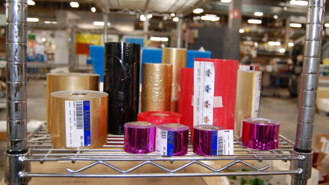
Foil stamping is a specialty printing process that uses heat, pressure, metal dies and foil film. The foil comes in rolls in a wide assortment of colors, finishes, and optical effects. Metallic foil is most commonly seen today – particularly gold foil, silver foil, copper foil, and holographic metallic foils – but foil rolls are also available in solid colors in both glossy and matte finishes.
Early foil stamping was done using hand-set lettering or custom engraved dies. Because foil stamping was so labor intensive, early foil stamping was primarily restricted to book covers and literary titles. To print gold text on a book cover, printers used separate fonts of lead or brass type, with text assembled by hand, one letter at a time, or a custom engraved die with a single image. Once the text or die was assembled, it was loaded into a press, which then pressed thin sheets of metallic foil into a book cover or other material.
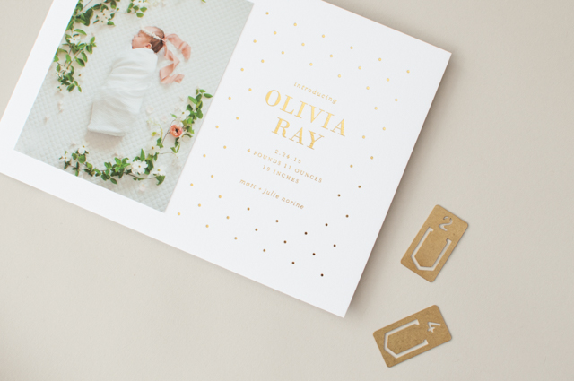
Baby Announcements by Lauren Chism
The development of modern hot foil stamping took place in the late 1800s and early 1900s. Ernst Oeser, a master bookbinder in Berlin, is credited as a pioneer in the development of hot-stamping foils as early as 1880. In the 1930s, an English foil manufacturer, George M. Whiley, introduced atomized gold on thin sheets of polyester film. Hot foil stamping using these rolls of gold foil increased in popularity in the 1950s through the late 1960s.
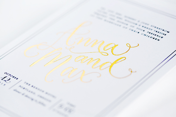
Wedding Invitations by 4th Year Studio
The Printing Process
Foil stamping is somewhat similar to letterpress and engraving, in that the color is applied to paper with pressure. Once the design is finalized, metal dies are created in the appropriate shape for each individual color foil to be applied for a particular design. The dies are heated and then stamped with enough pressure to seal a thin layer of foil to the paper, and each color is applied individually through multiple runs of the press to create the final design. A final die may also be created if an embossed (raised) image or effect is desired for the design.
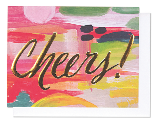
Cheers! Thimblepress Gold Foil Embossed Greeting Card


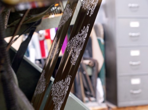
Photos from my tour of Crane & Co. in September 2011
Tips and Advice
As with any printing process, there are pros and cons. Here are a few tips to keep in mind if you’re considering foil for your wedding invitations or personal stationery.
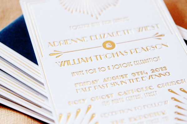
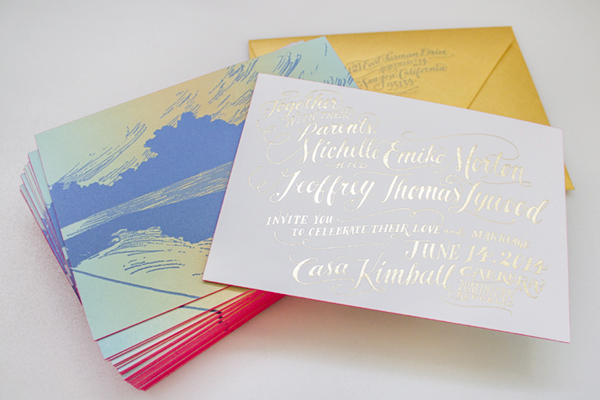
Wedding Invitations by Lauren Chism
Pros
Foil is an opaque medium. Unlike thermography, lithography and letterpress, foil stamping does not use any ink. As a result, the foil color does not change based on the color of paper on which you are printing. Â This makes metallic or lighter color foil great for darker or colored papers. Foil can be used for a variety of finishes, including metallic, matte, glossy, pearlescent, holographic, and patterns such as marbling. There are also semi-transparent tint foils, if you do want to allow the paper color to show through.
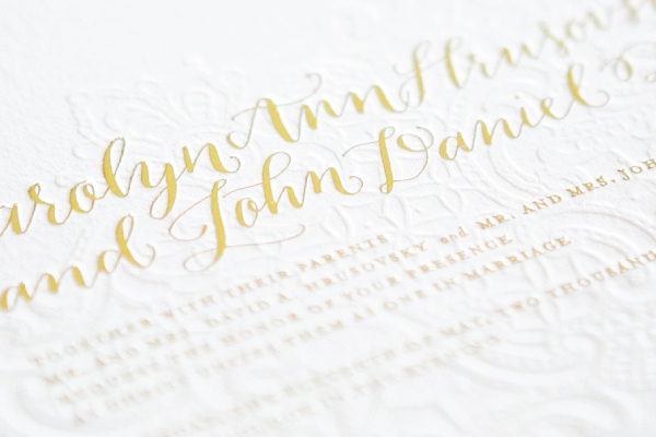
Metallic foils have a shiny, lustrous finish with a big visual impact. With thermography, lithography, and letterpress, metallics can fall flat and aren’t very shiny.
Wedding Invitations by Ladyfingers Letterpress
Cons
Like letterpress, foil stamping is a labor-intensive printing method that requires multiple runs through the press to achieve multi-color designs. As a result, foil stamping can be expensive.
Because foil is applied by heat, it should not be applied near text or designs already applied by thermography. Â The heat will melt the thermographic resins.
To see more of the foiling process, check out the video below of some foil stamping in action from the Crane & Co. production facility!


