Jen + Dan’s Wedding, Part 2 – Details and Our Invitations

CL77a10-R01-001

Hello again! Jen here from the haystack needle.  Yesterday I left you on a Maine farm with many ways to craft together a wedding with rubber stamps.  Still following?  Here are some more details from our wedding (no stamps involved.)

CL77a11-R01-008

CL77a08-R01-029A

I outsourced the paper cocktail napkins and drink stirrers to For Your Party.  I love how they turned out. And I picked one of my favorites in the paper world, Delphine Studio, for the napkin design.

CL77a11-R01-029

My father-in-law is my hero.  We needed a bunch of signage to point to where to park, where to go for the ceremony, and even where to find the loo.  He made us wooden signs that looked adorable.  All I did was paint them.

CL77a06-R01-033

CL77a09-R01-003A

We turned the back room of the barn that served as our wedding venue into a lounge where everyone could eat cupcakes and blueberry cobbler and check out old photos of Dan and me (and our families.)  My friends decorated the cupcakes with fresh blossoms and set a few birch paper flowers around the table.

CL77a12-R01-013

Our wedding invitations!  I decided to splurge on letterpress, because I love it so.  I saved on costs by opting for a postcard rsvp card and handling the map and envelopes myself.  Stacy of Pancake & Franks designed our wedding invites.  She was so much fun to work with and Stacy really understood my vision.  I made the maps by simply photocopying our Maine atlas, glued the map squares to cardstock, and then I punched a hole to mark where the event was taking place.  I couldn’t swing the cost of a calligrapher, but I really wish I had ordered a custom return address stamp, which would have saved time and looked prettier on the envelopes.

All photographs by the ever-talented Charlotte Jenks Lewis.

Tomorrow, I’ll be sharing our save-the-dates!

Kristy + Adam’s Hand-Painted Letterpress Save the Dates

Before we jump back into holiday cards, I just have to share these amazing hand-painted watercolor letterpress Save the Dates created by Kristy at Momental Designs for her upcoming 10-year vow renewal ceremony.  The pop of watercolor detail works so well with the letterpress impressions on thick cotton paper – and Kristy was kind enough to send over the background behind her design.

Letterpress-watercolor-invitations

From Kristy: Hand-painted details and original artwork are my passion.  While planning my own renewal celebration I knew letterpress had to be included but of course wanted to incorporate my signature hand-painted look.  Thus, hand-painted letterpress was born!  I simply love the very visceral, textured nature of letterpress.  When combined with juicy, romantic watercolor brushstrokes, letterpress, in my opinion is transformed to a whole new level.  The intimate touch of the pressed image first makes an impression but then the washy, romantic quality of the watercolor gives the perfect finish.

Letterpress-watercolor-invitations2

Choice of materials were extremely important for this project.  I wanted to mimic the many natural occurring textures so obvious in Zion National Park, where are renewal ceremony is taking place.  From Crane’s roughly textured cotton stock to the champagne silk ribbon and cobalt blue envelopes, every detail needed to be reminiscent of the crystal clear river, intense blue skies and towering red rock landscape of Zion.  So many of our guests have never traveled to this magical place.  The goal was to translate the Zion experience on paper in hopes of creating great anticipation of the adventure to come!

Letterpress-watercolor-invitations8

Original illustration didn’t stop at the save the date cover!  Each page features one of my sketches with watercolor details added throughout.  At the center of the booklet is a hand-drawn map which is not only functional but seems to unify the look overall.  Envelope liners are reproductions of vintage topographical maps.  I just love the rich orange and blue colors — nothing needed to be altered!

Letterpress-watercolor-invitations6

Betsy Dunlap created a printable file with the calligraphy for my envelope backflap.  This was a great budget option I would add — it certainly doesn’t hurt to save when you can!  I am saving patiently to have Betsy pen all the invitation outer envelopes!  When I first contacted Betsy I proclaimed that this particular lettering style was simply perfect as it really mimicked the red rock landscape of Zion!  Thank you Betsy for your artistry!

Thanks so much Kristy!  You can read more about Kristy’s design process right here and see some of her other recent projects here.

{image credits: Momental Designs}

Layered Envelope Wedding Invitations

Ever since seeing Cheree Berry’s Matryoshka doll-inspired save the dates over the summer, I’ve been kind of obsessed with the idea of wedding invitations that incorporate layered envelopes – giving the recipient the feeling of unwrapping a beautifully packaged gift.  These invitations from Erin Jang are a perfect example with the main invitation was enclosed in a small envelope placed on a letterpress card:

Indigo-bunting-fold-out-invitation

Indigo-bunting-fold-out-invitation-envelope

Indigo-bunting-fold-out-invitation-envelope-enclosure

I’m a big fan of the long, skinny layout of the main invitation – which complements the rest of the invitation suite in a really unique way.  And behind the fold-out invitation were a reception enclosure with perforated rsvp postcard and a map of the wedding location, both beautifully letterpress printed by Studio on Fire:

Indigo-bunting-fold-out-invitation-perforated-rsvp

Indigo-bunting-fold-out-invitation-letterpress-map

Lovely! You can read more about these invitations and see additional photos of these wedding invitations over at The Indigo Bunting.

{image credits: Erin Jang}

Danielle + Greg’s Vintage Cinema-Inspired Wedding Invitations

So last week was all about music-inspired invitations, and this week I’ve got some totally awesome real wedding invitations inspired by foreign cinema!  Kathryn featured Danielle and Greg’s wedding a few months back, and I was so smitten with her vintage cinema inspiration that I asked Danielle, the talented designer behind Tallu-lah, if she’d be willing to share her invitations and paper ephemera in greater detail.  Lucky for us, Danielle was more than willing to oblige, so let’s get right to it!

Danielle-greg-vintage-cinema-wedding-invitations

Danielle and Greg’s foreign cinema invitation theme was inspired in part by their wedding venue and in part by their shared love of vintage lettering and illustrations.  With these two ideas they started the creation of a vintage movie themed event:

Foreign-cinema-restaurant

From Danielle: 
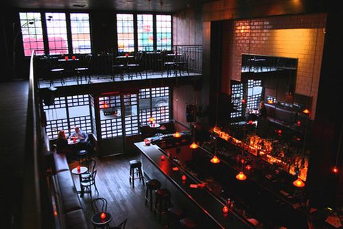
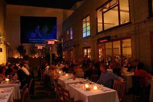
Since we’re both in the wedding industry — I work as an event planner for Samantha Smith Productions and Greg is a wedding photographer — we knew we wanted something unique and fun.  After a year and a half of being engaged and looking at venues all over the United States and Mexico, we finally found a place very close to our personalities and home, Foreign Cinema.  More then just one of the best-known restaurants in the city, the venue includes an outside courtyard where movies are shown drive-in-speaker style and a modern art gallery.  The décor is industrial chic meets Northern California.

Foreign-cinema-restaurant2

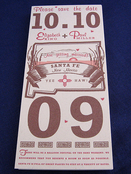
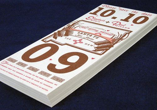
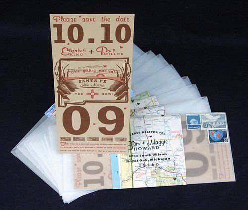
Once they settled on their vintage cinema theme and wedding venue, it was time to get to work on their Save the Dates.  To give their guests their first glimpse into the cinema theme of the wedding, Danielle and Greg created a Save the Date in the style of a movie poster:

Danielle-Tallulah-Foreign-Cinema-Save-the-Date

We created the look and feel and Hatch Show Print of Tennessee made it come to life though old vintage images and the process of letterpress printing.  We used words on the save the date to give guests the feel that they would be coming to a show.

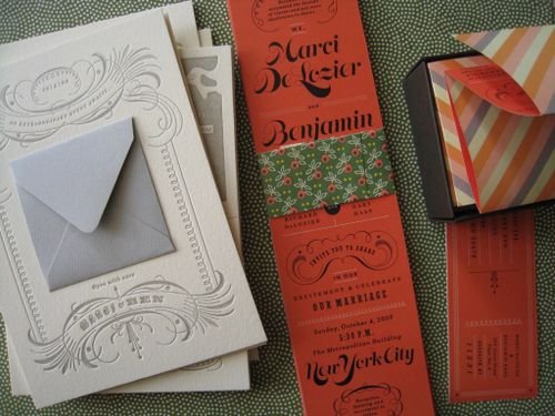
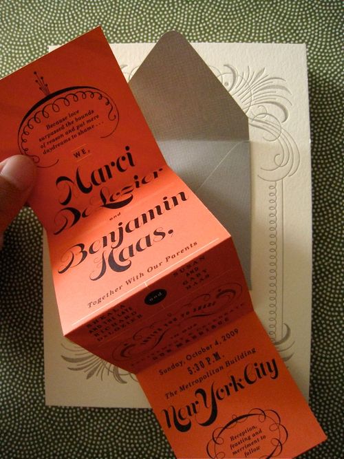
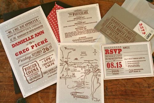
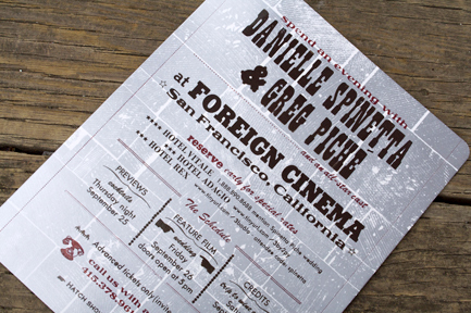
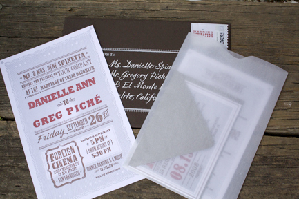
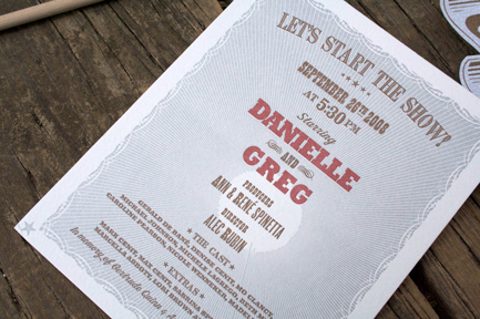
Danielle’s designs for Tallu-lah are all letterpress printed, and she knew she wanted the wedding invitations to be letterpressed too.  For the invitation design, Danielle and Greg turned to Hello!Lucky to help bring their vintage cinema inspiration to life:

Danielle-Tallulah-Invitations5

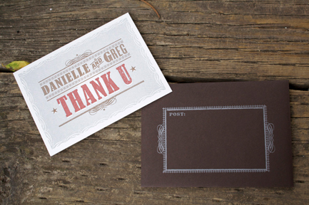
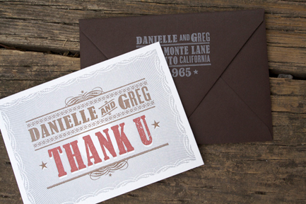
The rest of the paper goods (invitations, playbill, ceremony programs, cocktail napkins, seating cards/tickets, menu, reception cards and parting gifts, Poco Dolce candy boxes, thank you cards) were created by both Danielle and Eunice Moyle of Hello!Lucky.

Danielle-Tallulah-Invitations4

I asked Eunice if she would take on the project of designing for us, I couldn’t think of anyone better to ask — she was the perfect designer for the project and was already a great business friend living in the same town as me, San Francisco.  She out-did herself, they were perfect!

Danielle-Tallulah-Invitations3

Danielle-Tallulah-Invitations2

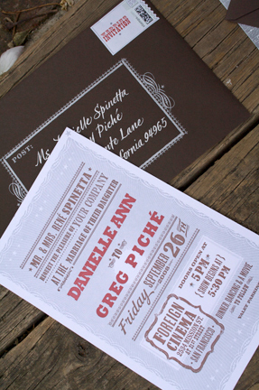
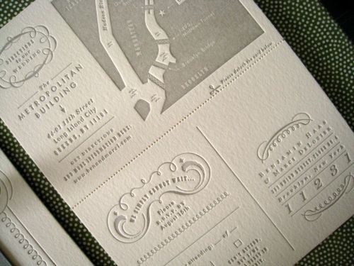
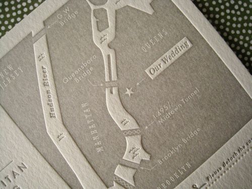
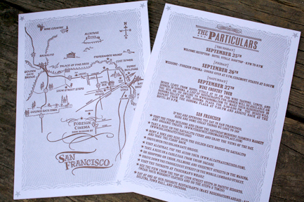
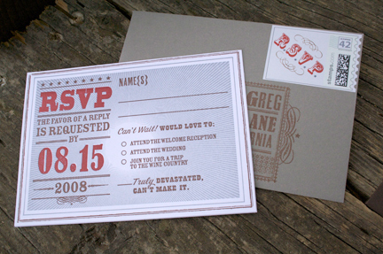
Once designed, my stationery company, Tallu-lah, printed the invites on over-sized, extra thick paper and included special details like a hand drawn map of San Francisco by calligrapher Mo Seder, a list of the top 10 things to do in San Francisco, hand stamped RSVP envelopes, and customized postage stamps – all assembled in a glassine sleeve packaged in a star-studded lined and letterpressed envelope.

Danielle-Tallulah-Invitations-Directions

Danielle-Tallulah-Invitations-RSVP

Danielle-Tallulah-Thank-You-Cards

Danielle-Tallulah-Thank-You-Cards2

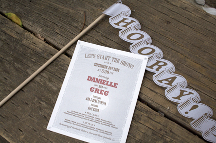
Other vintage movie items were added into the wedding like truffled popcorn before the ceremony and “hooray flags” for each guest to wave when Danielle and Greg walked back down the aisle at the end of the ceremony:

Danielle-Tallulah-Ceremony-Programs-Flags

Danielle-Tallulah-Cinema-Ceremony-Programs

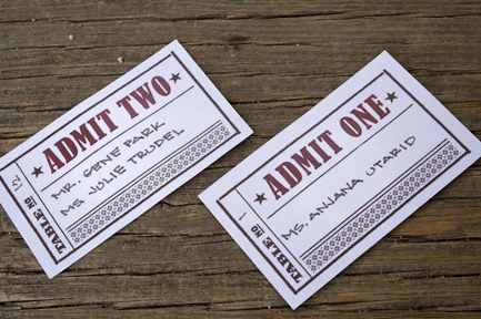
I love that Danielle and Greg carried their cinema theme through to the escort cards – which were designed to look like vintage movie tickets and then hung for guests to find on their way to the reception:

Danielle-Tallulah-Movie-Ticket-Escort-Cards

Danielle-greg-movie-ticket-escort-cards-display

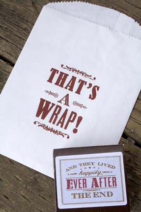
Danielle and Greg printed cocktail napkins to match the flow of their wedding, from the ceremony (“The Show”) in the outside courtyard, to the cocktail reception (“Intermission”) to the dinner and after-party (“The Final Act- It’s A Wrap!”) in two separate lounges – one for Mr. Piché and another Mrs. Piché – that the newlyweds created:

Danielle-Tallulah-Napkins

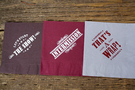
Mr. Piché’s lounge (in the courtyard) is where our guests could watch “Butch Cassidy and the Sundance Kid” on cozy furniture and snack on movie treats from the “concession stand” or mini cones with salted caramel and lavender ice cream (Ed note: yum!) – while singing along to the live music of Syd and Matt York. For guests wanting to dance, Mrs. Pichés lounge (in the art gallery) offered a hip local DJ, as well as the opportunity to watch “Grease” and try treats from the dessert bar including a wedding cake covered in 300 truffles, Poco Dolce chocolate tastings accompanied with port, and an array of French macarons baked by the chef.

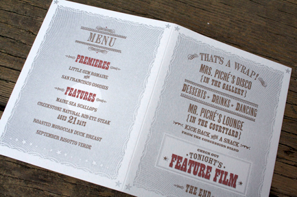
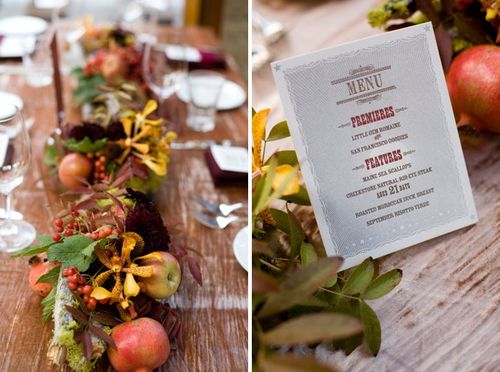
The vintage cinema theme was also incorporated into these reception cards, which were provided on each dinner table and contained both the menu and details for each lounge:

Danielle-Tallulah-Dinner-Menus

Danielle-greg-cinema-inspired-wedding-menu

As a final touch, favors from Poco Dolce chocolates packaged in a little paper box printed with the saying all old movies end with “And they lived happily ever after.  The End.”  Such a nice touch!

Danielle-Tallulah-Favor-Bags

Do you all love Danielle’s invitations and wedding stationery as much as I do?  I love the foreign cinema theme – and both Danielle and Hello!Lucky did an amazing job in translating the inspiration into a beautiful design.  For more photos from Danielle and Greg’s wedding, be sure to check out their feature on Snippet and Ink right here – and a huge thanks to Danielle for sharing her wedding stationery with us!

Yeehaw! Save the Dates

Molly from Paisley Quill recently sent over these fabulous Save the Dates – and I’m loving the rustic design inspired by some of the more iconic aspects and spirit of New Mexico:

Paisly-quill-yeehaw-save-the-dates

Molly says that the couple, Elizabeth and Paul, wanted a non-traditional design inspired by the natural beauty of New Mexico.  Molly added the image of a sunset and some lavender (which apparently grows like weeds all over New Mexico!) and used a desert-inspired color palette for the design.  They also incorporated some Native American basket weave patterns and designs into the Save the Date, since Elizabeth and Paul plan to include Native American traditions in their wedding ceremony.

Paisly-quill-yeehaw-save-the-dates2

The S/Ds were printed on kraft paper and packaged in glassine envelopes.  Since most of Elizabeth and Paul’s guests will be from outside of New Mexico, they decided to give the design a vintage travel-inspired twist by using vintage maps of New Mexico as address labels and completing the entire package with vintage stamps:

Paisly-quill-yeehaw-save-the-dates3

Paisly-quill-yeehaw-save-the-dates4

You can read more about these S/Ds over on the Paisley Quill blog right here.  Thanks so much Molly!

{images via Paisley Quill}