Urbanic Faves | A High Five

Hey everyone! So glad to be back. I can’t believe it’s been a month already since our last post! Around here at Urbanic Paper Boutique we all work pretty hard each day (as I’m sure the majority of you do). Let’s face it, we all need a high five every now and then to keep the momentum up on projects and our spirits high in the midst of a busy work day. Nothing says team camaraderie like an arms up, solid hand slap. We use them for small things …. Look! I just found the earring that a customer lost in the shop last week – HIGH FIVE!  and for bigger deals … I just entered, received, and tagged 500 rolls of washi tape in 10 minutes – HIGH FIVE! 

Today I’m rounding up some of my favorite things from around the shop and beyond in recognition of this celebratory hand gesture. How many people can you think of right now that could use a dose of encouragement? xo – Audrey

A High Five | Urbanic Paper Boutique

1. Candyspotting laser cut card; 2. Meri Meri gold foil tattoos; 3. Sapling Press card; 4. Quiet Whimsy card; 5. Dude and Chic card ; 6. Smock letterpress card; 7. Knock Knock sticky notes; 8. Emily McDowell card; 9. Smarty Pants Paper Co. card; 10. Maid Servant Of wall print; 11.Paul Hess print; 12. Knock Knock notepad, 13. Iron Curtain Press card

 {images via their respective sources}

DIY Tutorial: Hand Tinted Letterpress Save the Dates

Hand tinting was historically used to color black and white photographs before color photography was invented. It was also used on prints made by etching as a means to color them. For this tutorial, we’ll show you how to use this technique to bring a unique, vintage look to your letterpress save the dates or wedding invitations. Not only is it beautiful, it’s also super easy (as in two steps)! – Bailey and Emma of Antiquaria

Hand-tint-Save the Date-Final-1

Hand-tinted-Save the Date-Step1

Step One: We chose two colors for this design: green and pink. When deciding what to do with your letterpress design, consider historical references for colors (searching hand tinted etching or photographs yields nice results).

First, we mixed our green color. We wanted it to be a little yellow tinged so we added some yellow to the green in our palette (see the upper left mixing area). The color needs to be very diluted to have it tint and not paint too heavily cover your letterpress print. Make sure to test your colors on an extra piece to make sure you have the technique down before starting the project.

Another key factor is how dry the brush is when it’s tinting the paper. You do not want it to be wet. Brushing it first against a paper towel helps keep the tint from being to watery. Again, it helps to work through this in testing.

Paint your first color in the desired area (in our case, green on the leaves) and set it aside to dry. Repeat on all cards.

Hand-tinted-Save the Date-Step2

Step Two: Next, you’ll be adding in your second color to the flowers on the design. Mix up your desired color and test it on your spare piece until the color and dilution is right. Brush on the color (in our case, pink) in the desired areas. Set aside to dry and repeat on the rest of your cards.

Hand-tinted-Save the Date-Final-5

Letterpress printing works exceptionally well with hand tinting because it created an indented texture when the print is made. This helps keep your tint in place and prevents coloring outside the lines or blotchiness. If you do end up with too much water on the print, it’s easy to quickly dab it with a clean paper towel and absorb any excess. No harm done!

Hand-tint-Save the Date-FInal-2

We found that the tinting technique worked most beautifully and effectively on our botanical collection of letterpress cards. The softness and vintage appeal lends to the charm of the designs. Of course, the possibilities are as endless as your imagination!

Materials

Savannah Letterpress Save the Date Card. We recommend ordering extra pieces (10% overage) for testing.

Watercolors

Paint brush. We recommend a very nice, small brush so that you have control and precision.

Water cup

Anti­quaria is a mem­ber of the Designer Rolodex – you can see more of their beau­ti­ful work right here or visit the real save the dates gallery for more save the date ideas!

Photo Credits: Antiquaria for Oh So Beautiful Paper

Friday Happy Hour: The Cocktail

We’ve written about a lot of different kinds of drinks: some with long ingredient lists and others that literally take weeks to prepare and others that are super simple to throw together. But we’ve never written about the foundation of all those other drinks: the Cocktail. That’s it, just: the Cocktail. So let’s kick off a month of back-to-basics with the most basic drink of all. – Andrew

OSBP-Signature-Cocktail-Recipe-The-Cocktail-1

OSBP-Signature-Cocktail-Recipe-Illustration-The-Cocktail

Illustration by Shauna Lynn for Oh So Beautiful Paper

The Cocktail

Spirits
Bitters
Sugar
Ice

Put everything together and shake. Or stir. Strain into a glass and serve over more ice. Or straight up. With a garnish (we used a brandied cherry). Or not. Your call. Enjoy!

That’s it: spirits, bitters, sugar, and ice. Every other cocktail is a variation or elaboration on this theme. It’s at least 200 years old and probably older (Americans have been loving their booze for a long time), and it’s just as good now as it was (as I love to imagine) back then.

Ok: so how to turn this list of ingredients into a drinkable drink? Easy: 2 oz of spirits, two dashes of bitters, and 1/2 simple syrup in a glass with ice and…that’s it. Give it a stir to mix in the sugar, but otherwise, that’s literally all you have to do. This comes from the oldest detailed recipe for a Cocktail I’ve seen. From 1833.

OSBP-Signature-Cocktail-Recipe-The-Cocktail-6OSBP-Signature-Cocktail-Recipe-The-Cocktail-7

Because Americans love taking a thing and figuring out how they can make it even better (and how they can add bells and whistles), it didn’t take long before the simple perfection of the Cocktail evolved into the Plain Cocktail – add a dash or two of orange liqueur and a squeeze of lemon peel – and then the Fancy Cocktail, same as the Plain, just throw the lemon peel in as garnish, and then the Improved Cocktail with a couple dashes Maraschino liqueur and a dash of Absinthe in place of the orange liqueur. These are all great. I recommend trying these versions out too. Just try the Cocktail first.

Spirits? Make sure you’re using solid pot-still liquor here: whiskey, genever, brandy aged rum, Tequila or Mezcal, that sort of thing. Steer clear of lighter, clear spirits, like dry gin or unaged rum, that won’t have enough body or flavor to support a drink as bare-bones as this. Bitters? Aromatic. Sugar? Syrup is easier to mix, while granulated sugar looks a little cooler. It also doesn’t mix as well as syrup, so you’ll need to muddle the sugar with the bitters before you add everything else. The amount of sugar you’ll need will vary based on your taste and on the sweetness of the spirits you’re using. A sweet bourbon will need less sugar than a malty and sharp genever.

Shaken or stirred? I like stirring myself, it dilutes the drink less and leaves it with a cleaner look, or just building the drink over ice. Garnish? Drop a lemon twist, or grate some nutmeg, or plop in a brandied cherry, or leave it alone. No rules. Go wild.

Here’s how I made the Cocktail in Nole’s beautiful photographs: an ounce of brandy, an ounce of rye whiskey. Two dashes of Fee Brothers Aromatic Bitters and an eighth of an ounce of rich simple syrup. Stirred, strained, and garnished with a brandied cherry. Beautiful.

OSBP-Signature-Cocktail-Recipe-The-Cocktail-15

Don’t forget to let us know if you try any of our recipes. And if you do make one at home, you can use #osbphappyhour to share photos of these (or your own creations) on Instagram.

Photo Credits: Nole Garey for Oh So Beautiful Paper

DC Guide: Where to Eat, Part 2

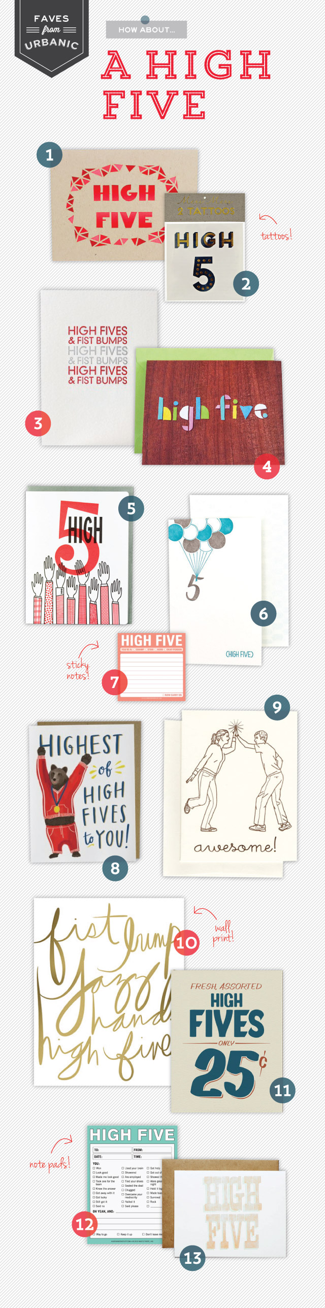
A couple of years ago, we shared our very first mini guide to DC – including some of our favorite restaurants in the District. And with the cherry blossom season only a few weeks away, I thought it might be time to share a little update for any of you planning Spring trips to DC. Now, our dining habits have changed quite a bit in the last two years thanks to Sophie, so most of these are either in our Capitol Hill neighborhood or the nearby H Street corridor – but luckily they’re all really good! And while we might not be the best at keeping up with the trendiest new restaurants, we can offer a few tried-and-true recommendations.

Molly-Jacques-DC-Guide-Illustration-Oh-So-Beautiful-Paper

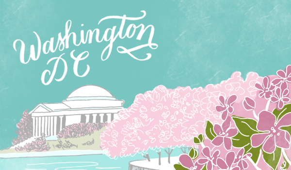
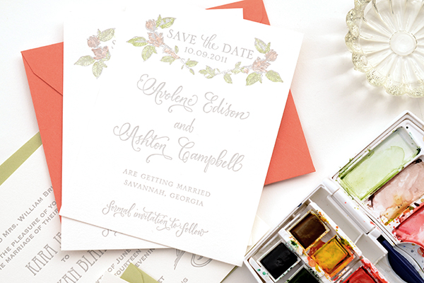
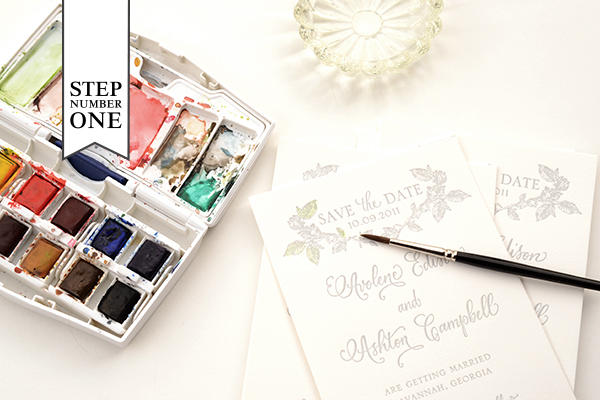
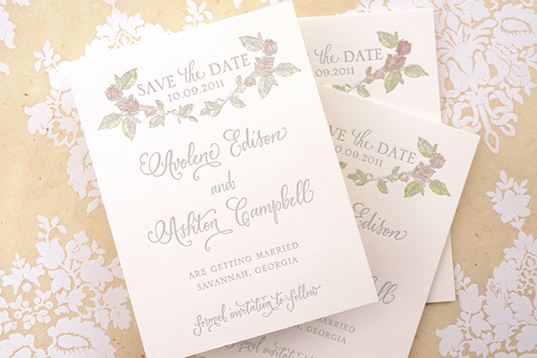
Illustration by Molly Jacques for Oh So Beautiful Paper

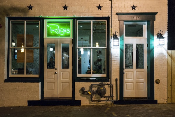
Rose’s Luxury: I don’t think I could possibly say enough good things about Rose’s Luxury. This amazing restaurant opened up in our neighborhood just a few months ago and has earned rave reviews from every single food critic in town (examples here and here). We visited Rose’s Luxury shortly after their October opening with Sophie in tow, and it’s easily the best meal we’ve had in recent memory. They also have an amazing drink menu with several seriously delicious cocktails. And if all of that wasn’t enough, the staff was amazing with Sophie – even taking her on a little tour of the restaurant so we could have a few more minutes to enjoy our meal! Go, and you won’t regret it.

Roses-Luxury-EaterDC

Rose’s Luxury via EaterDC

The Red Hen: It’s surprisingly difficult to find good pasta in DC (or good Italian food, for that matter), so we were pleasantly surprised when we visited The Red Hen a few weeks ago. We focused in on the pasta, but based just on our one experience I’d wager that everything on the menu at this Italian-influenced American restaurant is incredible. You’ll also definitely want to save room for dessert: Sophie was a big fan of the maple custard with hazelnut crumble. We saw several other families dining there during our visit, and they even have counter-height high chairs for tiny patrons so you don’t have to wait for a table!

Union Market: Union Market isn’t a single restaurant, but rather a large market comprised of shops, artisan vendors, and multiple casual dining options. It’s one of our favorite spots for a casual lunch or dinner. We’re partial to the sandwiches from Red Apron Butcher, the Korean tacos from TaKorean, and the hummus from DC Mediterranean Corner, but you’re bound to find something you love at Union Market.

Graffiato: Graffiato is probably the only non-kid-friendly restaurant on this list, but it’s worth a special night out. We indulged in our last pre-Sophie night out meal at Graffiato and still talk about it today. We went with the tasting menu, but you can’t go wrong here. Just be sure to make a reservation well in advance: it’s one of DC’s most popular spots!

District Taco: For a casual family night out, we’re big fans of food truck turned brick and mortar restaurant District Taco. Everything is simple, made daily from fresh ingredients, and really delicious. From fish tacos to quesadillas to soft tacos, you can’t go wrong here.

Beuchert’s Saloon: We were so happy when this restaurant opened in our neighborhood last year! A re-imagining of an 1800s saloon and Prohibition-era speakeasy, Beuchert’s devotes equal focus to both its food and drink menus. On the food side, Beuchert’s sources most of its ingredients from local farms and co-ops with delicious results, while the house cocktail menu includes several throwbacks to the restaurant’s long saloon history. So good!

Batter Bowl Bakery: Located along the H Street corridor, Batter Bowl Bakery is one of our favorite neighborhood lunch and brunch spots. The menu includes a variety of breakfast platters and open faced sandwiches, along with a range of freshly baked pastries. If you’re a coffee drinker, you’ll love Batter Bowl Bakery: the lattes are some of the best we’ve found in DC yet.

Founding Farmers: Speaking of brunch, we would be remiss if we didn’t recommend brunch at Founding Farmers. You’ll need to make reservations well in advance, but the menu of farmhouse hashes, cast iron skillets, and signature breakfast dishes is well worth the advance planning. We visited with my in-laws just before Sophie’s first birthday, and everyone at the table (Sophie included!) was a big big fan.

p.s. DC is lucky to have two amazing food critics, so if you’re planning a visit to DC you’ll definitely also want to check out both the Washingtonian and Washington Post restaurant sections and even some of the DC foodie blogs like Metrocurean and Eater DC for the latest openings and reviews.

Courtney + Nate’s Wisconsin Lake Wedding Invitations

Created for a summer wedding along a lake in Madison, Wisconsin, these wedding invitations from Sugar River Stationers feature a beautiful line illustration of Madison and wave-inspired laser cut details. But my favorite detail? The wood box mailer, a fun nod to the groom’s profession as a distiller!

Wisconsin-Lake-Wedding-Invitations-Sugar-River-Stationers2

From Heather: We designed these wedding invitations for a July 2013 wedding in Madison, Wisconsin. I would categorize Courtney and Nathan’s stationery as “quirky” with lots of character. Courtney is an elementary school teacher and Nathan owns a distillery in Madison. The suite features an original line art illustration of Madison, as well as supplemental illustrations used in the custom stamps and various “day of” items. The couple live along one of Madison’s largest lakes and spend a great deal of time together boating.

Wisconsin-Lake-Wedding-Invitations-Sugar-River-Stationers

The invitation suite was mailed in a slide top wood box. Given that Nathan owns a distillery, the wood box and excelsior packaging appealed to him. Inside, the presentation layer features a laser-cut pocket with tag detail on the front.

Wisconsin-Lake-Wedding-Invitations-Sugar-River-Stationers4

The invitation is booklet format, with illustration and additional items such as the RSVP, map and accommodations card were housed inside the laser cut pocket. The RSVP features an original photograph of Courtney and Nate changed to vector art. We created custom stamps with another original illustration of Courtney and Nate sitting on a pier in front of the house and used the boat illustration for a circle cut tag that was placed around succulents used as favors.

Wisconsin-Lake-Wedding-Invitations-Sugar-River-Stationers3

Wisconsin-Lake-Wedding-Invitations-Sugar-River-Stationers5

Thanks Heather!

Design: Sugar River Stationers

Illustration: Steph Davies

Check out the Designer Rolodex for more tal­ented wed­ding invi­ta­tion design­ers and the real invi­ta­tions gallery for more wedding invitation ideas!

Photo Credits: Harper Fritsch Studios and Maureen Cassidy Photography