Brick + Mortar: Clementine Turns 5! (+ a giveaway!)

On Clementine’s 4th birthday last year, I started daydreaming about collaborating with beloved stationery designers on a few custom cards. I had plenty of time. But as the months went on, I talked myself out of it: maybe it would be asking too much; or the project wouldn’t make sense to customers; and I couldn’t ask some designers but not others. So, I shelved the idea. But the year went on and the daydream still tapped lightly, so I went for it. I emailed each designer, asking them to jump in. I hope my joy in this project translates, but for a little extra, Nole + I are giving away a full set of everything to one card-loving reader! –Emily of Clementine

Clementine Turns 5! And a giveaway! / Oh So Beautiful Paper

The Clementine Turns 5 Card Set!

As designers said yes, I emailed back with two things: 1) What I loved most about their work and 2) a few ideas for what I’d love to see them try. Through this process, the goal became clear: I wanted to highlight the joy that stationery has brought to Clementine, and I wanted to give die-hard stationery lovers a set of cards they could use to send love and laughter into their world. Here are the 14 cards:

People I've Loved for Clementine Turns 5! And a giveaway! / Oh So Beautiful Paper

Carissa of People I’ve Loved understands all of the parts of being human that I love. Joy, frustration, maybe both together.

Iron Curtain Press for Clementine Turns 5! And a giveaway! / Oh So Beautiful Paper

I knew Rosanna of Iron Curtain Press would nail the lightning bolts that fly in love and friendship when you’re such a fan.

Belle and Union for Clementine Turns 5! And a giveaway! / Oh So Beautiful Paper

There’s no one to better to capture the sweet Vermont-Americana than Meg of Belle + Union Co. And there’s no creamee better than a maple creamee, in case you needed a reason to visit Vermont.

Letter & Lark for Clementine Turns 5! And a giveaway! / Oh So Beautiful Paper

I askedColleen of Letter + Lark to capture something between parent and child. Her cards are so poetic and the back and forth between us made me cry more than once.

E.Frances Paper for Clementine Turns 5! And a giveaway! / Oh So Beautiful Paper

I sent Ali, of E. Frances, a phrase that my momma said to me. I hope other families love her Brussels sprouts as much as I do (as always, the back of the card has a little love surprise!)

May Day Studio for Clementine Turns 5! And a giveaway! / Oh So Beautiful Paper

I’ve long wanted Kelly of May Day Studio to add another sweet bold card to her stack, this silver lullaby was an easy choice.

CT5Sapling

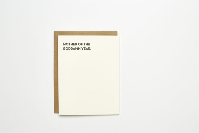
I’ve been saying this phrase to mama friends for a while now and there was no-one better than Lisa from Sapling Press to conspire with to print it.

Birdwalk Press for Clementine Turns 5! And a giveaway! / Oh So Beautiful Paper

Mina and Ian of Birdwalk Press know how to pack a punch into beautiful foil type. I wanted a card to send to friends in moments of “I don’t think I can.”

Near Modern Disaster for Clementine Turns 5! And a giveaway! / Oh So Beautiful Paper

Speaking of friendship, I knew Sam from Near Modern Disaster was the lady to design a card about the unspoken rules of true friends.

Ink Meets Paper for Clementine Turns 5! And a giveaway! / Oh So Beautiful Paper

I asked Allison + Daniel of Ink Meets Paper to balance the light side of friendship and family with how deep those bonds can be.

Parrott Design Studio for Clementine Turns 5! And a giveaway! / Oh So Beautiful Paper

Lately, I’m drawn to cards that celebrate people just for being. I knew Sarah of Parrot Design Studio could mix neon and pattern to produce the perfect punch of love.

Marnetta for Clementine Turns 5! And a giveaway! / Oh So Beautiful Paper

Abbey of Marnetta sketched this saying on instagram and I tracked her down to say: Please make this into a card. Lots of donuts ensued.

Printerette for Clementine Turns 5! And a giveaway! / Oh So Beautiful Paper

I just wanted Catherine of Printerette to make a card that felt like hugs. She did it with rainbows.

Banquet Workshop for Clementine Turns 5! And a giveaway! / Oh So Beautiful Paper

I sent Sarah of Banquet Workshop a photo of a watermelon my grandmother painted 40+ years ago. Sarah got it, plus a sentiment I couldn’t love more.

These last few weeks were a whirlwind of drafts, designs and sweet surprises. Several designers said no too, for good reason: time, energy, the constraints of the project didn’t fit with their style. I know I am lucky to be in a world where so many people said yes. Thank you. It brought bushels of joy and fun (and I would probably do it every year for ever in case anyone is wondering.)

I hope you all love this set as much as I do and for a chance to win your own set, just follow the options on Rafflecopter below!

a Rafflecopter giveaway

Behind the Stationery: Sapling Press

Our next designer is one of my favorites because whenever I need a good laugh, Sapling Press is there. Lisa’s simple cards with a bold and clever sense of humor are right up my alley – and I particularly look forward to her new offerings each year. Lisa has grown her business from a one-woman show to leading and managing a staff and working with other local businesses. I am so honored to share their story today. Here’s Lisa! –Megan

Behind the Stationery: Sapling Press / Oh So Beautiful Paper

Before starting Sapling Press in 2003, I worked in Baltimore as a full-time graphic designer for a small firm. I became interested in letterpress printing and I contacted the letterpress professor at MICA and she was nice enough to give me a 4-hour personal lesson out of her home studio. I fell in love with printing and within a few months I found a studio space, bought my first press, and registered to exhibit at the National Stationery Show. I had no plan, zero product, and absolutely no idea how to run a business – I just went for it.

Behind the Stationery: Sapling Press / Oh So Beautiful Paper

I dedicated as much time as I had to printing and growing my business while working my 9-5. Two years later, my husband and I moved to Pittsburgh and I made Sapling Press my full-time gig. However, shortly after moving I had 2 kiddos back to back, started a side wedding stationery business with a friend, and just took some time to reevaluate my product, plans, and goals for Sapling Press. Those years were crazy hard, but I was in it to win it. In 2010, I basically started over and re-introduced Sapling Press with the look and vibe that we’re known for today.

Behind the Stationery: Sapling Press / Oh So Beautiful Paper

I’ve moved my shop three times within the last five years all within the city of Pittsburgh. Our shop is currently located in a 3-story building in the borough of Lawrenceville, close to lots of great shops and other small businesses. The first floor is dedicated to printing, production, and classes, while the middle floor is reserved for packaging, shipping, and meetings. I rent out the 3rd floor to my husband who has his own design firm.

Behind the Stationery: Sapling Press / Oh So Beautiful Paper

While we don’t sell any products out of the space, we have a retail store front where our presses sit front and center. Having people stop and stare and seeing kid’s faces pressed against the window definitely took some time to get used to, but we love watching people watch us and the presses in action.

Behind the Stationery: Sapling Press / Oh So Beautiful PaperEverything we do is letterpress printed in house. While there are a ton of great letterpress stationery companies out there, I think our minimal design and copywriting sets us apart from some of the others. Smart words on a page – that’s our thing. Humor has also been known to be our calling card. 99% of our products have no real sentiment or intention other than to make someone laugh. A few years ago, I started reaching out to folks in the hopes of collaborating on some cards. The collaborations have lead to great friendships, lasting partnerships, and have resulted in some of our best selling cards. Working with others is something that we’ll always do.

Behind the Stationery: Sapling Press / Oh So Beautiful Paper

I hired my first full-time employee almost four years ago. There are now seven of us here, and everyone has their own role in the business. The shop employs 3 printers, 2 packagers, and a project coordinator who runs everything else behind the scenes. We meet every Monday to go over the week in regards to deadlines, meetings, custom orders, etc…and then we each go our separate ways and do our thing throughout the week.

Behind the Stationery: Sapling Press / Oh So Beautiful Paper

Behind the Stationery: Sapling Press / Oh So Beautiful Paper

Behind the Stationery: Sapling Press / Oh So Beautiful Paper

As the business has grown, I’ve found myself sitting more behind the desk than behind the press, which has been my biggest adjustment within the business. These days I play the role of creative director, head of product development, social media maven, and all the other non-glamorous jobs that come along with owning a business. When I’m not here at the shop, I’m busy being a mom and shopkeeper at Sapling & Sons, a separate retail shop I opened almost one year ago. I like to stay busy.

Behind the Stationery: Sapling Press / Oh So Beautiful Paper

I struggle with time management more than anything else. Because I’m a night owl, I sometimes count all 24 hours in the day as possible working hours. I’m a lot better than I used to be, but I still enjoy an all nighter every once in a while. The majority of my ideas, designs, and scheming are all done after midnight. My inspiration comes from anywhere and everywhere. I love watching sketch comedies. I like pop culture. The wordsmiths of ’90s hip hop. I love people watching. When something gives me pause, or I find myself laughing at something, I make a note of it on my phone. Why did I laugh, what memory did that spark, who did that make me think of, and so on. That rabbit hole usually leads me to a new idea which is always just one card.

Behind the Stationery: Sapling Press / Oh So Beautiful Paper

Because I design in complete collections instead of individual SKUs, I think about how we could expand on that one card. In the end, the result is usually about 8-12 cards within that collection. As time goes on, I’ve realized we seem to have a bit of a formula. A caffeine reference, a grammar reference, a pop culture reference, and so on. I write what I can, keep what I think is good, and then reach out to my collaborators to see what they can add.

Behind the Stationery: Sapling Press / Oh So Beautiful Paper

Once I go through their ideas, I filter them down a bit, and then share them with the team. The ideas are printed out, and everyone is asked to read them on their own and simply make a note as soon as one makes you laugh out loud. Those are always our winners. Designing this way has us expanding our line by about 40-50 new cards a year, keeps us current, and continues to help the business grow in every direction possible. Our next endeavor is a brand new website, product lines that go beyond stationery, and a collaboration between some of our favorite local designers on a new line of Sapling Press wedding stationery. Gotta love the hustle!

Behind the Stationery: Sapling Press / Oh So Beautiful Paper

Photos by Matt Dayak

Interested in participating in this column? Reach out to Megan at megan(at)ohsobeautifulpaper.com for more details about Behind the Stationery.

A Kentucky Mule

This month, we thought we’d have some fun with bourbon cocktails. Bourbon, that most American of spirits, is rich and sweet and brown and ideal for fall cocktails. We had in mind lots of dark, brooding bourbon cocktails for fall, but suddenly we find ourselves with temperatures near the 80s in November, so we’re starting out the month a little differently, with a drink that fits this weird in-between weather we’re having, the Kentucky Mule. – Andrew

Kentucky Mule Cocktail Recipe / Liquorary for Oh So Beautiful Paper

The Kentucky Mule

2 oz Kentucky Bourbon
3/4 oz Lime Juice
4-6 oz Ginger Beer

Combine the bourbon and lime juice in a copper mug or highball glass filled with crushed ice, then top with the ginger beer. Give the drink a stir, garnish with a mint bouquet, and enjoy!

Kentucky Mule Cocktail Recipe / Liquorary for Oh So Beautiful Paper

The Kentucky Mule is a descendant of the Moscow Mule, a drink invented in the 1940s as gimmick to convince Americans to drink more vodka. At the time, American drinkers were apparently more discerning and had not yet fallen in love with the Russian spirit that is – by U.S. law – odorless and colorless and flavorless. (In case you hadn’t noticed, I’m not a fan of vodka, because I wouldn’t drink a tasteless spirit any more than I would eat a flavorless steak.)

The combination of tart lime and spicy, zippy ginger beer offers a smooth and easy template that you can apply to spirits with actual flavor. Like bourbon. The Kentucky Mule has those rich, oaky notes of the bourbon, but is a refreshing, effervescent drink with a lot of pep to it.

Kentucky Mule Cocktail Recipe / Liquorary for Oh So Beautiful Paper

Bourbon is a whiskey made from at least 51% corn. That corn lends bourbon a sweeter profile than other whiskeys, that same sweetness you get when you bite into a roasted ear of sweat corn on the Fourth of July. Not all of it is made in Kentucky, but a lot of it is, and it gets its name from the eastern part of Kentucky that was once called Old Bourbon and contains, fittingly enough, Bourbon County. This is where American colonists found huge tracts of land perfect for growing corn, and bourbon eventually would come to outstrip rum and rye whiskey, the original American spirits.

(Don’t forget to follow us on Instagram, where we’ve been posting our experiments before they make their way onto this column!)

Glassware by Liquorary

Photo Credits: Nole Garey for Oh So Beautiful Paper


Finding the Paper: Type Twenty Seven

When Parse & Parcel settled into our sample studio we made sure to carve out a space conducive to Friday happy hours with our office mates. We knew after a busy week of making mockups, packing parcels and shipping samples we’d be ready for a cocktail (or two). Of course it’s stocked with all the necessary essentials – booze, barware, mixers and ice – all that’s been missing is the perfect coaster set. Then we came upon The Mixed Up Alphabet of Cocktails. In this installment of Finding The Paper, we’ll see how Type Twenty Seven combined their love of type and print with cocktails. – Jill

Finding the Paper: Type Twenty Seven / Parse & Parcel for Oh So Beautiful Paper

On the second floor of a converted, mid-town Cleveland warehouse is Type Twenty Seven, a graphic design and letterpress studio. Type Twenty Seven is known for mixing modern technology with lead type and vintage printing presses. It’s little wonder that when it came time for the studio to do a self-promotion, a type driven design would be at the center of the concept.

Finding the Paper: Type Twenty Seven / Parse & Parcel for Oh So Beautiful Paper

The Mixed Up Alphabet of Cocktails incorporates unique illustrations and custom typography to showcase classic and modern cocktails for each letter of the alphabet. That’s twenty six different cocktails, or six months of weekly happy hours. This self promotion consists of poster, coaster set and packaging design that showcases the beauty of letterpress printing. The use of a toothy, cotton paper adds a layer of tactility to the piece and is a perfect choice for packaging design. Haptics (the science of touch) has become a hot topic in packaging design of late. Did you know that packaging featuring tactile papers and print techniques like letterpress actually increases a product’s perceived value?

The Mixed Up Alphabet of Cocktails features a limited edition poster and packaging sleeve letterpress printed on Reich Savoy 100% Cotton in 92# Natural White cover stock, produced using a 1967 Vandercook Universal III printing press. This process produces a highly tactile feel where the ink is pressed into the surface, creating an impression. Savoy is a bit different from some other 100% cotton papers commonly used for letterpress printing in that it works well when scoring and folding – something that can be troublesome on bulkier, softer stocks. The choice of basis weight was smart as well, just enough heft to give the poster and box sleeve body and sturdiness, but not too heavy so as to create print production difficulties.

Finding the Paper: Type Twenty Seven / Parse & Parcel for Oh So Beautiful Paper

The coasters were letterpress printed on a high absorbent, heavy 2.0mm coaster stock with black ink. Produced on two vintage presses, a 1924 C&P Pilot printing press, and an 1890’s C&P hand-feed printing press. They’re almost too pretty to use!

The inspiration for the project was fueled by Type Twenty Seven’s love of cocktails. The idea that anybody can mix and match ingredients to make their own cocktail led to creating a set of coasters that would encourage people to try new recipes. They wanted it to be fun to read, playful, and—most of all—perfect for any party. Showcasing some more unique and lesser known cocktails might encourage people to interact with their drink coasters more often.
Finding the Paper: Type Twenty Seven / Parse & Parcel for Oh So Beautiful Paper

Finding the Paper: Type Twenty Seven / Parse & Parcel for Oh So Beautiful Paper

Not only are they a fab print sample to have on hand but they also do double duty for our Friday happy hours!

Hazel’s Fall Harvest First Birthday Party Invitations

For her daughter Hazel’s first birthday, my friend Maggie worked with Courtney from Swiss Cottage Designs to create the most fun and whimsical Fall Harvest-inspired invitations. And I’m so excited to share them here on OSBP today, along with photos of some of the party details from the talented ladies at Sweet Root Village! The invitations feature watercolor illustrations by Courtney paired with plaid patterns, a cute insert featuring Hazel’s monthly baby photos, and the most adorable (and completely perfect) vintage stamps. The whole thing came together so beautifully!

Fall Harvest First Birthday Party Invitations by Swiss Cottage Designs / Photo Credit: Sweet Root Village / Oh So Beautiful Paper

From Courtney: Hazel’s invitations were inspired by colors found during autumn and that cozy feeling you get during this time of year. We wanted the invitations to be fun and cute but nothing that was too overtly baby. I created a watercolor border made up of different autumnal elements and complemented that with a fun little fox friend (complete with party hat!) We contrasted the hand illustrations with the bold envelope and graphic plaid liner.

Fall Harvest First Birthday Party Invitations by Swiss Cottage Designs / Photo Credit: Sweet Root Village / Oh So Beautiful Paper

Fall Harvest First Birthday Party Invitations by Swiss Cottage Designs / Photo Credit: Sweet Root Village / Oh So Beautiful Paper

Love those beautiful plaid patterns!

Fall Harvest First Birthday Party Invitations by Swiss Cottage Designs / Photo Credit: Sweet Root Village / Oh So Beautiful Paper

From Maggie: We loved how the invitations perfectly embodied the party’s look and feel with the gorgeous plaids and whimsical animals.

Fall Harvest First Birthday Party Invitations by Swiss Cottage Designs / Photo Credit: Sweet Root Village / Oh So Beautiful Paper

And here are some of the amazing party details by Maggie!

Fall Harvest First Birthday Party / Photo Credit: Sweet Root Village / Oh So Beautiful Paper

Fall Harvest First Birthday Party / Photo Credit: Sweet Root Village / Oh So Beautiful Paper

Fall Harvest First Birthday Party / Photo Credit: Sweet Root Village / Oh So Beautiful Paper

Fall Harvest First Birthday Party / Photo Credit: Sweet Root Village / Oh So Beautiful Paper

Fall Harvest First Birthday Party / Photo Credit: Sweet Root Village / Oh So Beautiful Paper

Fall Harvest First Birthday Party / Photo Credit: Sweet Root Village / Oh So Beautiful Paper

Fall Harvest First Birthday Party / Photo Credit: Sweet Root Village / Oh So Beautiful Paper

Fall Harvest First Birthday Party / Photo Credit: Sweet Root Village / Oh So Beautiful Paper

Fall Harvest First Birthday Party / Photo Credit: Sweet Root Village / Oh So Beautiful Paper

Fall Harvest First Birthday Party / Photo Credit: Sweet Root Village / Oh So Beautiful Paper

Thanks Maggie and Courtney!

Invitation Design: Swiss Cottage Designs

Swiss Cottage Designs is a member of the Designer Rolodex – you can see more of Courtney’s amazing work right here or visit the real invi­ta­tions gallery for more wedding invitation ideas!

Photo Credits: Sweet Root Village