Refined Powder Blue and Vellum Baby Announcements

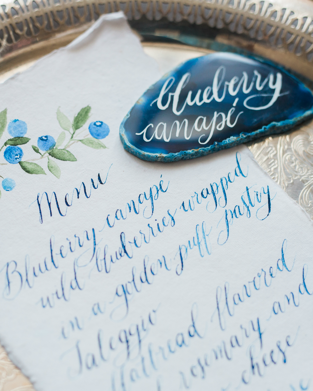
We love love love watching our Designer Rolodex friends celebrate milestones, like adding to their families! And today is truly a special day, because we get to share the baby announcements that Jackie of Sincerely, Jackie designed for her little guy Richie’s welcome into the world! Jackie is known for her elegant invitation design, so it’s no surprise that she created these stunning and refined powder blue and vellum baby announcements for her own sweet boy. Congrats to the happy, and adorable, family!

Refined Powder Blue and Vellum Baby Announcements

From Jackie: We wanted these announcements to be a simple declaration of both Richie’s birth and his coming home, over three months later. When I was first hospitalized with HELLP Syndrome, my husband and I made the decision to be public with our journey. Many, many people kept us in their thoughts and prayers after our son was born 14 weeks early. We ended up mailing several hundred birth announcements, and I never shared the sentimental story behind them.

Refined Powder Blue and Vellum Baby Announcements

They may be overly simple, but they’re more meaningful than they appear. I purposefully kept the typography clean, and the colors subtle because I did not want to detract from the three most important things: Richie’s announcement, our two favorite photos, and the song that planted itself in my heart.

Refined Powder Blue and Vellum Baby Announcements

The announcements were digitally printed in a soft blue-grey on cotton paper, and contained two cards, each with a photo on one side, and typography on the other. The first, smaller card was our actual announcement containing both the date Richie was born (May 26, 2016, weighing 2lbs 2oz, and only 13.75″ long), and the day he came home from the NICU, 99 days later (September 1, 2016, weighting 7bs 6oz, and 20.25″ long) . The second card contained the lyrics from “Amazing Grace.”

Refined Powder Blue and Vellum Baby Announcements

When you go through something as life-changing as what my little family endured, you find peace anywhere it is offered. For me, I found that peace driving to the NICU one morning when “Amazing Grace” was playing on the radio. I hadn’t really cried before that. Not like, cried cried, if you know what I mean. But in the car that day, I had to pull over to the side of the highway to catch my breath. I felt an overwhelming sense that we’d be alright. Nearly every day after that, I would listen to any version of “Amazing Grace” that I could find on YouTube. About halfway through our NICU stay, little Richie was transferred from an isolette (incubator) to an open crib. A nurse, Patti, found a mobile in a storage room and felt compelled to get it to start working again. She stayed late that day to fiddle with the mobile, and proudly announced the next day that she had gotten it to work. The first song it played was “Amazing Grace.” I remember just standing there, in awe, as my little miracle baby slept peacefully under the mobile in his crib.

Refined Powder Blue and Vellum Baby Announcements

After Richie came home, I sang “Amazing Grace” every single night while I rocked him to sleep. It’s become the melody of our journey, and I felt it was important to include that in Richie’s birth announcement, although not many people knew the story behind it.

Refined Powder Blue and Vellum Baby Announcements

In addition to the two birth announcement cards, we added the invitation to our son’s baptism, which was sent to a select few family members. The baptism invitation featured a verse on one side, and the baptism details on the other, neatly slipped into a vellum envelope.

Refined Powder Blue and Vellum Baby Announcements

Thanks Jackie!

Design: Sincerely, Jackie

Styling: Kristen Poissant

Sincerely, Jackie is a member of the Designer Rolodex – you can see more of their beautiful work right here or visit the real invi­ta­tions gallery for more wedding invitation ideas!

Photo Credits: Charlie Juliet Photography

A Tequila and Mezcal Old Fashioned

When people think of Tequila and Mezcal, those wonderful Mexican spirits distilled from agave plants, they often think of Sours – Margaritas, Palomas, and the like. And agave spirits really do love all those citrusy, fruity flavors – lime, grapefruit, watermelon, you get the idea. But sometimes you don’t want something that fruity and light. Sometimes you’re in the mood for something dark and rich, something to sip on. And agave can do the trick for that, too. Here’s our take on a classic cocktail: a Tequila and Mezcal Old Fashioned. – Andrew

A Tequila and Mezcal Old Fashioned Cocktail Recipe

Tequila and Mezcal Old Fashioned

2 oz Tequila or Mezcal (or Both)
1 barspoon Simple Syrup
2 dashes Angostura Bitters

Combine the Tequila (or Mezcal…or both) with the syrup and bitters in a mixing glass filled with a few big ice cubes. Stir well to dilute, then strain into a rocks or lowball glass. Add a fresh big ice cube and garnish with a piece of grapefruit peel. Enjoy!

A Tequila and Mezcal Old Fashioned Cocktail Recipe

An Old Fashioned made with agave spirits is earthy, vegetal, and luxuriant. This is a drink for slow, languid sipping. Some people like to make their agave Old Fashioneds with agave nectar, the theory going that like goes with like in the world of cocktails. And they’re not wrong; agave nectar is a wonderful sweetener for agave drinks. But there is such a thing as too much of a good thing. I like to balance my agave spirits with some simple syrup – which you can make easily by simmering equal parts raw sugar and water until the sugar is melted – because agave nectar on top of agave spirits can be pretty intense.

A Tequila and Mezcal Old Fashioned Cocktail Recipe

Same goes for bitters. Lots of stirred agave drinks call for chocolate mole bitters, which incorporate other traditional Mexican flavors. And you can give those a try here in place of the Angostura. But I like to balance my agave spirits with more traditional Old Fashioned flavors, to give you something that’s still distinctly vegetal but with some of that smooth mellowness you expect from an Old Fashioned.

A Tequila and Mezcal Old Fashioned Cocktail Recipe

So, Tequila or Mezcal? Aged or unaged spirits? Your call. Aged spirits will give you a smoother drink, while young or silver spirits will give you cleaner notes of agave. Mezcal’s smokiness is not for everyone, but a bit of Mezcal in the mix with Tequila – a “split base” for your cocktail” – is one way of adding some depth to your cocktail without making it too smokey.

So mix one of these up, sit back, and relax…

(Don’t forget to follow us on Instagram!)

Glassware by Liquorary

Photo Credits: Nole Garey for Oh So Beautiful Paper

This post contains affiliate links. By clicking on these links, you’ll help support Oh So Beautiful Paper while also purchasing some fantastic products. We only recommend products that we truly love and trust that you’ll love, too. Our full disclosure policy can be found here.

Blue Agate-Inspired Watercolor Wedding Invitations

A bit of agate-inspired prettiness to brighten your Wednesday! Agate slices and jewel tones are having quite a moment these days, don’t you think? First these gorgeous purple-hued agate-inspired invitations a few weeks ago, and now these vibrant blue agate-inspired watercolor wedding invitations from Debbie Wong Design! The watercolor does a great job of mimicking the unique and varied nature of agate stones. And the hand painted watercolor is even more beautiful when paired with deckle edge paper and modern calligraphy in white ink!

Blue Agate-Inspired Watercolor Wedding Invitations by Debbie Wong Design

From Debbie: The aesthetic and rich jewel tones of agate were the main inspiration for this invitation suite. Blue is incredibly versatile and a beautiful color to use year-round, no matter how seasonal trends may change.

Blue Agate-Inspired Watercolor Wedding Invitations by Debbie Wong Design

Since agate stones come in so many different patterns, the background for the invitation and response card were also unique from one to another, due to the handmade nature of watercolors. Another unique element of agate slices that we wanted to highlight was the unique crystal design at the center of each stone.

Blue Agate-Inspired Watercolor Wedding Invitations by Debbie Wong Design

I decided modern calligraphy was an appropriate style to use for this fun invitation suite, and white ink was the perfect choice to stand out the most against the dark blue tones of the suite. The invitation suite was created on hand deckled cotton rag paper to get a gorgeous texture. Then, the invitation and the response card were tied together with a soft dusty blue silk ribbon from Silk and Willow, before inserting them into a light blue envelope.

Blue Agate-Inspired Watercolor Wedding Invitations by Debbie Wong Design

Vintage stamps were another fun detail we incorporated. Blue stamps fit the theme, but we added a couple of brightly colored stamps to make the envelopes stand out in a fun and vibrant. A blueberry stamp was also incorporated, and this motif tied in with the menu card.

Blue Agate-Inspired Watercolor Wedding Invitations by Debbie Wong Design

The reception was going to be a cocktail style affair, so the menu items were hors d’oeuvres instead of a full seated dinner. The menu was also made on the same hand deckled cotton paper, with a little blueberry painted on the top as the header. We used watercolor to write the appetizer names onto these cards. I knew using watercolor would give the menu cards an organic look with the colors varying slightly from word to word.

Blue Agate-Inspired Watercolor Wedding Invitations by Debbie Wong Design

We used actual agate slices as food labels for the stations at the reception. Brilliant white ink with modern calligraphy was used to match the invitation suite’s calligraphy. I purposely chose three distinctive looking agate stones for the appetizer cards, as no two agates are exact, just like a hand painting. This was such a fun project to orchestrate and I love how it came together!

Blue Agate-Inspired Watercolor Wedding Invitations by Debbie Wong Design

Thanks Debbie!

Design, calligraphy, & hand painting: Debbie Wong Design

Ribbon: Silk and Willow

Check out the Designer Rolodex for more tal­ented wed­ding invi­ta­tion design­ers and the real invi­ta­tions gallery for more wedding invitation ideas!

Photo Credits: Debbie Wong

Spring at the National Arboretum

Spring is far and away my favorite season in DC. I love watching everything wake up and see color come back into the world after months of winter, and all the gorgeous spring flowers fill me with ridiculous levels of joy. It’s my favorite time of year to visit some of my favorite floral destinations in DC: the National Arboretum, Dumbarton Oaks Gardens, and George Washington’s Mount Vernon Estate. When Sophie was on Spring Break a couple of weeks ago, we spent an afternoon wandering around the Dogwood Collection and Asian Collection at the National Arboretum – and I brought my big camera along to document the gorgeousness around us. It was pretty much the perfect time to visit: the dogwoods and azaleas were both in full bloom along with the camellias and bluebells, and the peonies were just starting to make an appearance!

Spring at the National Arboretum

Spring at the National Arboretum

I love visiting the Arboretum year-round, but there’s just something special about early spring at the National Arboretum. Sophie was in heaven with all the pink flowers blooming everywhere. She even ran up to a giant pink azalea bush to give it a hug! I’m so happy that my sweet girl inherited my love for flowers.

Spring at the National Arboretum

Spring at the National Arboretum

Spring at the National Arboretum

Spring at the National Arboretum

Spring at the National Arboretum

Spring at the National Arboretum

Other than the flowers, Sophie loved exploring all the different paths and trails within the garden collections. She made sure we went on every single path in the Asian Collection at least once, and two or three times for a couple of favorite paths that felt like secret fairy trails through all the flowers and greenery.

Spring at the National Arboretum

Spring at the National Arboretum

Spring at the National Arboretum

Oh, and yes, we wear our tiara EVERYWHERE these days. To explore garden trails. To the splash pad. Even to school! People often ask if it’s her birthday, and I love telling complete strangers that it’s part of her everyday attire these days. Four and a half is such a magical age.

Spring at the National Arboretum

Spring at the National Arboretum

Spring at the National Arboretum

p.s. Autumn at the National Arboretum, Fall Foliage Destinations in DC, and the Gardens of Dumbarton Oaks

Autumn Ombré Letterpress Wedding Invitations

I always love the colors of changing leaves in Autumn: crisp red, warm orange, and bright yellow. To create these autumn ombré letterpress wedding invitations, Alex of Al Stampa utilized one of my favorite letterpress printing techniques – the split fountain – to create a wonderful color gradient that evokes all those wonderful autumn colors. Can’t you just see everyone gathered around a fire drinking a cup of warm apple cider??

Autumn Ombré Letterpress Wedding Invitations by Al Stampa

From Alex: This wedding invitation was designed for a sweet couple, Colette and Petey. They wanted a colorful, fire crackling, leaf-turning, autumn wedding, and we wanted to inspire guests with the first piece everyone would receive… the wedding invitation!

Autumn Ombré Letterpress Wedding Invitations by Al Stampa

The wedding took place in Red Hook, Brooklyn at the Liberty Warehouse â€“ right on the water. Colette was the mastermind behind everything having to do with planning her wedding, and she took it all on her own shoulders. It was such a pleasure to be able to take this portion of the wedding planning away from her and ease her to-do list.

Autumn Ombré Letterpress Wedding Invitations by Al Stampa

Because coloring is so important with an autumn wedding, and the fact that it can become quite pricey to letterpress multiple colors, especially for a wedding of 200+ people, I suggested we treat the press, and how I print the colors, similarly to how nature treats the trees in October. We decided to use an ombré technique called a split fountain to make the amazing colors of the season the focus, by inking up the press with various yellows, oranges, and reds and letting it do its work on each invitation. In doing this, each invitation came out a bit different, but with the same amazing gradient effect.

Autumn Ombré Letterpress Wedding Invitations by Al Stampa

The illustration of the branches and leaves were meant to take over the invitation, and also create a large illustrated area that would absorb the ink’s changing of colors perfectly. We paired the branch illustrations with lovely calligraphy by Ashley Curry and a modern typeface to maintain the modernity of the wedding invitations and complement the wedding’s modern warehouse venue. Printed on 120 lb Reich Bright White paper, the invitation had a wonderful heaviness to it – and the beautiful ombré colors made these invitations something really special!

Autumn Ombré Letterpress Wedding Invitations by Al Stampa

Thanks Alex!

Design, printing, and styling: Al Stampa

Calligraphy: Ashley Curry

Paper: Reich Paper

Check out the Designer Rolodex for more tal­ented wed­ding invi­ta­tion design­ers and the real invi­ta­tions gallery for more wedding invitation ideas!

Photo Credits: Roland Kielman and Alex Labriola