Happy Weekend!

This week has been Operation Apple Recipe week for me – we've got tons of apples from our orchard excursion over the weekend and have been trying to put them to good use.  So far I've made soup and stuffing, but this weekend I'm planning to make individual serving apple pies and possibly an apple crisp if I don't put myself into a sugar coma first.  I do have photos from the apple orchard to share with you next week, and may share photos of my baking adventures depending on how things turn out, but in the meantime…

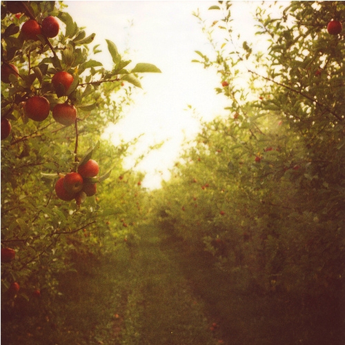
Apple-orchard 

Here are a few things I've enjoyed this week:

That's it for me this week!  I hope you all have a warm + cozy weekend, and I'll see you all back here on Monday!

{image credits: bloom, grow, love via abby sharp}

Real Invitations — Isabel’s Graduation

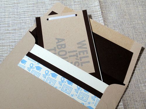
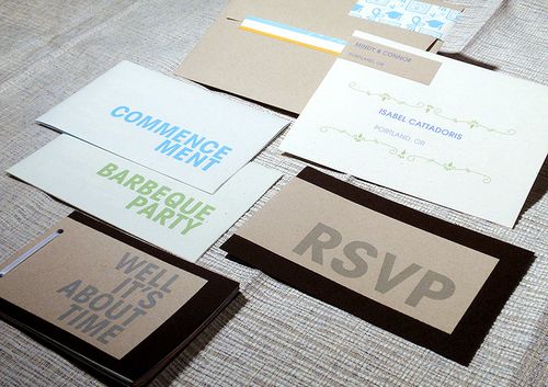
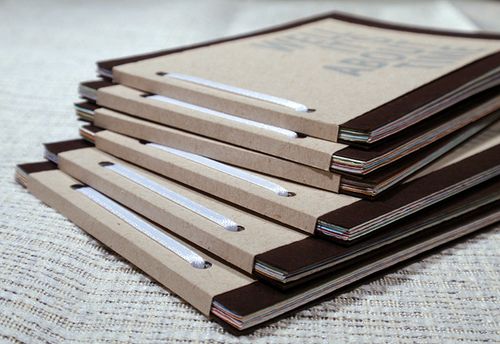
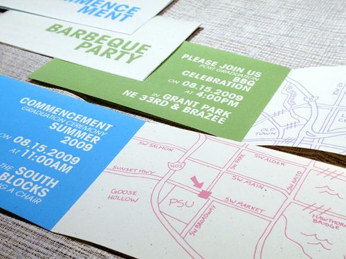
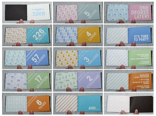
That's right — these aren't wedding invitations, but rather a graduation announcement and party invitation from recent art school grad Isabel!  I love that Isabel celebrated this momentous, six-years-in-the-making (see below), occasion and the beginning of her new graphic design career with an equally monumental booklet invitation:

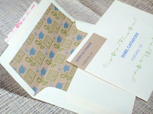
Isabel-graduation-invitation-booklet-envelope-open

From Isabel: I felt my invitations should reflect the career path I'd chosen, as well as tell a story about my education.  And, since I love small keepsakes and all things paper, I wanted each invitation to be a mini souvenir of sorts.  I was very inspired by a couple of my professors at Portland State University, Precious Bugarin and Kate Bingaman-Burt, who encouraged me to use a more hands-on approach to design.  Everything was printed on my home printer.

Isabel-graduation-invitation-booklet

Isabel-graduation-invitation-booklet-cover

Isabel-graduation-invitation-booklet-inside

Isabel-graduation-invitation-booklet-booklet-pages

Isabel-graduation-invitation-booklet-open

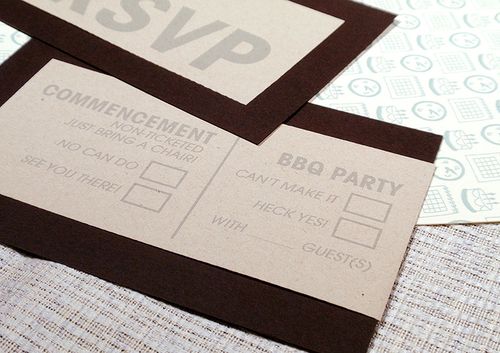
Isabel-graduation-invitation-booklet-RSVP

To make the smaller RSVP envelopes, I took apart and traced one of the large kraft paper envelopes I purchased for the invitations, scanned it in, adjusted the size, then printed, cut out, and glued them together.  I then used that file to correctly size my envelope liners, which were just lightly glued inside the envelopes.

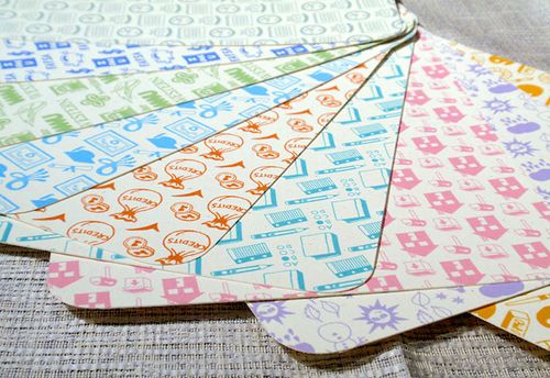
Isabel-graduation-invitation-booklet-patterns

Isabel-graduation-invitation-booklet-RSVP-envelopes

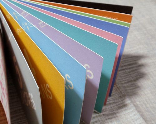
With some tweaking, I was able to print the booklets double-sided.  Once each page was printed and cut to size, I measured the width so I could score the covers to fit around them properly.  I also marked hole-punch guides to save guesswork.  My crocodile hole punch went through all the layers no problem, then I just tightly glued the ribbon on to bind them.  I was able to use the scraps from the booklet pages as envelope sealers, then made stickers to wrap-around seal them as well. 

In addition to the fabulous booklet-style invitation, I love the mix of the neutral kraft paper with brightly colored patterned papers for a more modern design.  Congratulations on your graduation Isabel — and thank you so much for sharing your fabulous invitations!


{image credits: Isabel Cattadoris}

Danielle + Greg’s Vintage Cinema-Inspired Wedding Invitations

So last week was all about music-inspired invitations, and this week I’ve got some totally awesome real wedding invitations inspired by foreign cinema!  Kathryn featured Danielle and Greg’s wedding a few months back, and I was so smitten with her vintage cinema inspiration that I asked Danielle, the talented designer behind Tallu-lah, if she’d be willing to share her invitations and paper ephemera in greater detail.  Lucky for us, Danielle was more than willing to oblige, so let’s get right to it!
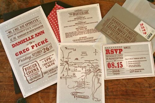
Danielle-greg-vintage-cinema-wedding-invitations

Danielle and Greg’s foreign cinema invitation theme was inspired in part by their wedding venue and in part by their shared love of vintage lettering and illustrations.  With these two ideas they started the creation of a vintage movie themed event:

Foreign-cinema-restaurant

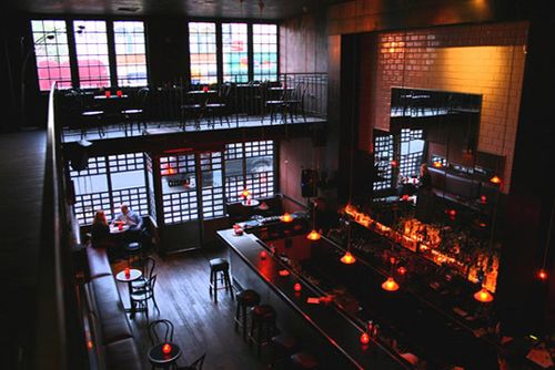
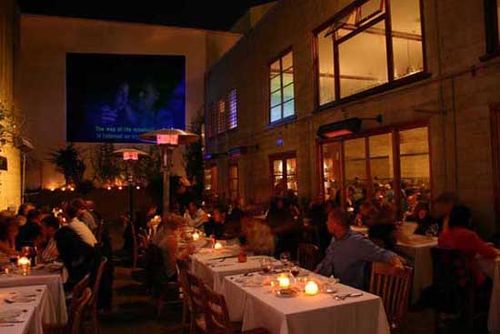
From Danielle: Since we’re both in the wedding industry — I work as an event planner for Samantha Smith Productions and Greg is a wedding photographer — we knew we wanted something unique and fun.  After a year and a half of being engaged and looking at venues all over the United States and Mexico, we finally found a place very close to our personalities and home, Foreign Cinema.  More then just one of the best-known restaurants in the city, the venue includes an outside courtyard where movies are shown drive-in-speaker style and a modern art gallery.  The décor is industrial chic meets Northern California.
Foreign-cinema-restaurant2

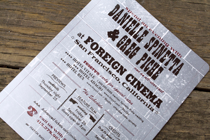
Once they settled on their vintage cinema theme and wedding venue, it was time to get to work on their Save the Dates.  To give their guests their first glimpse into the cinema theme of the wedding, Danielle and Greg created a Save the Date in the style of a movie poster:
Danielle-Tallulah-Foreign-Cinema-Save-the-Date

We created the look and feel and Hatch Show Print of Tennessee made it come to life though old vintage images and the process of letterpress printing.  We used words on the save the date to give guests the feel that they would be coming to a show.

Danielle’s designs for Tallu-lah are all letterpress printed, and she knew she wanted the wedding invitations to be letterpressed too.  For the invitation design, Danielle and Greg turned to Hello!Lucky to help bring their vintage cinema inspiration to life:

Danielle-Tallulah-Invitations5

The rest of the paper goods (invitations, playbill, ceremony programs, cocktail napkins, seating cards/tickets, menu, reception cards and parting gifts, Poco Dolce candy boxes, thank you cards) were created by both Danielle and Eunice Moyle of Hello!Lucky.
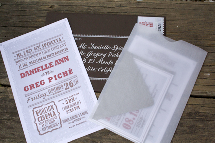
Danielle-Tallulah-Invitations4

I asked Eunice if she would take on the project of designing for us, I couldn’t think of anyone better to ask — she was the perfect designer for the project and was already a great business friend living in the same town as me, San Francisco.  She out-did herself, they were perfect!

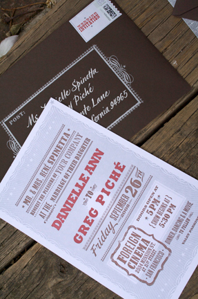
Danielle-Tallulah-Invitations3

Danielle-Tallulah-Invitations2

Once designed, my stationery company, Tallu-lah, printed the invites on over-sized, extra thick paper and included special details like a hand drawn map of San Francisco by calligrapher Mo Seder, a list of the top 10 things to do in San Francisco, hand stamped RSVP envelopes, and customized postage stamps – all assembled in a glassine sleeve packaged in a star-studded lined and letterpressed envelope.
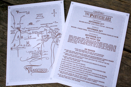
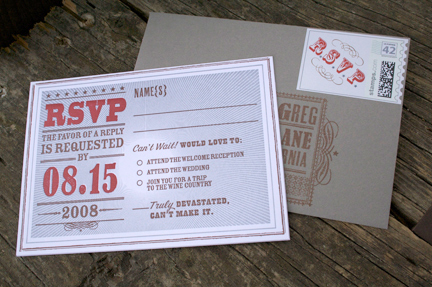
Danielle-Tallulah-Invitations-Directions

Danielle-Tallulah-Invitations-RSVP

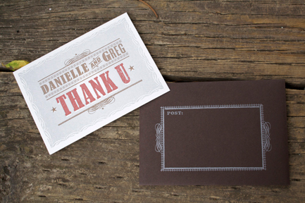
Danielle-Tallulah-Thank-You-Cards

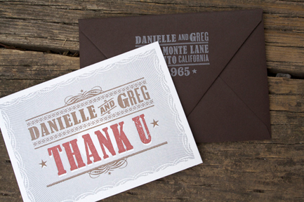
Danielle-Tallulah-Thank-You-Cards2

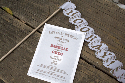
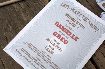
Other vintage movie items were added into the wedding like truffled popcorn before the ceremony and “hooray flags” for each guest to wave when Danielle and Greg walked back down the aisle at the end of the ceremony:
Danielle-Tallulah-Ceremony-Programs-Flags

Danielle-Tallulah-Cinema-Ceremony-Programs

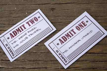
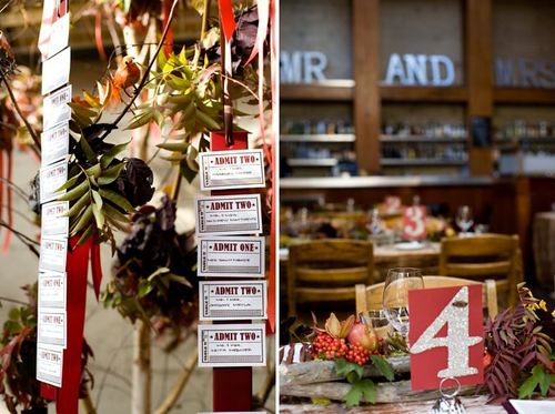
I love that Danielle and Greg carried their cinema theme through to the escort cards – which were designed to look like vintage movie tickets and then hung for guests to find on their way to the reception:
Danielle-Tallulah-Movie-Ticket-Escort-Cards

Danielle-greg-movie-ticket-escort-cards-display

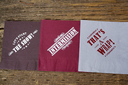
Danielle and Greg printed cocktail napkins to match the flow of their wedding, from the ceremony (“The Show”) in the outside courtyard, to the cocktail reception (“Intermission”) to the dinner and after-party (“The Final Act- It’s A Wrap!”) in two separate lounges – one for Mr. Piché and another Mrs. Piché – that the newlyweds created:
Danielle-Tallulah-Napkins

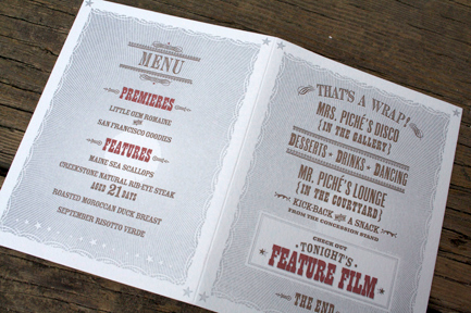
Mr. Piché’s lounge (in the courtyard) is where our guests could watch “Butch Cassidy and the Sundance Kid” on cozy furniture and snack on movie treats from the “concession stand” or mini cones with salted caramel and lavender ice cream (Ed note: yum!) – while singing along to the live music of Syd and Matt York. For guests wanting to dance, Mrs. Pichés lounge (in the art gallery) offered a hip local DJ, as well as the opportunity to watch “Grease” and try treats from the dessert bar including a wedding cake covered in 300 truffles, Poco Dolce chocolate tastings accompanied with port, and an array of French macarons baked by the chef.

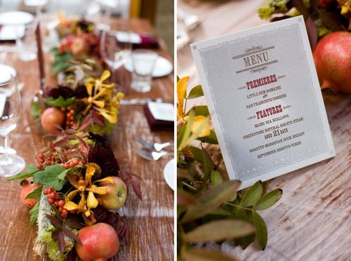
The vintage cinema theme was also incorporated into these reception cards, which were provided on each dinner table and contained both the menu and details for each lounge:
Danielle-Tallulah-Dinner-Menus

Danielle-greg-cinema-inspired-wedding-menu

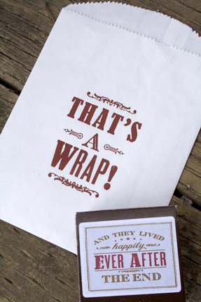
As a final touch, favors from Poco Dolce chocolates packaged in a little paper box printed with the saying all old movies end with “And they lived happily ever after.  The End.”  Such a nice touch!
Danielle-Tallulah-Favor-Bags

Do you all love Danielle’s invitations and wedding stationery as much as I do?  I love the foreign cinema theme – and both Danielle and Hello!Lucky did an amazing job in translating the inspiration into a beautiful design.  For more photos from Danielle and Greg’s wedding, be sure to check out their feature on Snippet and Ink right here – and a huge thanks to Danielle for sharing her wedding stationery with us!

Yellow Wedding Invitation from Rifle Design

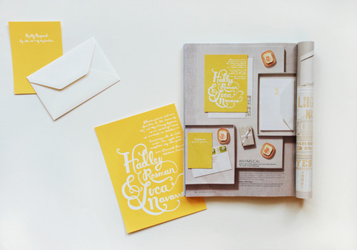
I’m heading out a bit early to work on a couple of other projects (including the first installment of my 2010 calendar round-up – coming on Wednesday!), but thought I’d leave you with this lovely yellow screen printed invitation from Anna of Rifle Design along with a very small sneak peek at the upcoming issue of MS Weddings:

Rifle-design-yellow-invitation

I’m anxiously awaiting my own copy of the fall issue – it seems like its going to be a fabulous issue and I can’t wait to finally see the photos from Grace’s wedding!  See you all back here tomorrow!

{image credits: riflemade}

Caitlin + Joseph’s Vintage Aviation Wedding Invitations

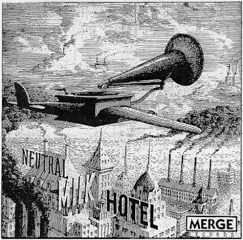
I am so excited about today’s real invitations!  The invitations were submitted by the bride, Caitlin, who is thrilled with the custom design that her stationer, Li Lai, developed for her invitations.  As you’ll see, Caitlin and her husband Joseph went for a vintage aviation theme in their wedding invitation design.  The aviation theme was itself inspired by the album artwork from one of their favorite bands, Neutral Milk Hotel.  I love, love the way Caitlin worked with Li to translate this inspiration to a successful wedding invitation, so let’s get right to it!

aviation-wedding-invitation

From Caitlin: We asked Li to design something flight-themed using a vintagey line-drawing style.  We actually gave her the liner notes to one of our favorite albums, “In the Aeroplane Over the Sea” by Neutral Milk Hotel, to use as inspiration for the overall design (Aeroplane was also our wedding song):

invitation-inspiration-vintage-drawing

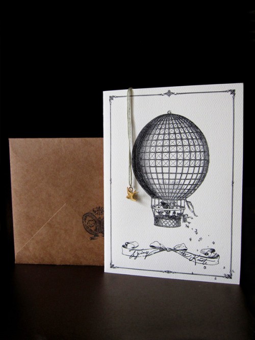
Li found a bunch of flight images and tweaked them a little bit (adding the people in the hot air balloon on the front, etc.) and created a really wonderful, whimsical invitation:

hot-air-balloon-wedding-invitation

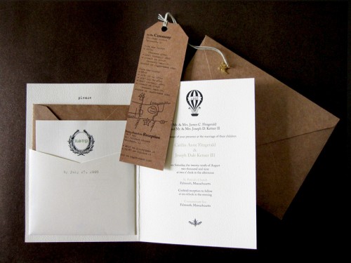
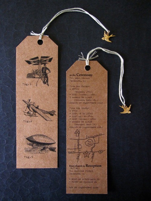
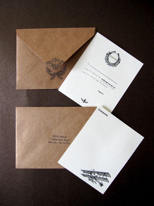
The invitations include a pocket for the RSVP card and return envelope, as well as a fun bookmark containing all of the directions (and a bird charm tied on with pale green string).  I think the bookmark is my favorite part, with all of the weird images of different antique flight contraptions:

kraft-paper-aviation-wedding-invitation

Finally, Li made us a custom rubber stamp with a crest tweaked to include our initials, with which all of our envelopes were stamped with on the back:

Flight-wedding-invitation

Gorgeous!  I love the way all the different elements work together, from the kraft paper envelopes and details to the vintage design elements and drawings, while still reflecting the design’s original lyrical inspiration.  You can check out more from Li Lai’s portfolio — including Caitlin + Joseph’s bird-themed Save the Date — right here.  Thanks Caitlin!
{image credits: invitation photos by Li Lai; album artwork by Neutral Milk Hotel courtesy Merge Records}