Amy + Forrest’s Modern Illustrated Wedding Invitations

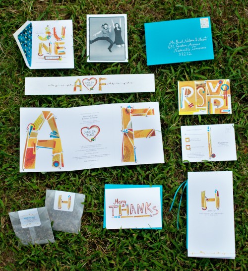
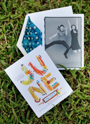
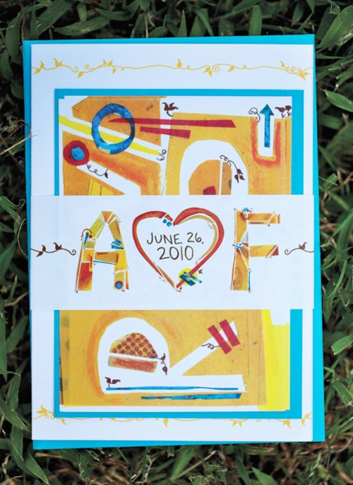
Today’s second set of real invitations comes from Amy Hardy, a freelance designer who was married in Nashville this past June!  Amy put together a fun, modern wedding invitation suite with hand lettering (and letters individually constructed from paper!) that also incorporates her husband’s background in landscape architecture.  So cool!

Modern-Illustrated-Wedding-Invitations

From Amy: I am an art director and graphic designer, and my husband Forrest is studying Landscape Architecture.  We met through a mutual friend in 2007 and got to know each other as running partners.  Once we finally started dating, our friendship quickly became romantic and real.  Within the first year of dating, we knew this was it.  On June 26, 2010 we made the promise of marriage to one another.  Our wedding was in Nashville, Tennessee.

Modern-Illustrated-Wedding-Invitations-Full-Suite

Our wedding stationery represented our creative and detail-oriented personalities, as well as our wedding’s charming Southern summer theme.  This included save-the-dates, invitations with a belly band and RSVP card, programs, favors, signage, and thank you cards.

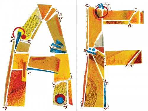
Modern-Illustrated-Wedding-Invitations-Initials

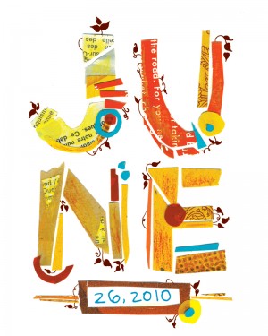
I considered every detail in the stationery, from the stamps to the envelope liners. After constructing individual letters out of paper, I added vine details and Delicato as a secondary typeface.

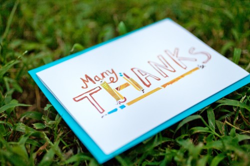
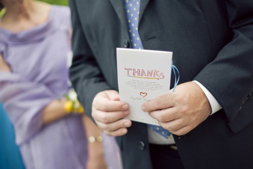
Modern-Illustrated-Wedding-Invitations-Thanks

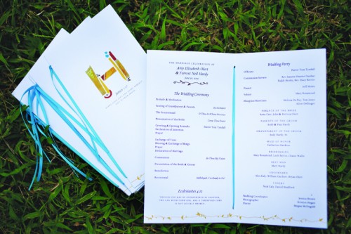
Modern-Illustrated-Wedding-Invitations-Programs

Modern-Illustrated-Wedding-Invitations-Programs

I love bright colored accents (note my husband’s bright red hair!) and hand-rendered typography, so we knew our stationery had to be typographic and colorful. Because of his blue eyes, red hair, and fun personality, Forrest wanted to wear a bright blue bow tie. That led to a bright, jewel blue as our founding color, with yellow as the accent.

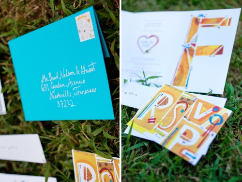
Modern-Illustrated-Wedding-Invitations-RSVP

Because printing was digital, we used Mohawk Via Vellum to slightly raise the type.  The paper’s subtle and soft texture also complimented the cut paper typography.

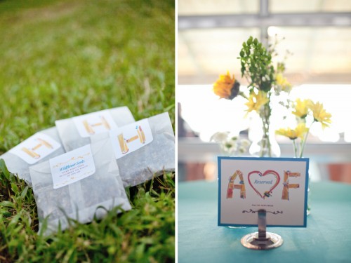
Modern-Illustrated-Wedding-Invitations-Favors-Table-Numbers

I was inspired by our unique obsessions and the details that define us as a couple.  For instance, Forrest has a plant background, so I detailed the typography with vines. For favors, we made packets of wildflower seeds.  Each packet read, “Wildflower Seeds: Please plant these to celebrate the beauty of this day.”

Modern-Illustrated-Wedding-Invitations-DrawingModern-Illustrated-Wedding-Invitations-Save-the-Date

We had a blast at our Save the Date photo shoot, as seen in the photo we chose.

Beautiful Amy, thank you so much for sharing your wedding invitations and stationery!  For more from Amy and Forrest’s gorgeous wedding just click right here, and you can check out more of Amy’s design work right here!

{image credits: invitation photos by Amy | reception photos by Kristyn Hogan}

*Mohawk Paper is one of our fantastic sponsors; for more on our editorial policies, please click here.

Eleanor + Armin’s Chipboard Wedding Invitations

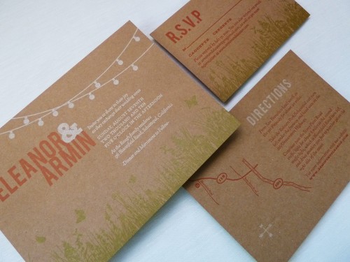
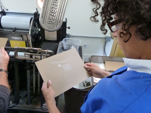
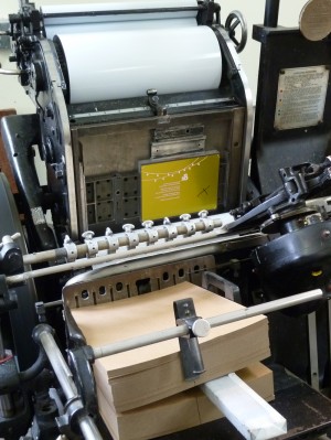
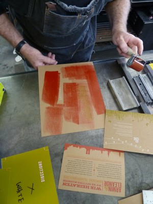
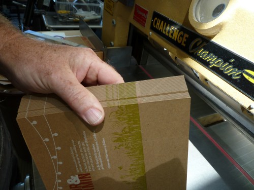
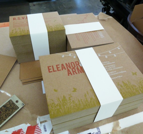
Today’s real invitations come to us from Eleanor, a graphic designer and recent bride whose father happens to be a letterpress printer (lucky girl!).  Eleanor knew that she wanted the invitations to reflect her wedding’s outdoor garden party theme, but chose to print on chipboard for a more relaxed feel.  Eleanor and her fiancé spent two days with her Dad in the print shop creating her three-color wedding invitation, and fortunately for us she documented the entire process!

Kraft-Chipboard-Wedding-Invitations

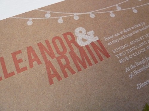
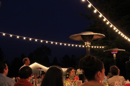
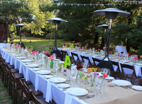
From Eleanor: My parents live on a 5 acre property in Sebastopol, which is not quite a backyard but not quite a farm, and I wanted the invitations to reflect the feeling of an outdoor, mid-summer, evening garden party.  I knew white string party lights would be a key element in our wedding reception décor and decided to make them a featured part of our invitation design.

Kraft-Chipboard-Wedding-Invitation-Detail

Outdoor-Wedding-Reception-Patio-String-Lights

Outdoor-Wedding-Butcher-Paper-Table-Runner

The overall feel of the wedding was homemade and DIY with some of the print shop elements that I grew up with – butcher paper from my Dad’s shop for the table runners, chipboard for the invitations, and old wood type table numbers that we painted to go along with our color scheme.
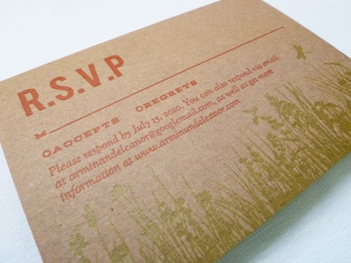
Kraft-Chipboard-Wedding-Invitations-RSVP

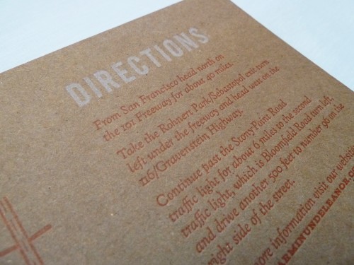
Kraft-Chipboard-Wedding-Invitations-Enclosures

I intentionally did not try to match everything perfectly, there was an overall look that tied everything together.
Kraft-Chipboard-Wedding-Invitation

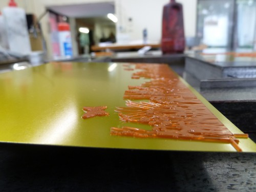
My dad is an longtime letterpress printer and is somewhat of a curmudgeon (he doesn’t even have a website!) – he makes a big point of refusing to print items such as wedding invitations.  He wanted me to see how much work goes into making the invitations I designed.

Letterpress-Wedding-Invitation-Making-Of1

Letterpress-Wedding-Invitation-Making-Of2

Letterpress-Wedding-Invitation-Making-Of3 Letterpress-Wedding-Invitation-Making-Of4

Letterpress-Wedding-Invitation-Making-Of5

If I had known how difficult it is to get white to read on chip board I would have never designed them that way!  It was indeed a good education.  I’m  very happy with how the invitations came out, but mostly what makes them so special is they are infused with so much love – as my dad, my husband and I bonded over those two days while his Heidelberg press huffed, puffed and clanked away in his shop.

Letterpress-Wedding-Invitation-Making-Of6

Eleanor has a ton more photos from the printing process, which you can find on her flickr page, and you can see more from Eleanor’s wedding over on her blog.  Eleanor has also created a printable version of her wedding invitation suite, which you can find available for purchase on her website right here!  Thanks so much Eleanor!

{image credits: Eleanor | E.M. Papers}

Birthday Treasures

I mentioned on twitter that, instead of new things, my Mom sends me little family heirlooms and treasures for my birthday each year.  Past gifts include some of my grandmother’s jewelry and my grandfather’s Army Air Corps pilot’s wings.  I never knew either of my grandparents on my mother’s side, so it’s nice to keep a tiny bit of family history with me.  This year, my Mom sent some family photos, and I thought I’d share a few:

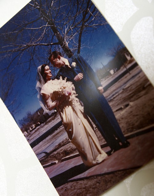
grandma-grandpa-wedding-day

{my grandparents on their wedding day – my grandmother made her own dress!}

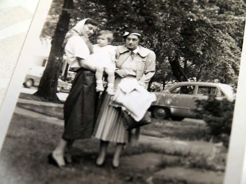
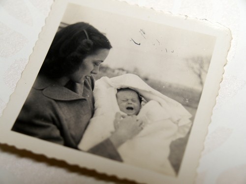
{my mom, my grandmother Margaret, and my great-grandmother Hazel}

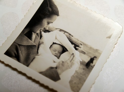
{my Mom and grandmother – the first baby of the family!}

{all photos by me}

Lis + Jay’s Pulp Novel Wedding Invitations

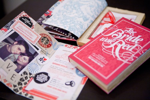
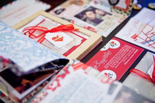
These wedding invitations are just so cool and different – well, they just make me happy.  Lyndsay from It’s a Date Design created this pulp novel invitation suite for the wedding of her friends Lis and Jay, which she made out of re-purposed Mills and Boon books.  This project turned out to be quite an international affair – with the invitations traveling from Lyndsay’s design studio in Melbourne, Australia all the way to Lis + Jay in Glasgow, Scotland!

Pulp-Romance-Novel-Wedding-Invitations

From Lyndsay: This project was a labour of love for my dear friend Lisa-Marie to celebrate her marriage to Jay – both are talented writers and avid music fans, so when it came to thinking about the format for their wedding invitation, a pulp novel seemed like the perfect solution!

Pulp-Romance-Novel-Wedding-Invitations

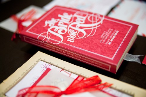
I commissioned good friend Dale Harris of Studio Ink to design a custom type creation for the “front cover” of the book, based on hours of research into the pulp novella genre and lots of Old Hollywood movie posters!

Pulp-Romance-Novel-Wedding-Invitations

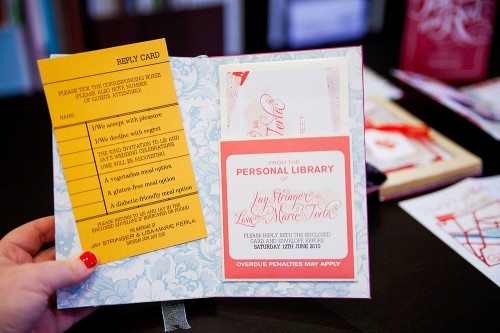
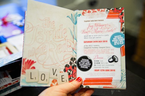
The cover opened to reveal the invitation to Lis and Jay’s nuptials, as well as a short story/scrapbook of how the couple met, and closed with a little library-inspired pocket and library card inside the back cover, which guests could fill out and return to the couple with their attendance plans.

Pulp-Romance-Novel-Wedding-Invitations

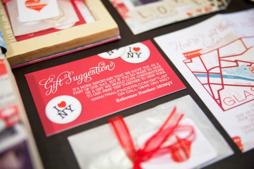
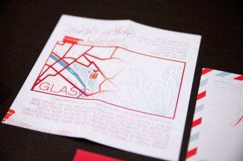
Below the invitation was a hidden compartment which housed a little button badge pack with gift tag, registry information and fold-out map.

Pulp-Romance-Novel-Wedding-Invitations

Pulp-Romance-Novel-Wedding-Invitations

Each invitation was re purposed out of vintage romance novels (many a Mills and Boon was harmed, I’m afraid!) which were stuck together page by page to form the hollowed out secret section and rebound with the couple’s custom artwork.

Pulp-Romance-Novel-Wedding-Invitations

Pulp-Romance-Novel-Wedding-Invitations

The dedication page was made out to each guest in receipt of an invitation, and each book included a beautiful silk ribbon bookmark. The great thing about this suite, apart from being completely “Lis and Jay”, is that I imagine many went straight to the bookshelf for keeps – a lovely memento of a beautiful day.

Pulp-Romance-Novel-Wedding-Invitations

Thank you so much Lyndsay – these are fantastic!  Check out a bit more, including some work-in-progress photos, over at Lyndsay’s blog!

{image credits: it’s a date design}

NYIGF, Part 4 — My Favorites!

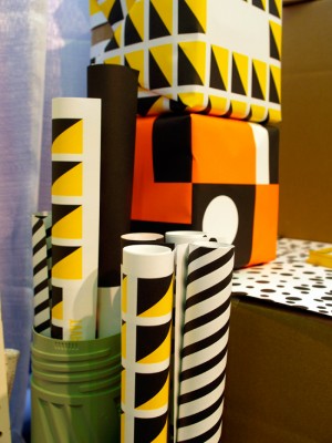
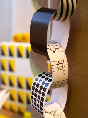
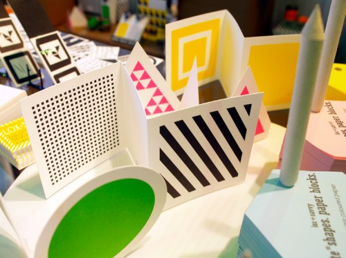
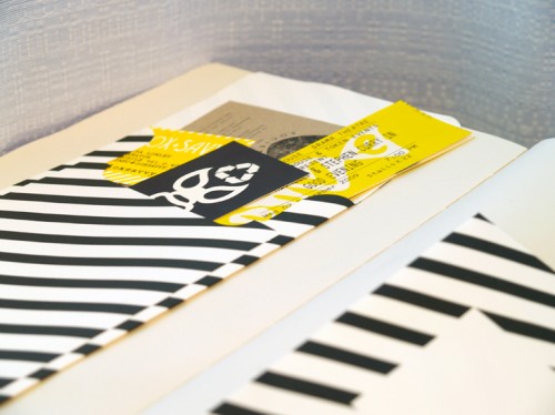
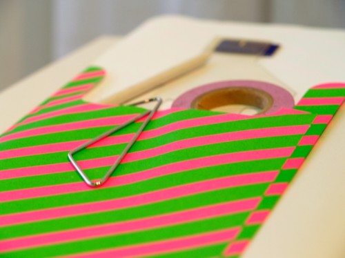
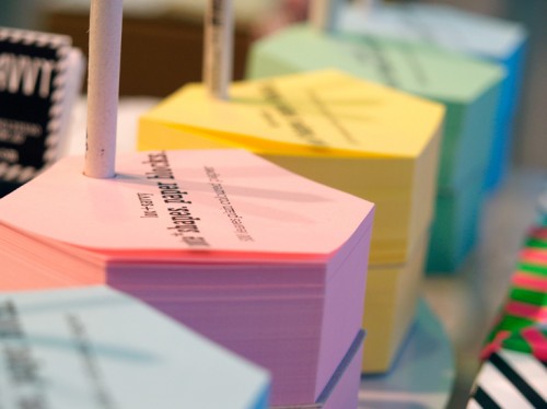
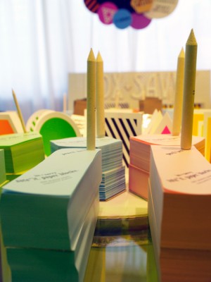
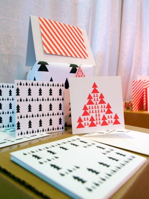
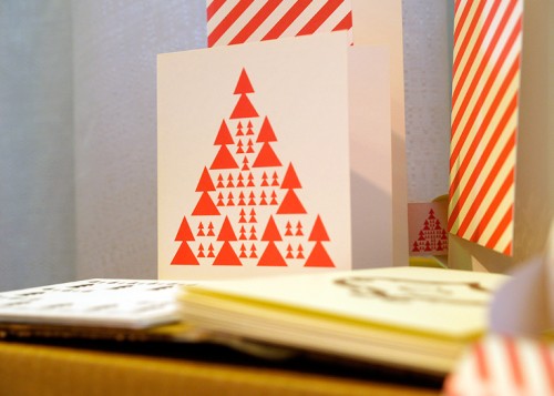
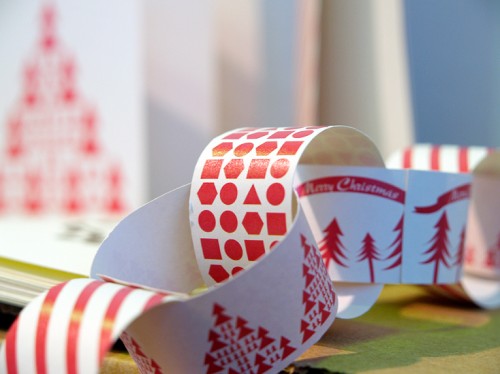
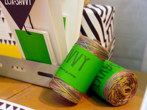
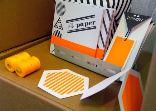
My official favorite find at NYIGF was an awesome Australian stationery studio called Lox + Savvy.  Designer Lisa Loxley creates super fun stationery, note pads, wrapping paper sheets, paper chains, and paper pockets (perfect for scrapbooking) – all in bright colors and bold, graphic patterns:

Lox + Savvy Modern Paper Goods

Lox + Savvy Modern Paper Goods

Lox + Savvy Modern Paper Goods Lox + Savvy Modern Paper Goods

Lox + Savvy Modern Paper Goods

Lox + Savvy Modern Paper Goods

Lox + Savvy Modern Paper Goods

Lox + Savvy Modern Paper Goods

Lox + Savvy Modern Paper Goods Lox + Savvy Modern Paper Goods

Lox + Savvy Modern Paper Goods

Lox + Savvy Modern Paper Goods
{lox + savvy}

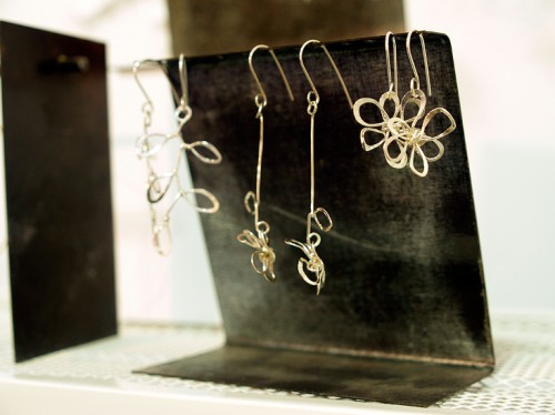
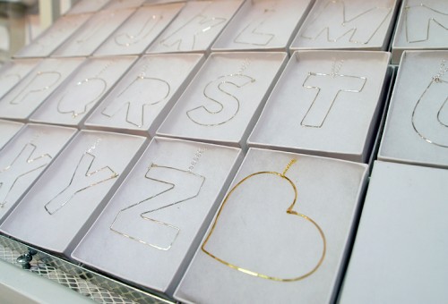
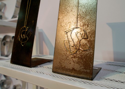
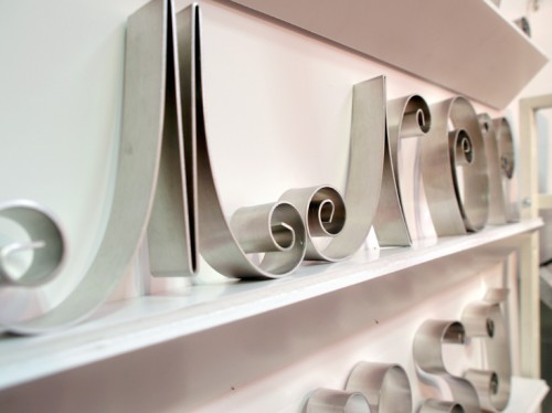
Another favorite find from this year’s show came from the handmade section – Gauge NYC, a metal crafting shop located in Brooklyn, New York and founded by Paul Smotrys.  Gauge NYC creates beautiful jewelry and decorative metal letters:

modern silver jewelry

modern silver jewelry

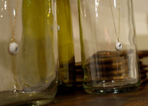
I love these modern alphabet necklaces – you can even layer two on the same chain!

modern silver jewelry

silver quilled letters

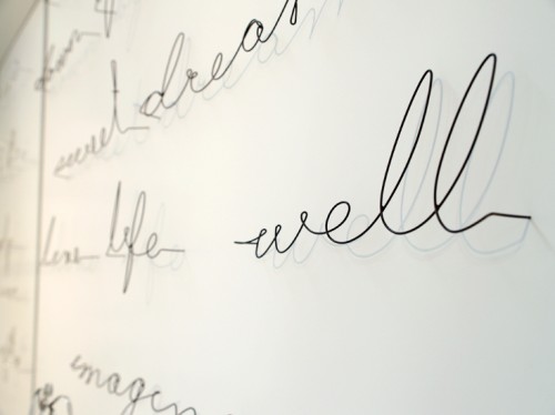
Paul recently began experimenting with these beautiful quotes made from memory wire that can stick directly into a wall or surface like push pins.  Wouldn’t these be amazing in an office or child’s bedroom?

memory wire quotes
{gauge nyc}

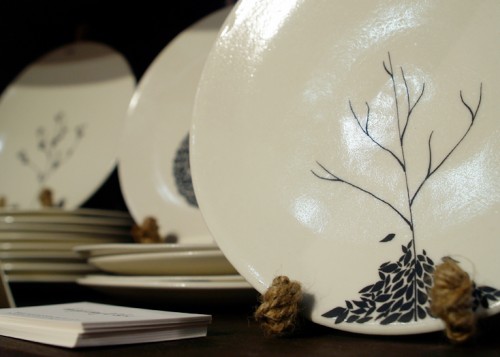
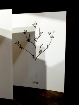
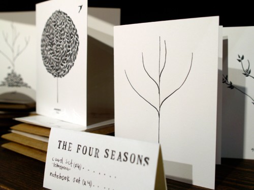
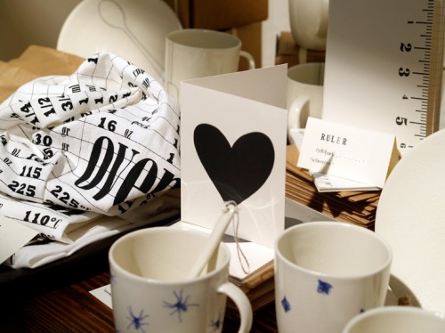
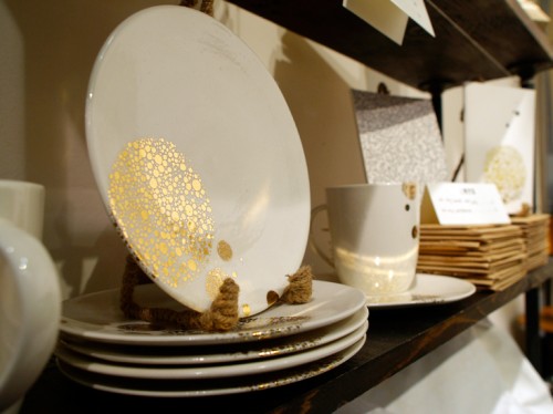
I’m a huge fan of the ceramic and stationery collections from Bailey Doesn’t Bark, and it was wonderful to see it all in person at NYIGF!  The letterpress four seasons and heart notecards are still among my all-time favorites:

bailey doesn't bark modern ceramics and stationery

bailey doesn't bark modern ceramics and stationery

bailey doesn't bark modern ceramics and stationery bailey doesn't bark modern ceramics and stationery

bailey doesn't bark modern ceramics and stationery

bailey doesn't bark modern ceramics and stationery

bailey doesn't bark modern ceramics and stationery

bailey doesn't bark modern ceramics and stationery
{bailey doesn’t bark}

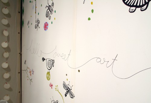
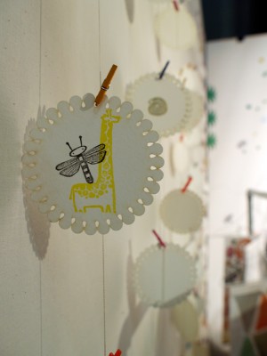
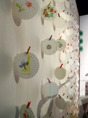
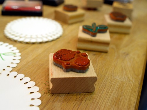
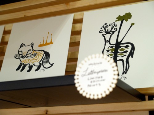
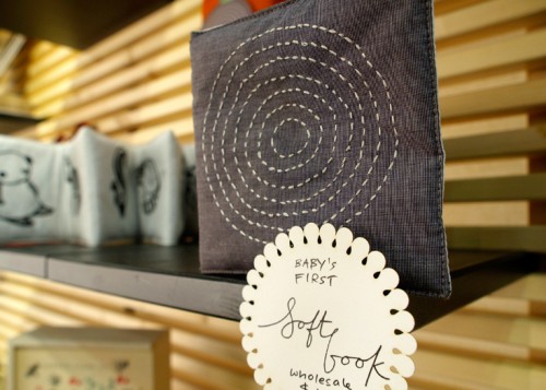
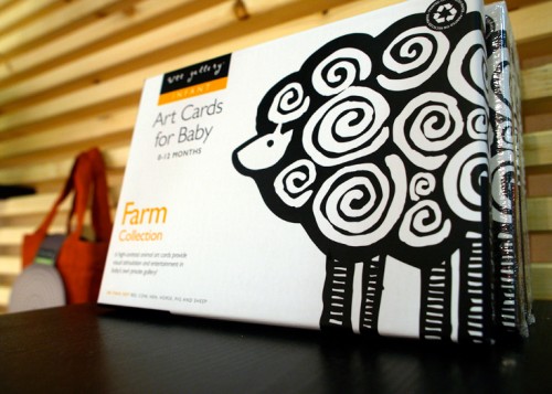
I loved the entire kid-focused collection from Florida-based Wee Gallery – from animal flash cards to letterpress art prints to wall decals.  I also love that they think beyond traditional farm animals, incorporating insects and marine animals into their stamp sets, wall decals, and art cards:

wee gallery modern kids accessories

wee gallery modern kids accessories wee gallery modern kids accessories

wee gallery modern kids accessories

LOVE the stamp sets – there’s even a safari edition!

wee gallery modern kids accessories

Gorgeous limited edition letterpress prints!

wee gallery modern kids accessories

wee gallery modern kids accessories
{wee gallery}

That’s it for me from NYIGF, at least until the January show!  Which ones were your favorites from this summer’s show?

{all photos by me}