Hello Brick & Mortar: Packaging for Retail

I judge books by their covers, wine by its label and brands by their logos. I know the good stuff is on the inside, but I could ogle good packaging all day and have been known to buy things for reasons far divorced from utility. (I’d guess I’m not alone in this crowd.) Packaging may not seem like the sexiest topic, but good packaging is an invitation to purchase, and that’s an invitation we want to extend. –Emily of Clementine

Hello Brick + Mortar by Emily of Clementine for Oh So Beautiful Paper

Illustration by Emily McDowell for Oh So Beautiful Paper

First, the golden rule of retail packaging: They’re going to try to open it anyway. I know, you wrote “blank inside.” Customers will still look at me and ask “is it blank inside?” while opening the cellophane. I know, it’s sealed with a sticker. They will carefully peal back the sticker and reach for the card. I know, you labeled what’s inside and drew a little picture on the back showing the 6 different cards in a card set. Maybe they’ll ask me to open it. Why? I think it’s human nature. If you close something, people want to open it. Especially if it’s pretty. But let’s see if we can make your packaging something customers want to open, but instead choose to purchase and wait until they get home to break into. How? 90% of it is simple show & tell.

1. Tell them what’s inside. Pretty basic, but I receive a lot of beautiful, poorly labeled stationery. Is it a flat card? Is it blank inside? Is it a card set? How many card are in the set? Are they all the same or different? How big is that print? Is it a sticker or a mini-note? What’s it for….? I watch customers fumble through unclear packaging every day. Often, I can interrupt a quizzical look to explain what’s inside, but if I don’t, she’s stranded and will put it back down. If you don’t know what to include, try calling a friend and describing what the product looks like. Then find a well designed way to say the same thing. (Where? My vote is usually on the back. Unless you can make it work with the image.)

Hello Brick + Mortar: Packaging for Retail by Emily of Clementine for Oh So Beautiful Paper

J. Falkner’s Perfect Little Notes use paper bands to tell what’s inside without interfering with the product. The bands are a slight deterrent for customers to open the box and allow retailers to slip the band off for a photo, and put it back on for customers. Win/win!

2. Show them what’s inside. In your online shops, you can clearly photograph and explain. In person, your packaging must speak for the contents. Unless you are packaging a single card or print that is clearly visible, you need to show what’s inside (with a photo, a great good drawing or innovative packaging). Every time customers pick up a box of cards, they’re asking “what’s inside? Answering this clearly increases the likelihood that your product will sell. (Where should you put this information? My vote is for the back if it’s a card/set/calendar or smack in the middle if it’s a tube.)

Hello Brick + Mortar: Packaging for Retail by Emily of Clementine for Oh So Beautiful Paper

The Albertine Press letterpress library is one of the few products, I (happily) display without cellophane. The spine tells what’s inside and a quick flip open reveals the cards. The packaging itself feels like a gift and looks beautiful displayed in multiples.

3. Extend your branding. The cost of packaging increases the price of your products, but don’t make it a throwaway purchase. Good packaging makes your product feel like a gift, and if done well, can make an indelible mark that the customer returns to.

SHP_Packaging3

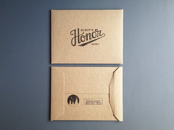
Scout’s Honor Paper packages her prints in stiff craft sleeves with a strong branded stamp on the front and back that tells the print name and size. Though she totally breaks my rule of showing what’s inside, I can easily take one print out to display and house the extras behind. 

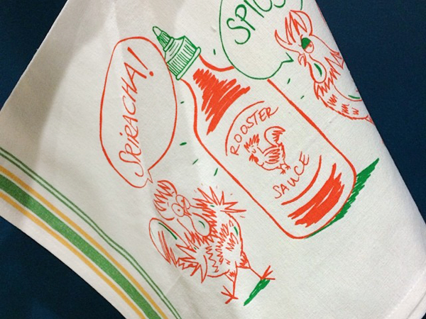
4. Packaging should keep it together and look great. Do you want the parade of horribles? I’ve had cello sleeves crumple or split as customers shove cards back in; stiff cello boxes that pop open; sealed small notes that aren’t affixed within the package so they jumble, but I can’t adjust them without damaging the package; prints with crumpled corners after being dropped; boxes that obscure the card design; gorgeous prints, postcards and tea towels that no one buys because they have no idea what’s inside; closure stickers that pop open more than they stick; belly bands that come unstuck and end up all over the floor; twine that frays and looks frumpy; calendars and prints with no backing that slide to the floor; products that fade in the window; and (through fault of my own) a cello box or two melted each winter due to radiator proximity. Those horribles are not so horrible, but these are costs that retailers absorb, if a product remains poorly packaged we won’t take the risk. You can’t always avoid these pitfalls, but you can mitigate by simply using the packaging yourself: pack your product up, throw the box around, unpack it and leave it on a table for a few weeks. See which of your items still shine, and adjust the rest.

5. There’s no right answer. When in doubt, reach out to a retailer you trust or hop into your favorite store and see what’s working. You should decide on the packaging you want, but here are some considerations:

  • Single Cards – Cellophane sleeves are a must. I’m torn on whether a sleeve with the fold over seal is preferable. A little sticker on the back can tell the customer if the card is flat or folded, how big it is and whether the card is blank inside.
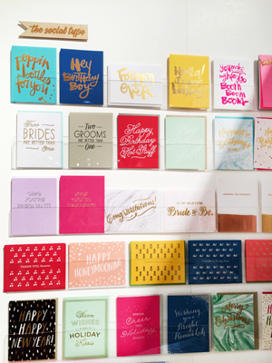
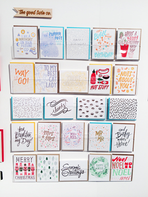
  • Card Sets – Card sets are the slowest sellers. I think they’re also the most vaguely labeled. You can only show one card on the front, but you can show and tell on the back of the box. How many cards are in there? Are they all the same (if not, please include a label with a photo or drawing), what color is the envelope? Tying it with twine can look pretty or obstruct your image. Stickers can make a pretty seal but the occasional customer that ignores the sticker’s purpose and opens it, leaves me with a damaged product.

Hello Brick + Mortar: Packaging for Retail by Emily of Clementine for Oh So Beautiful Paper

Moglea’s vibrant packaging shows both envelope and note, while the sticker draws your eye from the front to the back of the box where you learn the details of what’s inside!

OSBPblackbirdback

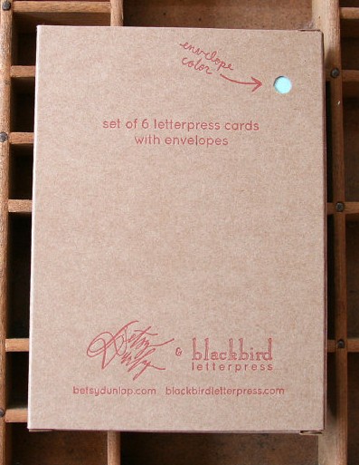
The cute peephole on the back of this card set from Blackbird Letterpress invites the customer to look closer while communicating basic info about this card set.

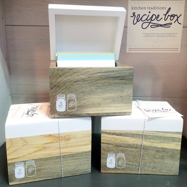
  • Tiny notes, gift tags, book plates, recipe cards – These things don’t often get much respect in a retail setting because they’re little and often confuse the customer. They benefit from super clear packaging, and a bit of personality to invite the customer to pick them up.

EMexistingnote


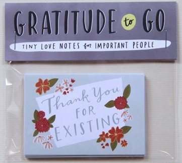
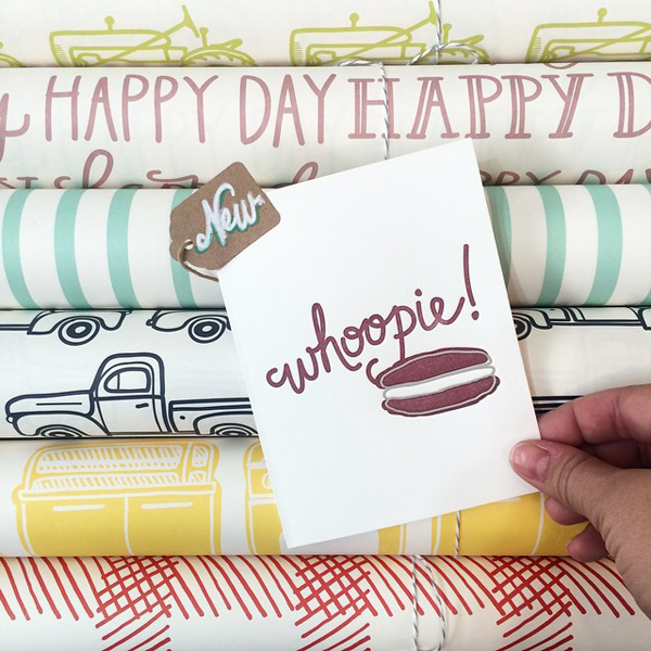
Emily McDowell draws people in with words alone. By the time customers read what her notes say, they’re already sold on the sentiment, with little need to even know the function.


  • Pads of paper, journals & notebooks – You guys, wars could be started over whether a notebook should have lined or unlined pages. Let the customer know upfront. Also, let them know how many pages are in there. Cello sleeves help keep the corners neat and the pages clean.
  • Prints – Customers often buy prints for gifts or quick decor, so including the dimensions is crucial. A sturdy piece of cardboard lets retailers display the print safely. Prints packaged in tubes are the most difficult to sell. I often have large prints professionally framed, but if the framed print sells, we’re back to the tube. A large color sticker is the best way to show what’s inside.
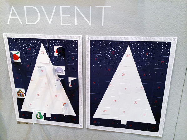
  • Calendars – Customers who are on a calendar hunt want the days to be in boxes, customers who fall in love with your designs don’t care! Either way, it’s nice to show the customer whether or not there are boxes and display each month on the back (customers want to see their birth month, it’s often what sells them.) Like prints, a sturdy piece of cardboard is helpful for display and protection. I see a lot of dual purpose calendars these days (eg, once used, each month can be a print!) I love this idea, but make sure it’s clear so the customer knows they’re getting two uses for the price.
  • Coasters – Coasters are one item where the packaging might be saved for storage, so this can be a great chance to extend your brand into a customer’s home.

Hello Brick + Mortar: Packaging for Retail by Emily of Clementine for Oh So Beautiful PaperRifle Paper Co’s coasters are packaged in boxes that make adorable storage for any other little thing. It’s a perfect extension of branding and makes the packing bridge into extended use.

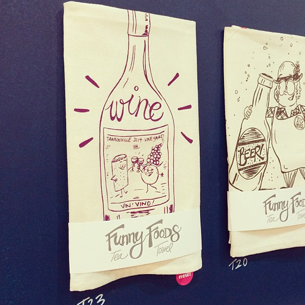
  • Tea Towels – Tea towels are almost always displayed folded. To prevent constant unfolding, a nice wide belly band with an image of the opened towel can help. (Bonus: offer to send a sample to display if your retailer buys a certain quantity.)
  • Temporary tattoos – Temporary tattoos are often shared, or used as party favors, so people want to know how many they’re getting. I also think they look better on the body, so a photo of them in action is a super plus.

TattlyAnimalDrivers

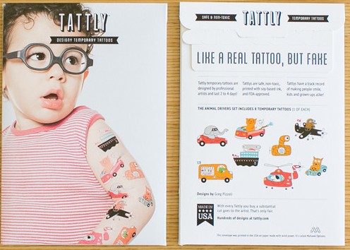
Tattly’s packing shows the products on (uh, adorable) models, then the back manages to be fun while describing exactly what’s inside.

  • All other beauties – You makers are so darn prolific, I can’t even keep up with all of the areas that you’re branching into, so I’ll leave you with something simple: let the product speak for itself. Let it guide the packaging and be ok with being simple. Sometimes, that’s the best approach.

Hello Brick + Mortar: Packaging for Retail by Emily of Clementine for Oh So Beautiful Paper

I’m utterly blown away by the beauty created by mixing the talents of Angela Liguori and Maybelle Imasa Stukuls. All I want to know is more about this ribbon, and Angela’s simple spool and clear font on a card give me just that. 

The final golden rule of packaging is this: if you have an innovative idea, go for it. All of this is open to your interpretation. I don’t like cello sleeves, but I’m pimping them out here because it’s the current best solution to selling cards. If you have a better idea, please, go on. As long as your packaging shows and tells what’s inside, you’re meeting your retailers’ needs. If you can make it inventive and even more fun, you’re taking a step further to extend your brand and build a relationship with your retailers and customers.

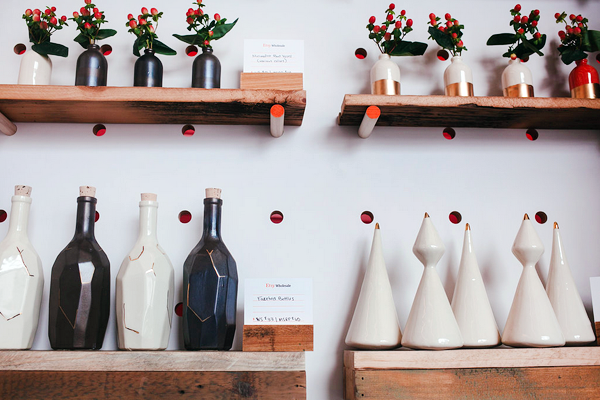
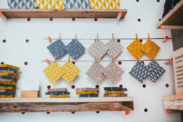
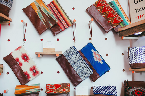
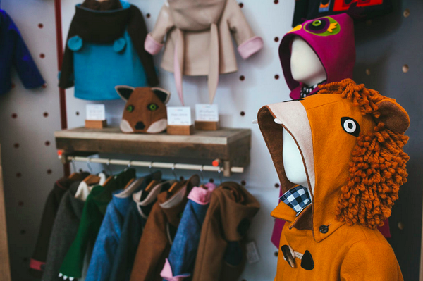
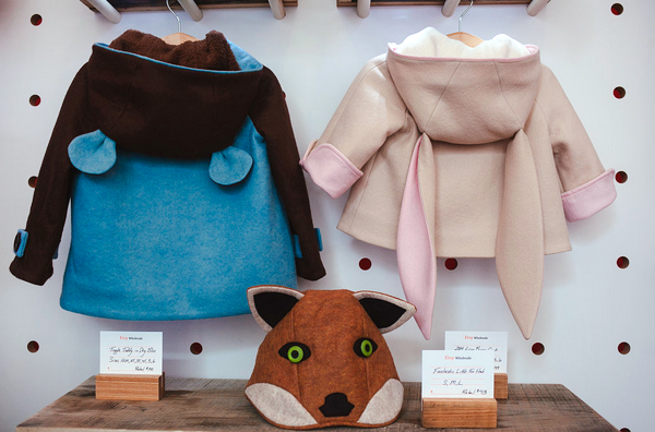
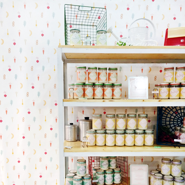
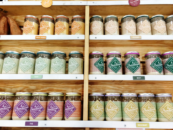
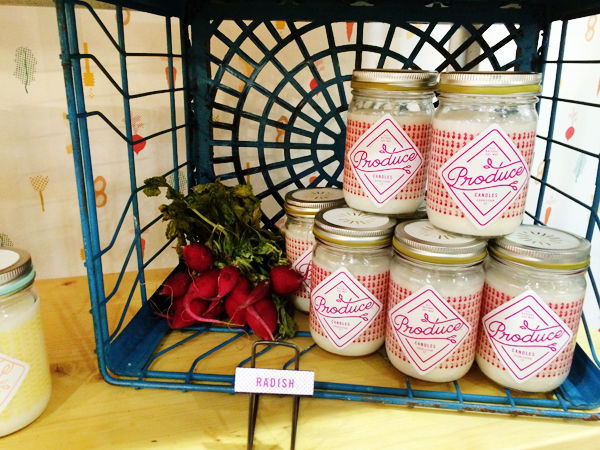
Search outside of the stationery world for ideas. When I need a bit of inspiration (like how to finish up this post) I pull a collection of items from Clementine to see where themes emerge. I love the packaging below for all kinds of reasons: font, color, utility. Mostly, because it draws you a step closer to the product, making the customer one step closer to falling in love and taking it home.

Hello Brick + Mortar: Packaging for Retail by Emily of Clementine for Oh So Beautiful Paper

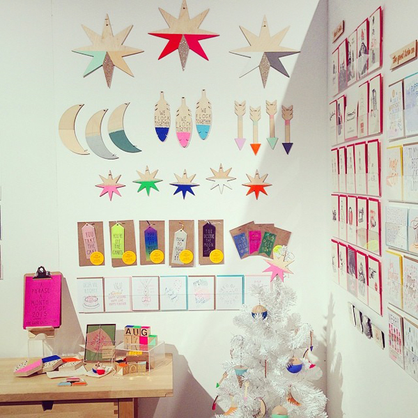
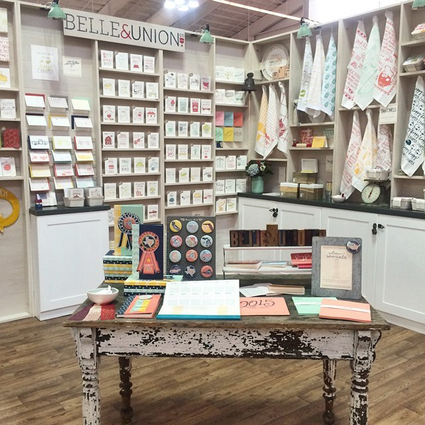
Just another day in the shop, lost down a rabbit-hole of the beauty you all make via my Instagram.

I can’t wait to see what you pack up next! xoxoxo – Emily

Kaitlin + Taylor’s Urban Winery Wedding Invitations

I love the juxtaposition of organic elements with a very urban venue in these wedding invitations from designer Christa Alexandra. Created for a wedding at The Brooklyn Winery, the design was inspired by the reclaimed wood walls and decor of the wedding venue. The wedding invitation suite features an organic color palette of soft green, taupe, and brown. Beautiful!

Urban-Winery-Wedding-Invitations-Christa-Alexander-OSBP4

From Christa: I designed and printed this letterpress invitation suite for Kaitlin and Taylor’s wedding at The Brooklyn Winery. Kaitlin was inspired by an organic palette of leaf green, taupe, and brown. The venue, self described as an “urban winery,” boasts a warm ambiance, reclaimed wood walls and locally sourced decor.

Urban-Winery-Wedding-Invitations-Christa-Alexander-OSBP

Urban-Winery-Wedding-Invitations-Christa-Alexander-OSBP6

We created a sophisticated invitation with an informal feel using pretty typography and pops of green. Staying away from the traditional vineyard vines, we chose to use leaves and thin branches to incorporate some natural elements into the stationery. The entire suite was lovingly hand-printed on my 1918 Chandler & Price letterpress.

Urban-Winery-Wedding-Invitations-Christa-Alexander-OSBP8

Urban-Winery-Wedding-Invitations-Christa-Alexander-OSBP9

Urban-Winery-Wedding-Invitations-Christa-Alexander-OSBP10

Urban-Winery-Wedding-Invitations-Christa-Alexander-OSBP3

Thanks Christa!

Check out the Designer Rolodex for more tal­ented wed­ding invi­ta­tion design­ers and the real invi­ta­tions gallery for more wedding invitation ideas!

Photo Credits: Christa Alexandra

NYNOW Summer 2014, Part 2

Even though I wasn’t able to attend NYNOW Summer 2014, I definitely tried to walk the show vicariously via photos and Instagram! Samantha & Whitney shared their favorite finds earlier today, but I thought I’d also share a few of the booths that I really really wish I’d been able to cover in person. First up – Etsy Wholesale! I was so bummed to miss their inaugural pavilion with 24 amazing designers, from lighting to ceramics to textiles. Everyone I’ve spoken with who attended the show said that the pavilion looked amazing and the designers all brought wonderful products. And seriously – how awesome is that pegboard display?? I hope they do this again at the Winter 2015 show!

NYNOW-Summer2014-EtsyWholesale-Laura-Pardo

All Etsy Wholesale booth photos by Laura Pardo Photography

NYNOW-Summer2014-EtsyWholesale-Laura-Pardo2

Honeycomb Studio

NYNOW-Summer2014-EtsyWholesale-Laura-Pardo3

Cotton and Flax

NYNOW-Summer2014-EtsyWholesale-Laura-Pardo4

Grace Design

NYNOW-Summer2014-EtsyWholesale-Laura-Pardo5

NYNOW-Summer2014-EtsyWholesale-Laura-Pardo6

Little Goodall

NYNOW-Summer2014-EtsyWholesale-Laura-Pardo7

NYNOW-Summer2014-EtsyWholesale-Laura-Pardo8

Redraven Studios

NYNOW-Summer2014-EtsyWholesale-Laura-Pardo11

NYNOW-Summer2014-EtsyWholesale-Laura-Pardo12

Little Low Studio

The Crow & Canary booth is always a highlight of my tradeshow experience – and with new goodies from Red Cap Cards, The Great Lakes Goods, and more on display and more I was even more bummed not to see it in person!

NYNOW-Summer2014-CrowandCanary

The Great Lakes Goods

NYNOW-Summer2014-CrowandCanary2

The Good Twin Co / Photos via Crow & Canary

NYNOW-Summer2014-Gus-and-Ruby-Letterpress-CrowandCanaryNYNOW-Summer2014-Gus-and-Ruby-Letterpress-CrowandCanary2

Ferme à Papier / Red Cap Cards

NYNOW-Summer2014-Gus-and-Ruby-Letterpress-CrowandCanary3NYNOW-Summer2014-Gus-and-Ruby-Letterpress-CrowandCanary4

The Social Type / The Good Twin Co / Photos by Gus & Ruby Letterpress

After sitting out the most recent Stationery Show with her new baby, Laura from Fisk & Fern was back in force at NYNOW! So many cute new cards and tea towels.

NYNOW-Summer2014-FiskandFern

NYNOW-Summer2014-FiskandFern2

NYNOW-Summer2014-FiskandFern3

NYNOW-Summer2014-FiskandFern4

Photos via Fisk & Fern

I’m looking forward to heading back up to NYC for the Winter 2015 show!

NYNOW Through the Eyes of Gus & Ruby Letterpress

Hi Everyone! I always look forward to the twice-a-year NYNOW trade show – but with my due date rapidly approaching I was sadly unable to attend the Summer 2014 NYNOW in August. Luckily, Samantha and Whitney from Gus & Ruby Letterpress – one of my favorite stationery stores in Portsmouth, New Hampshire – were planning to attend and agreed to share a few of their favorite finds from the show with us! Thanks so much ladies! –Nole

Hello Oh So Beautiful friends (see what we did there?), Sam & Whit here from Gus & Ruby Letterpress! A few weeks ago, we jetted off to NYC for a mad dash through the aisles of the NYNOW summer show in search of some rad new products for the shelves of our little shop. We walked the show for 2.5 days and found oodles of gorgeous new products that we can’t wait to share. We were writing orders like crazy and trying to visit as many new booths as we possibly could during our quick trip. Here are a few snaps of some standout booths:

Hand in Hand

This gorgeous skincare & fragrance line had us smitten with their hand-made paper-flower booth design – you know we’re suckers for some gorgeous paper blooms! The packaging of each product was just darling and the scents were divine. Even better, it’s a company with a cause: for each product sold, Hand in Hand saves 50 square feet of rainforest and donates one bar of soap and one month of clean water to a child in a developing country. Beautiful products, beautiful mission.

NYNOW-Summer2014-HandinHandSoapNYNOW-Summer2014-HandinHandSoap2NYNOW-Summer2014-HandinHandSoap4

Photos via Hand in Hand

Yellow Owl Workshop

Yellow Owl Workshop always puts up a awesome booth and this show was no exception. We loved their new 3-color tiny ink pad sets and the holiday-themed carve-a-stamp kit.

NYNOW-Summer2014-Gus-and-Ruby-Letterpress-YellowOwlWorkshop

NYNOW-Summer2014-Gus-and-Ruby-Letterpress-YellowOwlWorkshop2

NYNOW-Summer2014-Gus-and-Ruby-Letterpress-YellowOwlWorkshop3

Produce Candles

We’ve been carrying this fresh line of hand-poured soy candles for some time now and just can’t get enough. With new fall and winter scents on the way, it was a treat to sniff the next harvest. And it’s always so great to meet our beloved vendors in person.

NYNOW-Summer2014-Gus-and-Ruby-Letterpress-ProduceCandlesNYNOW-Summer2014-Gus-and-Ruby-Letterpress-ProduceCandles2NYNOW-Summer2014-Gus-and-Ruby-Letterpress-ProduceCandles3

Banquet Atelier & Workshop

Banquet Workshop goodies absolutely fly off the shelves at Gus & Ruby, so we were jazzed to see the new advent calendar, monthly calendar, and some lovely new pillows and greeting cards from this talented group.

NYNOW-Summer2014-BanquetWorkshop

Photo via Banquet Workshop

NYNOW-Summer2014-Gus-and-Ruby-Letterpress-BanquetWorkshopNYNOW-Summer2014-Gus-and-Ruby-Letterpress-BanquetWorkshop6

Coral & Tusk

The intricate embroidery of Coral & Tusk is too good to miss. Each print and pillow is a work of art.

NYNOW-Summer2014-CoralandTuskNYNOW-Summer2014-CoralandTusk2

Photos via Coral & Tusk

Belle & Union

We were totally digging the new recipe card boxes from Belle & Union as well as their gift wrap and cheeky cards. And let’s give it up to B&U for a super clean, cohesive booth design, too!

NYNOW-Summer2014-BelleandUnion

NYNOW-Summer2014-BelleandUnion2

NYNOW-Summer2014-BelleandUnion3

NYNOW-Summer2014-BelleandUnion4

NYNOW-Summer2014-BelleandUnion5

Photos via Belle & Union

Haptic Lab

We had been lusting after these hand-made kite ships for some time so we were eager to see the pieces in person. The booth design was absolutely magical and the kites proved to be as lovely and whimsical as we’d hoped.

NYNOW-Summer2014-HapticLab

Photo via Haptic Lab

Rebecca Atwood Designs & Light + Ladder

Oh, Rebecca, where do we even begin? Your gorgeous hand-dyed fabric pillows and bags made us weak in the knees. Please let us live in your booth? Thank you.

NYNOW-Summer2014-RebeccaAtwood-LightLadderNYNOW-Summer2014-LightLadder

Light + Ladder

NYNOW-Summer2014-RebeccaAtwoodNYNOW-Summer2014-RebeccaAtwood2NYNOW-Summer2014-RebeccaAtwood3NYNOW-Summer2014-RebeccaAtwood4

Light + Ladder / Rebecca Atwood photos via Rebecca Atwood

It was a slap-dash, so-much-to-see, exhausting trip to be sure. But, man oh man, are there some talented makers out there! We left feeling inspired and excited or what’s to come. Thank you for letting us share a teencey weency snippet of our time in NYC – we had a blast!

xoxo, Samantha & Whitney

Except where noted, photos by Gus & Ruby Letterpress

Chelsea + Nick’s Night Under the Stars Wedding Invitations

You might remember Chelsea and Nick’s fun navy and white gingham save the dates from a few months back – and today they’re back with their wedding invitations! Created by Rachel from Robinson Press, these beautiful wedding invitations feature a navy and neon red color palette and the Vermont landscape under the stars!

Vermont-Under-the-Stars-Wedding-Invitations-Robinson-Press-OSBP3

From Rachel: In keeping with the Vermont theme of their save the date, Chelsea and Nicholas wanted a landscape under the stars for their wedding invitation suite, so an illustration of the snake river became the centerpiece of the suite. They also loved this quote from poet Nikki Giovanni: We love because it is the only true adventure.

Vermont-Under-the-Stars-Wedding-Invitations-Robinson-Press-OSBP

This is a three piece invitation suite, plus double-sided his and hers patterned informal stationery, with a color palette of navy and neon red. The invitation suite was letterpress printed on bright white 100% cotton paper and tied with a gauzy italian cotton ribbon from Studio Carta.

Vermont-Under-the-Stars-Wedding-Invitations-Robinson-Press-OSBP8Vermont-Under-the-Stars-Wedding-Invitations-Robinson-Press-OSBP13

Vermont-Under-the-Stars-Wedding-Invitations-Robinson-Press-OSBP7

Vermont-Under-the-Stars-Wedding-Invitations-Robinson-Press-OSBP6

Thanks Rachel!

Robinson Press is a member of the Designer Rolodex – you can see more of their beautiful work right here or visit the real invi­ta­tions gallery for more wedding invitation ideas!

Photo Credits: Robinson Press