Maine Moose Gold Foil Wedding Invitations

These wedding invitations from Lauren at Charm & Fig make me wish that every wedding invitation had a moose on it! Lauren captured the rustic wilderness of Bar Harbor, Maine with the aforementioned (gold foil!) moose, along with the subtle nautical vibe requested by the bride. The formal invitation text was printed entirely in gold foil and Lauren incorporated modern geometric shapes inspired by nautical flags. So pretty!

Maine Moose Gold Foil Wedding Invitations by Charm and Fig / Oh So Beautiful Paper

From Lauren: Stephanie and Sam’s number one goal was to bring friends and family together for a good time. Stephanie is an event planner and wanted a wedding invitation suite that had a nautical feel without an overkill of anchors and sailboats. As a designer who has seen every nautical invitation under the sun, I couldn’t have been more on board with this request. Pun intended!

Maine Moose Gold Foil Wedding Invitations by Charm and Fig / Oh So Beautiful Paper

While the invitation itself was formal, the rest of the pieces were festive to indicate that an amazing weekend in Bar Harbor, Maine lay ahead.

Maine Moose Gold Foil Wedding Invitations by Charm and Fig / Oh So Beautiful Paper

We embraced the geometrics of nautical flags throughout and added a Moose, which is the pronunciation of the grooms last name and a nod to Maine wildlife. For the color palette, we started with crisp whites, and then sprinkled in sun-bleached ocean hues, kraft paper and touches of gold.

Maine Moose Gold Foil Wedding Invitations by Charm and Fig / Oh So Beautiful Paper

Everything was bundled in kraft folder and envelopes, both foil-stamped with moose tracks. The envelopes were covered in vintage nautical stamps and addressed in white calligraphy by the talented Dionne Christiansen of Nib & Pixel.

Maine Moose Gold Foil Wedding Invitations by Charm and Fig / Oh So Beautiful Paper

Maine Moose Gold Foil Wedding Invitations by Charm and Fig / Oh So Beautiful Paper

Maine Moose Gold Foil Wedding Invitations by Charm and Fig / Oh So Beautiful Paper

In the invitation folder, we included the rehearsal dinner invitation, a vintage postcard response card, a website tag modeled after lobster buoys and an illustrated map of the island with wedding events.

Maine Moose Gold Foil Wedding Invitations by Charm and Fig / Oh So Beautiful Paper

Maine Moose Gold Foil Wedding Invitations by Charm and Fig / Oh So Beautiful Paper

Maine Moose Gold Foil Wedding Invitations by Charm and Fig / Oh So Beautiful Paper

Thanks Lauren!

Design: Charm & Fig
Envelope Calligraphy: Nib & Pixel
Color Printing: Crest Printing
Foil Printing: Gold Leaf Embossing

Check out the Designer Rolodex for more tal­ented wed­ding invi­ta­tion design­ers and the real invi­ta­tions gallery for more wedding invitation ideas!

Photo Credits: Charm & Fig

Behind the Stationery: Dancing Pen and Press

For our next feature, I want to introduce Elecia from Dancing Pen & Press – she’s a calligrapher turned letterpress and watercolor artist. Learning from Morgan of Ladyfingers Letterpress, Elecia expanded her skill set to expand and appeal to her customer base. Her story is proof that with determination in teaching yourself and the powers of Google, you can learn and do anything. From selling on Etsy to having her own website and soon her own brick & mortar location, here is Elecia! – Megan

Behind the Stationery: Dancing Pen and Press / Oh So Beautiful Paper

Hello, Oh So Beautiful Paper readers! My name is Elecia and I would love to share with you all a bit about us here at Dancing Pen & Press. It started with just a pen and a dream…literally. As a little girl I was obsessed with calligraphy. Going to grade school in New England in the ’80s while most kids had their “erasable” ballpoint pens (that never really erased, did they?), my love of calligraphy and art followed me throughout my teenage years. I started college as a Biology major, but I ended up graduating with a major in Textiles, Merchandising & Design and a minor in Fine Arts. The numerous color theory and color science classes I took did not go to waste. Mixing color is one of my favorite tasks here at Dancing Pen & Press, and we mix a LOT of color!

Behind the Stationery: Dancing Pen and Press / Oh So Beautiful Paper

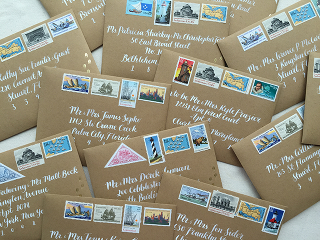
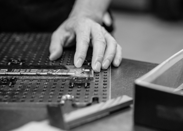
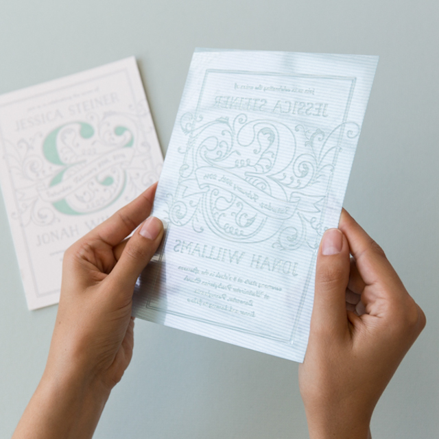
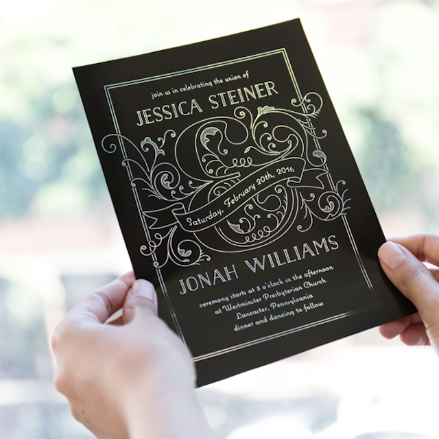
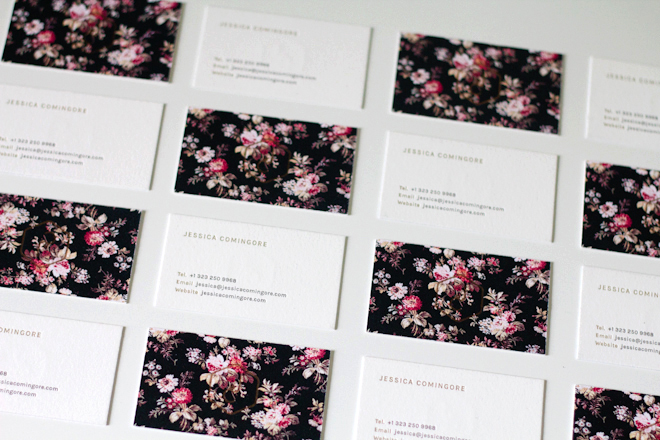
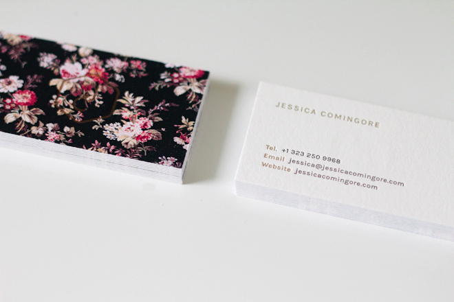
We custom mix all of our letterpress inks, watercolors, and calligraphy inks. I find it a personal challenge when a client gives me a swatch to get it exact. After working for a few years in corporate retail, I started Dancing Pen in 2008. I learned that there was a “new” type of calligraphy out there. It wasn’t new at all, actually. It was a form of calligraphy called copperplate, dating back to the 1700s. This type of calligraphy uses a pointed dip pen instead of a flat tip. Using pressure on the down stroke of the letterform creates the gorgeous thick and thin lines of this style of calligraphy. This opens the nib and allows more ink to flow through.

Behind the Stationery: Dancing Pen and Press / Oh So Beautiful Paper

I ordered all of the supplies and instructional guides from the United Kingdom because they weren’t yet available here in the States. I didn’t have a website, and had not heard of Etsy, so I put up a listing on Craigslist of all places. Within 24 hours, I had my first job! It was 275 envelopes for a Bat Mitzvah in Boston. More and more jobs came my way, and a few short months later I started my Etsy shop.

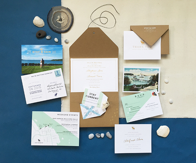
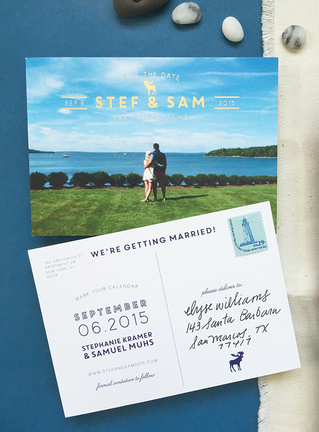
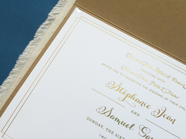
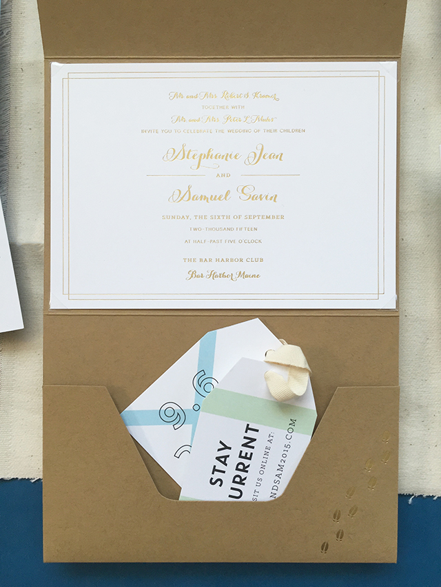
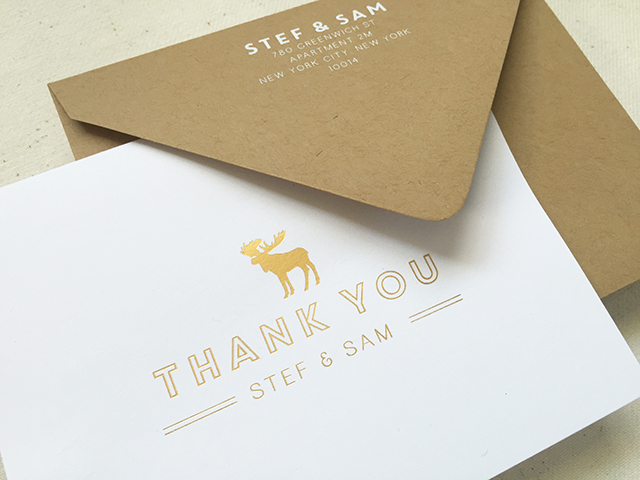
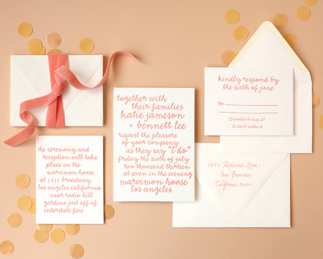
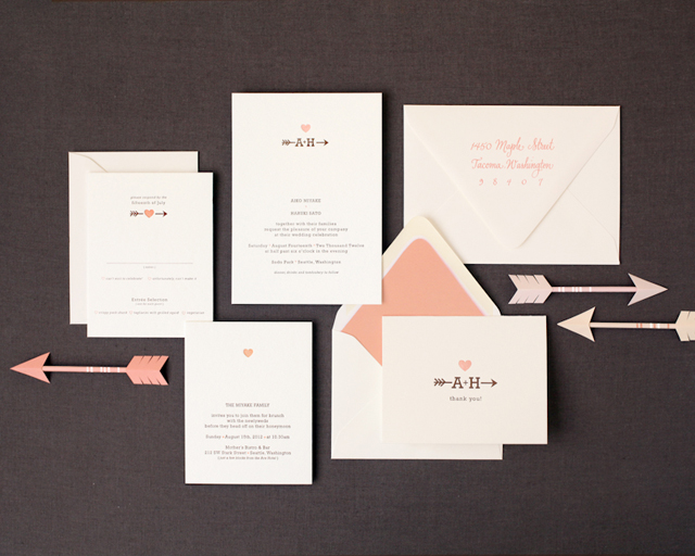
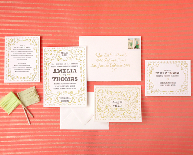
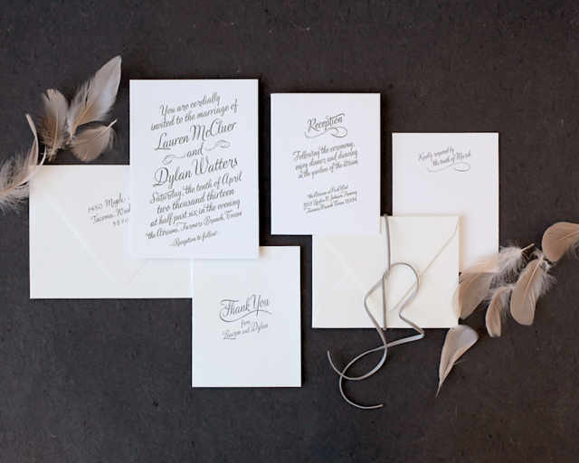
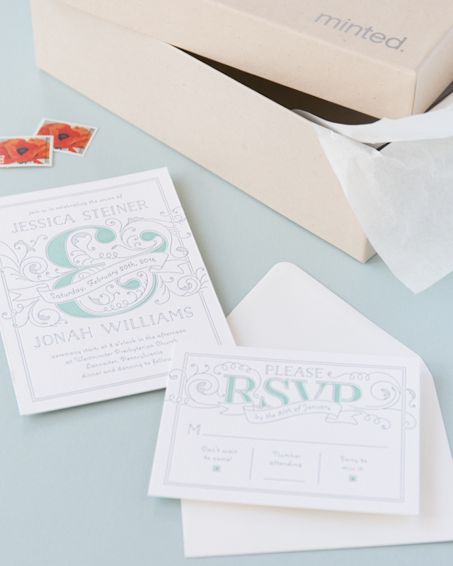
For a few years, calligraphy was the bread and butter of Dancing Pen Calligraphy. We offered hand calligraphy envelopes, place cards, vows and simple marriage certificates. I would ask my clients to include one sample of their wedding invitation so I could get a feel for their aesthetic and carry that look to their envelopes. I remember getting my first letterpress invitation in my hands and just fell in love!! I didn’t even know what it was called, but I knew I had to learn how to create something with that type of depth, texture, and handcrafted yet luxurious feel.

Behind the Stationery: Dancing Pen and Press / Oh So Beautiful Paper

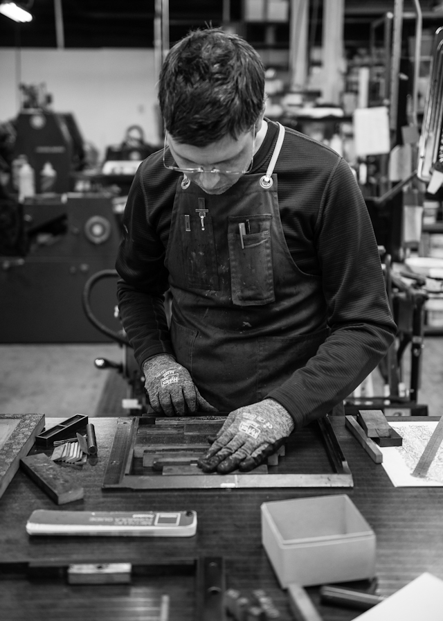
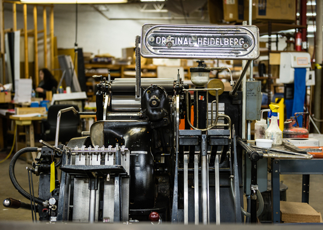
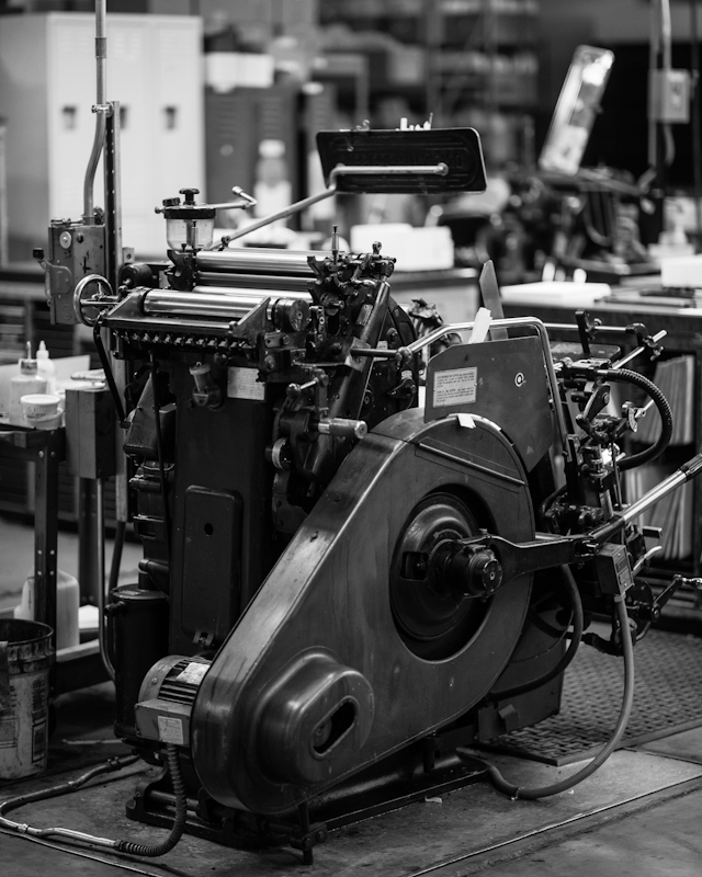
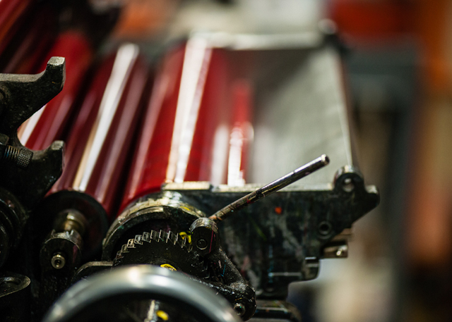
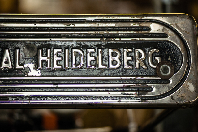
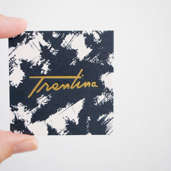
After a few minutes on the Internet (Google did not fail me), I learned about the wonder that is letterpress printing. Lucky for me, AS220, a local community print shop offered three-day letterpress workshops. Morgan Calderini of Ladyfingers Letterpress (before there was a Ladyfingers Letterpress) taught the class. I quickly realized that this was a calling for me. I just adored the way that I could “marry” the hand calligraphy I have always loved, with my new crush – letterpress. I scoured local ads and found a Chandler & Price New Style letterpress for the deal of the century at $200. And this is when Dancing Pen Calligraphy, became Dancing Pen & Press.

Behind the Stationery: Dancing Pen and Press / Oh So Beautiful Paper

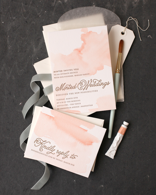
In 2010, I packed my bags and moved from Rhode Island to sunny Houston, Texas. I wanted to expand my horizons with custom marriage certificates and add more flair to them besides hand calligraphy. My Chandler and Price letterpress isn’t large enough to print an 18×24″ certificate so I knew that I had to learn watercolor! Just like calligraphy, I purchased a book and taught myself that as well. I seriously LOVE the unpredictable nature of watercolor and plan to incorporate it more in letterpress wedding invitations in the near future.

Behind the Stationery: Dancing Pen and Press / Oh So Beautiful Paper

Our business is busy all year long, but depending on the season product popularity ebbs and flows. Late winter to early summer we are humming right along with letterpress invitations, then mid-summer to early fall we are in marriage certificate season, followed by a huge Christmas/Holiday letterpress card season. I love all of the different aspects of what we do. They are all my babies and I could not pick my favorite!

Behind the Stationery: Dancing Pen and Press / Oh So Beautiful Paper

In 2012, Allison joined the team. It was so nice to share some of the responsibilities of running a business. I am also a huge brainstormer, so it’s fantastic to have someone to bounce ideas off of. I have always thought of myself as having a keen eye for color. She helps with quality control, packing up letterpress goodies with care and scheduling.

At this point we were still running our business 100% off of Etsy. We shipped all over the world, but most clients came from Los Angeles, NYC, Australia (yes, Australia!), and the Southern Belle states. Allison and I launched our website exactly one year ago and our new Houston clientele immediately responded.

We like to joke that we should rebrand ourselves as “Swanky Letterpress”, because we are Southern (Allison), and Yankee (Elecia). Did I mention we are huge word dorks? We work well together since we are so different. I love traditional curly calligraphy or trendy gold foil on an invitation, while Allison leans more towards clean lines and a contemporary aesthetic.

Behind the Stationery: Dancing Pen and Press / Oh So Beautiful Paper

We have been wanting to expand to a brick & mortar storefront for a while now. Envelopes, boxes of Crane Lettra paper, pads of watercolor paper, samples, ink cans, watercolor palettes, hot foil stamping machines, and the like have been overflowing to other parts of my not-so-huge house in the past year or two. We have been searching for the perfect location for Dancing Pen & Press to call home. We are THRILLED to announce that we have secured a location, and are in the process of renovating & will open doors the first week of November!! We will of course be posting a photo diary all along the way of our progress. Think dove grey painted wood floors and cabinetry, blush walls, gold…well, we won’t give it all away.

Stay tuned!

All photos courtesy of Dancing Pen & Press.

Interested in participating in the Behind the Stationery column? Please send an email to Megan at megan[at]ohsobeautifulpaper.com for more information.

Minted Letterpress Wedding Invitations

I’ve been a huge fan of Minted for years – and I’ve loved watching their product selection expand to include letterpress printing, gold foil, and now even fabric, art prints, photo artwork, and home décor! Minted works with a diverse and ridiculously talented roster of independent designers around the world. I love that they provide a platform for both established designers and freelancers that have tons of talent but perhaps don’t have the time to take on custom design projects and clients. It’s seriously such a great resource. Minted has offered letterpress wedding invitations for a few years now, and today they asked me to share a few of my favorites from their Minted Letterpress collection! Plus they’re sharing a behind-the-scenes peek at their letterpress printing studio and offering a 15% discount for OSBP readers! Yay!

Minted Letterpress Wedding Invitations and Print Shop Tour / Oh So Beautiful Paper

Minted Letterpress combines the artisanal letterpress printing process with modern wedding invitation designs from their community of independent artists to create a unique, beautiful, and completely customizable invitation collection. And I love that they offer FREE wedding websites in matching designs. When you put that much effort into selecting the perfect invitation design, you also want your wedding website to match!

Minted Letterpress Wedding Invitations and Print Shop Tour / Oh So Beautiful Paper

Minted Letterpress Wedding Invitations and Print Shop Tour / Oh So Beautiful Paper

Minted Letterpress Wedding Invitations and Print Shop Tour / Oh So Beautiful Paper

Minted put a lot of careful time and effort into selecting the details for their letterpress collection. They chose 100% cotton paper for its soft feel and porous texture that delivers a deep, hand-printed impression. They offer an extensive color palette with more than 40 colors that can be used in any combination, making each design completely unique. And in case all these choices sound super overwhelming, don’t worry. Dedicated Minted design consultants specialize in making each invitation perfect and will work with you to help create your design vision, from start to finish – all at an affordable price.

Minted Letterpress Wedding Invitations and Print Shop Tour / Oh So Beautiful Paper

Minted Letterpress Wedding Invitations and Print Shop Tour / Oh So Beautiful Paper

Like other letterpress studios, each and every Minted Letterpress wedding invitation is produced by an individual press operator, who hand feeds each piece of paper into antique Heidelberg presses to achieve a unique impression. In an age of digital everything, letterpress is a throwback to slower days and a focus on quality workmanship. Every letterpress invitation has a printer behind it who is responsible for everything from hand inking the press, setting it up, and checking each invitation as it comes off the press. Here’s a little peek into the Minted print shop!

Minted Letterpress Wedding Invitations and Print Shop Tour / Oh So Beautiful Paper

Minted Letterpress Wedding Invitations and Print Shop Tour / Oh So Beautiful Paper

Minted Letterpress Wedding Invitations and Print Shop Tour / Oh So Beautiful Paper

Minted Letterpress Wedding Invitations and Print Shop Tour / Oh So Beautiful Paper

Minted Letterpress Wedding Invitations and Print Shop Tour / Oh So Beautiful Paper

Minted Letterpress Wedding Invitations and Print Shop Tour / Oh So Beautiful Paper

Minted Letterpress Wedding Invitations and Print Shop Tour / Oh So Beautiful Paper

Minted Letterpress Wedding Invitations and Print Shop Tour / Oh So Beautiful Paper

Minted Letterpress Wedding Invitations and Print Shop Tour / Oh So Beautiful Paper

You just can’t beat the tactile feel of a letterpress printed wedding invitation!

Minted Letterpress Wedding Invitations and Print Shop Tour / Oh So Beautiful Paper

Minted is generously offering 15% off letterpress wedding invitations for OSBP readers with the code OHSO15WED through Tuesday, October 6!

This post was created in partnership with Minted. All opinions are my own. Thank you for supporting the sponsors that make Oh So Beautiful Paper possible!

Unexpected Business Card Ideas

As far as I’m concerned, business cards are tiny works of art. A beautiful business card makes a huge impression, and I would argue that the business card is even more relevant in today’s world of email, cell phones, and social media. Here are a few unexpected business card ideas for creating a beautiful – and unforgettable – business card!

Unexpected Business Card Ideas

Oh So Beautiful Paper Watercolor and Letterpress Business Cards / Design and Printing by Gus & Ruby Letterpress

A Bit of Shine

Metallics are the new neutral. And they look amazing on a business card! The options are endless – from shiny metallic foil logos and type to more abstract applications. And the metallic foils themselves come in every hue imaginable, from classic gold to of-the-moment rose gold and copper to trendy hologram silver!

En Route Photography Gold Foil Business Cards / Design by Belinda Love Lee

En Route Photography Gold Foil Business Cards / Design by Belinda Love Lee

Hand Painted Details

What could possibly be more unique than a hand painted business card? A splash of semi-transparent watercolor pairs perfectly with letterpress printed type, whether layered over blind impression (no color) text or as a modern swash underneath the key details. You could even DIY your own business cards using a custom rubber stamp over a watercolor painted background!

Satsuki Shibuya Watercolor and Blind Impression Letterpress Business Cards / Printed by PresshausLA

Satsuki Shibuya Watercolor and Blind Impression Letterpress Business Cards / Printed by PresshausLA

Akula Kreative Rubber Stamp and Watercolor Business Cards

Akula Kreative Rubber Stamp and Watercolor Business Cards

Colorful Edges

The edge is the perfect place to incorporate a bright pop of color – or even stripes of different colors! You’ll want to use double-thick paper ( at least 220lb) to maximize the visual effect, but it’s well worth the extra effort!

Oh Happy Day Stripe Edge Painted Business Cards

Oh Happy Day Stripe Edge Painted Business Cards

Or Shiny Edges!

Did you know that you can put shiny metallic foil on the edges of business cards and wedding invitations? Well, you can! It’s a very specialized printing method, but perfect for a card that is already full of color or wants an even bigger visual impact.

Oh So Beautiful Paper Gold Foil Edge Business Cards / Foil Edging by Boxcar Press

Oh So Beautiful Paper Gold Foil Edge Business Cards / Foil Edging by Boxcar Press

Unique Shapes and Layouts

Who said that a business card has to be rectangular? I’m a big fan of square business cards, circular business cards, even hexagon cards! Or stick with the rectangular shape but go with a vertical layout. Anything goes!

Trentina Navy and Gold Foil Business Cards / Design by Christine Wisnieski

Trentina Navy and Gold Foil Business Cards / Design by Christine Wisnieski

Go Double Sided

A double sided business card is a great way to create visual impact while keeping all of your contact information in one place. You can have the reverse side printed or adhere patterned papers – like vintage wallpaper, gift wrap, and scrapbooking paper – to the reverse side using spray adhesive.

Jessica Comingore Floral Double Sided Business Cards / Printed by PresshausLA

Jessica Comingore Floral Double Sided Business Cards / Printed by PresshausLA

Jessica Comingore Floral Double Sided Business Cards / Printed by PresshausLA

Light on Dark

I love the look of light text against a dark background – so unexpected! Metallic foils and matte white foil look amazing against dark navy blue and black paper.

Clementine Rose Gold and Navy Business Cards / Design by Sara Jensen / Printed by Iron Curtain Press

Clementine Rose Gold and Navy Business Cards / Design by Sara Jensen / Printed by Iron Curtain Press

Unique Materials

I thought I had seen everything – but then I saw a leather business card and thought it was the most amazing idea! You can letterpress print, foil stamp, and screen print on leather, making it as versatile a medium as paper. I’ve also seen paper business cards that incorporated embroidery and fabric. The sky’s the limit!

Arnsdorf Leather Business Card

p.s. More creative business card ideas right here!

This post was created in partnership with eBay. All content and opinions are my own. Thank you for supporting the sponsors that make Oh So Beautiful Paper possible!

Finding the Paper: Trentina Identity Design

Hi Everyone! I’m SO excited to introduce a brand new column – with a brand new contributing author – here on Oh So Beautiful Paper today! Jill DiNicolantonio is a life-long paper enthusiast, former paper rep, and the founder of Parse & Parcel, an online resource for print and paper samples. Jill is on a mission to help creatives find and use the right paper for their projects – which just so happens to be the focus of her column: Finding the Paper. Welcome Jill! –Nole

Finding the Paper: Trentina Identity System by Christine Wisnieski / Jill of Parse & Parcel for Oh So Beautiful Paper

As if a James Beard Award winning chef isn’t enough of a reason to lure me in to Trentina, then this identity system by Cleveland Graphic Designer, Christine Wisnieski will definitely do it. Chef Jonathon Sawyer and his wife Amelia created an elegant and lavish dining experience for their patrons. Inspired by the cuisine of Trentino, Italy, where Amelia and her family originated, visitors are treated to a luxe, yet relaxed ambiance with glamorous design touches throughout. Christine created the logo and identity for Trentina, perfectly capturing the polished and expressive aesthetic of the restaurant and its owners.

This identity system is rooted in beautiful art, and expressive, voluptuous typography. The gold script logo is speed-infused, drawing inspiration from traditional Italian signage and crafted by hand. Metallic colors play a major role in the restaurant’s decor with mirrored tables and gold walls, and is echoed among the papers and finishes used throughout Trentina’s identity system.

Finding the Paper: Trentina Identity System by Christine Wisnieski / Jill of Parse & Parcel for Oh So Beautiful Paper

Trentina offers a variety of menus; brunch, lunch, dinner and a 12 course tasting menu. The menu system emulates the food — bold but delicate, expressive yet refined. The system smartly utilizes a mix of digital and offset printing processes, simplifying the task of  future menu edits. By employing the use of colored metallic papers, an added layer of elegance is achieved without the added expense of a metallic ink. The pearlescent finishes in Neenah Paper’s Esse and Stardream grades used for the menu cover and dividers, play nicely against subtle text and cover pages of the interiors in Neenah Classic Crest Classic Natural White 70# Text and French Construction Insulation Pink 80# Cover.

Finding the Paper: Trentina Identity System by Christine Wisnieski / Jill of Parse & Parcel for Oh So Beautiful Paper

Other elements include the offset printed business card featuring a stunning gold gloss foil logo on Neenah Eames White Vellum in 100# Cover. And I adore the matchbook with the Trentina logo in a gold gloss foil stamp on the Stardream Antique Gold 80# Cover, such a striking combination. The check presenter pairs offset printing with a blind letterpress printed logo on Neenah Eames White Vellum in 100# Cover. This is definitely one identity system to raise a glass of prosecco to, cin cin!

Finding the Paper: Trentina Identity System by Christine Wisnieski / Jill of Parse & Parcel for Oh So Beautiful Paper

Finding the Paper: Trentina Identity System by Christine Wisnieski / Jill of Parse & Parcel for Oh So Beautiful Paper

Finding the Paper: Trentina Identity System by Christine Wisnieski / Jill of Parse & Parcel for Oh So Beautiful Paper Finding the Paper: Trentina Identity System by Christine Wisnieski / Jill of Parse & Parcel for Oh So Beautiful Paper

Finding the Paper: Trentina Identity System by Christine Wisnieski / Jill of Parse & Parcel for Oh So Beautiful Paper

Photo Credits: Paul Sobota, BurkleHagen, Christine Wisnieski