Seasonal Stationery: 2016 Hanukkah cards

Oh, the festival of lights! As a kid, I couldn’t wait to open my Hanukkah gifts. As an adult, I can’t wait for a guilt-free way to enjoy fried foods (pro-tip: if you are planning to make latkes at home, be sure to open all your windows BEFORE you start cooking). Whatever your personal motivation, sharing a joyful message with loved ones is what the holiday is really all about. We’ve rounded up some of our favorite iconography associated with the holiday including chocolate, misspellings, and the aforementioned fried foods (and yes, a few traditional icons such as dreidels and menorahs as well) to bring you a few awesome Hanukkah cards. – Shauna

Seasonal Stationery: 2016 Hanukkah Cards

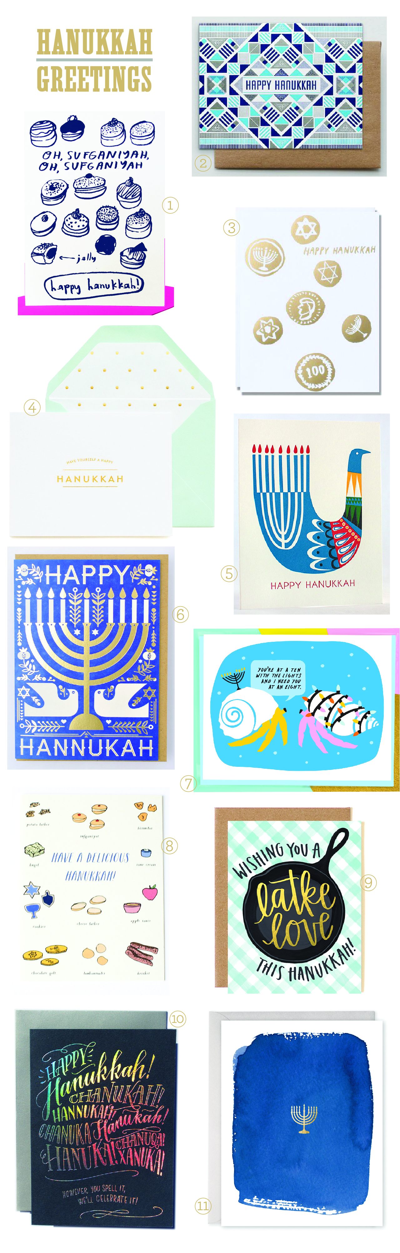
1. Hanukkah begins on Christmas Eve this year, so this play on a famous Christmas carol feels especially appropriate – from People I’ve Loved.

2. Really appreciating the tight registration and geometric details of this three color letterpress card from Hammerpress.

3. Egg Press celebrates the sweeter side of the holiday with a gelt-themed design.

4. If simple and elegant is more your bag, you can’t go wrong with Los Angeles-based Sugar Paper.

5. Loving this clever bird menorah (letterpressed in four colors!) from husband and wife team Fugu Fugu Press.

6. Most Hanukkah cards feature a menorah, but this folk-inspired one from Hello!Lucky is one of my favs.

7. This Lark + Raven card made me laugh out loud. Perfect for your friend who celebrates Hanukkah and Christmas!

8. Paula and Waffle, you had me at cheese latkes.

9. Speaking of latkes, a good food pun is also always a good idea (from One Canoe Two).

10. ‘However you spell it, we’ll celebrate it!’ with holographic foil! This super fun design comes courtesy of Ladyfingers Letterpress.

11. For those purists out there, this gold foil menorah from E. Frances Paper is a sure win.

Be sure to check out our previous holiday card round ups here and here!

We’ll be back soon with a few more holiday cards, New Year’s cards – oh, and a few 2017 calendars, too!

Happy Weekend!

Happy Friday everyone! Since we usually travel for the Thanksgiving holiday, we’re just now getting our Christmas decorations out and getting our home into the holiday spirit. Alice still has no idea what all the fuss is really about, but Sophie is so excited to decorate! We’re getting our Christmas tree this afternoon from a fundraiser at Sophie’s school, and I’m sure we’ll spend the rest of the night stringing lights and hanging ornaments. With a two year old and four year old in the house, I finally bought a set of shatterproof ornaments and will set our breakable glass ornaments aside for a few years. I’ll be sure to share our tree on Instagram later tonight or tomorrow! But in the meantime…

Esther Clark Co. via Instagram

Image by Esther Clark Co. via #dailydoseofpaper

…a few links for your weekend!

This week on Oh So Beautiful Paper:

That’s it for us this week! Have a fabulous weekend, and I’ll see you back here next week! xoxo

Eclectic Jewel Tone Geometric Wedding Invitations

Christy from Papertree Studio worked with photographer Jen Woodruff to create these eclectic jewel tone geometric wedding invitations with copper foil printing for Jen’s offbeat mid-week (so fun!) wedding. Christie incorporated geometric lines, multiple patterns, pops of copper, and a super cool marbled envelope liner to match Jen’s unique and modern aesthetic. I’m loving all the details in this suite!

Eclectic Jewel Tone Geometric Wedding Invitations by Papertree Studio

From Christy: This past fall I was approached by a talented photographer in the industry, Jen Woodruff, to meet and discuss the vision she had for her offbeat Thursday wedding. Jen wasn’t finding anything she liked online so she decided custom was the way to go. After chatting with Jen, I had my fingers crossed that I would get to design her wedding invitations!

Eclectic Jewel Tone Geometric Wedding Invitations by Papertree Studio

Jen wanted to use rich jewel tones paired with a metallic color and wanted to incorporate different patterns throughout her invitation suite.  Jen really wanted her invitations to be unique and fun, but also high end. I couldn’t wait to get started! I began the design process with the invitation. I pulled in a very simple geometric line art drawing and decided on a rich green background with copper foil accents.

Eclectic Jewel Tone Geometric Wedding Invitations by Papertree Studio

To add an element of surprise, we put a beautiful and colorful pattern on the back to pull in more colors that were in our palette. Also pulling details from that pattern, I designed the response card and details enclosure card. Both of the pieces also had the geometric pattern on the back.

Eclectic Jewel Tone Geometric Wedding Invitations by Papertree Studio

Eclectic Jewel Tone Geometric Wedding Invitations by Papertree Studio

The invitations were printed on a heavy 130lb white linen paper. I thought a rich navy outer envelope with a cool marble patterned envelope liner would add to the eclectic mix and decided to bring in that pink jewel tone again with the response envelope. I used a copper loose weave cotton ribbon from Studio Carta to complement the copper foil in the invitation.

Eclectic Jewel Tone Geometric Wedding Invitations by Papertree Studio

Thanks Christy!

Design: Papertree Studio

Paper: Neenah

Envelopes: Soho Paper

Printer: The Chambers Group, Malvern

Ribbon: Studio Carta

Check out the Designer Rolodex for more tal­ented wed­ding invi­ta­tion design­ers and the real invi­ta­tions gallery for more wedding invitation ideas!

Photo Credits: Christy Howton

Seasonal Stationery: 2016 Holiday Cards, Part 2

Ho ho ho! Time to get out your stockings, dust off those fairy lights, and make sure Santa knows you’ve been good this year. While the promise of snow seems far in the distance for many of us, the promise of holiday shopping and gift giving has definitely arrived. We know custom and photo holiday cards aren’t for everyone, so we wanted to make sure we rounded up some gorgeous 2016 holiday cards that help share the spirit of the Christmas season either long distance or in person. We’ve taken the liberty of collecting some of our favorites below! –Shauna

2016 Christmas Card Round Up / Oh So Beautiful Paper

1. Loving this claymation-inspired Santa and Rudolph from Clap Clap Design

2. A more traditional sentiment from Chic + Nawdie featuring classic Christmas icons

3. Those hardworking elves over at Rifle Paper Co. know a thing or two about making cute holiday cards. This one is even die cut in the shape of a snow globe!

4. Clever use of copper foil in this holiday card design from Nicolas John Firth for Red Cap Cards. Don’t you wish this guy was coming to your holiday party?

5. The Nutcracker ballet remains a childhood favorite, so why not share this Pei Design with someone who shares a love of nostalgia?

6. All I want for Christmas is to sleep in, but I suppose diamonds don’t hurt either (according to 417 Press)

7. Power and Light uses a simple message paired with a candy cane stripe for a modern twist on a classic design

8. It’s a card! It’s an ornament! Get more bang for your buck (or pound) with this cleaver Katie Leamon holiday card

9. If you are as obsessed with Stranger Things as I am, you’ll love this creepy Christmas message from Lionheart Prints

10. Such a sweet illustration from Amy Heitman

If Santa and elves aren’t your thing, be sure to check out yesterday’s round up of 2016 holiday greeting cards that celebrate the winter spirit!

Romantic Gold Foil Calligraphy Wedding Invitations

We may be heading into winter, but Spring will always be my favorite season in my heart. I adore the combination of spring floral illustrations and  whimsical calligraphy in these romantic gold foil calligraphy wedding invitations by Kara Anne Paper. Kara designed this invitation suite for her own wedding and incorporated many meaningful nods to her family, including her new family crest and an illustration of her father’s home. What a special invitation suite that will certainly be treasured for a long time to come!

Romantic Gold Foil Calligraphy Wedding Invitations by Kara Anne Paper

Romantic Gold Foil Calligraphy Wedding Invitations by Kara Anne Paper

From Kara: Designing my own wedding invitation suite came easy! After finalizing our wedding style and color scheme, the late night invitation doodles began. Staying cohesive with all the paper details was important to me.

Romantic Gold Foil Calligraphy Wedding Invitations by Kara Anne Paper

Romantic Gold Foil Calligraphy Wedding Invitations by Kara Anne Paper

William and I wanted a chic backyard wedding filled with beautiful spring colors and a touch of gold accents. I felt introducing an original watercolor invitation cover was just the perfect touch for our gold foil calligraphy invitation. The invitation was printed on 220# Crane’s Pearl White Lettra with gold painted edges. We also included a tri-fold reply card with our new family crest on the front and an illustration of the ceremony location and reception venue. This design was letterpress printed on 110# Pearl White Lettra. Our special wedding suite was all tied together beautifully with silk blue ribbon and placed inside a Crane’s Royalty envelope. The front of the envelope was graced with gold calligraphy to match the invitation.

Romantic Gold Foil Calligraphy Wedding Invitations by Kara Anne Paper

Romantic Gold Foil Calligraphy Wedding Invitations by Kara Anne Paper

The wedding program was one of my favorites! The small booklet included a cover page with a pop-up illustration of my father’s house, where I was raised and where William and I first met. To tie the program back in with the wedding suite the cover was a blind embossed printed impression of the same floral pattern used on the invitation cover. Behind the pop-up, on the inside page was the illustration of the pond and dock where William and I exchanged vows. The pages that followed included the ceremony and wedding party details.

Romantic Gold Foil Calligraphy Wedding Invitations by Kara Anne Paper

Romantic Gold Foil Calligraphy Wedding Invitations by Kara Anne Paper

Although our rehearsal dinner was indoors we wanted it to have a fresh spring, outdoor feel. We had fresh flowers that matched the watercolor paintings used on both invitations. The invitation was placed inside a wood and glass box with preserved green moss laid nicely on the bottom. The top of the box included the guest names with a pretty blue silk ribbon tied around it. Our closest friends and family were invited so we wanted these invitations to be extra special and personalized.

Romantic Gold Foil Calligraphy Wedding Invitations by Kara Anne Paper

Romantic Gold Foil Calligraphy Wedding Invitations by Kara Anne Paper

Thanks Kara!

Design: Kara Anne Paper

Check out the Designer Rolodex for more tal­ented wed­ding invi­ta­tion design­ers and the real invi­ta­tions gallery for more wedding invitation ideas!

Photo Credits: Kara Anne Paper and Kim Box Photography