Behind the Stationery: Tiny Bones Press

Our next designer on Behind the Stationery is a new-to-me stationer that I discovered at NSS 2017. Megan’s delicate and minimalistic work at Tiny Bones Press caught my eye amongst the other booths with brighter hues and bold art. With a background in post and print production for fashion designers and photographers, Megan shares about her journey into the letterpress and stationery world as a solopreneur. —Megan Soh

Behind the Stationery: Tiny Bones Press

From Megan: I’ve always worked within the printing world in NYC and slowly started exploring practices on my own. I learned to letterpress about five years ago and really fell in love with the process. I love writing letters and notes and started to make stationery that I wanted to use myself.

Behind the Stationery: Tiny Bones Press

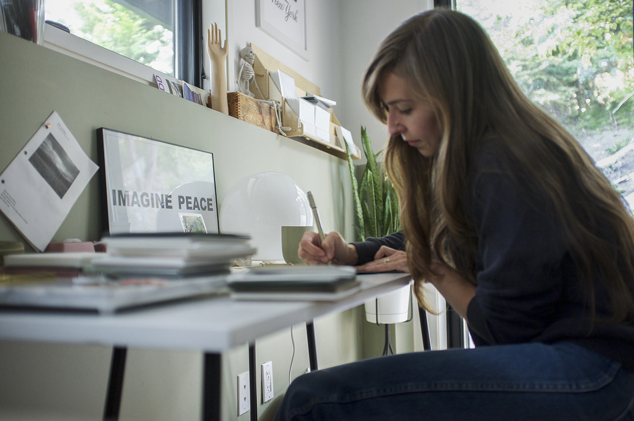
My husband and I bought a house on the north shore of Long Island. We were in Brooklyn for a decade and loved it but needed a bit more space and I really wanted to be by the water! We truly lucked out and now I have a lovely little studio that really has provided me the creative haven I was dreaming of.

Behind the Stationery: Tiny Bones Press

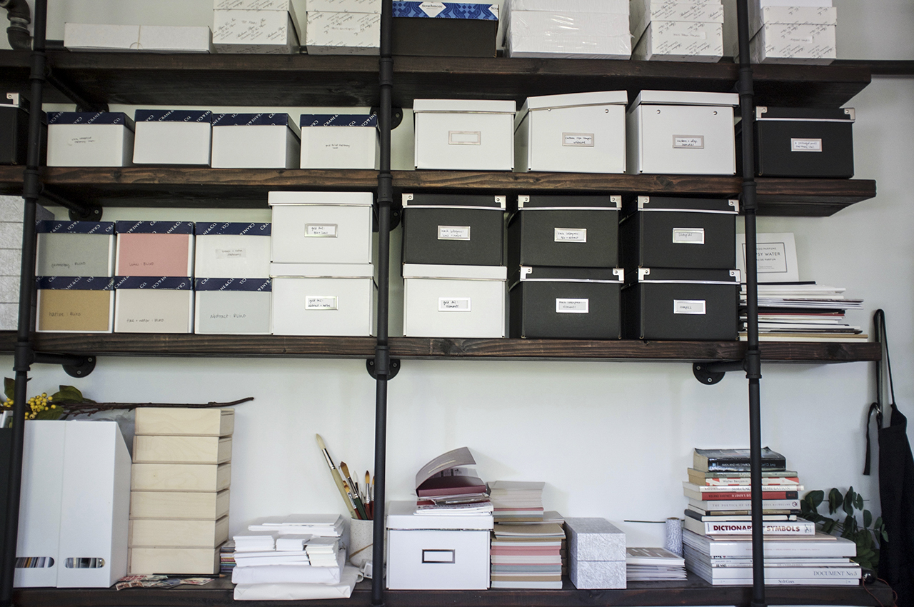
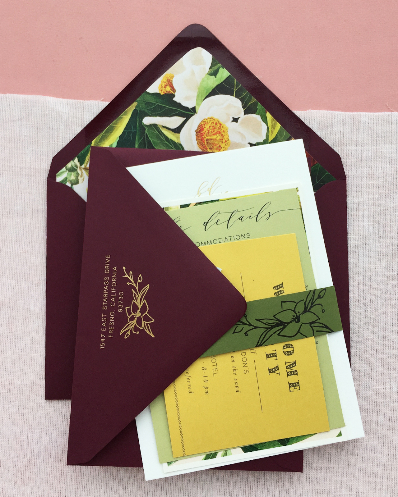
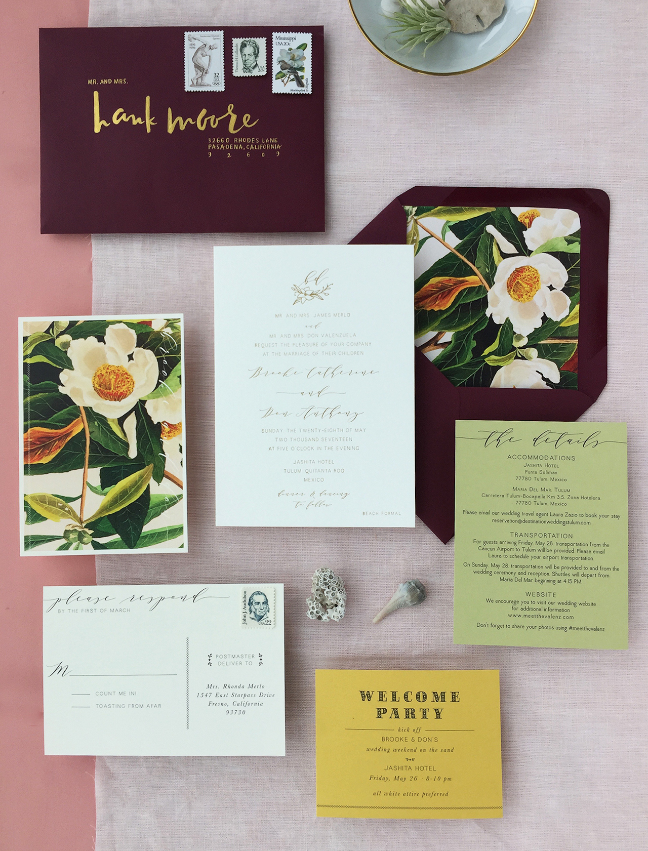
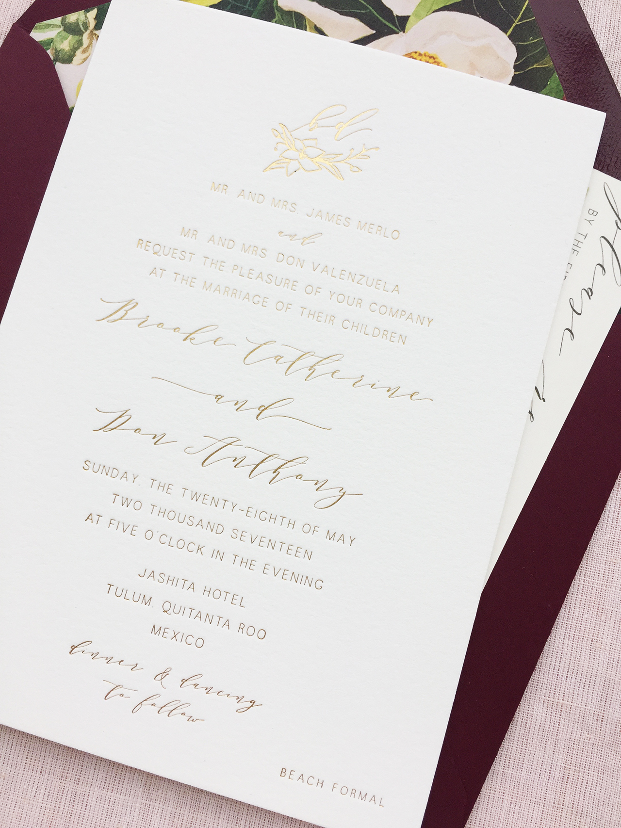
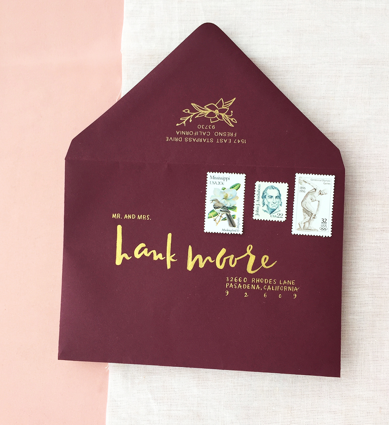
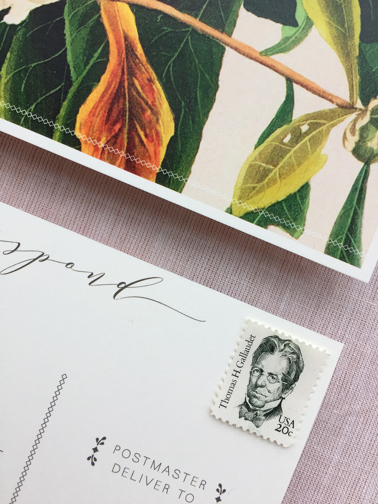
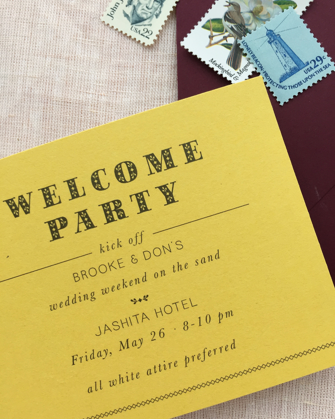
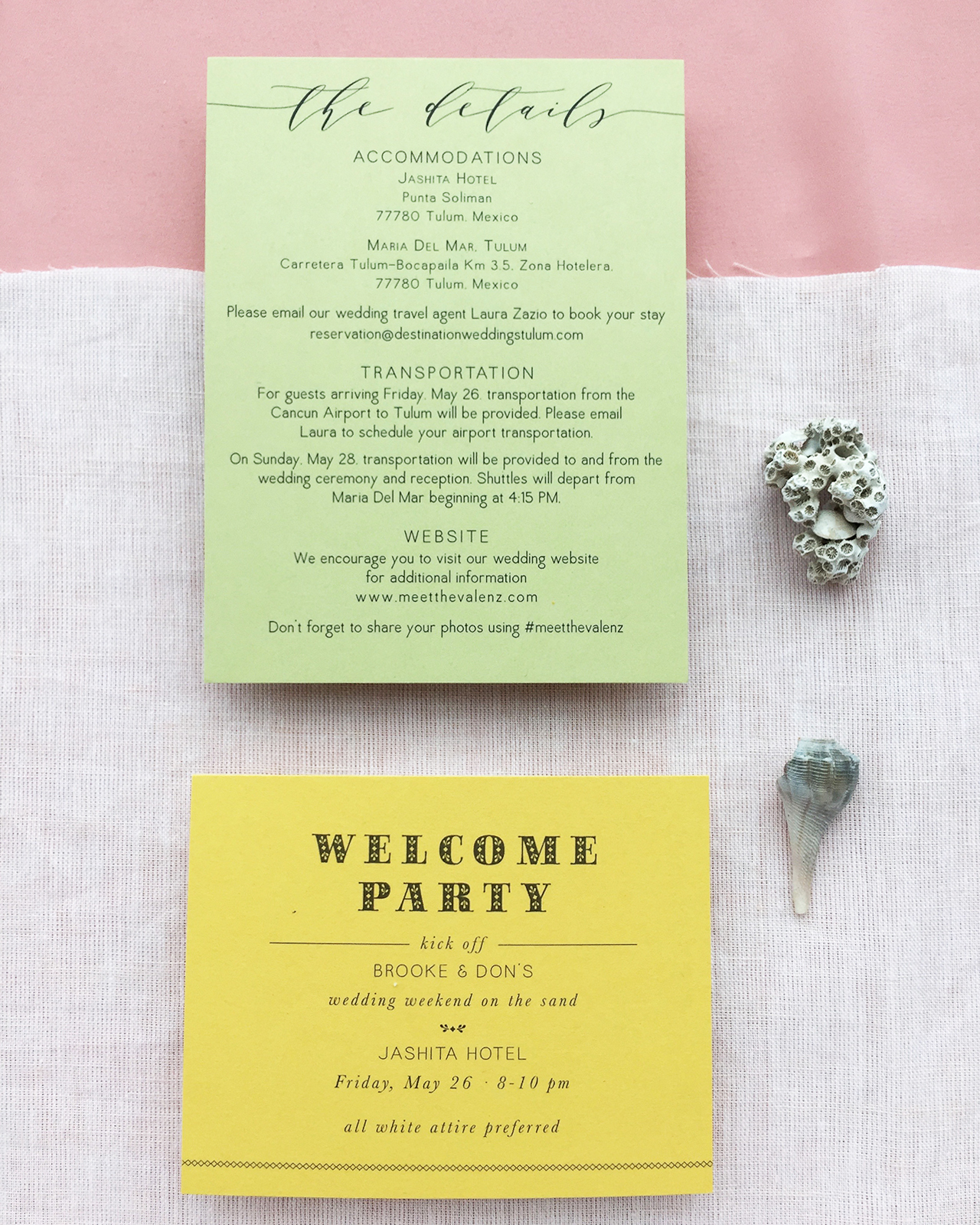
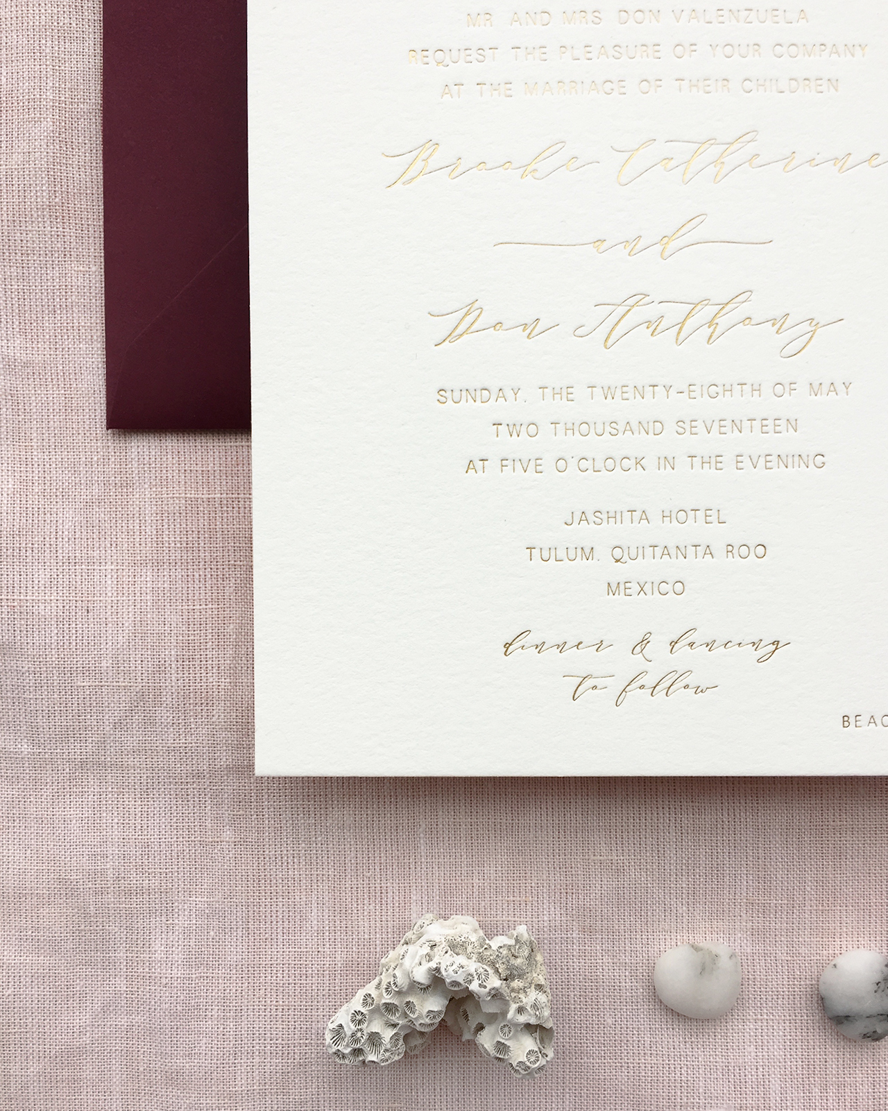
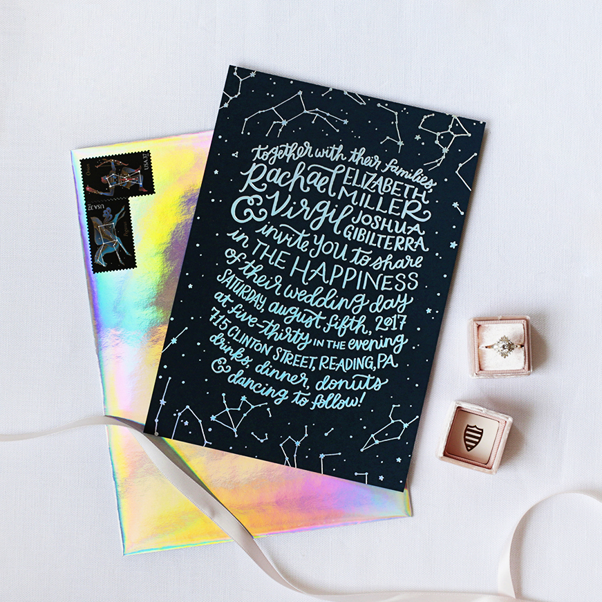
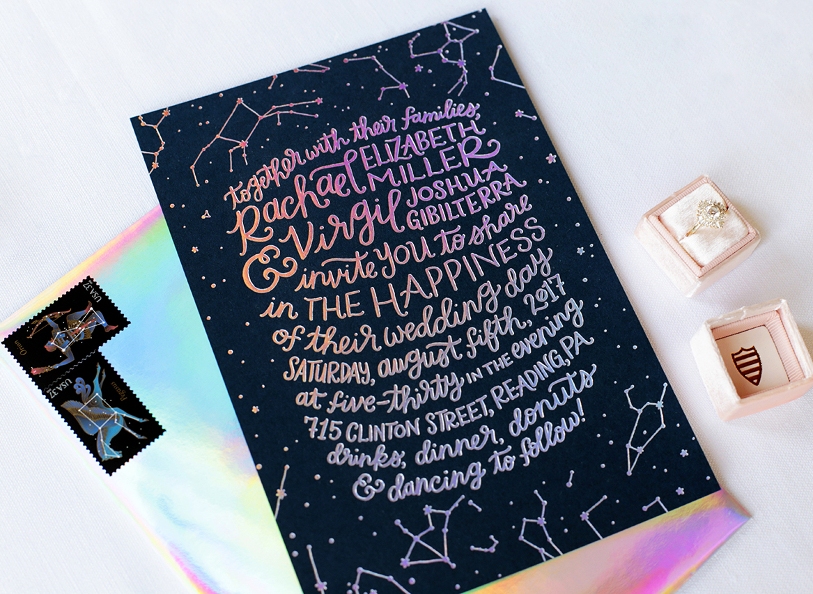
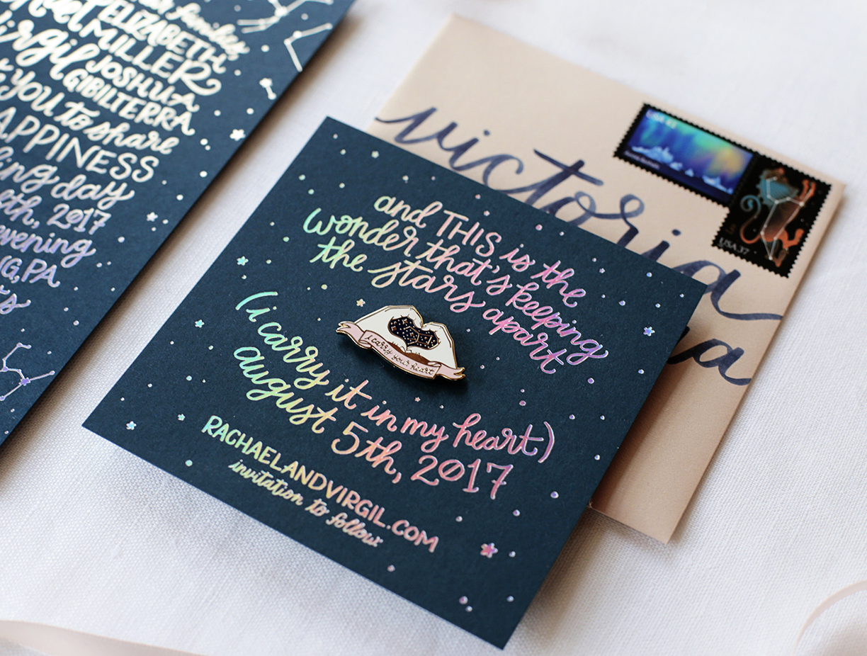
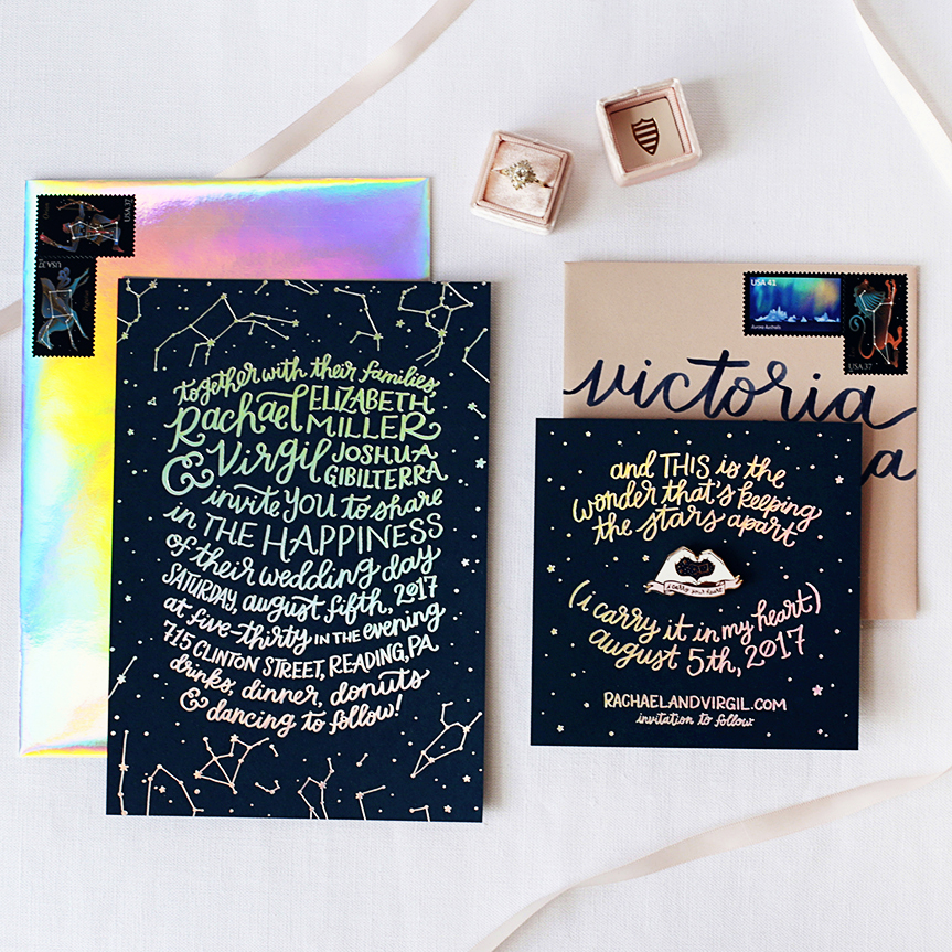
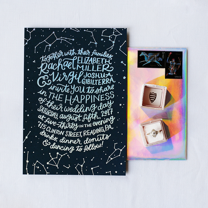
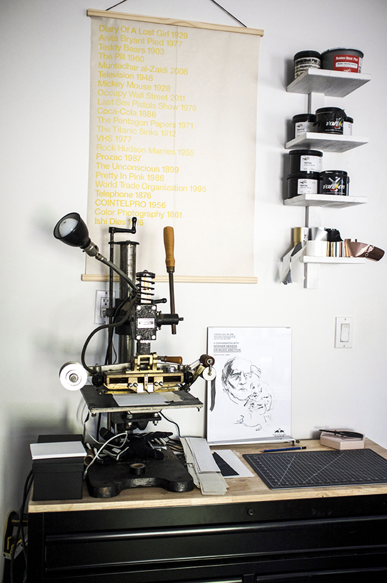
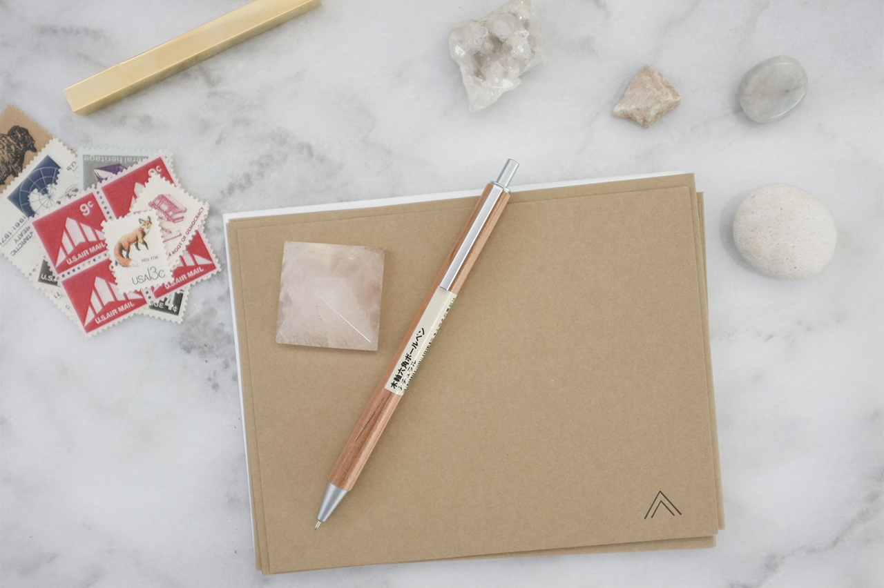
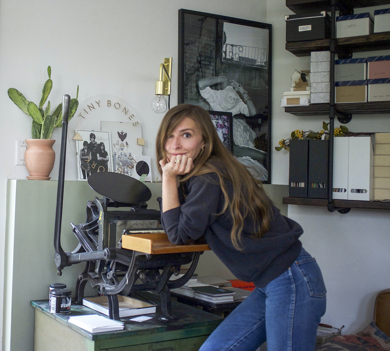
In house, I offer design services and letterpress and foil stamp printing. I frequently collaborate with trusted digital printers to add that process to my designs as well. People who are drawn to my work are people who love minimal design and also who love truly love paper and print. Having a minimal aesthetic — the feel of the paper, the tones, the delicate foiling and letterpress all add up to make the pieces special and unique. All Tiny Bones Press stationery is printed in my studio, by me, one by one, on vintage presses.

Behind the Stationery: Tiny Bones Press

Behind the Stationery: Tiny Bones Press

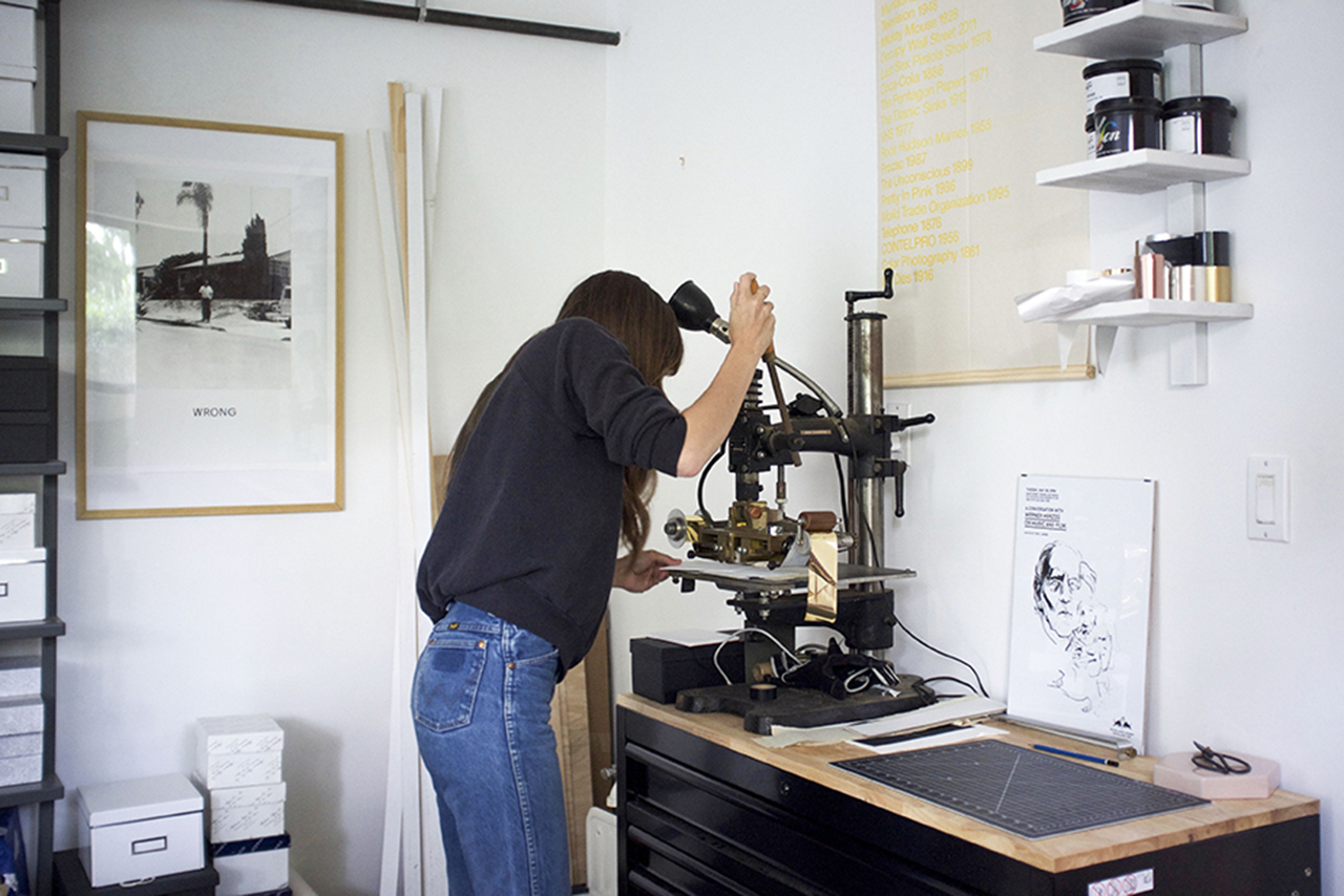
Right now, I am a one woman team! I typically start the day with a coffee and make my daily list. Usually I get to work on emails (I try to do this outside if I can) and then spend the afternoon in the studio printing. I’m trying to get better at balancing all aspects of the business – it can be hard to juggle everything solo.

Behind the Stationery: Tiny Bones Press

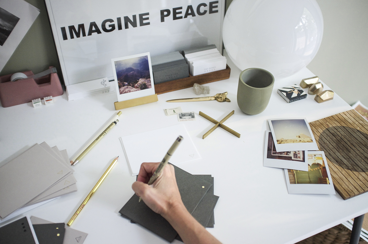
My design process is all about exploring – I’m very interested in the world around me and try to find inspiration by exposing myself to a number of different images throughout industries: from architecture to art to books and science, etc. I always make lists and keep a notebook handy and do feel that it’s important to explore things that you as a person are naturally drawn to – for me that is geometric linework and symbols. My sketches then turn into digital drawings, which then turn into plates, and then finished printed pieces – the evolution of a piece is really the most fun aspect (next to sending them off for others to enjoy).

Behind the Stationery: Tiny Bones Press

Behind the Stationery: Tiny Bones Press

All photos by Tiny Bones Press.

Want to be featured in the Behind the Stationery column? Reach out to Megan at megan [at] ohsobeautifulpaper [dot] com for more details.

Romantic Burgundy and Gold Foil Wedding Invitations

These invitations totally had me at that gorgeous floral envelope liner! These romantic burgundy and gold foil wedding invitations were designed by Lauren of Charm & Fig for a destination wedding in Tulum, Mexico. I love the way Lauren incorporated subtle nods to traditional Mexican design while maintaining the couple’s unique vibe. Those deep burgundy envelopes are absolute perfection paired with the crisp gold foil and tones of green and yellow! 

Romantic Burgundy and Gold Foil Wedding Invitations with Floral Envelope Liner by Charm and Fig

From Lauren: Brooke and Don were hosting their wedding weekend in Tulum, Mexico and wanted their invitations to be sophisticated, romantic, and bohemian, with hints of traditional Mexican design. I’ve found that couples often struggle with how to make their destination wedding invitations not overly contrived or thematic, so we avoided “festival colors” and found inspiration in nature for our lush color scheme.

Romantic Burgundy and Gold Foil Wedding Invitations with Floral Envelope Liner by Charm and Fig

Romantic Burgundy and Gold Foil Wedding Invitations with Floral Envelope Liner by Charm and Fig

For the invitation, we created a full gold foil printed suite on Crane’s Lettra double-thick 100% cotton paper, using minimalist typography and romantic scripts to set a loose, but luxe tone. To add an organic touch, I hand-illustrated a mini floral wreath to frame their monogram and used it throughout the design of the suite.

Romantic Burgundy and Gold Foil Wedding Invitations with Floral Envelope Liner by Charm and Fig

For a dramatic first impression, we selected deep burgundy envelopes that were hand addressed in gold ink by artist Jaymie Eaton. I still can’t get over how precise her brush lettering is for the guest addresses! The return address and floral illustration was foil printed in gold on the back, and our vintage stamps showcased beautifully in high-contrast against the dark envelope.

Romantic Burgundy and Gold Foil Wedding Invitations with Floral Envelope Liner by Charm and Fig

Romantic Burgundy and Gold Foil Wedding Invitations with Floral Envelope Liner by Charm and Fig

The laser printed postcard and envelope liner was a great opportunity to inject color and lush tropical botanicals into the suite. We found a John James Audubon print with rich tones that served as a color source for the yellow Welcome Party Card and tropical green Details card. On each of these pieces, we incorporated graphic details inspired by Mexican folk embroidery with delicate lines of diamond “stitching” and tiny decorative designs to highlight important text.

Romantic Burgundy and Gold Foil Wedding Invitations with Floral Envelope Liner by Charm and Fig

Romantic Burgundy and Gold Foil Wedding Invitations with Floral Envelope Liner by Charm and Fig

The entire suite was wrapped up with a thin, olive green belly band that was laser-printed in charcoal with our hand-illustrated florals. The end result was full of color but true to the sophisticated palette that was inspired by the lush tropics of Central America.

Romantic Burgundy and Gold Foil Wedding Invitations with Floral Envelope Liner by Charm and Fig

Thanks Lauren!

Design: Charm & Fig
Gold Foil Printing: Gold Leaf Embossing 
Laser-Printing: Crest Printing Company 
Address Lettering: Jaymie Eaton Lettering 

Charm & Fig is a member of the Designer Rolodex – you can see more of their beautiful work right here or visit the real invi­ta­tions gallery for more wedding invitation ideas!

Photo Credits: Charm & Fig

Behind the Stationery: People I’ve Loved

For our next installment of Behind the Stationery, we head to the San Francisco Bay Area to get a look behind the playful hand-drawn illustrations of Carissa from People I’ve Loved. She delves into her thought process behind designing, time management struggles, and the dynamics of her team. I love all the honesty throughout her post. Take it away, Carissa!
—Megan Soh

Behind the Stationery: People I've Loved

From Carissa: Before stationery there was nothing. Ha. I had to say that. I studied print at SFAI and was really interested in social interactions. My buddy Luca Antonucci and I started Colpa Press right after grad school where we were really interested in making prints, books, objects, and cards that were concept driven and affordable. I think I got into cards as mini performance art works. I could theoretically compose a situation for two people and have them come together to feel connected. I would imagine people’s social situations as working out better than my own —that they could say what they really felt. Do you ever have a conversation on repeat in your head? I get obsessed with things I should have said. But I am not quick witted…

I guess I could say that we are women-owned and run, and we like to deal with feelings that are not always pretty. I think now we are in the really special time where we can be more open about how we are feeling and that things don’t always have to make sense. We have a lemon tree.

Behind the Stationery: People I've Loved

We are in the Bay Area. Oakland. PIL has really always been in my house. The rent is high around these parts and we just cannot compete with tech budgets. PIL keeps taking up more and more of the house, so something might have to change sometime soon to save my marriage. But for now, we just kind of pack it in wherever we can find space.

Schedules are something that I am not super good with. Josh, my partner, said that I have a problem with authority. And I was like, “What? No, I don’t.” And he was like, “time — you have a problem with time.” These days, we try to work 9 – 5pm and then swim. I kinda think that everything is work though. Watering plants is also inspiring so I like to spend time with them. And I think about work all the time – some of my favorite ideas come while in the shower. Most days there are people around, which is great because, as it turns out, I like people. I am scared of being alone. I mean I don’t know what I would do with myself if I was alone.

Behind the Stationery: People I've Loved

Process is tricky. Everything is always different. Sometimes we have brainstorming sessions for card ideas, sometimes someone is having an event in their lives that we explore, or sometimes we might just randomly feel like making time to make something.

For budget and ethical reasons, I always try to make things here, at the house from either ethically sourced materials or recycled stock. That being said, we have to order pins overseas. Which is what it is. If anyone can actually find a pin person in the USA, let me know. I would be all about that.

Behind the Stationery: People I've Loved

As for who does what — everybody just kinda does what is needed or what comes up on the day to day. I am trying to do less production which is hard for me since I love production, but we all brainstorm ideas, and help out where we can. Loretta is a really great organizer, manager, and writer so she has taken that on. Grace helps with website, C&P printing, and being an all around joy to be around. And Emily does all or most all of our screen printing. I do the Vandercook printing (but I shouldn’t because my wrists are in bad shape these days).

Behind the Stationery: People I've Loved

Oh, oh, oh! And we also have help from our press superhero, Al. He has pretty much saved my life time and time again. He also works at Solstice Press in Oakland, and if we do outsource things, we do it with them. They are a local lady-run print shop. They help out with all of our offset printing and foil. They do a great job and I don’t think I would ever print with anyone else.

Most of all, I love to draw. I wish I had more time for just drawing. I think I would like to work on one thing at a time. These days I feel like my mind is in so many places at once that I end up feeling overwhelmed all the time.

Behind the Stationery: People I've Loved

All photos by Carissa Potter Carlson

Want to be featured on the Behind the Stationery column? Inquire with Megan at megan [at] ohsobeautifulpaper [dot] com for details.

Modern Holographic Foil and Enamel Pin Wedding Invitations

Um, YES. With shiny and colorful holographic foil and a custom enamel pin keepsake, these wedding invitations are right up our alley! Designer and lettering artist Rachael Gibilterra designed these stunning modern holographic foil and enamel pin wedding invitations and save the dates for her own special day. We can’t imagine a better way of sending fun vibes to all of your guests than a wedding invitation full of holographic foil and mailed INSIDE hologram envelopes!

Modern Holographic Foil and Enamel Pin Wedding Invitations by Rachael Gibilterra

Modern Holographic Foil and Enamel Pin Wedding Invitations by Rachael Gibilterra

From Rachael: It all started with my main goal for our wedding: be different. In this social media age, and especially with Pinterest and wedding blogs, everyone is seeing and doing the same things. They’re all very pretty, but as a designer and creative, I strive to do what no one else is doing. I came across these holographic envelopes and after initially writing them off as “too flashy,” I came back around to them about a month later, still obsessed, determined to use them in our wedding stationery.

Modern Holographic Foil and Enamel Pin Wedding Invitations by Rachael Gibilterra

With the whole night sky concept I had for the actual stationery pieces, holographic foil printing was the obvious choice. It’s unexpected and amazing, and I couldn’t be happier with the final result! It fit perfectly into the starry night bohemian vibe I envisioned for the whole event. It embodies us as a couple. What I’ve learned so far through this process is that you should never back down from something that speaks to you because of what other people may think. If you make decisions based on things you love, it will all come together beautifully FOR YOU, which is what matters most.

Modern Holographic Foil and Enamel Pin Wedding Invitations by Rachael Gibilterra

The enamel pins are another unusual addition to a wedding suite, and I wanted to do something special for our save the date that was memorable and sort of interactive, but also useful and not have our names plastered all over it. This way, our guests can keep and use this pin for themselves and while it’ll remind them of us and our celebration, it’s also totally unbranded! I wanted to give them something that they could keep and use well beyond our wedding. Many friends tell me they still have our save the date on their fridge, which warms a designer’s heart.

Modern Holographic Foil and Enamel Pin Wedding Invitations by Rachael Gibilterra

I’m so happy with how our wedding came together, everything following in the wake of these crazy invitations. Once I followed my instincts and these actually came into existence, it helped me to visualize the rest of the wedding. We finished it off with organic, wild florals, midnight blue tuxes, blush details, and an embellished deco-inspired gown. We also had hand-dyed shibori tea towel favors and donuts for a cake! We tried to just choose things that spoke to us as a couple and be genuine in everything we did. It worked out fabulously, and it was the best day of our lives.

Modern Holographic Foil and Enamel Pin Wedding Invitations by Rachael Gibilterra

Thanks Rachael!

Design: Rachael Gibilterra Design & Lettering
Printing: Mama’s Sauce
Paper: French Paper Company
Envelopes: Blake Envelopes
Ring: Heidi Gibson
Ring Box: The Mrs. Box

Check out the Designer Rolodex for more tal­ented wed­ding invi­ta­tion design­ers and the real invi­ta­tions gallery for more wedding invitation ideas!

Photo Credits: Rachael Gibilterra

Stationery A-Z: Boob Cards

Be it the women’s movement, the uptick in lady social clubs, or just a general sense of growing female empowerment, but we’ve been seeing a whole lot of a certain, ahem, anatomical item (or items) showing up in greeting cards recently. There seem to be boob cards for pretty much any occasion! These particular ‘designs’ are available in all shapes, sizes, colors, and categories and can be used for everything from a thank you note, to a good luck card, to a quick pep talk for someone battling cancer. Send one to your mom, your mentor or even your bosom buddy. Whatever the inspiration, we’re two lady lumps up for this new trend. (I know, I know.) – Shauna

Trendspotting: Boob Cards!

From top right:

1. You are the best! Send this delicately painted Boss Dotty card to your bestest buddy.

2. They come in all shapes and sizes, so why not in holographic foil as well? From Gravel and Gold.

3. Tits are, in fact, pretty dope. Send this Dahlia Press card to anyone who needs a little flattering at this moment.

4. Cheerleading encouragement or sexy compliment? Either work with this Anne & Kate design.

5. You (and your tits) are downright perfect and I’m so glad that Jordan Sondler for The Found agrees.

6. We love a good pun here at OSBP and this Lark + Raven design is no exception.

7. Literally so many uses for this Egg Press greeting – an empathetic note for someone battling breast cancer, an encouraging message for a new mom, or a cheeky congratulatory sentiment for a recent plastic surgery recipient. The list goes on!

8. This Gold Teeth Brooklyn note comes in not one, but three shades of female anatomy.

9. We all could use a little encouragement every now and then…often in the form of lingerie. Also from Boss Dotty (check our post on her debut at the National Stationery Show here).

10. A timeless tradition, now forever immortalized in this clever design from Lovebird Paper Co.