Urbanic Faves | Farmer’s Market Fresh

Happy Spring everyone!

I hope you’re enjoying the change of weather lately and getting a chance to spend some time outside.  A recent trip to our local outdoor market inspired this post ( … and the vegetable herb garden I’m about to kill plant).  Here’s to vine ripened tomatoes and rosemary mint lemonade!  Below are some fresh picks from around Urbanic and beyond.

xo – Audrey

farmers_market_

1. Rifle Paper Co. vegetables card; 2. Apolis market bag; 3. Rifle Paper Co. notepads; 4. Sugar Paper market list pad; 5.+ 6. Rifle Paper Co. cards; 7,8,9 One Canoe Two cards; 10. Girl of All Work page tabs; 11. Paddywax relish candle; 12.Claudia Pearson calendar; 13.Freckle Paper tomato print; 14. Jayde Fish flower bundle print; 15. Eat Pretty book; 16.Galison kitchen sticky notes


{images via their respective sources}

Seasonal Stationery: Mother’s Day, Part 1

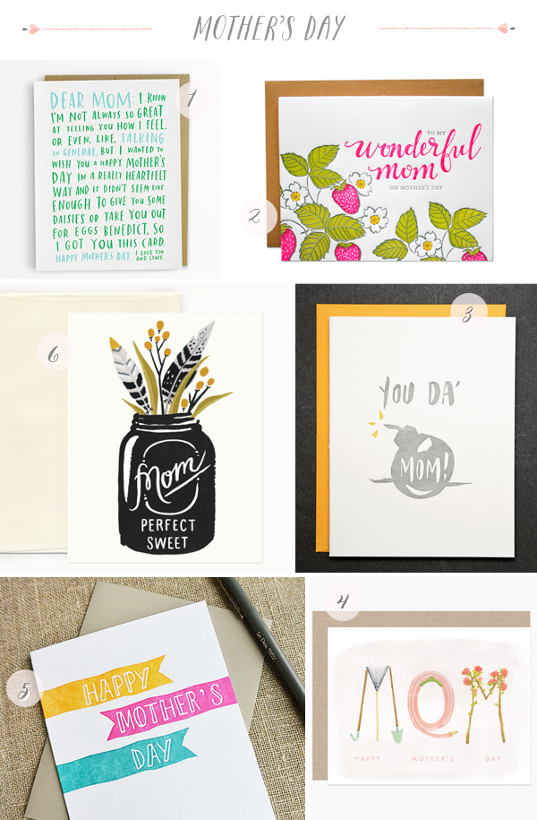
Mother’s Day is coming up! If you’re searching for the perfect card for your mom, grandmother, or wife, I’ve got you covered. I’m rounding up a few of my favorites below, with lots more to browse over in the Market List!

2014-Mothers-Day-Cards-Part1

1. Emily McDowell; 2. Parrott Design Studio; 3. Ladyfingers Letterpress; 4. Dear Hancock; 5. Grey Moggie Press; 6. Idlewild Co.

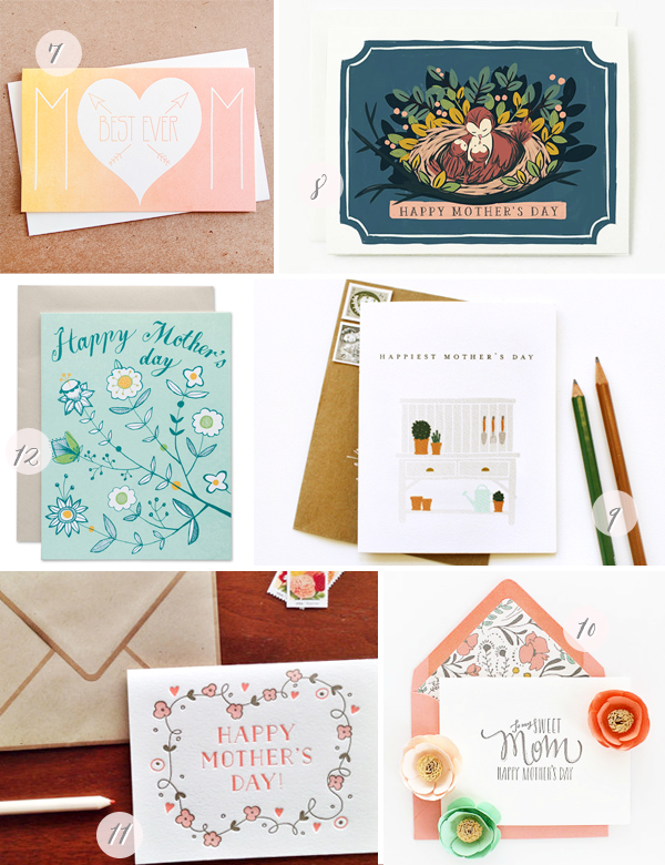
2014-Mothers-Day-Cards-Part2

7. Anemone Letterpress; 8. Quill and Fox; 9. Kate & Birdie; 10. Honizukle; 11. Ink Meets Paper; 12. Sycamore Street Press

Lots more Mother’s Day cards in the Market List right here!

{images via their respective sources}

Pretty Paper in the Office: Magazine Files

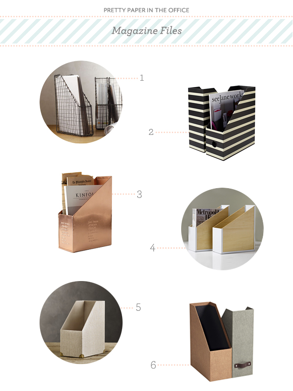
Magazines have been one of my go-to sources for ideas and inspiration for years, no matter the subject. As a result, I’ve accumulated stacks (and stacks and stacks) of them. I love magazine files for the simple fact that they tuck away the visual clutter of magazine piles, and provide an easy way to organize them by whatever subject suits you best. A shelf of these lined up neatly makes quite a statement! I’ve put together a round up of a few different styles that may tickle your organizational fancy. – Julie

Pretty Paper in the Office - Magazine File Round Up via Oh So Beautiful Paper

No. 1 Vintage Magazine File from See Jane Work; No. 2 See Jane Work Paperboard File from Office Depot; No. 3 Copper Magazine Holder from Anthropologie; No. 4 Portola Magazine File from See Jane Work; No. 5 Linen Magazine Box from Restoration Hardware; No. 6 Marten Magazine File from The Container Store

{images via their respective sources}

Urbanic Faves | A High Five

Hey everyone! So glad to be back. I can’t believe it’s been a month already since our last post! Around here at Urbanic Paper Boutique we all work pretty hard each day (as I’m sure the majority of you do). Let’s face it, we all need a high five every now and then to keep the momentum up on projects and our spirits high in the midst of a busy work day. Nothing says team camaraderie like an arms up, solid hand slap. We use them for small things …. Look! I just found the earring that a customer lost in the shop last week – HIGH FIVE!  and for bigger deals … I just entered, received, and tagged 500 rolls of washi tape in 10 minutes – HIGH FIVE! 

Today I’m rounding up some of my favorite things from around the shop and beyond in recognition of this celebratory hand gesture. How many people can you think of right now that could use a dose of encouragement? xo – Audrey

A High Five | Urbanic Paper Boutique

1. Candyspotting laser cut card; 2. Meri Meri gold foil tattoos; 3. Sapling Press card; 4. Quiet Whimsy card; 5. Dude and Chic card ; 6. Smock letterpress card; 7. Knock Knock sticky notes; 8. Emily McDowell card; 9. Smarty Pants Paper Co. card; 10. Maid Servant Of wall print; 11.Paul Hess print; 12. Knock Knock notepad, 13. Iron Curtain Press card

 {images via their respective sources}

DIY Tutorial: Hand Tinted Letterpress Save the Dates

Hand tinting was historically used to color black and white photographs before color photography was invented. It was also used on prints made by etching as a means to color them. For this tutorial, we’ll show you how to use this technique to bring a unique, vintage look to your letterpress save the dates or wedding invitations. Not only is it beautiful, it’s also super easy (as in two steps)! – Bailey and Emma of Antiquaria
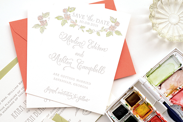
Hand-tint-Save the Date-Final-1

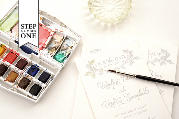
Hand-tinted-Save the Date-Step1

Step One: We chose two colors for this design: green and pink. When deciding what to do with your letterpress design, consider historical references for colors (searching hand tinted etching or photographs yields nice results).

First, we mixed our green color. We wanted it to be a little yellow tinged so we added some yellow to the green in our palette (see the upper left mixing area). The color needs to be very diluted to have it tint and not paint too heavily cover your letterpress print. Make sure to test your colors on an extra piece to make sure you have the technique down before starting the project.

Another key factor is how dry the brush is when it’s tinting the paper. You do not want it to be wet. Brushing it first against a paper towel helps keep the tint from being to watery. Again, it helps to work through this in testing.

Paint your first color in the desired area (in our case, green on the leaves) and set it aside to dry. Repeat on all cards.

Hand-tinted-Save the Date-Step2

Step Two: Next, you’ll be adding in your second color to the flowers on the design. Mix up your desired color and test it on your spare piece until the color and dilution is right. Brush on the color (in our case, pink) in the desired areas. Set aside to dry and repeat on the rest of your cards.
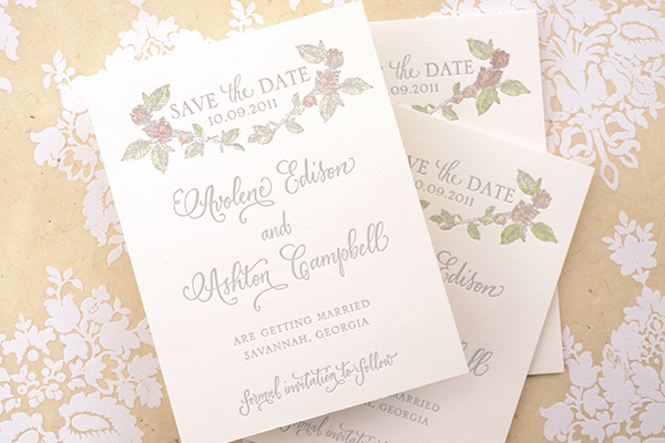
Hand-tinted-Save the Date-Final-5

Letterpress printing works exceptionally well with hand tinting because it created an indented texture when the print is made. This helps keep your tint in place and prevents coloring outside the lines or blotchiness. If you do end up with too much water on the print, it’s easy to quickly dab it with a clean paper towel and absorb any excess. No harm done!
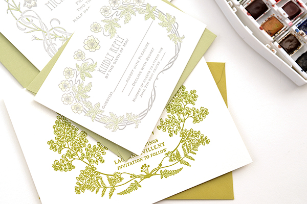
Hand-tint-Save the Date-FInal-2

We found that the tinting technique worked most beautifully and effectively on our botanical collection of letterpress cards. The softness and vintage appeal lends to the charm of the designs. Of course, the possibilities are as endless as your imagination!

Materials

Savannah Letterpress Save the Date Card. We recommend ordering extra pieces (10% overage) for testing.

Watercolors

Paint brush. We recommend a very nice, small brush so that you have control and precision.

Water cup

Anti­quaria is a mem­ber of the Designer Rolodex – you can see more of their beau­ti­ful work right here or visit the real save the dates gallery for more save the date ideas!

Photo Credits: Antiquaria for Oh So Beautiful Paper