Susan + Beth’s Laser Cut Wood Veneer Wedding Invitations

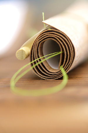
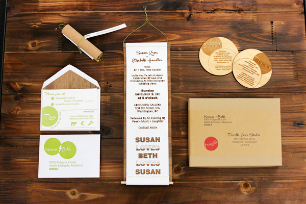
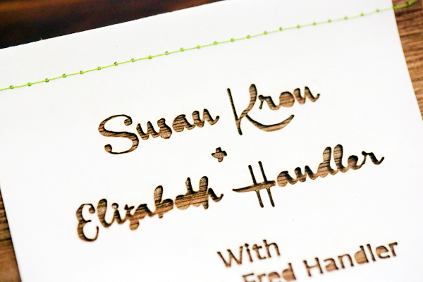
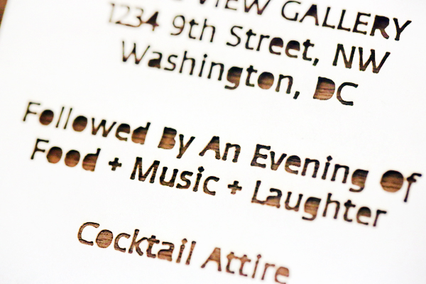
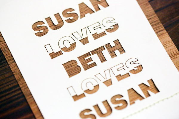
I’m a big fan of laser cut details in a wedding invitation suite – and these modern invitations from Emily and Dianna of Fourth Year Studio are no exception. Emily and Dianna paired paper and laser cut text with thin walnut wood veneer, which in turn could be rolled into a scroll! Such a cool idea!

Laser-Cut-Wood-Wedding-Invitations-Fourth-Year-Studio3

From Emily and Dianna: Beth and Susan came to us in search of a modern wedding invitation set to compliment their unique relationship. They have been together for many years and are now able to get married. It was a true celebration of their love and we were thrilled for the opportunity to help spread the word with their friends and family.

Laser-Cut-Wood-Wedding-Invitations-Fourth-Year-Studio5Laser-Cut-Wood-Wedding-Invitations-Fourth-Year-Studio6

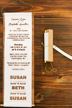
A laser cut scroll style invitation was backed with a walnut veneer. Along the top we stitched a line with green thread to provide a spot for a dowel to pass through so it could be flattened and hung. The scroll was rolled and tied with a tag before it was all packaged inside kraft box with a matching label.

Laser-Cut-Wood-Wedding-Invitations-Fourth-Year-Studio

Laser-Cut-Wood-Wedding-Invitations-Fourth-Year-Studio4

Laser-Cut-Wood-Wedding-Invitations-Fourth-Year-Studio7

Laser-Cut-Wood-Wedding-Invitations-Fourth-Year-Studio9

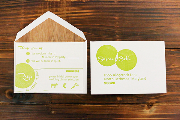
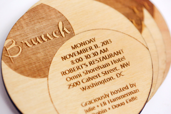
The RSVP card was letterpress printed in green with a simple linked rings design. We laser cut walnut veneer for lining the RSVP envelope. A wooden laser etched coaster invited guests to both the rehearsal dinner and the morning after brunch.

Laser-Cut-Wood-Wedding-Invitations-Fourth-Year-Studio8

Thanks Emily and Dianna!

Design + Letterpress Printing: Fourth Year Studio

Check out the Designer Rolodex for more tal­ented wed­ding invi­ta­tion design­ers and the real invi­ta­tions gallery for more wedding invitation ideas!

Photos Credits: Julie Roberts

Envelope Addressing Styles

We’re often (very often) asked about addressing options for wedding invitations. Many of our clients are DIY couples and it’s simply not in their budget to hire a professional or to pay for digital addressing. Believe us: even if you or a loved one are planning address them yourself, they can still be creative and cohesive with your invitation! It’s simply a matter of the right tools, methods, and a some practice! – Bailey and Emma of Antiquaria
DIY Envelope Addressing Styles by Antiquaria via Oh So Beautiful Paper

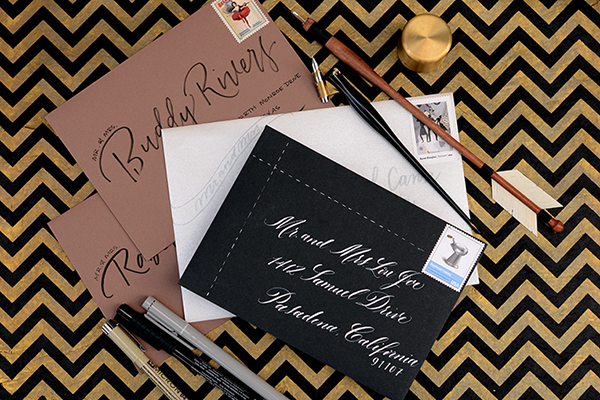
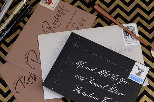
Option One: DIY Pointed Pen Calligraphy. For someone that has a little experience already with a dip pen and ink or for someone with plenty of time to practice before the invitations need mailing, calligraphy addressing can actually be a great DIY option. One hundred years ago, everyone who wanted to write had to use a dip pen and ink. We’re certainly used to modern pens these days, but it’s inspiring to think that it can be done with practice! It takes years and years of practice to truly master the art – so don’t hold yourself to expectations of perfection for the project. Try playing with your unique hand writing and see what is most natural for you with the tools.
DIY Envelope Addressing Styles by Antiquaria via Oh So Beautiful Paper

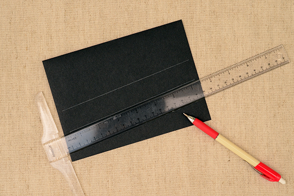
It’s really helpful to give yourself guidelines when writing with pen and ink (your focus will be more on the writing than keeping the lines straight). For a playful look, we drew them at a slant, leaving a ruler’s width between them. Three lines will suffice for most U.S. addresses but occasionally you’ll need four. Just count up how many 3 and 4 liners you need on your list and tackle all of the “ruling up” first.
DIY Envelope Addressing Styles by Antiquaria via Oh So Beautiful Paper

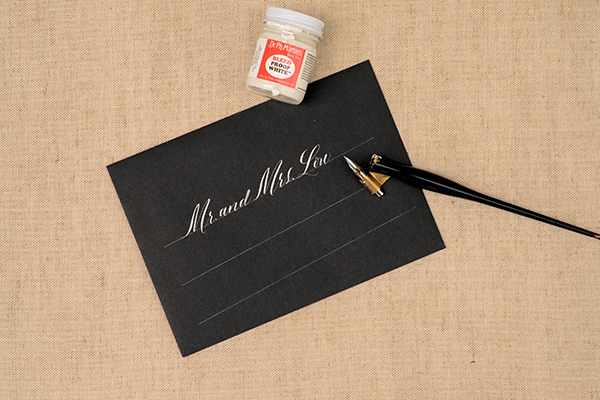
Address each envelope on your guest list. Set aside to dry. This can take minutes to a day depending on the ink and weather, so don’t be too anxious. The last thing you want is to smear you hard work! We used our favorite white ink on these gorgeous black envelopes. It’s the loveliest and most opaque that we’ve found but it must be diluted quite a bit to use with a pointed pen and nib. Add (distilled) water with an eyedropper to the bottle. Stir the ink with the water until it reaches the consistency of heavy cream.
DIY Envelope Addressing Styles by Antiquaria via Oh So Beautiful Paper

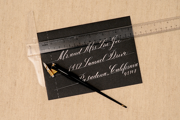
Once they’re all addressed, we added a fun little dashed line to further decorate and modernize the envelope. Use a T-square ruler and dash along the straight line with the white ink loaded into the dip pen. Let them all dry once more.
DIY Envelope Addressing Styles by Antiquaria via Oh So Beautiful Paper

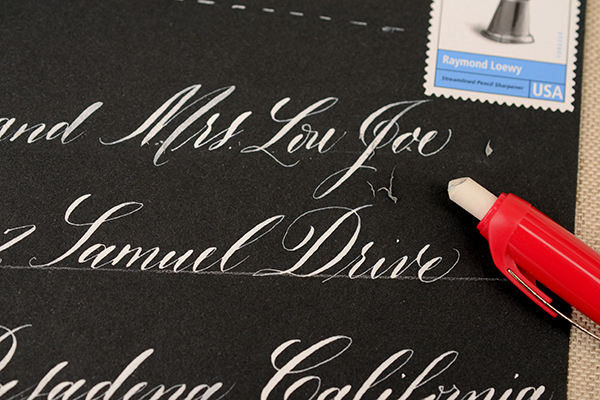
Erase the lines gently once everything is good and dry.

You can find more information about DIY calligraphy on our blog. You can also search for local calligraphy classes to get you started. The key to calligraphy is practice, practice, and more practice!
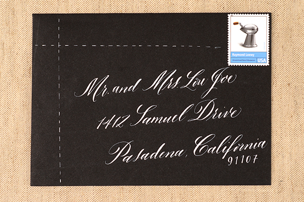
DIY Envelope Addressing Styles by Antiquaria via Oh So Beautiful Paper

Option Two: Brush Pen Lettering. Brush pens can be a great option for addressing without the mess of an actual brush and ink. A lot of them are actually felt tipped (like the ones in this tutorial) which makes controlling them much easier. This silver and gray design is lovely, soft and tonal. Play with the brush lettering a bit and find a style that’s comfortable for you. You can print or use cursive with them, so the options are endless!
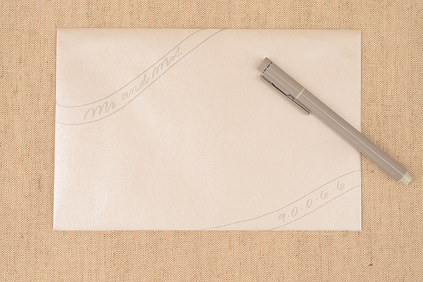
DIY Envelope Addressing Styles by Antiquaria via Oh So Beautiful Paper

Draw “ribbons” in the upper left and lower right corners. Then write the title(s) (i.e. Mr., Miss, Ms., or Mr. and Mrs.) in the upper left banner. Move to the lower right and write the zip code, spacing out each number with a small dot.
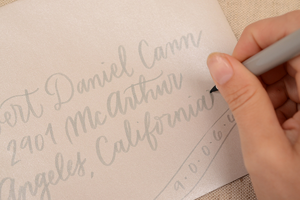
DIY Envelope Addressing Styles by Antiquaria via Oh So Beautiful Paper

In the middle of the envelope, you’ll write the guest(s) name and address. We used a simple handwriting cursive. Because the brush pen gives the lines weight variation, it looks fancier than a ball point pen, which we love. One key to writing with a brush pen is to write on its point, as shown in the photo above. This will help keep the writing thin and legible. Center the address as much as you can, but the banners in the corners will help keep the design looking balanced even if it’s not perfect.
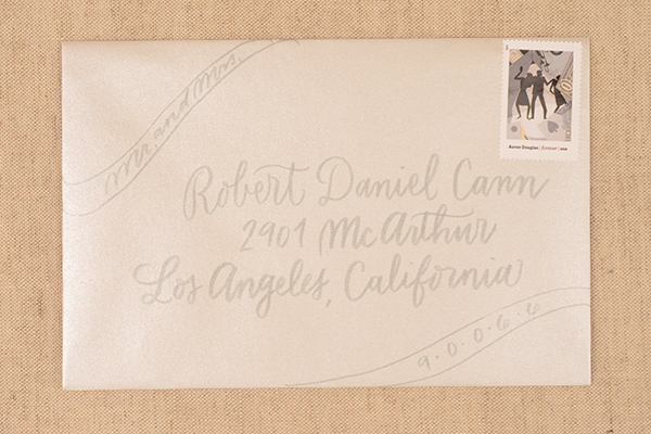
DIY Envelope Addressing Styles by Antiquaria via Oh So Beautiful Paper

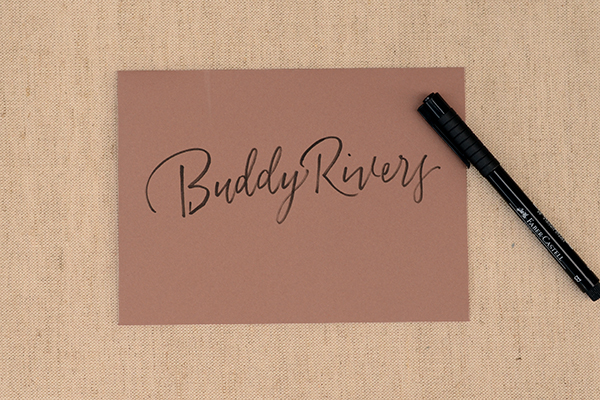
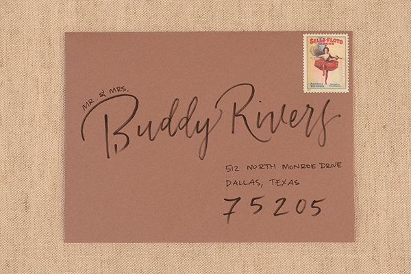
Option Three: Mixed Pen Lettering. This design uses two different kinds of pens to achieve a very custom look. We again used a brush pen, this time in black, as well as a thin felt tipped pen for variation in line quality and so that we could make some text much smaller.
DIY Envelope Addressing Styles by Antiquaria via Oh So Beautiful Paper

Write your guests name fairly large across the envelope. Vary the size of lettering depending on the length of their name (you’ll get the hang of this with practice).
DIY Envelope Addressing Styles by Antiquaria via Oh So Beautiful Paper

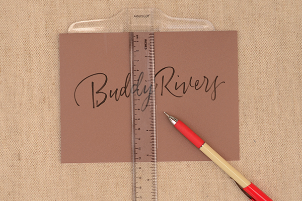
Then, draw straight line down, using a T-square ruler a little right of center. You will use this line to left justify the address.
DIY Envelope Addressing Styles by Antiquaria via Oh So Beautiful Paper

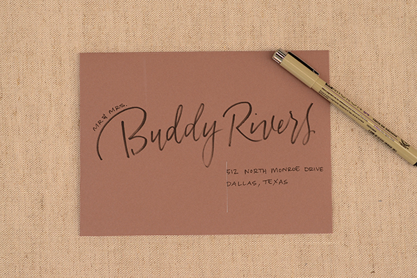
With the vertical lines as your guide, print the street, city and state portion of the address using the felt tipped marker. Add the appropriate title(s) to the left hand side of the guests name.
DIY Envelope Addressing Styles by Antiquaria via Oh So Beautiful Paper

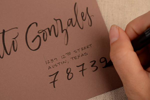
With the brush pen, add the guest’s zip code in large numbers below the address. Erase your vertical line and the envelope is done!
DIY Envelope Addressing Styles by Antiquaria via Oh So Beautiful Paper

DIY Envelope Addressing Styles by Antiquaria via Oh So Beautiful Paper

Addressing options really are limitless. Play around with ideas until you find something that works for you and coordinates well with your invitation suite. It can help to experiment with addressing your own save the dates (usually they’re less formal) to determine if you want to tackle the process of addressing your wedding invitations.

Materials & Resources

Calligraphy Starter Kit

White Calligraphy Ink

Calligraphy Resources: Setting up your Tools,  Lower Case Alphabet by Bailey Rivera, Calligraphy Supplies

Brush and Felt Tipped Pens

For envelopes, we discuss many different envelope resources and options in a previous post, found here.

T-square Ruler

White Mechanical Pencil or Graphite Pencil

Photo Credits: Antiquaria for Oh So Beautiful Paper
Hello Brick & Mortar: How a Retailer Preps For NSS

The 2014 National Stationery Show is a few days away. If you’re exhibiting at the show, your crates are on their way and so are you (hooray!). Last week, we talked about how to catch a retailer’s eye. This week I thought I’d give you a little peek into how I prep for NSS. So far it involves a lot of ‘getting excited’ and very little ‘buying of train tickets.’ – Emily of Clementine

OSBPEmilyMcdowellIllustration

Illustration by Emily McDowell for Oh So Beautiful Paper

How a Retailer Preps for the National Stationery Show via Oh So Beautiful Paper

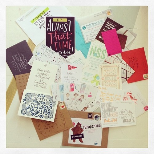
Step 1: Delight in your mailers. The weeks leading up to NSS are similar to what I imagine it would feel like to be a girl in a Louisa May Alcott novel with her dance card filled up. Which is to say: very attended to and very good. (Thank you!)

How a Retailer Preps for the National Stationery Show via Oh So Beautiful Paper How a Retailer Preps for the National Stationery Show via Oh So Beautiful PaperHow a Retailer Preps for the National Stationery Show via Oh So Beautiful Paper How a Retailer Preps for the National Stationery Show via Oh So Beautiful Paper

The mailers this year have been exceptional; color, creativity and the sweetest personal notes!  After the show, mail can be a little bit bleak. (In other words, not a terrible time to follow up with a little note to keep you in our hearts/minds.)

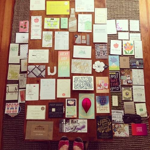
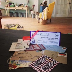
Step 2: Map it out. I mean this literally. I’m a very visual person and find it helpful to create an actual map of my route. This year I had help from my wonderful intern who put the mailers in order by booth number. We then talked through each vendor, creating categories of: current vendor, prospective vendors, vendors I definitely want to make an order with, and people I want to make sure to say hello to (nb: this has a lot to do with personal notes…). After that, I create a veritable yellow brick road of mailers. This gives me a visual road map that I can rely on when the lights of the show start to blur.

How a Retailer Preps for the National Stationery Show via Oh So Beautiful Paper

Mapping it out on Instagram. Am I standing on a chair or floating? You decide.

This mapping helps me prep for how I will spend my 2-3 days at the show. I will plan to break my days down into two categories: First, I make orders with my existing lines that need re-stocking. Though I’m very excited to add new lines, my current vendors have my loyalty. Second, as I walk, I take notes on (and photos of) lines that I’ve had my eye on and new lines that catch my attention. I want to take in as much as possible and note why I’d be adding these lines – do they offer something new? A product or category I don’t currently sell? Or am I just plain smitten with them? This is often a big, big list. So I take this list back to the hotel. The biggest question I ask myself is: do I REALLY love it.  In the moment, in a booth, with a wonderful vendor it can be incredibly tempting to just make order after order. For this reason, I try to wait at least a day to mull over my options and make orders with new lines on my second or third day.

Step 3: Never Stop Looking. I’m constantly on the hunt for stationery. My walking list will continue to grow up until I step foot in the Javitz. I have vendors in the back of my mind who didn’t send mailers, mailers that didn’t catch my eye at first blush, and vendors who come out of nowhere at the last minute. To incorporate them into my larger walking list, I rely on:

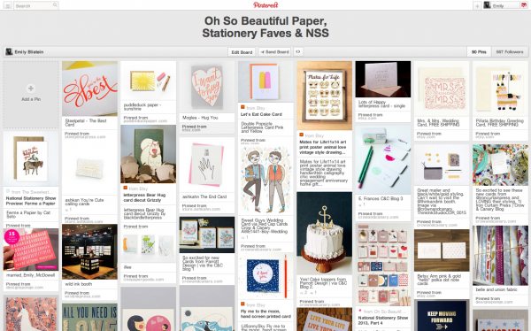
  • Pinterest. I keep a Pinterest board for stationery throughout the year. I pin new lines as I fall for them and revisit the board a few times a year (most notably on the train on the way to the show.)
  • Instagram. Instagram is a daily hangout and in the weeks leading up to the show I frequently jump over to the #nss2014 and #stationeryshow hashtags* to see what you’re creating. I love discovering new lines and catching sneak peeks of your preparations. Also, I think it’s a great leveling-of-the-playing-fields for getting all stationery lines in front of retailers’ eyes. (*I know we discussed hashtags last time, and I’m with the camp who just feels that #nss has too many non-stationery related happenings.)
  • Blogs. I check in on Nole and Carina’s NSS sneak peeks and to scroll back through their prior year posts to see how lines have evolved. I also frequently find myself in new places from their blogs and then back on Pinterest pinning what I love. I love the Etsy blog for giving me background on vendors. And Emily McDowell had a great post this week for fellow vendors. I agree with everything she said. And, I would only add that even if your walls fall down, phenomenal cards on the floor are better then half-assed cards on a beautiful wall.
  • You! I rely on my current vendors to tip me off to new members of the stationery community. I also appreciate all of the pre-show emails that are coming in to remind me of you!

How a Retailer Preps for the National Stationery Show via Oh So Beautiful Paper

A snapshot of my Stationery Board on Pinterest. Everchanging.

Step 4: Construct a plan for orders. This is the part where I have to quit daydreaming and start doing the hard work. I should take a moment to say that I don’t run a stationery store. Clementine is a lifestyle and home decor store. That said, I have happily let stationery grow like ivy into every nook of the shop. I have grown my stationery lines from 2 to 30+ over three years and though I plan to expand, I can’t expand infinitely. (This year I plan to add 3 lines, maybe 5. Ok 8 max.) So I make my walking list and walk the show with these this refrain: Will my customers love it? Is it in my budget? Does it offer something new to Clementine? And, do I really, really love it? 

Step 5. Walk it. I love almost every aspect of vendor interaction at the show: Visits with lines who I’ve carried since the beginning, hellos with vendors I adore from afar, and rounding the corner to be totally struck with a new line that rocks my world. I love that some booths are stunning theater-like sets and others are minimalist and let the cards speak for themselves. I’m not looking for one thing, I’m just looking to be delighted in roughly 2000 different ways. And I’m pretty confident that will happen.

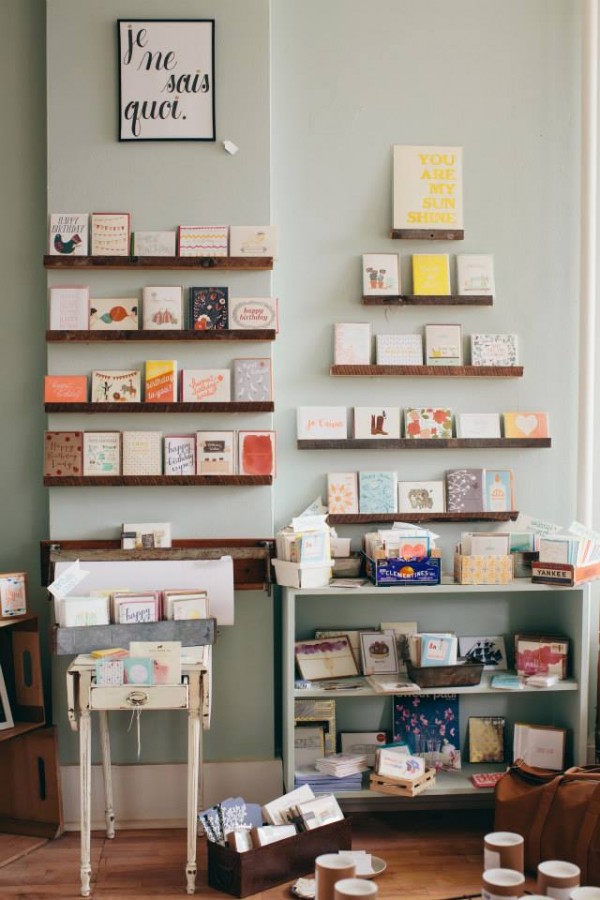
How a Retailer Preps for the National Stationery Show via Oh So Beautiful Paper

 A section of Clementine’s current stationery offerings. I’m so excited to see what it looks like a year from now!

See you at the show!

Photo Credits: Bottom image by Jessica Anderson Photography. All other images via my Instagram.

How to Add Your Personal Touch to DIY Wedding Invitations

Over the years, we’ve put countless wedding invitation suites together. Whether they were for this DIY column, for a client or even for our own weddings, we’re always blown away by how different a design can look once a couple puts their own personal spin on the details. Today we’ll show you just how different one of our standard letterpress designs (our Old West Invitation) can look once we add in all of the special details that bring the suite together. Hopefully this column inspires you to think outside the box about your own invitations! Be sure to check out the bottom of the post where we share our favorite DIY resources! – Bailey and Emma of Antiquaria

How to Add Your Personal Touch to DIY Wedding Invitations by Antiquaria via Oh So Beautiful Paper

Bespoke design services are certainly available and a very popular option right now. It stands to reason that couples want a suite that reflects their personal style and the special day that they are planning. While they’re a great option for some, many budgets just can’t accommodate the high prices that come along with the custom design process. It’s not the only option to get something that suits you and also your budget. DIY-ing components of your suite and putting everything together with friends and family can really help the bottom line.

Maybe you want a letterpress invitation but also a vintage postcard reply. That’s when using a rubber stamp on a portion of your wedding invitation suite can come in really handy. Want envelope liners but the high price tag of having them installed blows the budget? Find fun patterned wrapping paper or scrapbooking paper and do it yourself. It will definitely take some extra time and effort but in the end offers the same custom look. The options for customizing your suite are endless (really, they are) so we’ll show you three designs and outline what it took to achieve each look. We’ll also give you some of our go-to resources for the fun stuff so that you can find exactly what you might need!

How to Add Your Personal Touch to DIY Wedding Invitations by Antiquaria via Oh So Beautiful Paper

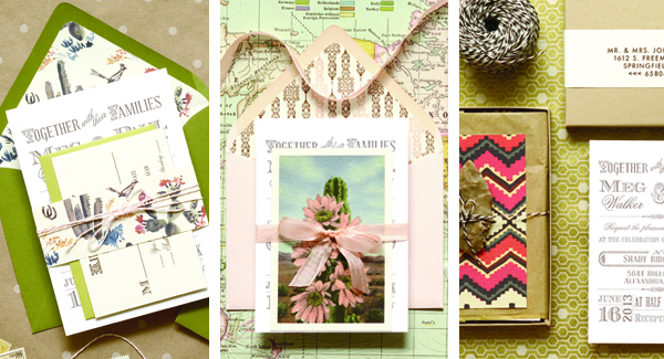
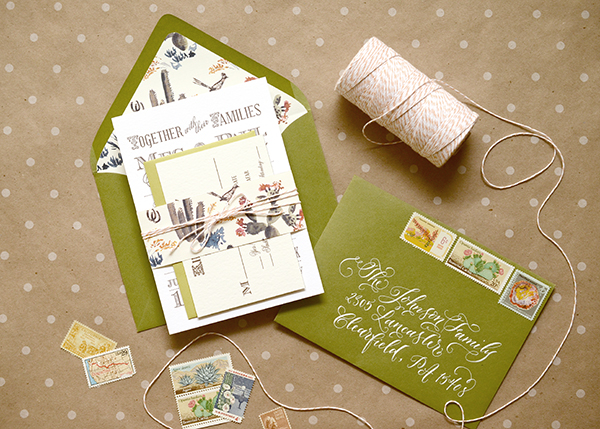
Our first suite is a fun play on traditional western imagery. We brought in tonal shades of green with the envelopes and a cactus patterned paper. We used the letterpress wedding invitation as well as the coordinating reply card (our Old West Invitation and Old West Reply Card) to keep it simple. For this suite we splurged and used calligraphy addressing because it’s really the best way to get opaque white ink and to add more of a unique touch. Twine always looks great with western design, so we used a peach bakers twine over a belly band to tie the pieces together.

How to Add Your Personal Touch to DIY Wedding Invitations by Antiquaria via Oh So Beautiful Paper

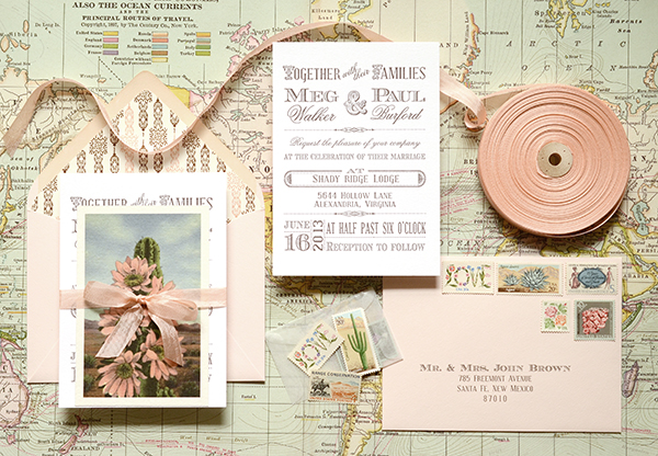
For the second design, we wanted to illustrate just how pretty and feminine western design can be. We took the same Old West Invitation but paired it with pretty vintage postcard that featured a peach colored cactus flower and rubber stamped our reply info on the back. Adding in this imagery really helped us tie in the blush envelope and the coordinating chocolate and pink western liner. Of course, tying it together with a pretty Grecian Pink ribbon doesn’t hurt either. This suite was addressed using a digital addressing service. Just because you might not be able to afford a calligrapher doesn’t mean that you must resort to those tacky clear labels. There are many options for guest addressing with style selections to choose from.  There’s a good chance that you’ll be able to find something to coordinate with your suite.

How to Add Your Personal Touch to DIY Wedding Invitations by Antiquaria via Oh So Beautiful Paper

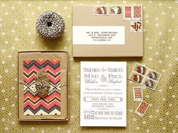
By far the most pricey and customized design of the group, this suite includes custom art and a box mailer. We still used the same Old West invitation design but brought in luxe details like the navajo patterned response card and vintage arrowheads – all enclosed in a little gift box. Thinking “out of the box” can be really fun if you have the time and budget to bring in special details like these (even if they’re actually in a box). Custom guest address labels were used on this design in lieu of calligraphy. We knew the box would need a lot of postage, especially if using vintage postage stamps, but hand lettering and calligraphy needs quite a bit of room to execute. The label is printed out with both your guest address as well as your return address and wraps onto the back of the envelope (or box). It’s especially appropriate for the box mailers since it seals one side of the box shut.

We hope that your mind is a-buzz with ideas of how to make your own wedding invitations custom and unique to you! There are many options out there and it pays off to spend a little time adding some DIY touches your your own invitations.

Resources

Designs used in the tutorial: Old West Letterpress Invitation, Old West Letterpress Reply Card, Old West Coral Patterned Paper

About Envelopes: Adding colored envelopes is always a great option. Often invitation companies will give you a credit if you elect not to use the envelope that they provide with the invitations. Our favorite envelope sources are Paper Source, Paper Presentation and Envelopes.com. Between the three, they offer a wide selection of colors and styles for your to choose from. There are many others out there too if you spend the time to search around.

About Addressing Options

Calligraphy: It’s not for every budget, but calligraphy is a great options for many couples. If you have time, you can even try to learn for yourself with our tutorials and supply kit. Otherwise, calligraphers are plentiful both online and locally. If you’d prefer to work with a local calligrapher, the best way to find a talented and reputable person is currently to go through your local calligraphy guild. Using a local calligrapher can make your life easier and can be less expensive since you can avoid shipping things back and forth. They also tend to accommodate rush jobs more easily. Some calligraphers may not have websites…don’t let this deter you, they can easily email samples to show you their skills!

Digital Addressing Services: Envelopes.com offers addressing on their huge selection of envelopes. It’s a great option for a professional look without hiring a professional calligraphy to hand letter each envelope. Etsy also has many, many sellers that offer this service as well. These vendors do not necessarily stock the envelopes so you’ll need to use the ones provided or find your own.

Guest Address Labels: Etsy is another great source for this service as well. You can also ask your designer or stationer if they offer addressing options to coordinate with the design that you choose. They might offer one or all of the options through their shop.

Our Favorite DIY Supply Resources

Pattterned papers for DIY envelope liners and bellybands: Antiquaria, Paper Source, Paper Mojo

Vintage Postage:  Our favorites source is Verde Studio Vintage Stamps, don’t hesitate to contact Virginia at Verde Studio: she is brilliant at currating a custom mix of vintage postage to suite your needs. Other resources for vintage postage include: Champion Stamp Co., Ebay – USA unused stamps 1901-now, The Paper Nickel

Ribbon: We love the soft look of rayon taylor’s ribbon available at Antiquaria, for a more organic look check out the gorgeous italian cotton ribbons at Angela Liguori, M&J Trimming has a full assortment of ribbons and trimming to choose from.

Bakers Twine: Baker’s twine now comes in a variety of colors. Here are two great sources: Antiquaria &  The Twinery

Anti­quaria is a mem­ber of the Designer Rolodex – you can see more of their beau­ti­ful work right here or visit the real wedding invitations gallery for more wedding invitation ideas!

Photo Credits: Antiquaria for Oh So Beautiful Paper
Envelope Address Hand Lettering Tutorial from Ladyfingers Letterpress

Hi Everyone! The ladies of Ladyfingers Letterpress were kind enough to fill in during my summer vacation last year, and this post on Arley-Rose’s signature hand lettering was one of my favorite posts that week! So I jumped at the chance when Arley-Rose volunteered to stop by with some tips and tricks for adorning your envelopes with beautiful and whimsical hand lettered addresses. Take it away ladies! –Nole

With the majority of correspondence these days taking place in the digital realm, it’s always such a treat to get something real and tangible in the mail. Heck, even before e-mail dominated our lines of communication, you knew something was really special when it arrived through your mail slot all decked out with big, beautiful lettering that you knew someone took time to carefully create. Hopefully by the end of this post you will want to sit yourself down and experiment with some of the styles shown below to make your own beautifully styled envelope addresses. –Arley-Rose of Ladyfingers Letterpress

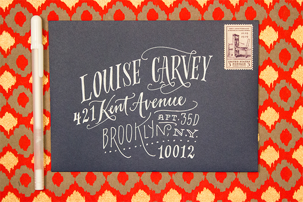
Envelope Address Hand Lettering Tutorial by Ladyfingers Letterpress / Oh So Beautiful Paper

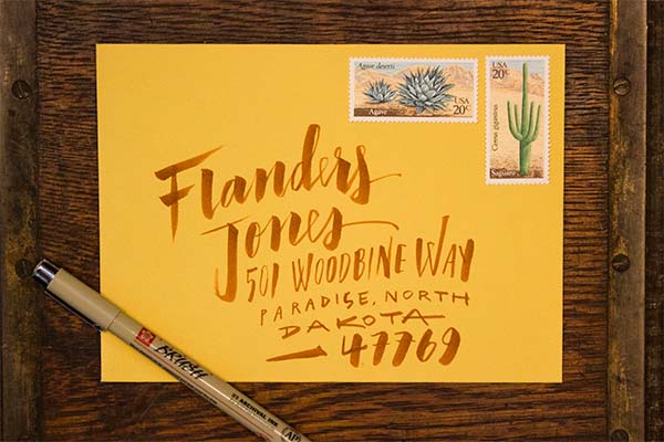
I like to think of hand-lettering as more of an “illustration using letters” more than a “trained handwriting” kinda thing, so I choose pens that give me the most control as possible. People are doing beautiful things with pointed pens and modern calligraphy these days, and I encourage you to experiment with pointed pens if you like, but for now I am going to stick the tools that I know and love.

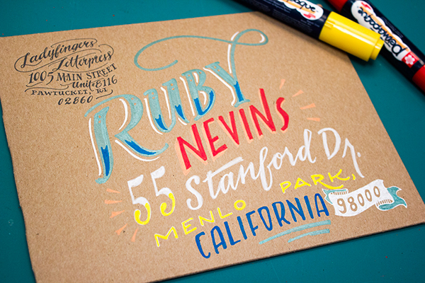
We’ll begin our journey into the world of lettering with familiarizing ourselves with a few different lettering styles that will act as our foundation and give us some variation in style that we can draw upon throughout our lettering endeavors! Personally, I like to combine different lettering styles, fluctuating between scripts, roman, and sans-serif characters to give the piece a lot of motion and personality. Not sure what a roman character is? Read on! Have questions about the etiquette and formality of addressing your envelopes? Martha Stewart has a terrific go-to tutorial about that!

Hand Lettering Envelope Address Tutorial by Ladyfingers Letterpress / Oh So Beautiful Paper

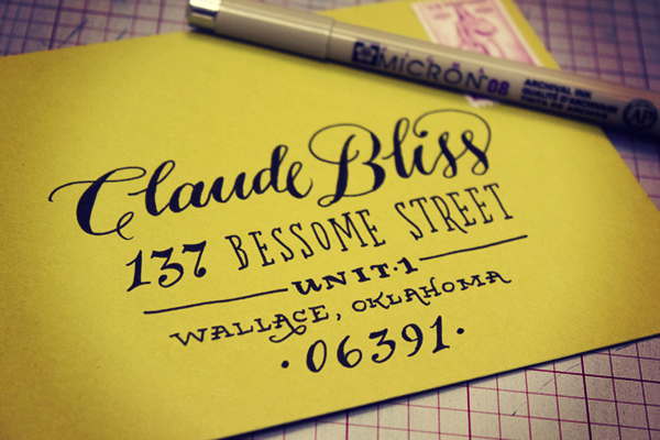
Roman lettering, which can also be called a “Serif,” has some of the earliest origins dating back to, well, the Romans! The word “Serif” is latin for “foot”, which makes sense when you look at the letters. See? They all have feet (except o’s)! Serifed typefaces such as Garamond or Baskerville look great as all caps and spaced out (which us type nerds refer to as “tracking”), or spelled out in both caps and lowercase with normal tracking. I sometimes like to make tall condensed roman letters if the address is really long and I need to make the most of my space. On capital As, Rs, Ns, Ys, Ks, Hs, and sometimes Gs, I like to add a little flourish, as you’ll notice on some of the envelope samples below.

Hand Lettering Envelope Address Tutorial by Ladyfingers Letterpress / Oh So Beautiful Paper

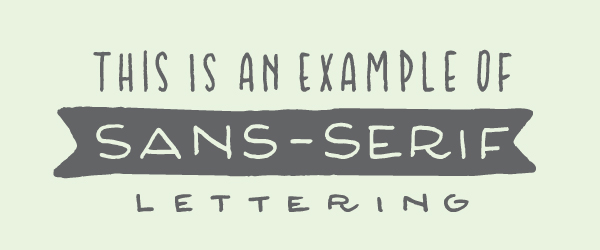
Now that you know that the word “Serif” means “foot”, naturally “Sans Serif” means “Without Feet!” Sans Serif letters were popularized in the mid twentieth century with the arrival of Helvetica, Gill Sans and Futura. I think they look great as all caps, tall and condensed! I also find that they’re easy to draw because they most closely resemble a clean, handwritten print style.

Hand Lettering Envelope Address Tutorial by Ladyfingers Letterpress / Oh So Beautiful Paper

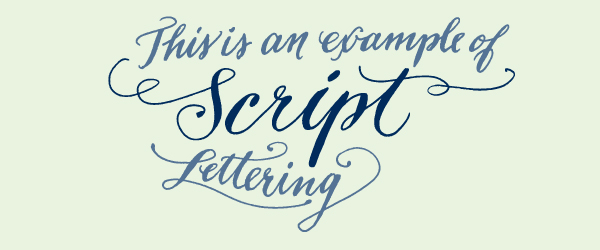
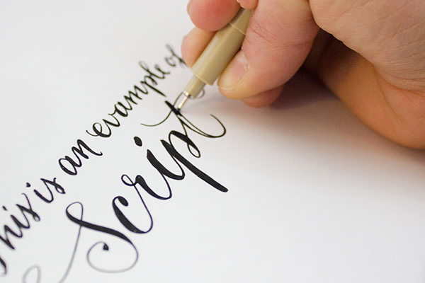
Now the fun part begins! Getting the hang of lettering a script might take some time to get the hang of, but here’s a secret! Write in cursive as you normally would, and then darken the strokes that should have accents. Feel free to refer to other scripts with a quick google image search to see where those accents should be. Have some fun with your script: it’s not necessary to keep a straight baseline, in fact I tend to like scripts that dance around a little bit on the page. They have more character! Ha! Get it! Character? Typography? Joke? Uhhh….. Nevermind.

Hand Lettering Envelope Address Tutorial by Ladyfingers Letterpress / Oh So Beautiful Paper

Hand Lettering Envelope Address Tutorial by Ladyfingers Letterpress / Oh So Beautiful Paper

My favorite go-to pen is the Pigma Micron from Sakura of America. I’ve been drawing with Micron pens since I was a wee young artist, and they continue to be my favorite pen for all types of uses, especially drawing on light-colored envelopes. My size of choice is an 08 but there was a time when all I used was the smaller 03s to get a really nice fine line.

Hand Lettering Envelope Address Tutorial by Ladyfingers Letterpress / Oh So Beautiful Paper

Hand Lettering Envelope Address Tutorial by Ladyfingers Letterpress / Oh So Beautiful Paper
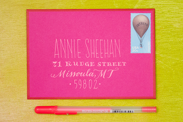
Keep it classy! Sometimes a white pen is all you need to do the trick, especially on dark or brightly colored envelopes. My go-to is the White Gelly Roll 08, which gives me a nice smooth line without any breaks or clogs. I’ve found that the Metallic Silver Gelly Roll pen is also super awesome! It’s not really too sparkly, but is super opaque which is exactly what I want. I also like the Moonlight pens for an extra burst of color.

Envelope Address Hand Lettering Tutorial by Ladyfingers Letterpress / Oh So Beautiful Paper
Sometimes I like the swift expression that can only be found with a brush pen. When I don’t have time to whip out the gouache and brushes, the Pigma Brush pens really do the trick. They also come in  a variety of colors, so if you’re not feeling like black ink is your thing that day, you can also choose from a variety of other colors that look great on white or light colored envelopes.

Envelope Address Hand Lettering Tutorial by Ladyfingers Letterpress / Oh So Beautiful Paper
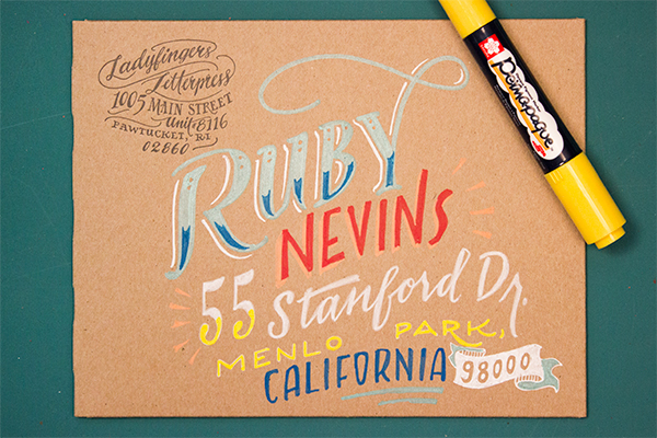
The Do Not Open Lettering Project  by Erik Marinovich was recently brought to my attention by my amazing typographer friend Jeremy Mickel, and it blew my mind. It still does blow my mind. Every time I look at it. I thought I would refer to it here because it shows how creative you can be with large oversize envelopes. Besides, envelopes: they’re really just a canvas for beautiful lettering, right? Anyway, the Permapaque markers are incredible for this task. They’re nice and opaque like a paint marker without the nasty smell, and you get a huge variety of colors!
Now that you’ve seen some samples, I’d love to see what you come up with! Don’t forget to tag your work on Instagram with @beautifulpaper, @ladyfingersletterpress and @sakuraofamerica. Thanks and happy lettering!

Pens provided by Sakura of America, with awesome stamps provided by Pack & Post!

Photo Credits: Ladyfingers Letterpress