Bilingual Copper Foil and Blind Letterpress Wedding Invitations

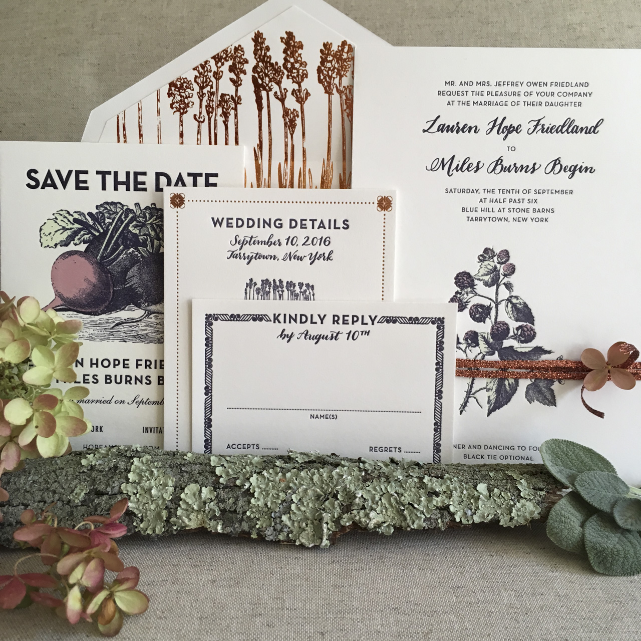
If you can’t have a typical destination wedding, why not bring the destination home to you? Sarah from Banter & Charm designed these bilingual copper foil and blind letterpress wedding invitations as a nod to both the English and Spanish heritage of the couple! A delicate blind letterpress printed lace-inspired design was the perfect way to complement the festive copper foil details!

Bilingual Copper Foil and Blind Letterpress Wedding Invitations by Banter and Charm

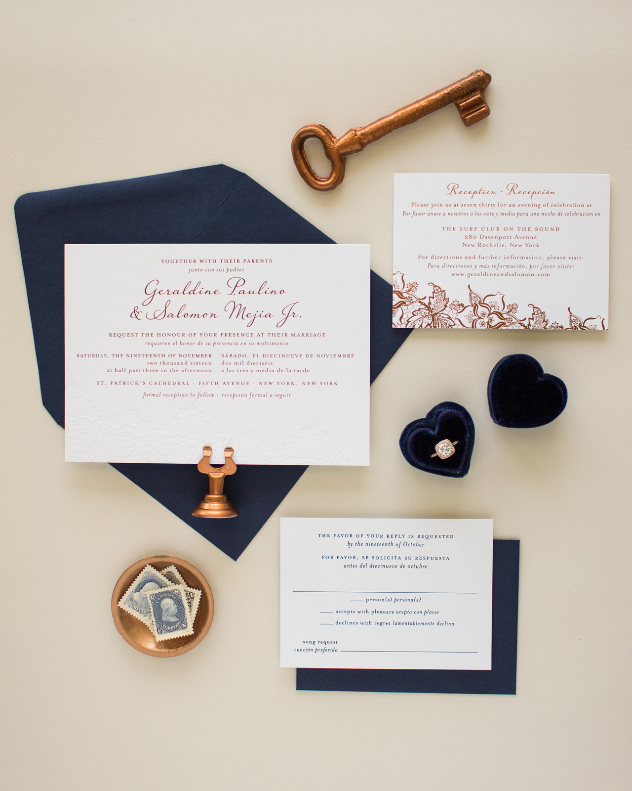
From Sarah: Copper foil and blind letterpress with navy accents – it’s no wonder that Geraldine and Salomon’s wedding invitation suite is one of my favorite designs from the past year. Geraldine came to me looking for a custom invitation design to accommodate the bilingual wording she and her fiancé would be using for their New York wedding. Since Geraldine and Salomon were inviting guests that spoke both English and Spanish, they wanted to include both languages in their wedding stationery.

Bilingual Copper Foil and Blind Letterpress Wedding Invitations by Banter and Charm

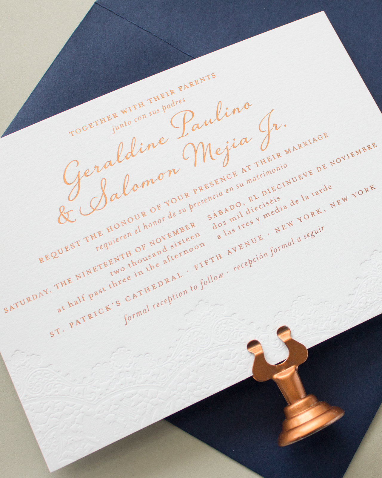
Instead of having two separate invitations, they decided to go with a bilingual design that incorporated both languages on a single card. Geraldine knew she wanted a romantic design, and really wanted to incorporate a vintage lace graphic with blind letterpress printing. She loved several of the designs from my invitation collection, but we decided to go with a custom design to accommodate the additional wording she needed.

Bilingual Copper Foil and Blind Letterpress Wedding Invitations by Banter and Charm

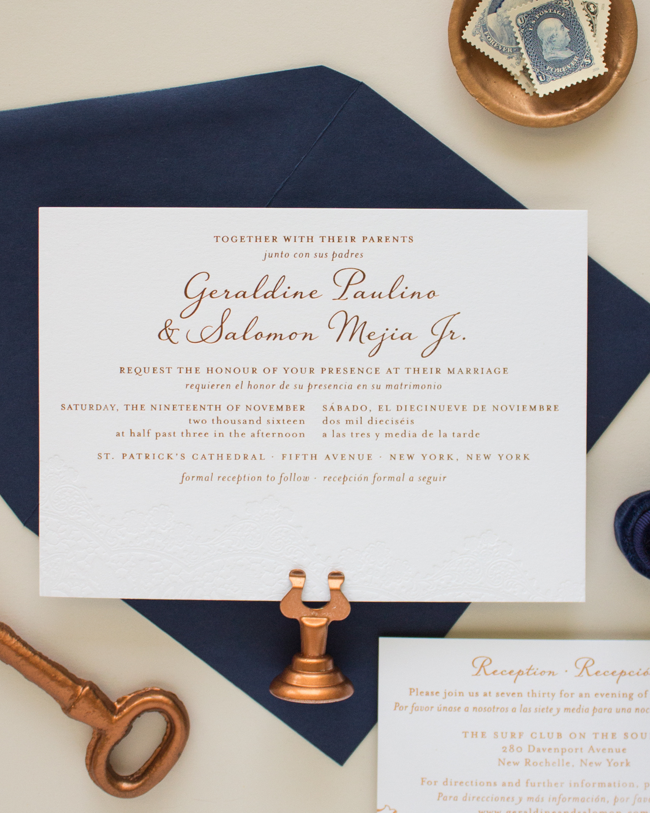
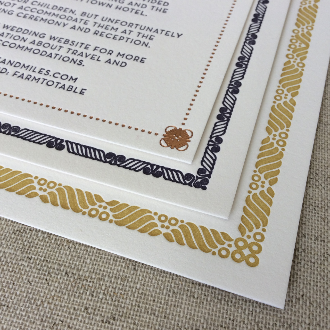
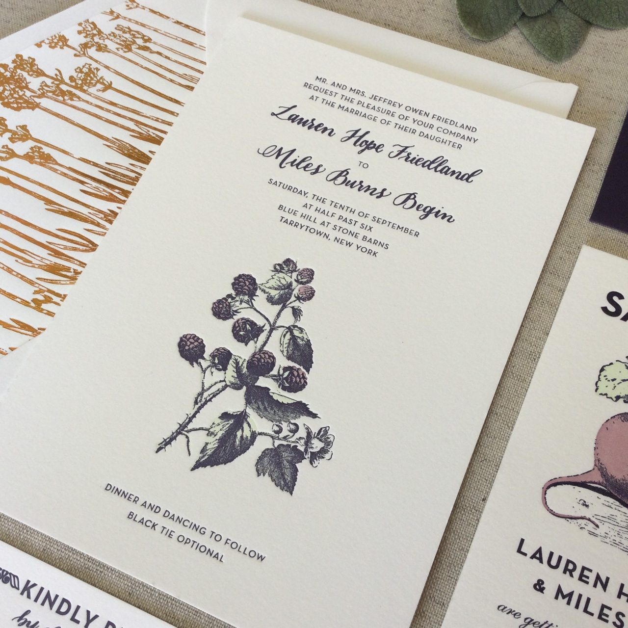
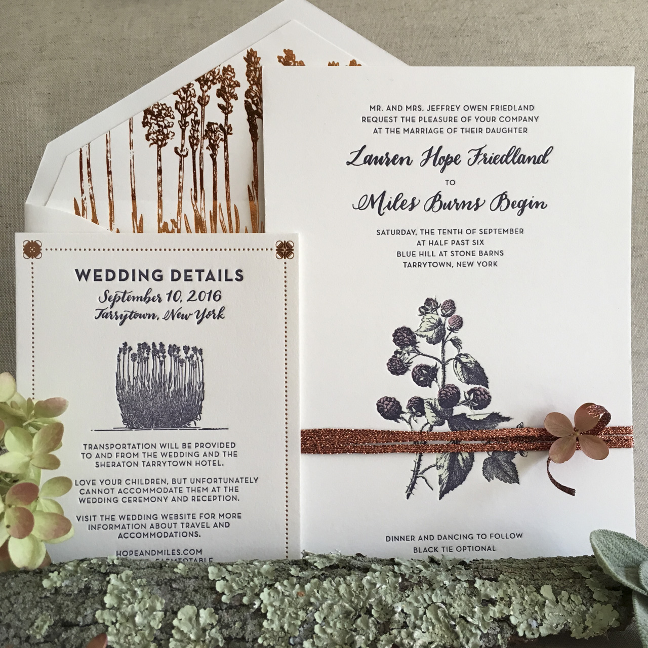
The final invitation design featured a gorgeous blind letterpress printed lace detail along the bottom edge, with copper foil printing for the text, all on Crane’s Lettra paper in Fluorescent white. With so much text to include, we needed to get creative on the layout. By using italics for the Spanish wording, we were able to distinguish between the two languages while keeping the design cohesive.

Bilingual Copper Foil and Blind Letterpress Wedding Invitations by Banter and Charm

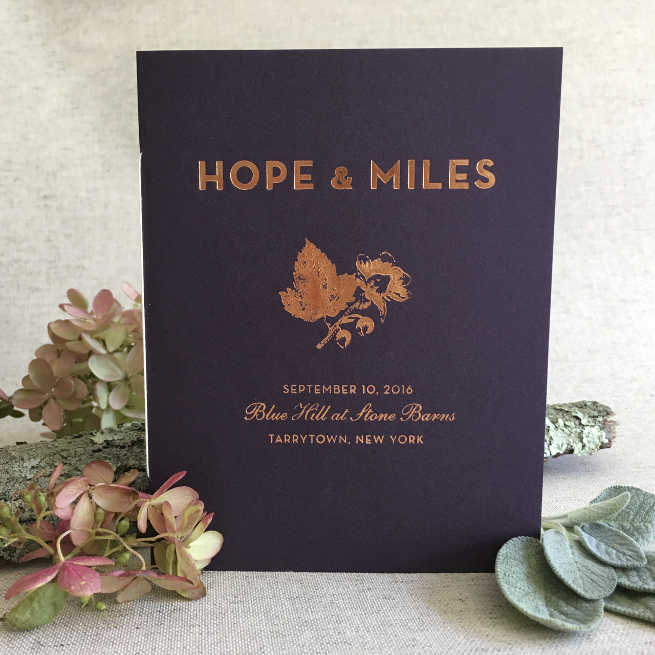
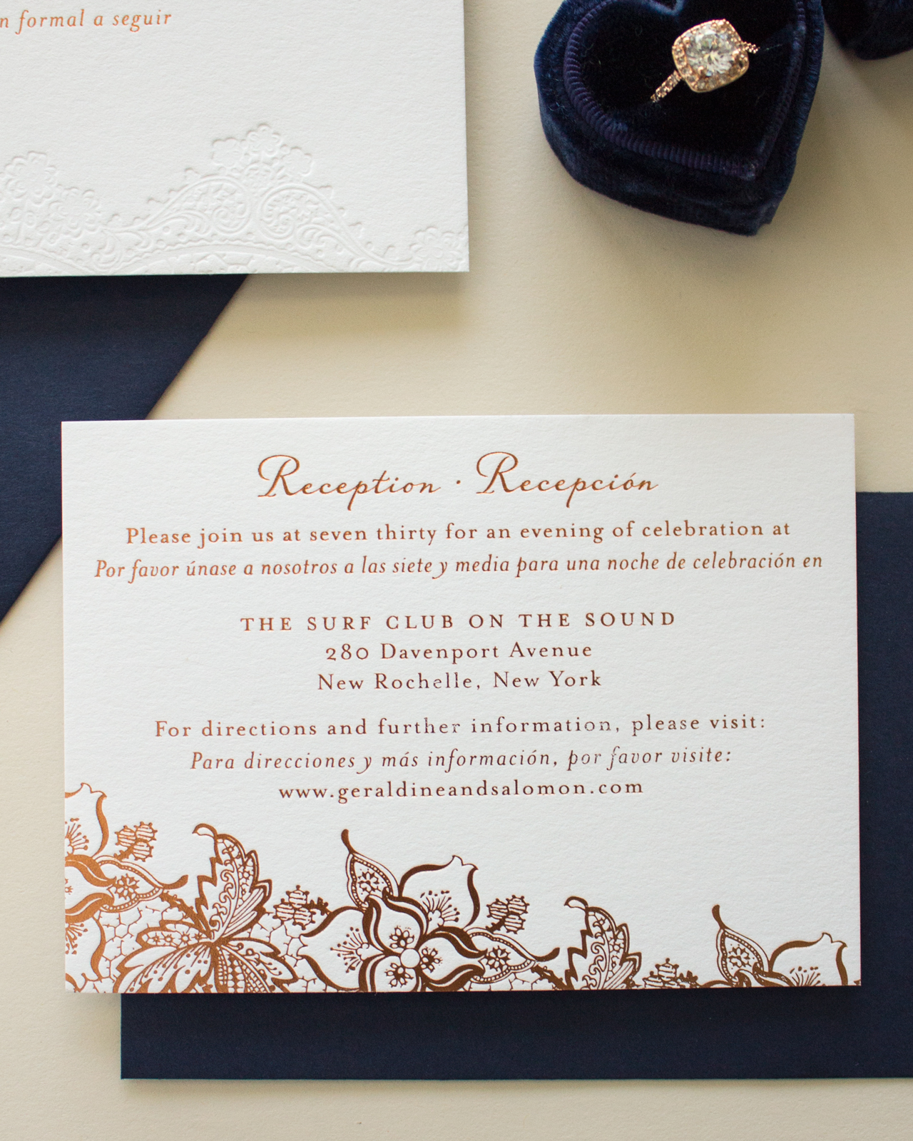
The reception card was also bilingual, and featured copper foil printing for all the elements. I love the contrast of the subtle blind letterpress printed lace on the invitation with the bold copper foil lace on the reception card. To bring in some color, we went with navy ink in flat printing for the response card. The navy ink added a great pop of color, and by using flat printing for the response card we were able to keep costs down.

Bilingual Copper Foil and Blind Letterpress Wedding Invitations by Banter and Charm

I absolutely love the way this suite turned out. Copper is my new favorite foil, and I have a feeling I’ll be using it a lot in the future.

Bilingual Copper Foil and Blind Letterpress Wedding Invitations by Banter and Charm

Thanks Sarah!

Design: Banter & Charm

Banter & Charm is a member of the Designer Rolodex – you can see more of their beautiful work right here or visit the real invi­ta­tions gallery for more wedding invitation ideas!

Photo Credits: Banter & Charm

Happy Weekend!

Happy Weekend everyone! The weather has been absolutely gorgeous in DC the last few days, so I’m doing my best to take advantage of it while it lasts. I chaperoned a field trip for my daughter’s preschool class on Thursday (which is when I took the photo below), and I’ve been spending a lot of time out in my front and backyard gardens soaking in the sunshine. It’s amazing what a little bit of sunshine can do for my overall mood, not to mention catching the first glimpses of daffodils, crocus, and magnolia blossoms around the neighborhood. I hope you all have a beautiful weekend! But in the meantime…

Washington, DC / Oh So Beautiful Paper

Photo by me via Instagram

…a few links for your weekend!

We shared our renovation experience and some of the lessons we learned during our bathroom renovation on the Wayfair blog!

Thanks to the Chronicle Herald for including our Apricot Tiki Mocktail in their article about Dryuary!

I can’t wait to go visit this exhibit at the Hirschorn Museum

Loving the glam metallic details in this pillow

The most beautiful new wedding agenda from the ladies of Sugar Paper

This copper pendant is so pretty – and it’s affordable!

The cutest clover pencils for St. Patrick’s Day

Such fun colors in this rug

The White Helmets has been nominated for an Academy Award – along with three other documentaries focused on the Syrian conflict. I highly recommend watching it, if you haven’t already. It’s tough to watch, but so important.


This week on Oh So Beautiful Paper:

Make it Pop! A delicious non-alcoholic winter citrus punch to enjoy at your next party

Sharing some inspiration for a kitchen renovation – and asking for your advice!

The cutest animal-themed birthday cards

A pretty new brush lettering script font

Illustrated farm-t0-table wedding invitations and save the dates

Fun black tie wedding invitations for a backyard wedding


OSBP at Home: Kitchen Inspiration

Oh man, you guys. I think I’ve been bitten by the renovation bug! Ever since we renovated our bathroom a year ago, I’ve been itching to finally do something with our kitchen. And since we’re in the kitchen every. single. day I think about renovating ALL the time. As I mentioned here, the kitchen layout is super awkward, with high gloss cabinets and frosted glass fronts (not to mention the corrugated cardboard “metallic” backsplash) that feel out of place with the overall aesthetic of our home. We’re still in the inspiration-gathering phase, and today I thought I’d share some of my favorite kitchen inspiration images with you today!

Kitchen Inspiration: Qanuk Interiors Kitchen via House & Home / Photo Credit: Donna Griffith Photography

Design: Qanūk Interiors / Photo Credit: Donna Griffith for House & Home Kitchens & Baths Fall 2013

We knew we wanted to renovate the kitchen from the day we moved in four years ago, but we wanted to live with our kitchen for a while to figure out the best layout for our needs. And I’ve honestly been stumped for most of the last four years! The kitchen is one of the largest rooms in our home, but the layout is so bad that we constantly feel pressed for prep space and accessible storage. (If you’re curious, I did a rough (and definitely not to scale) layout of our current kitchen layout that you can see here.) The cabinets and appliances are on opposite walls, with eight or so feet of empty space in the middle (where our dining table now sits), so we can’t easily go back and forth between counters and the stove or sink while we’re cooking. But I just couldn’t figure out where or how to move things around – until I saw the image above from House & Home Kitchens and Baths!

Kitchen Inspiration: Crystal Anne Interiors via Instagram

Design and Photo Credit: Crystal Ann Interiors

We’re now pretty settled on moving everything over to one side of the kitchen in a slight “c” shape, with either a built-in dining nook on the other side of the kitchen or floor-to-ceiling cabinets with an island in the middle. (You can see my rough layout here.) The layout would start with a refrigerator enclosed in cabinets at one end, then wrap around the wall towards a short peninsula at the other end. The wall between the kitchen and living room isn’t load bearing, so we’d open up that wall to create the peninsula and make the entire floor plan feel much more open. We would have lower cabinets for closed storage on the bottom, and a mix of upper cabinets and open shelving above. This would hopefully solve all the wasted space in our kitchen without compromising on storage.

Kitchen Inspiration: Melissa Lee Kitchen via Design Sponge / Photo Credit: Ty Cole Photography

Design: Melissa Lee / Photo Credit: Ty Cole Photography via Design Sponge

In terms of color and style, our kitchen sits in the middle of our home (a 1920s rowhouse) and doesn’t get much natural light, so my dream of a bright white kitchen probably won’t work. I’m loving the combination of navy lower cabinets, white walls, marble tile, and wood in the kitchen above.

Jersey Ice Cream Co. Kitchen via Remodelista

Design and Photo Credit: Jersey Ice Cream Co. via Remodelista

Butcher block counters with marble tile is also an excellent combination. And like everyone else in the world, we’re in love with the plaster walls that Jersey Ice Cream Co. did for Beth Kirby’s kitchen below. Although if I wasn’t worried about selling the house down the road I’d totally go with the pink plaster version instead.

Jersey Ice Cream Co. Kitchen for Local Milk via Remodelista

Design: Jersey Ice Cream Co. / Photo Credit: Beth Kirby via Remodelista

Sarah Sherman Samuel Cabin Kitchen

Design and Photo Credit: Sarah Sherman Samuel

Wit + Delight Kitchen / Photo Credit: Canary Grey for Domino

Design: Wit + Delight / Photo Credit: Canary Grey for Domino

I’ve got the color combination for the cabinets, countertops, and walls, but what to do about the floor? I love the cement tile that Kate used in her kitchen, but I worry that it’s too modern for our 1920s home. But maybe not? I don’t think we’ll be able to match the wide plank wood flooring from the rest of the house, so I’m definitely leaning towards some type of tile. Old school hexagon tile? I love the way the tile meets the wood floors in the kitchen below!

Royal Roulotte Kitchen via My Domaine

Design: Royal Roulotte via My Domaine

Alright everyone, throw it at me! We’ve only been through a bathroom renovation before, which I’m sure is a piece of cake compared to a kitchen renovation. What do I need to know? Any advice for renovating a kitchen with two small kids at home? I’m all ears!

Illustrated Farm to Table Inspired Wedding Invitations

When you’re getting married at a farm-to-table restaurant inside a gorgeous refurbished barn in upstate New York, why would you look anywhere else for your wedding invitation inspiration? Enter these gorgeous illustrated farm to table inspired wedding invitations with rich natural hues and stunning copper foil details from Rachel of Robinson Press! From the save the date card inspired by an antique seed packet to the sophisticated navy wedding program, every stationery element from this farm to table wedding is perfect for a crisp fall wedding!

Illustrated Farm to Table Inspired Wedding Invitations by Robinson Press

From Rachel: Hope and Miles wanted to build excitement for their farm to table wedding celebration at the esteemed Blue Hill at Stone Barns restaurant. We decided to base the save the date design on antique seed packets. The save the date was letterpress printed in three colors on Reich Savoy double thick cotton paper.

Illustrated Farm to Table Inspired Wedding Invitations by Robinson Press

The invitation evolved from there to include antique botanical illustrations, mixed with artful borders, and hand calligraphy of the couple’s names and return address by Jenny at Leveret & Hare.

Illustrated Farm to Table Inspired Wedding Invitations by Robinson Press

We added some copper foil details and enlarged a lavender illustration to create an abstract foil printed envelope liner. We letterpress printed it all on Reich Savoy double thick cotton paper, enlisting the help of our pals at DWRI Letterpress in Providence.

Illustrated Farm to Table Inspired Wedding Invitations by Robinson Press

We used Colorplan amethyst RSVP envelopes for a pop of dark purple here and there. We took the printed suite to our friend Angela at Studio Carta and spent way too long trying out different colors and styles of ribbon for the perfect complement to tie together the four coordinating pieces. Settling on a metallic copper ribbon, we then sent the outer envelopes off for calligraphy addressing by Jenny at Leveret & Hare.

Illustrated Farm to Table Inspired Wedding Invitations by Robinson Press

Meanwhile, for the wedding programs, we designed and hand-bound 150 passport sized booklets with Italian parchment endpapers and waxed Irish cotton linen book thread. We made further use of the beautiful borders and botanicals for escort cards, table names, and welcome notes.

Illustrated Farm to Table Inspired Wedding Invitations by Robinson Press

Thanks Rachel!

Design: Robinson Press

Calligraphy: Leveret & Hare

Foil Printing: DWRI Letterpress

Ribbon: Studio Carta

Bookbinding Supplies: Talas Bookbinding

Paper: Reich Paper and Colorplan Paper

Robinson Press is a member of the Designer Rolodex – you can see more of their beautiful work right here or visit the real invi­ta­tions gallery for more wedding invitation ideas!

Photo Credits: Rachel Robinson