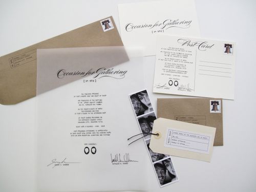
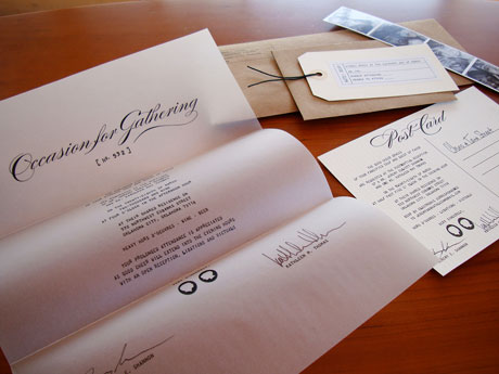
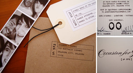
A couple of weeks ago I featured these engagement party invitations from itsmematt, but the wedding invitations and Save the Dates are just as fabulous!

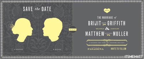
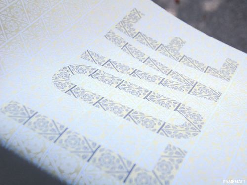
{Matt and Brijit’s Save the Date poster}
I asked Matt if he’d be willing to tell us about the design process in creating their invitations, and here’s what he had to say:
When I proposed to my now wife, I knew before hand that I would be designing all of the invites and additional goodies.  I feared that, designing for myself, like most designers can attest to, is extremely hard to do.  So I treated the invites like a collaboration for an event that I wasn’t partaking in.  That sounds stupid right?  Well I knew that if I designed it as though it were my wedding I might seize up.  I mean seriously, I was getting married!?  It’s one of the most frightening/exciting things you can go through in life, I couldn’t add being my own harshest critic on top of that.  So what I did was treat it like my wife was the client (after all, she should be in love with everything for the big day).  Boy oh boy did that make it easier to get started.

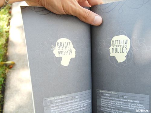
She picked a color scheme: grays, yellow and white.  She then showed me some silhouettes she liked and some calligraphic flourishes she really liked.  I then went to town making silhouettes of the two of us and scanning in some really cool French calligraphy.

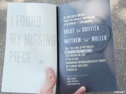
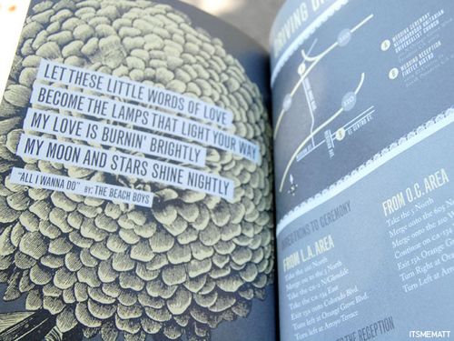
The design process went easy. Â We wanted to make a booklet from the get-go and so instead of the traditional
saddle stitch we went for a more personal approach and we sewed each one along the left side.

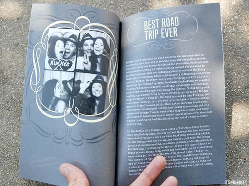
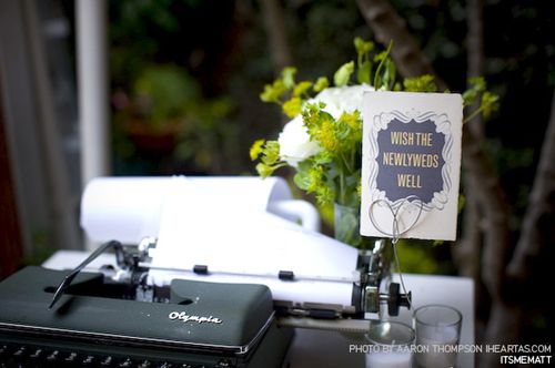
I used a typewriter font for a personal story of how the proposal went down to tie in the fact that our guest book at the reception would be an old typewriter with a roll of paper attached.


It was such a great process from start to finish and it was so well received from everyone in attendance.

I love the way Matt and Brijit took a more personal approach, using their wedding invitations to tell their story in a completely unique way. For me, that’s one of the biggest advantages of having an invitation booklet, and I’m so happy to see more and more couples moving in this direction. Thanks so much Matt, for sharing your invitations with us!
{images via itsmematt}

