Folk Art-Inspired Birth Announcements

How adorable are these folk art-inspired birth announcements from Jackie of 42 Pressed? Jackie designed a beautiful floral border that combines folk art and nature-inspired influences, all letterpress printed in complementing shades of green and blue. The new parents also included a kraft paper tag with a quick life update for family and friends. Such a great idea!

Folk-Art-Inspired-Birth-Announcement-42Pressed

From Jackie: Designing a custom baby announcement is definitely one of my favorite things because it’s so personal. When a designer can hit it right for their client, and their aesthetics seem to match, the result is normally pretty incredible. The mother really wanted something that had a folk-woodsy-flora feel to announce her daughter without it being overtly feminine. She wanted there to be a balance of soft and feminine while still remaining very natural and woodsy.

Folk-Art-Inspired-Birth-Announcement-42Pressed2

I always really like to design for overprinting when something is going to be letterpress printed; I think it adds great depth and a little pop of color without it being too much. We chose an olive green color and a soft blue, which enabled us to print the olive green over the soft blue without the colors competing with each other. We also printed a kraft tag that was designed to be sent along with the baby announcement, as a sort of “update” on what has been going on in their busy lives recently. That tag needed to be simple and clean to compliment the announcement. All pieces were designed and letterpress printed in house. 

Floral-Letterpress-Birth-Announcement-42Pressed2

Thanks Jackie!

Photo Credits: 42 Pressed

James + Daniel’s Masculine Letterpress Wedding Invitations

James and Daniel approached designer Chase Kettl looking for a masculine design for their wedding invitations. Chase created a modern two-color design with bold typography-inspired elements. Blue edge painting was the perfect finishing touch!

Masculine-Wedding-Invitations-Dependable-Letterpress

From Chase: James and Daniel contacted me looking for a masculine feel for their wedding invitations. Being a wedding of two men, they wanted to have a masculine feel as opposed to something flowery and frilly. I was thrilled to work with them! We decided to go with a two-color letterpress with bold design elements. We also decided to invest in blue edge painting to really give it a clean, dapper finish.

Masculine-Wedding-Invitations-Dependable-Letterpress3

Masculine-Wedding-Invitations-Dependable-Letterpress7

Masculine-Wedding-Invitations-Dependable-Letterpress5

Thanks Chase!

Design: Chase Kettl

Letterpress Printing: Dependable Letterpress

Check out the Designer Rolodex for more tal­ented wed­ding invi­ta­tion design­ers and the real invi­ta­tions gallery for more wedding invitation ideas!

Photo Credits: Chase Kettl

Kristen + Austin’s 1950s-Inspired Lake Tahoe Wedding Invitations

Ooooh, laser engraved wood wedding invitations! For these destination wedding invitations, Courtney from Swiss Cottage Designs paired the wood invitation with colorful accents inspired by the venue – Lake Tahoe! With her fabulous eye for detail, Courtney incorporated lots of cute and quirky elements into the day-of wedding stationery, from custom camp-inspired patches to welcome tote bags.

Wood-Lake-Tahoe-Wedding-Invitations-Swiss-Cottage-Designs

From Courtney: This suite was inspired by 1950s Lake Tahoe with a modern twist: so think Rat Pack, martinis and camping in retro cabins under the stars. Lake Tahoe is notoriously blue so it was natural to have cobalt blue be the star of the show. The bold yellow color complemented the blue and helped play into the ’50s inspiration.

Wood-Lake-Tahoe-Wedding-Invitations-Swiss-Cottage-Designs3

When it came to the invitation, Kristen wanted to do something with wood to represent the nature of Tahoe. I found an amazing vendor to laser engrave these on double thick wood. It was a great touch and the invites actually smelled a bit like firewood which was an awesome bonus element! With the RSVP card, we wanted it to feel like a post card you would grab when traveling through the area on vacation.

Wood-Lake-Tahoe-Wedding-Invitations-Swiss-Cottage-Designs2

Since this was a destination wedding, we wanted the save the date to act as an incentive package to guests. I created a two fold brochure filled with fun facts about Tahoe as well as travel details, hotel info. and more. With destination weddings, the save the dates always end up being a bit more important as guests need to book early. As an extra element to help tie suite together, we came up with the idea of doing an actual patch like you might get at camp. I ended up working with a great vendor who created the patches (2.5″ x 2.5″) with iron-on material on the back. Some guests even showed up with the patches adhered to their outfits. Brilliant!

Wood-Lake-Tahoe-Wedding-Invitations-Swiss-Cottage-Designs5

My favorite element is the envelope liner. Lake Tahoe is the second deepest Lake in the country so I thought it might be cool to highlight that with a depth chart. Depth charts aren’t exactly the most exciting thing but by using different shades of cobalt and placing it against the clean white paper, it was a great design element that really added to the suite.

Wood-Lake-Tahoe-Wedding-Invitations-Swiss-Cottage-Designs6

For the day of elements, we played with cocktail napkins, drink stirrers, buttons, custom kazoos (weird, but fun!), “Keep Tahoe Blue” stickers, and silk screened tote bags.  I’m a firm believer that the day of elements really help round out the event. It’s such a fun way to bring all the great details from your save the date and invitation into the big day!

Wood-Lake-Tahoe-Wedding-Invitations-Swiss-Cottage-Designs4

Thanks Courtney!

Design: Swiss Cottage Designs

Swiss Cottage Designs is a member of the Designer Rolodex – you can see more of Courtney’s amazing work right here or visit the real invi­ta­tions gallery for more wedding invitation ideas!

Photo Credits: Courtney Jentzen | Swiss Cottage Designs

Wedding Stationery Inspiration: Bubblegum Pink

I’ve been hearing a ton of buzz about pink being a big color trend for fall fashion. Have you? I must say, I’m pretty excited about this! One of the “it” pink hues is bubblegum, no less. What a contrast to the typical autumn shades we see! To get all of you on the “pink for fall” bandwagon, even when it comes to your fall weddings, I’ve rounded up a few of my favorite ways to “pop” (pun intended) your day-of stationery with a little hit of bubblegum. —Kelly

Day-Of Wedding Stationery Inspiration and Ideas: Bubblegum Pink via Oh So Beautiful Paper

Photo by Abbey Moore via 100 Layer Cake

Day-Of Wedding Stationery Inspiration and Ideas: Bubblegum Pink via Oh So Beautiful Paper Day-Of Wedding Stationery Inspiration and Ideas: Bubblegum Pink via Oh So Beautiful Paper

Photos by Gabriel Ryan Photographers, Paper Goods by Pitbulls and Posies via Design*Sponge

Day-Of Wedding Stationery Inspiration and Ideas: Bubblegum Pink via Oh So Beautiful Paper

Photo by Chelsea Mitchell Photo, Menu by Copper Willow Paper Studio via Style Me Pretty

Day-Of Wedding Stationery Inspiration and Ideas: Bubblegum Pink via Oh So Beautiful Paper Day-Of Wedding Stationery Inspiration and Ideas: Bubblegum Pink via Oh So Beautiful Paper

Photo by Adrienne Gunde Photography, Escort Cards by It’s Amore Design + Letterpress via Elizabeth Anne Designs (left), Photo by Julie Lim Photography, Escort Cards and Calligraphy by Just Write Studios via Ruffled (right)

Day-Of Wedding Stationery Inspiration and Ideas: Bubblegum Pink via Oh So Beautiful Paper

Photo by Holland Photo Arts, Stationery by Rock Paper Scissors via Elizabeth Anne Designs

Day-Of Wedding Stationery Inspiration and Ideas: Bubblegum Pink via Oh So Beautiful Paper Day-Of Wedding Stationery Inspiration and Ideas: Bubblegum Pink via Oh So Beautiful Paper

Photo by Mirelle Carmichael Photography, Menu by Alissa Bell Press via Style Me Pretty (left), Photo by Wayne Yuan Photography, Calligraphy by Neither Snow via Style Me Pretty (right)

Day-Of Wedding Stationery Inspiration and Ideas: Bubblegum Pink via Oh So Beautiful Paper

Photo by nbarrett photography, Tags by Southern Fried Paper via Ruffled

Day-Of Wedding Stationery Inspiration and Ideas: Bubblegum Pink via Oh So Beautiful Paper Day-Of Wedding Stationery Inspiration and Ideas: Bubblegum Pink via Oh So Beautiful Paper

Photo by Half Orange Photography, Ceremony Program by Haley McMichael via Ruffled (left), Photo by KT Merry, Drink Sign by Fig. 2 Design Studio with Calligraphy by Meant To Be Calligraphy via Southern Weddings (right)

 {images via their respective sources}

DIY Tutorial: Stamped Nautical Tri-Fold Wedding Invitation Suite

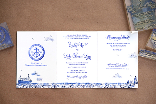
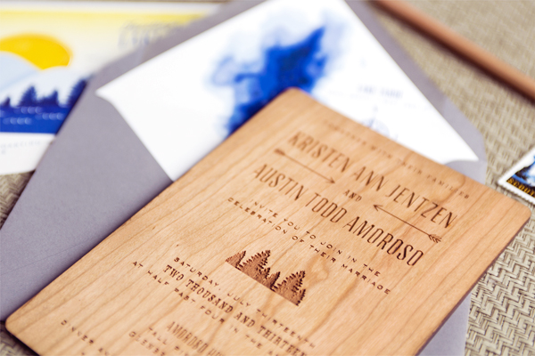
Shades of blue, anchor motifs, ships and rope… you could say that we are a pretty obsessed with nautical design. In this invitation suite, we created a stamped, fold out invitation with nautical details in mind. After discovering how easy and useful a fold out card is in a previous tutorial, we wanted to explore the format more and translate it into a full invitation. This would be perfect for a nautical seaside affair! To make this week even more fun, we’ve included a free download of the watercolor ocean-scape to make this tutorial a breeze. Enjoy! – Bailey and Emma of Antiquaria

DIY Tutorial: Stamped Nautical Tri-Fold Wedding Invitation Suite by Antiquaria for Oh So Beautiful Paper

DIY Tutorial: Stamped Nautical Tri-Fold Wedding Invitation Suite by Antiquaria for Oh So Beautiful Paper

DIY Tutorial: Stamped Nautical Tri-Fold Wedding Invitation Suite by Antiquaria for Oh So Beautiful Paper

Step One: After downloading and printing the nautical tri-fold design (see bottom of post for download link). You will need 11″ x 17″ card stock to print the ocean scape. Next trim the card down at the crop marks to reach the final size (15″ x 7″). We used a self healing mat, metal ruler and craft knife for this step. If cutting many cards, we recommend taking them to a local printer to have them cut them all at once with an industrial cutter.

DIY Tutorial: Stamped Nautical Tri-Fold Wedding Invitation Suite by Antiquaria for Oh So Beautiful Paper

Step Two: Score the card twice: once at the 5″ mark and the other at the 10″ mark. Those will be your fold lines for the card but do not fold it yet!!

DIY Tutorial: Stamped Nautical Tri-Fold Wedding Invitation Suite by Antiquaria for Oh So Beautiful Paper

Step Three: Gather all of your stamps and lay them out to make certain that you have a stamping plan. The stamps we used for this design, from left to right are our Anchor Monogram Wedding Date Stamp, Vintage Calligraphy Invitation Stamp, Calligraphy Accent Accommodations Stamp and Calligraphy Accent Website Card Stamp. Once you have your plan, you will ink each stamp and align it into its appropriate space. For a step-by-step video tutorial about the stamp printing process go here.

DIY Tutorial: Stamped Nautical Tri-Fold Wedding Invitation Suite by Antiquaria for Oh So Beautiful Paper

DIY Tutorial: Stamped Nautical Tri-Fold Wedding Invitation Suite by Antiquaria for Oh So Beautiful Paper

Step Four: Fold the card at the score marks. Use a bone folder to create crisp folds.

DIY Tutorial: Stamped Nautical Tri-Fold Wedding Invitation Suite by Antiquaria for Oh So Beautiful Paper

Step Five: Since the reply card will need to be sent back to you, we designed it as a separate piece. We used a white stamp pad with our Calligraphy Accent Reply Postcard Stamp on a navy A6 card (4″ x 6″).

DIY Tutorial: Stamped Nautical Tri-Fold Wedding Invitation Suite by Antiquaria for Oh So Beautiful Paper

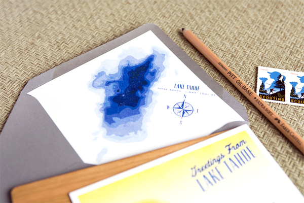
Step Six: Adding a printed envelope liner is a great way to add color and pattern to your save the date design. To make the liner, trace the template onto your printed paper (we used our  Watercolor Stripe in Ocean text weight) and cut it out with scissors. To install, simply use stick glue or double sided tape to adhere them into your envelope.

DIY Tutorial: Stamped Nautical Tri-Fold Wedding Invitation Suite by Antiquaria for Oh So Beautiful Paper

Step Seven: Next, you will stamp your return address on the back flap of your A7 envelope. We used our Scripted Return Address Stamp with navy blue ink for this design.

DIY Tutorial: Stamped Nautical Tri-Fold Wedding Invitation Suite by Antiquaria for Oh So Beautiful Paper

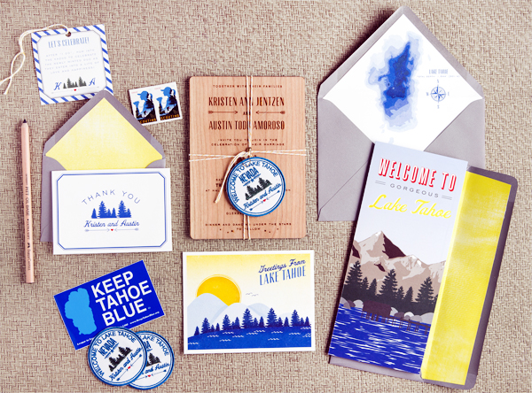
All that’s left is to add some gorgeous vintage postage (ours is from Verde Studio) and address them to your guests! We guarantee that they will be stoked to receive them in the mailbox and will be counting the days until your celebration!

Materials

Anchor Monogram Wedding Date Stamp

Vintage Calligraphy Invitation Stamp

Calligraphy Accent Accommodations Stamp

Calligraphy Accent Website Card Stamp

Calligraphy Accent Reply Postcard Stamp

Scripted Return Address Stamp

Stamp Pad in Midnight and Frost White

Watercolor Stripe Patterned Paper in Ocean Text Weight

Nautical Tri-Fold printed sheet (printed on 11×17 card stock), download file HERE  Note: digital download is for personal use only**

Self Healing Mat, Metal Ruler and Craft Knife

A6 Cards in Night

A7 Envelopes in Bluebell

Envelope Liner Templates

Vintage Postage

Anti­quaria is a mem­ber of the Designer Rolodex – you can see more of their beau­ti­ful work right here or visit the real wedding invitations gallery for more wedding invitation ideas!

Photo Credits: Antiquaria