A Paper Chandelier!

I came across this fantastic chandelier while browsing through the Pottery Barn catalog last night and thought you might love it as much as I do:

Pottery-barn-paper-chandelier3

Pottery-barn-paper-chandelier2

It’s made with paper!  With three tiers and 35 clips, that’s a lot of space to display love letters, travel post cards, holiday cards — pretty much whatever you want.  This is clearly Pottery Barn’s (much more affordable) take on the Ingo Maurer Zettl’z chandelier:

Ingo-Maurer-Zettl'z-Chandelier3

As much as I love the Zettl’z, I think I actually prefer the rustic look of the Pottery Barn chandelier.  I’m definitely putting it on my wish list… even if I have to wait a little while before we actually have the space to properly hang and display it!

{image credits: top photos via pottery barn, bottom photos via house beautiful and illums bolighus}

Real Invitations – Cynthia + Michael, Part 2

Cyd’s wedding ceremony programs were a true labor of love — with a beautiful result! — deserving of a post all their own.  Plus they were inspired in part by my own wedding ceremony programs, so I just had to give Cyd’s lovely blue and kraft paper programs a bit of extra love!

Program-Cover-Blue-Brown

From Cyd: For our ceremony programs, I was inspired by your cute pocket-sized ceremony programs and the lovely programs you featured by Erin Jang which had kraft paper pages and gocco’d covers.

Program-Cover-Blue-Brown3

These were easily the most time consuming of my DIY projects – I designed them and laid them out myself in InDesign.  Every cover was individually cut, scored, lined on the inside with the same paper as our envelope liners, and then hand bound (we’re talking old school book binding with a needle and thread here) with blue and white striped baker’s twine.

Program-Kraft-Corner-Inside-Detail

Program-Inside-Back-Kraft-Middle

The pages were kraft paper, which was a material I introduced with the envelopes of our Bookmark the Dates (DIY bookmarks as I’m a literature buff and my husband is an English teacher) and later incorporated in several areas throughout our event.

Program-Inside-Back-Kraft2

I gocco’d both the front and back covers, picking up on the flourish from our invitations, and used Paper Source cardstock in Lake for the actual covers.

Program-Kraft-Corner-Detail

They were immensely time-consuming, but guests loved them and very few were left behind. I can’t say I’ll be making any more miniature books anytime soon, but I sure did love the way these turned out!

Beautiful!  Don’t you all just love the mix of craft paper and that gorgeous lake blue?  You can read more about Cyd’s wedding over on The Sweetest Occassion or on her column on Elizabeth Anne Designs.  Oh, and for those of you curious about the script font used in Cyd’s programs, it’s called Burgues and can be found at Veer.  Thanks so much, Cyd, for sharing your lovely programs and gorgeous wedding invitations with us!

{all photos by Oh So Beautiful Paper}

Let’s Go!

Perhaps its the impending winter and cold weather, but lately I've had a serious case of wanderlust — so I'm definitely feeling this letterpress print by Cindy Tomczyk:

Lets-Go-Poster

Although I'm definitely not limiting myself to Europe.  Last summer, my husband and I went to Peru for our honeymoon, but I've always wanted to visit New Zealand and Madagascar among many, many others.  Have you also found yourself with a bit of a travel bug — and where would you go?

{image credits: Cindy Tomczyk}

A Crisp White Bedroom

Today I love this crisp white bedroom:

Maura-mcevoy-white-bedroom

Don’t get me wrong, I’m a girl who loves pattern, color, and texture and often prefers that over clean white walls.  But I’ve been plagued by insomnia as far back as I can remember, so when I saw this serene bedroom on desire to inspire today, it made me stop and consider a relaxing white room as a better way to get a full night’s sleep.  Doesn’t it look peaceful?

What about you – do you prefer white or a bit of color on your bedroom walls?

{image credits: Maura McEvoy via desire to inspire}

2010 Calendar Round-Up, Part 2

Hi everyone!  I've been a busy bee the past few days compiling even more fantastic 2010 calendars to share with you.  So once again, you might want to settle in, get comfortable, and prepare yourself for more calendar goodies!  

First up, Sarah from Parrott Design Studio switched from gocco to letterpress for her calendar this year, and it's absolutely beautiful!  But there are only about 15 left (and it's definitely a one-time limited edition run), so hurry over to Sarah's etsy shop to pick up your copy:

Parrott-Design-Calendar1
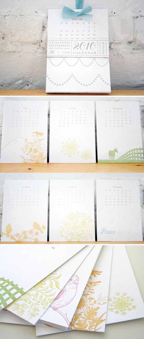
{Parrott Design Studio}

Postal Press also debuted its first calendar this year, and I'm loving the entomological and botanical specimen theme:
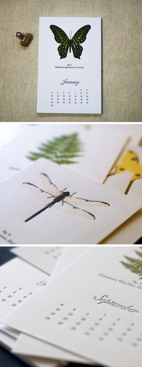
Postal-Press-Specimen-Calendar
{Postal Press}

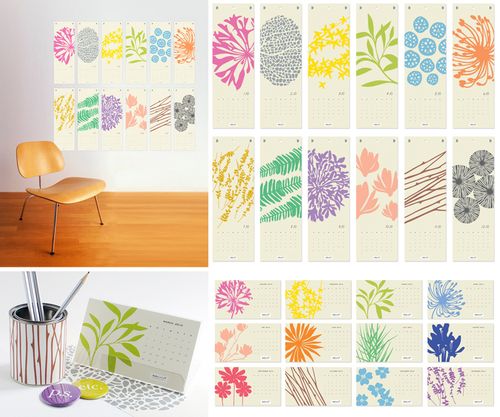
Catlin Keegan's 2010 calendar features her beautiful signature illustration and hand lettering, and is printed in a wheel format with space to write birthdays and other important dates below each month:
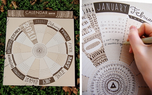
Caitlin-Keegan-Calendar
{Caitlin Keegan}

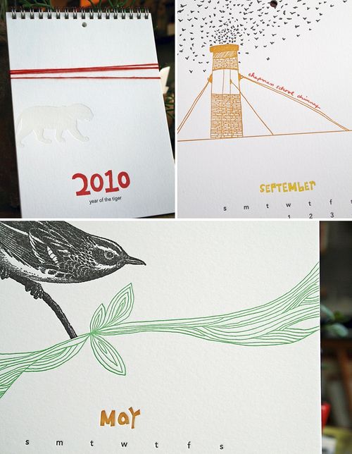
The 2010 Cats Let Nothing Darken Their Roar calendar by Noah Bembribre continues to be one of the coolest calendars available — almost guaranteed to be a favorite for any designer friends: 

Noah-Bembribre-2010-Calendar

Noah-Bembribre-2010-Calendar2
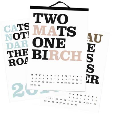
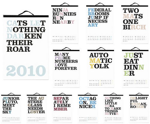
{Cats Let Nothing Darken Their Roar; images via maquette}

Decoy Lab is offering a combination clock and calendar this year — the calendar can be replaced with a photo at the end of the year:
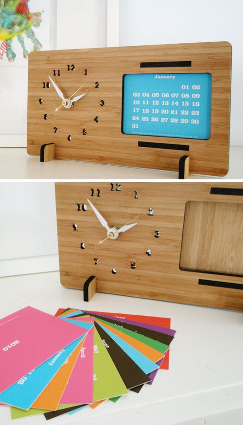
Decoy-Lab-Wood-Clock-Calendar
{Decoy Lab}

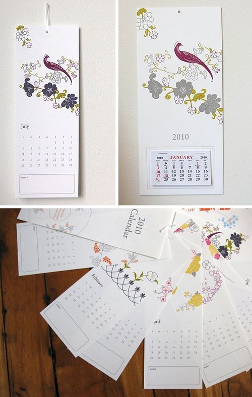
The Lark Press 2010 calendar features letterpress illustrations and hand lettering:

Lark-Letterpress-Calendar
{Lark Press}

I love the letterpress illustrations and woodgrain texture on the cover of this year's calendar from Paisley Tree Press:

Paisley-Tree-Press-Calendar
{Paisley Tree Press}

One of my favorite calendars last year was the fabric panel calendar from Cicada Studio — which is back this year with two fabric calendar choices:
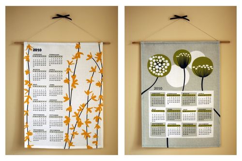
Cicada-Studio-Fabric-Calendar
{Cicada Studio}

This hand-illustrated calendar from Nisee Made is just darling, and is printed on 100% recycled paper with soy-based inks:
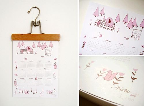
Nisee-Made-Calendar
{Nisee Made}

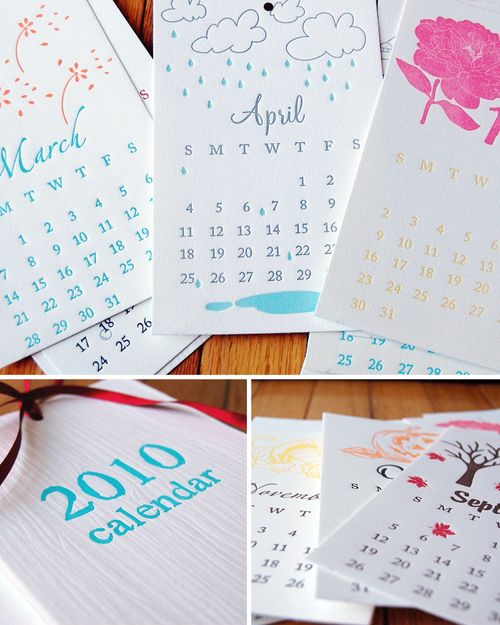
Pistachio Press is offering two versions of its 2010 letterpress calendar — a tear-away version and a traditional version with different artwork for each month inspired by vintage china patterns:

Pistachio-Press-Calendars
{Pistachio Press}

Albertine Press took a slightly different direction with this year's letterpress calendar, incorporating overlapping illustrations with a unique color scheme for each month — requiring to 29 (!!) separate color runs for the calendar — with a lovely result.  Each calendar has rounded corners and is hung with fine ribbon and printed onto 100% recycled paper:
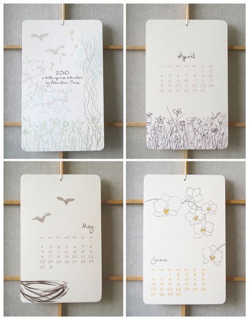
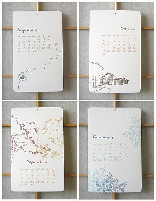
Albertine-Press-Calendar
Albertine-Press-Calendar2
{Albertine Press}

Both Suzy Jack and Snow and Graham are offering coordinating desk and wall versions of their 2010 calendars:

Suzy-Jack-2010-Calendars
{Suzy Jack}

Snow-and-Graham-Calendars
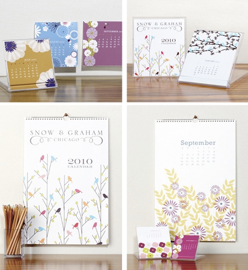
{Snow and Graham – click on "stores" for online retailers}

These pocket calendars from Sub-Studio are a perfect calendar-on-the-go — just tuck them into a pocket or purse for a handy reference whenever needed.  The calendars feature 24 different proverbs printed on the front, with the full 2010 calendar printed on the back: 
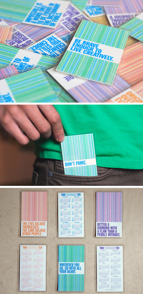
Sub-Studio-Pocket-Calendar
{sub-studio}

Another favorite from last year, this eco-chic calendar from Cat Seto is printed on 100% recycled paper and includes a wood block stand made from reclaimed lumber:

Cat-Seto-Eco-Chic-Calendar
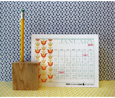
{Cat Seto via See Jane Work}

Also, I'm afraid I kind of lied — I'm going to have to break my calendar coverage into a 3-part round-up since there are so many calendars!  I'm working on gathering the rest together now and will be back with Part 3 of the 2010 calendar round-up a bit later this week.  In the meantime, if you'd like to catch up on the previous calendar round-up, you can find Part 1 right here.

{images from their respective sources}