Hello Brick & Mortar: Real Customers, Everyday Thanksgivings

In the early months at Clementine I was a total sucker for “hello” cards. Letterpress print an animal saying “hello” or “hi” and I was sold. I mean, give-me-some-box sets, sold. I was certain that everyone would buy them because they were a sweet, quick way to let someone know you’re thinking of them. But they didn’t sell. I was stumped.  â€“ Emily of Clementine

Brick + Mortar: Retail Trends from Clementine for Oh So Beautiful Paper

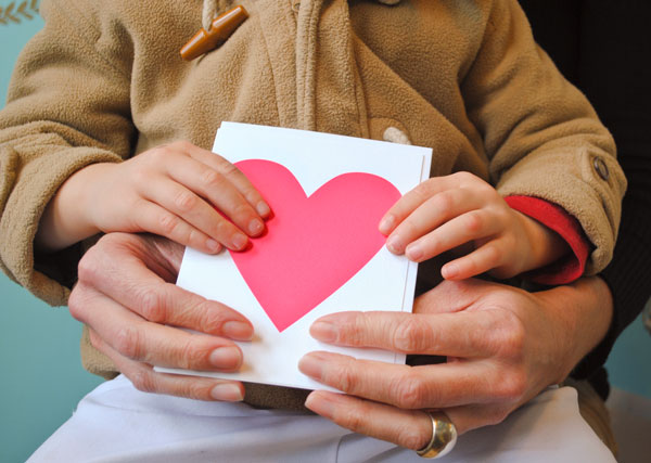
Anne & Leo ~ Banquet, Neon Heart ~ For Anne’s parents who took care of her kids so that she and her husband could get away for the first time in years.  

Meanwhile stationery flew off the shelves. Customers who came in to buy a birthday card wound their way to the counter with a thick stack of cards, always telling me they couldn’t resist and would find a time to use it. We would joke about stocking a stationery drawer, like a mini-bunker, to avoid emergency trips to the drug store. My card lines doubled, then tripled. I found a soft spot for “just because” cards and for the stories customers told about where each card was headed.
Brick + Mortar: Retail Trends from Clementine for Oh So Beautiful Paper

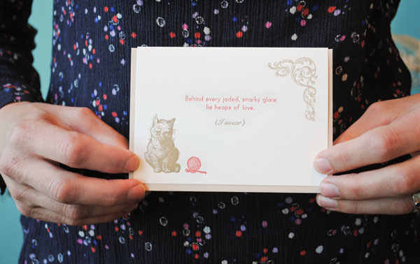
Caroline ~ Pearl & Marmalade, Snarky Cat ~ Just a good card to keep in reserves for the right occasion.

I can’t say specifically why hello cards sell slowly (were you wondering if I still order them? Of course I do!). What I’ve learned is that sending a “just because” card is a simple act done with great care. It’s more than a hello. It makes you vow to stop texting so much. It can reconnect you to someone in a heartbeat and make you feel implausibly good. And who doesn’t like that?
Brick + Mortar: Retail Trends from Clementine for Oh So Beautiful Paper Brick + Mortar: Retail Trends from Clementine for Oh So Beautiful Paper

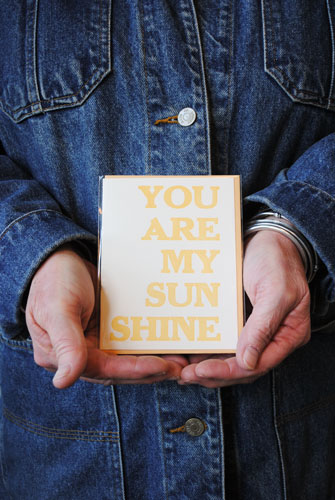
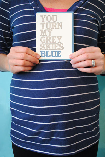
Sarah – May Day Studio, You Are My Sunshine ~ for a friend who sent a package that arrived on her door after a very tough day caring for her mom // Eliza & babe ~ May Day Studio, You Turn My Grey Skies Blue ~ for a friend who often sends thoughtful things, who works long and hard and deserves to have her day brightened.

It’s always fun to hear people chuckle from across the store, or pull friends in through the door because they see a card in the window that they must have.
Brick + Mortar: Retail Trends from Clementine for Oh So Beautiful Paper Brick + Mortar: Retail Trends from Clementine for Oh So Beautiful Paper

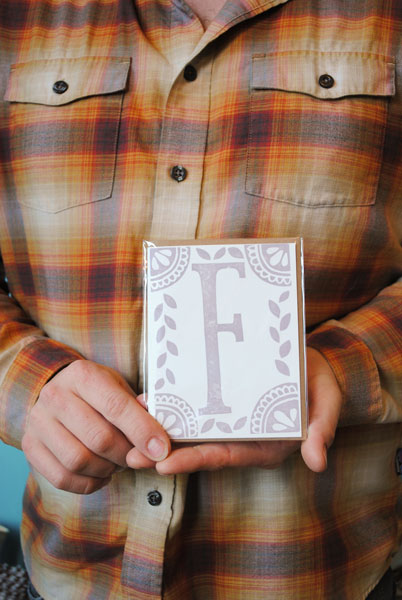
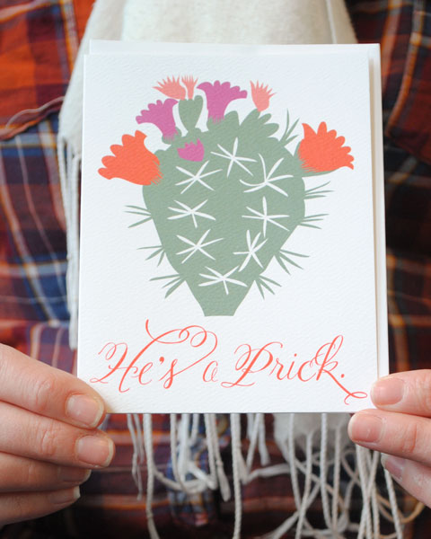
Sam ~ Katharine Watson, “F” ~ for a friend whose last name begins with F, just because she shares a great love for Jack Handey // Linda ~ Banquet, He’s a Prick ~ Kind of self explanatory, yes?….
Brick + Mortar: Retail Trends from Clementine for Oh So Beautiful Paper

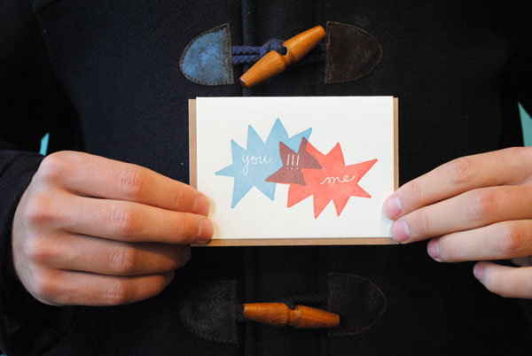
Felix ~ Iron Curtain Press, You!!!Me ~ a just because I love you, for his girlfriend living several cities away.

I buy a lot of stationery from Valentine’s Day collections long after the holiday, because love is a “just because” sentiment I can never get enough of. And customers agree. I also really like the burgeoning lines of celebration and encouragement cards (yippees, yahoos, hoorays to be braves, weather it together, with comfort) that focus on the exclamation of excitement or compassion, rather than a specific event. These give customers the opportunity to insert their own applause and celebrate for any reason. Or share comfort for rough patches that may not be so easy to define.
Brick + Mortar: Retail Trends from Clementine for Oh So Beautiful Paper Brick + Mortar: Retail Trends from Clementine for Oh So Beautiful Paper

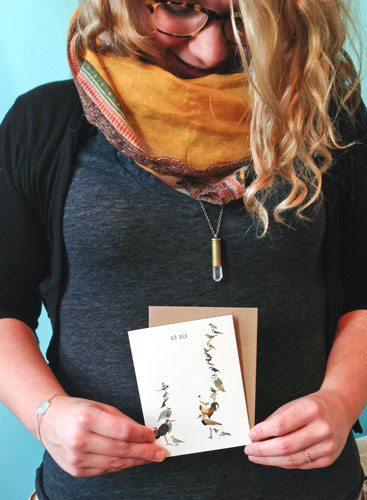
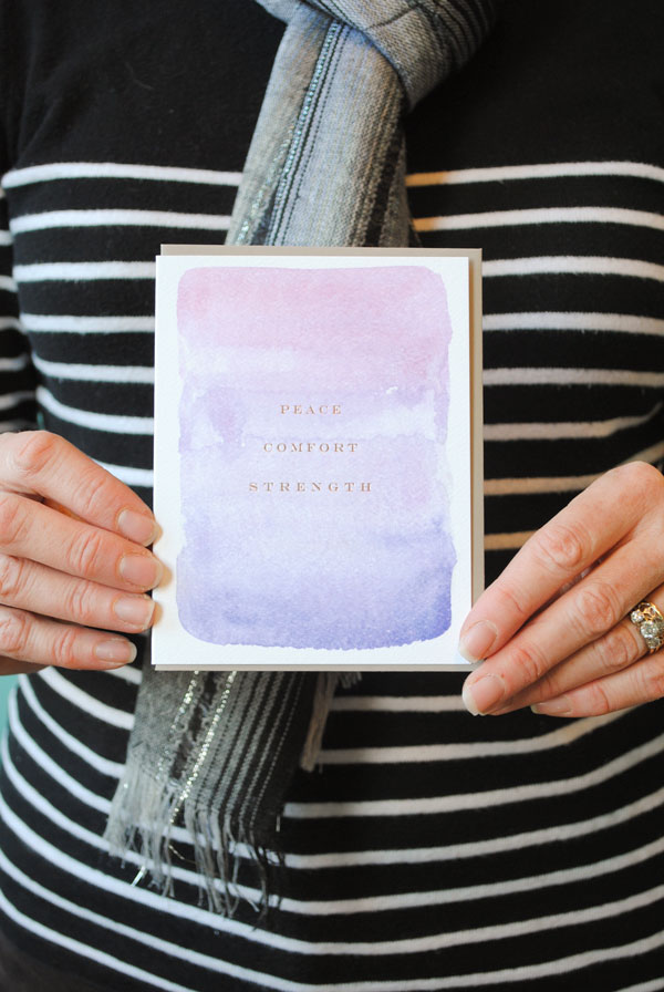
Shawna – Screech Owl, Aim High ~ For a friend trying to find the career that’s right for her. To remind her that she’s fabulous, to keep her spirits and confidence high! / Sarah ~ E. Frances Paper, Peace Comfort Strength ~  just a note to brighten her mom’s spirits.

Brick + Mortar: Retail Trends from Clementine for Oh So Beautiful Paper

Susan ~ Printerette, Strawberry Jam ~ just a bit of housewarming sweetness for a good friend who just moved in with her boyfriend.
Brick + Mortar: Retail Trends from Clementine for Oh So Beautiful Paper

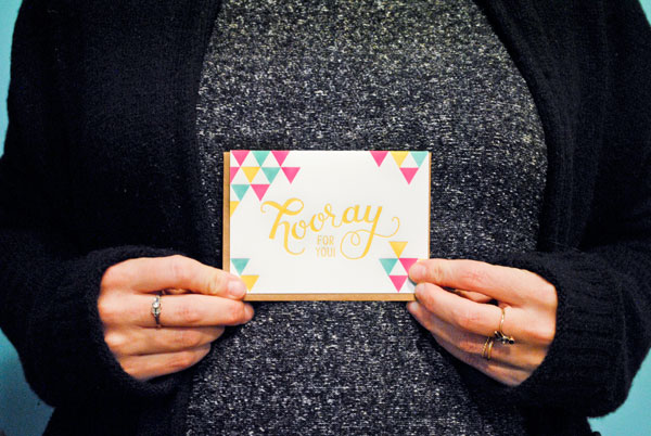
Sophie & babe ~ Parrott Design Studio, hooray for you ~ for her sister, Julia who’s totally rocking the party planning world.

I order “just because” cards in bushels. Cards that don’t always have a category in vendors’ catalogs, now out-sell almost every other occasion. Yet I realized I wasn’t sending them. This is the shop owner’s lament: It’s hard to use your own inventory, especially if it’s the last card left and it’s a favorite. At the beginning of this month, Clementine’s 3rd birthday, I decided it was high time I got over that and start sending more cards. Here are my first four, to very different people who impact very different parts of my life, but who I’m so thankful for:
Brick + Mortar: Retail Trends from Clementine for Oh So Beautiful Paper

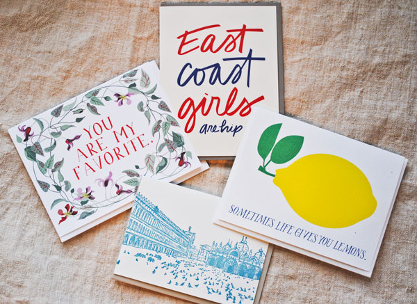
Scout’s Honor Co, East Coast Girls Are Hip ~ for my oldest hippest friend, Sophie, who I’ve known since I was a baby, now pregnant with her first baby (yippee!) // Banquet, Sometimes Life Gives You Lemons, for Anna, a vendor I’ve connected with about the trials of mothering and small-business owning, after her unexpected trip to the hospital (she’s ok!) which delayed outgoing orders (lemons!) but I hope gave her some time to lie down and daydream // Banquet, You Are My Favorite, to Paul, the fabulous marketing director at Sweet Paul, who has often gone out of his way to do thoughtful things for my little business // Albertine Press, Venice Letterpress Library, to the wife of my favorite art teacher, who passed away last year. He made an indelible mark on my life (including sneaking me on to a trip to Italy for upperclassman).  It took me too long to send, but I cried while I wrote it, and when I sent it I really vowed: Less texts. Less email. More cards.

“Just because” cards are the Thanksgiving of cards. Through humor or kindness or love, they give us a moment to just be thankful that the person we’re sending them to exists. They are a hello, with some serious oomph.

Do send “just because” cards? Have you received them? I’d love to hear your stories.

Maggie + Trevor’s Campaign-Inspired Baby Shower: The Invitations!

A couple of weekends ago, my friend Sara and I co-hosted a baby shower for our friends Maggie and Trevor. Maggie co-hosted my own baby shower last year, so it was an absolute honor to be able to return the favor! Maggie and Trevor wanted a fun night with friends before their baby girl arrived, so we planned the evening as more of a cocktail party  (aka “unshower”) than a traditional baby shower. Naturally, I was responsible for the paper details – and today I’m so excited to share the invitations and day-of stationery with you! We’ll start with the amazing invitations by Sarah of August Blume, with the rest of the details to follow a bit later today!

Campaign-Inspired-Baby-Shower-Invitations-August-Blume-OSBP-10

Maggie and Trevor had the most beautiful campaign-inspired wedding four years ago, so Sara and I decided to run with that as our inspiration for the party. Inspired by Maggie’s plans for the nursery, we chose a color palette of red, white, and aqua. Maggie also loves graphic prints and patterns, which we also wanted to incorporate into the invitations and party stationery.

Campaign-Inspired-Baby-Shower-Invitations-August-Blume-OSBP-23

I’ve been a fan of Sarah from August Blume since featuring Beth and Michael’s save the dates in early 2012, and I thought her aesthetic would be a good match for Maggie and our overall party style. I sent Sarah links to Maggie’s blog, wedding invitations, and a Pinterest board that Sara put together with inspiration for the party. The invitation suite that she created could not have been more perfect!

Campaign-Inspired-Baby-Shower-Invitations-August-Blume-OSBP-1

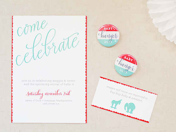
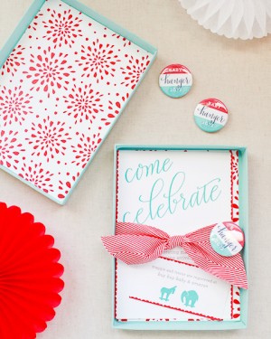
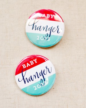
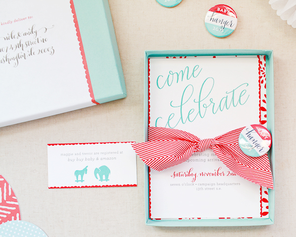
From Sarah: I was thrilled to design for such a special project! The campaign-themed “unshower” had my creative wheels turning right from the start. Creating a mini campaign pin to include with the invitation seemed like the perfect, interactive touch. I wanted to incorporate something that had a hint of “baby” to it – and the elephant and donkey push toys have ended up being one of my favorite aspects of the whole design. Michele’s beautiful lettering kept the tone soft and her calligraphy on the wrap labels tied everything together. What an honor to be a part of Baby H’s unshower!

Campaign-Inspired-Baby-Shower-Invitations-August-Blume-OSBP-61

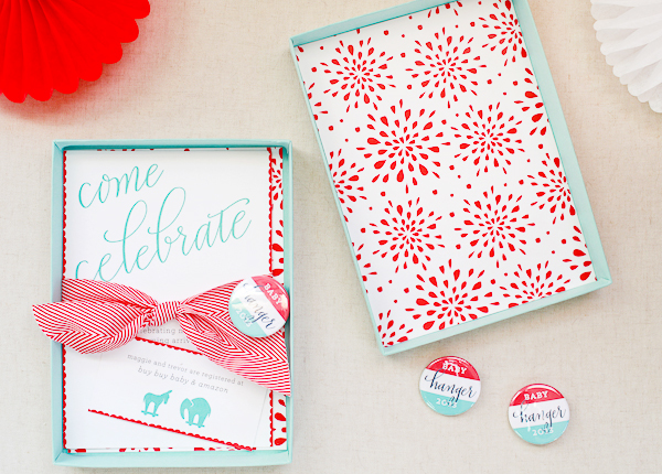
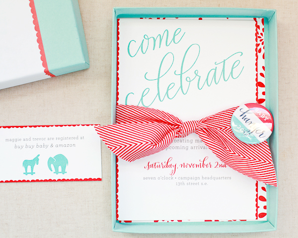
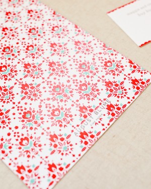
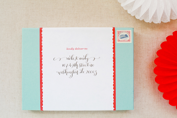
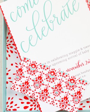
Sarah designed the invitations to be mailed in pool blue box mailers. The invitations feature calligraphy by Michele from Meant to Be Calligraphy. A red and white twill ribbon – and a custom campaign button! – tied the invitation and registry card together. Sarah honored our request for pattern with two fun graphic patterns: one lining the inside of the box mailers and another to back the invitation.

Campaign-Inspired-Baby-Shower-Invitations-August-Blume-OSBP-20Campaign-Inspired-Baby-Shower-Invitations-August-Blume-OSBP-71

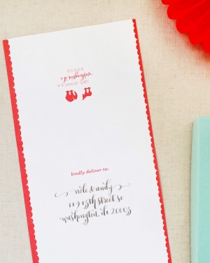
Wrap around address labels – calligraphed by Michele – and reissued Inverted Jenny stamps were the perfect finishing touch!

Campaign-Inspired-Baby-Shower-Invitations-August-Blume-OSBP-1-2Campaign-Inspired-Baby-Shower-Invitations-August-Blume-OSBP-83

Campaign-Inspired-Baby-Shower-Invitations-August-Blume-OSBP-27

Campaign-Inspired-Baby-Shower-Invitations-August-Blume-OSBP-79Campaign-Inspired-Baby-Shower-Invitations-August-Blume-OSBP-30

Campaign-Inspired-Baby-Shower-Invitations-August-Blume-OSBP-11

Check back soon for the fun day-of stationery from Maggie and Trevor’s shower!

Invitation Design: August Blume

Calligraphy: Meant to Be Calligraphy

August Blume is a member of the Designer Rolodex – you can see more of Sarah’s beautiful work right here!

Photo Credits: Nole Garey for Oh So Beautiful Paper

Lauren’s Modern Black and White Moving Announcements

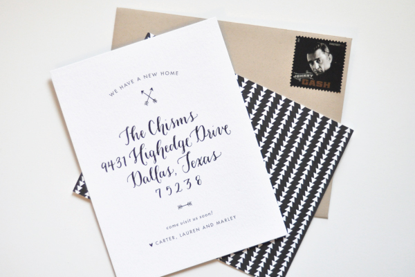
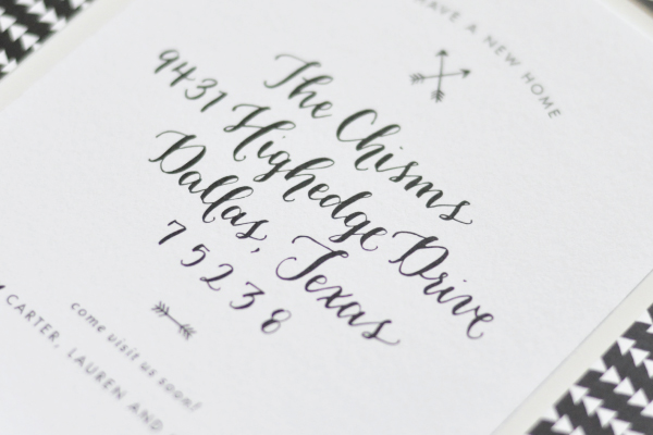
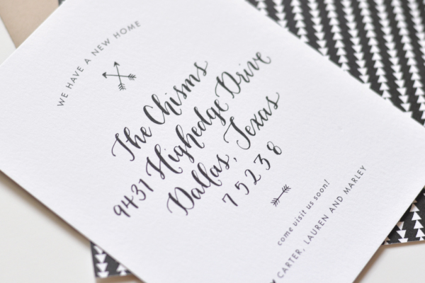
Designer Lauren Chism and her husband moved into a new home over the summer – and today she’s sharing her moving announcements with us! I share Lauren’s tendency to take a maximalist approach to personal stationery projects, so I’m loving the modern, pared down approach to her moving announcements. Just beautiful calligraphy, a couple of arrow motifs, and a modern graphic backing pattern – all in simple black and white. Perfect!

Black-White-Moving-Announcements-Lauren-Chism-Fine-Papers

From LaurenMy husband and I moved into a new home this summer and amongst all the excitement of furniture purchases and decorating, I didn’t forget that I had a fun excuse to send out some paper: moving announcements! When it comes to designing my own stationery, I tend to want to try new printing techniques and papers, which results in me going completely over the top. This time, I thought I’d keep it simple and – most importantly – affordable with some small, flat printed cards. Gotta save the big bucks for all that new furniture!

Black-White-Moving-Announcements-Lauren-Chism-Fine-Papers6

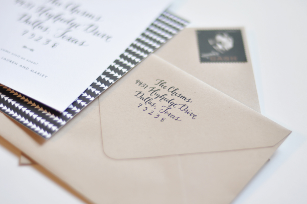
The design started with the calligraphy talents of Lauren Essl of Blue Eye Brown Eye, who penned our new address for us to use. I love the idea of calligraphy for moving announcements. I was able to use the calligraphy on the cards and make a return address stamp with it, which made sending everything out even easier. Add in a fun arrow motif and kraft envelopes and they turned out to be just fun way to share our new address with family and friends.

Black-White-Moving-Announcements-Lauren-Chism-Fine-Papers3

Not one to leave off any details in my stationery, I finished the kraft envelopes off with fun washi tape and Johnny Cash stamps, which might have been my favorite part of all!

Black-White-Moving-Announcements-Lauren-Chism-Fine-Papers7

Thanks Lauren!

Calligraphy: Blue Eye Brown Eye

Design: Lauren Chism Fine Papers

Lauren Chism Fine Papers is a member of the Designer Rolodex â€“ you can check out more of Lauren’s work right here!

Photo Credits: Lauren Chism Fine Papers

Wedding Stationery Inspiration: Watercolor

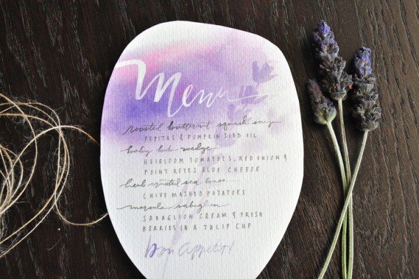
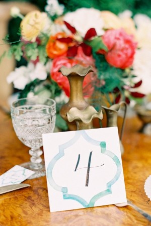
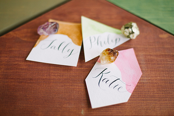
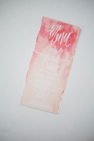
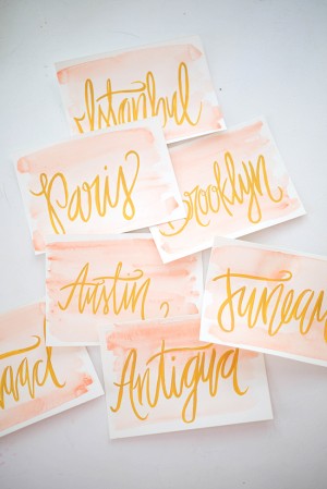
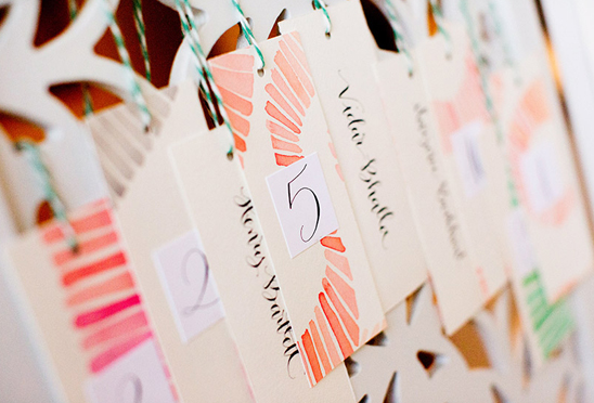
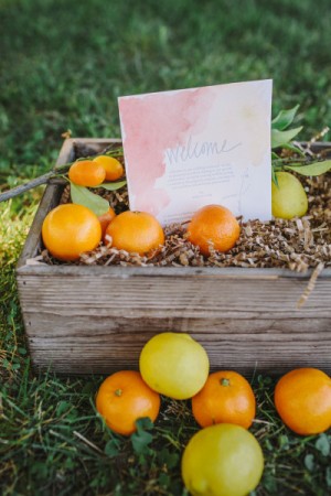
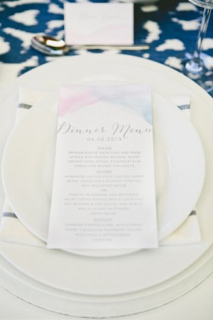
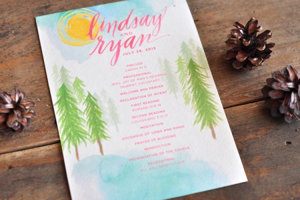
One of my all time favorite wedding stationery elements has to be watercolor. I love that it can be deep and rich, or light and airy and it just makes the most perfect color statement when brushed across any day-of item. And paired with calligraphy? Well that’s just too good. Take a look! —Kelly

Day-Of Wedding Stationery Inspiration and Ideas: Watercolor via Oh So Beautiful Paper

Menu by Julie Song Ink

Day-Of Wedding Stationery Inspiration and Ideas: Watercolor via Oh So Beautiful Paper Day-Of Wedding Stationery Inspiration and Ideas: Watercolor via Oh So Beautiful Paper

Photo by Taylor Lord Photography, Tags by Hip Ink Co via Style Me Pretty (left), Photo by Love & Perry Photography, Escort Cards by Strawberry Small Works Studio, Calligraphy by Kathryn Hashey via Style Me Pretty (right)

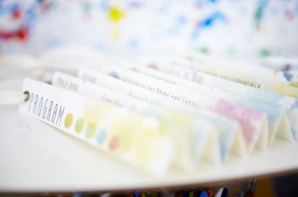
Day-Of Wedding Stationery Inspiration and Ideas: Watercolor via Oh So Beautiful Paper

Photo by Scott Clark Photography, Program by Treespace Studio via Green Wedding Shoes

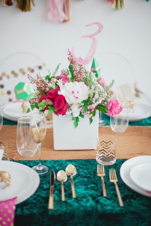
Day-Of Wedding Stationery Inspiration and Ideas: Watercolor via Oh So Beautiful Paper Day-Of Wedding Stationery Inspiration and Ideas: Watercolor via Oh So Beautiful Paper

Photo by Lauren Peele Photography, Table Number by The Stationery Bakery via Ruffled (left), Photo by Jen Huang Photography, Table Number by Paperfinger via Style Me Pretty (right)

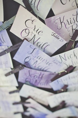
Day-Of Wedding Stationery Inspiration and Ideas: Watercolor via Oh So Beautiful Paper

Photo by Apryl Ann Photography, Place Cards by Blue Eye Brown Eye via 100 Layer Cake

Day-Of Wedding Stationery Inspiration and Ideas: Watercolor via Oh So Beautiful Paper Day-Of Wedding Stationery Inspiration and Ideas: Watercolor via Oh So Beautiful Paper

Menu and Place Cards by Shannon Kirsten

Day-Of Wedding Stationery Inspiration and Ideas: Watercolor via Oh So Beautiful Paper

Photo by Olivia Leigh, Calligraphy by Angelique Ink via 100 Layer Cake

Day-Of Wedding Stationery Inspiration and Ideas: Watercolor via Oh So Beautiful Paper Day-Of Wedding Stationery Inspiration and Ideas: Watercolor via Oh So Beautiful Paper

Photo + Sign by Anna Delores Photography via Style Me Pretty (left), Photo by One-Love Photography, Menu by The Aerialist Press via Style Me Pretty (right)

Day-Of Wedding Stationery Inspiration and Ideas: Watercolor via Oh So Beautiful Paper

Program by Julie Song Ink

{images via their respective sources}

Lauren + Daniel’s Historic Charleston Save the Dates

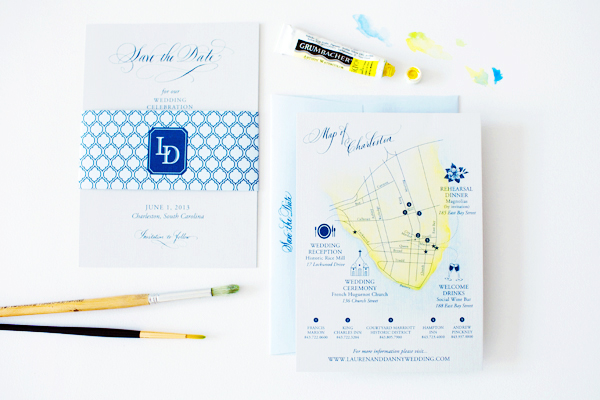
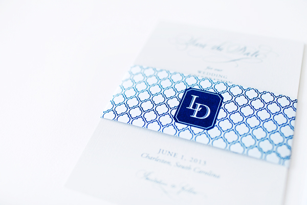
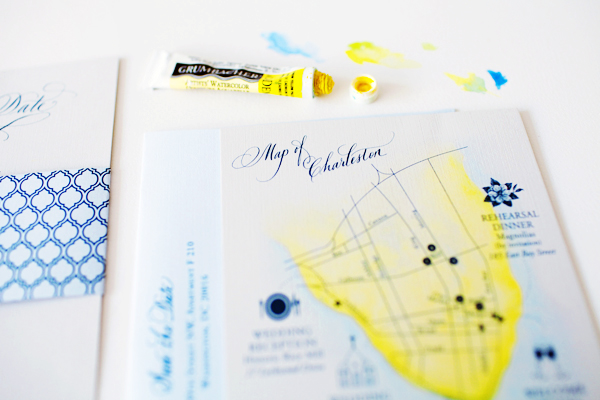
We’re on a hand painting roll these days! First Julie and Bo’s hand painted watercolor wedding invitations, and now these stunning save the dates from Studio R! The ladies of Studio R – Rachael, Megan, and Amanda Claire – created these save the dates for a wedding in the low country: Charleston, South Carolina. Inspired by Old Charleston charm, the save the dates feature a quatrefoil pattern belly band and hand painted map of Charleston. Love!

Hand-Painted-Historic-Charleston-Wedding-Invitations-StudioR7

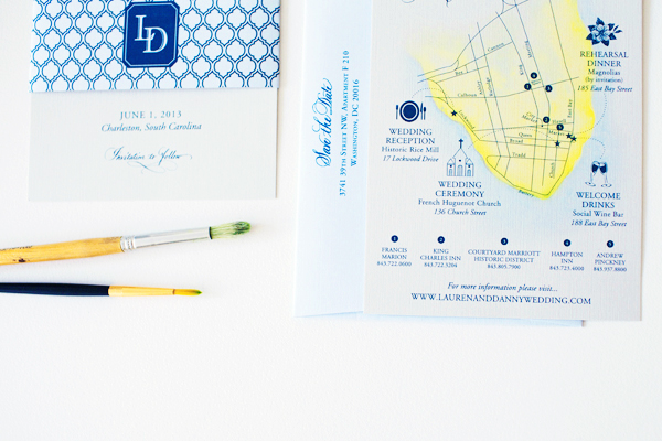
From Amanda Claire at Studio R: Our bride came to us inspired by the aesthetic charm of historic Charleston, South Carolina, where she and her fiancé Daniel were married. We took her inspiration and created a stacked, two-card save the date. The soft gray cards were wrapped in a pale blue belly band that included the couple’s monogram and a quatrefoil pattern to mimic shapes found in traditional Charleston architecture.

Hand-Painted-Historic-Charleston-Wedding-Invitations-StudioR

We used a local calligrapher’s hand lettering throughout the stationery, complimenting the hand painted elements of the Charleston map on the second insert card. The watercolor map orients guests to wedding weekend venues and accommodations. The subdued color palette of the inks and papers complements the coastal landscape of the city. Our fine art skills were showcased in this set with a custom watercolor painting, hand drawn map icons and hand lettering.

Hand-Painted-Historic-Charleston-Wedding-Invitations-StudioR8

Hand-Painted-Historic-Charleston-Wedding-Invitations-StudioR9

Thanks ladies!

Design: Studio R

Calligraphy: Elizabeth Porcher Jones

Check out the Designer Rolodex for more tal­ented wed­ding invi­ta­tion design­ers and visit the real save the dates gallery for more beau­ti­ful save the date ideas!

Photo Credits: Olivia Rae James