Autumn Wheat Wedding Invitations

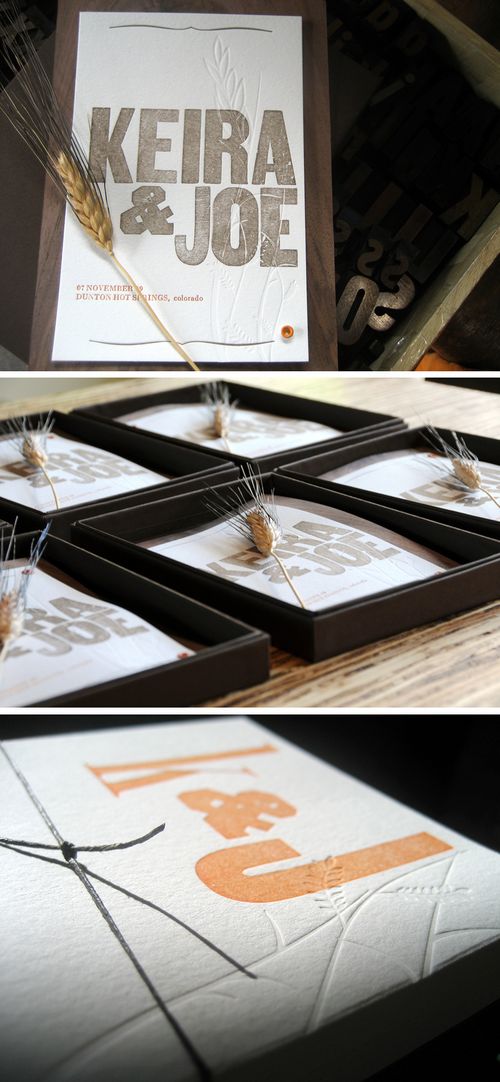
With December literally just around the corner, I’m just trying to hang on to the last few remaining days of fall.  Luckily for me, these wheat sprig letterpress wedding invitations from Birddog Press are doing just the trick:

Autumn-wheat-wedding-invitation

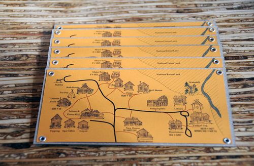
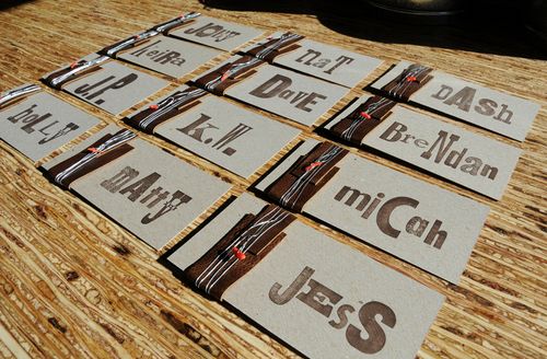
Each invitation was letterpress printed using vintage metal and wood type, then attached to a thin sheet of walnut wood veneer and enclosed in its own box with a sprig of wheat.  I also love the accompanying map and escort cards:

Autumn-wheat-wedding-invitation3
Autumn-wheat-wedding-escort-cards

I’m a big fan of pretty much anything that Allison does using vintage type, but the soft details with the wheat stalk blind impressions and pops of orange in both the invitations and escort cards.  Check out more details over on Birddog Impressions right here.

{image credits: Birddog Press}

More 2010 Calendars

Happy Monday everyone!  I hope you all had a wonderful weekend whether it was a holiday weekend for you or not.  I'm back in DC and slooowly getting back into my routine, and as I ease back into things I thought I'd start off with a few new calendars.  I've been waiting for each of these calendars to come out for a while now, and am so happy to see them in their shops.

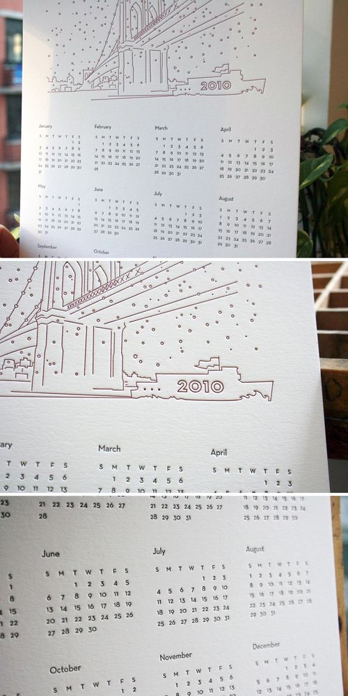
First up, Moontree Letterpress with a beautiful and modern one-page letterpress calendar featuring a line drawing of the Brooklyn Bridge:

Moontree-letterpress-2010-brooklyn-calendar{moontree letterpress}
 

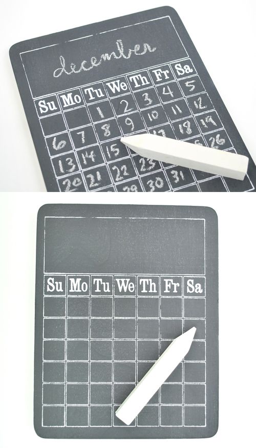
Next up, Something's Hiding in Here with a perpetual chalkboard calendar (painted on a wood block) that can be re-used for years to come — just fill in the month and dates and you're ready to go!

Chalkboard-2010-calendar{something's hiding in here}
 

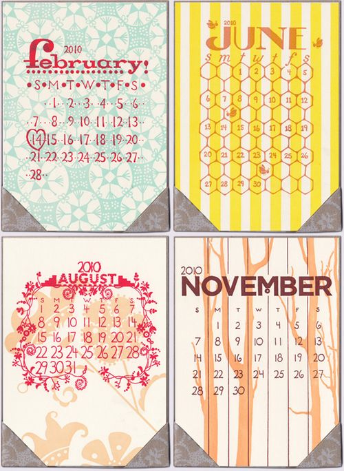
For this 2010 calendar from Old School Stationers, each month features hand lettering and unique illustrations and patterns — all individually letterpress printed in bright colors:

Old-school-stationers-2010-calendar{old school stationers}

{images from their respective sources}

Best-of Real Wedding Invitations – Mike + Emma

When I think of unique or non-traditional invitation designs, Mike and Emma’s invitations are usually the first that come to mind. Mike and Emma were married in her parent’s home in New York City and really took advantage of having a small wedding in their invitation design:

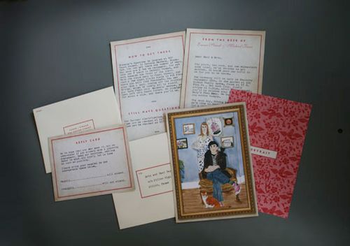
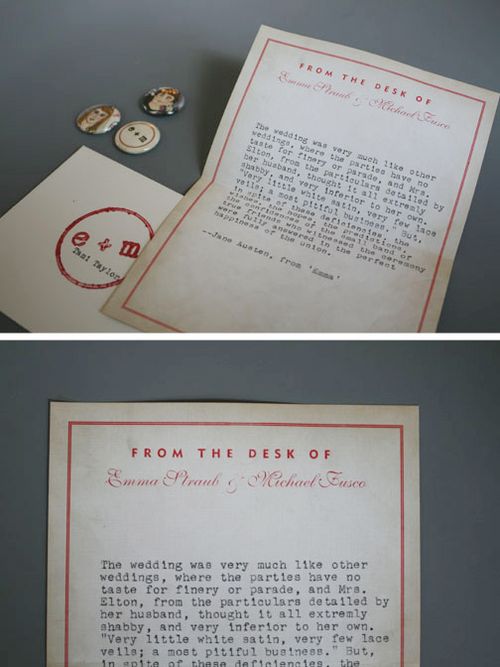
Mfd-portrait-typewriter-wedding-invitation

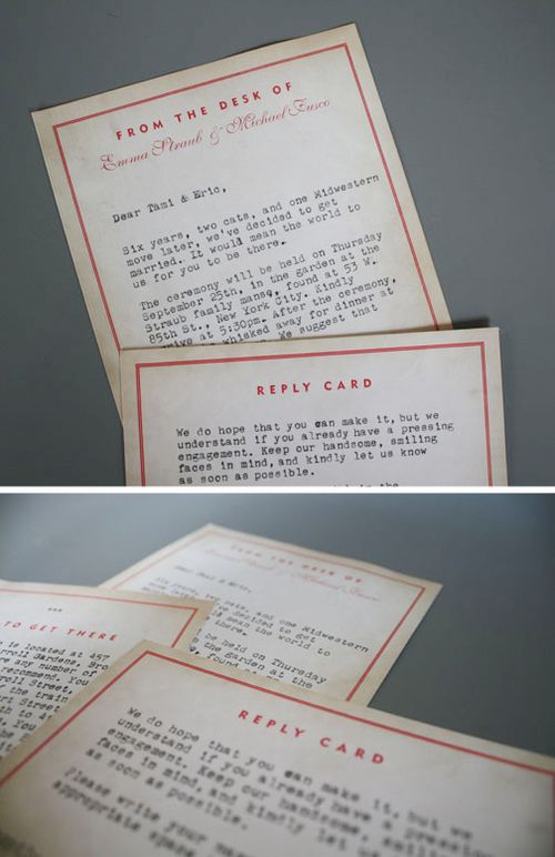
Mike and Emma commissioned a friend to create a portrait of them that served as the artwork for the main invitation.  Within the full invitation suite they enclosed a completely personalized hand-written letter (typed on a typewriter, naturally) to each guest, a matching rsvp card, and a passage from Jane Austen’s Emma, which a friend later read during the wedding ceremony:

Mfd-portrait-typewriter-wedding-invitatation-rsvp

Mfd-portrait-typewriter-emma-ceremony-reading

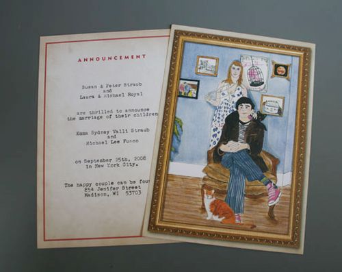
Friends or family who Mike and Emma were unable to invite to the wedding all received a wedding announcement with the portrait from the main invitation:

Mfd-portrait-typewriter-wedding-announcement

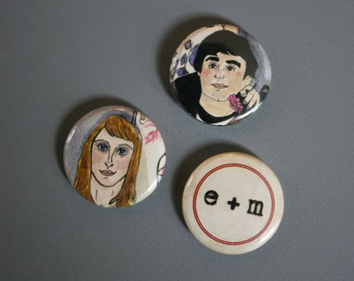
And how cute are these buttons of Mike and Emma?

Mfd-portrait-typewriter-wedding-invitation-buttons

Check out the original post right here.

{image credits: michael fusco design}

Best-of Real Wedding Invitations – Vané + Chad

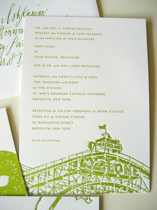
I’m sure I’ve said this before, but one of my very favorite things about the blog world is the sense of community that develops over time with your readers and other fellow bloggers.  I’ve been very lucky to meet so many amazing women through this blog and The B List, and one of my absolute favorite people that I’ve met so far is Vané from Brooklyn Bride.  Just to show how nice she is, Vané was kind enough to share some of the details from her modern wedding invitation design for one of my first-ever real invitation features:

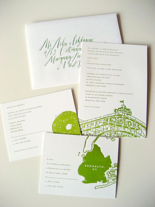
Brooklyn-Bride-green-white-modern-letterpress-wedding-invitations

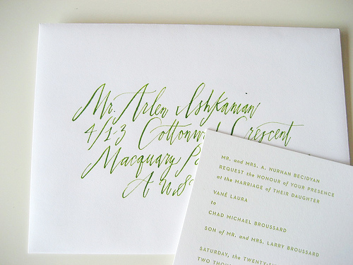
The thing I love most about Vané’s invitations is the way she incorporated key design details – like the Brooklyn icons, green and white color palette, modern calligraphy and an architect-designed typeface (for her architect husband!) – to create a completely unique and personalized design, and one that was 100% perfect for Vané’s modern design aesthetic:

Brooklyn-Bride-green-white-modern-letterpress-wedding-invitation

Brooklyn-Bride-green-white-modern-letterpress-wedding-invitations-calligraphy

Another cool detail?  Since the invitations were letterpress printed, the tiny sesame seeds on the bagel were left white, and so popped up above the rest of the bagel.  Those kinds of little details are one of the many reasons that I heart letterpress.

Check out the original post right here.

{image credits: bethalee photography via brooklyn bride}

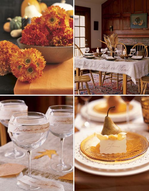
Happy Thanksgiving!

Rustic-Thanksgiving-Decorating-Centerpieces

Happy Thanksgiving to all my U.S. readers — I hope you're all spending the holiday with friends, family and your loved ones!

For all my non-U.S. readers, don't worry, I haven't forgotten about you!  I've got another set of favorite real wedding invitations coming right up…

{image credits: country living}