Beck’s Chartreuse Letterpress Birth Announcements

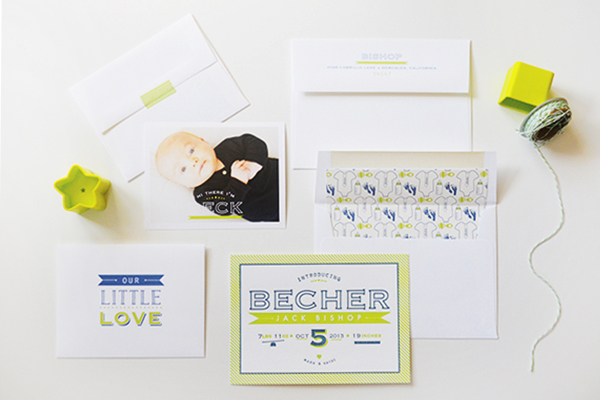
Designer Kaydi from Maison Yellow and her husband welcomed their first child last October: an adorable baby boy named Becher! Kaydi wanted Beck’s birth announcements to be bold and fun, so she chose a bright chartreuse and steel blue color palette and a cute illustrated envelope liner. Letterpress printing from Czar Press and a sweet baby photo were the perfect finishing touches!

Chartreuse-Letterpress-Birth-Announcement-Maison-Yellow5

From Kaydi: In October of last year my husband and I were blessed with our first child. No one can ever accurately explain to you just how crazy those first few weeks and months are. To add to the chaos, my husband is in the Air Force and had to leave for an assignment when our son was just 4 weeks old. Needless to say all my big plans of sending out fantastic custom birth announcements the month after he was born went out the window. As a designer myself, the last thing I wanted to skip out on was my own child’s birth announcement. So, even though they are a few months late, I finally decided on a design direction and ran with it.

Chartreuse-Letterpress-Birth-Announcement-Maison-Yellow2

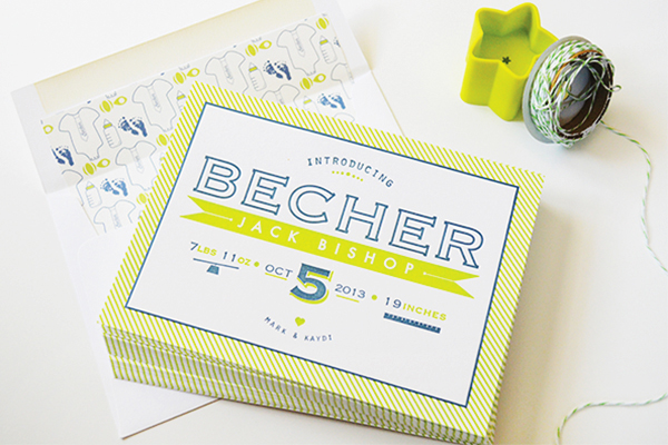
When deciding on a name for our son we both wanted something strong and bold but still a bit fun and different. I used those keywords as inspiration for the birth announcements: strong, bold, fun, and different. I feel those concepts came to life through the color palette, illustrations, envelope liner pattern, and layered component of the additional envelope with picture card. Being a multi-piece announcement suite, it also allowed for opportunities to use letterpress and flat printing, creating a depth of texture as well as opportunities to expand upon the main design concepts but in different formats.

Chartreuse-Letterpress-Birth-Announcement-Maison-Yellow10

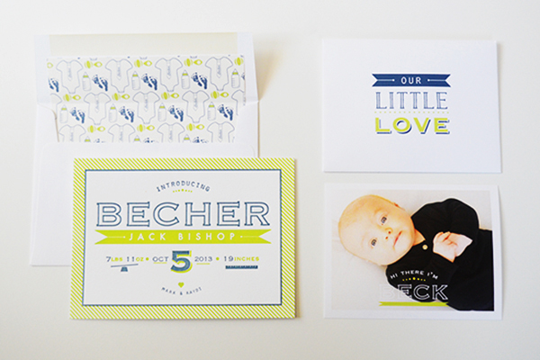
Since our son’s first name is a little different and special in that it means first born son in Hebrew, I wanted this to be the main focus of the letterpress card and come across strong and bold without a real “babyish” feel. The separate photo card tucked in an envelope labeled “our little love” sealed with washi tape was also a great way to introduce a nickname leaving the letterpress card with the complete formal name.

Chartreuse-Letterpress-Birth-Announcement-Maison-Yellow

Chartreuse-Letterpress-Birth-Announcement-Maison-Yellow7

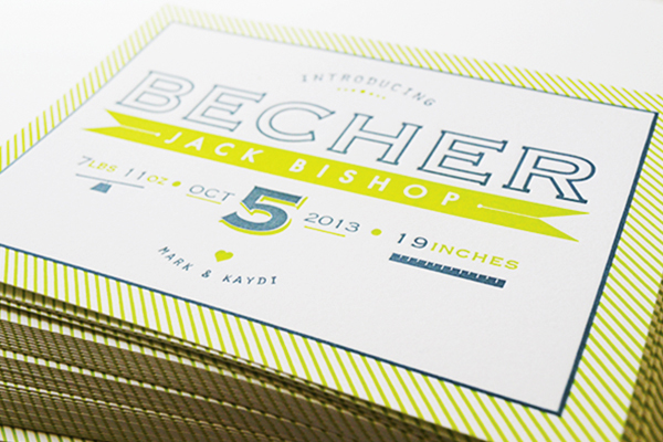
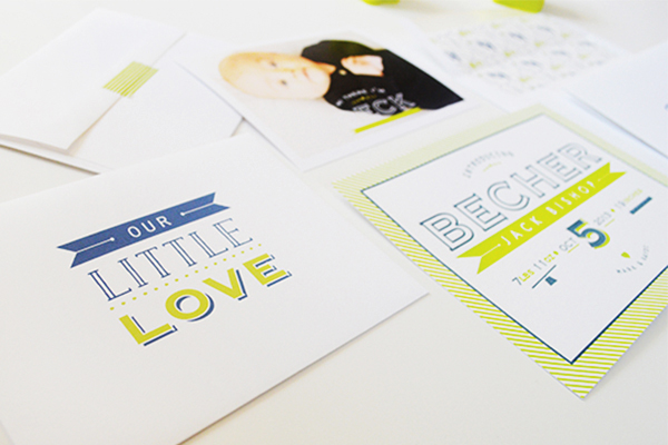
The envelope liner, featuring onesies with ties labeled “Becher,” bottles, footprints, and rattles, was a must for me and added the extra playful patterning in the same chartreuse and steel blue palette as the rest of the suite. All in all, this birth announcement design turned out to be a perfect representation of our little guy and his wonderful personality… and not to mention a great excuse for more letterpress in my life!

Chartreuse-Letterpress-Birth-Announcement-Maison-Yellow9

Thanks Kaydi – and congrats!

Design: Maison Yellow

Letterpress and Photo Card printing: Czar Press

Baby Photo: Joseph Mark Photography

Photo Credits: Maison Yellow

Ashley + James’s Chambray and Citrus Wedding Invitations

As you’ve heard me say countless times before, I love love love it when couples incorporate their unique personalities into their wedding invitations! For these two mechanical engineers, that meant incorporating gear illustrations into the invitation design for their Texas ranch wedding. Ashley and James worked with Liz at The Nouveau Romantics to bring their invitation vision to life. The result is the perfect quirky mix of modern design and rustic texture!

Chambray-Citrus-Texas-Ranch-Wedding-Invitations-The-Nouveau-Romantics2

From Liz at The Nouveau Romantics: Ashley and James are two mechanical engineers with a penchant for modern design. They were married on a rustic ranch here in Austin, Texas. They were both actively involved in the design process, and wanted their invitation to reflect a masculine and feminine sensibility, while also incorporating gears, if at all possible.

Chambray-Citrus-Texas-Ranch-Wedding-Invitations-The-Nouveau-Romantics4

We opted for an unusual shape in the long and narrow, as well as an off-centered assembly. As guests opened the kraft envelopes, they were greeted with a blind printed main invitation texture and the front of the RSVP postcard that had the couple’s separate “venn diagrams” with appropriate descriptions of each of their personalities. As you unwrapped the chambray band and wax seal, you revealed the shared qualities of the couple as the “overlap” in their diagram.

Chambray-Citrus-Texas-Ranch-Wedding-Invitations-The-Nouveau-Romantics3

I loved the texture in the color fields of the venn diagram via the two color letterpress as it’s perfectly imperfect and gives a really big graphic impact. Underneath the venn diagram postcard was their info card and finally the double-sided invitation. The back of the invitation was a flood of color in a medium blue, with a darker blue outline for a technical sketch of a complex gear-oriented machine. Pretty perfect! The front of the invitation was a mix of blind printing and grey ink for the invitation wording, while the machine drawing was blind printed to the left hand side.

Chambray-Citrus-Texas-Ranch-Wedding-Invitations-The-Nouveau-Romantics5

Chambray-Citrus-Texas-Ranch-Wedding-Invitations-The-Nouveau-Romantics6

For their save the date, we went the postcard route. Something simple and quirky with two vintage Austin postcards and a welcome note on the front, and Ashley’s handwriting scanned in as the back. I love the 5″ x 7″ size; while it’s more postage, it definitely has an impact!

Chambray-Citrus-Texas-Ranch-Wedding-Invitations-The-Nouveau-Romantics7

The rest of the day-of paper goods incorporated the same quality of modern fonts in a range of grays, blues, and chambray to create the perfect mix of modern and mechanical for these two!

Chambray-Citrus-Texas-Ranch-Wedding-Invitations-The-Nouveau-Romantics8

Chambray-Citrus-Texas-Ranch-Wedding-Invitations-The-Nouveau-Romantics9

Thanks Liz!

Design: The Nouveau Romantics

Letterpress Printing: Thomas Printers

Check out the Designer Rolodex for more tal­ented wed­ding invi­ta­tion design­ers and the real invi­ta­tions gallery for more wedding invitation ideas!

Photo Credits: Heather Curiel Photography

Hot Air Balloon Baby Shower Invitations

Ooooh, surprise baby shower invitations! So fun. Anastasia Marie Cards & Stationery created these colorful baby shower invitations using inspiration from the soon-to-be nursery. Too cute, and I’m loving the gold heart stickers on the kraft envelopes!

Hot-Air-Balloon-Baby-Shower-Invitations-Anastasia-Marie

From Anastasia: These baby shower invitations featured an array of hot air balloons with peach, yellow, blue, and touches of pink as the color theme. Printed on smooth white paper, they were then paired with kraft envelopes and gold heart stickers. The idea was created by the papa-to-be from his wife’s nursery inspiration. How adorable is that!?

Hot-Air-Balloon-Baby-Shower-Invitations-Anastasia-Marie3Hot-Air-Balloon-Baby-Shower-Invitations-Anastasia-Marie4

Hot-Air-Balloon-Baby-Shower-Invitations-Anastasia-Marie2

Thanks Anastasia!

Photo Credits: Anastasia Marie Cards & Stationery

Stationery Inspiration: Mixing Vintage Postage

I’m a big big fan of using vintage postage stamps on everything from wedding invitations to baby announcements. So when Cara from Underwood Letterpress and Anne Robin Calligraphy sent over a few tips for mixing vintage postage to create little art collections on your envelopes, I couldn’t resist! These envelopes definitely make an impression and, especially when combined with stunning calligraphy, are a beautiful keepsake for the recipients!

How-To-Mix-Vintage-Postage-Underwood-Letterpress-Anne-Robin-Calligraphy-Pink-and-Beige

From Cara of Underwood Letterpress: Your wedding invitation sets the tone for your special event. The vintage postage on these envelopes takes first impressions to the next level by mixing genre, color and technique. Here are a few tips for ways to turn your outer envelope in to a piece of art that will leave a lasting impression!

How-To-Mix-Vintage-Postage-Underwood-Letterpress-Anne-Robin-Calligraphy-Sweet-Pea2

Don’t Be Afraid of Color!
Pops of color are essential to any design palette. Go bold with these fun and out there envelope designs. Mixing traditional design with Pop Art never looked so good. Each of these fabulous postage collages in the “In Love” line come with an eclectic mix of vintage postage plus a special Love stamp to celebrate the occasion!

How-To-Mix-Vintage-Postage-Underwood-Letterpress-Anne-Robin-Calligraphy-Love

How-To-Mix-Vintage-Postage-Underwood-Letterpress-Anne-Robin-Calligraphy-Love2

Tone on Tone
Tone on tone is all the rage this season and there is no better way to maximize your wedding colors than by using multiple shades of your favorite hues. Check out these vintage postage collages with purple tones, blues and greens. Your guests might just decide to put these envelopes in a frame.

How-To-Mix-Vintage-Postage-Underwood-Letterpress-Anne-Robin-Calligraphy-Black-Tie

How-To-Mix-Vintage-Postage-Underwood-Letterpress-Anne-Robin-Calligraphy-Golden-Sunshine

How-To-Mix-Vintage-Postage-Underwood-Letterpress-Anne-Robin-Calligraphy-Plum

How-To-Mix-Vintage-Postage-Underwood-Letterpress-Anne-Robin-Calligraphy-Something-Blue

Mix Your Mediums
Try mixing techniques on your envelopes with this beautiful watercolor calligraphy design. The watercolor adds a whimsical touch while the modern address provides the perfect amount of juxtaposition.

How-To-Mix-Vintage-Postage-Underwood-Letterpress-Anne-Robin-Calligraphy-Sweet-Pea

Vintage Postage: Underwood Letterpress

Calligraphy: Anne Robin

Photography: Stephanie Collins Photography

Wedding Stationery Inspiration: Bold Florals

Who else is craving spring!? I can’t bring you warm weather and blooming botanicals, but I can bring you a little floral goodness in the form of wedding stationery! I’ve been seeing bold, dramatic floral prints popping up here and there for day-of wedding paper, and I can’t say I’m complaining! In fact, it’s a motif I’m hoping to use for my very own upcoming wedding. For those of you that love flowers just as much as me, and don’t think just the fresh variety is enough, these paper pretties are for you! —Kelly

Day-of Wedding Stationery Inspiratoin: Bold Florals via Oh So Beautiful Paper

Photo by John Schnack Photography, Table Numbers by Lucky to Be in Love via Green Wedding Shoes

Day-of Wedding Stationery Inspiratoin: Bold Florals via Oh So Beautiful PaperDay-of Wedding Stationery Inspiratoin: Bold Florals via Oh So Beautiful Paper

Photo by Lani Elias Fine Art Photography, Table Number by One Plus One via Style Me Pretty (left), Photo by Whitney Neal, Place Card by Heart Felt by Bri via 100 Layer Cake (right)

Day-of Wedding Stationery Inspiratoin: Bold Florals via Oh So Beautiful Paper

Photo by Lauren Fair Photography, Drink Sign by Miss Wyolene via Green Wedding Shoes

Day-of Wedding Stationery Inspiratoin: Bold Florals via Oh So Beautiful PaperDay-of Wedding Stationery Inspiratoin: Bold Florals via Oh So Beautiful Paper

Photo by Kat Willson Photography, Menu by Robin Egg Blue Design via Ruffled (left), Photo by Catherine Rhodes via Style Me Pretty (right)

Day-of Wedding Stationery Inspiratoin: Bold Florals via Oh So Beautiful Paper

Photo by Michelle Cross Photography, Card by Rifle Paper Co. via Elizabeth Anne Designs

Day-of Wedding Stationery Inspiratoin: Bold Florals via Oh So Beautiful PaperDay-of Wedding Stationery Inspiratoin: Bold Florals via Oh So Beautiful Paper

Photo by Lauren Fair Photography, Table Number by Miss Wyolene via Green Wedding Shoes (left), Photo by John Schnack Photography, Program by Lucky to Be in Love via Green Wedding Shoes (right)

Day-of Wedding Stationery Inspiratoin: Bold Florals via Oh So Beautiful Paper

Photo by Lahra Bryant Photography, Dessert Labels by Bird Dog Wedding via Southern Weddings

Day-of Wedding Stationery Inspiratoin: Bold Florals via Oh So Beautiful PaperDay-of Wedding Stationery Inspiratoin: Bold Florals via Oh So Beautiful Paper

Photo by Hunter Photographic, Table Sign by Aaron Fetter via Elizabeth Anne Designs (left), Printable Cards via Camille Styles (right)

{images via their respective sources}