Nine Awesome Design and DIY Books

Hi everyone! I have a growing list of books that I’ve been meaning to share with all of you – so today I’m sharing them all in one fell swoop! We’ve got some fun illustration instruction books from some familiar faces around OSBP, creative ways to customize your things at home, a peek into the lives of creative business owners, nature-inspired prints and patterns, and so much more!

Nine Awesome Design and DIY Books

1. Erin Austen Abbot of Amelia is known for curating amazing wares for her shop in Oxford, Mississippi. With her first book, How to Make It, Erin takes us behind the scenes with 25 makers to share a behind the scenes look at what it takes to run a creative business. Yay Erin!

2. Dinara Mirtalipova is one of my favorite illustrators; we’ve been lucky enough to feature some of Dinara’s work here on OSBP, and I’m constantly in awe of her intricate folk art-inspired illustration style. Her new book, Imagine a Forest, includes 45 step-by-step tutorials for creating your own folk-inspired illustrations – along with plenty of illustration inspiration to gaze throughout the day.

3. Christine from Yellow Owl Workshop is a genius when it comes to stamps, stencils, and fabric dyeing. Her latest book, Make it Yours, is all about customizing your favorite objects around your home, from scarves and tote bags to quilts and dressers.

4. If you’ve ever wanted to learn the art of watercolor illustration, now is your chance! Everyday Watercolor from Jenna of Mon Voir will teach you everything you need to know for creating gorgeous watercolor florals and nature illustrations.

5. I love following illustrator Carolyn Gavin on Instagram, and I was thrilled to see her new book: Draw, Color, and Sticker Things I Love Sketchbook. The sketchbook is full of ready-to-color illustrations and partially illustrated pages that you can fill in using your own imagination. So fun!

6. How to Draw Type and Influence People is basically an activity book for grown-ups with a focus on hand drawn type and the role that type plays in advertising. If you’re interested in the grown up coloring book trend but not into traditional illustrations and patterns, this might be for you! 

7. Print & Pattern: Nature celebrates beautiful nature-inspired surface design, patterns, and motifs – including from a few stationers that are familiar faces around OSBP!

8. Rubber Stamping offers a comprehensive guide to the art of block printing and reduction printing using traditional rubber blocks, hand carved designs, and roller printing techniques.

9. I’m a huge fan of watercolor artist Kristy Rice of Momental Designs, so I was thrilled when she came out with a series of adult coloring books for watercolor featuring her original illustrations! The books are printed using thick watercolor paper and feature floral illustrations, woodland illustrations, and fun patterns. Check out the full series here!

Tropical Turquoise and Gold Foil Wedding Invitations

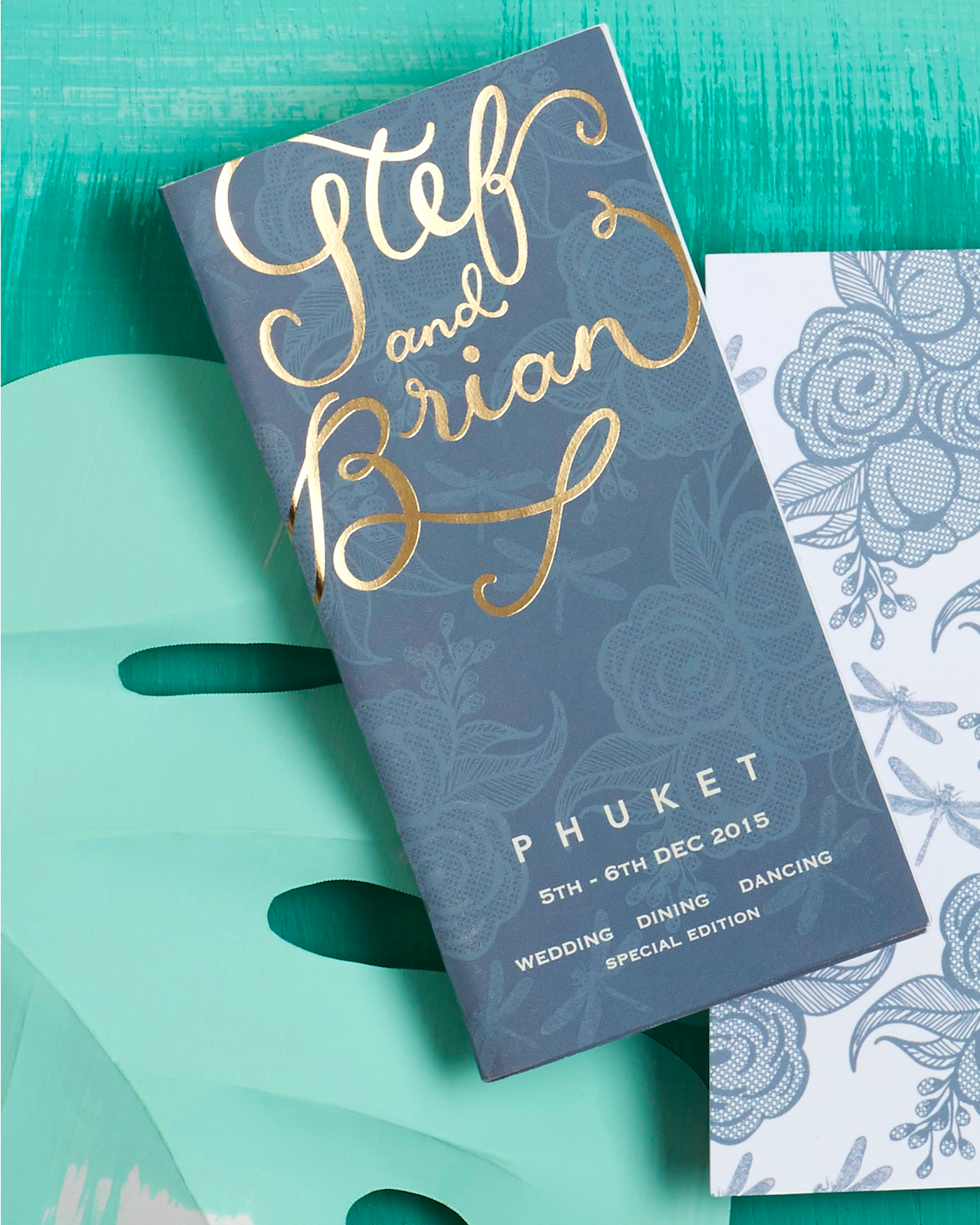
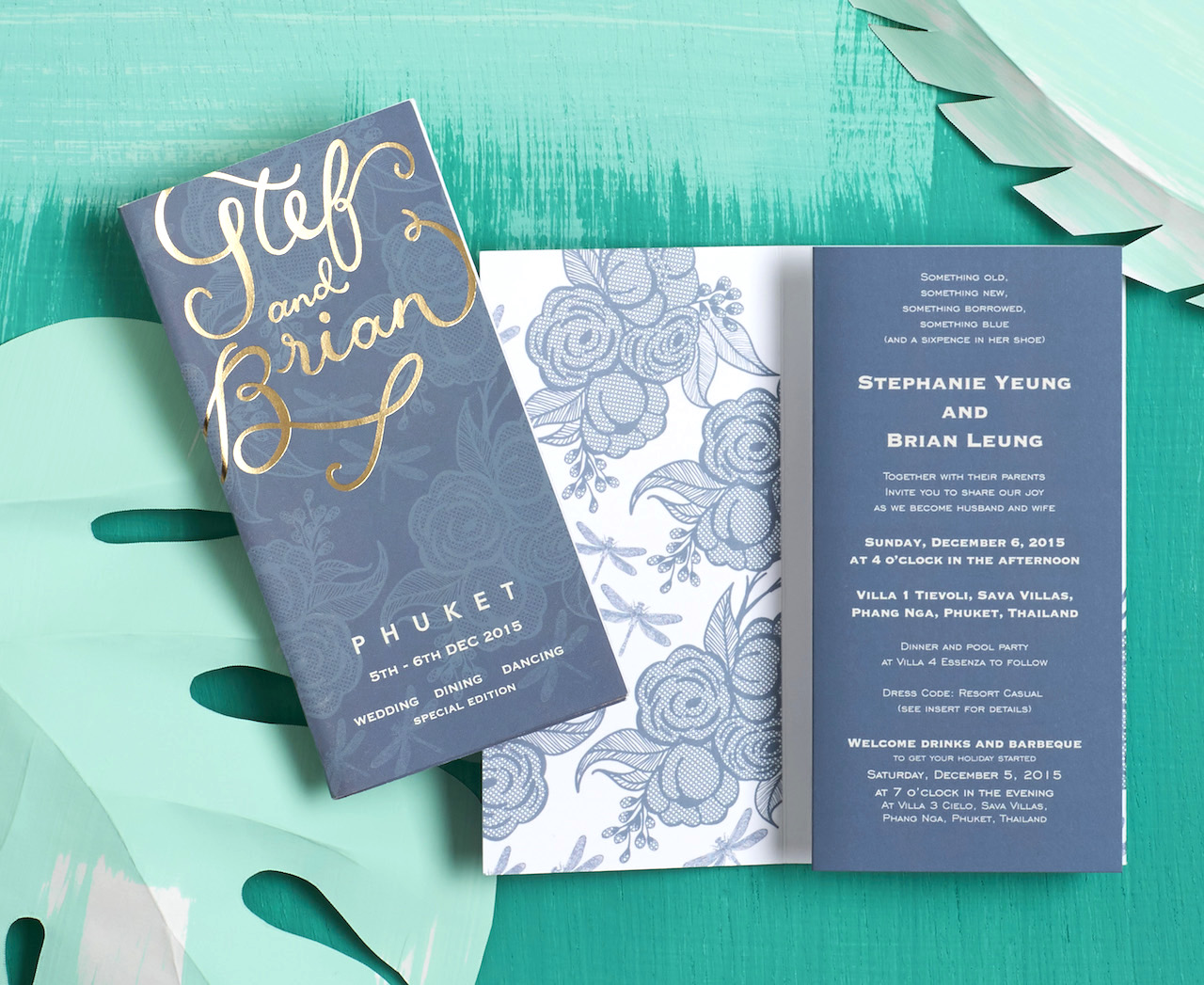
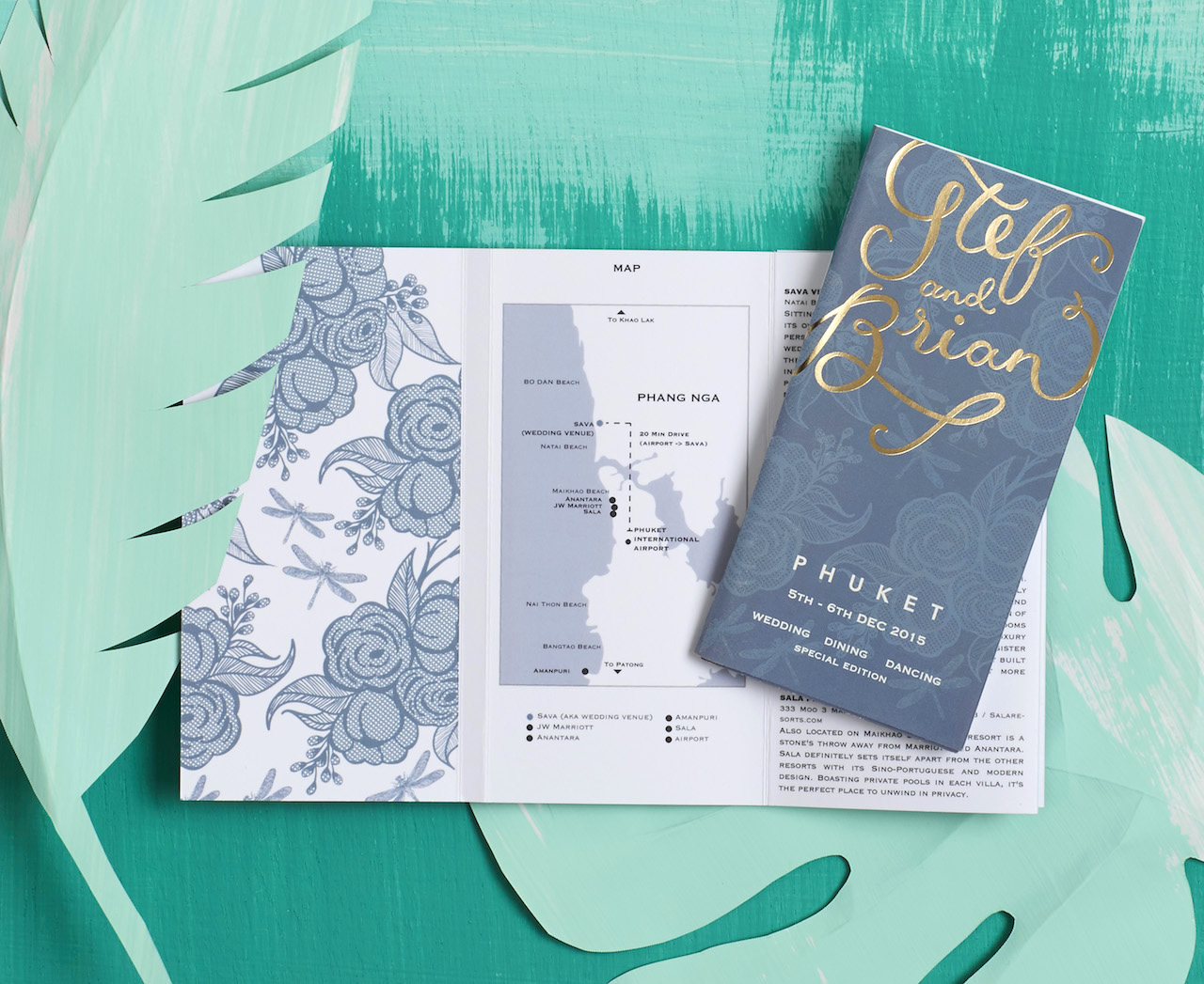
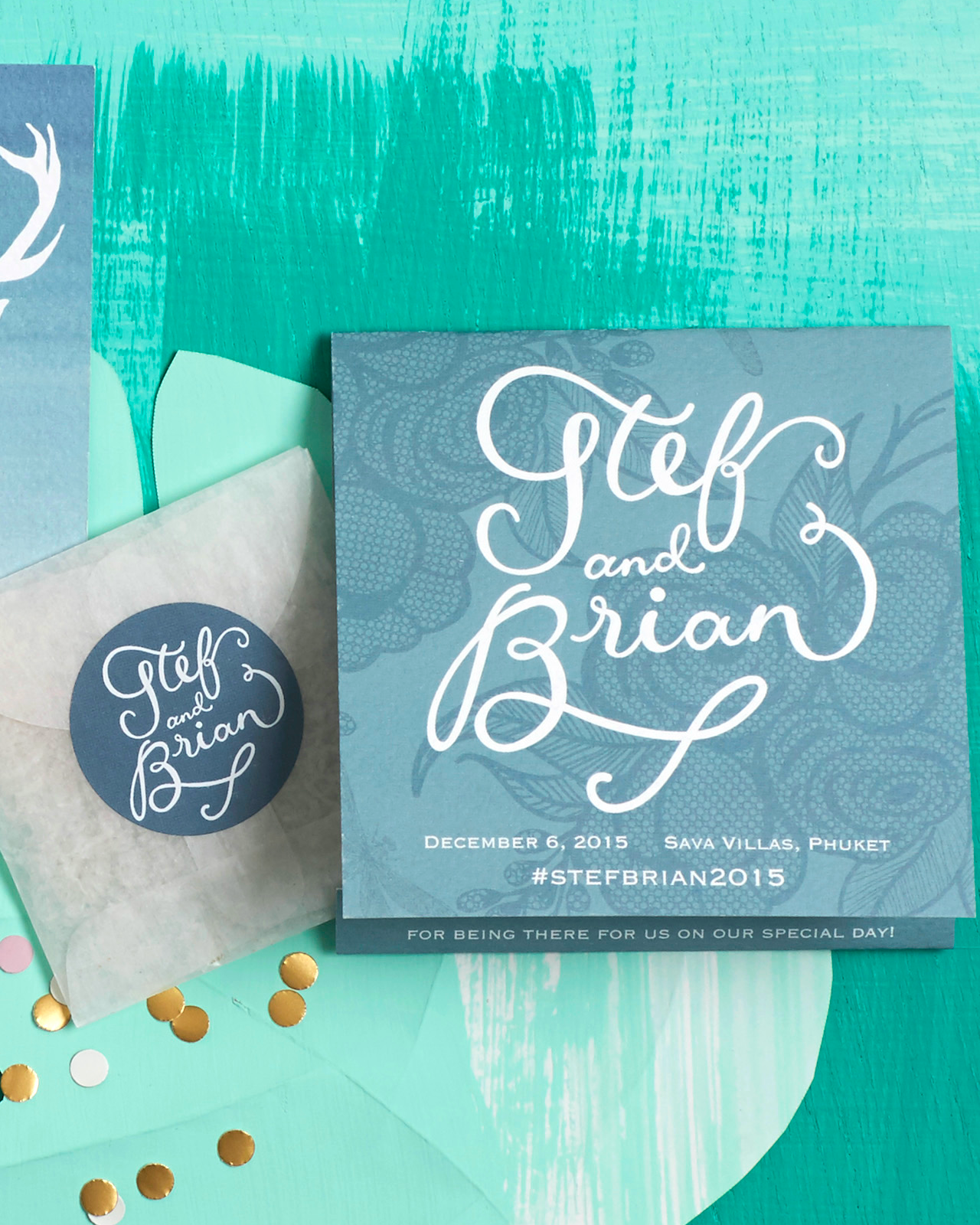
Spring is officially here – and the warm weather has us dreaming of tropical vacations! Erin from BerinMade sent over these gorgeous tropical turquoise and gold foil wedding invitations for a destination wedding in Phuket, Thailand! (BTW, have you seen BerinMade’s new website? So many beautiful custom wedding invitations to gaze at over there!) Destination weddings usually involve LOTS of logistics, and the interactive travel guide-inspired format of these invitations is a fun and festive way to share all that information with wedding guests, plus get your guests super excited to travel the world in celebration of loved ones. Yay for weddings on warm sandy beaches! – Hannah

Tropical Turquoise and Gold Foil Wedding Invitations by Berin Made

From Erin: I’m so excited to share one of my favourite custom projects, these travel-guide inspired invitations! This project started with kind of a funny, serendipitous story! The groom, Brian, was a good friend of mine from back in high school, but we had lost touch over a decade since I moved to London. His fiancée, Stef, was browsing through Oh So Beautiful Paper and Pinterest while planning their wedding and found my work. Then, she decided to get in touch with me about designing her wedding invitations. After a few rounds of funny emails, we finally discovered that we had known each other all along! What a small world!

Tropical Turquoise and Gold Foil Wedding Invitations by Berin Made

Tropical Turquoise and Gold Foil Wedding Invitations by Berin Made

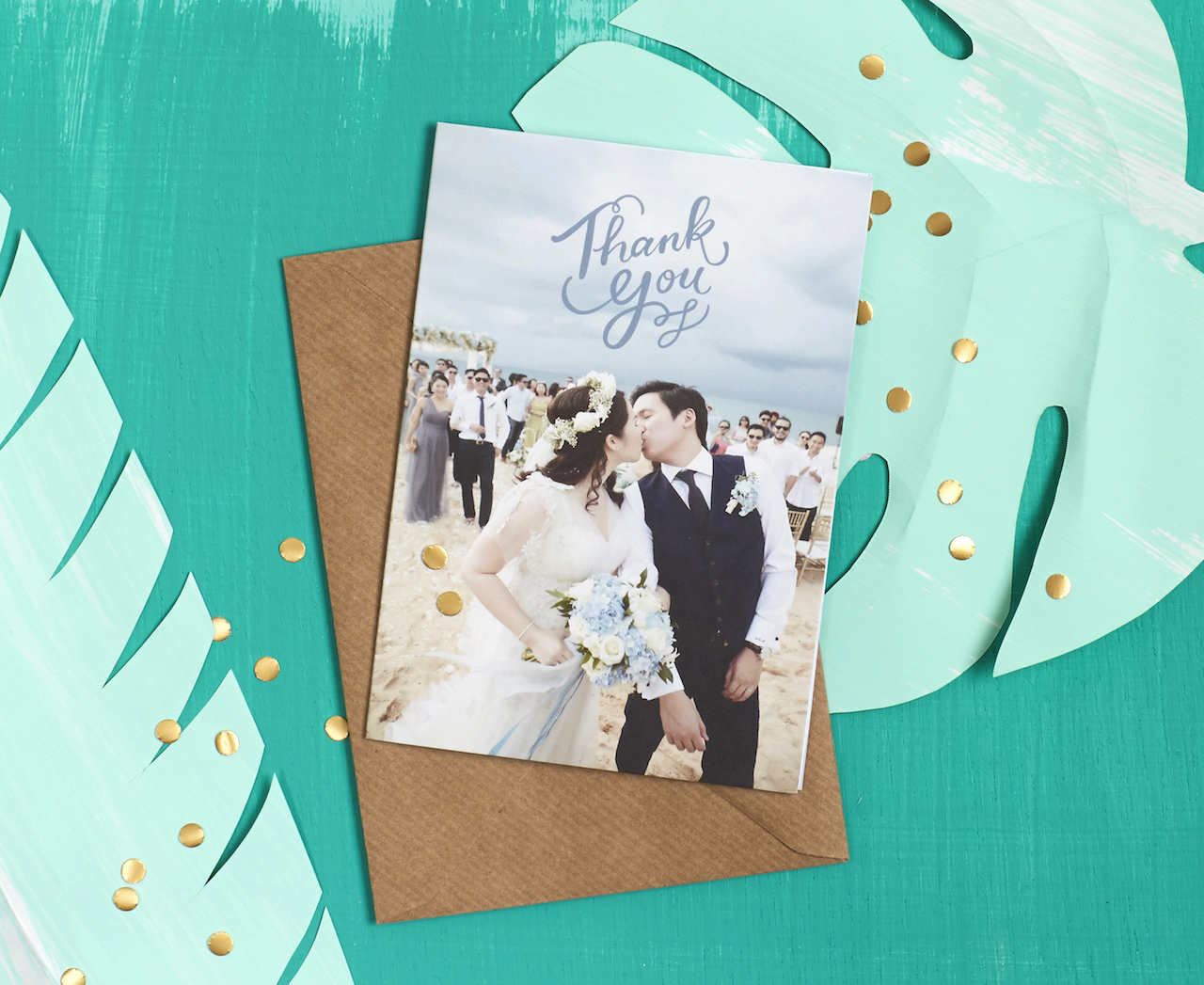
Stef and Brian are a fun-loving couple who love to travel the world. Their destination wedding was at a beautiful resort in Phuket, Thailand and they were married on the beach at sunset!

Tropical Turquoise and Gold Foil Wedding Invitations by Berin Made

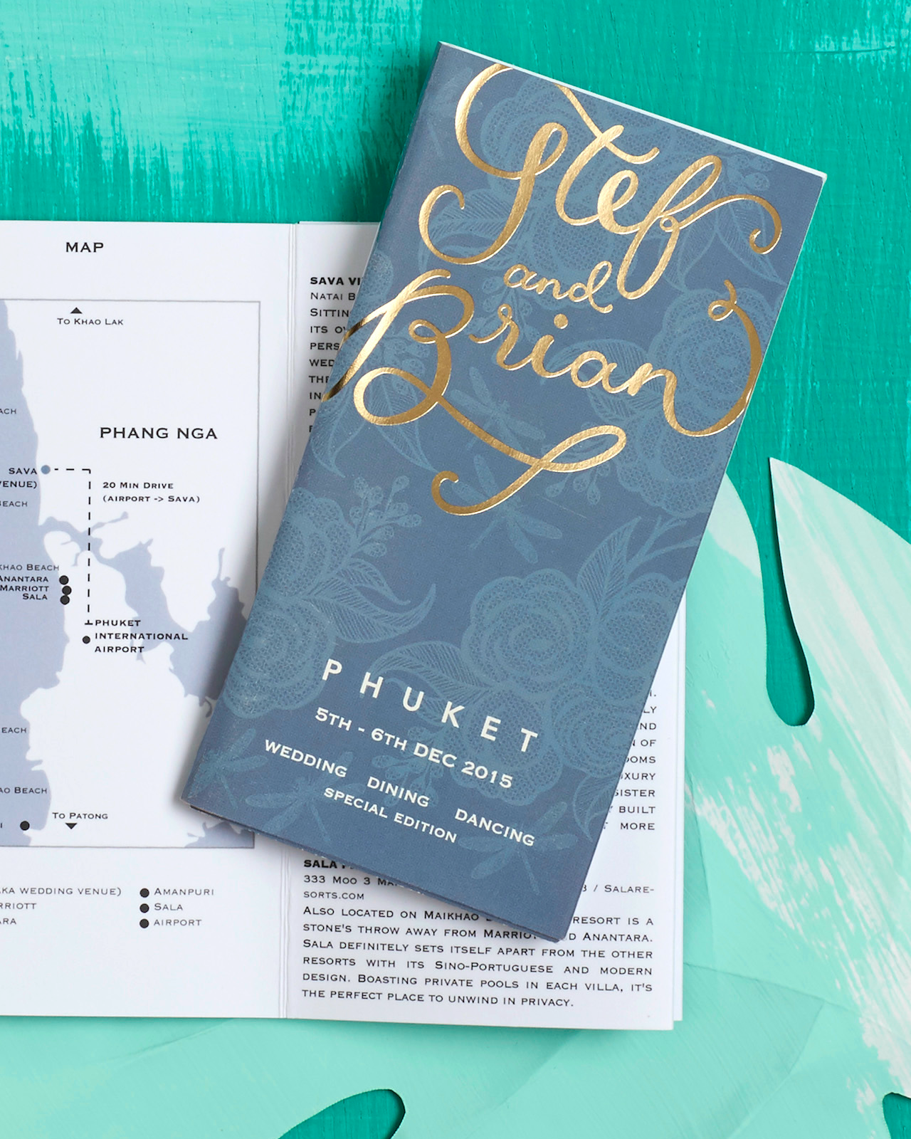
At the outset, Stef already had some lovely ideas for her invitations, which she shared with me and I used as a starting point. She loved the idea of a travel guide which documents not only their wedding details, but all the amazing restaurants and local haunts that their friends could try out when they arrived for the wedding weekend. Armed with lots of content, we decided on a pocket-sized accordion fold-out booklet as our format. This was able to house all their restaurant and spa reviews, as well as dress codes, packing guide, and a helpful map of the local area!

Tropical Turquoise and Gold Foil Wedding Invitations by Berin Made

Stef also showed me the beautiful lace pattern of her dress which incorporated dragonflies, and I was immediately smitten with it! The color palette for her wedding was cool blues and cream, inspired by sandy beaches and the flowing dresses of her bridesmaids. We worked that inspiration into the aesthetic of the suite, with the subtle dragonfly lace illustration on the front cover, and gold foil hand lettering for their names.

Tropical Turquoise and Gold Foil Wedding Invitations by Berin Made

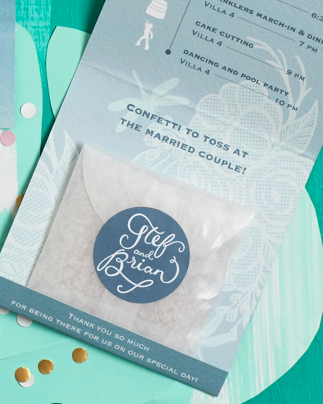
To complete the stationery suite, we also made wedding programs, which doubled as confetti pockets, calligraphy place cards and thank you cards!

Tropical Turquoise and Gold Foil Wedding Invitations by Berin Made

Thanks Erin!

Design: BerinMade

Calligraphy: Lauhaus.co

BerinMade is a member of the Designer Rolodex – you can see more of their beautiful work right here or visit the real invi­ta­tions gallery for more wedding invitation ideas!

Photo Credits: Teddy Ng

Behind the Stationery: INK MEETS PAPER

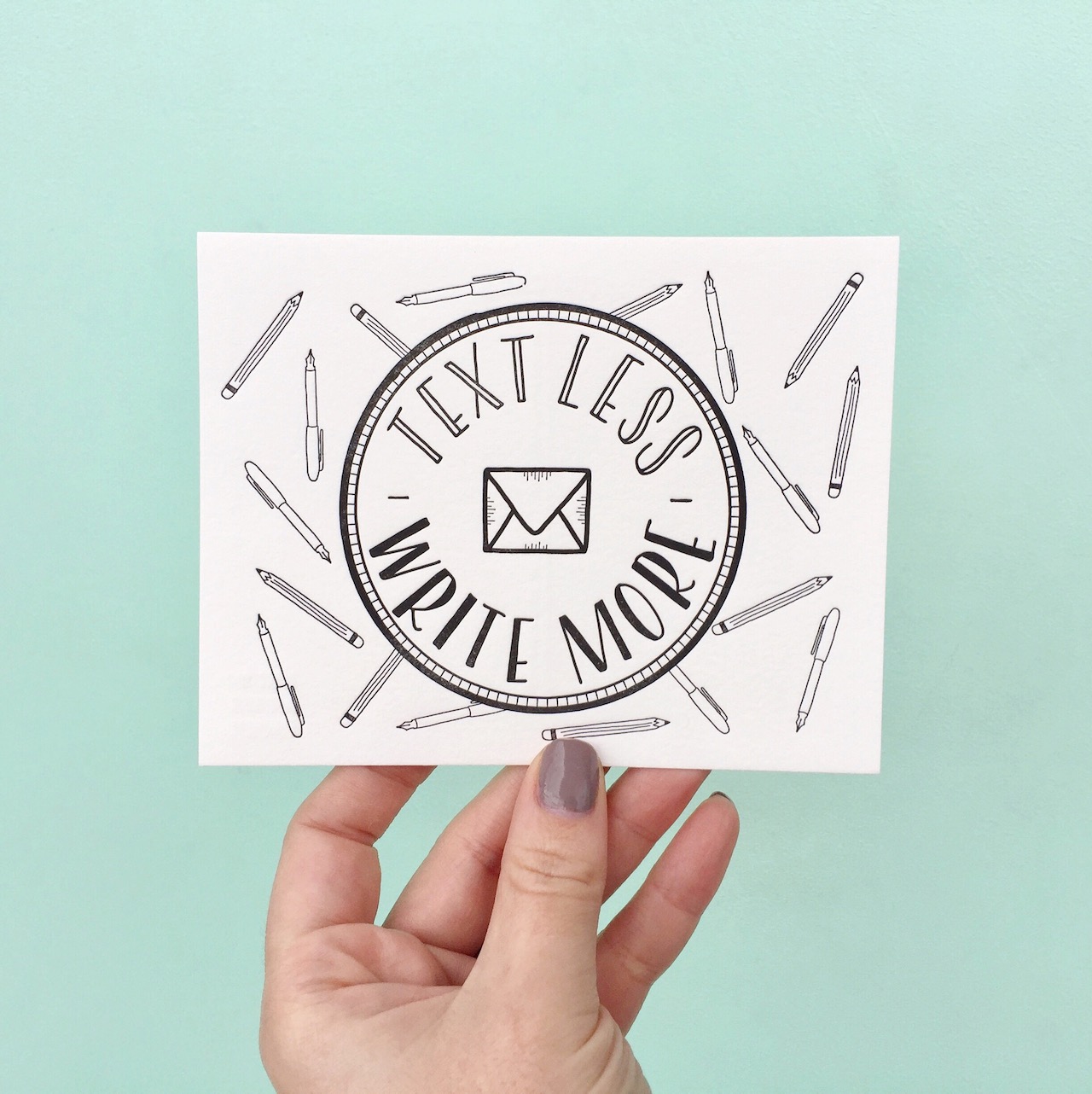
Today we’re highlighting the duo behind INK MEETS PAPER, Allison and Jamie Nadeau! Allison is here to share their story with us, including how they split work as a partners, their design process from developing concept sketches to getting ready for pre-press, and why they focus solely on letterpress printing. In line with their motto “Text less. Write more.” the INK MEETS PAPER studio serves as both a letterpress studio and also hosts calligraphy classes. Welcome, Allison! –Megan
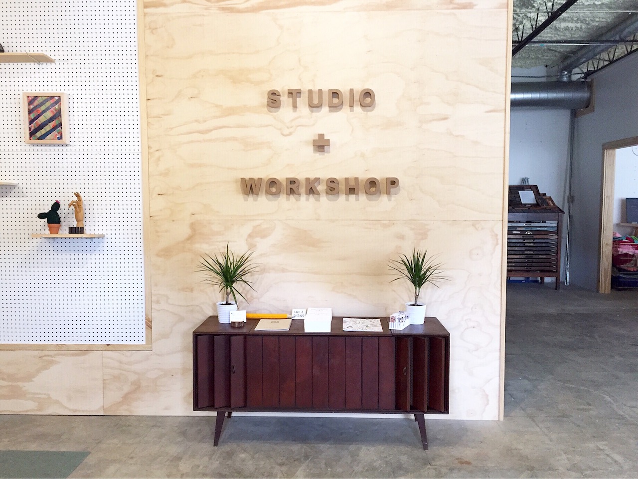
Ink Meets Paper - Studio

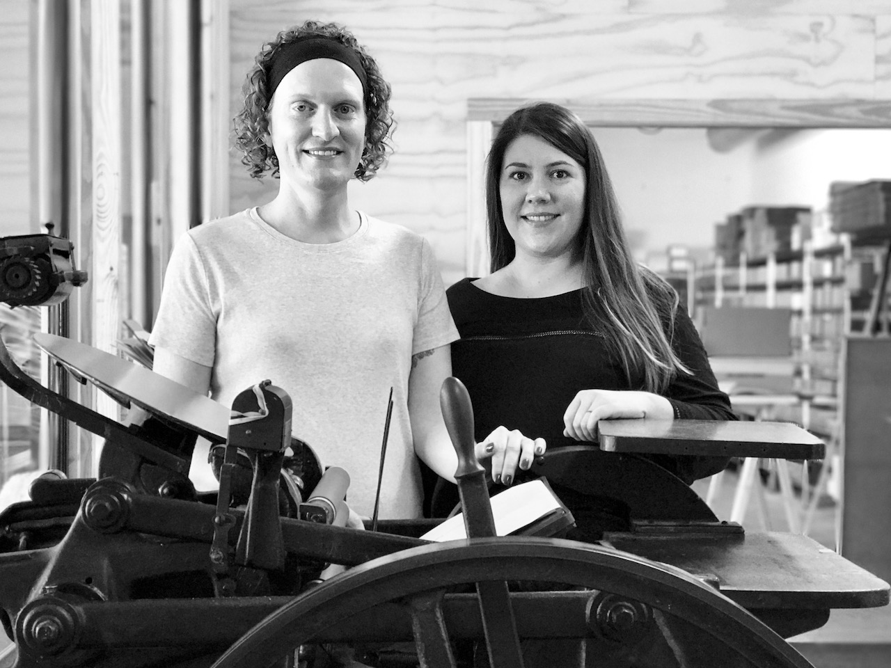
From Allison: We’re Allison and Jamie Nadeau, co-owners of INK MEETS PAPER. Prior to running INK MEETS PAPER full time, I was a copy editor, and Jamie was an interaction designer at a software company. Our love of art and creative expression has always been a part of who we both are (and we’ve worked on various creative projects together). INK MEETS PAPER initially started as a side/hobby project back in 2006, when I designed and printed custom stationery and invitations for friends and family. The love for the craft of letterpress printing came in 2008 with a class at a local art gallery/studio in Charleston. After spending so much time behind the screen, we realized how refreshing it was to be so hands-on and involved in the physical process of creating a printed piece. That same year, we purchased a 1,000+ pound Chandler & Price platen press.
Ink Meets Paper - Jamie and Allison

As we became comfortable printing on antique equipment, we started to explore more segments of the paper industry (stationery/greeting cards, wedding invitations, custom printing for others). In particular, the idea of connecting people with handwritten correspondence really resonated with both of us, and we saw greeting cards as an accessible way of encouraging people to text less and write more. With that passion for the handcrafted and the handwritten, we launched the INK MEETS PAPER wholesale line in 2010.
Ink Meets Paper - Collection

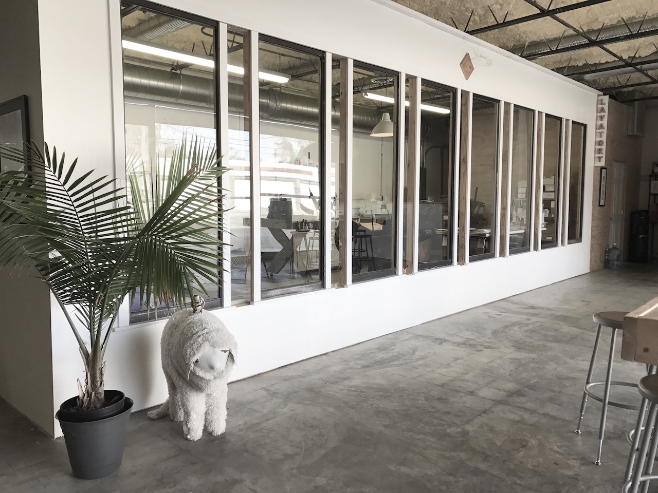
Our studio is located in the Park Circle neighborhood of North Charleston, SC. Our building was a former convenience store, and it was just a big open space when we first signed our lease. Along with painting the exterior, we also added a glass-walled pressroom and a few other walls to further divide the space into different work areas (inventory/shipping, computer/desk area, retail/showroom, and a big flex space in the middle). One of my favorite parts to our studio is the enormous windows at the front—they let in so much natural light, and it does wonders for making the whole space feel bright and cheery.
Ink Meets Paper - Studio Windows

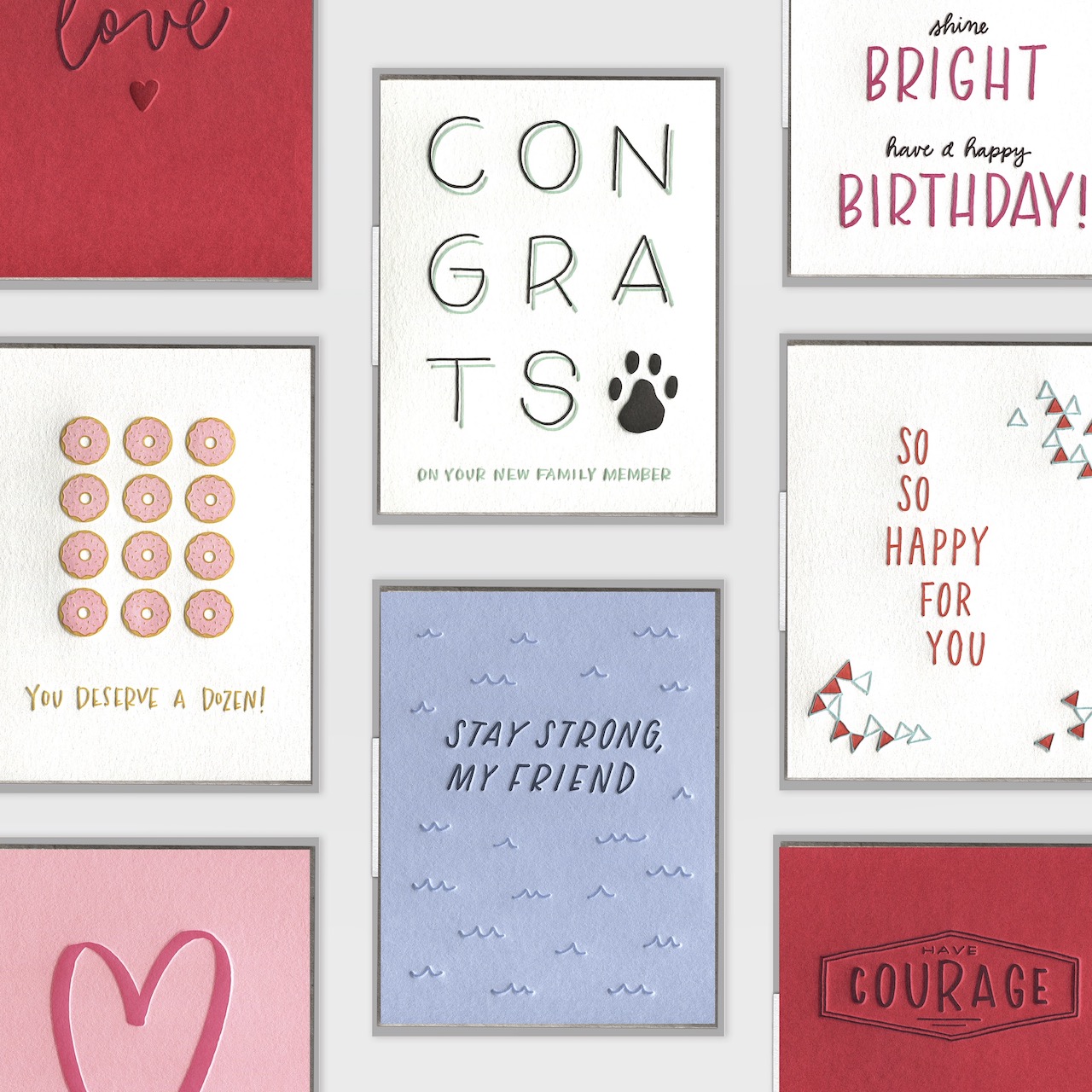
Letterpress printing is our only focus, and we’ve really been able to become comfortable with that process. I love the constraints it provides, and we’ve both grown stronger as designers since we started letterpress printing. Our greeting card line is known for hand-lettered and illustrated details paired with fresh and original sentiments. We’re decidedly not snarky, and lots of inspiration for our card sentiments comes from relationships (often our own), and the sweet or quirky phrases that come from those. Our company is a big proponent of the power of the handwritten note — we believe that with each card sent, the world gets a bit more love and humanity. Our motto is “Text less. Write more.”

Ink Meets Paper - Text Less Write More

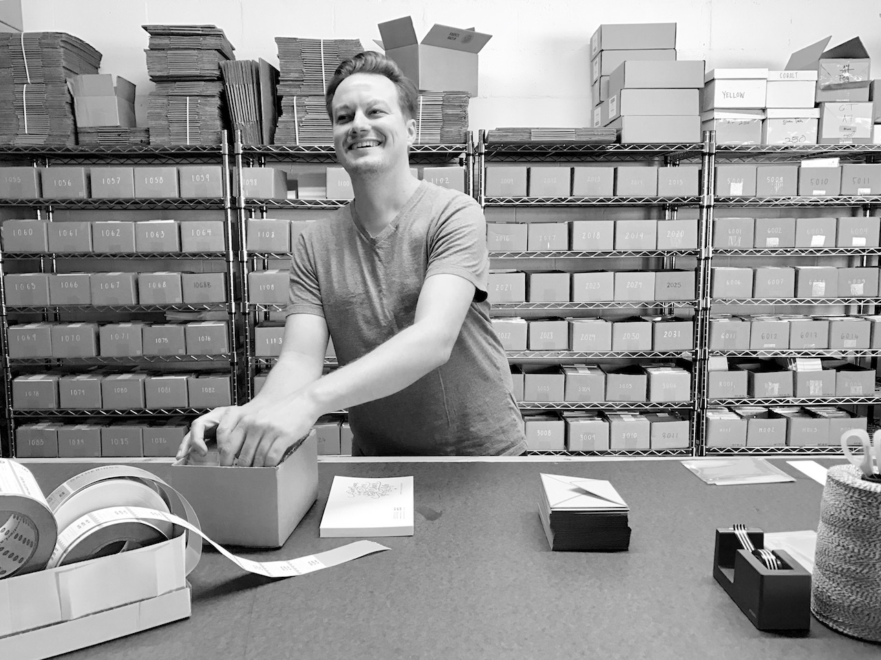
Jamie and I are both full time at INK MEETS PAPER, and we also have a part-time employee. We’re a small, but mighty, team, and I’m consistency amazed by how much our team accomplishes. A typical day starts with coffee (of course!), and we’re usually all in the studio by 9 am. Our employee packages and ships any new orders, and then restocks inventory and works on other studio tasks. Each final card is assembled by hand — slipping it into the cellophane sleeve and affixing a product label.
Ink Meets Paper - Packaging Cards

I start most mornings by responding to emails before reviewing the print queue for the day or tracking the progress of other projects, whether internal (like a new greeting card release) or external (a custom wedding invitation suite). As both our creative director and printer, I have the opportunity to be involved in each of our projects through from start to finish. Balancing time between production and design can be a bit challenging at times, but it’s very rewarding to see a vision come to life when that first print comes off the press!
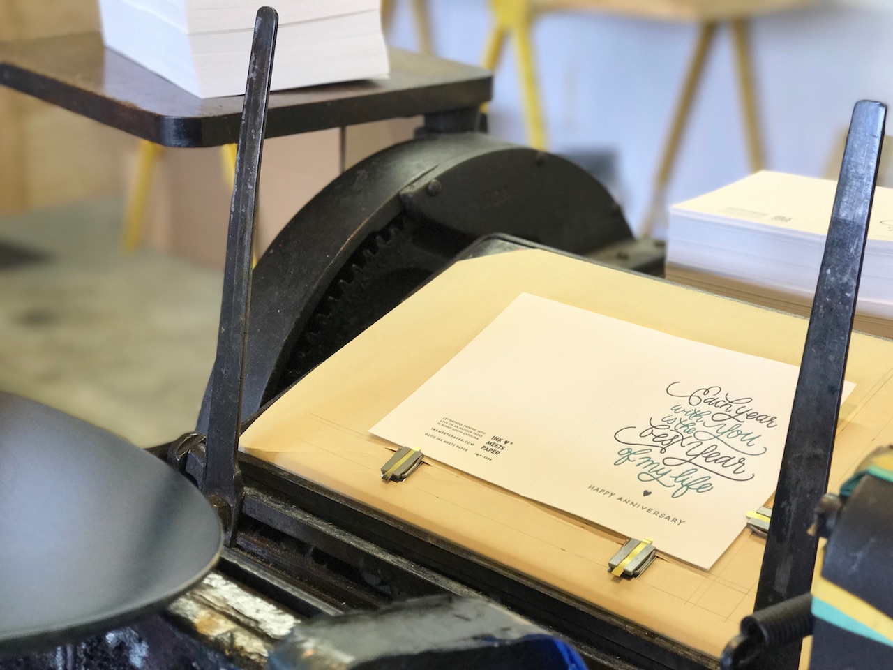
Ink Meets Paper - Printing

Jamie handles the operations and technology side of our business, as well as managing all of our branding. She reserves mornings for the most mentally taxing tasks of the day, which can range from long-term business planning and strategy to technical operations for our websites and spends afternoons on projects ranging from pre-press work to graphic layouts.

Ink Meets Paper - Jamie

We both agree that a big challenge is growing the business while also running the business. We wear so many different hats that maximizing efficiencies is super important, and we’re consistently trying to make our systems and processes better. And this is where we also rely on technology to keep everything running smoothly.

While I’m the creative director, our design process is very collaborative. After deciding what card categories (birthday, encouragement, etc.) we’re including in a release, we have a brainstorming session to come up with various sentiments. I keep a big folder of ongoing ideas, so we’ll also see if any of those really resonates. We work really hard to be both authentic and heartfelt (without being sappy). With greeting cards, people really gravitate towards what a card says. Even though all of our cards are a blank on the interior, the exterior message gives them a starting point for writing their own messages. From there, we pare down our favorites and look at how they feel for the collection as a whole.
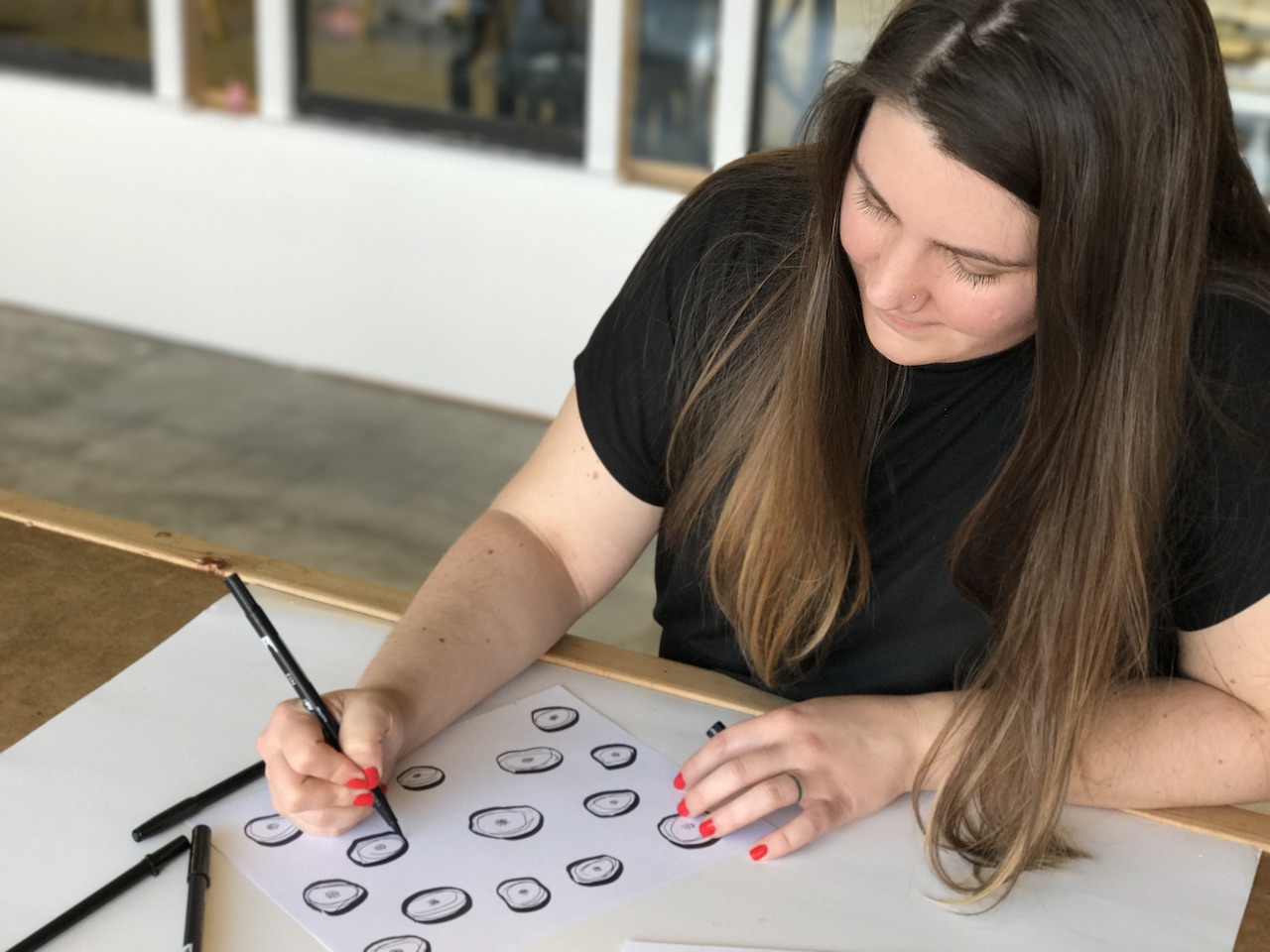
Ink Meets Paper - Allison

Next, I start simple concept sketches — all of our cards start with actual physical artwork. We introduced colored paper stocks to our line last year, and I also reference those paper swatches when sketching. I want to make sure that the design not only works with the sentiment but also the paper stock it’s on. All of our designs are hand lettered and hand drawn. Lately, I’ve enjoyed pairing more abstract patterns with simple, understated lettering. We’ll review the sketches and slowly the new release begins to take shape. From there, I’ll begin producing the final artwork that we’ll scan into the computer for any clean-up and color work. Since letterpress printing is done one color at a time, I produce the final, scan-ready artwork in black ink but divided by color.
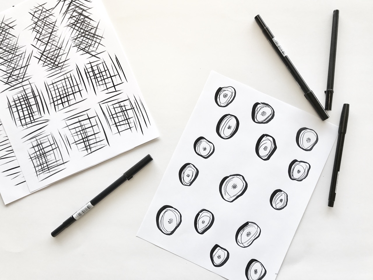
Ink Meets Paper - Sketching

Refining the color palette is probably the hardest part — there are so many beautiful colors! I typically gravitate towards blues and greens (probably the result of living on the coast). To make production run more efficiently, we have a master file for all the Pantone colors that we use in our line. This makes it easier to choose colors and reprint, since we reprint all cards that contain a certain Pantone color simultaneously. Any new ink colors are documented, and we’re constantly looking at our greeting card line as a whole to ensure it feels focused and cohesive.

We’ll hold another design review focusing on color and overall artwork. We also make a printed mockup of each card design. Even though it doesn’t remotely compare to seeing/feeling the actual letterpress-printed piece, seeing the design to scale is really important. Jamie and I are really comfortable giving and receiving feedback with one another, and we know the other person will offer a completely honest critique. Any changes are made, and we start the pre-press process in order to make a photopolymer plate for printing. This is also the time where we assign SKU numbers and item names, as well as document the ink and paper colors used.
Behind the Stationery: Ink Meets Paper

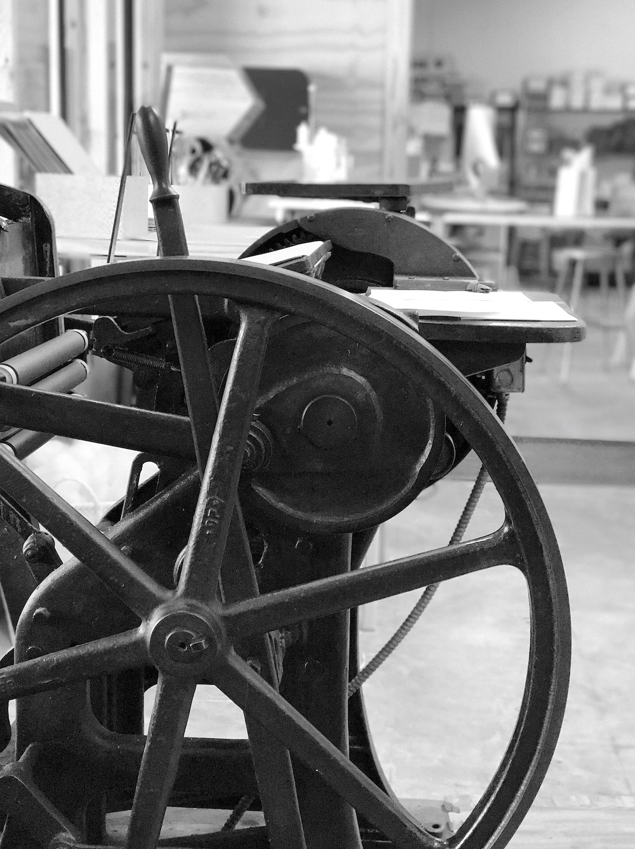
Production is the next step, and this is where it really starts coming together. I plan out our production schedule based on Pantone color (including any cards that we’ll also be reprinting). Big stacks of paper are trimmed down on our vintage paper cutter in preparation for print. Inks are mixed according to a formula specified in the Pantone guide. Color by color, each sheet of paper is hand-fed into the press. After everything is printed, I send each card through the press to be scored (which allows the paper to fold without cracking). Most of our cards are two colors, which means they go through the press three times before heading to assembly and inventory.
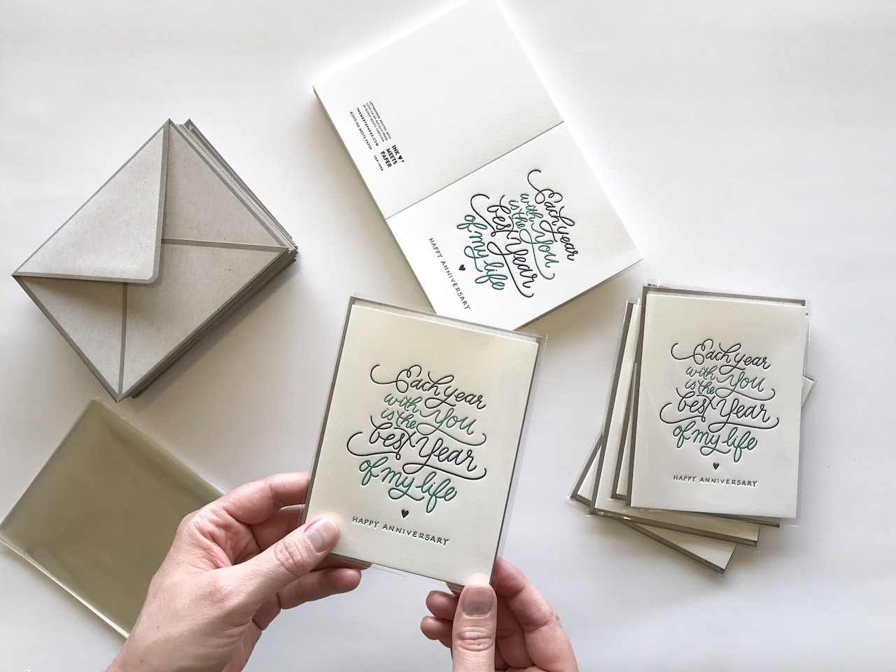
Behind the Stationery: Ink Meets Paper

Printing the finished cards aren’t the final job though. All new designs need consistent product photography for our wholesale website and soon-to-launch retail site. We also discuss an overall marketing plan for the new release and ensure we have styled photography shots to accompany the plan. Along with the digital updates, we also design printed supplements for the spring/winter releases and then produce a new print catalog each May.

All photos courtesy of INK MEETS PAPER.

Want to be featured? Reach out to Megan at megan[at]ohsobeautifulpaper.com for details.
Minimalist Black and White Hand Lettered Wedding Invitations

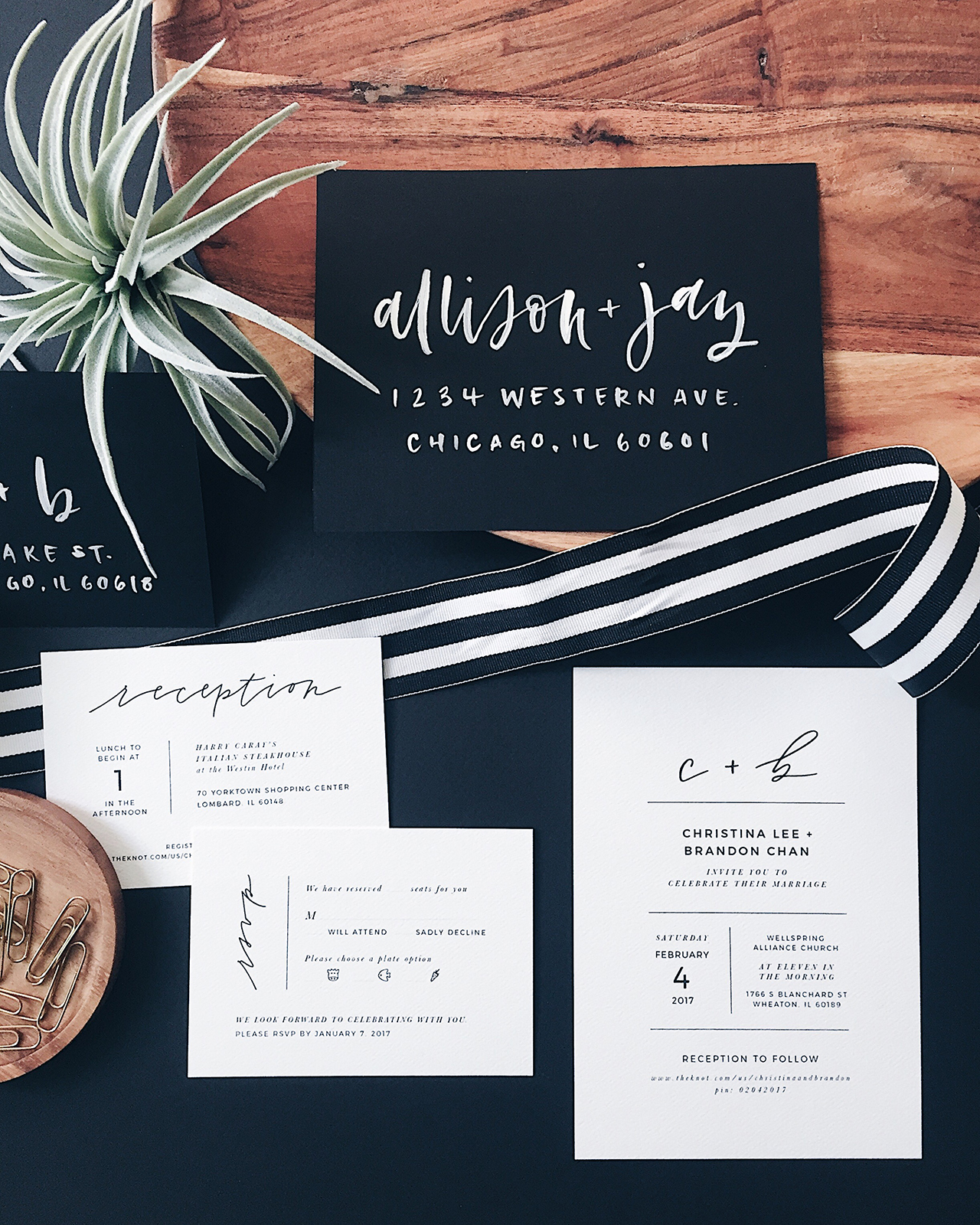
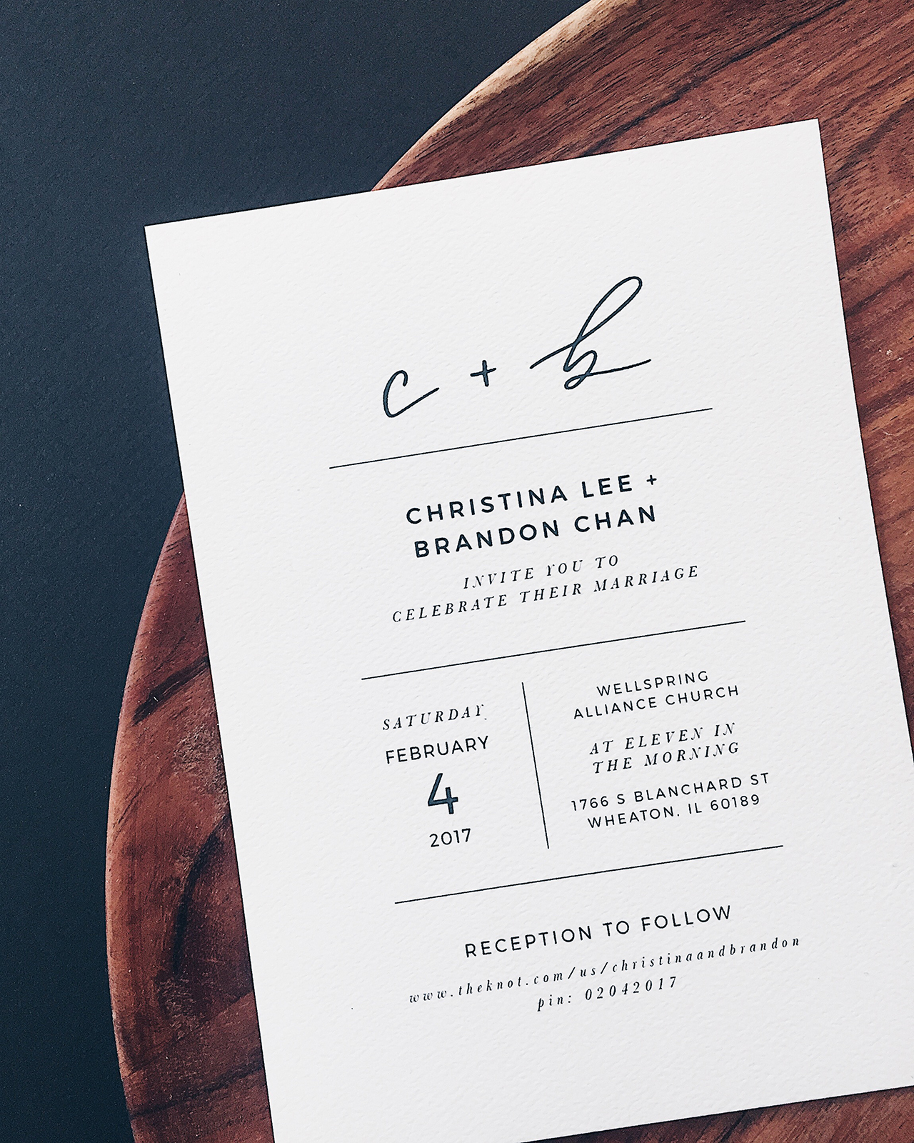
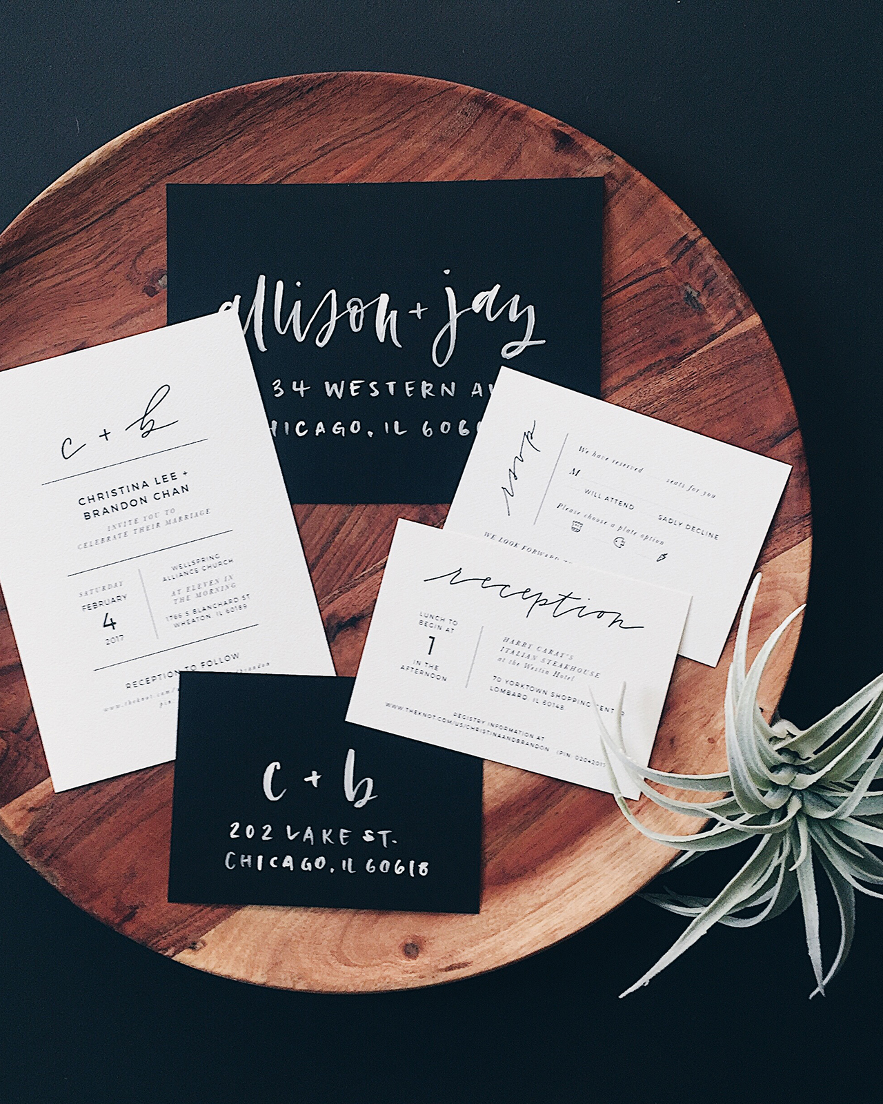
When an artist with a minimalist, yet elevated, aesthetic enlists you to design her wedding invitations, you know they are going to pack a punch! These gorgeous minimalist black and white hand lettered wedding invitations by Grace Niu are bold, yet refined and modern all at the same time! We’re loving the interplay between her thin monoline hand lettering and the carefully curated serif and san-serif typeface selections. Add in bold black envelopes with white brush lettering, and you’ve got one seriously gorgeous modern wedding invitation suite.

Minimalist Black and White Handlettered Wedding Invitations by Grace Niu

From Grace: I’m truly excited to share this invitation suite! Christina, the bride, came to me with a beautiful inspiration board full of very minimally designed invitations. She also wanted to incorporate hand lettering in a way that would complement the minimalist look she wanted. Christina is an artist and loves a good minimalist aesthetic, and absolutely loves black and white. Her wedding vision was a ton of black and white elements paired with lush greenery, yet all kept very simple, quiet and beautiful.

Minimalist Black and White Handlettered Wedding Invitations by Grace Niu

The invitation design incorporates thin modern hand-lettering and a mix of sans-serif and serif fonts. For the reply and reception cards, I was able to play with some different layouts so that they were their own distinct pieces. Christina requested cute little animal icons for her meal choices, and I love how those turned out. I also love that we chose to rotate the “rsvp” lettering on the reply card to make it stand out a little from the rest of the suite.

Minimalist Black and White Handlettered Wedding Invitations by Grace Niu

I chose to print the suite on a felt textured paper because the design was already so minimal, and I wanted to bring in a little texture to keep it from being too flat. To complement the minimal black and white theme, I chose black envelopes and hand-lettered them with white ink in a modern style. This invitation suite was perfect for me to work on because it’s really indicative of my style as a designer – pairing modern hand-lettering with beautiful typography is something I pride myself on.

Minimalist Black and White Handlettered Wedding Invitations by Grace Niu

Thanks Grace!

Design, Calligraphy, & Production: Grace Niu

Check out the Designer Rolodex for more tal­ented wed­ding invi­ta­tion design­ers and the real invi­ta­tions gallery for more wedding invitation ideas!

Photo Credits: Grace Niu

Matcha and Mint Mocktail

You might have noticed that Saint Patrick’s Day has become something of a drinking holiday. I’m not a huge fan of this whole turn-a-meaningful-day-into-a-themed-drinking-day thing, because I tend to think that those days were already important to people for reasons other than drinking. I also think that drinking is something we should incorporate into our every day cuisines, and not something we should cram into wild days of excessive partying. So, if you’re looking for something to drink today that doesn’t require booze, we’ve got a great Matcha and Mint mocktail recipe for you. It’s green. Total coincidence. –Andrew

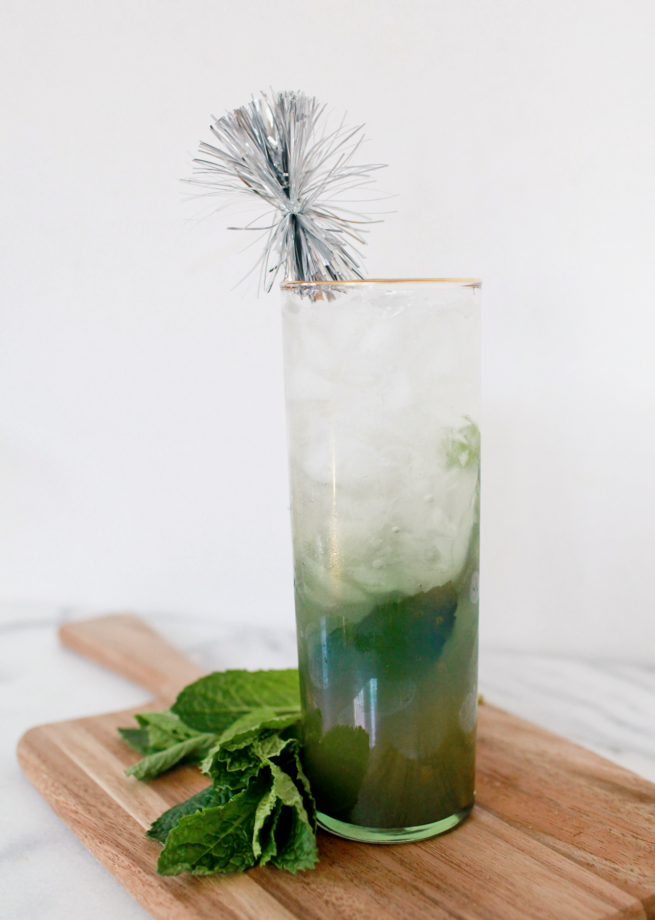
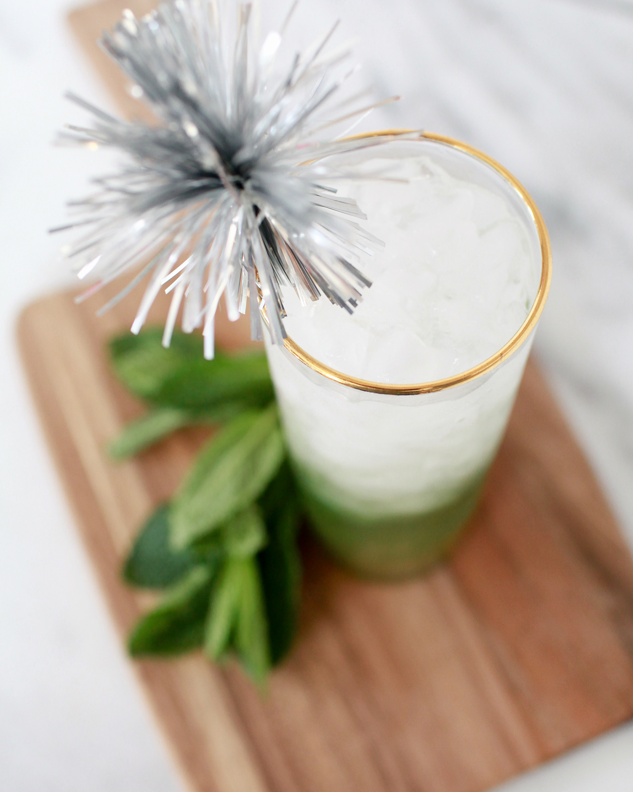
Matcha and Mint Mocktail

Matcha and Mint Mocktail

1 oz Matcha Syrup
1 oz Lime Juice
Mint Leaves
Tonic Water

To make the matcha syrup: combine a cup of water, a cup of white sugar, and 2 tablespoons of matcha green tea powder in a sauce pan over low heat. Whisk everything together until the sugar is melted and the matcha is dissolved. Bottle and refrigerate.

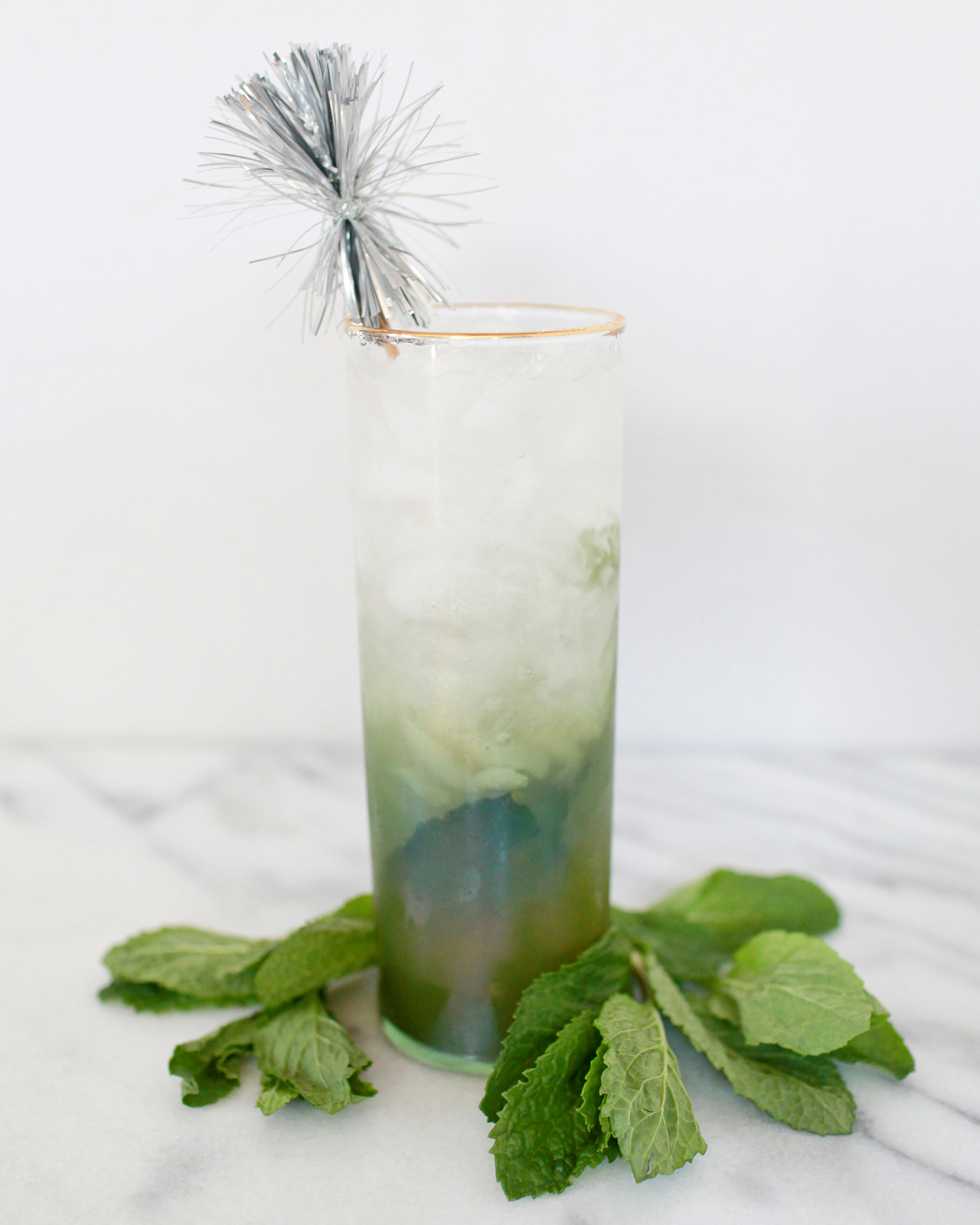
To make the mocktail: combine the syrup and lime juice in a highball glass. Add the leaves of a sprig of mint and gently muddle. Then fill the glass with ice, top with tonic water, and give a good stir. Enjoy!

Matcha and Mint Mocktail

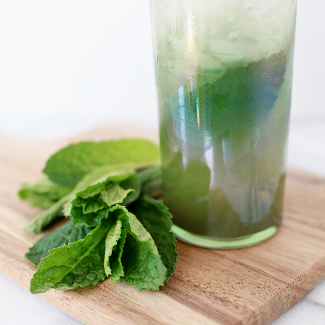
Matcha – a powder made from carefully selected and dried green tea leaves – is a fun thing to add to mocktails and cocktails alike. It’s the same ingredient that goes into Japanese green tea, of tea ceremony fame. Matcha adds earthy botanical notes and a bit of tannic astringency – something that you might get from some spirits but that can be hard to replicate in a mocktail. A syrup made from matcha is also a deep, rich green color, which can make your drinks sparkle green.

Matcha and Mint Mocktail

Mint and lime are, it goes without saying, amazing and delicious together. Add in the matcha syrup and you have the foundation of a pretty good mocktail – sweet and tart and minty and earthy and richly green.

Matcha and Mint Mocktail

To that we add tonic water, and we can’t emphasize enough: real tonic water, made with actual quinine, is the only way to go for mocktails. (I mean, it’s important in cocktails too, but it’s a lot harder to fake flavors in a mocktail, since mocktails don’t benefit from the powerhouse flavors of booze.) Tonic water adds refreshing effervescence (and this is a really refreshing drink) and some of the bitterness that can be missing from mocktails. Bitter is one of the ways our brains recognize things that are really dangerous (like poison!) or really fun (like coffee!) or a little bit of both (like alcohol!). It helps elevate this drink into a legitimately complex and grownup mocktail.

(Don’t forget to follow us on Instagram!)

Glassware by Liquorary

Photo Credits: Nole Garey for Oh So Beautiful Paper