Modern B’nai Mitzvah Invitations

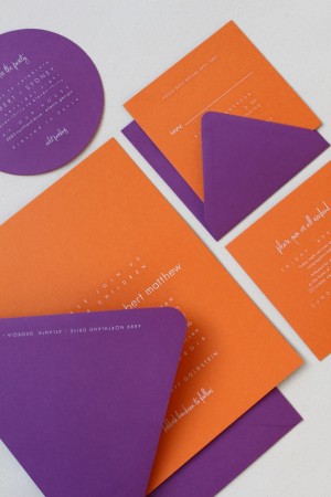
Tova from Brighten My Day Studio created these super-colorful and modern invitations last year for the B’nai Mitzvah of twins Sydney and Robert.  The family wanted to go with a slightly different approach to the design, so Tova created the entire invitation suite using a colorful orange and purple color palette, complete with pop-art inspired save the date and envelope liners!

From Tova: This family loves art.  Their home is a gorgeous canvas for the amazing, bold artwork – from life-size mosaics to the classic paintings – that hang on each wall.  Since the evening celebration was being held at their home, we wanted the invitation to reflect their home and the party to come: bold color, modern feel, some drama and a nod to art.

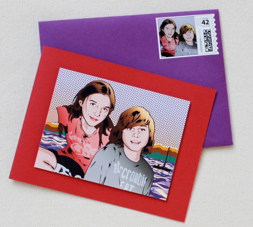
Modern-Bnai-Mitzvah-Save-the-Date

The save the date was a great introduction: cherry red and beet papers featuring white engraved text and hand-illustrated Lichtenstein-inspired drawing of Sydney and Robert (which was mounted 3-dimesionally to the card).  In-town guests received a folded card, while out-of-towners received a tri-fold card which contained the weekend events.

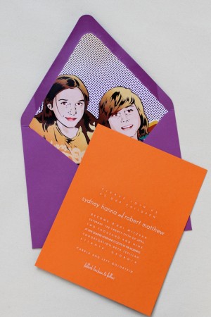
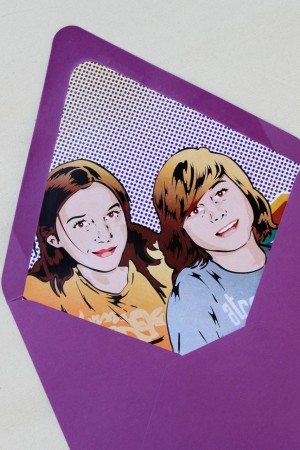
Modern-Bnai-Mitzvah-Invitation-Liner Modern-Bnai-Mitzvah-Invitation-Pop-Art-Liner

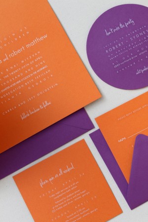
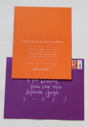
We wanted to keep the design of the invitation really simple and clean, to showcase a huge wow factor in the color palate and the invitation size.  The invitation was 9″ x 11″ (huge!) and tri-plexed into a heavy-weight board of tangerine on the front and beet on the back.  The accompanying enclosure cards were also duplexed – tangerine on one side, purple on the back – in the same style as the invitation, but in a variety of modern shapes.

Modern-Bnai-Mitzvah-Invitation-Suite Modern-Bnai-Mitzvah-Invitation-Suite

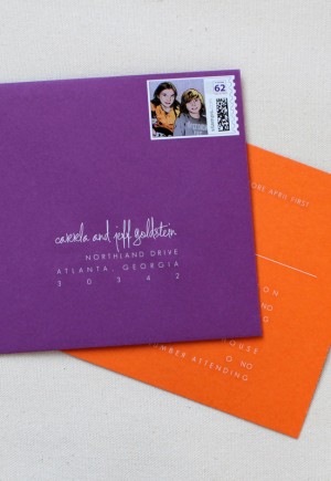
The typefaces were a fun mix of clean and crisp, paired with a fresh, hand-writing inspired script.  And the kicker – the envelope liner was the Lichtenstein image from the save the date, blown-up and digitally printed in colors to mesh with the new tangerine and beet color palette.  Custom stamps were created for both the invitation envelope and the response card.  And, the envelopes were addressed in white gouache calligraphy by the uber-talented Crystal Kluge.

Modern-Bnai-Mitzvah-Invitation-Envelope Modern-Bnai-Mitzvah-Invitation-Envelope-Stamp

I LOVED creating this invitation, in huge part because the Goldstein family was so incredible and trusting.  I am still obsessed with the color palette – and just love that we were able to incorporate the “photo” of the twins into the pieces in such a funky, non-traditional way.

Beautiful work as always Tova!  Thank you so much for sharing these incredible invitations!

{image credits: brighten my day studio}

Cross Country Letterpress Adventures

For those of you who love the look and feel of letterpress as much as I do and have ever wanted to learn more about the printing process… well, this is just about the coolest project ever!

Kyle from Power and Light Press is starting a new project to take the art of letterpress on a cross-country adventure!  She’s building a mobile press shop in the back of an old delivery truck, complete with a small table top press and a larger proof press, and plans to visit schools, art spaces, craft shows, and any other place or venue with an interest in letterpress – all the while conducting printing workshops and demonstrations.

In order to make this project a reality, Kyle needs our help.  She’s set up a kickstarter page where you can learn more about the project and make a donation.  Check it out right there!

Satsuma Press Giveaway Winner – and Discount!

I had a blast hosting the custom holiday card giveaway from Satsuma Press last week, and I’m thrilled to finally announce the three winners!  And the lucky readers are…

Yay!  A big congratulations to Sarah, Jaclyn, and Lisabeth, and a huge thanks to all of you who entered!  With over 250 entries, Lynn has extended a generous discount to all those who entered the giveaway – she’s offering a 20% discount for 25 or 50 cards, and a 25% discount for 75 or 100 cards.  Just head on over to the Satsuma Press shop to contact Lynn and place your order.  Thanks Lynn!

Illustrated Wedding Invitations from Me + E

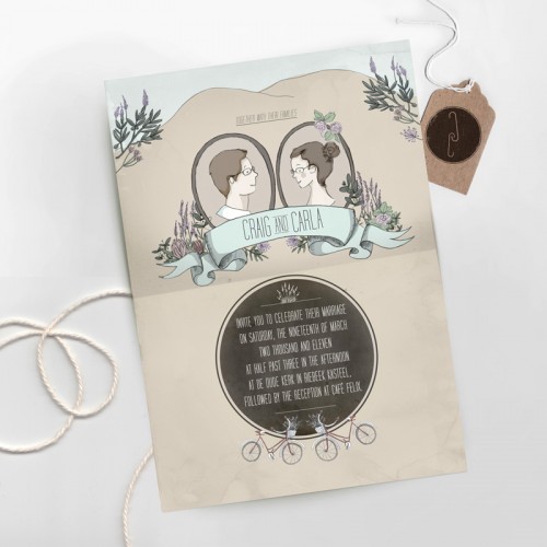
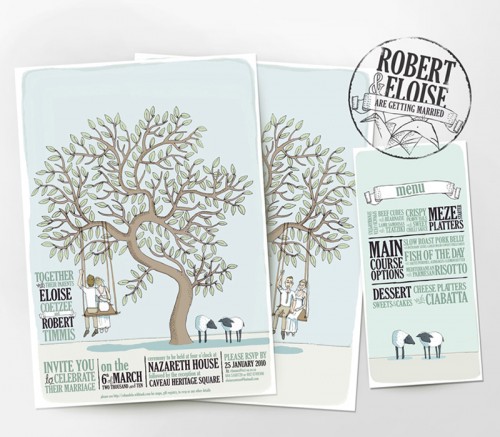
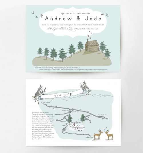
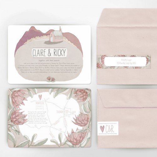
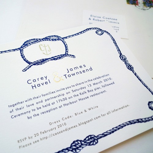
I’m loving these whimsical, yet modern, illustrated wedding invitations from South Africa-based design studio Me & E:

modern-whimsical-illustrated-wedding-invitations

modern-whimsical-illustrated-wedding-invitations

modern-whimsical-illustrated-wedding-invitations

modern-whimsical-illustrated-wedding-invitations

modern-tying-the-knot-wedding-invitations

Designers Eloise and Elizabeth come from an advertising background, so in addition to beautiful wedding invitations they also do some lovely branding, illustration, and web design.  Check it all out right here!

{image credits: me + e}

Melissa’s Golf-Themed Wedding Details

Earlier this year, I had the pleasure of featuring Melissa and Jerome’s elegant letterpress golf-theme wedding invitations and save the dates.  Melissa and Jerome were married in September at a local golf club, and Melissa carried some of the more subtle elements of her theme through to the wedding day details, including the menus, ceremony programs, even the wedding cake! Today I’m thrilled to welcome Melissa back to share some lovely photos – courtesy of Joe Elario Photography – and the inspiration behind the details!

Golf-Theme-Wedding-Cocktail-Hour-Label

From Melissa:  As a graphic designer, I brand projects and design for clients all day long.  When I started with the the golf tee save the date, I wasn’t sure how far I would take the golf theme, but knew at that point that I really wanted to push the logo, the green and white color palette, and the overall aesthetic.

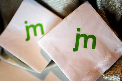
Golf-Theme-Wedding-Napkins

The venue, being a golf club, is very green outside and very brown inside.  Because the interior is so brown, I chose not to bring in any brown elements, but rather played only to green and balanced it all with white and cream flowers.

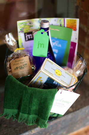
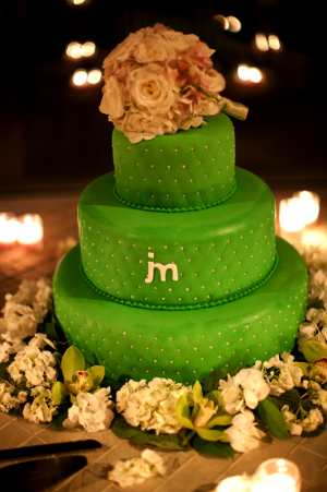
Golf-Theme-Wedding-Welcome-Basket Golf-Theme-Wedding-Cake

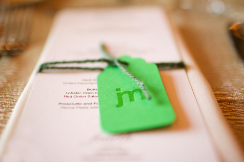
Golf-Theme-Wedding-Menu

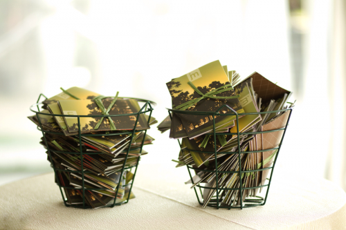
I decided to keep the ‘golf’ theme subtle, but brought in elements here and there — like using driving range golf ball baskets to hand out programs and for welcome baskets.

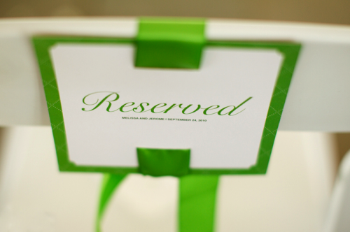
Golf-Theme-Wedding-Ceremony-Reserved-Seat-Sign

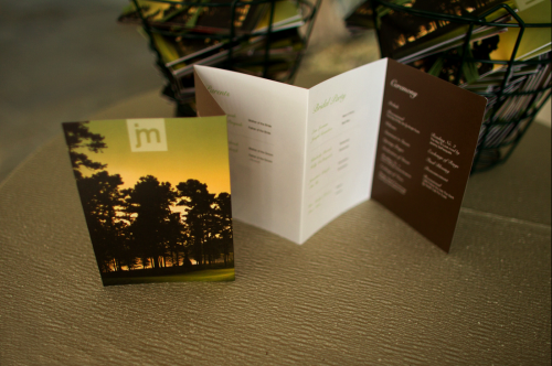
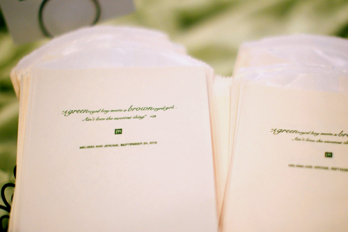
For the ceremony programs, I knew that I wanted to create an accordion fold, using photos from our engagement shoot on the back.  The cover of the program uses a portion of the golf course image I used on the invitation design.

Golf-Theme-Wedding-Ceremony-Programs

Golf-Theme-Wedding-Ceremony-Programs-Front

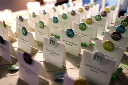
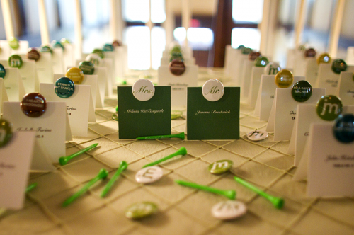
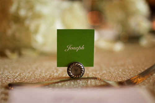
For the escort cards, I knew that buttons with phrases like “I’m a dance machine” or “Which way to the bar” would really lighten the mood.  It also gave me another opportunity to play off the bellyband on the invitation design, which had a die-cut circle show casing the logo.

Golf-Theme-Wedding-Escort-Cards2

Golf-Theme-Wedding-Escort-Cards

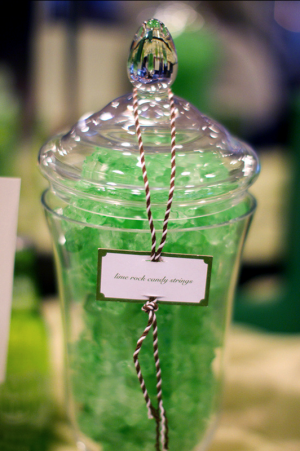
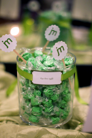
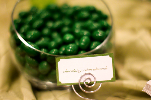
I had to have a green candy bar, no question!  It was just another great way to break up the heavy brown in the venue.  I knew the decision to have a candy bar meant extra work to create the labels, but in the end the candy bar created a great display of color.  It also gave me a great excuse to bring in the quote on the candy bags.

Golf-Theme-Wedding-Candy-Bar-Bags

Golf-Theme-Wedding-Candy-Bar2 Golf-Theme-Wedding-Candy-Bar

Golf-Theme-Wedding-Candy-Bar3

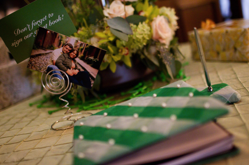
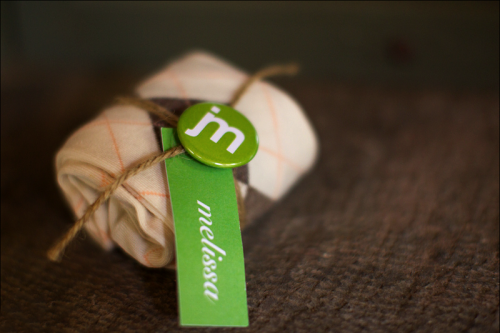
We played to the argyle as much as possible.  The guestbook exterior used a more pronounced green and white pattern, where as the cake used a more subtle pattern bringing the argyle influence through texture.  For the rehearsal dinner, we used socks as place cards – which was a great way to give our family and everyone in the party just a little something extra to remember the day.

Golf-Theme-Wedding-Guestbook

Golf-Theme-Wedding-Sock-Favors

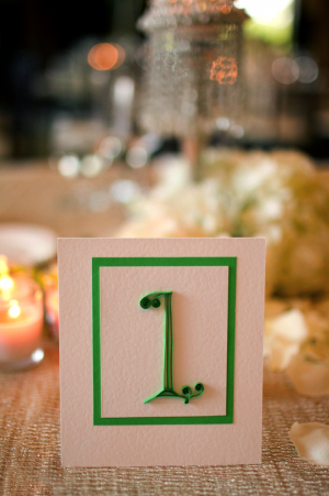
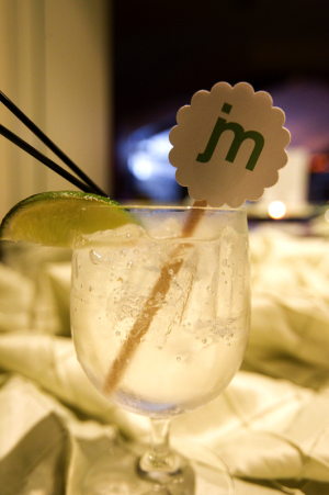
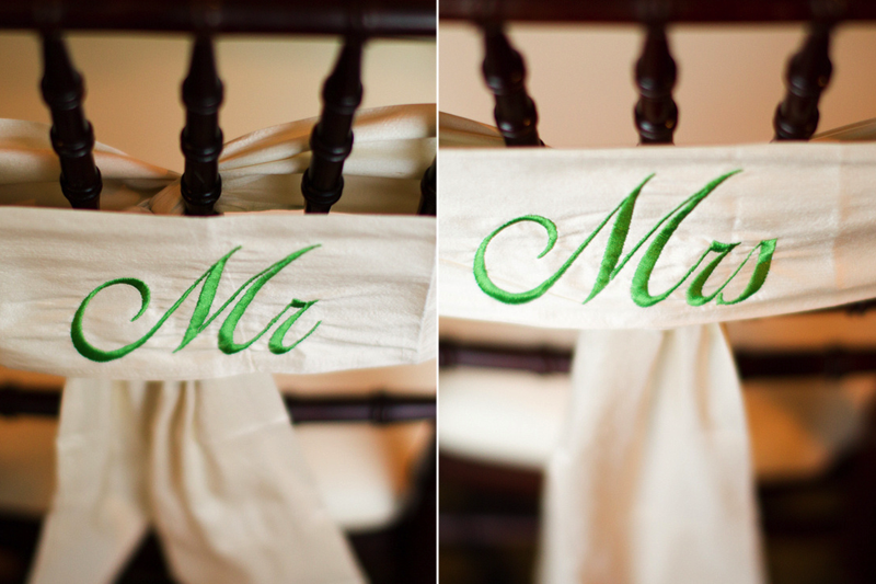
We wanted to create a very modern feel with a lot of these elements—while still being elegant.  The table numbers, which are quilled, really gave a playful feel to each table.  In the end, I think all the little touches—like the drink stir sticks, chair sashes and labels really made for a unique experience.

Golf-Theme-Wedding-Quilled-Table-Numbers Golf-Theme-Wedding-Drink-Stir-Stick

Golf-Theme-Wedding-Place-Cards

Golf-Theme-Wedding-Chair-Sash

Melissa was responsible for the design for all of the details in her wedding, but she was kind enough to provide a list of the different production resources that she used for other couples looking for something similar for their own wedding.  Thanks Melissa!

Stir Sticks: Lemon and Lavender
Quilled Table Numbers: Paper Daisy Card Design
Candy Bags and Chair Sashes: Bella Bride Designs
Buttons: Not Made in China
Guestbook: To Have and To Hold
Ceremony Programs: UniqueActive
Letterpress Hang Tags: Sideshow Press

{image credits: Joe Elario Photography}