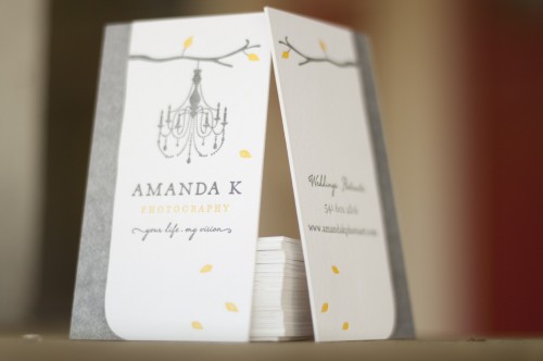
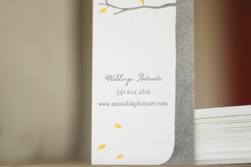
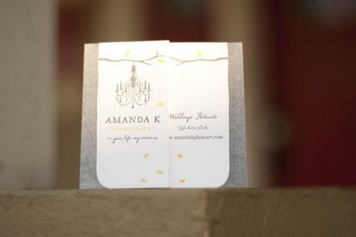
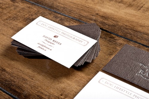
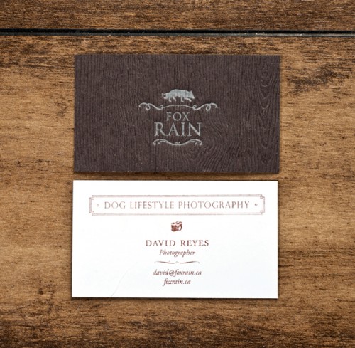
As promised, I’m back with a couple more stunning business card designs! Â First up, Matthew from A Fine Press created these lovely, rustic business cards for Amanda K Photography…
From Matthew:  Amanda brought me the branding that the amazing Jane Johnson did for her and asked me to help her realize this beautiful branding as a show-stopping business card. These are printed on both sides in two colors on Crane’s 220# Flourescent White Lettra. There’s a little bit of saltiness in the ink of the tree that, in my mind, brings just the right amount of rustic texture.
Photo Credit: Matthew Wengard | A Fine Press
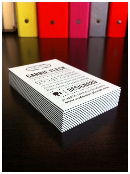
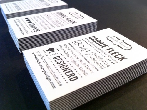
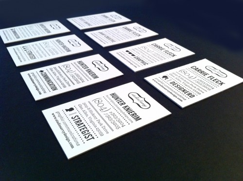
Next up, Carrie from studioSavvy sent over her super-fabulous business cards. Â I’m loving the crisp black and white of the layered paper stocks (more on that below) and the mix of complementary icons used by Carrie and her business partner…
From Carrie: The cards were printed on a privately-owned letterpress by a friend of a friend. Â We used 92# Reich Savoy for the top and bottom layers, and I had him sandwich in a 100# cover sheet of French Paper’s pop-tone in black licorice. Â Overall there are 8 cards involving 4 complimentary sets of icons for my business partner and me.
Photo Credit: studioSavvy
*A Fine Press is one of my fabulous sponsors; for more on my editorial policies, please click here.

