Lisa + Brian’s Modern Foodie Wedding Invitations

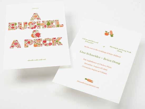
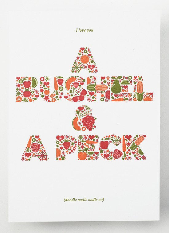
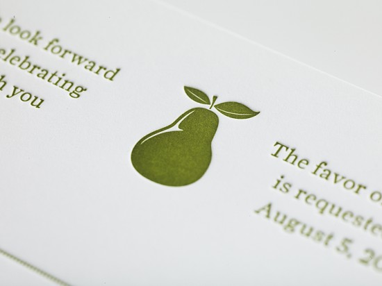
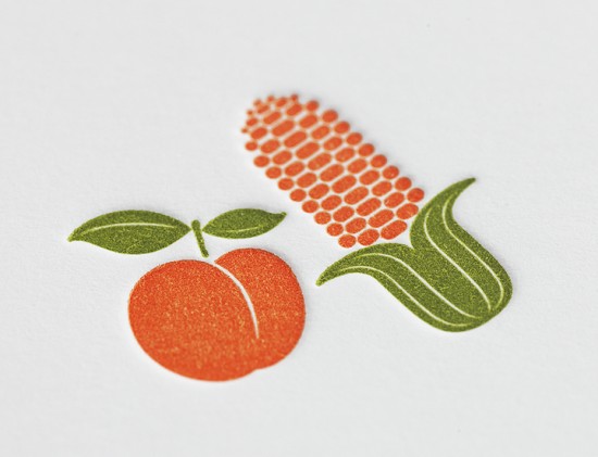
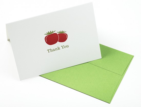
I love seeing all of the creative ideas and concepts that designers use to create wedding invitations.  The immensely talented Jordan and Jason of Enormous Champion sent over these beautiful letterpress wedding invitations that they created for friends getting married later this summer.  Jason and Jordan combined two of the couple’s big loves – food and Doris Day – into a truly unique modern invitation suite.

Enormous-Champion-Modern-Foodie-Letterpress-Wedding-Invitations

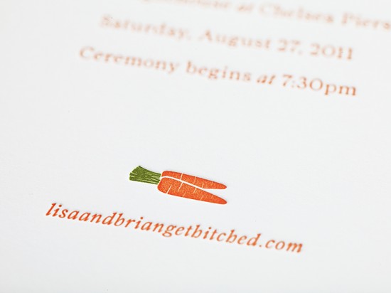
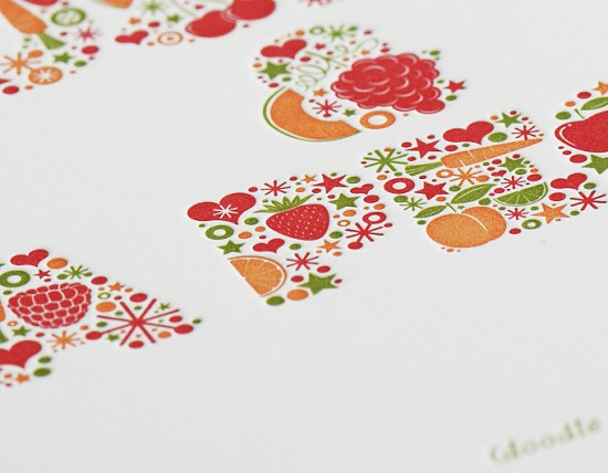
From Jason and Jordan: Our good friends Lisa & Brian are getting married later this summer… and we love them a bushel and a peck.  We recently completed a 3-color letterpress invitation suite printed on Neenah Classic Crest 165 lbs Solar White paper.  When they asked us to create their wedding invitation, the one thing they requested was an art piece (based on our All Good Things) to accompany the information portion of the invitation as a memento to their invited guests.  Lisa and Brian are life long foodies and Doris Day enthusiasts, the line comes from a song in musical Guys & Dolls and the letterforms are made up of fruits, veggies and a whole lotta love.

Enormous-Champion-Modern-Foodie-Letterpress-Wedding-Invitations

Enormous-Champion-Modern-Foodie-Letterpress-Wedding-Invitations

Enormous-Champion-Modern-Foodie-Letterpress-Wedding-Invitations

Enormous-Champion-Modern-Foodie-Letterpress-Wedding-Invitations

Enormous-Champion-Modern-Foodie-Letterpress-Wedding-Invitations

Enormous-Champion-Modern-Foodie-Letterpress-Wedding-Invitations

So awesome!  Check out more from Enormous Champion right here – thanks Jordan and Jason!

Photo Credits: Enormous Champion

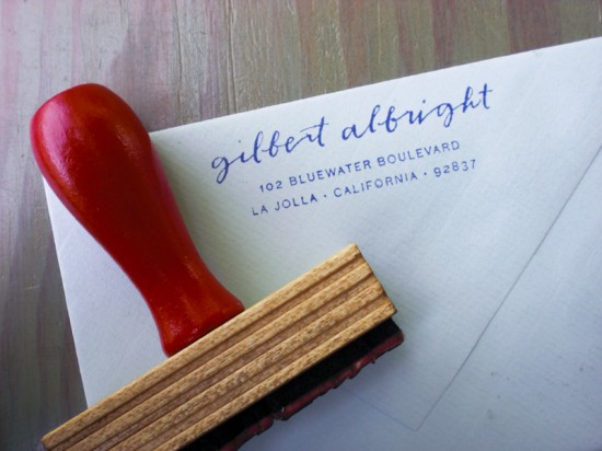
Fawnsberg Calligraphy Return Address Rubber Stamp

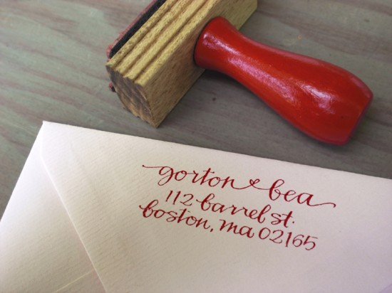
It’s been a little over a year since the ladies of Primele introduced their beautiful calligraphy return address stamps, and just a couple of months ago they premiered their new stationery line, Fawnsberg, at the National Stationery Show.  The return address stamps are now available in the Fawnsberg shop, and to celebrate the occasion the ladies have updated the stamp construction with a pretty red hardwood handle – and they’ve added some lovely new styles to the collection!

Fawnsberg-Calligraphy-Rubber-Address-Stamp

Fawnsberg-Calligraphy-Rubber-Address-Stamp

Fawnsberg-Calligraphy-Rubber-Address-Stamp

So pretty – check out all of the designs right here!  Thanks Patricia and Rachel!

Photo Credits: Fawnsberg

Summer Giveaway with Moontree Letterpress

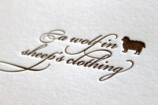
It’s Mon­day, which means that it’s time for another install­ment of our sum­mer con­test series with Moon­tree Let­ter­press!  In case you missed it the first time, here’s a bit of back­ground on the con­test and how to enter.  This week we’re switching things up a bit and the winner with the best six word story will receive 100 let­ter­press calling cards.  This week’s theme is “A Wolf in Sheep’s Clothing” – feel free to leave mul­ti­ple comments/entries, and don’t be afraid to get creative!

You’ll have until 11:59 p.m. EST on Tues­day to leave your entry in the com­ments below, then Rebecca will announce the win­ner on her blog on Wednes­day!  And just in case you need some inspi­ra­tion, you can check out these six word auto­bi­ogra­phies.  Bonne chance!

Photo Credit: Moon­tree Letterpress

Jennifer + Blake’s Sunny Yellow and Blind Deboss Wedding Invitations

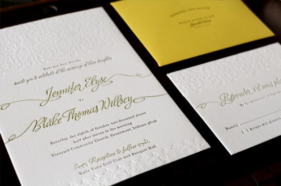
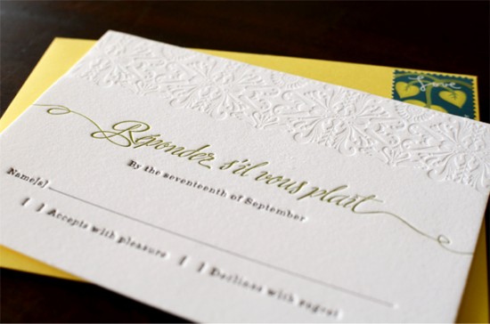
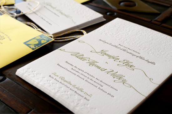
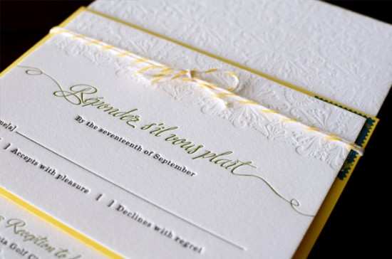
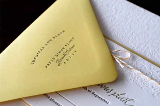
I spotted these sophisticated, yet modern, yellow wedding invitations on designer Sarah Rusin‘s blog, Ten Lines Pica.  Sarah created the invitation suite for an adorable couple, Jenni and Blake, and of course wanted the invitations to reflect their sunny personalities.  Sarah incorporated two beautiful fonts – one script and one serif – and a gorgeous blind (no-ink) pattern, and I absolutely love the resulting invitation design!

yellow-blind-deboss-letterpress-wedding-invitations

From Sarah: The couple, Jenni and Blake, are adorable and sunny and I think the final invitation captured their spirit perfectly.  Jenni wanted them to be sophisticated and a bit traditional but with some personality.  I designed a pattern for a blind deboss to give them a little extra visual interest.  I used two of my favorite typefaces, Ministry by Ale Paul and Eames from House Industries.  They were printed onto 110# Crane cotton paper.  I used Baker’s twine to keep them together; I felt like it suited the style really well and was extremely budget-friendly.

yellow-blind-deboss-letterpress-wedding-invitations-rsvp

yellow-blind-deboss-letterpress-wedding-invitations

yellow-blind-deboss-letterpress-wedding-invitations-rsvp

yellow-blind-deboss-letterpress-wedding-invitations-envelope

So pretty!  Thanks Sarah!

Photo Credits: Sarah Rusin Graphic Design

{happy weekend!}

Happy Friday everyone!  I feel like I’ve spent most of this week in daydream land, making plans for all of the things that I want to do with my husband when he comes back home in just a few weeks.  Most of them happen to involve food, since my husband has been living on terrible cafeteria food for the last six months.  And I think there should be at least one cake waiting for him when he comes home, don’t you agree?  Anyway, right now I’m looking forward to hanging out with one of my favorite girls tonight, but in the meantime…

Fireflies

…a few links for your weekend!

This week on Oh So Beautiful Paper:

That’s it for me this week!  I hope you all have a wonderful weekend, and I’ll see you back here on Monday! xoxo

Photo Credit: Amber Nyman via Paper Schmaper