Crafty Bastards 2011

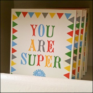
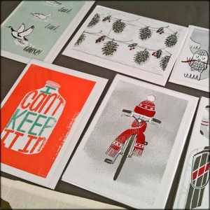
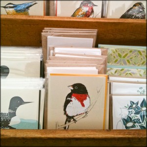
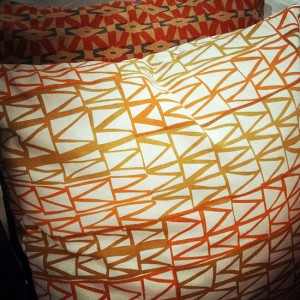
We had a cold and rainy weekend here in DC, but that didn’t stop folks from heading out to Crafty Bastards on Saturday – the fair was packed!  This year’s fair was packed full of exhibitors from as far away as Washington state, Ohio, Boston, Georgia, and everywhere else in between.  I managed to sneak in a few pictures even while trying to dodge the rain, so today I thought I’d share a few favorites from this year!


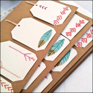
New House Project was probably my favorite from the whole fair.  I loved everything from the hand watercolor painted postcards to the embroidered gift tags.  So pretty!


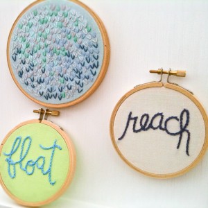
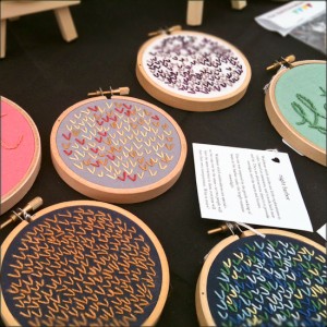
I also love these embroidery pieces from Merriweather Council.  The little hearts are sweet, and she also has embroidered pendant necklaces!

  
Figs-Ginger-Crafty-Bastards

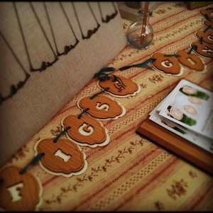
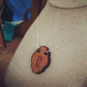
I always love the delicate jewelry from Figs + Ginger – the new initial pendants and silhouette designs are just beautiful.


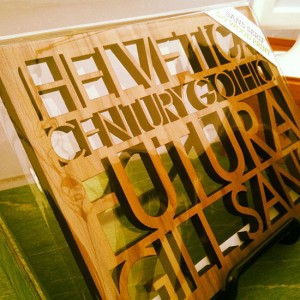
These serif and sans-serif wood lasercuts from Pepper Sprouts were another favorite from the fair


Amazing woodblock prints from Tugboat Printshop (left), and cute cards and rubber stamp sets from Small Talk Studio (right)


Fun screen printed cards and prints from Slide Sideways


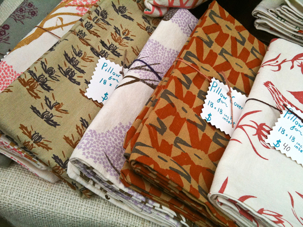
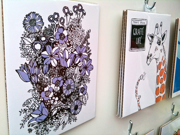
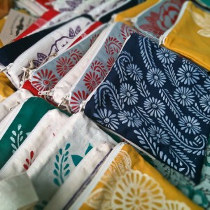
I couldn’t get enough of these beautiful illustrated cards and gorgeous textiles from Sara Lee Parker

More gorgeous prints from Brainstorm Print + Design


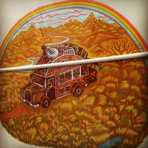
Awesome illustrated posters by Nate Duval


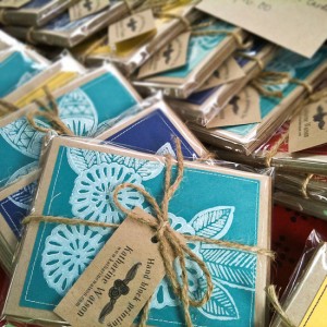
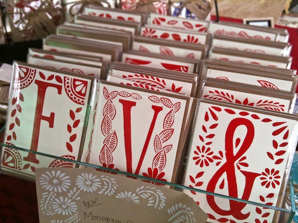
Last, but definitely not least – block printed cards and textiles, including some fun new monogram cards, by local artist Katharine Watson

Those were some of my favorites!  I’d love to hear what you think!

Photo Credits: Nole Garey for Oh So Beautiful Paper

Alecia + Jon’s Black, White, and Neon Graphic Wedding Invitations

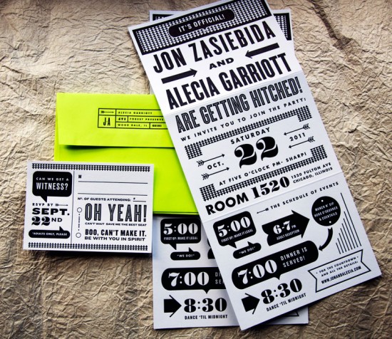
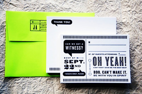
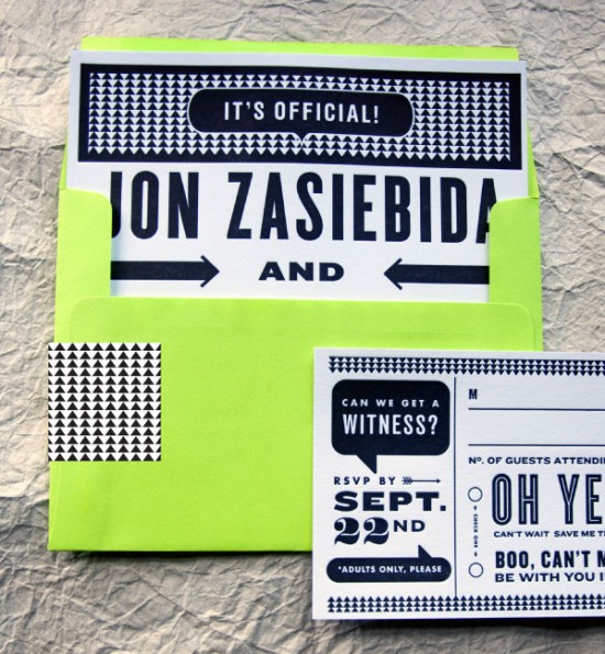
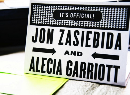
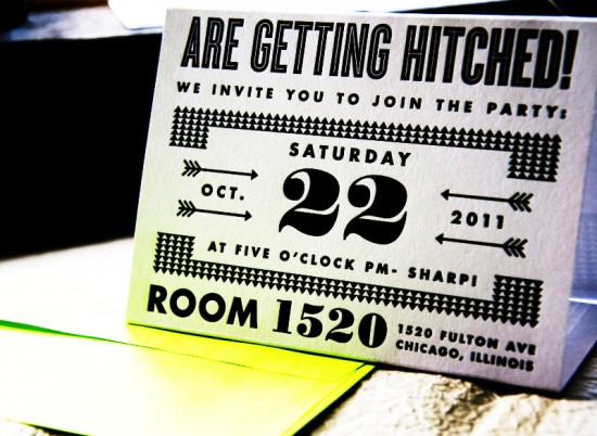
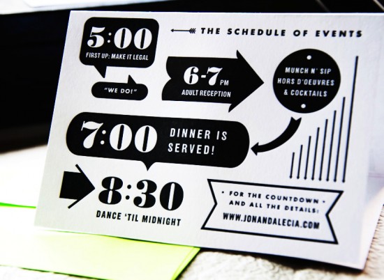
Happy Monday everyone!  We’re starting the week with another fabulous set of wedding invitations from Kate Gabriel of Wit + Delight.  Alecia and Jon wanted modern and funky invitations for their upcoming Chicago loft wedding.  Kate designed these awesome graphic black and white wedding invitations, then incorporated a bright (almost neon!) chartreuse green envelope for a bold pop of color.  Awesome!

From Kate: Jon and Alecia are planning a color-filled event in a downtown Chicago loft.  They wanted the invites to be bold and funky with a lot of their personality coming through.  They wanted letterpress invitations without breaking the bank, so we chose to print with black ink and use a bright chartreuse for the envelopes.  The graphic nature of the design really reflects their style and attitude.  I love the way we incorporated fun language in the word bubbles.

The main invitation was scored in two places and could be folded into a triangle shape to sit on a desk or console as an event reminder!  So cool!

Thanks Kate!

Design: Kate Gabriel

Letterpress Printing: Studio on Fire

Photo Credits: Kate Gabriel | Wit + Delight

{happy weekend!}

Happy Friday everyone!  I’m super excited for this weekend – tomorrow is Crafty Bastards, the DC area’s biggest craft fair!  Is anyone going?  I go every year and always have the best time wandering all the different booths at the show.  I can’t wait!  But in the meantime…


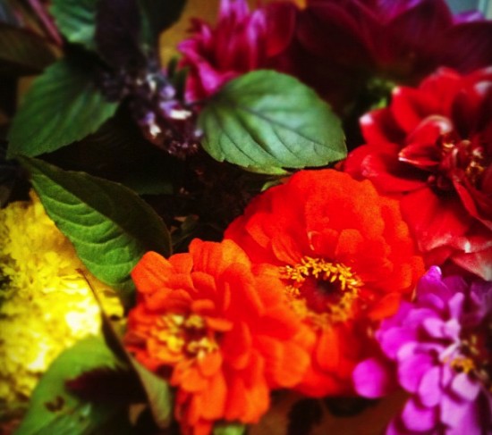
Photo by me.  A few fall flowers and some fresh basil that I picked up at the farmer’s market yesterday. The basil is such a lovely addition to the bouquet!

…a few links for your weekend!

I’m also super excited to announce that the lovely Jackie of 42 Pressed is celebrating her return from maternity leave (you might remember their adorable baby shower invitations) with a fun promotion!  Jackie is offering free save the dates to couples who order their wedding invitation suite from 42 Pressed.  Just enter code RILEYKICKOFF when ordering!

This week on Oh So Beautiful Paper:

Welcome to the newest members of the Designer Rolodex!

That’s it for me this week!  I hope you all have a wonderful weekend, and I’ll see you back here on Monday! xoxo

Amy + Patrick’s Wedding Ceremony Program Fans

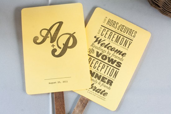
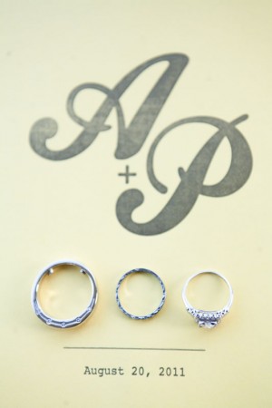
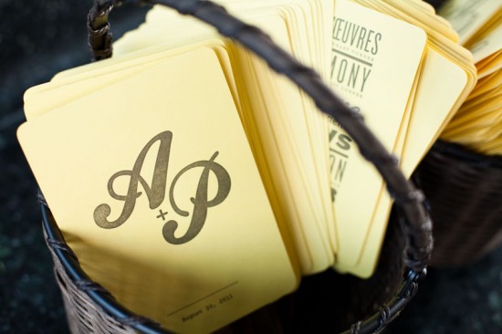
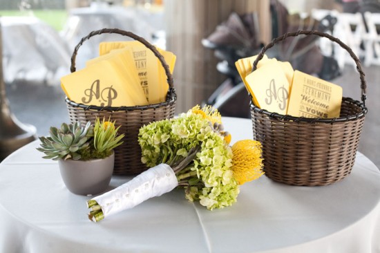
As much as I adore wedding invitations, I love it when couples put some thought and energy into their day-of stationery.  Designer and letterpress printer Stephanie Laursen sent over these fun ceremony programs that she created for recent clients Amy and Patrick.  Stephanie incorporated the wedding color palette of yellow and gray along with the bride’s love of antique wood type into a clean yet vintage-inspired design.

From Stephanie: Amy & Patrick wanted a low key wedding, with sunny pops of yellow and cool gray hues.  They wanted a hand-printed program to give to guests, both as a functional piece to be used at the event, and as something to take home to remember the day.  Amy loves blocks of type, and mixtures of different fonts, and wanted the program to have a vintage wood type feel.


Thanks Stephanie!

Photo Credits: Azuree Wiitala

{today I love…}

This little round up is kind of random, but I thought I’d just share a few of the pretty paper goodies that have caught my eye recently.  Enjoy!

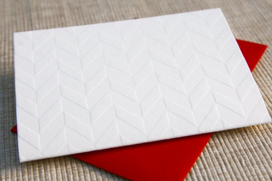
Beautiful blind deboss chevron notecards from Maida Vale

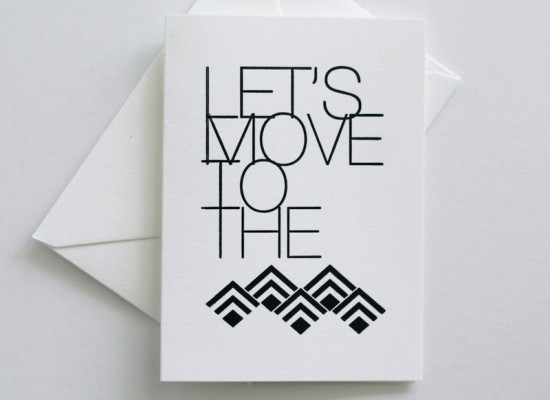
Let’s move to the mountains from In Haus Press


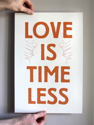
A lovely new print from Dapper Paper

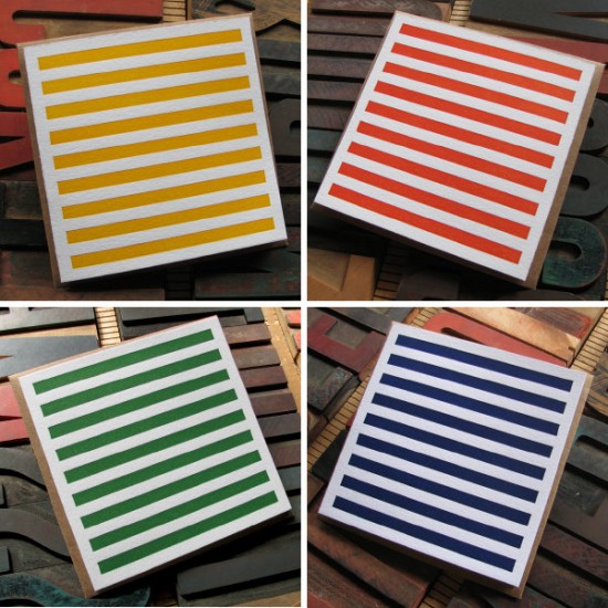
Letterpress notecards in a classic stripe pattern from Sixpenny Press

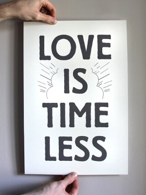
Such a cute poster from Steel Petal Press – wouldn’t this be perfect for a child’s bedroom?
{images via their respective sources}