Illustration by Emily McDowell for Oh So Beautiful Paper
Dear Emily,Â
I was sketching out booth designs for the National Stationery Show and had a few questions (see below!)
xoxo, Sarah
1. Do you find it helpful to label the card category (eg Birthday, Thank You) above/near the cards?
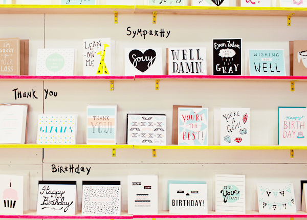
The Paper Cub uses their own signature lettering in a larger size, making it well branded and easy to read!
Labeling cards by category is a great idea, but make sure it integrates well into your booth. It should be well branded with the rest of your booth design, not a messy/half-done afterthought. These labels are your table of contents, and act as your megaphone (Hey! These are the cards/accessories I sell! Come in for a closer look) so use type that’s large enough to read if I’m standing in the aisle. Also, don’t feel constricted to the normal categories. Birthday, Thank You, Baby, Wedding, Sympathy are all important, but if you have an unusual category let us know what you call it, that can start a conversation. If you don’t create cards in traditional categories, think of this as a reminder to highlight or embolden your line in smaller sub-groups, so that buyers can view it in bite-size chunks.
2. I have never highlighted what is new and what is a best seller, but I found I was constantly pointing them out to buyers. Is it helpful for buyers to see this or is it a better idea to highlight these categories in their own section?Â
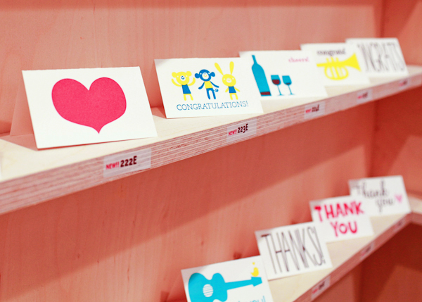
Fugu Fugu Press highlights new additions on their stickers with a different color, the perfect visual cue to buyers.
It’s a good idea to highlight new and best seller cards for obvious reasons, but I would be careful that these tags don’t become visual clutter. I like little flags/stickers that note new cards cards because this shows you’re coming up with fresh content. Noting “best sellers” may be smart, if you’ve done a significant volume of sales. But if you’ve never sold wholesale before, or only have a few stockists, it may be a subjective/possibly irrelevant distinction to the buyers you meet at the Stationery Show. By telling me what a best seller is, you’re giving a recommendation, so make sure you’re confident. I would always recommend a small sticker or flag next to the card, rather than creating a whole section to note new or best sellers. A mailer or email is a great way to send me a visual of all new cards, but at the Stationery Show, I want to see all of your birthday cards together, because I’m comparing them against each other to make my selections.
3. A lot of exhibitors are taking orders digitally. I still love writing out an order and feel like too much can go wrong at the Javits (wonky wifi, computer error), etc. As a buyer, do you like leaving a booth with a physical piece of paper/receipt, or are you happy with an emailed order? Or does it really matter as long as we take the order quickly and correctly?
It doesn’t really matter. Do the system you’re most comfortable with and do it well. I don’t care if you give me paper that I throw away, I do care if you lose my order. If you are doing digital orders, I would suggest sending an email confirmation asap. I’m making a lot of orders and I don’t remember what I ordered a day later, especially if there’s no physical record, this can lead to confusion a month later when my order arrives. If you are taking the order by hand, do your best to make it clear. Many of the paper orders I get are so messy, I can’t tell what I’ve ordered based on what vendors write down. Which ever way you do it, get it to the retailer clearly and as quickly as possible. (If you do go digital, it’s probably not a bad idea to have a backup system, just in case!)
4. Show Specials – I remember you asking me if I had one last year (I did not) and you were trying to maximize specials at the show and would order from me after if I didn’t have one (and you did!). I am thinking of offering one this year as I think it would help with not only new orders, but re-orders. We have been talking about this on the Tradeshow Bootcamp forum on Facebook and we all seem to agree they are a good thing!
I just think show specials are smart. They are a marketing tool. They serve as: 1) a nice way to say “hey, this is a special time, thanks for coming out!” 2) a good incentive for a buyer who is on the fence about placing an order at the show, or 3) A great way to make existing retailers take their credit card out again. If I know I’ll be buying from you later in the year, I’ll certainly do it now with financial incentive. I talked about show specials in this post, but essentially, I think there are two smart specials: 1) Free shipping 2) A percentage off or free product for buying a little more. How do you decide what this should be? Look at your average order – is it $200, then make the incentive 10% off for orders over $250; or order $250 and get $25 in free product; or order 12 dozen cards get 6 cards free. In other words, you’re giving me a benefit, while giving me the incentive to order a little more than I might normally. Different incentives will appeal to different retailers. If you have a handful you trust, why not ask them now what they’d respond to at the show? (I would love to know some of the ideas that you’ve discussed in Tradeshow Bootcamp!)
5. I would love to hear if you have further thoughts on how booths are laid out and what you, as a buyer, find helpful when you have a million booths to see and what makes shopping a breeze!
Well, since you asked, I do have a few:
- I would really encourage sellers to display their cards without sleeves this year. I know you run the risk of getting them damaged, but it just looks so much better.
- Please make your booth numbers easy to read. Consider a nice, bold font that can been seen from at least several booths away.
- Showcase your work. To me, this means framing your prints and showing your accessories in use. Your booth is a mini-shop, merchandise it!
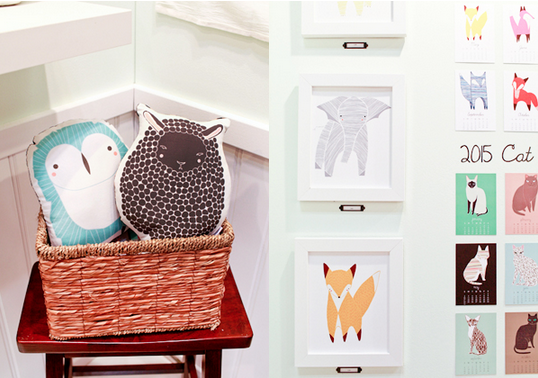
Gingiber’s pillows are stuffed and cozy and her prints are framed so you can picture them on your walls.
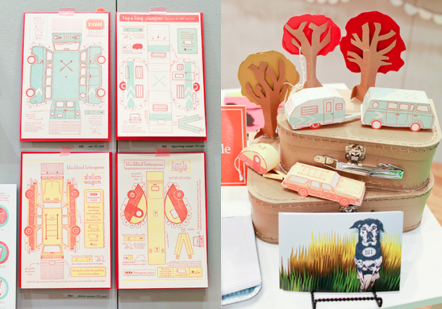
I think we can all agree, it’s helpful to see the Blackbird Letterpress 3D cut + fold vehicles when they’re actually put together.
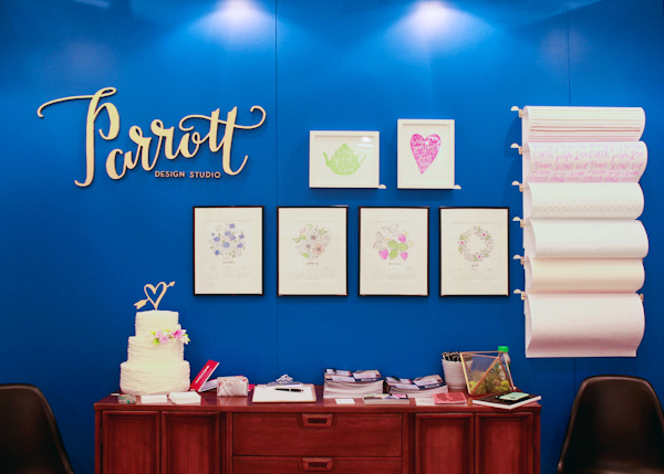
- Find a place for calm within your booth: Maybe it’s one wall with just your name or a large counter with nothing on it. In a day, I see thousands of cards, prints and accessories. My eyes are exhausted. Smart blank spaces will stand out more than anything. Your deep blue wall from the Stationery Show last year is a great example of this:
- Finally, do that thing you’re excited about and a little afraid of doing. You know your line and your aesthetic better than anyone else. When in doubt, when you’re sleep deprived and questioning everything, ask yourself: what you I best? What do I love doing? Then trust it. Add it in to your booth, or pump up an element that seems to be working. You’ll love it, and you’ll be memorable because of it.
All images swiped from Nole’s prior National Stationery Show recaps. They’re great, I’d totally suggest perusing them now. See you in a few weeks!
xo Emily

