Best of 2011: Jaime + Anthony’s Modern Woodgrain Wedding Invitations

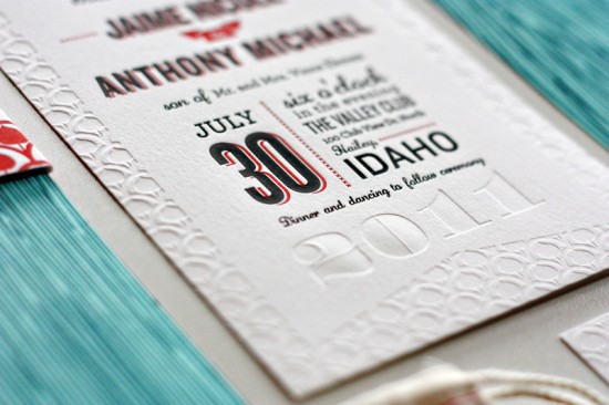
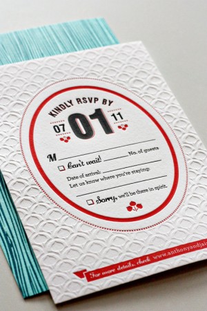
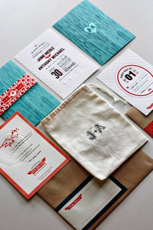
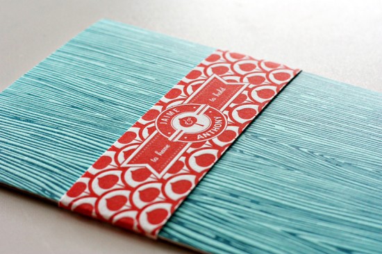
I love texture in wedding invitations; it’s one of the reasons I’m drawn to letterpress printing overall, and I particularly love blind impression (no ink) elements in letterpress cards and invitations.  Jaime and Anthony’s mountain wedding invitations by designer Kate Holgate are full of beautiful texture, from the woodgrain enclosures to the muslin bags (in lieu of traditional internal envelopes) to the beautiful blind impression details and patterns.  So very lovely.


Check out Jaime + Anthony’s wedding invitations right here!

Check out the Designer Rolodex for more tal­ented wed­ding invi­ta­tion design­ers and the real invi­ta­tions gallery for more wedding invitation ideas!

Photo Credits: Kate Holgate

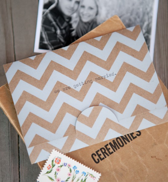
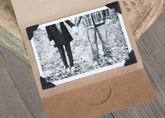
Best of 2011: Laura’s Chevron Stripe + Kraft Save the Dates

These save the dates are both a personal favorite and easily one of the most popular features from 2011.  Laura from Lande & Maze created these lovely save the dates for her own wedding this past summer, combining screen printed chevron stripes with kraft paper and hand typed details for a unique and understated save the date with natural colors and beautiful texture.

Check out Laura’s chevron + kraft save the dates right here!

Photo Credits: Engagement photos by MNC Photography, product images by Becker Photography

Best of 2011: Neon Storybook Wedding Invitations

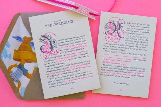
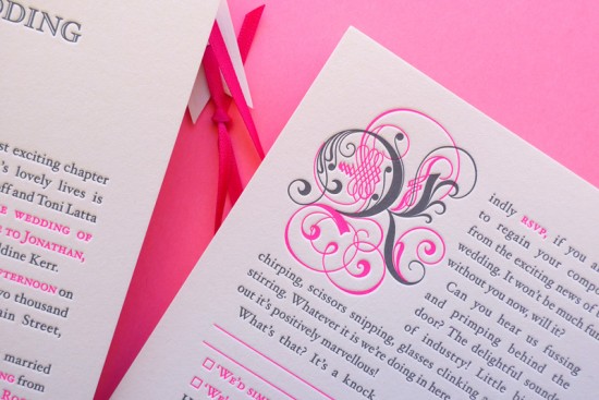
Since we’re on the subject of neon wedding invitations today, I thought I’d mention one additional wedding invitation suite that I actually didn’t have the chance to feature earlier in the year but is still incredibly awesome.  These fantastic storybook wedding invitations were created by Simon and Jenna of The Hungry Workshop in Australia and feature antique drop caps, a bookmark-inspired belly band, and of course bright neon pink details from the text to the matching ribbon.
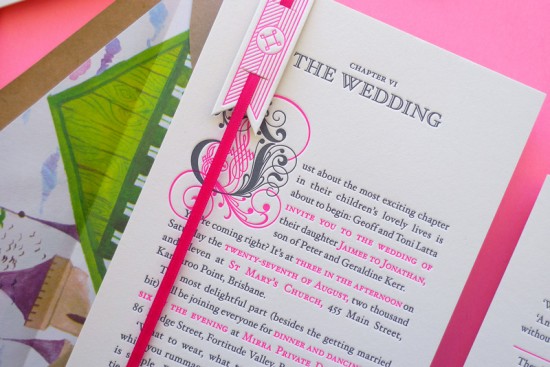
From The Hungry Workshop:  We tried to capture the personalities of Jaimee & JK throughout the invitation suite.  The quirky story we wrote (with a little help from a very talented friend) is brimming with character and printed in charcoal ink, with the details of the wedding highlighted in a neon pink accent colour.  Perhaps the most striking element is the vintage drop caps, circa 1682.  We found these in an old type specimen book which we carefully re-drew, and modernised by splitting them into two plates.
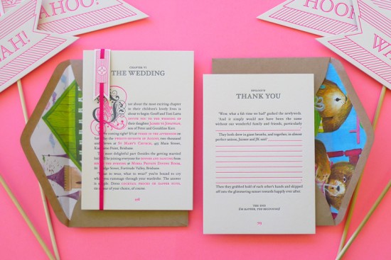
The invitation is accompanied by an RSVP postcard forming the second page of the story, with a return address letterpress printed on the back.  Both pages are lovingly wrapped up with a bookmark inspired vertical belly band and matching pink ribbon.
Check out more over on The Hungry Workshop!

Check out the Designer Rolodex for more tal­ented wed­ding invi­ta­tion design­ers and the real invi­ta­tions gallery for more wedding invitation ideas!

Photo Credits: The Hungry Workshop

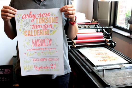
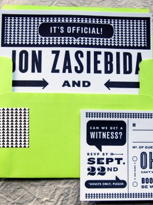
Best of 2011: Neon Wedding Invitations

2011 was a good year for neon – from Fig. 2’s collection of neon greeting cards to business cards and calendars to wedding invitations.  Today I’m highlighting two favorite wedding invitations that incorporated bright pops of neon, although in very different ways.  First up, the wedding invitations of Arley-Rose and Morgan from Ladyfingers Letterpress.  I fell in love with these gorgeous large format wedding invitations from the first moment I saw them, from the beautiful hand lettering to the cute “Bits of Knowledge” information booklet.

Check out Arley-Rose and Morgan’s wedding invitations right here!

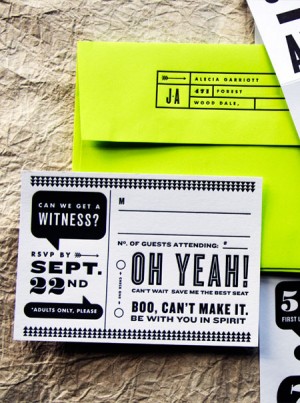
Next up, designer Kate Gabriel incorporated bright neon envelopes into Alecia + Jon’s graphic wedding invitations.  The colorful envelopes complemented the black and white invitation suite – perfect for a modern loft wedding!  In addition to the neon details, I love the fun word bubble details and the fact that these invitations could be folded into a triangle shape to sit on a desk or console.


Check out Alecia and Jon’s wedding invitations right here!

Check out the Designer Rolodex for more tal­ented wed­ding invi­ta­tion design­ers and the real invi­ta­tions gallery for more wedding invitation ideas!

Photo Credits: Ladyfingers Letterpress (Arley-Rose + Morgan); Kate Gabriel (Alecia + Jon)

Best of 2011: Christine + Ian’s Woodland Wedding Invitations

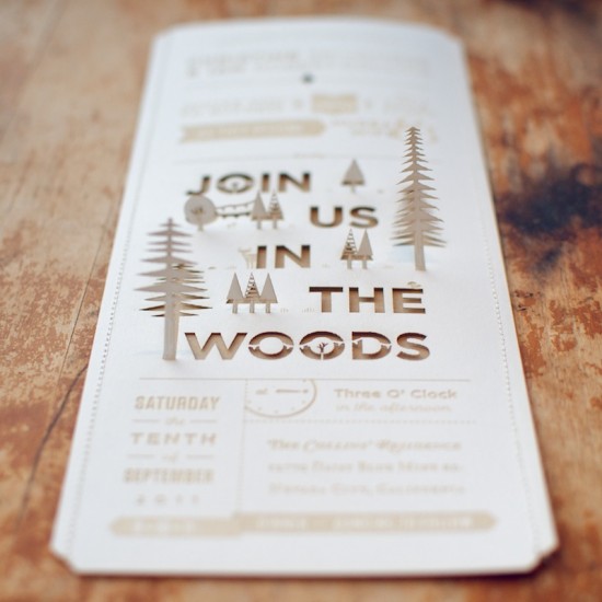
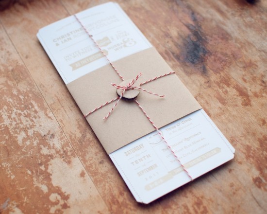
I’ll admit, it was realllly hard to come up with a list of favorite wedding invitations to highlight this year – there were so many amazing invitations!  But, as I was going through the posts from the last year, one clear frontrunner emerged – Christine and Ian’s amazing woodland wedding invitations.  After deciding on a wedding venue in the woods near Ian’s childhood home, Christine and Ian put an incredible amount of thought and creativity into their wedding invitations – from the amazing lasercut pop up details to the kraft paper enclosures (including a cool field guide with sketches of local wildlife).  Breathtaking!

See the rest of Christine and Ian’s wedding invitations right here!

Check out the Designer Rolodex for more tal­ented wed­ding invi­ta­tion design­ers and the real invi­ta­tions gallery for more wedding invitation ideas!

Photo Credits: Christine and Ian