60th Birthday Party Invitations

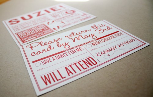
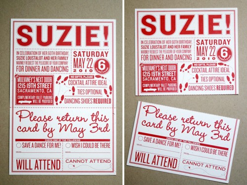
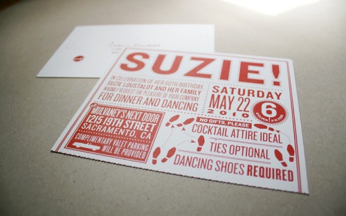
My friends over at M + E recently designed an invitation for a 60th birthday celebration.  The main invitation is full of exclamation points and dancing shoes to make sure guests arrive ready to boogie, and a perforated rsvp postcard at the bottom:

red and white 60th birthday party invitation perforated rsvp

red and white 60th birthday party invitation perforated rsvp

red and white 60th birthday party invitation

Seriously, how much fun are these?  Cocktail attire and dancing shoes? I bet this was one stylin’ party!  You can check out more from M + E here and here.  Thanks Mike!

{image credits: m + e}

Aleksandra + Scott’s Antique Wood Type Poster Wedding Invitations

Today’s real invitations come to us from Jen and Starshaped Press, one of my fantastic sponsors, and were printed using antique wood and metal type and ornaments – each of which are 50-100 years old!  In order to preserve these delicate materials Jen creates a gentle impression (known as a “kiss”) on each invitation, with a result that feels timeless and elegant.  For these invitations, Jen used antique type and ornaments for a poster-style invitation that evokes old-school Chicago.  Oh, and since today is Jen’s birthday (Happy Birthday Jen!), make sure you read all the way through for a special promotion that Jen is offering to Oh So Beautiful Paper readers!
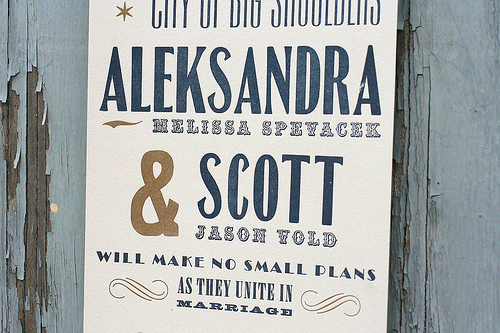
From Jen: The bride, Aleks, really wanted an invite that felt old-school Chicago, but from more of a working class, insider’s perspective.

They definitely wanted to use the quote from architect and urban planner Daniel Burnham on the front panel, as it felt appropriate to their marriage (make no small plans!).  The front panel was the visible element when the invitations were folded and inserted into the envelope.
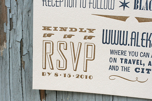
Since this was a Black Tie affair, we wanted to keep some formality to the invitation.  The colors were a more muted navy and gold with corresponding navy envelopes, while the antique typography kept the invitations grounded.
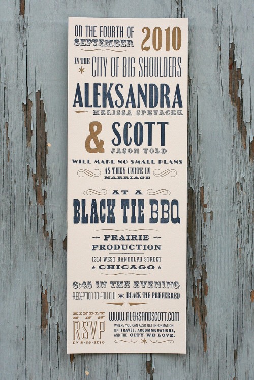
What I love about these invitations is that they really showcase a great mix of wood and metal type, and make the invitation more of a poster than a traditional invitation, even though we are still able to fold and mail it at the first class rate.  This particular style (from our Wanted! collection) can be customized through different colors and formats to resemble anything from a wild west poster to a carnival broadside. And much of the type we use probably printed both of those items 100 years ago!
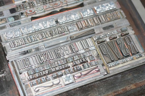
You can check out additional wedding invitation styles from Starshaped Press right here, as well as on their flickr page.  And as I mentioned above, to help celebrate her birthday, Jen is offering 10% off the Starshaped Press Wanted! wedding invitation collection to OSBP readers!  Just be sure to mention the code “Beautiful Paper” when you contact Jen to receive the discount.  Thanks Jen!

{image credits: starshaped press}

Bedroom Inspiration

I’m slowly working my way through my apartment, decorating room by room.  And since the living room and office are all mostly done (although I’m still on the hunt for the perfect desk for the office), I’m now starting to focus on the bedroom – and I’ve pulled a few of my favorite bedroom images (all from my tumblr page) to help figure out my next steps.


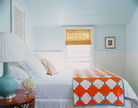
{house beautiful}

The room itself is pretty tiny, just enough room for our bed and a couple of dressers.  We have three windows, so the room gets plenty of light during the day, and we installed bamboo blinds like the ones above.


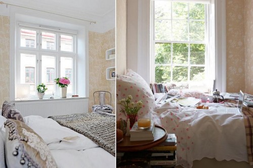
{left: alvhem makleri via desire to inspire; right: rita konig’s bedroom from t magazine}

Since the room isn’t very big, I’m focused on trying to make the space cozy and peaceful without being dark.  The walls were already painted a light beige color when we moved in, which in the absence of any other interesting features or architectural details feels a bit flat.  I really like the idea of at least one wall with some pattern, and I love (love, love) the soft floral details in the wallpaper from Rita Konig’s bedroom above.


{living etc.}

Or maybe just a bit of shimmer on one accent wall?  Perhaps on the wall behind the bed…


{light locations via desire to inspire}


{design sponge}

I love how the two bedrooms above still have masculine elements even with the floral and toile wallpaper.  Neither is quite what I have in mind, but I really like the darker accents incorporated into each room.


{laura resen via decorology via mary ruffle}

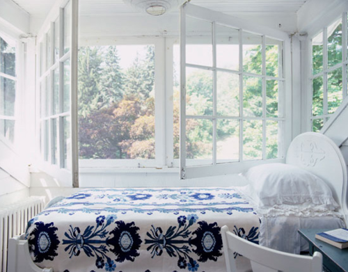
Sigh… my dream summer bedroom.  Preferably somewhere close to a beach!

{all images from their respective sources}

Sugar Paper – Modern Gray + White Baby Announcements

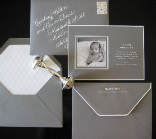
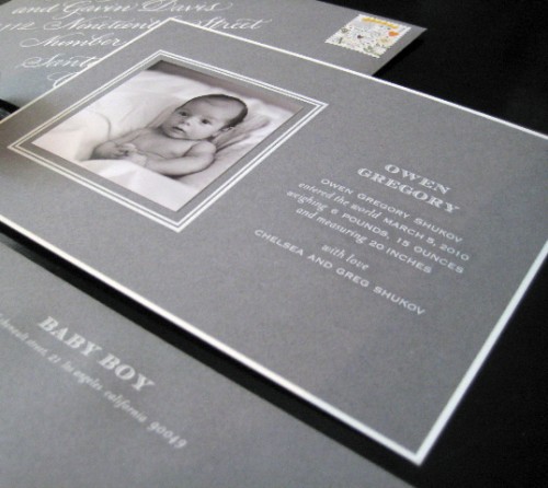
You might remember the modern baby shower for Chelsea from Sugar Paper that I featured back in February – Chelsea welcomed her beautiful son Owen in early March, and today I’m thrilled to share Owen’s baby announcements!

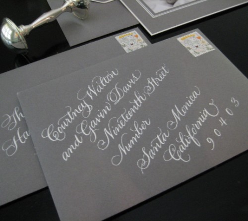
In designing the announcements, Chelsea used one of Sugar Paper’s custom papers in “smoke” with white engraved text and an envelope liner with a silver foil diamond pattern.  Lisa Holtzman created the gorgeous calligraphy, also in white text to complement the engraved text of the baby announcement.   The entire suite is just stunning – simple and modern, yet totally luxurious.  Thanks so much Chelsea – and congratulations!

{image credits: sugar paper}