Eve + Mike’s Metallic Silver New Year’s Eve Wedding Invitations

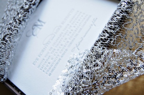
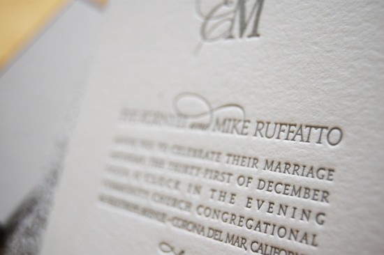
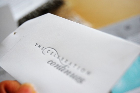
These wedding invitations from Wiley Valentine mix classic design with a bit of sparkle.  Rachelle and Emily created these letterpress invitations for a New Year’s Eve wedding, pairing classic silver ink and edge painting with embellished packaging and a sparkly fabric wrap – perfect for a winter wedding!

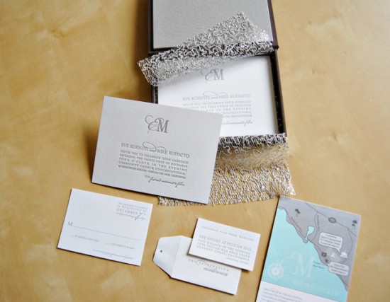
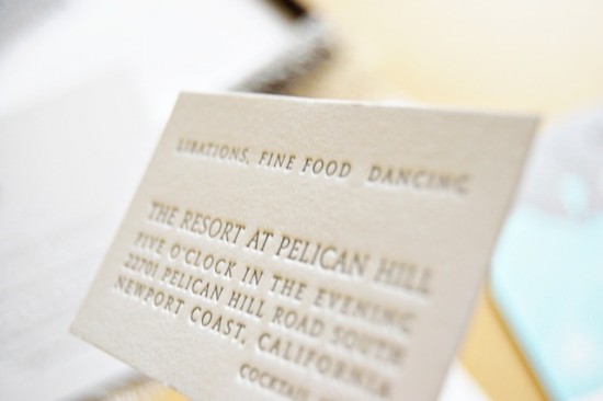
From Rachelle at Wiley Valentine: Eve and Mike’s wedding invitations were letterpress printed by hand with silver edge painting.  The invitation suite includes a custom map and a tiny reception card that fit inside a coin envelope.  The groom preferred simple and classic design while the bride really wanted some bling, so we added some fabulous silver fabric as a wrap inside the invitation.

The bride really wanted something special to arrive in the mail.  The presentation was really important to her, so we had custom cloth covered boxes made with her charcoal and silver color palette.  The inside silver fabric wrap was also used as table runners at the wedding.

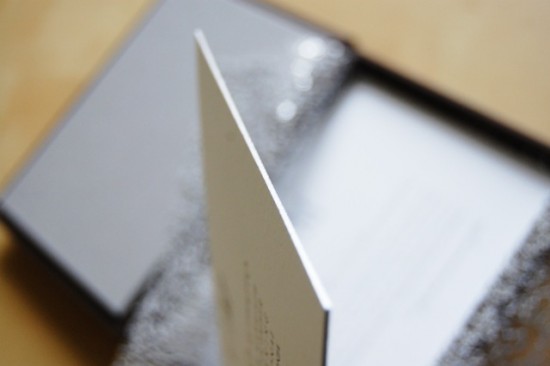
We kept the design of the pieces classic with clean fonts and a bold monogram using their first initials, all letterpress printed on white white cotton paper in silver ink.  Silver edge painting added a bit of sparkle.

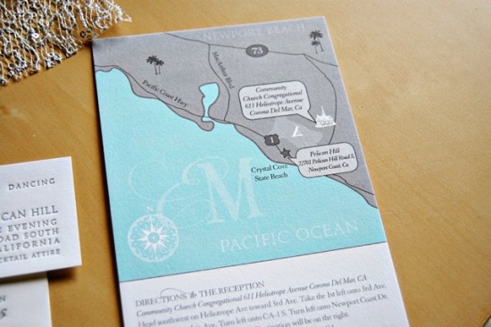
The tiny reception card was tucked inside a letterpress envelope adorned with a single Swarovski crystal.  We created a digitally-printed hand drawn map to let guests know the location of the ceremony and the reception.

Thanks Rachelle and Emily!

Wiley Valentine is a member of the Designer Rolodex – check out more of their beautiful work right here or visit the real invi­ta­tions gallery for more wedding invitation ideas!

Photo Credits: Wiley Valentine

Catherine + Ted’s Modern and Rustic Faux Bois Wedding Invitations

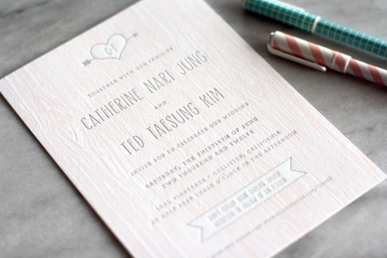
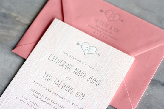
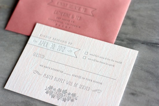
Sarah from Truly Smitten sent over these beautiful invitations that she designed for a friend’s wedding this summer, incorporating a sophisticated faux bois pattern and playful typography for a modern take on rustic wedding invitations.  Sarah worked with Kseniya from Thomas Printers to letterpress print the entire invitation suite, including the adorable RSVP card and envelopes.

From Sarah: I had the honor of designing a dear friend’s wedding invitation suite for this summer.  Catherine and Ted are having their wedding at a rustic vineyard in California with lots of elements of wood and nature.

I incorporated the faux bois woodgrain style and chose a more whimsical, informal typography style since I wanted to reflect the couple’s fun, laid back personalities.  The wedding suite was letterpress printed by Thomas Printers on Crane’s Flourescent White Lettra. 

Thanks so much Sarah!

Design: Truly Smitten

Letterpress Printing: Thomas Printers

Check out the Designer Rolodex for more tal­ented wed­ding invi­ta­tion design­ers and the real invi­ta­tions gallery for more wedding invitation ideas!

Photo Credits: Truly Smitten

*Thomas Printers is a sponsor of Oh So Beautiful Paper

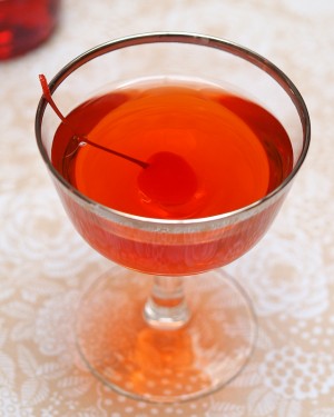
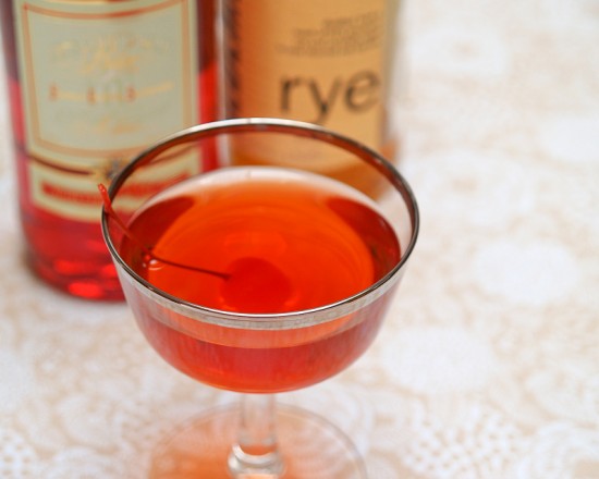
Friday Happy Hour: The Boulevardier (aka: The Bittersweet Manhattan)

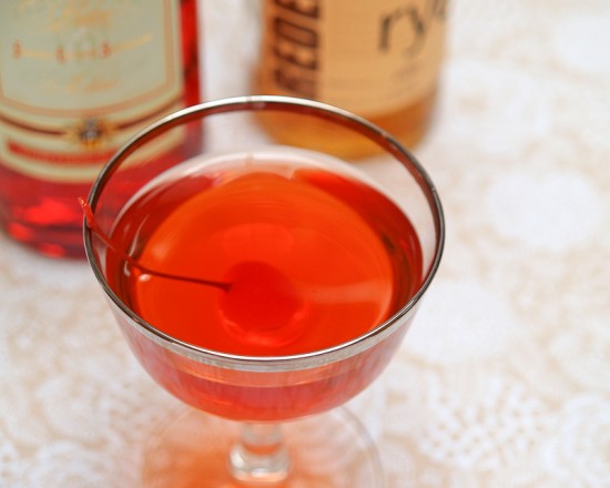
I am not the biggest fan of the Manhattan.  This is something of a terrible secret to confess in the world of cocktail aficionados.  The Manhattan is as classic a cocktail as they come; it’s a quintessentially masculine cocktail.  But it’s a little too rich for my taste.  So, I played around until I found a version I loved, which I dubbed the Bittersweet Manhattan.  Except it’s hard to invent anything truly new in the world of cocktails, and I found out that my recipe goes back at least to the 1920s as the Boulevardier.  Oh well.  It’s delicious no matter what you call it.

Read below for the full recipe!

The Boulevardier

2 oz Rye Whiskey
1/2 oz Sweet Vermouth
1/2 oz Campari
2 Dashes Bitters (optional)

Combine the ingredients and stir well with ice, then strain into a chilled cocktail glass or serve with an ample lump of ice.  Garnish with a lemon twist and enjoy.


A Manhattan, made with Rye, sweet vermouth, and bitters, is rich, spicy and oaky, sweet and sharp, icy cold and warming at the same time.  A Boulevardier is a Manhattan made with Campari – a very bitter Italian liqueur – in place of some of the vermouth, and is a little less sweet, a little more rounded, but just as sharp, aromatic, and complex.  With all that Campari, this version really doesn’t need any more bitters (though I found that Fee Brothers Cherry Bitters works well here).  I like a lemon twist for a garnish as the oils help balance the drink; you can go with a twist or the more common Manhattan garnish, a cherry.


Campari is one of the amari – Italian bitters – that also include Aperol, Punt e Mes, Cynar, and Zucca.  To be honest, its bitterness can be overwhelming.  I was ready to write it off until I read Jason Wilson’s fun and fascinating (and slightly self-impressed) spirits memoir Boozehound.  Wilson described happy hour in Milan as sipping amari and soda, munching on tramezzini and prosciutto and polenta covered in gorgonzola with coiffed men in red pants and brown belts or crisp blue suits, and lithe, tan, sunglassed women who drive Vespas in their high heels.  After that, I figured Campari was worth another try.  I may never love it, but I’m a fan when it’s mixed well in cocktails like the Boulevardier.

From whence the Boulevardier?  This drink belongs to Harry McElhone, proprietor of Harry’s New York Bar in Paris (and inventor of the French 75), and first appears in his 1927 cocktail guide.  It probably gets its name from a magazine published by Erskine Gwynne, an American expat who almost certainly patronized Harry’s.  Gwynne’s magazine, which featured the work of the likes of Hemingway, Lewis, Coward, and Joyce, was called – what else – The Boulevardier.

Photo Credits: Nole Garey for Oh So Beautiful Paper

{happy weekend!}

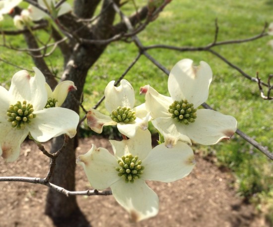
Happy Friday everyone!  We’ve had another gorgeous week here in DC – last weekend we finally made it down to Mount Vernon, where I couldn’t tear my eyes (or nose) away from the gorgeous dogwoods and lilacs blooming all around the estate.  Yay spring!  I’m looking forward to an even more beautiful weekend and a bit of relaxation.  But in the meantime…

…a few links for your weekend!

This week on Oh So Beautiful Paper:

As usual, we have a fun cocktail coming up for you this afternoon, so check back a bit later for the recipe!  I hope you all have a wonderful weekend, and I’ll see you back here on Monday!  xoxo

Photo by me, from a trip to Mount Vernon last weekend

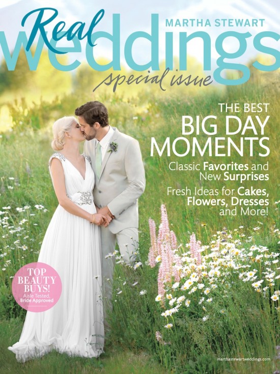
Sneak Peek – Martha Stewart Weddings Special Issue

Martha Stewart Weddings recently released a special issue focused entirely on real weddings – and I’m thrilled to share a sneak peek of the issue today!   The issue is full of some of my all time favorite real weddings – including Cheree + Jeff, Lena + Joshua, and Randi + Jacob – along with ideas and details from countless other past features and several beautiful new real wedding features.

Martha-Stewart-Weddings-Real-Weddings-Issue

Of course, an issue of Martha Stewart Weddings wouldn’t be complete without lots of beautiful stationery!  For this special issue, the editors have pulled a range of wedding invitations from several talented wedding invitation designers for every season of the year.  So many pretty invitations!

The special real weddings issue is on newsstands now, so check it out soon!

Photo Credits: Martha Stewart Weddings 2012