Ana’s Delicate and Ethereal Birth Announcements

Colleen of Letter & Lark creates some of the most incredibly beautiful, subtle, and delicate stationery – the birth announcements that she created for her daughter Ana last year took my breath away! Colleen put so much thought into each and every detail, from the pale color palette to explaining the meaning behind Ana’s names. Just so, so lovely.

Delicate-Ethereal-Baby-Girl-Birth-Announcements-Letter-and-Lark-OSBP3

From Colleen: This project was very close to my heart and I hoped to do it justice! Our sweet Ana is an incredible baby. She is happy, loving, and easy going, but incredibly determined and strong; she spent five weeks in the hospital after surprising us by arriving six weeks early. Our preemie & NICU experience along with her gentle spirit gave me the inspiration for her announcement.

Delicate-Ethereal-Baby-Girl-Birth-Announcements-Letter-and-Lark-OSBP

For the recipients who opened it, I wanted to evoke a sense of fragility and sacredness for this tiny, special person. I wanted it to feel exquisite and ethereal, to emphasize that she really came out of something amazing. Rather than a flat or folded card, I wanted an experience of opening her announcement; by discovering different layers, papers, and textures along with reading about her birth information.

Delicate-Ethereal-Baby-Girl-Birth-Announcements-Letter-and-Lark-OSBP4

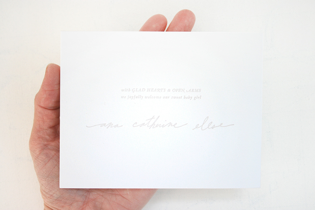
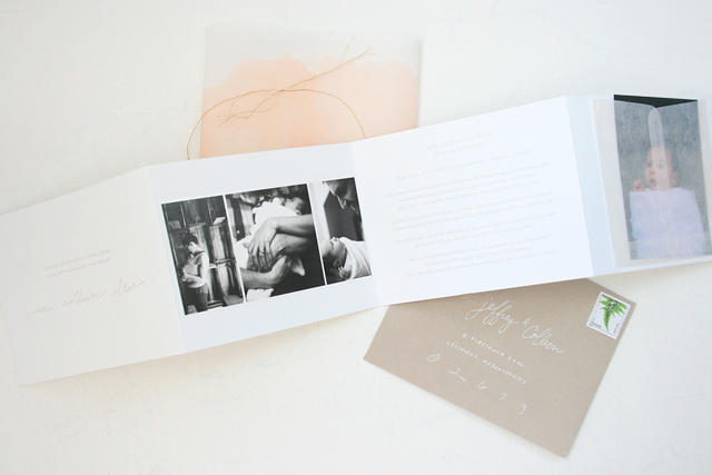
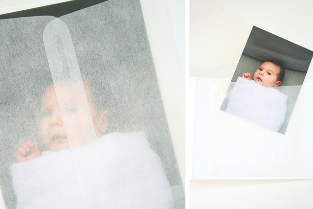
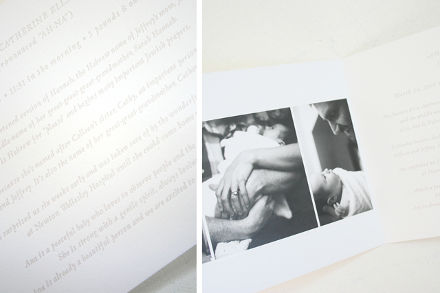
To emphasize the fact that tiny packages can hold complexity and so much importance, I decided to go with a small, 4-bar sized announcement with an accordion folded card. The design was focused on clean, elegant type and a minimal color palette alongside gorgeous photography by the incredibly talented Leighanne Evelyn (who we are so proud to call a friend!). Leighanne’s photographs are very sentimental since they were taken shortly after Ana came home from the hospital. We chose to show a small tryptic of family photos on one panel and then included our favorite portrait of Ana in a tiny glassine envelope in the back. I love how you can barely see this tiny little face with big eyes looking at you through the cloudy envelope! I also knew it would be the perfect size for relatives who wanted to keep a picture of Ana as well.

Delicate-Ethereal-Baby-Girl-Birth-Announcements-Letter-and-Lark-OSBP5

Delicate-Ethereal-Baby-Girl-Birth-Announcements-Letter-and-Lark-OSBP8

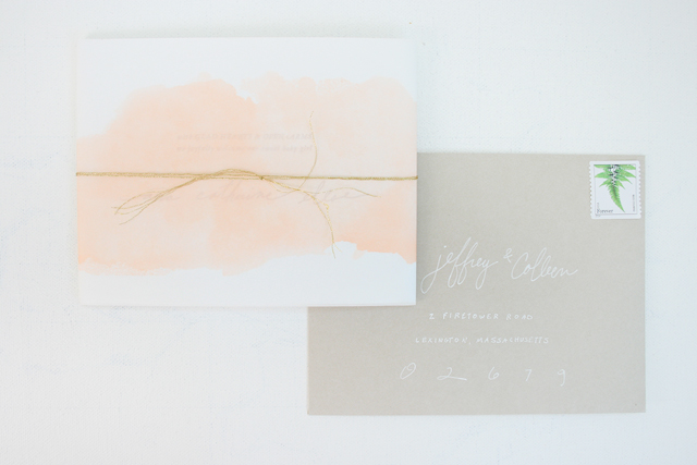
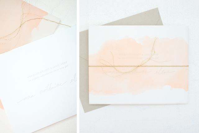
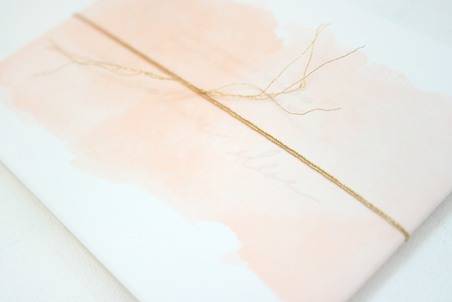
At first I had an idea of including a watercolor wash, but as a new mom I didn’t have the time to hand-paint each announcement (on top of designing, printing, and assembling!), so instead I printed a cantaloupe-colored “wash” on vellum paper. These vellum paper sashes wrap around the accordion card and the front text of the announcement can be carefully read through the faux wash. A very delicate, gold twine (the thinnest I could find) wraps around the entire piece.

Delicate-Ethereal-Baby-Girl-Birth-Announcements-Letter-and-Lark-OSBP2

Rather than just list her birth information, I decided it would be more interesting for people to read the story of how we chose her name, since her first and middle names have connections to family members as well as special meaning.  I also included a short description of her personality; I wanted to make sure even for people that live far away that they could still get a sense of who Ana is without even meeting her.

Delicate-Ethereal-Baby-Girl-Birth-Announcements-Letter-and-Lark-OSBP7

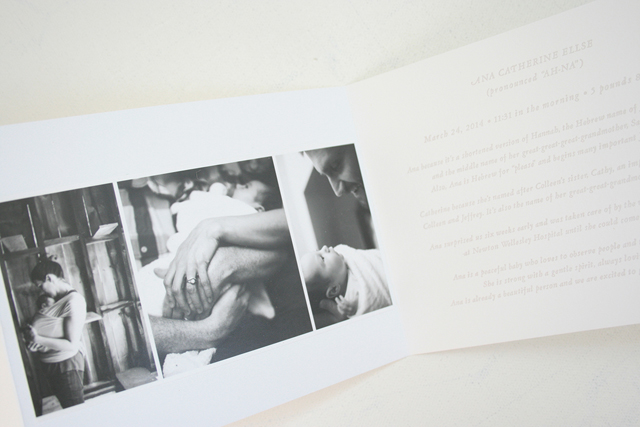
Letterpress printed in a smokey, lavender ink on bright white 100% cotton stock, paired with translucent vellum and glassine papers and Leighanne’s beautiful black and white photographs, I hoped to convey how we truly special Ana is, not only because of her birth story but because she’s brought so much love and joy to our family.

Delicate-Ethereal-Baby-Girl-Birth-Announcements-Letter-and-Lark-OSBP10

Thank you Colleen!

Photo Credits: Letter & Lark

DIY Hand Lettered Wall Art

We’re in the middle of prepping for the National Stationery Show in May, which for us means finalizing our latest product designs and finishing the catalogs. In the process, we have been designing new art prints for our line and shop – so we definitely have wall art on the brain! Our tutorial today is a break down of how to make your very own, one-of-a-kind hand lettered wall art for your house or to give as a gift. Just find your favorite quote and get pencil to paper! –Bailey and Emma of Antiquaria

DIY Hand Lettered Wall Art by Antiquaria for Oh So Beautiful Paper

Materials

High quality archival paper, such as Arches Watercolor Paper Hot Press

Pencil

Kneaded Eraser

Brush Pen

Fine Felt Tipped Pen

Gouache (optional)

Copy Paper (to draft layout)

DIY Hand Lettered Wall Art by Antiquaria for Oh So Beautiful Paper

DIY Hand Lettered Wall Art by Antiquaria for Oh So Beautiful Paper

Step One: Using sheets of copy paper, sketch out your quote in a variety of different layouts/styles. Look at some of your favorite fonts for letter-shape inspiration if you feel stuck about how to make the letters go together. Once you’ve settled on a layout that you like, re-draw it on your nice archival paper. So that it pressure isn’t too high, make sure that you have a couple of sheets of the nice paper-in case you need to make a couple of drafts of the piece.

DIY Hand Lettered Wall Art by Antiquaria for Oh So Beautiful Paper

Step Two: Before putting any ink down onto your piece, you want to lift up the pencil lines so that they can act as a light guide for you but will not require heavy force once the ink is in place. A kneaded eraser does this job easily by rolling over the pencil and picking up the excess lead, as shown above.

DIY Hand Lettered Wall Art by Antiquaria for Oh So Beautiful Paper

Step Three: Take a deep breath and do your lettering with ink using your very light pencil lines as a guide. You can use a brush pen as we did here, a brush and ink, a felt tipped pen or a calligraphy pen. Each of these will yield a different looking result so it’s worth figuring out what you like best (a great thing to do while your drafting your design on copy paper). We like the boldness that a brush pen gives, especially when it meant to be viewed from a distance, which it will be when hanging on the wall!

DIY Hand Lettered Wall Art by Antiquaria for Oh So Beautiful Paper

Step Four: To give some polish to the lettering, we like to go in with a fine tipped felt pen and do “touch-ups” to the outline. We typically smooth out any ending flourishes, tops of letters (like the “t”) and light areas that the brush didn’t get. The step is optional. You may achieve exactly the look you’re going for in step three! Once you’re happy with the lettering, gently erase the remaining light pencil lines.

DIY Hand Lettered Wall Art by Antiquaria for Oh So Beautiful Paper

Step Five: We added a pop of color with a hot pink heart painted with gouache (opaque water color). This step is also optional and will depend on your design!

We hope that you have fun creating your own pieces and that you let your imagination run wild! If you’re new to lettering, it’s probably best to start with one word or a short phrase so that you can practice the process without the layout being too difficult. Have fun and Happy Lettering!

All artwork © 2015 Antiquaria, with DIY tutorials created exclusively for Oh So Beautiful Paper and intended for personal, non-commercial use only.

Photo Credits: Antiquaria for Oh So Beautiful Paper

Happy Weekend!

Happy Friday everyone! I’ve been spending a lot of time out in my garden lately (now that the weather is finally nice again!) and it has been so nice to see everything start to turn green after so many months of brown and gray. My peonies even have buds and the lilacs aren’t far behind! But in the meantime…

Flowermuse-Coral-Charm-Peonies-Instagram

Photo by Flowermuse via Instagram

…a few links for your weekend!

This week on Oh So Beautiful Paper:

Whimsical Watercolor and Calligraphy Wedding Invitations

Not only is calligraphy a beautiful art form – but you can do some really cool things with it! I’m loving this invitation suite from calligrapher Ashley Bush featuring a dreamy watercolor wash over text created with masking fluid. Such a fun idea!

Watercolor-Masking-Text-Wedding-Invitations-Ashley-Bush-OSBP

From Ashley: The inspiration behind this wedding invitation suite was whimsical, candy-colored, and dreamy. I knew instantly that I wanted to do a masked brush-lettering style, with a watercolor wash over top. I let that design element guide the rest of the suite. 

Watercolor-Masking-Text-Wedding-Invitations-Ashley-Bush-OSBP2

Watercolor-Masking-Text-Wedding-Invitations-Ashley-Bush-OSBP3

Watercolor-Masking-Text-Wedding-Invitations-Ashley-Bush-OSBP4

Watercolor-Masking-Text-Wedding-Invitations-Ashley-Bush-OSBP5

Watercolor-Masking-Text-Wedding-Invitations-Ashley-Bush-OSBP6

Watercolor-Masking-Text-Wedding-Invitations-Ashley-Bush-OSBP7

Thanks Ashley!

Check out the Designer Rolodex for more tal­ented wed­ding invi­ta­tion design­ers and the real invi­ta­tions gallery for more wedding invitation ideas!

Photo Credits: 1 – 4 Ashley Bush / 5 Emily Millay Photography / 6 – 7 Bronwnyn Duffield

Angel + Arthur’s Spring Floral Wedding Invitations

I’m a big fan of floral-inspired wedding invitations any time of year, but especially for a spring wedding! These invitations from Amanda at Wide Eyes Paper Co. combine simple line illustrations with a floral watercolor envelope liner. So pretty!

Spring-Floral-Wedding-Invitations-Wide-Eyes-Paper-Co-OSBP7

From Amanda: We created this invitation suite for a couple getting married in Sunny San Diego, California. The bride and groom are both surfers and love the outdoors. They wanted their wedding invitations to reflect their personalities and the location of their wedding in Solana Beach. They wanted something simple, elegant, and nature inspired. I hand illustrated the wreath around their names and mixed in whimsical typography.

Spring-Floral-Wedding-Invitations-Wide-Eyes-Paper-Co-OSBP5

Spring-Floral-Wedding-Invitations-Wide-Eyes-Paper-Co-OSBP2

They also wanted their guests to know how to properly get to their wedding venue. I created a custom illustrated map to go alongside this vision which is a fun way to showcase directions versus just writing them out.

Spring-Floral-Wedding-Invitations-Wide-Eyes-Paper-Co-OSBP6

Spring-Floral-Wedding-Invitations-Wide-Eyes-Paper-Co-OSBP3

The invitation and map feature letterpress printing to complement the simplicity and elegance of the set.​ Angel and Arthur wanted to stick with the “natural look” so we included a painted floral envelope liner and paired it with our natural kraft envelopes to tie it all together.

Spring-Floral-Wedding-Invitations-Wide-Eyes-Paper-Co-OSBP4

Thanks Amanda!

Design: Wide Eyes Paper Co.

Watercolor Envelope Liner Pattern: Chau Matser

Letterpress Printing: Clove St. Press

Wide Eyes Paper Co. is a member of the Designer Rolodex – you can see more of Amanda’s work right here or visit the real invitations gallery for more wedding invitation ideas!

Photo Credits: Let’s Frolic Together