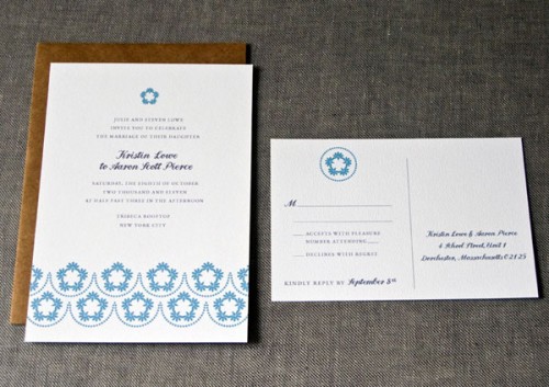
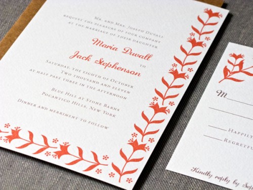
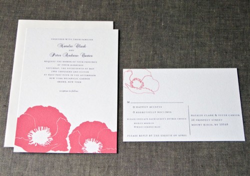
Maggie from Campbell Raw Press sent me a little sneak peek at the new designs in her wedding invitation collection, and I’m loving the spring inspired botanical elements! Â Maggie included a little background behind each invitation design, so scroll down for more info…

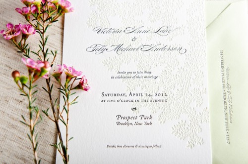
Leaves:  I used one of my own drawings, giving the text a bright cushion of leaves printed in pale green under gray lettering. This invite suite pairs with pale green envelopes that match the ink color on the vine background.  These would be perfect for a spring or summer wedding – airy and natural.

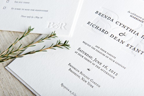
Entwined:  This suite is all about taking advantage of the sculptural, tactile nature of letterpress printing.  The couple’s initials are blended and printed as a blind deboss – just impression, no ink.  The invitation text is just a simple black, making this design spare and elegant and sophisticated.  Available with or without a chiyogami (Japanese silkscreened paper) envelope liner to dress up the invitation suite.

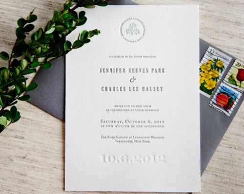
Signature:  I used a delicate vine drawing of mine with elegant text.  A tiny sprig is encircled by the couple’s name and wedding date, and the text of the invitation itself is set in simple, serif font.  The wedding date is blind debossed along the bottom and  I just love the invitation with gray envelopes.
You can check out the entire collection right here – thanks Maggie!
{image credits: campbell raw press}

