Friday Happy Hour: St-Germain Brunch Cocktail

It is a truth universally acknowledged, that brunch is the greatest meal of all time. So how about some brunch cocktails? I’ve decided to spend the next few weeks covering some great drinks for that best meal of the day, the one that’s not quite breakfast and not quite lunch but something sublimely in between, starting with a very easy and very tasty aperitif brunch cocktail.  â€“ Andrew

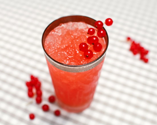
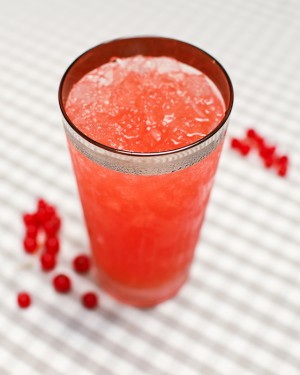
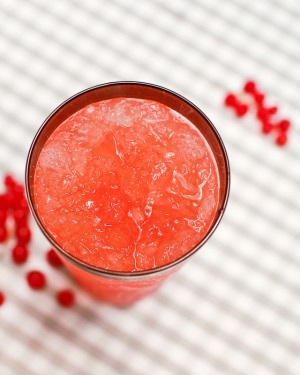
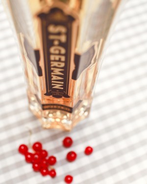
St-Germain Blood Orange Brunch Cocktail Recipe via Oh So Beautiful Paper (29)

Read below for the full recipe!

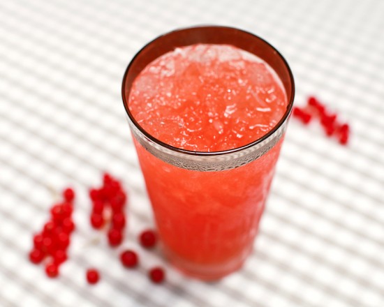
St-Germain Blood Orange Brunch Cocktail

1 oz St. Germain
1oz Cocchi Americano
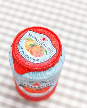
San Pellegrino Aranciata Rossa Sparkling Juice

In a highball glass filled with ice, combine the St. Germain, Cocchi Americano, and San Pellegrino (we used the Aranciata Rossa or Blood Orange). Give it a stir and enjoy.

St-Germain Blood Orange Brunch Cocktail Recipe via Oh So Beautiful Paper (25) St-Germain Blood Orange Brunch Cocktail Recipe via Oh So Beautiful Paper (26)

Nole is a big fan of the San Pellegrino sparkling juices, so I started playing around with recipes to find one that worked as a cocktail. I eventually struck upon a great combination of the St. Germain’s floral sweetness, the Cocchi Americano’s complex herbal bitterness, and the citrusy effervescence of the San Pellegrino. Match that with a mild alcohol content and you have something a great drink (or two or three) you can pair with brunch.

St-Germain Blood Orange Brunch Cocktail Recipe via Oh So Beautiful Paper (11) St-Germain Blood Orange Brunch Cocktail Recipe via Oh So Beautiful Paper (1)

Cocchi Americano is a really interesting ingredient. It’s an aperitif white wine made according to the original Kina Lillet recipe. Kina Lillet was first made in Italy in 1891, flavored with deeply bitter gentian and cinchona bark, along with a touch of brandy, orange peel, and herbs. (It’s the missing ingredient for such classic cocktails as the Vesper and the Corpse Reviver #2). For a long time, the only thing close to Kina Lillet available in the States was the much sweeter and milder (but still tasty!) Lillet Blanc. Fortunately, this complex and fascinating spirit is available again (thanks to the amazing Haus Alpenz), so you can enjoy it in great brunch cocktails or, as they do in Italy, over ice with a splash of soda water and an orange peel garnish.

St-Germain Blood Orange Brunch Cocktail Recipe via Oh So Beautiful Paper (20)

This is a great example of discovering a great recipe through experimentation. I started with an ingredient – the Pellegrino – and paired it with spirits until I found a combination that worked for us. Here, more than ever before, play around until you find what works for you!

Photo Credits: Nole Garey for Oh So Beautiful Paper

{happy weekend!}

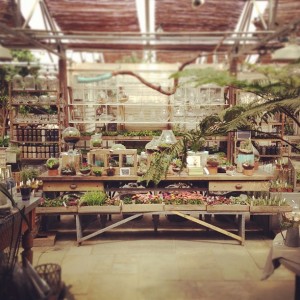
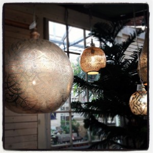
Happy Friday!  This week was pretty awesome – on Monday I took a little field trip with the talented Michele of Meant to Be Calligraphy to visit Terrain.  Have you been?  It was my first time there and I was just floored by how beautiful everything is – I had to resist the urge to bring home a million new plants for our poor little garden (which sadly isn’t doing so well in the brutal DC summer heat).  And lunch at the cafe?  Sooooo good.  I can’t wait to go back!  But in the meantime…

Terrain via Oh So Beautiful Paper (4) Terrain via Oh So Beautiful Paper (3)
Terrain via Oh So Beautiful Paper (1) Terrain via Oh So Beautiful Paper (2)
Photos of Terrain by me via Instagram (@beautifulpaper)

A few links for your weekend!

This week on Oh So Beautiful Paper:

We have a fun cocktail coming up for you this afternoon, so check back a bit later for the recipe!  I hope you all have a wonderful weekend, and I’ll see you back here on Monday!  xoxo

Dear Hancock From the “Desk” of Stationery

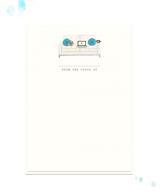
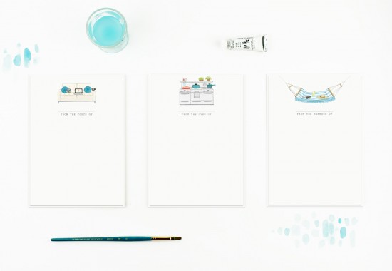
The New York International Gift Fair is coming up this weekend, and I’m super excited to see the new items that some of my favorite stationers and designers debut at the show!  Gwendolyn from Dear Hancock sent over this awesome new collection of cards that will be debuting in the Crow and Canary booth (#4150) – a fun and unconventional take on “from the desk of” stationery for folks who might not work from a traditional desk.  Love!

Dear Hancock Stationery via Oh So Beautiful Paper (4)
Dear Hancock Stationery via Oh So Beautiful Paper (3)
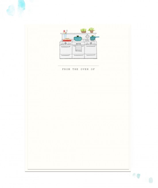
Dear Hancock Stationery via Oh So Beautiful Paper (1)
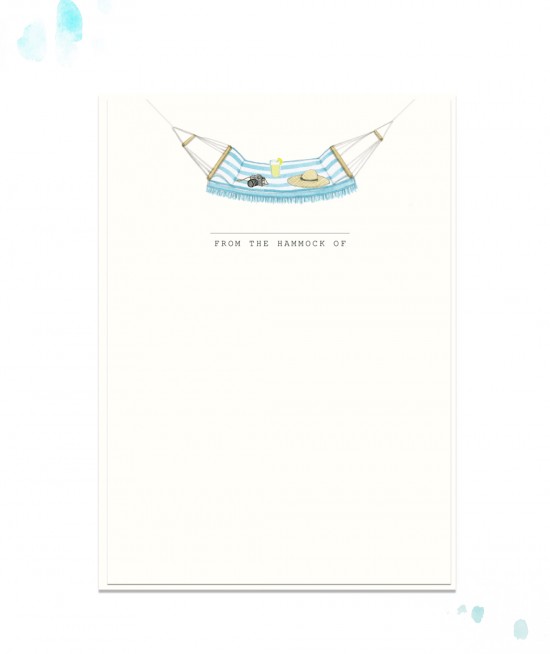
Dear Hancock Stationery via Oh So Beautiful Paper (2)
Thanks Gwendolyn!

Photo Credits: Dear Hancock

Matt + Kimmy’s Illustrated Movie Poster Wedding Invitation

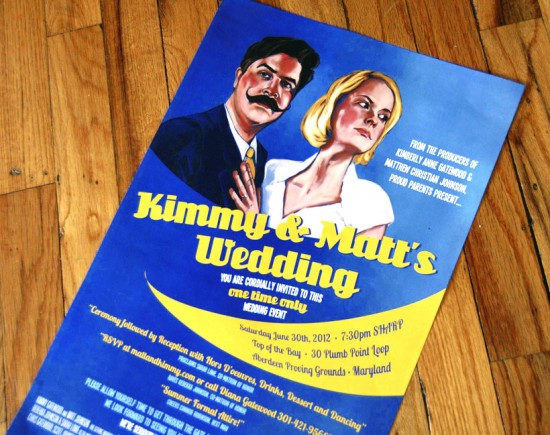
Nicole from The Nic Studio is known for her unique illustrations, from greeting cards to art prints to custom projects.  Nicole sent over these 1940s movie poster-style invitations that she designed for a recent wedding, and I couldn’t resist showing you how she went about creating these unique invitations!

Nic Studio Poster Wedding Invitations via Oh So Beautiful Paper (2)
From Nicole: The bride, Kimmy, is an old friend from college, and she and Matt both work in the entertainment industry in Los Angeles.  Kimmy is part of “The Apple Sisters” – a faux 1940s female singing group and comedy show that they perform live and distribute via podcasts.  Kimmy and Matt are both drawn towards 1930s and 1940s themed items, especially old movie posters.  We decided to do a 1940s movie poster invitation for their wedding.

Nic Studio Poster Wedding Invitations via Oh So Beautiful Paper (6)
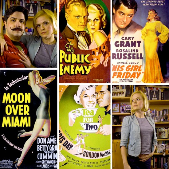
I gathered a number of old posters to inform different aspects of the invitation illustration and design. “The Public Enemy” poster for the drama and general illustration composition; the “His Girl Friday” poster for the painterly style; the “Tea for Two” poster for the circular design; and the “Moon Over Miami” poster for the typography.  I then asked Matt and Kimmy, both in the entertainment industry, to take a number of dramatic photos of themselves and derived the poster illustration from those photos.

Nic Studio Poster Wedding Invitations via Oh So Beautiful Paper (5)Nic Studio Poster Wedding Invitations via Oh So Beautiful Paper (4)
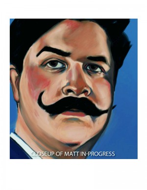
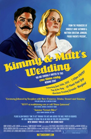
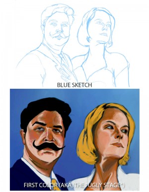
My background is in illustration and portraiture, so this was a dream for me.  I started by sketching out the couple in blue, then started to lay in some color, first in the background and then onto the subjects themselves.  This is ALWAYS the ugly stage, which I’ve learned to be comfortable showing to others.  I continued to work the piece from there.  All of the painting was actually done digitally on my Wacom Cintiq.   The final illustration sits on the blue background and the talented couple wrote their own copy for the poster, which was hilarious!  The invitation itself measures 11.5″ x 17.5″ and was mailed in a poster tube.

Nic Studio Poster Wedding Invitations via Oh So Beautiful Paper (3) The Nic Studio Poster Wedding Invitation via Oh So Beautiful Paper
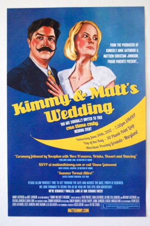
So fun!  Thanks Nicole!

The Nic Studio is a member of the Designer Rolodex – you can see more of Nicole’s fabulous work right here or or visit the real wedding invitations gallery for more wedding invitation ideas!

Photo Credits: The Nic Studio

*The Nic Studio is a sponsor of Oh So Beautiful Paper