Stationery A-Z: Anniversary Cards

Paper is the official gift of a first wedding anniversary, but we think it’s the perfect gift for however many years (or months for that matter) you’ve been together for. Good relationships require consistent attention, excellent communication, and strong motivation – as well as a constant reminding of the love the brought you together in the first place. Whether your relationship is built on romance, humor or sincerity, there’s sure to be something in round-up below that’s perfect for whichever anniversary you are celebrating. XOXO! –Shauna

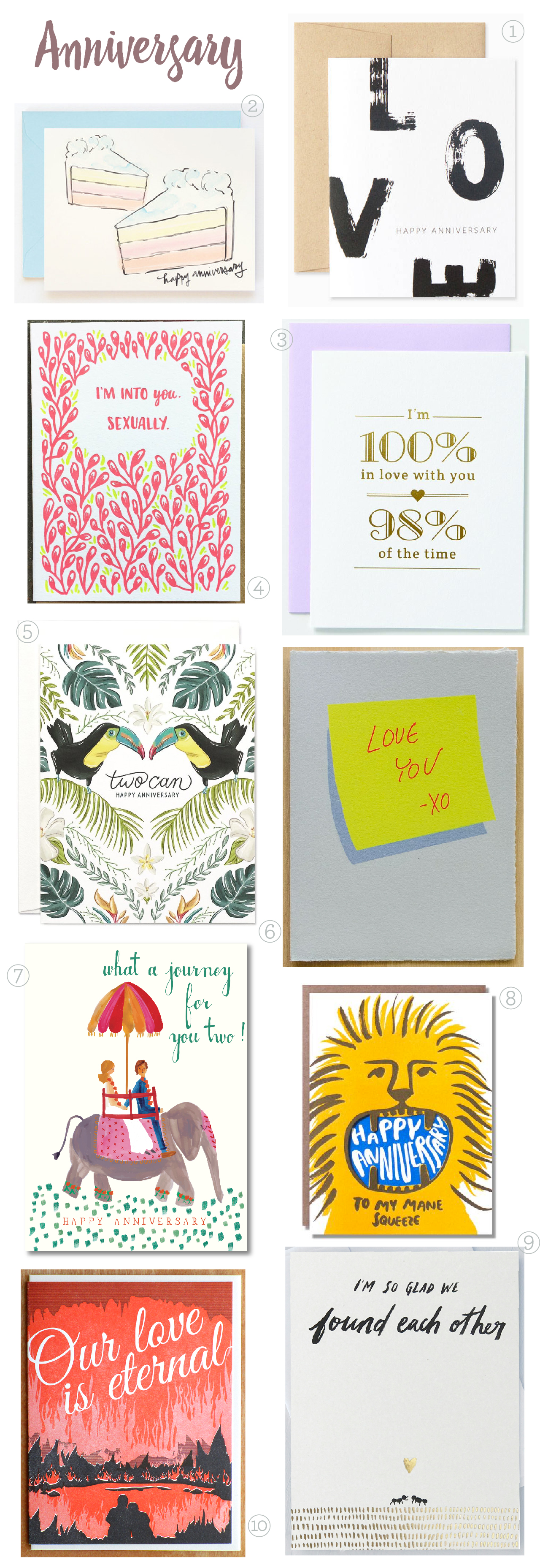
Anniversary CardsFrom top right:

1. Keep in simple with this brush painted lettering from Chicago based stationer Evermore Paper Co.

2. Foodie couple? This pastel cake design from Hart Paper Co. is reminiscent of a Wayne Thiebaud painting. Yum!

3. Ha! Whether your friends refer to you as the Bickersons or you hold the record for longest period between fights, being able to laugh it off is a sure sign of a marriage that’s meant to last. From Farewell Paperie.

4. Let’s be honest – monogamy has the possibility of getting a little stale. Spice things up with this um, rather direct message from Frog & Toad Press.

5. Yes, two CAN! Strength comes in numbers as proven by this elegantly painted greeting from Sagebrushed.

6. Post-it messages have gotten a bad wrap (thanks for nothing SATC!), but this simple message from Gold Teeth Brooklyn is about to change that.

7. Celebrating a friend or family members anniversary? Send this colorful Mr. Boddington’s Studio design to the most adventurous couple you know.

8. This die cut Egg Press design is guaranteed to make your main squeeze smile.

9. In a world as big and diverse as ours, isn’t it a miracle you found each other? This sweet greeting comes courtesy of Idlewild Press.

10. This McBittersons design really takes that ‘til death do us part bit to the next level.

Romantic Burgundy and Gold Foil Wedding Invitations

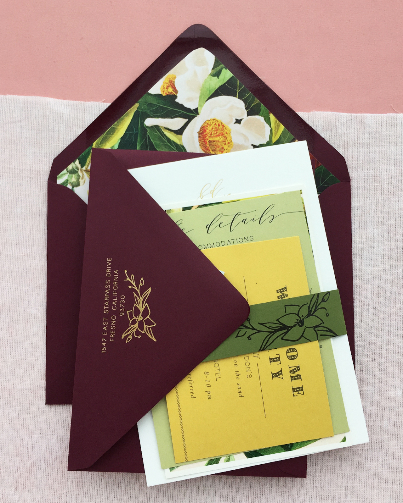
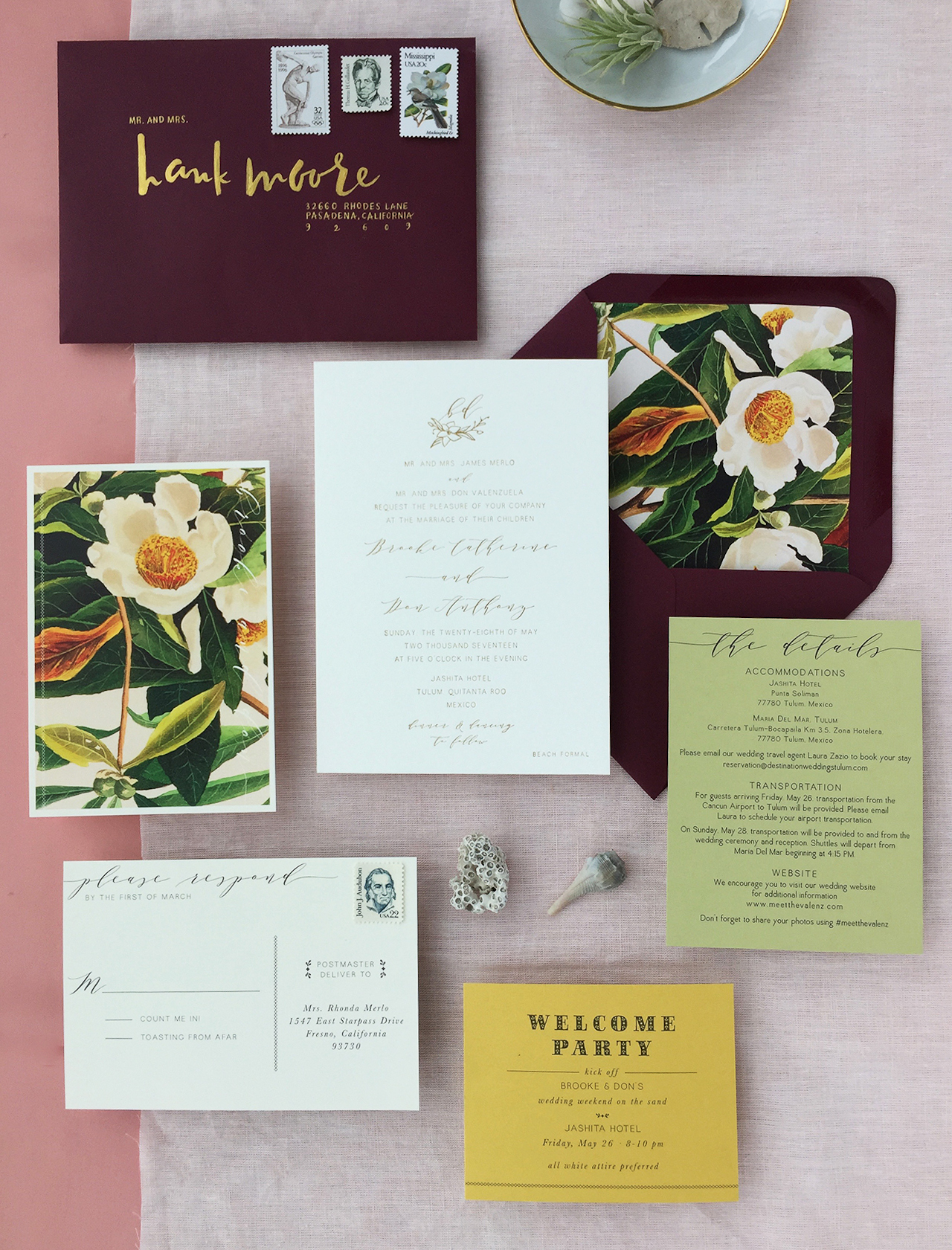
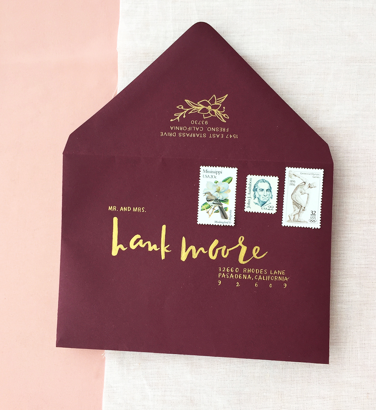
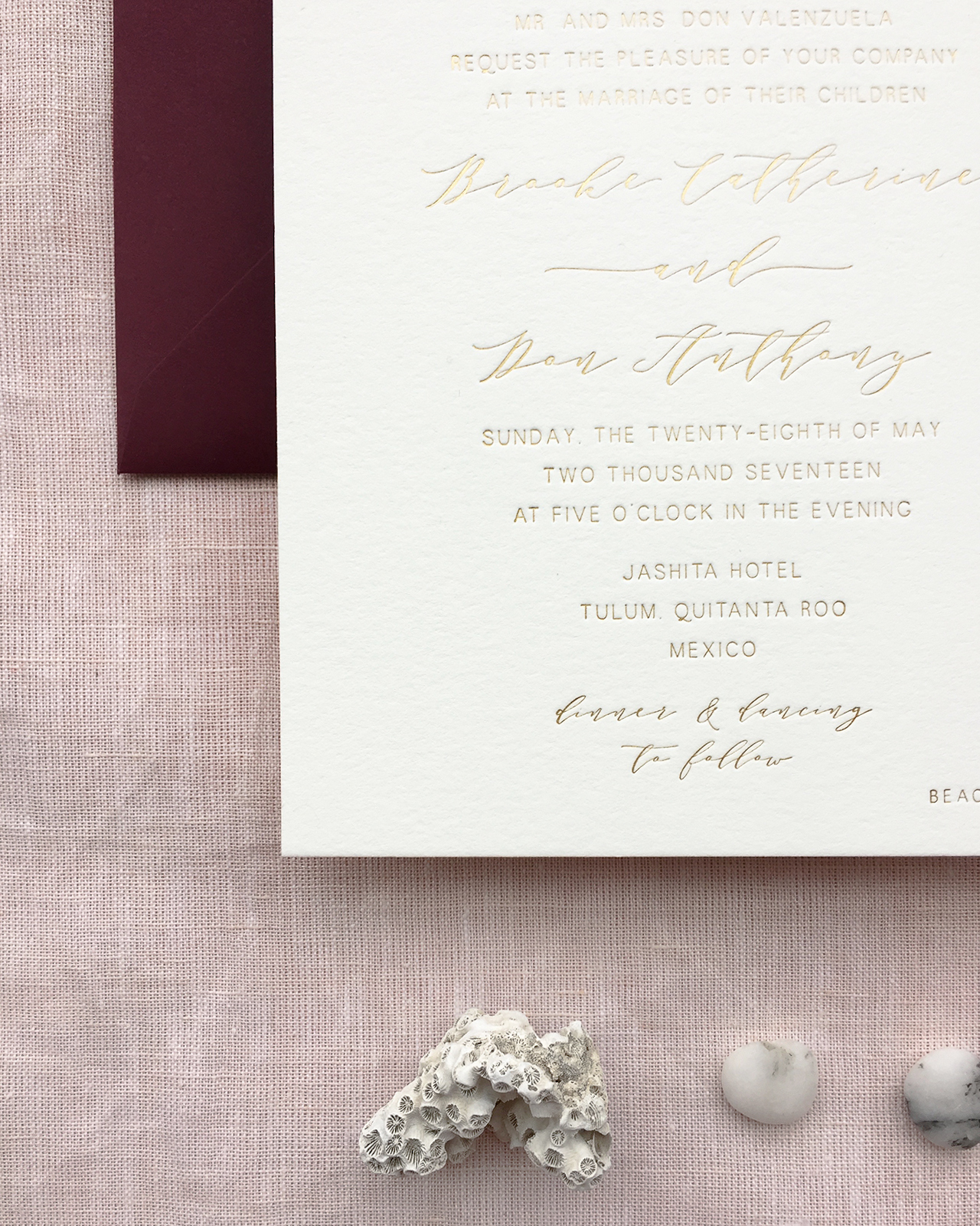
These invitations totally had me at that gorgeous floral envelope liner! These romantic burgundy and gold foil wedding invitations were designed by Lauren of Charm & Fig for a destination wedding in Tulum, Mexico. I love the way Lauren incorporated subtle nods to traditional Mexican design while maintaining the couple’s unique vibe. Those deep burgundy envelopes are absolute perfection paired with the crisp gold foil and tones of green and yellow! 

Romantic Burgundy and Gold Foil Wedding Invitations with Floral Envelope Liner by Charm and Fig

From Lauren: Brooke and Don were hosting their wedding weekend in Tulum, Mexico and wanted their invitations to be sophisticated, romantic, and bohemian, with hints of traditional Mexican design. I’ve found that couples often struggle with how to make their destination wedding invitations not overly contrived or thematic, so we avoided “festival colors” and found inspiration in nature for our lush color scheme.

Romantic Burgundy and Gold Foil Wedding Invitations with Floral Envelope Liner by Charm and Fig

Romantic Burgundy and Gold Foil Wedding Invitations with Floral Envelope Liner by Charm and Fig

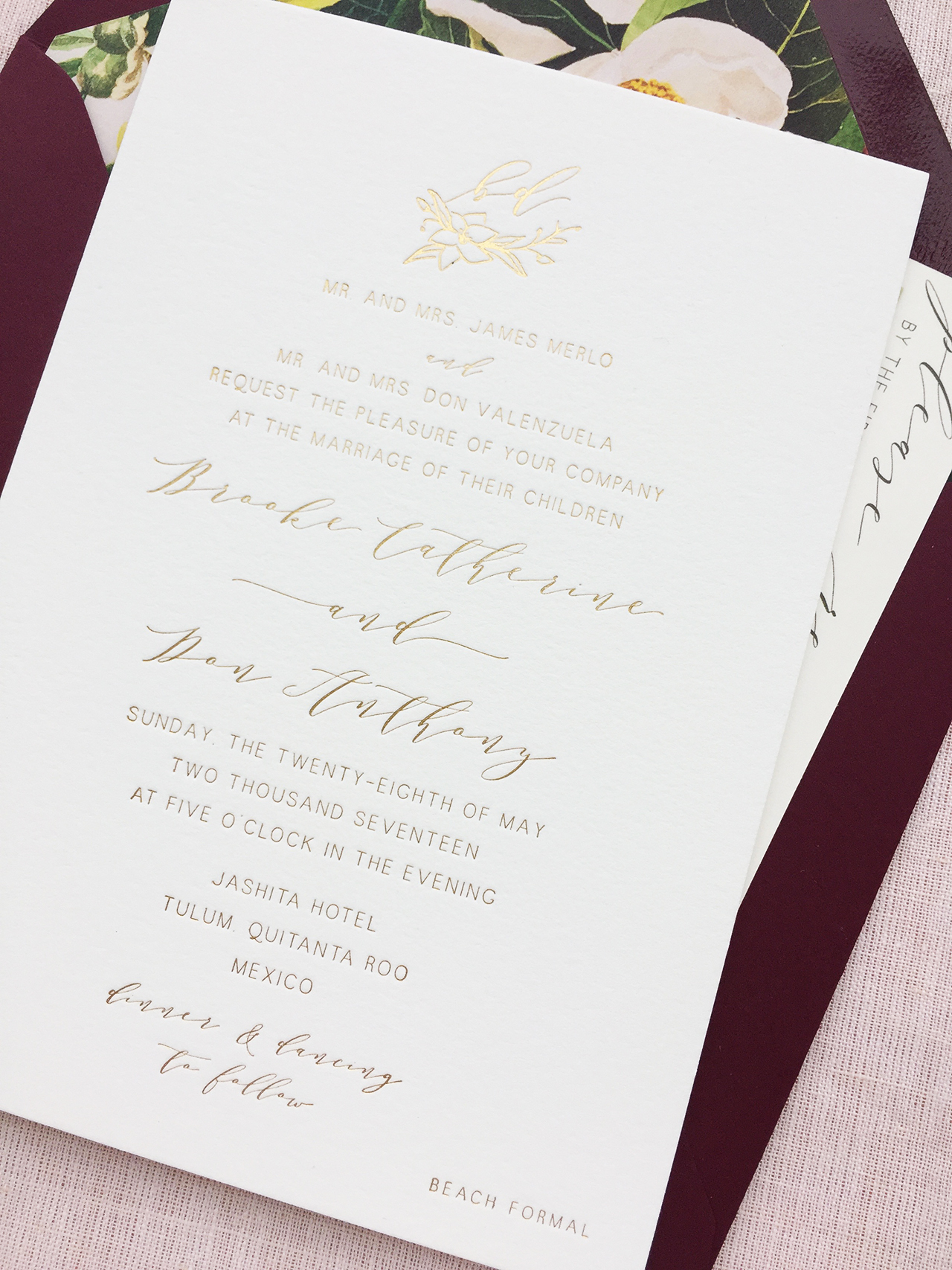
For the invitation, we created a full gold foil printed suite on Crane’s Lettra double-thick 100% cotton paper, using minimalist typography and romantic scripts to set a loose, but luxe tone. To add an organic touch, I hand-illustrated a mini floral wreath to frame their monogram and used it throughout the design of the suite.

Romantic Burgundy and Gold Foil Wedding Invitations with Floral Envelope Liner by Charm and Fig

For a dramatic first impression, we selected deep burgundy envelopes that were hand addressed in gold ink by artist Jaymie Eaton. I still can’t get over how precise her brush lettering is for the guest addresses! The return address and floral illustration was foil printed in gold on the back, and our vintage stamps showcased beautifully in high-contrast against the dark envelope.

Romantic Burgundy and Gold Foil Wedding Invitations with Floral Envelope Liner by Charm and Fig

Romantic Burgundy and Gold Foil Wedding Invitations with Floral Envelope Liner by Charm and Fig

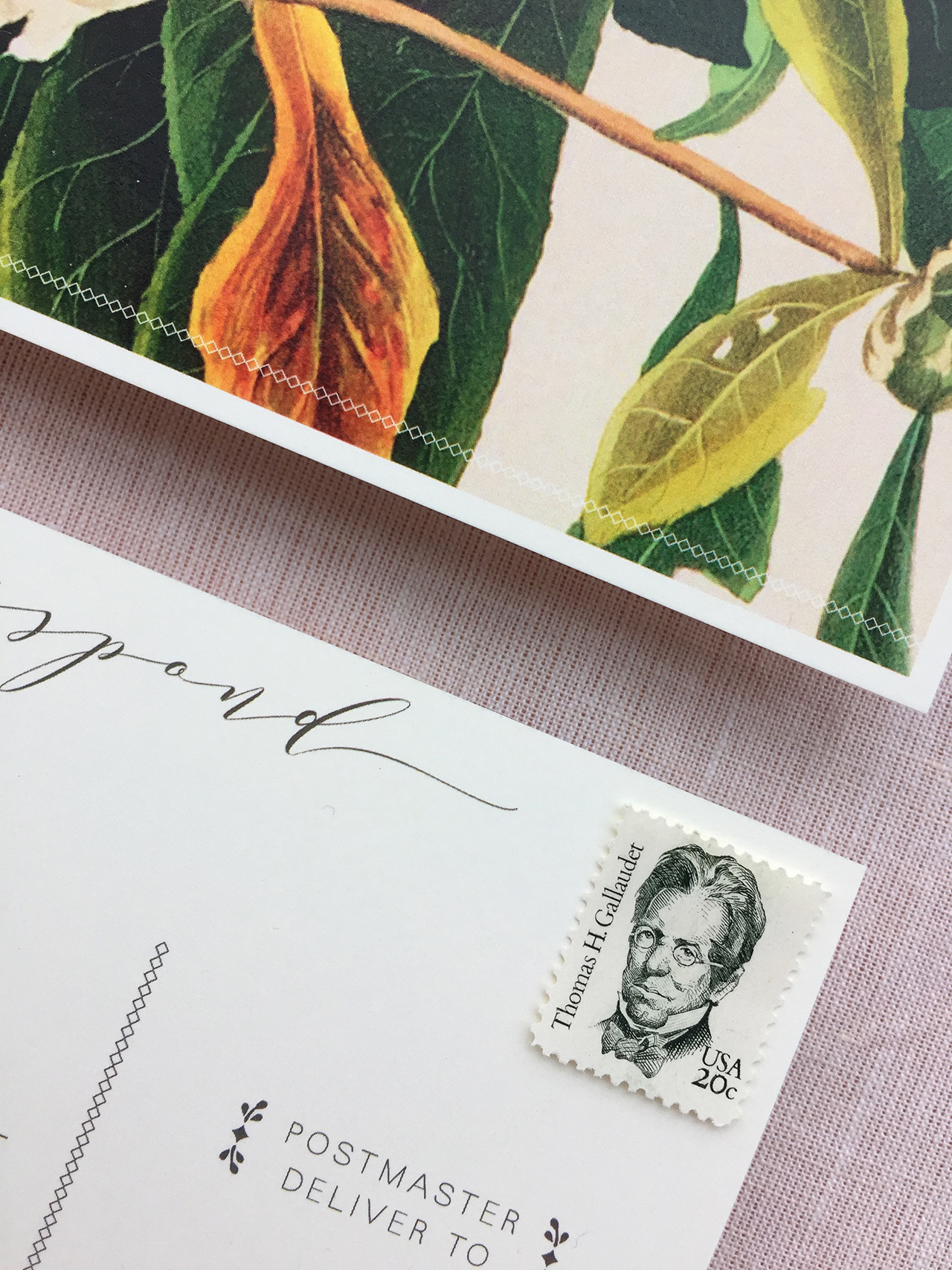
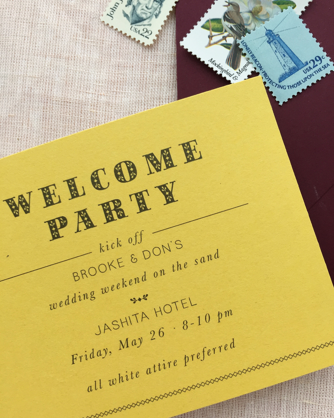
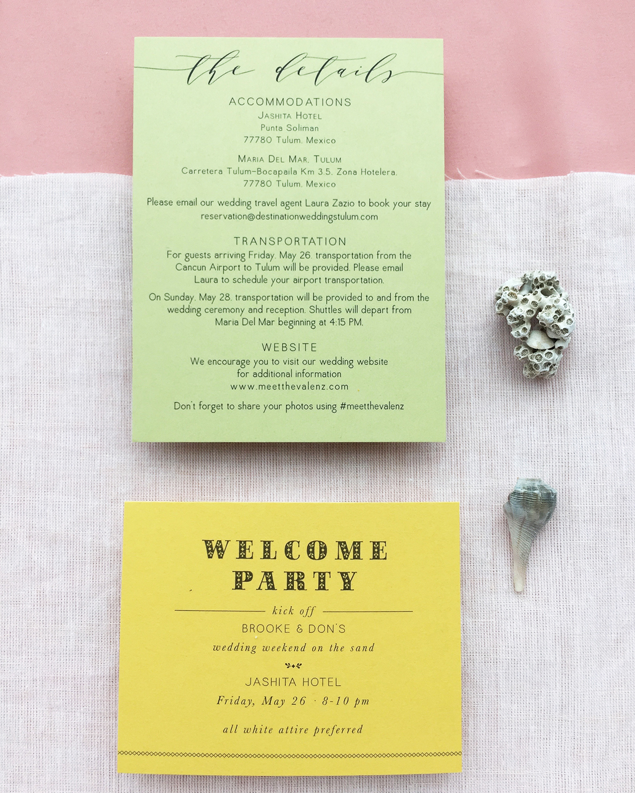
The laser printed postcard and envelope liner was a great opportunity to inject color and lush tropical botanicals into the suite. We found a John James Audubon print with rich tones that served as a color source for the yellow Welcome Party Card and tropical green Details card. On each of these pieces, we incorporated graphic details inspired by Mexican folk embroidery with delicate lines of diamond “stitching” and tiny decorative designs to highlight important text.

Romantic Burgundy and Gold Foil Wedding Invitations with Floral Envelope Liner by Charm and Fig

Romantic Burgundy and Gold Foil Wedding Invitations with Floral Envelope Liner by Charm and Fig

The entire suite was wrapped up with a thin, olive green belly band that was laser-printed in charcoal with our hand-illustrated florals. The end result was full of color but true to the sophisticated palette that was inspired by the lush tropics of Central America.

Romantic Burgundy and Gold Foil Wedding Invitations with Floral Envelope Liner by Charm and Fig

Thanks Lauren!

Design: Charm & Fig
Gold Foil Printing: Gold Leaf Embossing 
Laser-Printing: Crest Printing Company 
Address Lettering: Jaymie Eaton Lettering 

Charm & Fig is a member of the Designer Rolodex – you can see more of their beautiful work right here or visit the real invi­ta­tions gallery for more wedding invitation ideas!

Photo Credits: Charm & Fig

Calligraphy Inspiration: Nikki Ornopia

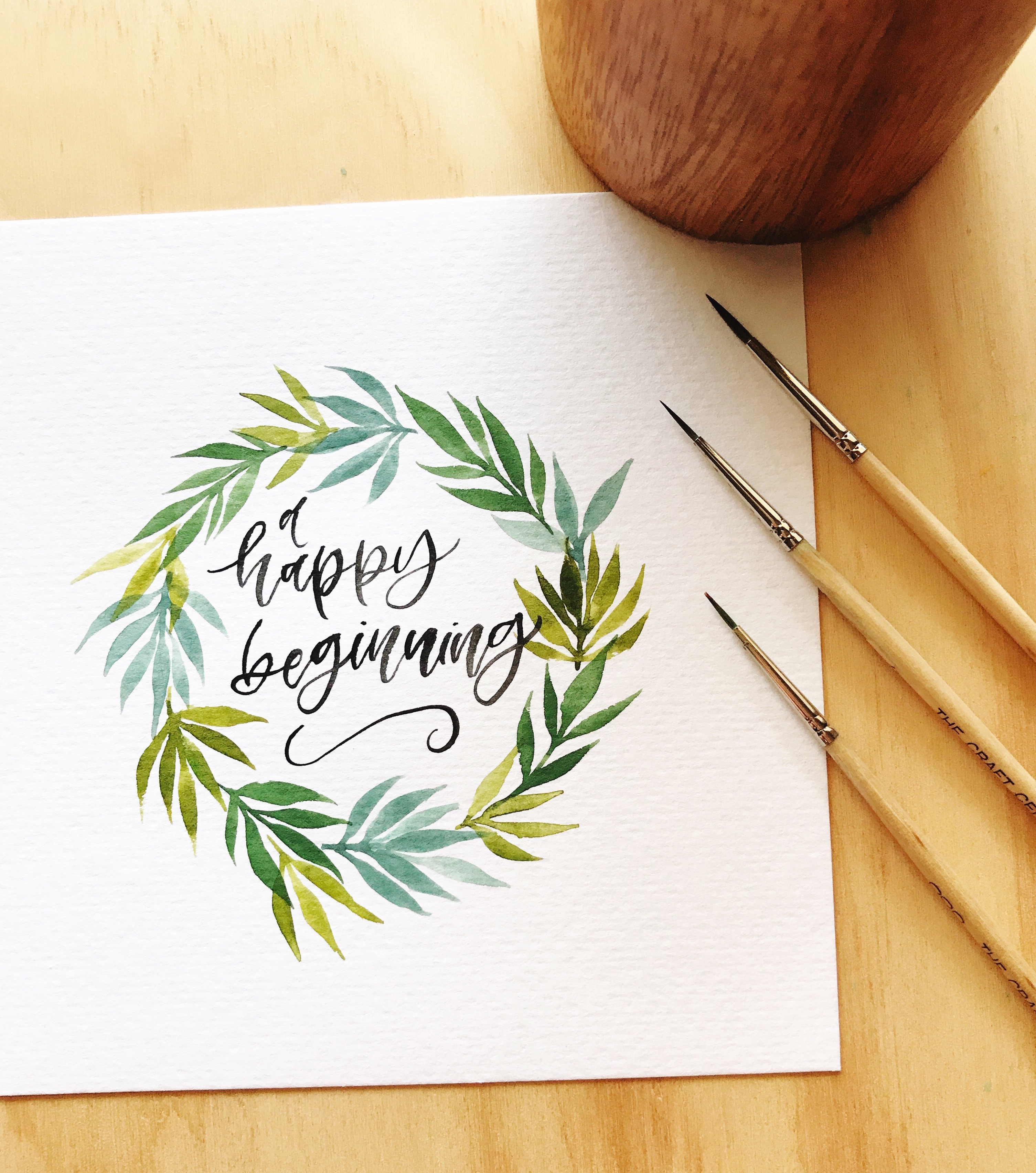
Hello everyone! September feels even more like a happy beginning and a new rhythm now that I’m a mama to school-age kiddos. So I thought I’d start here with this pretty print by a favorite calligrapher who’s new to the scene — and full of fresh inspiration. Here’s a peek into the work of Los Angeles-based calligrapher Nikki Ornopia. Jen

Calligraphy Inspiration: Nikki Ornopia

Calligraphy Inspiration: Nikki Ornopia

Nikki is a self-taught calligrapher and she’s also ambidextrous! So all the work she’s shared here was done with her right hand, yet she’s a true lefty. How amazing is that! Nikki said, “I found in the beginning how difficult it was to letter with my left hand. I wanted to control the brush. I then thought, hey I’ve written with my right hand before let’s try that! The rest was history. Using my right hand for lettering allowed me the freedom of being more relaxed when I letter, and I noticed the letters were coming out SO much better.”

Calligraphy Inspiration: Nikki Ornopia

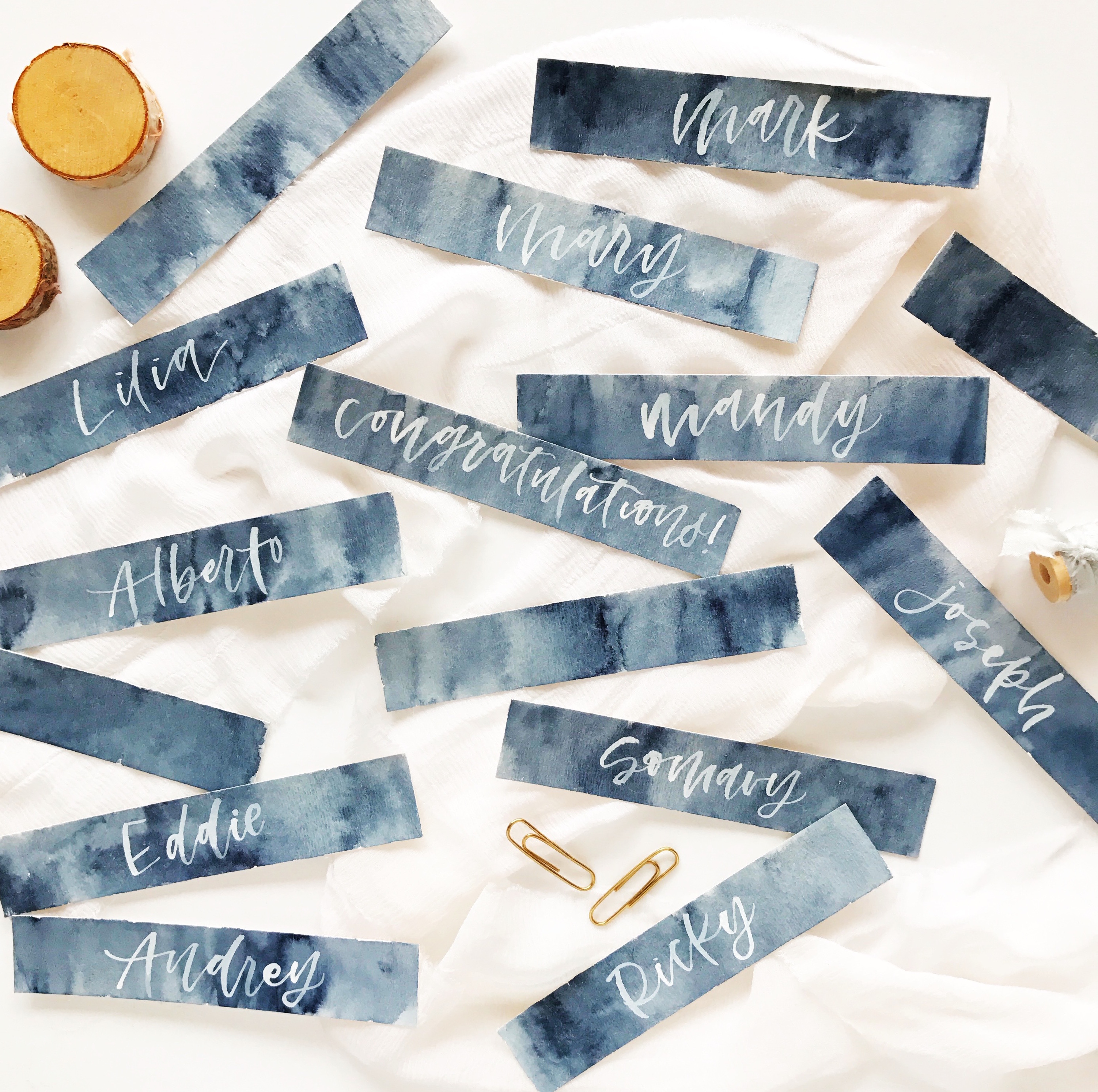
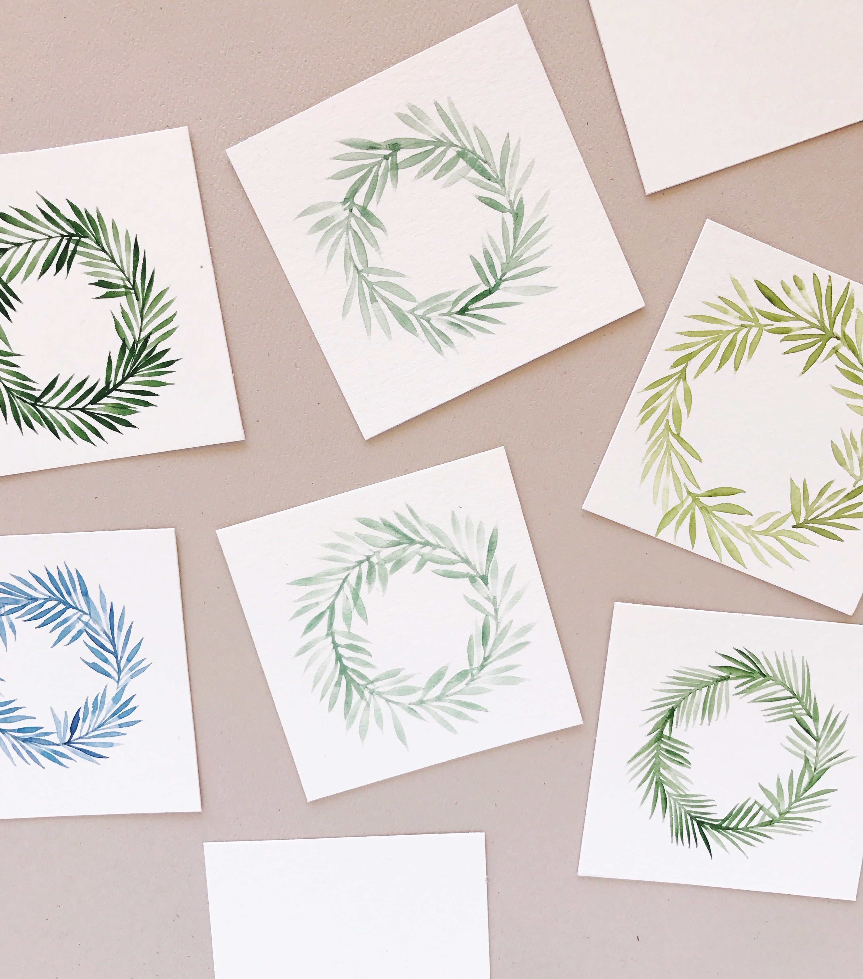
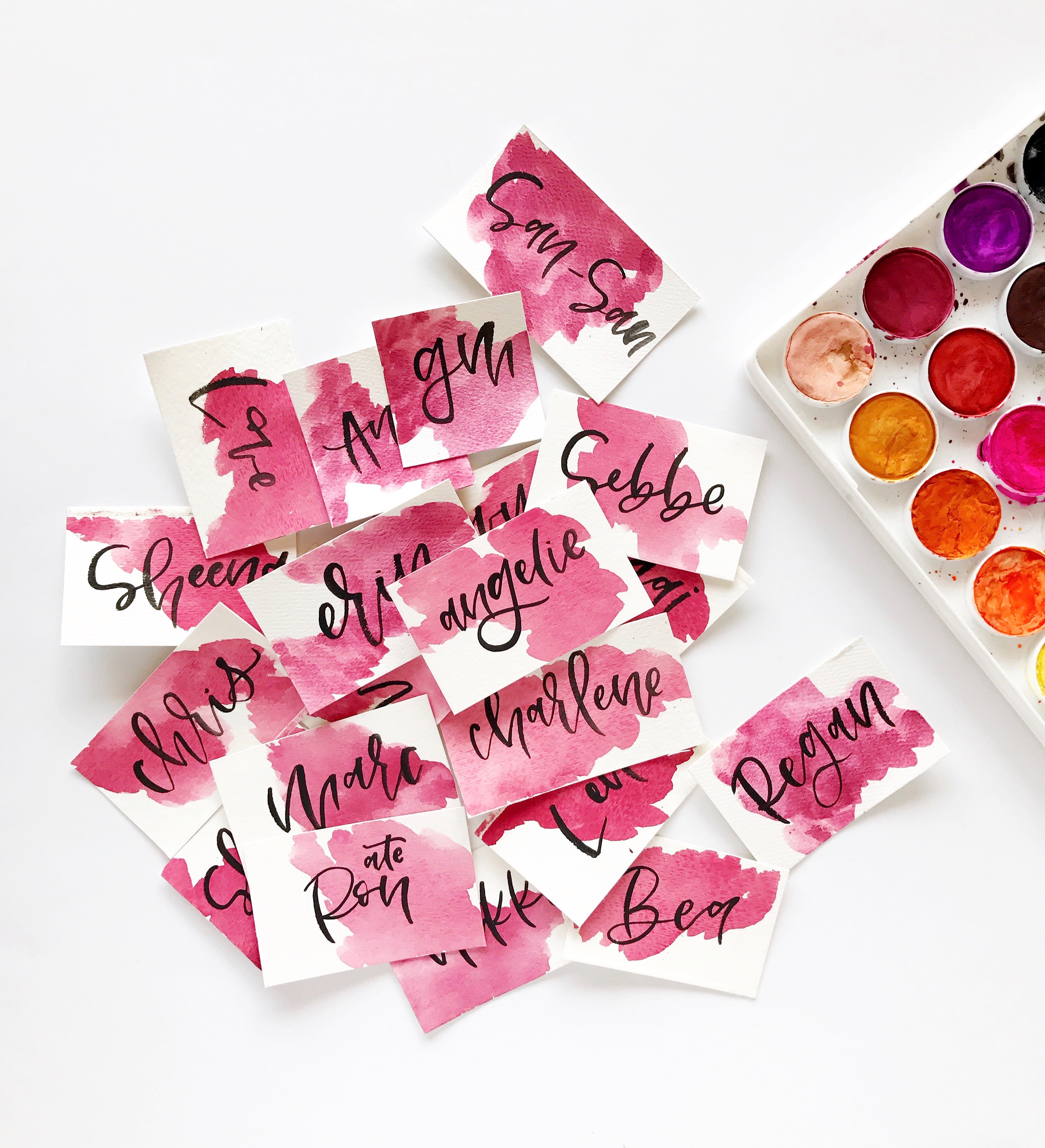
I love how Nikki incorporates watercolor into her calligraphy! Those watercolor garlands above are so sweet and these place cards have such a dreamy vibe to them. Nikki shares that her lettering style mixes simple and modern bouncy cursive and handwritten letters.

Calligraphy Inspiration: Nikki Ornopia

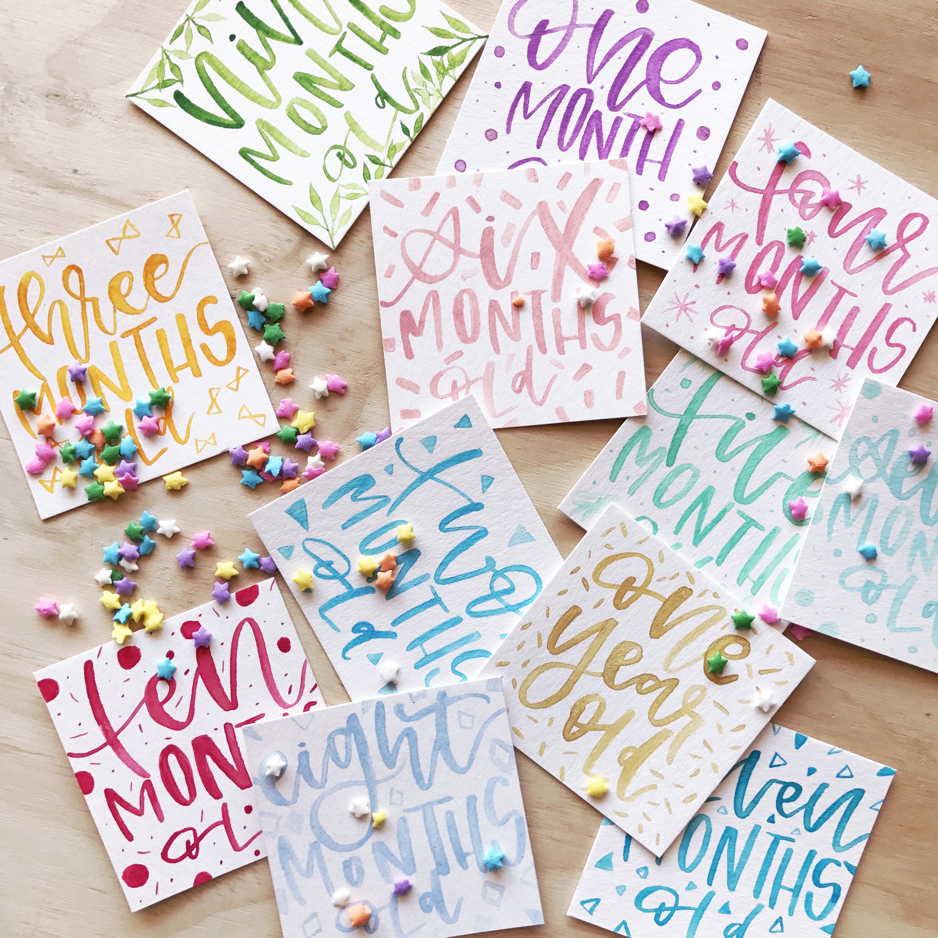
Look at how adorable these baby milestone cards are that Nikki created! So fun and unique.

Calligraphy Inspiration: Nikki Ornopia

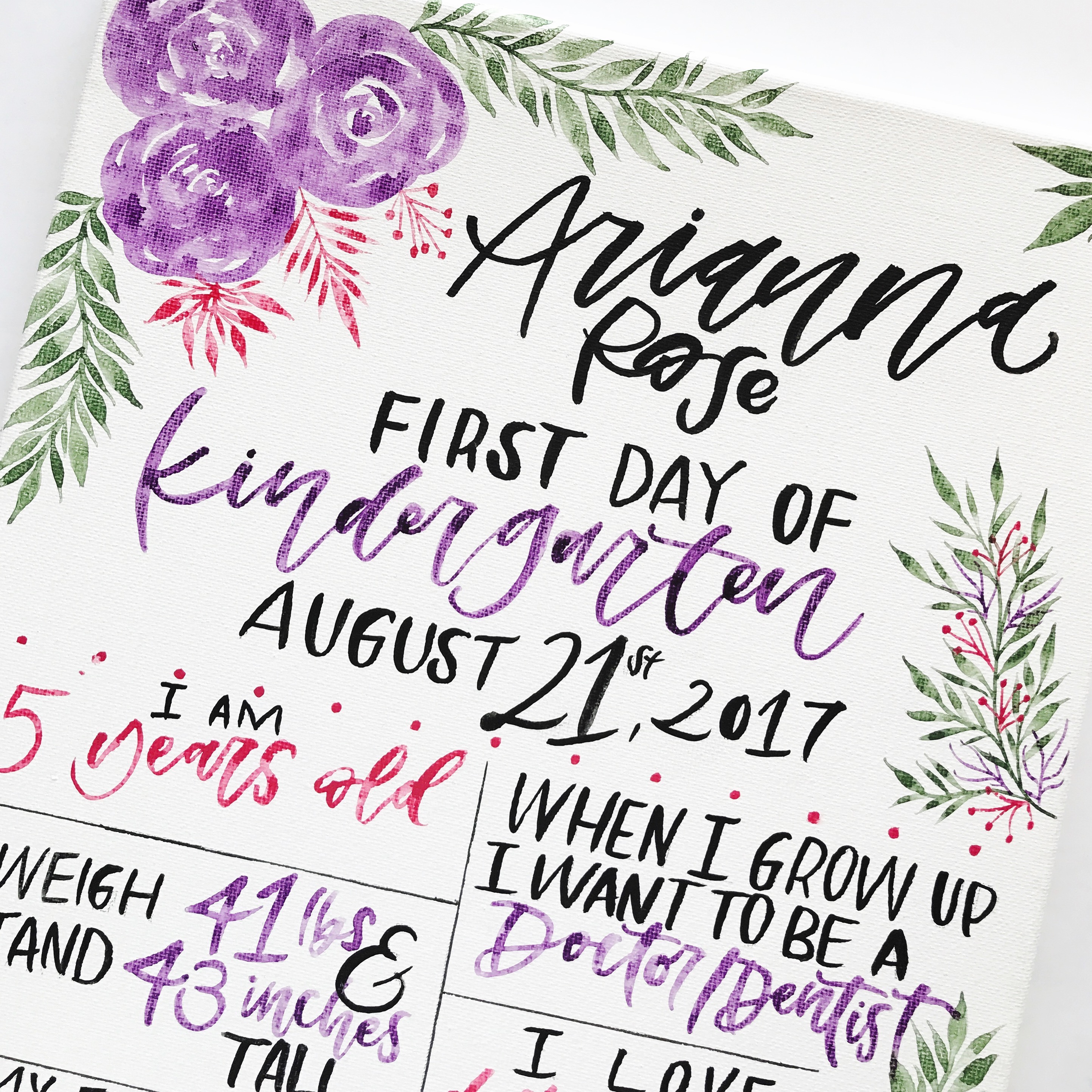
Here’s a peek at Nikki’s favorite project that she’s worked on so far — a first day of school sign! This canvas piece was done for a kiddo who had just begun kindergarten. Nikki shares, “It took about 3 hours to finish with waiting for the watercolor to dry in between, but it was just an overall amazing project.” What a sweet keepsake!

Calligraphy Inspiration: Nikki Ornopia

Calligraphy Inspiration: Nikki Ornopia

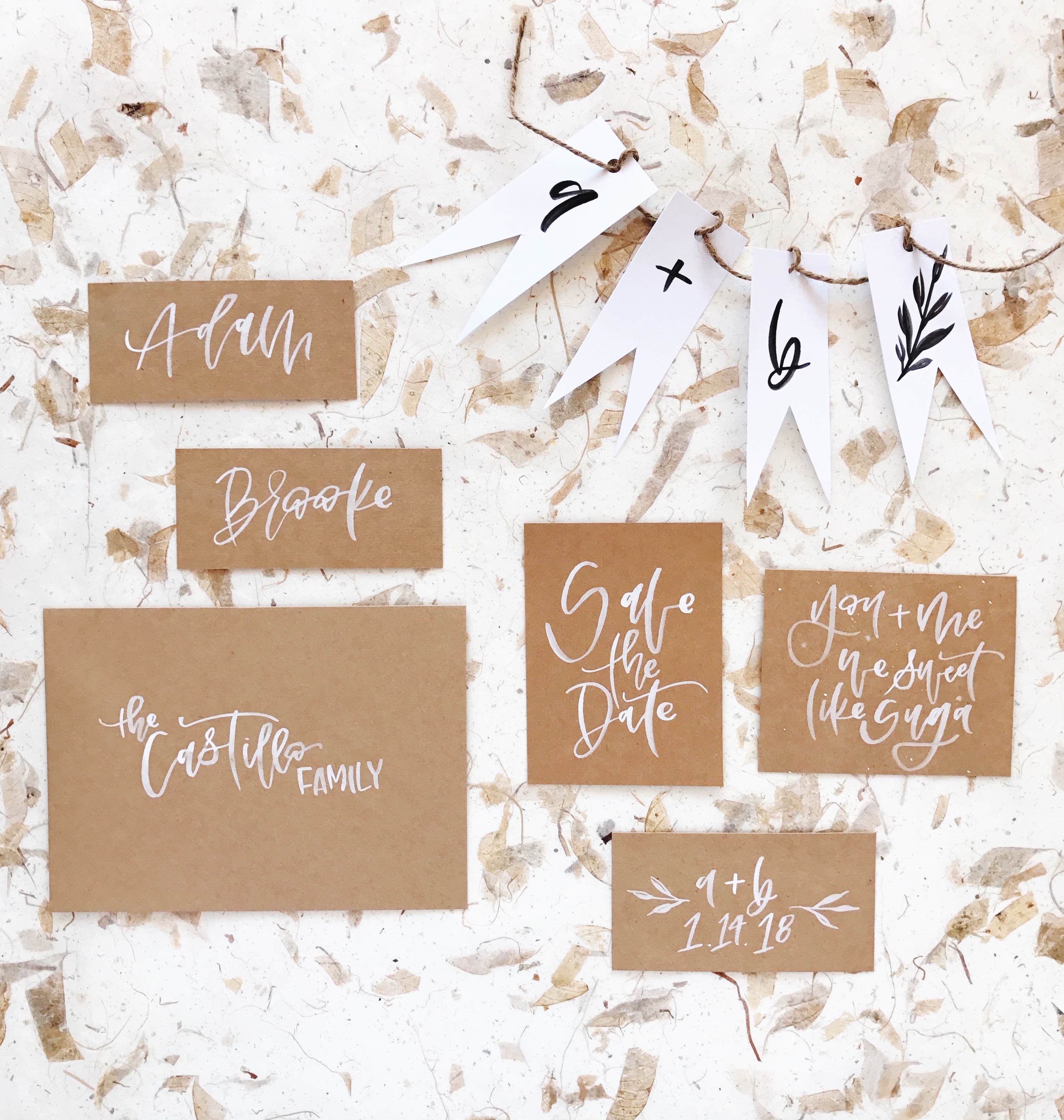
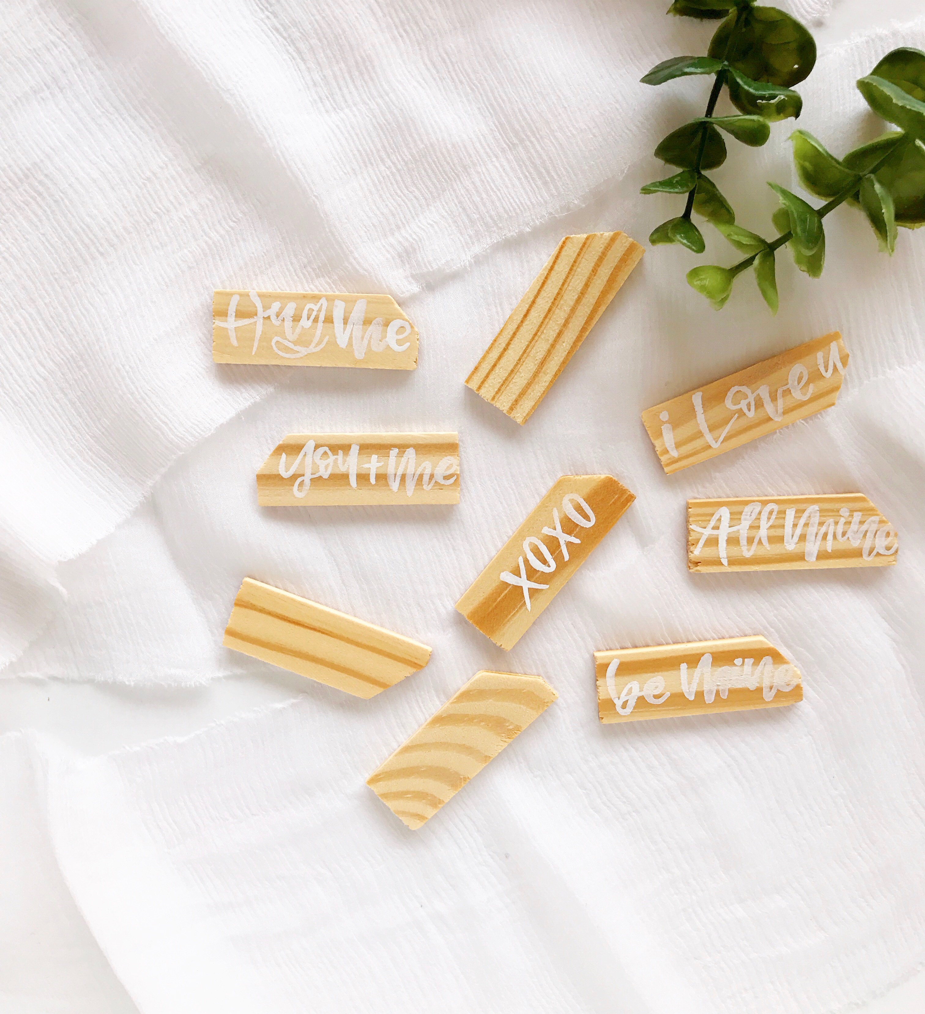
Nikki works on traditional wedding calligraphy projects, too. (Of course!) I’m always a fan of the white lettering on brown paper look.

Calligraphy Inspiration: Nikki Ornopia

Calligraphy Inspiration: Nikki Ornopia

What are her favorite calligraphy tools? Nikki shares: “My main tools that I use are fine tip brushes. I also love using fine tip brushes for painting leaves. I love the precision details I can create with those types of brushes.”

Calligraphy Inspiration: Nikki Ornopia

Many thanks to Nikki for sharing her work with us! I hope your September is off to a happy start!

Photo Credits: Nikki Ornopia

Illustrated Honeysuckle Vine Wedding Invitations

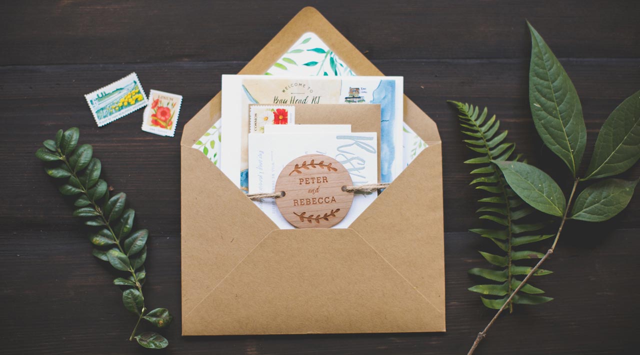
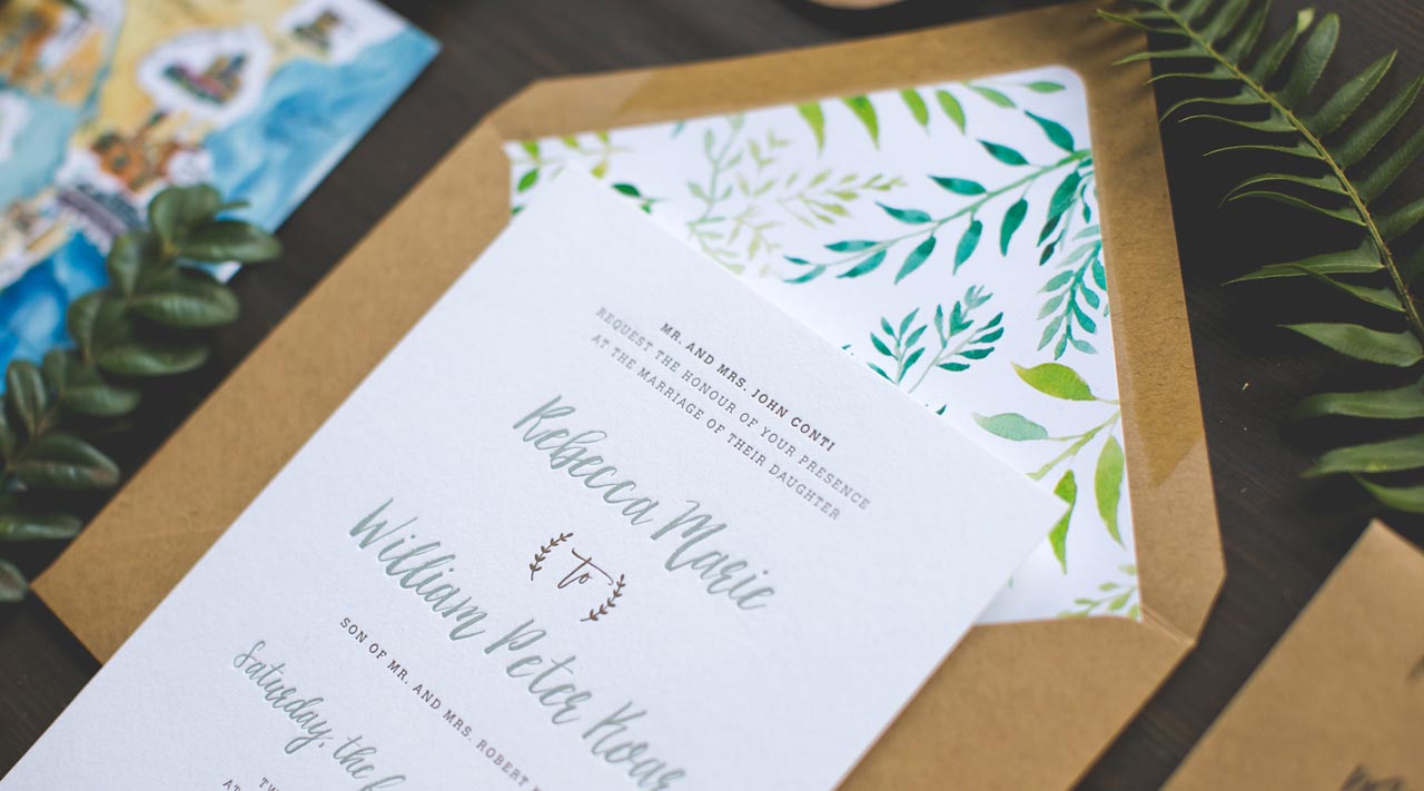
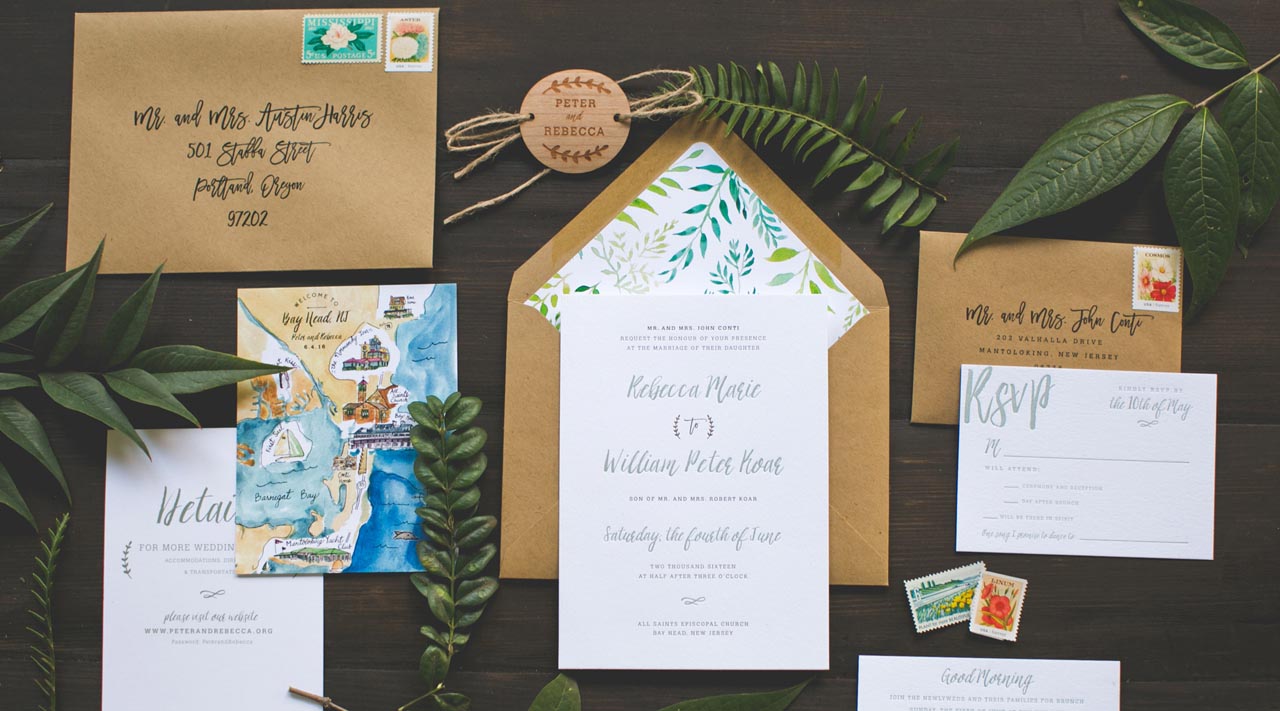
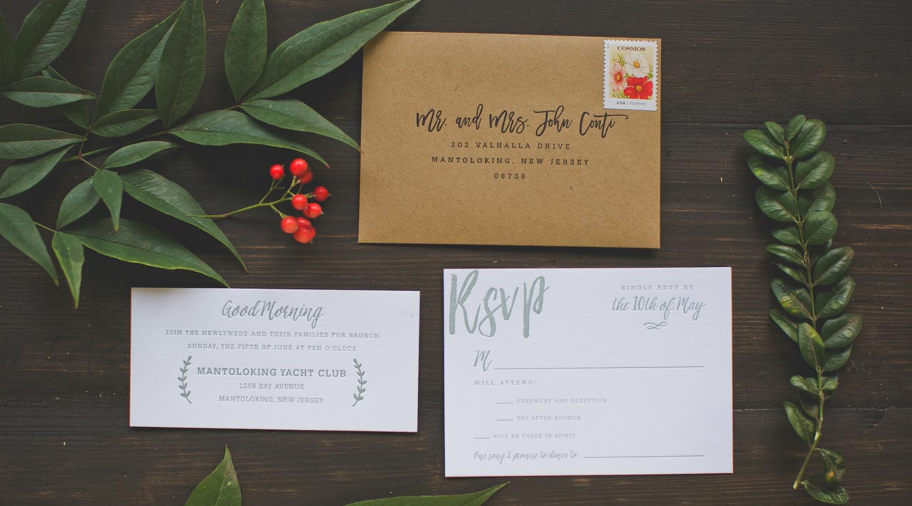
If you aren’t quite ready to say goodbye to summer, we’ve got some wedding invitations for you! Designer Rolodex member Amanda of Wide Eyes Paper Co. designed these stunning illustrated honeysuckle vine wedding invitations with a custom hand painted envelope liner as the main focal point. Along with the custom envelope liner, the invitation suite features an earthy green and kraft color palette and subtle rustic touches to honor their outdoor wedding venue. So pretty!

Illustrated Honeysuckle Vine Wedding Invitations by Wide Eyes Paper Co.

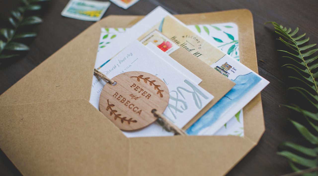
From Amanda: This sweet little three piece letterpress invitation suite is surely going to make it hard to say goodbye to summer. Rebecca and William wanted a simple two color invitation that captured the elegant beauty of their outdoor wedding in New Jersey. We created a whimsical design focused around illustrated honeysuckle vines and subtle rustic details. The letterpress cotton card stock added the perfect texture to the earthy color palette.

Illustrated Honeysuckle Vine Wedding Invitations by Wide Eyes Paper Co.

Illustrated Honeysuckle Vine Wedding Invitations by Wide Eyes Paper Co.

We loved working with the couple to create the RSVP card, details card, and adorable “good morning” card to make sure that every important detail was covered in style for the lucky guests of this rustic wedding.

Illustrated Honeysuckle Vine Wedding Invitations by Wide Eyes Paper Co.

Did we forget to mention the custom watercolor map? There is no better way to give your guests a lay of the land than highlighting all of the spots that are close to your heart. We included many landmarks that are special to the couple such as the location of their first kiss and first sailing adventure to the iconic Normandy Hotel.

Illustrated Honeysuckle Vine Wedding Invitations by Wide Eyes Paper Co.

Illustrated Honeysuckle Vine Wedding Invitations by Wide Eyes Paper Co.

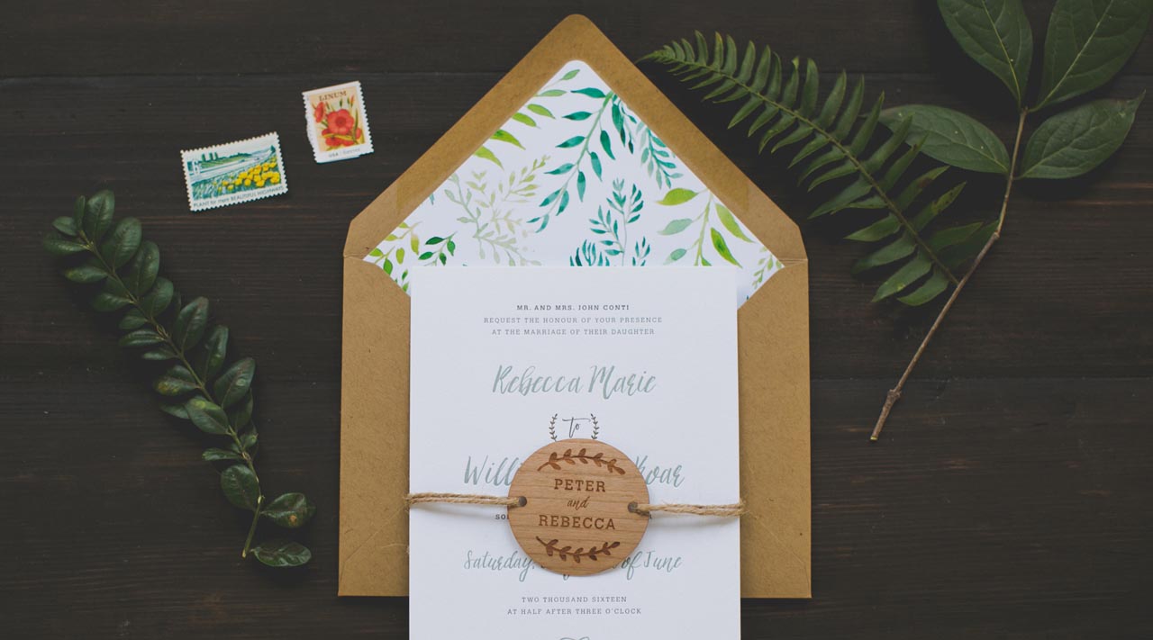
The custom floral watercolor liner and wood engraved tags were the perfect finishing touches to this whimsical invitation suite, with the wood engraved tags and natural twine adding a dose of rustic texture. We chose vintage-inspired floral postage stamps to enhance the natural feel of the invitation set.

Illustrated Honeysuckle Vine Wedding Invitations by Wide Eyes Paper Co.

Thanks Amanda!

Design: Wide Eyes Paper Co. 
Letterpress Printing: Clove St. Press

Wide Eyes Paper Co. is a member of the Designer Rolodex – you can see more of their beautiful work right here or visit the real invi­ta­tions gallery for more wedding invitation ideas!

Photo Credits: Kelly Wild

Behind the Stationery: People I’ve Loved

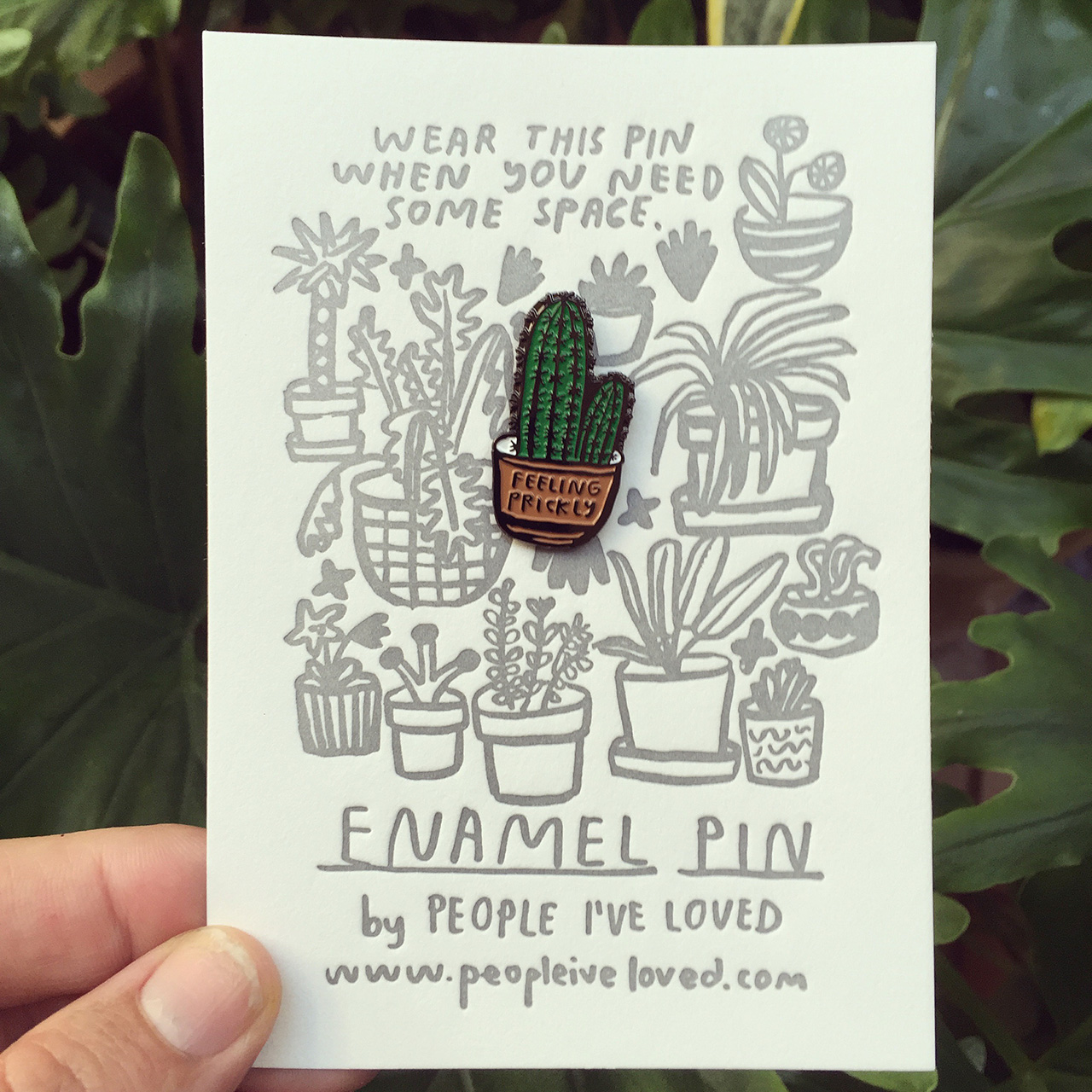
For our next installment of Behind the Stationery, we head to the San Francisco Bay Area to get a look behind the playful hand-drawn illustrations of Carissa from People I’ve Loved. She delves into her thought process behind designing, time management struggles, and the dynamics of her team. I love all the honesty throughout her post. Take it away, Carissa!
—Megan Soh
Behind the Stationery: People I've Loved

From Carissa: Before stationery there was nothing. Ha. I had to say that. I studied print at SFAI and was really interested in social interactions. My buddy Luca Antonucci and I started Colpa Press right after grad school where we were really interested in making prints, books, objects, and cards that were concept driven and affordable. I think I got into cards as mini performance art works. I could theoretically compose a situation for two people and have them come together to feel connected. I would imagine people’s social situations as working out better than my own —that they could say what they really felt. Do you ever have a conversation on repeat in your head? I get obsessed with things I should have said. But I am not quick witted…

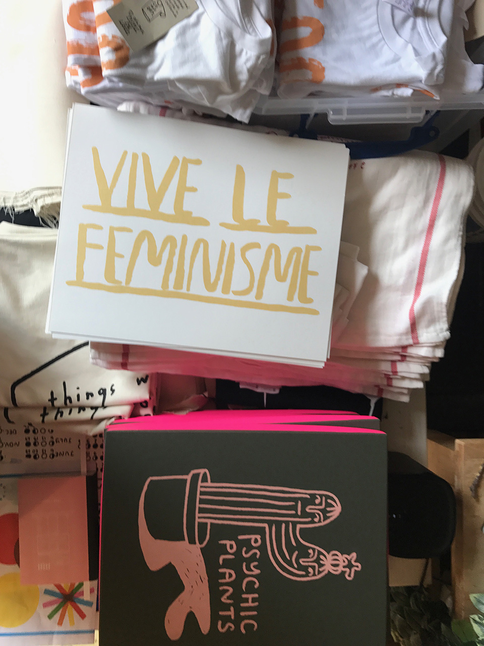
I guess I could say that we are women-owned and run, and we like to deal with feelings that are not always pretty. I think now we are in the really special time where we can be more open about how we are feeling and that things don’t always have to make sense. We have a lemon tree.
Behind the Stationery: People I've Loved

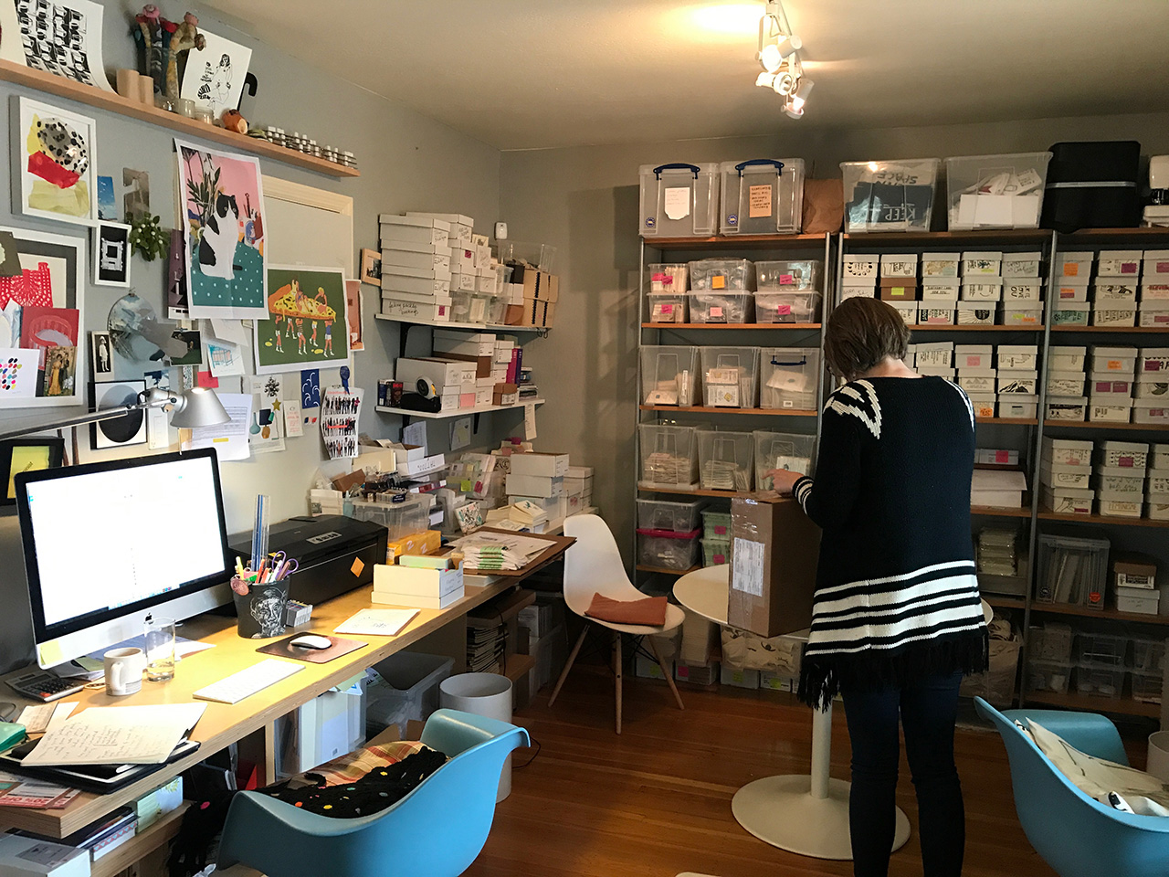
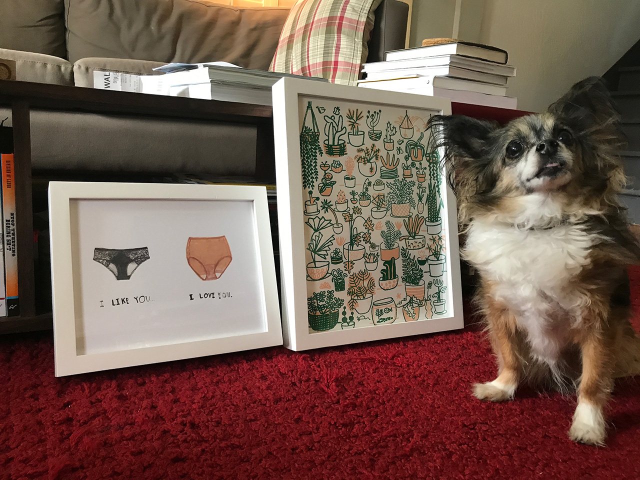
We are in the Bay Area. Oakland. PIL has really always been in my house. The rent is high around these parts and we just cannot compete with tech budgets. PIL keeps taking up more and more of the house, so something might have to change sometime soon to save my marriage. But for now, we just kind of pack it in wherever we can find space.

Schedules are something that I am not super good with. Josh, my partner, said that I have a problem with authority. And I was like, “What? No, I don’t.” And he was like, “time — you have a problem with time.” These days, we try to work 9 – 5pm and then swim. I kinda think that everything is work though. Watering plants is also inspiring so I like to spend time with them. And I think about work all the time – some of my favorite ideas come while in the shower. Most days there are people around, which is great because, as it turns out, I like people. I am scared of being alone. I mean I don’t know what I would do with myself if I was alone.
Behind the Stationery: People I've Loved

Process is tricky. Everything is always different. Sometimes we have brainstorming sessions for card ideas, sometimes someone is having an event in their lives that we explore, or sometimes we might just randomly feel like making time to make something.

For budget and ethical reasons, I always try to make things here, at the house from either ethically sourced materials or recycled stock. That being said, we have to order pins overseas. Which is what it is. If anyone can actually find a pin person in the USA, let me know. I would be all about that.
Behind the Stationery: People I've Loved

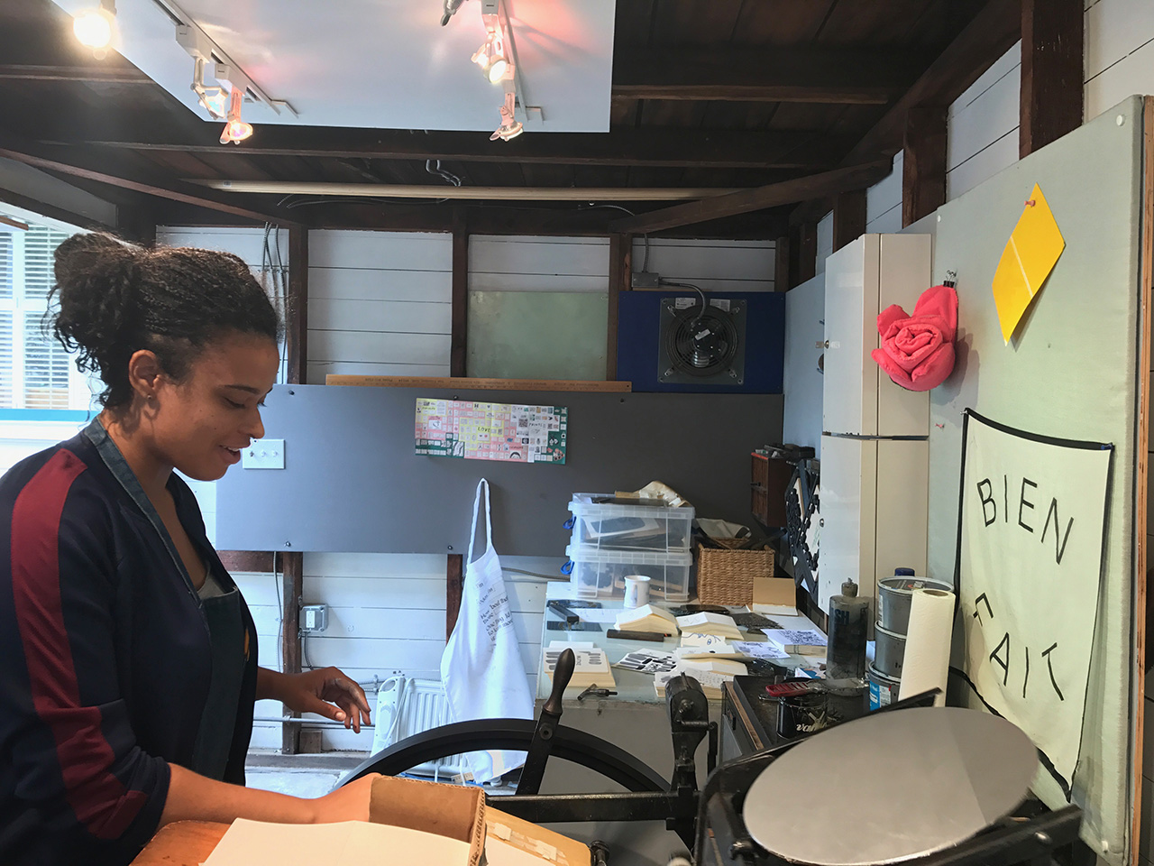
As for who does what — everybody just kinda does what is needed or what comes up on the day to day. I am trying to do less production which is hard for me since I love production, but we all brainstorm ideas, and help out where we can. Loretta is a really great organizer, manager, and writer so she has taken that on. Grace helps with website, C&P printing, and being an all around joy to be around. And Emily does all or most all of our screen printing. I do the Vandercook printing (but I shouldn’t because my wrists are in bad shape these days).
Behind the Stationery: People I've Loved

Oh, oh, oh! And we also have help from our press superhero, Al. He has pretty much saved my life time and time again. He also works at Solstice Press in Oakland, and if we do outsource things, we do it with them. They are a local lady-run print shop. They help out with all of our offset printing and foil. They do a great job and I don’t think I would ever print with anyone else.

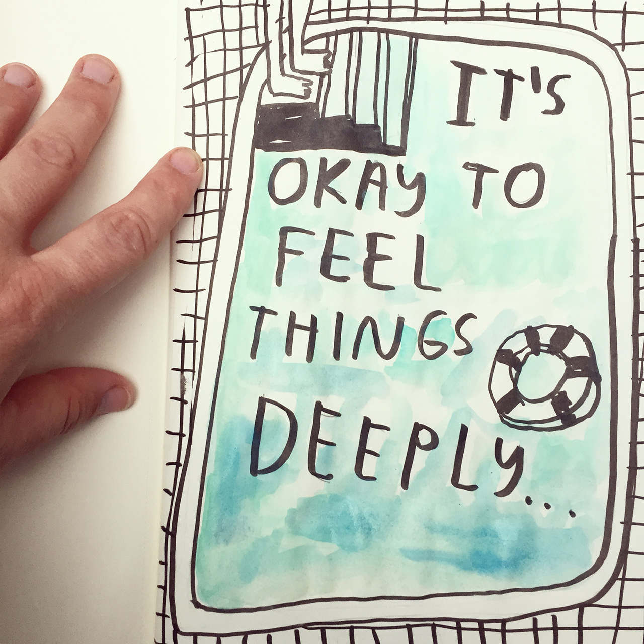
Most of all, I love to draw. I wish I had more time for just drawing. I think I would like to work on one thing at a time. These days I feel like my mind is in so many places at once that I end up feeling overwhelmed all the time.
Behind the Stationery: People I've Loved

All photos by Carissa Potter Carlson

Want to be featured on the Behind the Stationery column? Inquire with Megan at megan [at] ohsobeautifulpaper [dot] com for details.