Good morning everyone! Can you believe it's already the last day of August? But even as summer is ending, there are a few new ventures just getting started. First, Alyson's Postal Press is finally live! The shop is stocked full of wonderful note cards, journals and other letterpress goodies:
Search Results for: red summer invitation
Jennifer +Â James Sunflower Wedding Invitations
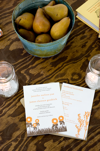
I am so excited to be featuring today’s real invitations and wedding stationery, designed by Lisa from Good on Paper for James and Jennifer’s beautiful sunflower-filled wedding:
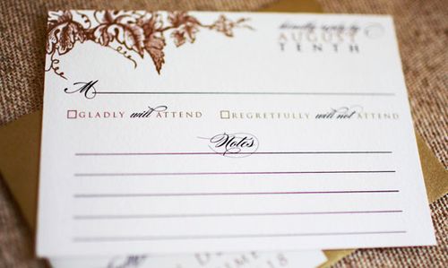
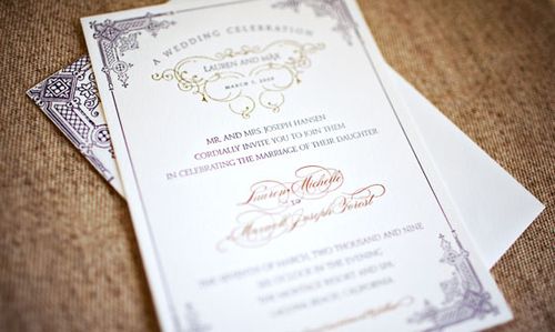
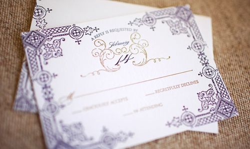
You might have seen this wedding, designed by the amazing Gloria Wong, in the latest issue of MS Weddings, but Heidi and Judy from Gertrude + Mabel Photography were kind enough to send over photos specifically of the paper elements:
The bride, Jennifer, also shared the inspiration behind Lisa’s beautiful designs:
We loved the casual, rustic style of an outdoor wedding. We definitely wanted a beautiful outdoor setting that made our guests feel like they were on a mini vacation (even if they only drove up from San Francisco). Beaulieu Gardens was a perfect romantic choice for us since it had so many different locations for the ceremony, cocktail hour, and reception (where we loved dining underneath a canopy of trees).
Also, it had a very vintage feel to it, and so we were inspired by the look and feel of the South of France. Our planner used old vintage suitcases as props, a lot of wooden signs, rusted copper and tin containers to hold the flower arrangements, casual french-inspired table cloth runners, mason jars, and sunflowers.
Nancy also did a great job weaving in elements of the two of us. For example, I love to eat and cook. For setting arrangements, we labeled each of the tables an herb that I normally use in my cooking.
We also created a “marketplace” that looked like a farmer’s market (since I love to frequent them) and gave away sunflowers, fresh fruits, flip flops, and a recipe box filled with 12 of my favor recipes to make and a little package of thyme (my favorite herb).
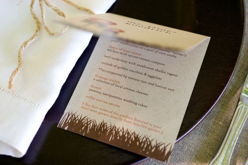
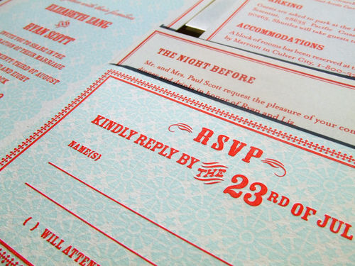
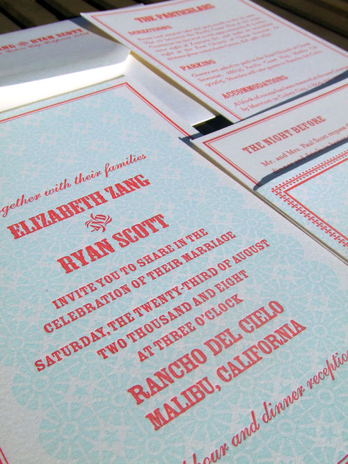
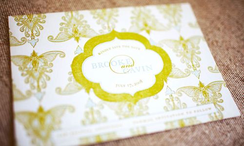
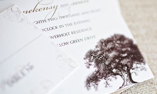
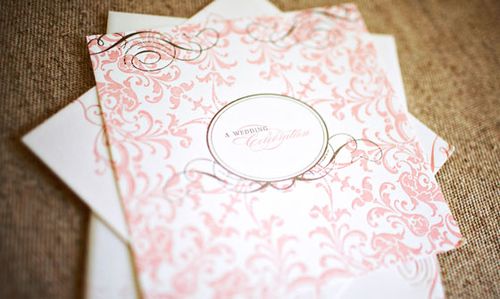
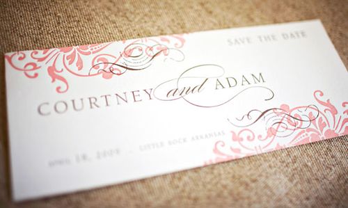
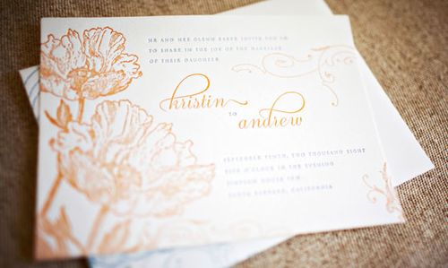
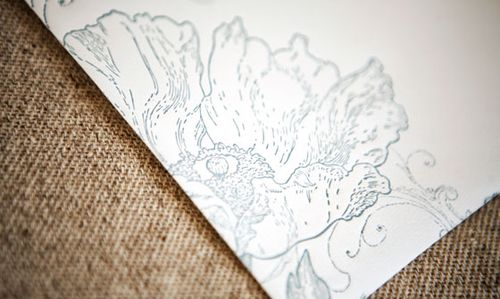
For the invitations specifically, we worked with Lisa to incorporate the wedding themes too. The main page had sunflowers that were drawn on them (which was the main flower we used in the wedding).
Lisa also incorporated herbs into the other cards such as the reply card since it tied back to my love of cooking. We had purchased a herb picture book so that Lisa could get inspired.  Also, everything was very casual with the invitation. We chose to write everything in lower case for the invitations and all other printed material at the wedding.
I love that Jenny’s love for cooking is reflected throughout the invitations and wedding – resulting in a very personal design and feel to the invitation – and the way Lisa designed the invitation suite to convey central theme without each element being too matchy-matchy.  Plus, the sunflower and herb motif seems like a perfect fit for a wedding taking place just as summer transitions into fall.  So lovely!  Thank you so much to Jennifer and Lisa for sharing these invitations – and to Heidi and Judy from Gertrude + Mabel for providing such lovely photos!
{all photos by Gertrude + Mabel}
Seersucker + Letterpress Wedding Invitations
I just cannot stop staring at these gorgeous letterpress wedding invitations, designed by the ladies at Ice Cream Social and printed by Gilah Press:
The crisp red + white color palette is perfect for a summer wedding – but can we just talk about the details for a minute? The seersucker fabric pouch with the gocco-printed apple + peach tag? The little red polka dots on the back of the rsvp postcard? The darling monogram (and I’m not usually a huge monogram person) inspired by vintage fruit wrappers? Love, love, love.
Check out more over at the Ice Cream Social blog right here.
{images from Ice Cream Social}
Liz + Ryan’s Modern Americana Wedding Invitations
I first came across these lovely invitations while browsing through one of my favorite blogs, Parcel Post. Luckily, Audrey (the author behind Parcel Post) is good friends with the bride, Liz, and put us in touch so that Liz could share the inspiration behind her invitations.   Liz and Ryan’s invitation suite included the stand-alone invitation, enclosures with accommodation information, directions, and a rehearsal dinner invitation, as well as a matching RSVP card:
From Liz: It was important to us that our wedding felt personal, relaxed and fun – that was our inspiration behind the invitation design. We choose a favorite color combination of red and turquoise because it feels fresh and fun and like summer; it also was perfectly suited to the ocean view at our venue.
The design of the invite was celebratory and informal, signaling the laid back vibe of our wedding. We worked with our stationer Audrey Woollen at Urbanic in Venice, CA, to order the Classic Cowboy invitation design from the Hello! Lucky letterpress studio. Audrey is the consummate professional and the entire process was a breeze.
For our escort cards we put name and table number on a stick inside little boxes of kettle corn. They doubled as our wedding favors. On the reverse side of the card was one of 10 different shots from our engagement session.  These were a big hit as they served as a take away reminder of the day as well.
{escort card photos by Viera Photographics}
{photos by Audrey Woollen}
Liz also sent a couple of photos of her Save the Date postcards, which I couldn’t resist sharing as well:
I love all the details – from the red and pool color palette to the popcorn bag escort cards, this seems like such a fun and relaxed wedding! For a couple more pictures from Liz and Ryan’s wedding, be sure to check out Audrey’s post on Parcel Post. And thanks to Liz for sharing her invitations!
Check out the Designer Rolodex for more talÂented wedÂding inviÂtaÂtion designÂers and the real inviÂtaÂtions gallery for more wedding invitation ideas!
{all photos by Liz Zang, unless noted otherwise}
Wedding Invitations — Wiley Valentine, part 2
As promised, here are some additional invitations from Wiley Valentine, specifically from their letterpress and custom invitation portfolio.  I think the designs speak for themselves, so here are a few of my favorites:
{love, LOVE, the blind impression on the activities enclosure card}
{this invitation combines a monogram and black + white graphics for an elegant design}
{gorgeous Moroccan-inspired details on this invitation}
{this oak tree invitation would be perfect for a late summer or fall wedding}
{love the beautiful + ornate designs in this invitation}
{this poppy invitation would be perfect for a spring wedding}
{lovely Victorian detailing on this invitation}
{a classic invitation for a vineyard wedding}
{this vintage-inspired is one of my favorite Wiley Valentine designs}
The custom portfolio is so pretty, I had trouble picking out which ones I wanted to share with you! Â You should definitely check out the full Wiley Valentine portfolio for more lovely invitations and some great design inspiration!
{images via Wiley Valentine}