DIY Rubber Stamp Floral Wedding Invitations

It’s the ladies of Anti­quaria, back with another cre­ative DIY project for you!  Today they’re sharing a fun tutorial on how to make gorgeous rubber stamp wedding invitations with a floral motif!

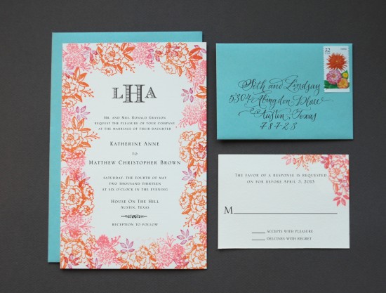
We love the versatility and custom look that rubber stamps can give your invitation suite.  This week, we wanted to show how the same stamp designs can lead to two very different wedding invitation suites: one designed for a festive tropical bash, and the other for more traditional, sophisticated affair!  It’s as simple as changing the stamp pad and envelope colors!  Let us show you…

DIY Tutorial: Floral Rubber Stamp Wedding Invitations

Option 1: For the tropical fete… shades of coral, mango, and berry make the floral border.  Lovely pool colored envelopes complement the suite.

DIY Tutorial: Floral Rubber Stamp Wedding Invitations

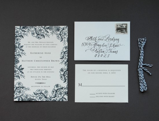
Option 2: Traditional black and white convey elegance and sophistication.

DIY Tutorial: Floral Rubber Stamp Wedding Invitations

Step 1:  You’ll want to stamp your invitation wording first… it makes things much more simple.  Ink your stamp (we used our classic invitation stamp) thoroughly, and center it over your paper.  Press firmly but moderately, using the handle as your primary pressure point to avoid an uneven print.  Let dry.

DIY Tutorial: Floral Rubber Stamp Wedding Invitations

Step 2: Put a sheet of regular text weight paper underneath your already printed invitation. Using your border stamps, (we used our camellia pattern stamp, daisy pattern stamp and small leaves pattern stamp) begin stamping the motifs around the border, making sure not to cover any text.  Go in a clockwise pattern and stamp the images sparsely first… you can always come back in and add more in each circular pass.  It also helps to stamp off of the page, giving the invitation a full bleed effect.  It  would be wise to start with your largest motif and move to the smaller ones to fill in the border.  If you are using multiple colors, be certain to make the overall border balanced in color and design.

DIY Tutorial: Floral Rubber Stamp Wedding Invitations

Step 3: Print your reply card (we used our classic reply card stamp) in the same manner as you did the invitation text.  If you like, you can also add your floral motifs to this card, like in the tropical suite, or keep it simple, as shown above.

DIY Tutorial: Floral Rubber Stamp Wedding Invitations

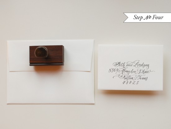
Step 4: Stamp your return and reply addresses (we used our calligraphy return address stamp) on your envelopes.  You can re-use the stamp long  after your wedding is over… maybe on all those thank you notes!!!

DIY Tutorial: Floral Rubber Stamp Wedding Invitations

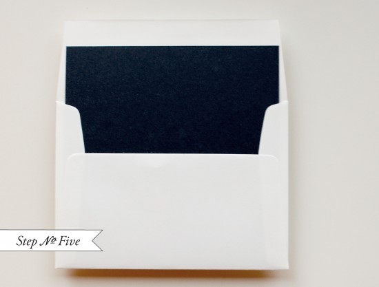
Step 5: We’ve chosen to add a black text weight paper liner to the outer envelope.  This is a great way to bring in some additional color to the suite and to create a nice balance.  It’s simple to do as well… you can find envelope liner template kits or pre-cut liners at Paper Source and local craft stores.  If you’re using square envelopes, you can also have your local print shop cut paper down to your envelope specifications.  Then just put a line  of double stick tape or stick glue across the top, slide them into position and press to secure.  Fold at the crease with a bone folder to get a nice, crisp edge.

DIY Tutorial: Floral Rubber Stamp Wedding Invitations

Now all that’s left is to tie the suite together, address them and hand them off to your post office to deliver to your lovely guests!!

Materials:

For the classic invitation suite

Classic Invitation Stamp

Classic Reply Card Stamp

Calligraphy Return Address Stamp

Camellia Pattern Stamp

Daisy Pattern Stamp

Small Leaves Pattern Stamp

Stamp Pad – in Black

Cover Weight Paper, cut to A7 (5″x7″) and 4bar (3″x5″)

A7 Envelope

4bar Envelope

Liner paper in black, cut to size

Double Stick tape

Twine – in black and white

For the tropical invitation suite

Classic Invitation Stamp

Classic Reply Card Stamp

Calligraphy Return Address Stamp

Classic Monogram Stamp

Camellia Pattern Stamp

Daisy Pattern Stamp

Small Leaves Pattern Stamp

Stamp Pad – in Coral, Mango Tango, Magenta and Antique Pewter

Cover Weight Paper, cut to A9 (5.5″x8.5″) and 4bar (3″x5″)

A9 Envelope – in Pool

4bar Envelope – in Pool

Business Card Ideas and Inspiration #11

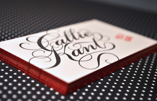
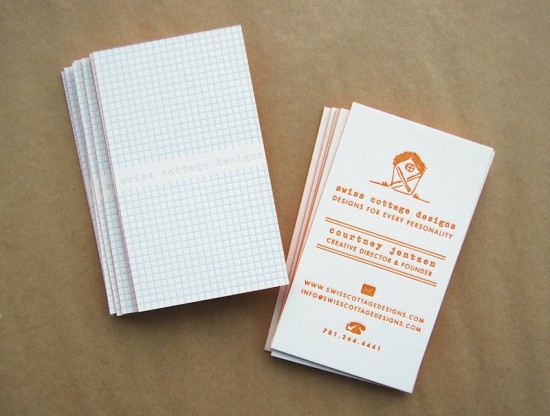
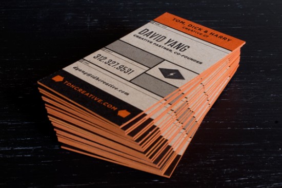
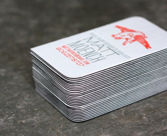
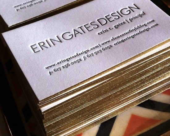
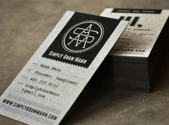
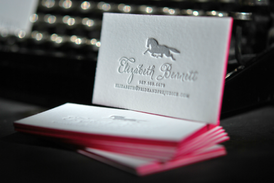
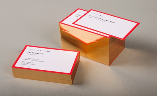
It’s no secret that I love business cards – a great business card can be like a tiny little piece of art!  I also love it when designers and printers incorporate edge painting into business card design, from bright pops of color to elegant metallics to sophisticated black ink.  It’s been a while since I rounded up some inspiring business cards, so today I thought I’d share some of my recent favorites!

Callie Kant via Lovely Stationery

Swiss Cottage Designs

Mike McQuade for Tom Dick & Harry Creative Co. via FPO

Dingbat Press

Parrott Design Studio

Adam Mann via FPO

Studio on Fire

Bespoke Letterpress Calling Cards

Gold Foil Edge Business Cards by Deutsche & Japaner via Design Work Life

Do you have an awesome business card that you’d like to share?  If so, e-mail me right here!

{images via their respective sources}

Laicie + Mark’s California Farm Wedding Save the Dates

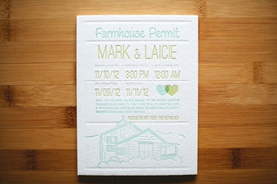
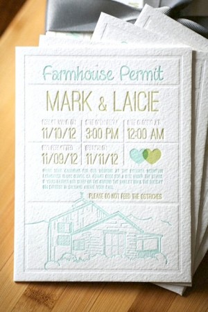
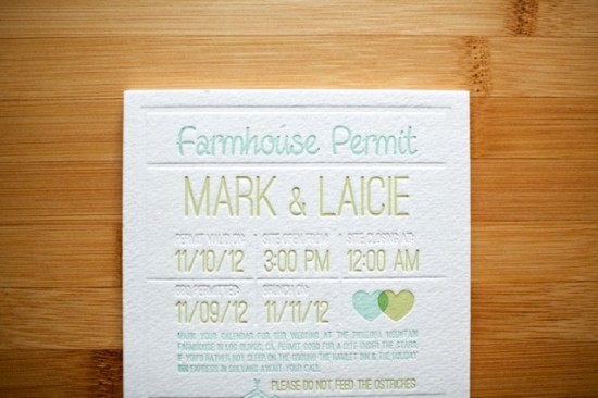
Happy Monday everyone!  We’re starting off the week with a sweet illustrated wedding save the date by NYC-based designer and photographer Matthew Novak.  Matthew’s clients, Mark and Laicie, are planning a fall wedding on a farm in California, so Matthew created a light hearted design inspired in part by a camping permit and in part by the wedding location!

From Matt: Mark and Laicie are getting married on a farm in California, but have a love for camping and the outdoors.  We decided to create a save the date that was inspired by a camping permit.

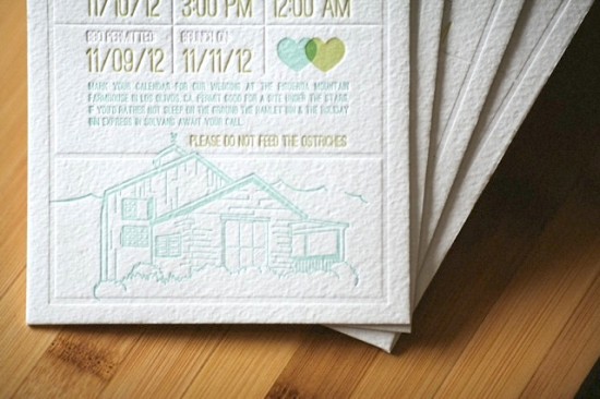
We played with the wording a bit to make sure it was light hearted and fun.  I had received a rough pencil sketch of what the farmhouse looked like.  I used this as a guideline to create the farmhouse illustration on the bottom of the save the date.


I love letterpress, so the decision to go in that direction was easy.  The third “color” – a blind (inkless) impression – really helped sell the permit style by creating dividers throughout the whole piece.

Thanks Matt!

Design: Matthew Novak

Letterpress Printing: Dingbat Press

Photo Credits: Tin Sparrow

Friday Happy Hour: The French Gimlet

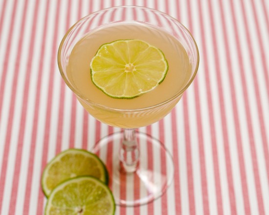
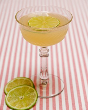
It’s not summer yet, but with 70-degree weather like yesterday’s (at least here in DC) you might think it is.  In that spirit, here’s one of the most refreshing drinks out there: the French Gimlet.

Continue reading for the recipe!

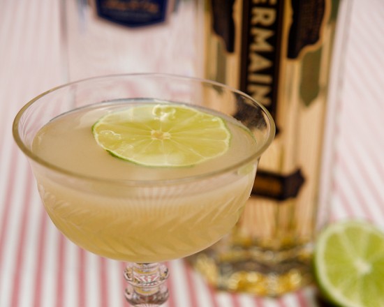
French Gimlet

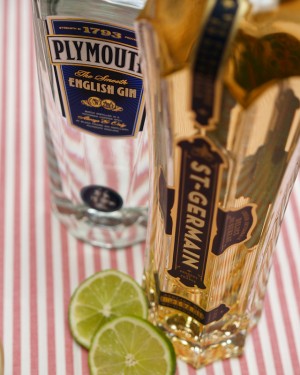
2 oz Dry Gin
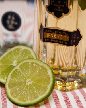
1 oz St. Germain
1 oz Lime Juice

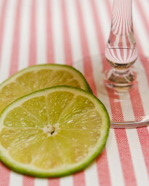
Combine all the ingredients and shake with ice, strain into a chilled cocktail glass, garnish with a lime wheel and enjoy.


The Gimlet – gin and lime juice or lime cordial – is a fantastic drink by itself, crisp and tart, citrusy and fantastically refreshing, the perfect thing to cool off on a muggy summer night.  The addition of the elderflower-flavored St. Germain liqueur adds a layer of floral complexity and a bit of sweetness to the French Gimlet that makes this an easy drink to sip.

The Royal Navy claims one of its own naval surgeons, Sir Thomas D. Gimlette, invented the Gimlet (or Gimlette as it was reportedly known at the start) sometime around the start of the 20th century.  Gimlette was apparently looking for a way to ensure sailors would drink the lime juice they needed to stave off scurvy.  It’s a good story, and it was an even better idea.  I, for one, am scurvy-free.


The Gimlet was probably made originally not with fresh lime juice, but with lime cordial, a sweetened preserved lime juice.  Lime cordial was invented in the 1860s to keep fresh the sailors’ lime ration that they were, apparently, so reluctant to drink that Sir Gimlette had to dump gin into it.  I do not recommend you use a lime cordial, like Rose’s, in the French Gimlet: the St. Germain adds plenty of sweetness on its own, and the tartness of fresh lime juice is a good balance to the drink’s other ingredients.

That said, I wonder how this drink would work with Old Tom Gin in place of dry gin, or even Genever…as always, experiment away.

Photo Credits: Nole Garey for Oh So Beautiful Paper

{happy weekend!}

This week felt like it was all about change – the change of seasons from winter to spring, the change of letting some things go, and the change of looking forward to lots of amazing things to come over the next few months.  It was also the first week that I didn’t feel completely overwhelmed by my never ending to do list, so maybe the two things go hand in hand.  This weekend I’m looking forward to heading out to the DC Big Flea and catching up with friends.  But in the meantime…

Photo Credit: flourfight

…a few links for your weekend!

This week on Oh So Beautiful Paper:

As usual, we have a fun cocktail coming up for you this afternoon, so check back a bit later for the recipe!  I hope you all have a wonderful weekend, and I’ll see you back here on Monday!  xoxo