Hand Painted Wedding Invitation Inspiration

Happy Monday everyone! You’re in for such a treat: the amazingly talented Kristy Rice of Momental Designs sent over three beautiful hand painted wedding invitations that she created for a shoot at the stunning Biltmore Estate in North Carolina – and we’re going to see all three! We’ll start off with the first invitation suite and some of the beautiful inspiration from the shoot, followed by the two other invitation suites a bit later. Let’s get right to it!

Biltmore-Estate-Inspired-Watercolor-Wedding-Invitations-Momental-Designs-OSBP-17

From Kristy: The antiquity of the Biltmore Estate in Asheville, North Carolina lends itself to creating wedding stationery that you might find in the actual details of the Vanderbilt home within the embossed wallpaper, ornate woodwork, treasured artworks, or the rich draperies adorning each window. I decided right away to feature a family crest-style monogram, just as the Vanderbilt family would have had on their own letterhead. But we updated the look with watercolor and hand gilded touches.

Biltmore-Estate-Inspired-Watercolor-Wedding-Invitations-Momental-Designs-OSBP-11

We evolved a traditional monogram concept to reveal a modern aesthetic. Hand gilded initials mingle with watercolor moments. The invitation features hand painted Dupioni silk photo corners in sage green with subtle ombre fading along the edge. The invitation also features the same hand painted silk in a wrap with a watercolor silhouette of the Biltmore Estate. The menu features a tonal layering of stock in bright pink hues.

Biltmore-Estate-Inspired-Watercolor-Wedding-Invitations-Momental-Designs-OSBP-3

Biltmore-Estate-Wedding-Invitation-Inspiration-Momental-Designs-OSBP3

Biltmore-Estate-Inspired-Watercolor-Wedding-Invitations-Momental-Designs-OSBP-12

Biltmore-Estate-Wedding-Invitation-Inspiration-Momental-Designs-OSBP7

Biltmore-Estate-Wedding-Invitation-Inspiration-Momental-Designs-OSBP5Biltmore-Estate-Inspired-Watercolor-Wedding-Invitations-Momental-Designs-OSBP-27

Biltmore-Estate-Inspired-Watercolor-Wedding-Invitations-Momental-Designs-OSBP-29

Biltmore-Estate-Inspired-Watercolor-Wedding-Invitations-Momental-Designs-OSBP-9

Biltmore-Estate-Inspired-Watercolor-Wedding-Invitations-Momental-Designs-OSBP-18

Biltmore-Estate-Inspired-Watercolor-Wedding-Invitations-Momental-Designs-OSBP-6

Embroidery-Inspired-Wedding-Invitations-Momental-Designs-OSBP-17

Biltmore-Estate-Wedding-Invitation-Inspiration-Momental-Designs-OSBP10

Thanks Kristy – and check back for the other two invitations (inspired by embroidery and vintage millinery!) a bit later!

Design and Hand Painted Stationery: Momental Designs

Calligraphy: Meant to Be Calligraphy

Hoop Art Place Cards: Thimble and Thistle

Venue: Biltmore Estate, Asheville, North Carolina

Check out the Designer Rolodex for more tal­ented wed­ding invi­ta­tion design­ers and the real invi­ta­tions gallery for more wedding invitation ideas!

Photo Credits: With Love and Embers

Swiss Cottage Designs: A Peek at Our Process

image 2.1 - Post 2 Banner

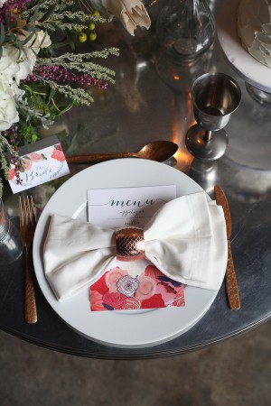
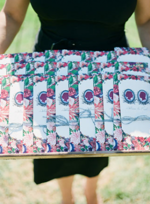
Every designer has a unique method that works for them. With so many different ways to arrive at the final product, there is always room for experimenting with different styles, supplies and ideas; it’s all about trial and error. Illustration is a process that is near and dear to my heart. I studied illustration at Syracuse University and it’s been the consistent force in my life (sorry flair jeans). I thought I’d share our illustration process here and give you a few tips on how we go about our projects. â€“ Courtney of Swiss Cottage Designs

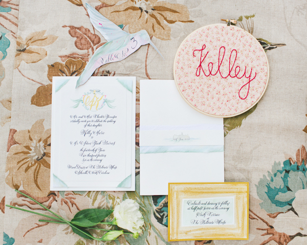
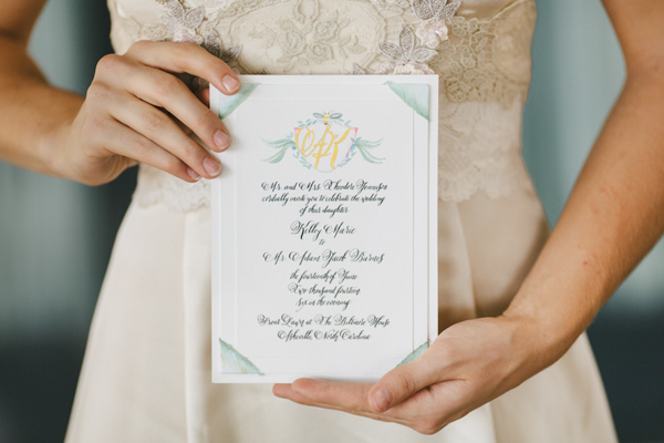
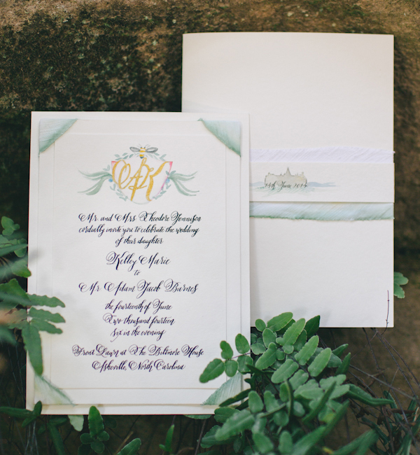
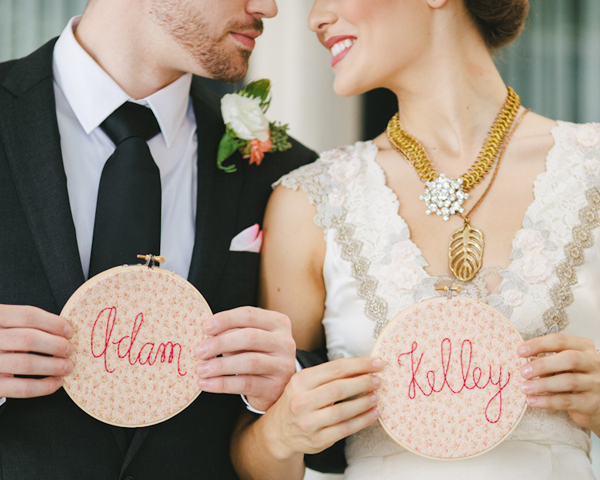
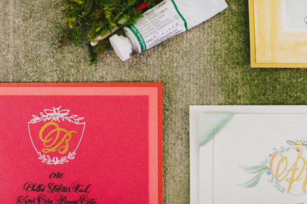
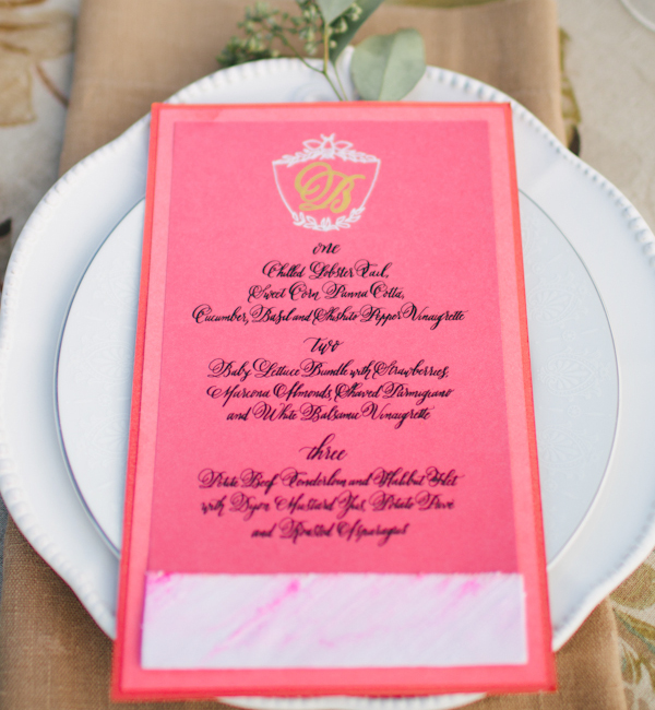
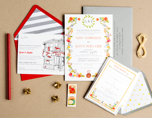
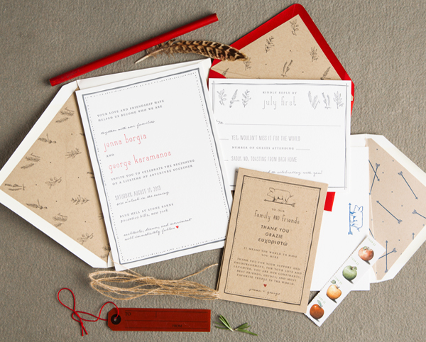
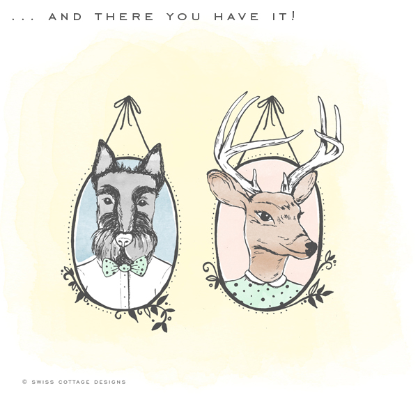
This one is a fun one: it was a crest for a client’s wedding invitation suite. Her last name is Buck and his last name is Scott, so they wanted to play off that and personify drawings of a deer and scottie dog to represent them. I was in love with this idea right from the get-got! Here is how we started Marie’s crest.
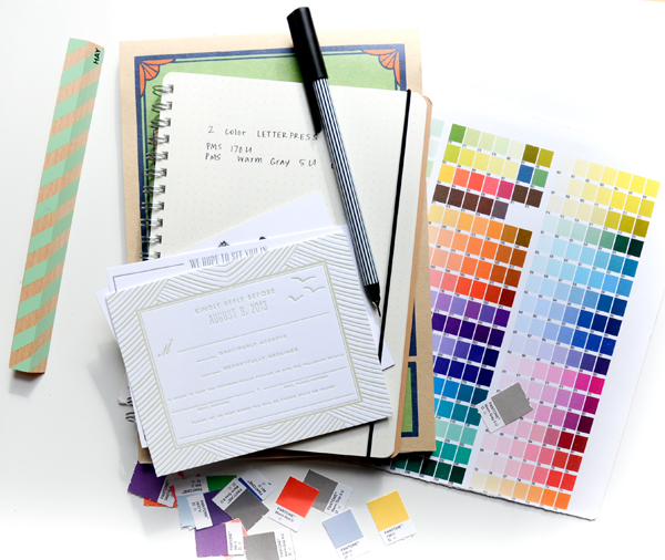
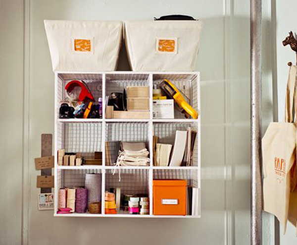
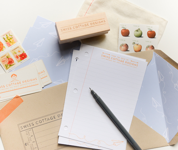
Tools

Every good project starts with your most tried and trusted tools. The ones shown here were not all used for this project but I thought I’d share a few of our favorites:

image 2.1 Favorite Tools

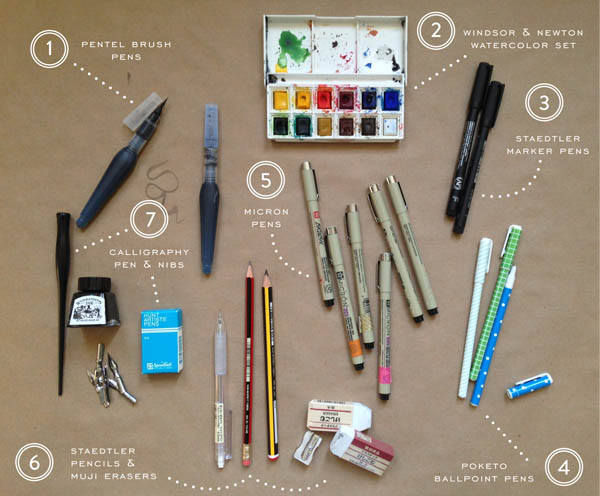
1. Pentel Brush Pens: I bought these while in London recently and they blew me away. They are amazing for loose sketches and lettering.

2. Poketo Ballpoint Pens: I couldn’t go a day without these guys. They have a fine point and make marking up proofs pretty neat and tidy.

3. Micron Pens: The amount of Micron pens I have is unhealthy. I color code them with Washi tape so I know which points work better than others.

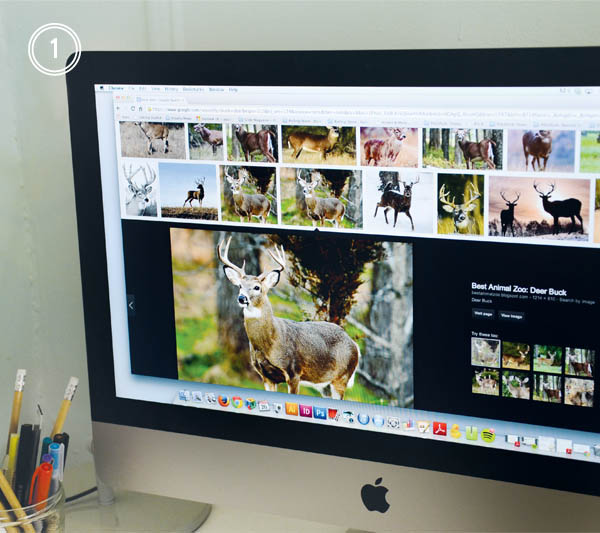
Step 1: After I get my supplies sorted out, I like to start with sourcing a few inspiration images. While the internet can be both blessing and a curse (who hasn’t fallen down a Pinterest black hole before?), it’s a wonderful resource to get started! I always remind myself that I don’t have to create in a vacuum. If I’m struggling to draw a deer, a million source images are only a few clicks away. One of the lessons I’ve had burned in my mind from college was photographic reference. It helps bring a certain likeness to the drawings.

image 2.2 Sourcing Inspiration

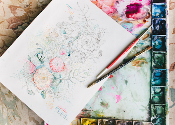
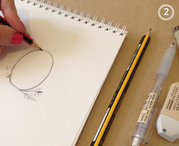
Step 2: Next, I sketch out a few options in my sketch book. I love using Straedtler pencils, I find they erase nice and clean so I don’t end up with a muddy mess before it’s all over. If you find yourself at an art supply shop, there are loads of options for leads, colors, weights, etc. so you can find what works best for you and your drawing style.

image 2.3 Process Sketch

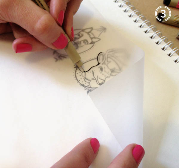
Step 3: Once I’m happy with the sketches, I’ll redraw them on vellum tracing paper using micron pens. Micron pens come in every thickness and weight under the sun, so I never have trouble creating the line style I’m after. Line weight change is key! The beauty of this step is that is allows me to add or subtract anything I wasn’t wild about from the original sketch.

image 2.4 Process Tracing

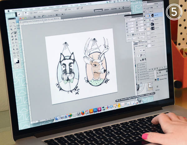
Step 4: Next I head over to my trust scanner! This little guy is key in the whole process. While I love digital illustration, nothing beats drawing by hand. Without my scanner, I wouldn’t be able to translate anything to digital. I scan in each image at a high resolution and always in black and white as I find it maintains the line integrity better.

image 2.5 Process Scanning

Step 5: Now that everything has been scanned, I can start working with color and placement. When I draw, I tend to illustrate everything in smaller pieces. This provides more flexibility in terms of adding, subtracting, or moving elements around. If I drew everything in one large image, it’d be more difficult to edit it down the road. Photoshop brushes are my best friend! It’s astounding how many textures and styles you can achieve using them. For this particular project, I’m looking for a softer, watercolor wash effect. This is the really fun part as it allows for experimentation. If I don’t like it, I can always undo or delete the layer.

image 2.6 Process Coloring

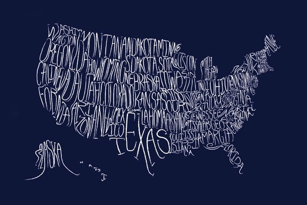
And finally (drum roll!) I’m all done and ready for the client to have a look.

image 2.7 Final Illustration Buck + Scotty… an illustration from start to finish! Some days I might bust out the watercolors or my trusty brush pens depending on the project, but it’s always great to experiment with what works best for you and refine your process as you learn. It’s always a lot of fun and very exciting to see the end result.

Photo/Image Credits: Swiss Cottage Designs

Swiss Cottage Designs: Hello from Brooklyn!

image 1.1

Hello from Brooklyn! I’m Courtney from Swiss Cottage Designs and I’m stoked to be guest blogging this week on our most favorite paper blog, Oh So Beautiful Paper! I’ve been a huge fan of Nole’s blog since the early days so it’s really fun to be able to contribute back to such an inspiring blog. Thanks for having us!

I thought it would be fun to start our week of guest blogging with a peek into our life here in Brooklyn. I founded Swiss Cottage Designs in 2009 after working in the design industry for 4 years. While those years were filled with amazing professional experiences, I always knew I wanted to work for myself. Thus, SCD was born! We specialize in illustration, invitations and custom branding. In the last 5 years we’ve had the pleasure of working with brands such as Warby Parker, Crown Publishing, and Paperless Post as well as many, many wonderful couples and planners. I feel so lucky to be in such an amazing and inspiring industry!

image 1.2 - Studio Desk

image 1.3 Studio Books

We’re located in Carroll Gardens, a Brooklyn neighborhood of tree lined streets, historic brownstones and about a million places to grab tasty treats (it’s kind of a problem, really.) We have a home studio which means the neighborhood becomes sort of like a co-worker. Lucky for us, he’s not that annoying guy who breathes too heavy in the next cube over.

image 1.5*

Photo courtesy bigriffith

image 1.4

 Photo courtesy of Shiny Bright

A day typical day (if there is such a thing) around the studio consists of lots and lots of emails, drawing, scanning, painting, designing, packaging, eagerly awaiting shipments from the printer, opening said shipments with bated breath, more emails, drawing, packaging and of course illicit amounts of coffee and tea. Running a business is the most incredible experience yet can be just as equally frustrating! There are days when the printer jams all your envelopes, a FedEx package goes missing and a press run comes back wrong and you just want to phone it in. Then you have days that are better than anything you could have imagined. I wouldn’t trade it for anything.

image 1.7 Swiss Cottage Colors

image 1.6 Studio Storage

image 1.8 Swiss Cottage Stationary

Our clients are constantly inspiring us! Because all of our projects are custom, we’re constantly exploring different methods of art and design. We love that no two jobs are alike. Here are a few recent projects we’ve worked on:

image 1.13

image 1.12

image 1.11

image 1.10

image 1.9

We can’t wait to share more with you! Stay tuned to Oh So Beautiful Paper this week and in the mean time, say hi to us on Twitter and Instagram. Looking forward to meeting you all!

Photo Credits: Swiss Cottage Designs, except where noted

Wedding Stationery Inspiration: Bold Florals

Who else is craving spring!? I can’t bring you warm weather and blooming botanicals, but I can bring you a little floral goodness in the form of wedding stationery! I’ve been seeing bold, dramatic floral prints popping up here and there for day-of wedding paper, and I can’t say I’m complaining! In fact, it’s a motif I’m hoping to use for my very own upcoming wedding. For those of you that love flowers just as much as me, and don’t think just the fresh variety is enough, these paper pretties are for you! —Kelly

Day-of Wedding Stationery Inspiratoin: Bold Florals via Oh So Beautiful Paper

Photo by John Schnack Photography, Table Numbers by Lucky to Be in Love via Green Wedding Shoes

Day-of Wedding Stationery Inspiratoin: Bold Florals via Oh So Beautiful PaperDay-of Wedding Stationery Inspiratoin: Bold Florals via Oh So Beautiful Paper

Photo by Lani Elias Fine Art Photography, Table Number by One Plus One via Style Me Pretty (left), Photo by Whitney Neal, Place Card by Heart Felt by Bri via 100 Layer Cake (right)

Day-of Wedding Stationery Inspiratoin: Bold Florals via Oh So Beautiful Paper

Photo by Lauren Fair Photography, Drink Sign by Miss Wyolene via Green Wedding Shoes

Day-of Wedding Stationery Inspiratoin: Bold Florals via Oh So Beautiful PaperDay-of Wedding Stationery Inspiratoin: Bold Florals via Oh So Beautiful Paper

Photo by Kat Willson Photography, Menu by Robin Egg Blue Design via Ruffled (left), Photo by Catherine Rhodes via Style Me Pretty (right)

Day-of Wedding Stationery Inspiratoin: Bold Florals via Oh So Beautiful Paper

Photo by Michelle Cross Photography, Card by Rifle Paper Co. via Elizabeth Anne Designs

Day-of Wedding Stationery Inspiratoin: Bold Florals via Oh So Beautiful PaperDay-of Wedding Stationery Inspiratoin: Bold Florals via Oh So Beautiful Paper

Photo by Lauren Fair Photography, Table Number by Miss Wyolene via Green Wedding Shoes (left), Photo by John Schnack Photography, Program by Lucky to Be in Love via Green Wedding Shoes (right)

Day-of Wedding Stationery Inspiratoin: Bold Florals via Oh So Beautiful Paper

Photo by Lahra Bryant Photography, Dessert Labels by Bird Dog Wedding via Southern Weddings

Day-of Wedding Stationery Inspiratoin: Bold Florals via Oh So Beautiful PaperDay-of Wedding Stationery Inspiratoin: Bold Florals via Oh So Beautiful Paper

Photo by Hunter Photographic, Table Sign by Aaron Fetter via Elizabeth Anne Designs (left), Printable Cards via Camille Styles (right)

{images via their respective sources}

Happy Weekend!

Happy Friday everyone! It has been a cold and wintery week here in DC – with more snow on the way this weekend, eeek! Last winter was incredibly mild and I kind of forgot what a real winter is like. The one bonus? Sophie looks adorable in the puffy winter coat we bought for her once we realized her little fleece sweatshirt wasn’t going to cut it this winter. Right now I’m looking forward to a mostly unscheduled weekend, except for checking out Holiday Heap in Baltimore tomorrow. But in the meantime…

Little-Owl-Design-Typographic-Map-Print

Typographic Map Print by Little Owl Designs

…a few links for your weekend!

This week on Oh So Beautiful Paper:

Check back soon for this week’s cocktail! I hope you all have a wonderful weekend, and I’ll see you back here next week! xoxo