National Stationery Show 2011 – Part 2

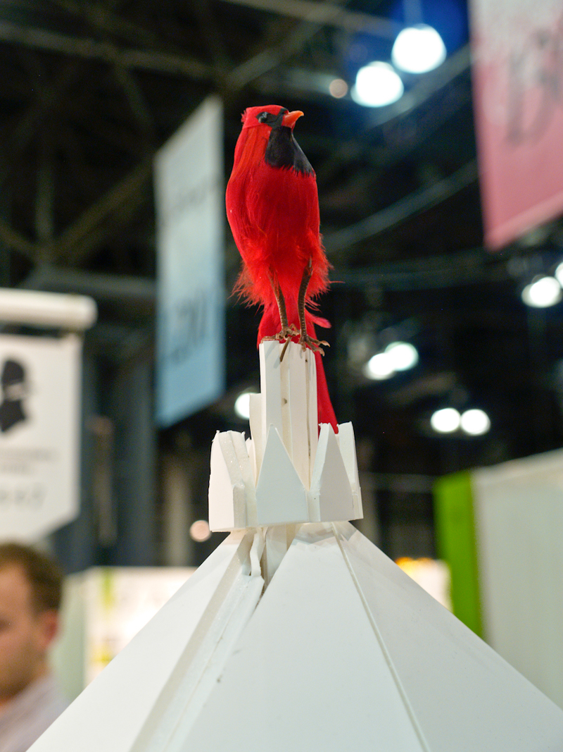
It’s already been a whirlwind couple of days at the National Stationery Show, and I can’t wait to share more images with all of you, including some seriously creative booth displays!  Of course, booth styling is always a huge part of exhibitor experience at the National Stationery Show, and this year’s show is no exception.  Mr. Boddington’s Studio had one of my favorite displays at last year’s show and this year they’re back with another stunning booth – both created by artist Donald Graham Hersey:

Gorgeous new boxed note sets from Mr. Boddington’s Studio

Mr. Boddington’s Studio

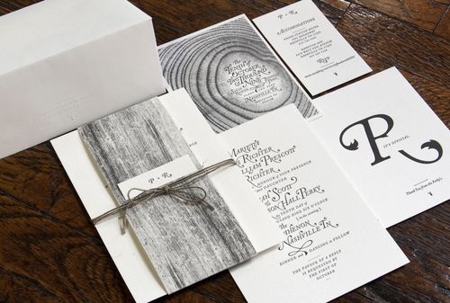
Another creative booth display, this time from a first time exhibitor: Nashville-based eco-friendly stationer Arboreal.  I’m loving the moss displays and the gorgeous wood sign, along with the beautiful Italian-inspired cards and gift tags.

Arboreal

Love the royal blue walls from another first time exhibitor Banquet Atelier and Workshop, which served as the perfect backdrop for Banquet’s nature-inspired prints, note cards, and patterned gift wrap.

Banquet Atelier and Workshop

I’ve been so happy to see (and meet!) so many new exhibitors at this year’s show.  Portland’s Two Guitars made its trade show debut this year, with an adorable selection of screen printed and letterpress note cards and notebooks.

Loving this vellum card layered over a vintage map!

Two Guitars

I’m totally smitten with the brand new wedding invitation and greeting card collection from The Nic Studio – all featuring Nicole’s playful and whimsical illustrations:

The Nic Studio

Even with all of the new exhibitors, it’s so nice to catch up with favorites from previous show.  I first fell for Urubbu‘s folk art and nature-inspired note cards at last year’s show, and I’m loving the new additions for this year’s collection!

Urubbu

That’s it for today, but I’ll have lots, lots more again tomorrow!

Photo Credits: Nole Garey for Oh So Beautiful Paper

Amy + Forrest’s Modern Illustrated Wedding Invitations

Today’s second set of real invitations comes from Amy Hardy, a freelance designer who was married in Nashville this past June!  Amy put together a fun, modern wedding invitation suite with hand lettering (and letters individually constructed from paper!) that also incorporates her husband’s background in landscape architecture.  So cool!

Modern-Illustrated-Wedding-Invitations

From Amy: I am an art director and graphic designer, and my husband Forrest is studying Landscape Architecture.  We met through a mutual friend in 2007 and got to know each other as running partners.  Once we finally started dating, our friendship quickly became romantic and real.  Within the first year of dating, we knew this was it.  On June 26, 2010 we made the promise of marriage to one another.  Our wedding was in Nashville, Tennessee.

Modern-Illustrated-Wedding-Invitations-Full-Suite

Our wedding stationery represented our creative and detail-oriented personalities, as well as our wedding’s charming Southern summer theme.  This included save-the-dates, invitations with a belly band and RSVP card, programs, favors, signage, and thank you cards.

Modern-Illustrated-Wedding-Invitations-Initials

I considered every detail in the stationery, from the stamps to the envelope liners. After constructing individual letters out of paper, I added vine details and Delicato as a secondary typeface.

Modern-Illustrated-Wedding-Invitations-Thanks

Modern-Illustrated-Wedding-Invitations-Programs

Modern-Illustrated-Wedding-Invitations-Programs

I love bright colored accents (note my husband’s bright red hair!) and hand-rendered typography, so we knew our stationery had to be typographic and colorful. Because of his blue eyes, red hair, and fun personality, Forrest wanted to wear a bright blue bow tie. That led to a bright, jewel blue as our founding color, with yellow as the accent.

Modern-Illustrated-Wedding-Invitations-RSVP

Because printing was digital, we used Mohawk Via Vellum to slightly raise the type.  The paper’s subtle and soft texture also complimented the cut paper typography.

Modern-Illustrated-Wedding-Invitations-Favors-Table-Numbers

I was inspired by our unique obsessions and the details that define us as a couple.  For instance, Forrest has a plant background, so I detailed the typography with vines. For favors, we made packets of wildflower seeds.  Each packet read, “Wildflower Seeds: Please plant these to celebrate the beauty of this day.”

Modern-Illustrated-Wedding-Invitations-DrawingModern-Illustrated-Wedding-Invitations-Save-the-Date

We had a blast at our Save the Date photo shoot, as seen in the photo we chose.

Beautiful Amy, thank you so much for sharing your wedding invitations and stationery!  For more from Amy and Forrest’s gorgeous wedding just click right here, and you can check out more of Amy’s design work right here!

{image credits: invitation photos by Amy | reception photos by Kristyn Hogan}

*Mohawk Paper is one of our fantastic sponsors; for more on our editorial policies, please click here.

Jefferson + Sarah’s Amazing Woodgrain Wedding Invitations

These invitations are another of my favorites from 2009 — the mix of woodgrain details and amazing typography just blow me away every time.  I first saw Jefferson and Sarah’s autumn Nashville wedding invitations on the Studio on Fire blog back in November, but when the designer (and groom!) Jefferson Perky sent over his take, I couldn’t resist sharing his perspective!

Woodgrain-typography-invitation-suite

From Jefferson: This invitation package was design for my own wedding. The idea was to create the feel of an elegant fall wedding with a hint of whimsy.  The growth of tree metaphor was carried out through the entire suite, from the Save the Date through the thank you cards.

Woodgrain-typography-letterpress-invitations
Woodgrain-typography-letterpress-invitation-detail

Everything but the envelopes was printed in a single color (black) on the same sheet and trimmed from there (a great cost saving technique).  Although I decided early on in the design process that the invitations would be letterpress printed, I still wanted to maintain a good range of value in the greyscale imagery.  So first we had the paper digitally printed to get the woodgrain imagery the way we wanted it before letterpress printing the text of the invitation.

Woodgrain-typography-letterpress-invitation-detail2
Woodgrain-typography-letterpress-invitation-type

The mix of digital and letterpress printing on soft cotton Lettra paper both allowed for the gradient detail in the tree rings and created subtle tactile differences in the invitation suite.

Woodgrain-typography-save-the-date

My wife teared up when they came back from the printer and we started assembly.  Happy tears. (Ed note: awwww… how sweet!)

Woodgrain-typography-thank-you-card

You can read more about these invitations over on Beast Pieces, and check out the Perky Bros website for lots of cool business collateral and print designs.  Thanks Jefferson!

{image credits: Studio on Fire and Perky Bros}

Happy Weekend!

Hello again everyone!  Do you all have fun plans for the weekend?  I'm actually looking forward to taking it easy this weekend – well, that and the National Book Festival on Saturday.  It's one of my favorite DC annual events and it looks like the organizers have got a bunch of really great authors lined up this year.  In the meantime…

Snippet-ink-vintage-wedding-dress-hand-illustrated-programs

…here are a few of my favorite links from this week:

That's it for me this week – I'll see you all back here again on Monday!

{image credits: Flowertoss Photography via Snippet & Ink}