Navy and Silver Hand Painted Wedding Invitations

You guys. Every piece in this wedding invitation suite from Ilana of Sugar & Type was individually hand painted. Each and every one! These beautiful navy and silver hand painted wedding invitations were created for the wedding of Ilana’s sister Danielle, who just also happens to be an artist. Danielle viewed the creative process behind these invitations as a symbolic representation of a new marriage, and her description of the process below is just so beautiful I can barely stand it!

Navy and Silver Hand Painted Wedding Invitations by Sugar and Type / Oh So Beautiful Paper

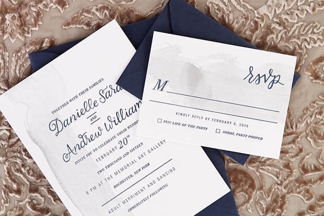
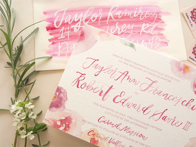
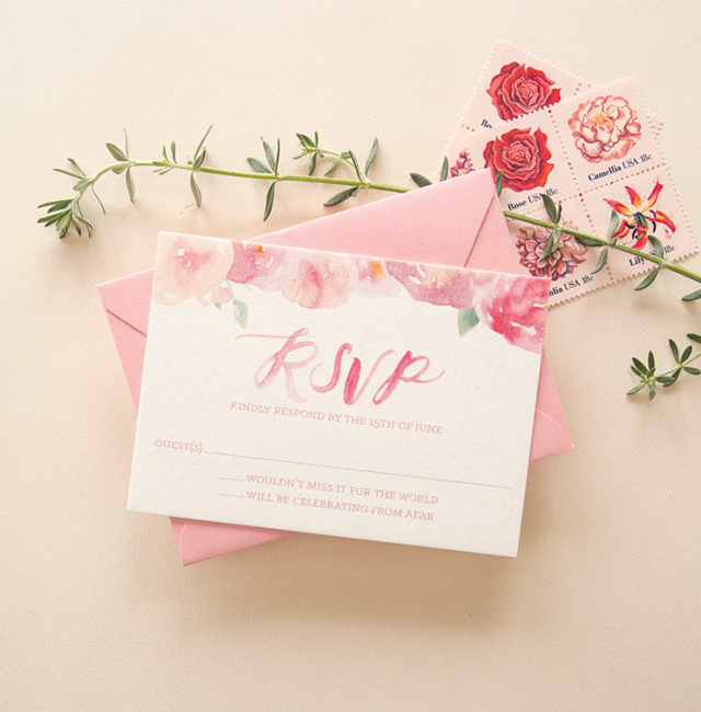
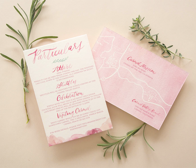
From Ilana: I’m so excited to share my sister Danielle’s wedding invitations! As an artist, my sister really wanted to have her hand in the creative process of the paper goods for her wedding day. My sister and I letterpress printed the invitations on a Vandercook letterpress (with the help of Amy at Green Girl Press), then Danielle individually hand painted each and every invitation, reply card, program, and info card. These invitations truly told a unique story.

Navy and Silver Hand Painted Wedding Invitations by Sugar and Type / Oh So Beautiful Paper

Navy and Silver Hand Painted Wedding Invitations by Sugar and Type / Oh So Beautiful Paper

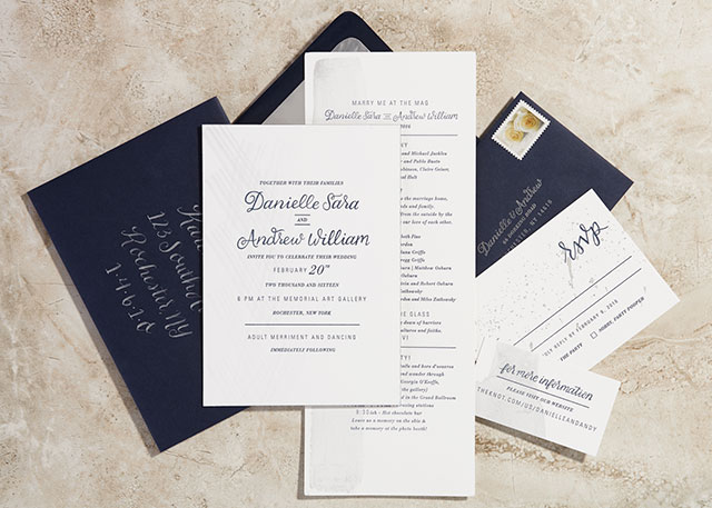
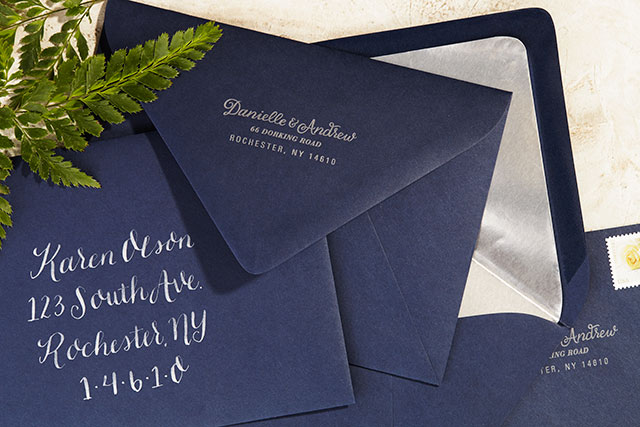
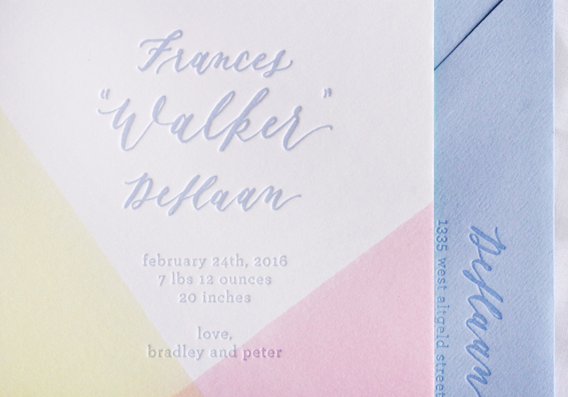
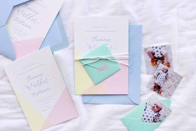
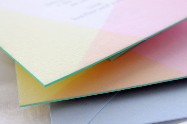
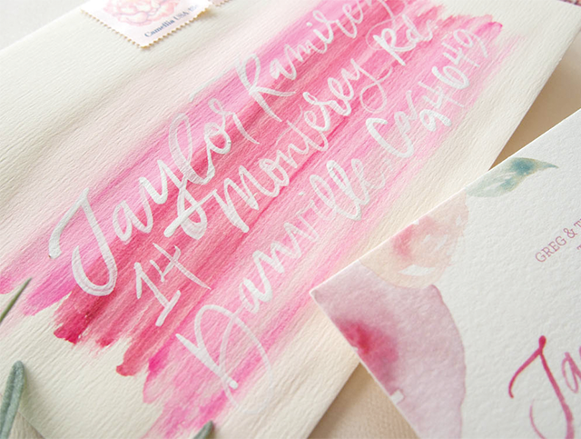
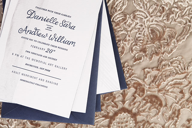
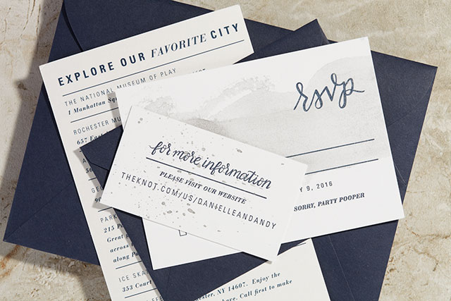
Danielle and Andrew’s winter wedding was held at an art gallery, where people were able to explore the space and really appreciate the art! The invitations were printed on 220lb paper with navy edge painting. Each envelope was hand addressed with silver ink to match the hand painted element on the suite. They carried out the metallic splatters throughout the details at their ceremony and reception, and it was truly a masterpiece.

Navy and Silver Hand Painted Wedding Invitations by Sugar and Type / Oh So Beautiful Paper

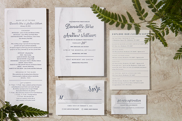
From Danielle – the bride and artist: For our wedding, it was important to us that the experience of art was gently portrayed in every element. From the hand painted brush strokes on each piece of every invitation, response card, information card, and program, to the calligraphy that was letterpress printed onto each sheet of paper.

Navy and Silver Hand Painted Wedding Invitations by Sugar and Type / Oh So Beautiful Paper

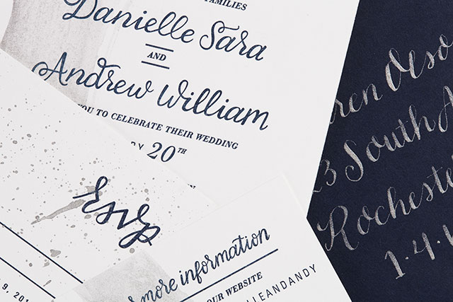
The brush strokes represented the evidence of process, the way that every motion in life leaves a mark, either large or small. These strokes were intentionally made to be perfectly imperfect and one of a kind, just like each individual marriage or relationship. Each mark was made specifically with intention and care, the way that everything you do in a marriage should be. Each component of the creation of the invitations reflected the ever changing atmosphere that exists in a marriage and fulfilled the symbolic process that felt necessary for us as we embarked on our next journey as a couple. We are thrilled with what the process yielded and the final product truly represents us as a couple. We are a team who tries to take time to consider the purpose and execution of our actions, and works to enjoy the journey to the final product.

Navy and Silver Hand Painted Wedding Invitations by Sugar and Type / Oh So Beautiful Paper

Navy and Silver Hand Painted Wedding Invitations by Sugar and Type / Oh So Beautiful Paper

Thanks Ilana and Danielle!

Design and Calligraphy: Sugar and Type

Letterpress Printing: Green Girl Press

Hand Painting: Danielle Sara

Check out the Designer Rolodex for more tal­ented wed­ding invi­ta­tion design­ers or visit the real invitations gallery for more wedding invitation ideas!

Photo Credits: Audra Zaba Photo

Colorful Dip Dyed Baby Announcements

I’ll always have a soft spot for dip dyed stationery, especially when combined with beautiful calligraphy and mint green edge painting! Brittany from Swell Press Paper Co. created these sweet dip dyed baby announcements – with a two color dip dye! And how cute are those mini mint green envelopes with little newborn baby photos???

Dip Dyed Baby Announcements by Swell Press / Oh So Beautiful Paper

From Brittany: When Bradley reached out to me to create a fun, one of a kind letterpress birth announcement for her new baby girl Frances Walker, I immediately knew this project was going to be a blast. Bradley wasn’t scared of color, and let me run wild with whatever design idea I had. I was so excited to be able to combine my two favorite techniques – dip dying (in two colors!) and edge painting – all topped off with the beautiful calligraphy of Melissa from Olive Branch & Co.

Dip Dyed Baby Announcements by Swell Press / Oh So Beautiful Paper

Dip Dyed Baby Announcements by Swell Press / Oh So Beautiful Paper

Dip Dyed Baby Announcements by Swell Press / Oh So Beautiful Paper

Crane’s super thick 220lb Lettra Cotton Paper in Pearl White perfectly absorbed the dip dye and allowed for a beautiful, deep impression of the text. I chose a light periwinkle ink color to match the envelopes; the spring colors were perfect to welcome the new babe into the world!

Dip Dyed Baby Announcements by Swell Press / Oh So Beautiful Paper

New mom Bradley also is a fan of anything miniature (I mean who isn’t?), so I included a mini mint green envelope (with matching edge paint color!) and three tiny photos of Walker (and her adorable chubby legs). This is by far one of my favorite projects to date!

Dip Dyed Baby Announcements by Swell Press / Oh So Beautiful Paper

Dip Dyed Baby Announcements by Swell Press / Oh So Beautiful Paper

Thanks Brittany!

Design, Printing, and Dip Dyeing: Swell Press Paper Co.

Calligraphy: Olive Branch & Co.

Photo Credits: Swell Press Paper Co.

Pink Floral Watercolor Wedding Invitations

Um, how gorgeous are these pink floral watercolor wedding invitations from Kim of Bright Room Studio?? I just returned to DC from a week in the Catskills in Upstate New York, and while the cherry blossoms are mostly a thing of the past (sigh…), we came home to FULL FORCE SPRING and flowers galore. So what better way to start the week than with these pretty pink floral invitations?!

Pink Floral Watercolor Wedding Invitations by Bright Room Studio / Oh So Beautiful Paper

From Kim: I loved working with Taylor and Bobby and getting to go full on girly with their invitation suite. Their Carmel Valley wedding was going to be dripping with flowers and they wanted their invitations the same way. So we went for it with hand-painted watercolor flowers in shades of pink and peach with sweet leafy details. The florals paired perfectly with the hand-painted script names and the variation in the watercolor gave it so much life and personality.

Pink Floral Watercolor Wedding Invitations by Bright Room Studio / Oh So Beautiful Paper

The map was a fun accent with the painted watercolor background. It gave the suite a little bit of contrast while still being feminine and perfect for their early summer wedding.

Pink Floral Watercolor Wedding Invitations by Bright Room Studio / Oh So Beautiful Paper

One of my favorite details was the envelope. I hand painted each envelope with a swash of pink and then addressed it on top with white hand lettering. They were so unique and gave the whole suite a little bit of edge. We then carried the swash of pink watercolor in to their day-of with fun place cards and other watercolor details. I had so much fun painting all the elements for their big day and love how this pretty-in-pink-flowers invitation came together.

Pink Floral Watercolor Wedding Invitations by Bright Room Studio / Oh So Beautiful Paper

Pink Floral Watercolor Wedding Invitations by Bright Room Studio / Oh So Beautiful Paper

Pink Floral Watercolor Wedding Invitations by Bright Room Studio / Oh So Beautiful Paper

Thanks Kim!

Design: Bright Room Studio

Bright Room Studio is a member of the Designer Rolodex  – you can see more of Kim’s beautiful work right here or visit the real invi­ta­tions gallery for more wedding invitation ideas!

Photo Credits: Bright Room Studio

Spring Botanical Letterpress Wedding Invitations

Spring is most definitely in the air here in DC. We’ve had several warm days, and I’m starting to see spring blossoms out in my neighborhood! I’m always a fan of botanical design motifs, but even more so for spring and summer weddings. Becca from Suite Paperie sent over these beautiful spring botanical letterpress wedding invitations that she created for a late spring wedding at the New York Botanical Garden. Such a dreamy venue for a May wedding!

Spring Botanical Letterpress Wedding Invitations by Suite Paperie / Oh So Beautiful Paper

From Becca: For this fun couple, we went with a design that felt like a breath of fresh, late spring / early summer air. Letterpress printed with thin lines in a delicate gray, this design paired clean and simple fonts with natural touches. We carried the playful font into a monogram that is centered inside a hand-drawn wreath, and sprigs of that same wreath are present throughout the invitation suite.

Spring Botanical Letterpress Wedding Invitations by Suite Paperie / Oh So Beautiful Paper

Spring Botanical Letterpress Wedding Invitations by Suite Paperie / Oh So Beautiful Paper

The letterpress printed invitation is complemented by matching inserts digitally printed on soft white stock. As for the blue floral touches? The dinner party card is framed by a pretty collage, which was dreamed up and sketched in our studio in the same style as the monogram wreath, and the RSVP card features small floral touches in the same blue as the liner. The airy feel of the invitation suite shined through in finishing touches, like a tied raffia belly band. Cornflower blue edge painting on the double-thick invitation added an irresistible touch.

Spring Botanical Letterpress Wedding Invitations by Suite Paperie / Oh So Beautiful Paper

Spring Botanical Letterpress Wedding Invitations by Suite Paperie / Oh So Beautiful Paper

Spring Botanical Letterpress Wedding Invitations by Suite Paperie / Oh So Beautiful Paper

Thanks Becca!

Check out the Designer Rolodex for more tal­ented wed­ding invi­ta­tion design­ers and the real invi­ta­tions gallery for more wedding invitation ideas!

Photo Credits: Lindsay Nathanson

Illustrated European-Inspired Watercolor Save The Dates

Well, these save the dates are quite romantic! Created for her own upcoming wedding by Erin of Grace + Ardor Co., these illustrated European-inspired watercolor save the dates feature a gorgeous custom watercolor illustration of the reception venue, hand-torn deckle edges, and a gorgeous wax seal. And I love that Erin chose to go with a large scale format for her save the dates – all the better to show off that beautiful illustration!

Illustrated European-Inspired Watercolor Save the Dates by Grace + Ardor / Oh So Beautiful Paper

From Erin: My fiancé, John, and I are getting married this September, and planning and designing a wedding has been something I’ve dreamed of doing since I was a little girl. I spent the first few months of our engagement really researching and refining my aesthetic. Once I had that in place, I decided to collaborate with a fellow designer (and one of my bridesmaids), Tracey, to create my Save the Dates.

Illustrated European-Inspired Watercolor Save the Dates by Grace + Ardor / Oh So Beautiful Paper

Illustrated European-Inspired Watercolor Save the Dates by Grace + Ardor / Oh So Beautiful Paper

Our wedding is going to be very soft, romantic, and European-inspired. Blush pinks and neutrals, lots of foliage, some deep merlot tones, and mixed metals are in the palette. The ceremony will be held at Bryn Athyn Cathedral in Pennsylvania: a gorgeous Early Gothic style structure set amongst beautiful gardens. Located next to that is the stunning Cairnwood Estate, in which our reception will take place.

Illustrated European-Inspired Watercolor Save the Dates by Grace + Ardor / Oh So Beautiful Paper

I also collaborated with an illustrator, Cheryl Geiger Sheeler, for the beautiful watercolor painting of Cairnwood Estate. This was scanned in to the computer and printed on Epson Watercolor Paper. We tore the edges of the paper by hand to give it a deckled edge, and the illustration bled off the edge to add to the natural, handmade feel.

Illustrated European-Inspired Watercolor Save the Dates by Grace + Ardor / Oh So Beautiful Paper

For impact, the scale was larger than a traditional Save the Date at 8.75 x 15 inches, folding down into a Crane Lettra A9 envelope. The fold was secured with an antique gold olive branch wax seal. I wanted to save the beautiful impression that calligraphy gives for our main wedding stationery, so I decided to create address labels that wrapped around the side of the envelope as an elegant alternative. Everything came together so wonderfully, and I especially love the handcrafted details. I cannot wait until our big day in September to celebrate our love for each other!

Illustrated European-Inspired Watercolor Save the Dates by Grace + Ardor / Oh So Beautiful Paper

Illustrated European-Inspired Watercolor Save the Dates by Grace + Ardor / Oh So Beautiful Paper

Thanks Erin!

Design: Grace + Ardor Co.

Watercolor Illustration: Cheryl Geiger Sheeler

Check out the Designer Rolodex for more tal­ented wed­ding invi­ta­tion design­ers and the real invi­ta­tions gallery for more wedding invitation ideas!

Photo Credits: Erin Doyle, Grace + Ardor Co.