Harvest Feast Invitations

Sam & Whit from Gus & Ruby Letterpress here! When our store manager, dear friend and creative extraordinaire (the genius behind Paper Posy Designs), Liz, asked us to collaborate with her on a harvest-feast inspiration shoot, we jumped at the chance.  Liz wanted to create a cozy, rustic shoot to commemorate her favorite time of year – Fall in New England.

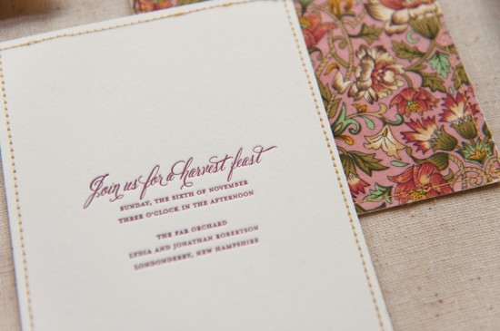
The shoot took place in an apple orchard and Liz’s vision was all apple pie, cozy blankets, wood texture and a rich, autumnal palette. With that direction, we were set loose to dream-up an invitation and paper details that would set the tone for this intimate Harvest feast.

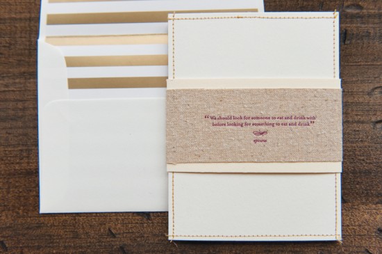
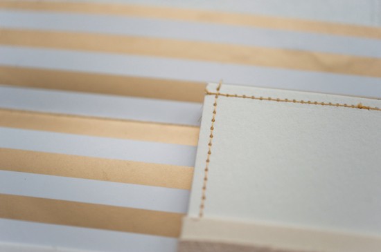
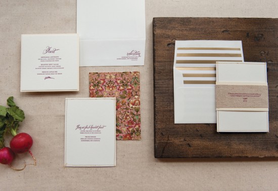
Luxe pearl white cotton paper was the perfect canvas for swooping calligraphy-inspired and classic roman fonts letterpress printed in a deep plummy ink.  Loads of white space made the invitation feel clean and airy. We then hand sewed a beautiful multicolor fabric backing to each invitation using metallic gold thread. The fabric backing spoke to the cozy nature of the shoot and added an interesting texture, and pop of color and pattern, to the clean invitation front.

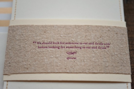
Finally, we wrapped the piece in a double-layer belly band composed of creamy ecru cotton and natural oatmeal linen upon which we letterpress printed an inviting quote. To top it all off, we lined each envelope with a metallic gold-stripe envelope liner.

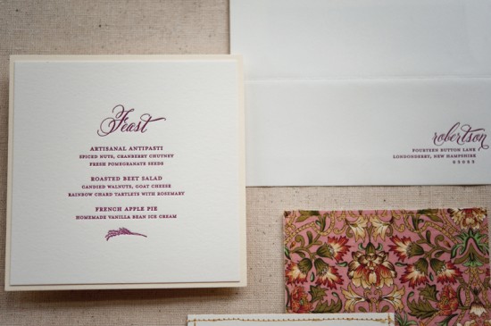
Menus at each place setting again featured simple typesetting, lots of white space and the addition of a small wheat graphic and were mounted to a creamy ecru cotton backing paper for a neutral tone on tone effect.

The end result was a paper trousseau that warmly set the tone for this cozy, creative shoot.  You can see photos of the whole shoot on The Sweetest Occasion!

Design and Letterpress Printing: Gus & Ruby Letterpress

Gus & Ruby Letterpress is a member of the Designer Rolodex – check out more of their beautiful work right here or visit the real invi­ta­tions gallery for more wedding invitation ideas!

Photo Credits: Brea McDonald Photography for Gus & Ruby Letterpress

Nikki + Mike’s Vintage-Inspired Illustrated Save the Dates

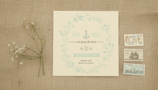
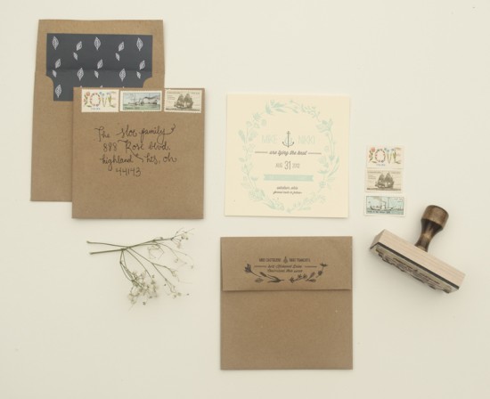
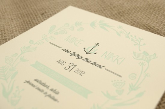
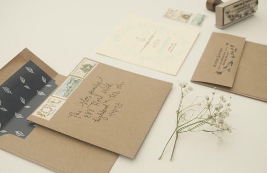
Who knew you could combine nautical, vintage and woodsy into one cohesive save the date?  Nikki Tranchita, both bride and graphic designer, made it happen for her outdoor, lakeside wedding.  Marrying outdoors was top priority for Nikki and Mike as it reminded them of their childhood exploring the rural mid-west.  She hand-illustrated the natural floral design before letterpress printing the save the dates herself and finishing them off with a hand addressed kraft paper envelope and an array of coordinating vintage stamps.

Vintage Inspired Illustrated Save the Dates by Nikki Tranchita via Oh So Beautiful Paper

From Nikki: The style of the wedding is lakeside nautical, vintage, outdoors/woodsy, and slightly bohemian. I strived to allude to all of that in my design. It was also very important to me to keep my hand drawn style throughout the design. I hand illustrated the floral/plant wreath around the text and the anchor/ampersand in the middle. I used vintage stamps for postage, stamped our return address on each Kraft envelope, and hand addressed them, too.

Vintage Inspired Illustrated Save the Dates by Nikki Tranchita via Oh So Beautiful Paper

Vintage Inspired Illustrated Save the Dates by Nikki Tranchita via Oh So Beautiful Paper

Vintage Inspired Illustrated Save the Dates by Nikki Tranchita via Oh So Beautiful Paper

Thanks so much Nikki!

Check out the Designer Rolodex for more tal­ented wed­ding invi­ta­tion design­ers and the real save the dates gallery for more beau­ti­ful cus­tom save the dates!

Photo Credits: Nikki Tranchita

All About Wedding Ceremony Programs

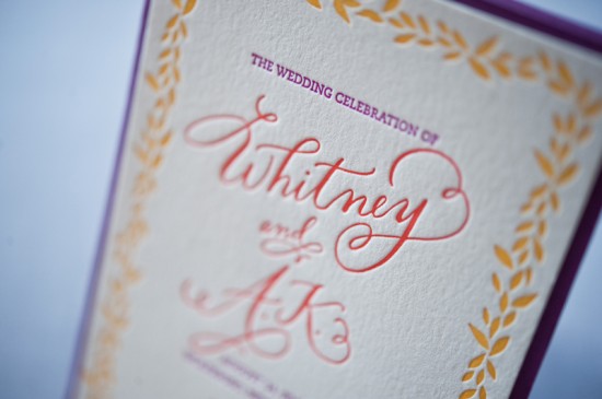
Once you’ve mailed your wedding invitations and are spending your days waiting expectantly by the mailbox for replies, you might start thinking about all those other lovely paper details needed for your big day. One such detail is the ceremony program.

So, what exactly is a ceremony program?

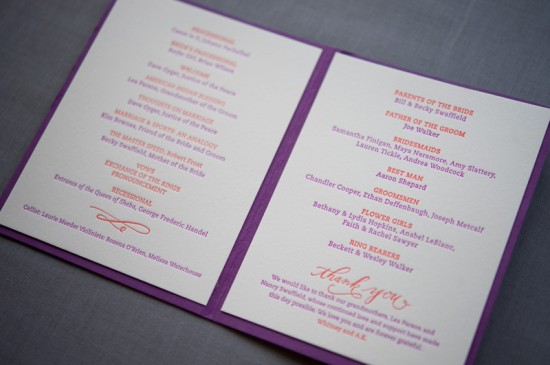
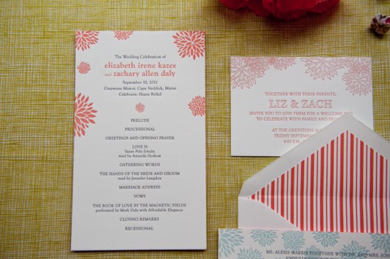
Ceremony programs should outline for guests a basic run-down of what will occur during the ceremony.  They often also outline who’s who in the wedding party and families of the couple. Some types of information you may want to include in your program:

• Order of events: this might include processionals, readings, prayers, the exchange of vows, etc.

• Specific details about the ceremony: this could include specific music that will accompany the wedding party processional, names and origins of readings, music heard or performed throughout the ceremony, etc.

• Names of parents, grandparents and celebrants/officiants

• Names of the bridesmaids, groomsmen, flower girls, ring bearers and ushers

• Any notes or explanations about specific cultural or personal traditions that will take place during the ceremony

• Any notes of remembrance for friends or family who are no longer with you or who were unable to attend

• Any notes of thanks to your friends and family for their presence and guidance

Of course, your program should be a reflection of your event, your personalities and what feels right to you. There is no wedding police and every program is different so do not feel that you need to include everything listed above.  Instead, just think about what you would want to or care to read if you were a guest at your wedding.

What do ceremony programs look like?
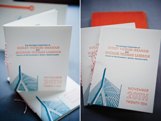
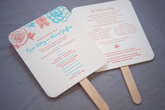
Ceremony programs come in all shapes and sizes and those shapes and sizes largely depend on the amount of content you’d like included and your vision for the piece!

Will you be including each reading and prayer written out?  Then perhaps a traditional bound booklet or flip-style program will work best and provide the most room for larger amounts of content.

Getting married on a hot summer day? Program fans are fun and functional!

Opting for a minimalist style or on a tight budget? Flat panels provide a perfect space for a to-the-point program.

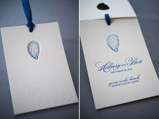
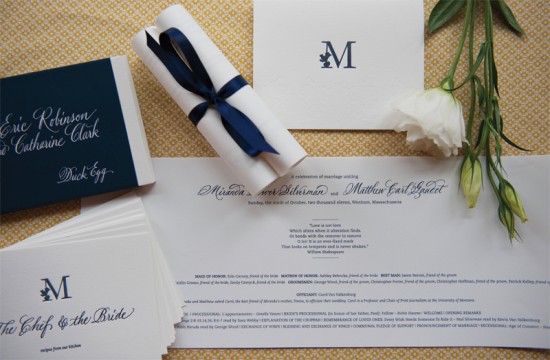
Feeling creative?  Programs can be designed in all sorts of creative ways to complement your event style, themes or your venue.  Scroll programs for an English garden wedding? Sure! A chalkboard program for a sweet backyard bash? Of course!

The sky is the limit to how creative, or how sweet and simple, you can make a ceremony program and, in the end, as long as the schedule ends with you getting married, it will be a success!

Design and Letterpress Printing of all the above: Gus & Ruby Letterpress

Gus & Ruby Letterpress is a member of the Designer Rolodex – check out more of their beautiful work right here or visit the real invi­ta­tions gallery for more wedding invitation ideas!

Photo Credits: Brea McDonald Photography for Gus & Ruby Letterpress
Anneke & Austin’s Nautical-Inspired Wedding Invitations

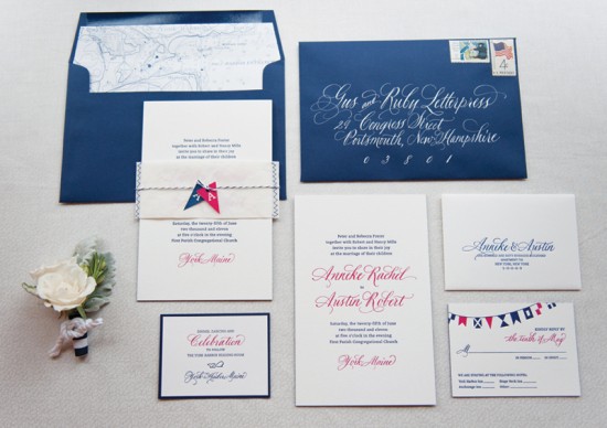
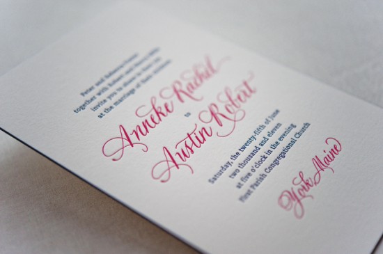
Good morning, paper lovers!  Samantha & Whitney here from Gus & Ruby Letterpress. We have the immense privilege of guest blogging on the Oh So Beautiful Paper blog this week and we are just delighted to be here. To start things off, today we’re thrilled to bring to you a chic, nautical invitation suite that we’ve been squirreling away for a few months. This custom suite was crafted for an absolutely too-cute-for-words couple, Anneke & Austin, in need of wedding stationery for their Maine-coast nuptials.

Knowing that A&A wanted to feature the seaside location of their wedding venue, we set about crafting a suite that was both nautical, personal and playful but still classic, elegant and timeless.

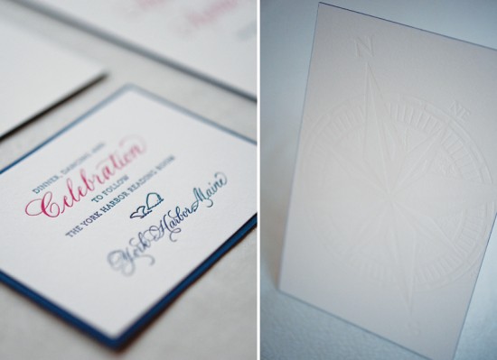
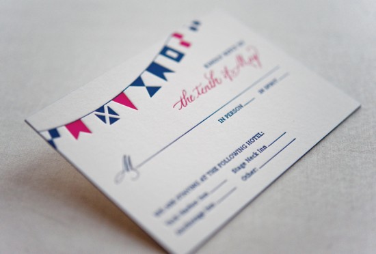
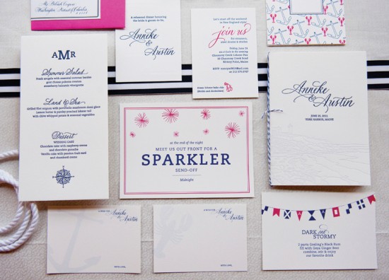
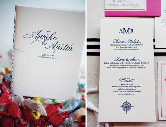
To set the tone on all pieces, we paired classic typesetting, stunning hand calligraphy by Elizabeth Porcher Jones and a preppy palette of navy and pink and letterpress printed everything on thick, textural cotton. Navy edge painting and a blind-printed compass on the back of the extra-thick invitation added subtle pops to the clean design. Nautical pennants (burgees), hand-illustration and color backing papers pulled even more nautical elements into the reply and reception cards.

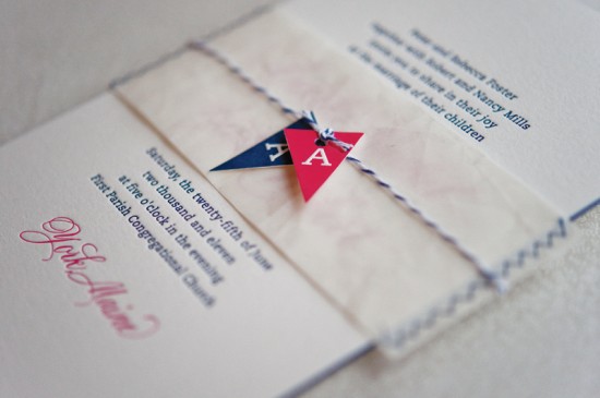
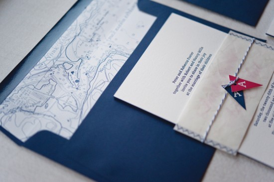
And, what really put the suite over the edge was the custom hand-sewn belly band made of recycled sail cloth that held all the pieces together. Each band was cut out of a piece of sail (previously used on a boat!) and sewn all by hand, and hand-cut monogram burgees were tied to striped twine around the band as a finishing touch.  The deep navy envelopes popped with stunning white calligraphy and featured custom nautical chart envelope liners as an added surprise for guests as they opened the suite.

The end result was an invitation suite (and then accompanying day-of pieces) that perfectly reflected the classic Maine wedding of this beautiful and lovely couple. See more photos of the Anneke & Austin suite (including the super fun poster-style save the date) HERE.

Design and Letterpress Printing: Gus & Ruby Letterpress

Calligraphy: Elizabeth Porcher Jones

Gus & Ruby Letterpress is a member of the Designer Rolodex – check out more of their beautiful work right here or visit the real invi­ta­tions gallery for more wedding invitation ideas!

Photo Credits: Brea McDonald Photography for Gus & Ruby Letterpress
42 Pressed Giveaway Winner – and Discount!

Happy Friday everyone!  We’ve had a big week here at Oh So Beautiful Paper – it was so much fun to host a fabulous giveaway from 42 Pressed to help celebrate our four year blog anniversary and I’m super excited to announce the winner!  The lucky reader is…

Comment # 13 – Rocio

Yay!  A big congratulations to the lucky winner, and a huge thanks to all of you who entered!  For anyone who entered the giveaway, Jackie from 42 Pressed has extended a generous discount to all those who entered the giveaway: she’s offering a 25% discount for all wedding stationery orders placed in the next week!  And don’t worry, you don’t have to know all of your details just yet – just head over to 42 Pressed and place a deposit by September 21 using the code 42GIVEAWAYOSBP to receive the discount.  Thanks Jackie!