Today’s real wedding invitations come to us from Kathryn of Blackbird Letterpress – and I love these invitations both for the incredibly cool design as well as the personal story behind it. Kathryn and David were married at an intimate (only 6 people!) ceremony in Louisiana last year, and chose to create combined marriage announcements and an invitation to a post-wedding celebration with family and friends — along with a few other paper goodies for the party…

From Kathryn: As a letterpress printer and designer of paper goods from invitations to stationery, it was a momentous project to design my own invitations.  The thrill is that it gave me a chance to design something more like my own artwork and not just a typical invitation.  And I found myself in a rather interesting position being the bride and designer.  I will admit it was both freeing and also a little difficult.
 {k + d at their wedding ceremony}
David and I were married in October 2009 out at a fishing camp off the coast of Louisiana, in the saltmarsh. Â The camp is 6 miles by boat from the closest marina. Â There were six of us total at the ceremony, us and 4 very close friends. Â It was quiet, spontaneous, and very special. Â The weather was perfect. Â The invitations are actually for the party we had a couple of months later in January gathering all our close family and friends together in celebration. Â I did as many DIY things as I could for the wedding as well as the celebration. Â It helps to be a letterpress printer.
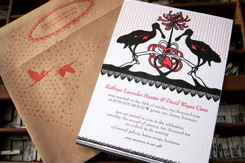
The invitations are printed on 100% recycled cotton rag paper, and the envelopes are kraft 100% postconsumer recycled. Â We strive to use recycled products as much as possible and to be conscious of our impact on the world here at Blackbird. Â The images are printed using photo polymer plates, the text is printed using hand set movable type.

The main feature on the invitation is the silhouettes of 2 Roseate Spoonbills.  In October in South Louisiana, we get the beautiful pink and reddish birds migrating south for the winter.  They are absolutely amazing.  You can see more pics of them at the wiki site.  I am not a fisherman but I love birds so I chose the spoonbills to be our image for the card.
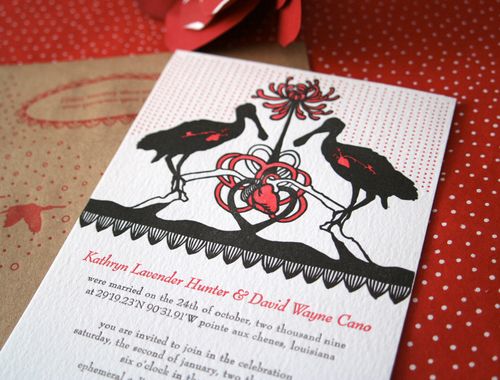
As an artist I have used the anatomical heart image in my work. Â The heart has often been thought of as a symbol of the center of all knowledge and the life source. Â And of course we think of hearts as symbols of love. Â My mom told me her friend said that she saw the two birds joining together with one heart, one love.
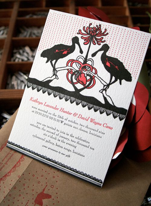
Since we were already married, this invitation serves as both an announcement of the marriage as well as the invitation to our post-wedding celebration.  The coordinates listed are the actual coordinates of the camp.  And since it really isn’t in a town or place (though I mention Pointe Aux Chenes), it is considered Louisiana right before you get to the mighty gulf of Mexico.
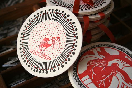
For favors for the guests at the celebration, I designed and printed coasters. The heart comes back here as well as the spoonbills, but instead of two spoonbills, there is a two headed spoonbill (I’m not sure most people notice that, which is fine).
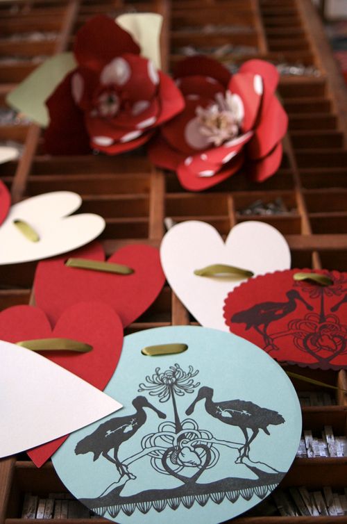
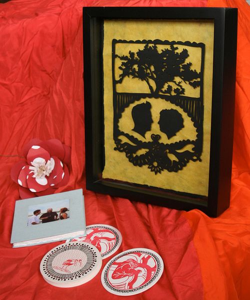
I also printed more of the image from the invitation on some diecut circles and other shapes to make garlands as decoration. Â I made a small accordion guest book and glued a picture from the ceremony on the front. Â As a wedding present for David I made the silhouette paper cut. Â Pointe Aux Chenes, means Oak Point in French, so there is an oak tree at the top, then a silhouette of David and me, and then a redfish under David and an Ibis under me. Â He likes to fish, I like the birds.
So cool, right? I love the way Kathryn incorporated her own artwork into the invitation design, and the paper cut silhouette is just amazing! You can check out more of Kathryn’s beautiful work on the Blackbird Letterpress website and shop, and see some of her recent custom projects on her blog. Thanks Kathryn!
{image credits: Kathryn Hunter}