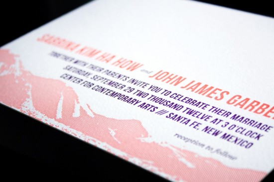
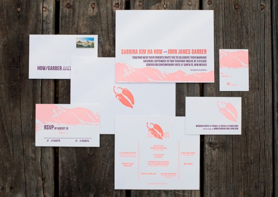
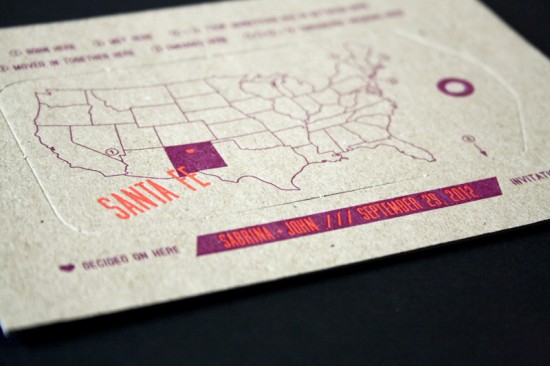
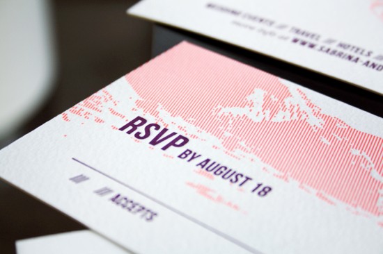
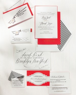
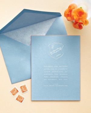
I’ve never had the pleasure of visiting New Mexico, but Sabrina and John’s destination wedding invitations remind me of what I imagine a famous New Mexico sunset might look like! Sabrina, a designer at Smudge Ink, wanted to stay true to her modern design style, incorporating a vibrant neon coral ink and bold purple into the design. Love it!
From Sabrina:Â John and I had a destination wedding in Santa Fe back in September. We had never even been to New Mexico before when the idea came to mind, but after making a weekend getaway there we had completely fallen for its small town warmth and desert landscapes. So when it came to the creating the look and feel for our wedding, we knew we wanted to celebrate the best of Santa Fe while keeping true to our modern tastes and playful personalities.
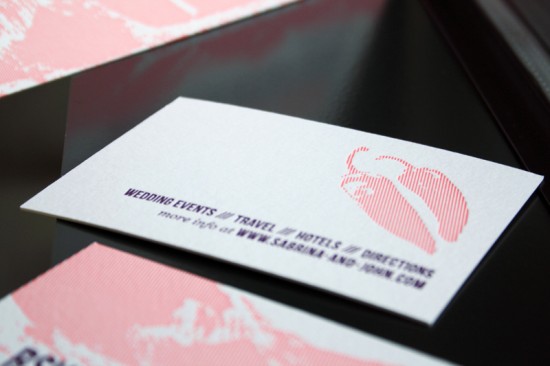
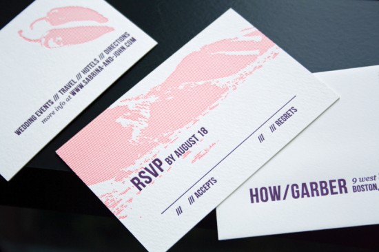
As someone who works with brides on their wedding stationery for a living, I naturally looked forward to designing all of the paper touches. The invitations reflected the serene mountain scenery but in a more modern light with the use of straight lines letterpress printed in fluorescent coral ink and bold text in prune. We also incorporated a pair of chiles as a humorous nod to our love for spicy food.
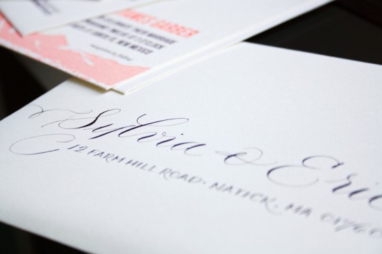
Fortunately, I had everyone at Smudge Ink to give me a helping hand and Megan Chapin Calligraphy to address each one in matching prune ink. And how happy do you think I was when I saw that the USPS had just released commemorative stamps in honor of New Mexico!
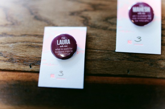
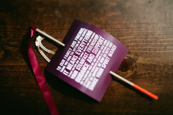
John and I tried to keep things fun and light in our day-of pieces too. From our ice breaker escort card pins to our ceremony “spirit†wands. The interactive nature of these pieces really got the party going!
Thanks Sabrina!
Design & Letterpress Printing: Smudge Ink
Calligraphy: Megan Chapin Calligraphy
Smudge Ink is a member of the Designer Rolodex – you can see more of their beautiful wedding invitations right here or  real inviÂtaÂtions gallery for more wedding invitation ideas!
Photo Credits: Sabrina Garber and Karen Kristian Photography

